Text
who tf even reads this
identify your self! my demands shall not be met. I know. I know this becos I am a reasonable person. my wishes are within reason. I do not wish. I have desires &/or preferences. & I recognize that.
0 notes
Text
diagnosis
she suffers from stupidity. sorry. I gotta keep it real. I cannot endure. I will not... or will i. no. I won't.
0 notes
Text
hot damn.
people are crazy. I should know this by now. yet I never fail to be amazed. just as they never fail to amaze. in dumbfounding ways.
0 notes
Text
for a moment I was like "this looks delicious… wait, this isn't a pie." damn.


Wolf Moon Panel
Luke Marston
45 notes
·
View notes
Text
c O a S t e R c O o K i e S
this may be lengthy but I would have difficulty communicating this all in a phone call. I really hope this is all useful/more helpful in conveying what I am imagining/envisioning.
CASBLANCA!!! //
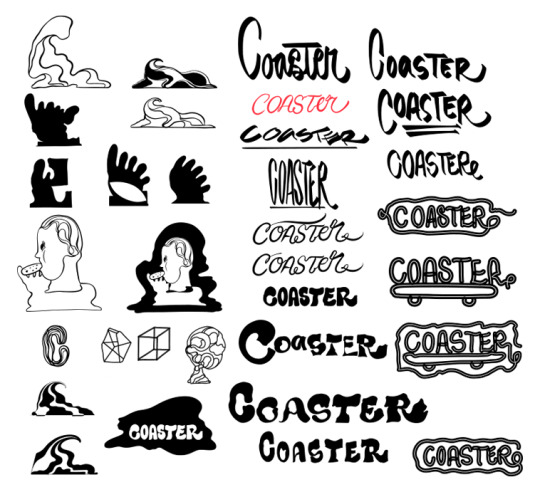
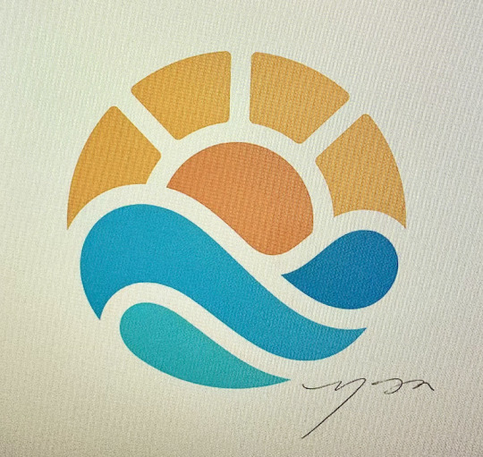
I sat with these concepts to let them sink in & tbh my initial impression was that this is giving "halloween spirit/skate shop" vibes... 👻 🛹 so I questioned whether if it had to do with being October or if I just completely failed that litmus test... 😳 so I sought a second opinion from marketing/communications person @ La Cocina & she suggested I consider using/requesting color, as most/all of the community of La Cocina businesses have their logos/palettes in color & it would probably open up the possibilities/be getting the best of your talent/capability/sensibilities. Initially, when we spoke, I was thinking of the SFCMT building + Market & 7th but after that conversation with La Cocina, I think the mural @ Bayshore Elementary + Buena Vista Elementary on Valencia/across from Arizmendi's is the right feel/aesthetic/direction I would like to take. & then after writing this, your TikTok came up as a rec & the 13th x van ness is the perfect example for the feel/aesthetic I am seeking from you. it's got a colorful/circular simplicity to it that feels like the exact opposite of the skatepark aesthetic/vibe on the other side of the street (👻 🛹).

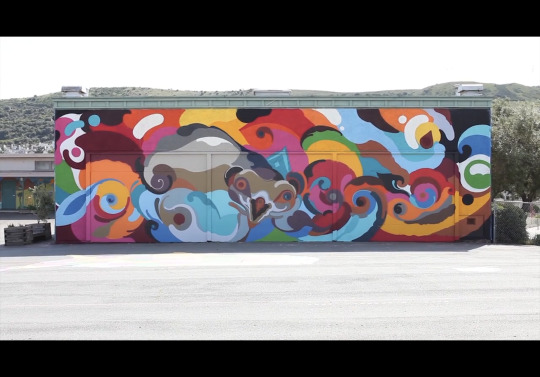

LETTERS // ALPHABET SOUP I am envisioning letters with width, weight, girth, boldness, so the letters may easily be read from a distance. I am thinking of letters that are composites of upper/lower case letters. letters that evoke a sense of fun/play/happiness like scattered alphabet blocks or alphabet fridge magnets. I would like for there to be breathing room between the letters so they may stand independent of each other. having the letters separated would also allow for future renditions / animations / rotations of the letters as to where they sit on the peak/valley of the wave, so I may arrange/connect them like buoys on an ocean surface or riding across a sin wave or letters floating in alphabet soup. similar to your sound design TikTok @ https://www.tiktok.com/@victorreyesstudio/video/7164492766368599339?is_from_webapp=1&sender_device=pc&web_id=7299195328857736750


so I sat with the Buena Vista mural & tried my best to sketch out what I am envisioning ... the C is the MVP, the beginning of the wave. the O might be the sun/moon/cookie. the a + A hybrid is like a mountain maybe. the S might be the view of a road coming down the mountain, chubbier than curvy like the S you did for Louis Vuitton. the t + T hybrid helps avoid religious connotation of a cross so I made the top half a capital T with a lower case tail that helps add a bit of "current" or "roll" out of the S & into/towards the direction of the end (R). I would like to use a lower case "e" cos it has a smiling quality that a capital E would not offer. the capital R because we got Reyes in the mix! & it provides the tail to finish/roll out the wave.


Another reason for my requesting letters that could stand independently is that if the C in "coaster" is the dopest C, perhaps that could be used as the basis for the logo rather than needing to create separate concepts/ideas for the logo & lettering. If there is a C to beat or remix or reference, that C might be the Carhartt C. I am also open to ditching a logo & just using the C.


COLOR & SHAPE //


I trust your color palette/sensibilities. but I am thinking shades of blue that have a feeling/sense of lightness/levity/easy going/openness/open sky/calm/coasting thru life. perhaps primary colors in lighter/softer tones that may add a feeling of warmth/harmony/mellow/simplicity. thinking of clouds + sky + sun, the thought of cotton candy/sherbert sunrise/sunsets also come to mind. but I trust whatever you wanna do/think/feel like, im just sharing my thoughts. for shapes relating to letter structure/flow, I am envisioning circular/rounded/smooth/soft curves (fender guitar, weathered driftwood, 13th x Van Ness wall, roller coaster track, hills, winding roads) // avoiding any sharp/cornered/squared edges/angles.
PHYSICAL x GEOGRAPHIC ORIGIN OF COASTER //


"classic/retro" mellow/easy going sober stoner CA coast vibe/scenery. I love plants from the time I spent learning cannabis cultivation. VW + camper has that physically retro/non aggressive feel. the in n out umbrellas give me a coaster vibe/shelter from the sun beating down. the EQ coffee is only there to represent the quality/brand category I am aiming for. the driftwood is just that smooth/soft sorta feel/tone like what will be used for the label/packaging for the cookies: craft paper, paper bag, brown sugar, more of a background color for the logo/lettering. SPIRIT ANIMAL //

During the phone convo, you asked about animals I'm drawn to & I was born in the year of the tiger & then I recalled this image I made for an art therapy assignment. I thought I would just share it as a supplement to that conversation/question. The tiger + stripes were inspired by your work + James Jean + Sam Flores. I am not asking for this to be incorporated into the project but I am envisioning that the style/lettering could work with this tiger illustration. If coaster cookies had a mascot, then it might be this tiger.
MISC //
I spoke with the designer @ La Cocina & he mentioned this concept of "designing backwards" & he asked me what is the impression I want to give when people get from the design/aesthetic? & I just thought, "fun, happy, joyful, inviting, crafted, unpretentious" GRAND FINALE //
for the final say... I had a thought, what if you asked your son which logo/concept he likes the most? & then maybe we just go with that. 🤷🏻♂️
ACKNOWLEDGEMENT //
I recognize you put time into drafts, so I don't want for you to exert more time/energy than necessary/commensurate to the compensation we've worked out. while I don't have a big budget, if this increases the ask beyond the expectations/scope of our initial convo, I am open to re-adjusting the pay/trade.
0 notes
Text
Peter Thiel's 7 questions for startups://
People // 1. Can your team pursue this?
I am a one person operation. I bake the cookies & I sell’em.
Distribution // 2. How will you deliver your product?
The local farmers market & specialty coffee shops seem like the right fit. They will be individually packaged & transported by vehicle.
Engineering // 3. Can you create a breakthrough?
I can work independently to start but I will need a team of cookie lovers or robots to maximize production.
Timing // 4. Is this the right timing?
Now is the only time & cookie time is a always a good time.
Monopoly // 5. Will you start with a small market?
The local farmers market may be conquered. Then Whole Foods Market, depending on whether Bezos likes cookies.
Durability // 6. Can you defend your market?
Cookies are not going anywhere, a commitment to excellence & baking exceptional cookies will endure the test of time.
Secret // 7. Do you see a unique insight?
The cookie aisle is too large. Classic/Traditional flavors deserve an update. People love cookies. The Girl Scouts need competition. Competition is good for the market, the farmers market, & Whole Foods Market.
0 notes
Text
MVP // minimum viable product // OKONOMI // cookies

1 // unsolved problem // there is not a cookie stand @ the farmers market. complementary commodities such as coffee or ice cream may supplement to make a cookie stand financially viable.
2 // research phase // there are only 2 shops in the Bay Area whose focus is cookies. the most popular bakeries do make some great cookies but the selection/variety may be limited. cookies are often an afterthought @ bakeries.
3 // the distinction // each unique cookie recipe has been developed over the course of 7 years, with thousands of cookies baked to test the recipes. the cookies are made & baked in small batches to insure consistency & quality.
4 // prototype // individual 2 oz cookies.
5 // product testing // 4 oz cookies were too large, 1 oz were too small, 2 oz hit the sweet spot.
6 // testing grounds // cookies have been sold @ a small sandwich shop offering 2 varieties in a rotation of 6+ cookies over the course of 5 years. cookies have been sampled to friends & acquaintances & have consistently received positive feedback.
7 // lean build approach // cookies have only been made in small batches. cookies are mixed one dozen @ a time, chilled/rested for 24 hours & baked 6 @ a time in a small pizza oven.
8 // launch destination // local farmers markets & specialty coffee shops.
9 // analysis & improvement // vegan versions may be a consideration. all organic may only be possible for certain cookies due to availability/variety of ingredients used. cost of all organics may also out price what the average consumer is willing to spend for a cookie, effecting financial viability of a cookie stand.
10 // development & expansion // the farmers market seems to be the perfect testing grounds, allowing for minimal startup costs. specialty coffee & independent grocery stores would additionally be great venues for small batch craft cookies.
0 notes
Text
MVP // minimum viable product // artisan cookies // OKONOMI

1 // unsolved problem // there is not a cookie stand @ the farmers market. complementary commodities such as coffee or ice cream may supplement to make a cookie stand financially viable.
2 // research phase // there are only 2 shops in the Bay Area whose focus is cookies. the most popular bakeries do make some great cookies but the selection/variety may be limited. cookies are often an afterthought @ bakeries.
3 // the distinction // each unique cookie recipe has been developed over the course of 7 years, with thousands of cookies baked to test the recipes. the cookies are made & baked in small batches to insure consistency & quality.
4 // prototype // individual 2 oz cookies.
5 // product testing // 4 oz cookies were too large, 1 oz were too small, 2 oz hit the sweet spot.
6 // testing grounds // cookies have been sold @ a small sandwich shop offering 2 varieties in a rotation of 6+ cookies over the course of 5 years. cookies have been sampled to friends & acquaintances & have received consistently positive feedback.
7 // lean build approach // cookies have only been made in small batches. cookies are mixed one dozen @ a time, chilled/rested for 24 hours & baked 6 @ a time in a small pizza oven.
8 // launch destination // local farmers markets & specialty coffee shops.
9 // analysis & improvement // vegan versions may be a consideration. all organic may only be possible for certain cookies due to availability/variety of ingredients used. cost of all organics may also out price what the average consumer is willing to spend for a cookie, effecting financial viability of a cookie stand.
10 // development & expansion // the farmers market seems to be the perfect testing grounds, allowing for minimal startup costs. specialty coffee & independent grocery stores would additionally be great venues for small batch craft cookies.
0 notes
Text
MVP // minimum viable product // small batch artisan craft cookies

1 // unsolved problem // there is not a cookie stand @ the farmers market. complementary commodities such as coffee or ice cream may supplement to make a cookie stand financially viable.
2 // research phase // there are only 2 shops in the Bay Area whose focus is cookies. the most popular bakeries do make some great cookies but the selection/variety may be limited. cookies are often an afterthought @ bakeries.
3 // the distinction // each unique cookie recipe has been developed over the course of 7 years, with thousands of cookies baked to test the recipes. the cookies are made & baked in small batches to insure consistency & quality.
4 // prototype // individual 2 oz cookies.
5 // product testing // 4 oz cookies were too large, 1 oz were too small, 2 oz hit the sweet spot.
6 // testing grounds // cookies have been sold @ a small sandwich shop offering 2 varieties in a rotation of 6+ cookies over the course of 5 years. cookies have been sampled to friends & acquaintances & have received consistently positive feedback.
7 // lean build approach // cookies have only been made in small batches. cookies are mixed one dozen @ a time, chilled/rested for 24 hours & baked 6 @ a time in a small pizza oven.
8 // launch destination // local farmers markets & specialty coffee shops.
9 // analysis & improvement // vegan versions may be a consideration. all organic may only be possible for certain cookies due to availability/variety of ingredients used. cost of all organics may also out price what the average consumer is willing to spend for a cookie, effecting financial viability of a cookie stand.
10 // development & expansion // the farmers market seems to be the perfect testing grounds, allowing for minimal startup costs. specialty coffee & independent grocery stores would additionally be great venues for small batch craft cookies.
0 notes


