
Don't wanna be here? Send us removal request.
Statistics
We looked inside some of the posts by chloeokeeffecommunitymultiverse and here's what we found interesting.
Average Info
Notes Per Post
11
Likes Per Post
9
Reblog Per Post
2
Reply Per Post
0
Time Between Posts
10 hours
Number of Posts By Type
Text
17
Last Seen Tumblr Blogs


Fun Fact
Mobile Tumblr US users spend an average of 4.04 minutes per session on the app.
Text
Multiverse GIF 2

This is my second GIF. I wanted to make two as I had the extra time and so much fun making the first GIF that I had to make a second one. When putting this GIF together I kept getting confused with what order I was putting everything in because it has a lot of elements, but I got the hang of it. When finishing it and setting a time delay I thought that the preset 1 second and 2 seconds were still making it move too fast so I set it to 3 seconds. I like that I let the type move on its own first before making the image move with it. But I do feel like I over did it with the filters on the images.


0 notes
Text

This is my favourite poster turned GIF. I love everything about this GIF! My original poster didn’t have this much text on it but I feel as though it needed more when I was turning it into a GIF. This was the first GIF I created and forgot how to make one so I followed a video step by step that helped me immensely. It took a long time to get right as it has a lot of different frames, so I got a little confused but I got it eventually. The GIF was moving way too fast so I set it to 3 seconds to slow it down.


0 notes
Text
Other poster outcomes.
These are some my poster outcomes. I wanted to use all the skills I’ve learnt so far and incorporate them in my posters. With these first two, I didn’t know which one looked better, I wanted to do something cool with this image I took from a previous offsite shoot, I decided to change the hue and saturation to create a visual effect of what my alternate reality Earth-150 looks like, but to also use the skills I learnt from this project and create a jarring effect to represent different realties.


With this poster, I really wanted to use my variety of images, especially the ones I used within this project. I also decided to use one fo my panorama planets as a background to incorporate it into at least one poster. I left it black and white so I could use a filter on my pose image to make the whole edit more interesting. I really wanted to further the whole poster somehow so I went back to my mood board and saw the image of the stretched face. I wanted to incorporate that somehow but not as a main focus to the poster, I only want to subtly use the distortion filter so I decided to stretch/distort the faces of each of my pose photos to make the edit more weird.

This poster was suppose to be a background and I didn’t have an idea of how to further it, but I think it looks good on it’s own. I feel like it encompasses some of the skills I’ve picked up during this course, cutting out, layering, using the filters.

When trying to create a halftone image I pressed into image, adjustments and gradient map instead of going onto image, mode, grayscale and then bitmap. I confused the gradient map for the bitmap but I discovered so many amazing gradient colours, it was a total accident but I think it looks so cool! My favourite group of colours are definitely the red, blue and purple gradients. The poster as a whole is something I have mixed feelings about, I’m not sure if it captures my posters aesthetic properly, so I didn’t pick it as a final poster but I’m still happy I discover the colours.


0 notes
Text
Final Poster Outcomes.
These edits heavily inspired my garment poster. I really liked the circles behind the model and then the text behind the circles, I thought this would be a good way to show off my garment pieces. In the Jaden Smith edit, I especially liked the gradient background colours and really wanted to incorporate it all into my own edit. I wanted to chose a colour gradient that fits my colour palette, which is mainly purples. I think the pink fading into purple works well with the leather bolero my model is wearing, although it is brighter than any other colours I’ve used.


This poster is my absolute favourites. At first I only had ‘Earth-150′ at the top and bottom of the poster, but I wanted to further this into a GIF, so I added duplicated layers behind the image. I got the inspiration for this edit, from this poster I found when looking for inspiration at the start of the week, I liked that that the eyes were cut out to expose the blue. I thought this would look cool with this specific image from a previous photoshoot, and instead of a bright background I wanted to use the galaxy to represent my universe being miles away from earth, literally in another galaxy but being that said galaxies version of earth, hence the ‘-150′. As a still image poster, I thought it looked fairly basic so I decided to use what I’d learnt from the Kaleidoscope task and create a hazed effect.


0 notes
Text
Bella Hadid is the girl who fell to earth.


Bella appears in V Magazine’s 2021 addition as a girl who fell to earth, fallen from the cosmos to probe earth with the lastest fashion and divinely crafted of silver and stardust, wearing ‘garments of modern wonder.” She’s in makeup by Sam Visser for Dior, styled by Anna Trevelyan in new garments from Dior, Giuseppe Zanotti, Louis Vuitton, Burberry, Omega, Bulgari, Giorgio Armani, Hermès, Mugler and Fenty x Savage, and lensed by Luke Gilford.
I came across these images on instagram and thought it immediately captures the project theme of Multiverses, so I decided to do further research. It helped me develop some poster ideas in response to the overall theme. Researching this photoshoot, also helped me stick with the name of my multiverse reality ‘Earth-150′. The whole idea of this photoshoot is so cool, an alien of higher fashion from a different universe coming to visit earth and show off her fashion to the ‘mortals’, is immensely creative and fun to me.


I also stumbled across these fan art edits people have created and developed further from the photoshoot. The second one really inspired me to make a poster kind of promoting my universe. I love all these edits so much.


1 note
·
View note
Text
Poster Mood board
With my 4 posters I want to involve all the skills I’ve learnt on this course so far. I’m aiming to use the liquify tool to create weird, distorted backgrounds. I want to incorporate hue/saturated eyes with the clone stamp tool much like my Kaleidoscope edit because I think they turned out amazingly. I’m also thinking of using halftone images like the one below, with my garment images.


0 notes
Text
The name Earth-150 is heavily influenced by the Marvel multi verses. I feel like the name insinuates that there’s 149 other versions of earth. Earth-150 is dark and mysterious, a complete opposite from our earth. I was thinking of using the bar code font on one of my posters as a way of kind of promoting the different reality. Encouraging people to visit it.


0 notes
Text
My own ‘Flipside’ edit.
With the panorama images I took, I wanted to create something that visualises how I imagine my ‘flipside’ reality, it being not all that it seems and being dark and mysterious. For this I took two separate panorama’s of my bedroom, one of what it normally looks like then I took down any posters or photos and tidied some areas like my desk as well as took the pillows off my sofa, to create a solitude and sad reflection of this reality. To further my ‘flipside’ I took both photos into Photoshop, before putting then together vertically, I took my ‘sad’/’Flipside’ photo and changed the hue so visually you can tell it’s a different reality. To add more mysteriousness I wanted to incorporate some creepy shadows, so I managed to get a shadow template off of google that worked perfectly but it was too light to show up against my image so I changed the contrast to darken it and to make it more realistic I added an overlay filter. I duplicated the shadow layer a few times to add more around the image. I’m really happy with how it came out and I think it portrays my idea very well.


0 notes
Text
Kaleidoscope edits.
I debated with if I should do this task in the app recommended but I really wanted to learn how to do this in Photoshop. I found this task so fun and fairly easy, although I kept forgetting to change layers, from the background to layer 1, so I had to keep going back which was tedious but I’m so happy with the outcome. At first I struggled with what images I should use, so I picked this one as an experimental piece just to get to grips with how to make a kaleidoscope effect edit. Using the clone stamp tool, I decided to duplicate the eye, I made the two bottom eyes bigger than the rest to make a more realistic kaleidoscope effect but I’m not too sure how effective it was.
After I finally got all the duplicated eyes I went onto layer 1, I made two more copies of that layer to then change the colours to make a hazed affect. With layer 1, I doubled clicked on it, then went to channels and took off the green and blue colours of the layer and only leaving the red. I did the same with the layer 1 copy but took off the red and blue, leaving it green and lastly with the layer one copy 2, I took off the red and green, leaving that layer blue. Once I’d done that I moved each layer, very carefully in different directions with the command T. I kept the background layer the same, I didn’t tamper with that layer at all.


I’m really happy with this outcome, it looks so cool. But I also wanted to further it because I think it would look even better if I changed the hue and saturation.
I think this looks so cool, I really enjoyed making this edit.

These are my other kaleidoscope edits, I used the exact process that I explained above to get these outcomes.


0 notes
Text
More planet edits.
I really wanted to experiment with some planet edits with people in just to see how they would turn out and these are my outcomes. I much prefer scenery type edits like my other ones, I just don’t like these edits compared to my others.


0 notes
Text
Panorama Planets 2.
more planet edit with screen shots


0 notes
Text
Panorama Planets.
As a task this week we had to further our panorama images into planets. I found this task so fun and quick. I picked a few panorama’s to use for this task. First I picked this image of my bedroom because when I took it, I planned to take it further and add some hue and saturation to it. So I dropped it into Photoshop and went to image then image size, which took me to dimension settings where I can change the width and height of the image. Depending on how small my images are I chose 6000 for both width and height for every edit I made, because the image needs to be square before editing it further. After pressing okay on the dimensions, my image stretched and looked distorted. Next I went to filter, down to distort then to polar coordinates and pressed okay, which created the planet effect with my images. With a select few edits I added some hue and saturation, where I thought it would look cool.
These edits were so fun and easy to do. These are my two favourite outcomes, I liked the light and dark colours on the pictures behind my bed and I really like the black and white.


0 notes
Text
Panorama planet inspiration/moodboard


1 note
·
View note
Text
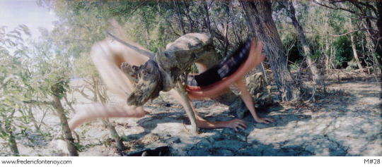
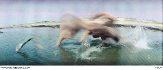
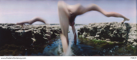
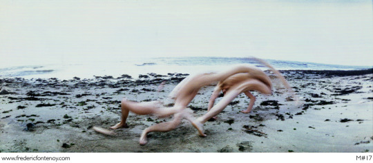
Panorama images.
These are my Fredric Fontenoy panorama images. I had fun creating these but it took me a while to get some decent outcomes. These first five were the best outcomes me and my sister got. Before going out to take them, I had ideas of how to get outcomes, so I had my sister do some cartwheels, simply walk slowly through the frame and run in a zig-zag. The first panorama is her doing the cartwheels, she went too fast for the panorama so it didn't work as well as I hoped. I wanted outcomes with no gaps, just a complete distortion, much like on the left side of the second images. For some reason the panorama would cut off some of my sister which then created gaps in the image, which annoyed me immensely. I wanted to try some fashion images of myself, again I tried a few different ways to get an images I liked the outcome of. The last images from these five is probably my favourite from these sets of panorama. Even though there is gaps, I like how her face is distorted.


I went to take some nice sunny, rural, landscape panorama’s with my sister that came out amazing.


These were taken a few days ago when we had a bit of snow. I thought it be a nice opportunity for me to get some images. I gave my mum my mustard beanie, to match her dress. These two images are some of the best panoramas that I produced. I’m happy I went out to get some more photos. I would’ve liked some of my panoramas to be more fashion based but I struggled a lot to get the outcomes I did.


This is another one of my panorama images that I took into Photoshop. I decided to change the hue to make it link it towards the project theme ‘Multiverse’. I really like the two colours, I especially like the green puddle on the bottom left.


0 notes
Text
Frédéric Fontenoy.
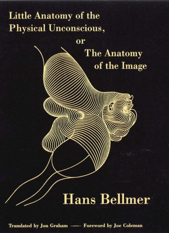
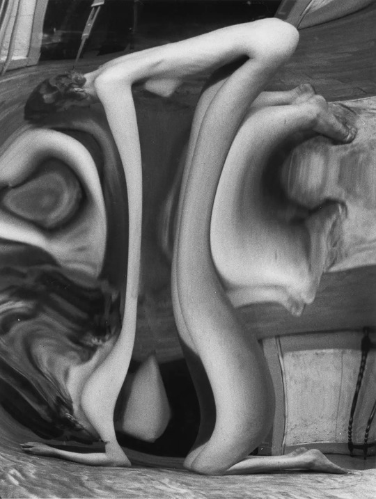
Frédéric Fontenoy has been working on his first series representation of the body, considering the photographic gesture as artistic in itself. From "Metamorphosis" in 1988, he plays with the reference to reality due to this medium, and readily relates to the distortions of Andre Kertesz and "The Anatomy of the image" of Hans Bellmer.
The distortion imagery by Andre Kertesz -


In 2006, Frédéric began working on combining fictional, intimate scenes in the history of avant-garde artists and policies of the first half of the twentieth century as subtle as a powerful eroticism. It is recognized among the symbols which plays Frederic Fontenoy, evocations of the Second World War, and number of citations of surrealist works: space of photography fits well in time and simultaneously uses the collective unconscious.
In 2006 he began work combining fictional, intimate scenes in the history of avant-garde artists and policies of the first half of the twentieth century as subtle as a powerful eroticism. It is recognized among the symbols which plays Frederic Fontenoy, evocations of the Second World War, and number of citations of surrealist works: space of photography fits well in time and simultaneously uses the collective unconscious.
Fontenoy has participated in many exhibitions and art fairs. He has also had several exhibitions in Paris, Arles, Barcelone, Madrid, Milan, Budapest, Bruxelles, Berlin, Knokke, Ljubljana, London and Shanghai.

His work links well to the project because......
8 notes
·
View notes
Text
Upcycling brands
FANFARE

FANFARE is a British fashion brand that sets out to create powerful, positive change within the fashion industry. It was originally launched in 2018 under the name ‘Fabric for Freedom’ by Esther Knight. The first collection saw huge success and went on to be featured by British Vogue, The Sunday Times, Glamour Magazine, Boyfriend Magazine, Harper’s BAZZAR and many more.


The FANFARE collection is entirely plastic free, and materials are sourced sustainably and are accredited by organisations including OEKO-TEX and GOTS. The collection also includes a recycled range, taking clothing & textiles that would otherwise be discarded in landfill repurposing, redesigning & and reusing wastage. Each piece is ethically produced in the UK, where Fanfare guarantees fair wages and good working conditions. Their ‘The New Hero’ collection combines bold and contemporary designs with repurposed and reused materials, designed to create a wardrobe of sustainable clothing made to last. The founder of Fanfare, Esther Knight has previously worked for many high street and designer brands including Vivienne Westwood. Working her way up to buy level, Esther saw first-hand the pressure that fast fashion companies place on their suppliers and contractors and began working on a solution, combining her industry expertise with her desire to promote sustainable fashion with eco-conscious practises.
Zero Waste Daniel

Zero Waste Daniel is a sustainable, eco-friendly, and handmade in Brooklyn fashion brand by Daniel Silverstein, a zero-waste lifestyle pioneer, and clothing designer. Daniel creates genderless clothing and accessories with pre-consumer waste, sourced from New York City’s garment industry, as well as other hard-to-recycle materials.
His New York City atelier is filled with endless bins of fabric scraps, discarded fabric that other designers, costume departments, fashion studios, and garment factories would normally send to landfills. Instead, he creates stylish and unique pieces of upcycled fashion.


Daniel’s story and brand went viral in 2017 with more than 35 million views worldwide on NOW THIS, INSIDER, MASHABLE, and BUZZFEED. He continues to inspire change and make headlines by growing the mission of ending waste culture and redefining the meaning of “sustainable design” as a call to action for all who wish to participate.
To date, Zero Waste Daniel has collaborated with brands including Alice + Olivia, Pact, ThredUp, American Express, Google Nissan, as well as the New York City Department of Sanitation. And has been featured on CNN, NBC, BuzzFeedNews, Forbes, Interview, Refinery 29 and many more.

1 note
·
View note
Text
Sustainable Fashion
The fashion industry emits more greenhouse gas than all international flights and maritime shipping journeys combined, and it's estimated that a bin lorry's worth of clothing is either burned or sent to a landfill every second. On top of that, thanks to our powerful washing machines, our clothes pollute the ocean with microfibers equating to approximately 50 million plastic bottles each year. Sustainable fashion is a movement and process of encouraging change to fashion products and the fashion system, towards greater ecological integrity and social justice. Sustainable fashion concerns more than just addressing fashion textiles or products. It incorporates addressing the whole system of fashion.
The problem with fashion pollution/fast fashion is that it has been estimated that in the UK alone around 350,000 tons of clothing ends up as landfill every year, which is a huge proportion of potentially recyclable waste that we produce. In addition to this issue, it takes at least 8,000 chemicals to turn raw materials into textiles. This use of chemicals causes irreversible damage to people and the environment. Studies have shown that all of the tiny microfibers from clothing made from synthetic fabrics are polluting the earth’s waters through the process of laundering, and contaminating our food chain as well. Although many people are aware of the issues with fast fashion – or quickly and cheaply made clothing, the insatiable appetite for fashion means people are actually buying more and more clothes, and according to Wikipedia; “With the fast fashion trend, garments tend to be used half as much as compared to 15 years ago.” An article on The Fashion Law.com, written by Mark Sumner, lecturer in sustainability, fashion and retail at the University of Leeds, shows that “Since 2012, there has been a 10% increase in the amount of clothing purchased in the UK alone. And not only are consumers buying more; the rate at which their clothing gets discarded is becoming increasingly quicker as they chase the latest fashion trends. It is estimated there is over 30 billion pounds worth of clothing sitting in wardrobes across the UK that has not been worn for over 12 months.”
Despite this growing problem in the fashion industry, fashion month in 2019 was full of big name brands showcasing garments made with recycled materials. Zero + Maria Cornejo’s collaboration with Hyundai, showed leftover car seat material turned into a capsule collection and Stella McCartney’s used recycled polyester and plastics alongside some organic cotton. Both clothing brands Preen and Marni also used fabrics made from plastic bottles. However at the Milan fashion week show, it was taken a step further by repurposing old clothing, mechanical pulp and plastic bottles into towering palm trees. Dior garnished its runway with more that 160 real trees, all of which were set to be replanted after the show.

At New York Fashion Week Gabriela Hearst’s began a “carbon neutral” trend and it was swiftly followed by Burberry in London and Gucci in Milan. Gucci’s parent company, Kering, which also owns Yves Saint Laurent, Balenciaga and Bottega Veneta, among others, also used fashion month to announce that the entire company will become carbon neutral within its own operations and across the entire supply chain.
0 notes