Text
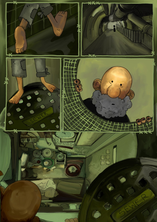
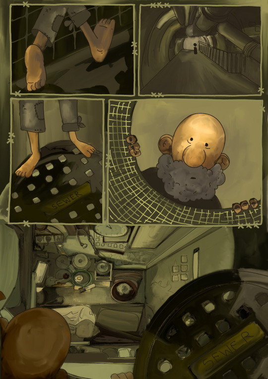
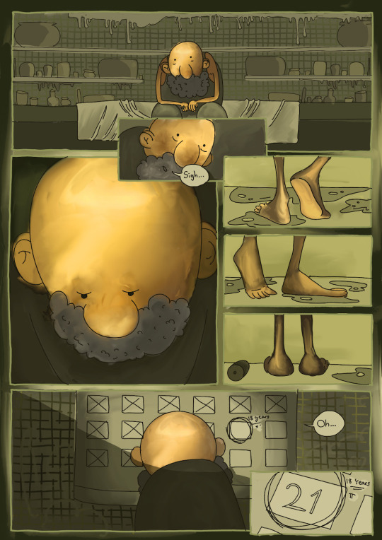
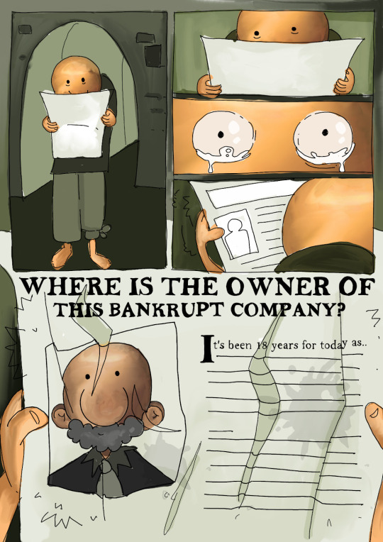
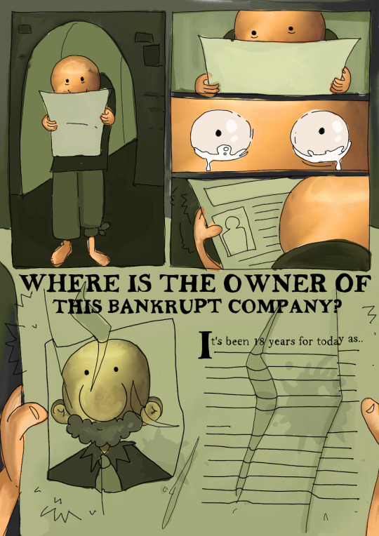
Adjusting the saturation and contrast as I felt like the other pages weren’t as “solid-looking” as the 1st page. They looked a bit washed out and flat.
I also played with the CMYK settings, to see if giving it a more dusty, yellow mood would look better, but however it did not and I liked the original version and the atmosphere better.
0 notes
Text
This is a painting I did a while ago and since it matched the mood of the story as well as the style and the composition i’m going towards, I decided to incorporate this as one of the key shots in the 1st page.
Reference:
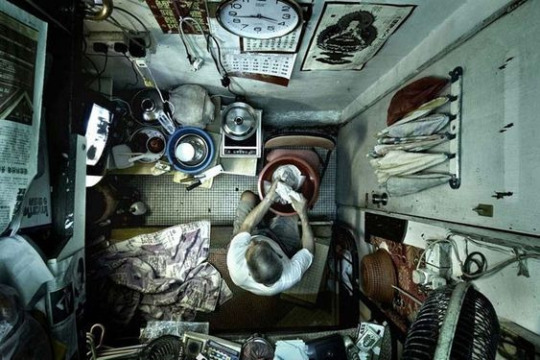
painting:

0 notes


