
Third Year Digital Animation and Illustration Student at Futureworks. For personal work, check out ThatFreakyCareBear !
Don't wanna be here? Send us removal request.
Statistics
We looked inside some of the posts by charliehopgoodfutureworks and here's what we found interesting.
Average Info
Notes Per Post
360K
Likes Per Post
202K
Reblog Per Post
158K
Reply Per Post
23
Time Between Posts
28 days ago
Number of Posts By Type
Photo
11
Text
6
Last Seen Tumblr Blogs


Fun Fact
Tumblr was named as a finalist in Lead411’s New York City Hot 125 in Aug 2010.
Photo

Spending tonight starting a new personal project: designing a set of tarot cards. I've been designing business cards as part of my university work and really enjoyed working in this style (sketchy white lineart on a black base). Someone suggest I do a design similar to a tarot card, and when I started working on it, I loved it! So I've decided to create my own set! I currently use my mum's old set that she passed down to me a few years back, but I've never been able to totally connect with them, so I figured I'd best connect with a set I make from scratch. This is all freehanded work (though the border was reflected for each corner to be the same) and every card will be of my own design, based on tarot traditions and meanings as well as my own personal beliefs within the craft. It'll be a fun project, and hopefully will help me better remember each cards individual meaning! #tfcb #tfcbart #thatfreakycarebear #freakybear #freakybearart #tarot #tarotcards #wip #workinprogress #lineart #digitalart #witch #wicca #wiccan #pagan
#freakybear#digitalart#tfcbart#tfcb#witch#wip#tarotcards#tarot#wiccan#pagan#lineart#workinprogress#thatfreakycarebear#freakybearart#wicca
2 notes
·
View notes
Photo
Personal Artwork I’ve been doing in the midst of coursework. I’m determined to have a nice looking, finish sketchbook for once!


Doing a bulk upload of stuff I’ve finished in my sketchbook over the festive period.
Also I just want to apologise for how much my phone butchers the picture quality, especially with Gabby..
#personal artwork#sketchbook#traditional art#illustration#tfcb#thatfreakycarebear#tfcbart#ink#character design
2 notes
·
View notes
Photo
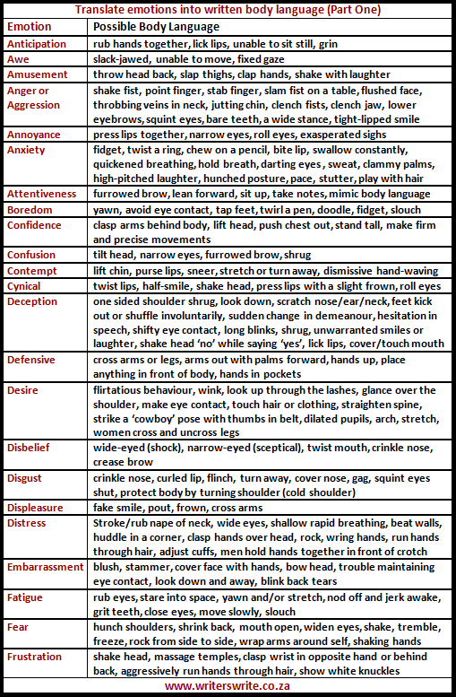
Cheat Sheets for Writing Body Language
We are always told to use body language in our writing. Sometimes, it’s easier said than written. I decided to create these cheat sheets to help you show a character’s state of mind. Obviously, a character may exhibit a number of these behaviours. For example, he may be shocked and angry, or shocked and happy. Use these combinations as needed.
by Amanda Patterson
360K notes
·
View notes
Photo
Starting to post personal artwork on a personal account, so feel free to follow me there!
Little warning, I will not post full on NSFW stuff, but it might get a little risqué, so keep that in mind~


So i got a new sketchbook a week ago while my parents were up for a visit, so i figured I should show off the last weeks worth of work in it. I’m using this sketchbook purely for these 3 characters, Michael (blue dude), Gabrielle, and myself. It’s to develop my characters and my art style, and since i’m working in it pretty frequently, it will have a nice flow, showing my personal development as an artist. (Plus michael and gabby are babes and make me feel better about having my potato-looking ass in there)
1 note
·
View note
Photo

So @iscoppie came to my uni today and gave a lovely lecture. It was a pleasure having you here ^^ hope you like the fan art and sorry if I was really cringey in person haha!
61 notes
·
View notes
Text
Brief 8 Feedback
Class:
Good colour scheme (but will rework it)
Good use of scaling
Brighter highlights to differentiate shapes
Put pedestal and side side by side (in terms of perspective)
Tutor:
Keep the colour scheme to just blues, par the moon.
(ref thumbnail in notebook)
age the statue
build up of sand and sand piles
Take away statues pupils
lower the horizon line
Note to self: For help with colourschemes, use https://color.adobe.com/create/color-wheel/
0 notes
Photo

Brief number 8! Based on the poem Ozymandias by Percy Bysshe Shelley.
This was my first time digitally painting a piece and frankly it doesn’t look half bad in my opinion. Sure, it’s not perfect, or anywhere close to that, but for my first try its a pretty damn good attempt.
I felt like I needed some variation in my portfolio, so even if this isn’t a style i’m necessarily comfortable with yet, it atleast shows a wider range of digital art skills.
#fwax2412#tfcb#thatfreakycarebear#digital art#Digital Illustration#illustration#digital painting#ozymandias#Percy Bysshe Shelley
2 notes
·
View notes
Text
Brief 7 Improvements
Class Feedback:
Add more detail into the paradise side (ie the orchard, more detail to the mountains, cracks in the mountain oozing the whiskey or lemonade ect)
make the real side more scruffy (ie litter, graffiti ect)
Reduce shading in immediate foreground
Tutor:
Windows look flat; add windowsills that protrude out from the walls to give depth in accordance to the perspective.
Move the person and dog back to the first third, then have the real world and fantasy world be exactly 50/50
have the real world tree looking more dead and the fantasy one looking more lively
have the buildings transform into candy equivalents rather than just candy mountains (ie gingerbread houses)
remove the hanging, fill the area inbetween the mountains (ie the farm)
Personal:
Add cream tops to the mountains
Colour lines (maybe)
add bales of hay to the barn area
0 notes
Text
Just a personal note, if you haven’t listened to the Hamilton Soundtrack, go DO IT. UGH it has kept me so motivated to work this past week, and it’s gotten me back into practising theatre singing as well as looking up all the old musical songs I used to jam too.
Absolutely amazing songs, from the lyrics to the wonderful performers. Musical theatre makes me so happy...
1 note
·
View note
Photo

This weeks brief (oh boy!) been looking forward to this one. So this is based on ‘The Big Rock Candy Mountain’ from the musical/ movie ‘Oh Brother, Where Art Thou?’ (Lyrics here: http://www.metrolyrics.com/big-rock-candy-mountain-lyrics-harry-mcclintock.html). I recognised this musical because another one of it’s songs, Oh Death, was used in the beginning sequence of the game Until Dawn. So I think I may need to give this a watch sometime. Anyway, onto the brief.
My initial ideas upon reading the lyrics were ‘this has to be a drug trip, right? I mean... seriously’. To be fair, i’m not far off. It’s based on a stereotypical old timey Hobo’s idea of paradise (and let’s be fair, anyones version of paradise is gonna seem like a drug trip to anyone else, so i continue). I went down that idea path and came up with this. It’s a mans (who’s not necessarily homeless but anyway) visions while being on this trip. The world morphs to his ideal paradise while he’s taking his poison (in this case, smoking on a crack pipe. Seriously, with the google searches for domestic abuse and crack pipes, I swear my internet provider will think I have problems).
Some of the lyrics I have taken into consideration while making this:
Lemonade Springs (which to me was a dude pissing up a wall. I mean come on, it fits so well!)
Hung the Jerk who invented work (there’s a dude strung up in the tree in the background. yeeaaaah, that was an interesting lyric when i came across it.)
Cigarette trees
Barns full of hay (i was gonna draw an orchard too but lets be fair, pics already pretty crowded as it is.
Bull dogs have rubber teeth (now i didnt draw that exactly, but he has a bulldog so that counts!)
obviously the candy mountains themselves
Never rains or snows, sun shines bright every day.
There are some lyrics I excluded from my rendition, such as those mentioning railroad and jails, because they wouldn’t work in the scene.
I’m pretty happy with how this came out. To be fair, i’m never gonna be amazed with what I do. That’s because of personal reasons, namely that I can never really see my work as ‘good’, as i will unintentionally compare myself to others, and always see the small insignificant problems or mistakes and Ugh. Self deprecation.
#FWAX2412#thatfreakycarebear#tfcb#digital art#illustration#the big rock candy mountain#oh brother#where art thou#oh brother where art thou#coursework#university
0 notes
Photo

So this was last weeks brief, based on the quote:
“You gotta be a good guy, son, ‘cause there’s way too many of the bad.” - Garth Ennis (Preacher)
So, even though I have covered the topic before in another piece, I decided to look at abusive relationships again, this time the more physical aspects of it, as well as how it affects the family dynamic.
Since i’ve already had the lesson that critiqued this, i’m just gonna list them below here:
Class Feedback:
More emotion needed from the child (ie crying, looking more confused/uncomfortable ect)
Move dialogue into the fame
sort out the writing (use a guide)
Boy’s hand is small
Tutor Feedback:
Remove the detail in the woman’s hair
Shrink the mother and child down a little, move them to the first third line, then move silhouette to the second for a better composition.
Shrink the lettering to give it a bit of space.
Bring speech bubbles into panel
sort out the kids eyes. have them concentrate on the mums face.
increase the saturation of the kids skin (ok yeah, he’s hella pale, i actually regret submitting it before doing that, haha...)
As it’s a comic book, do the shading in a similar way to Roy Lichtenstein.
0 notes
Text
Brief 5 Feedback
Class Crit:
Sky is too ‘loud’ (drop saturation).
Reduce the overall saturation.
Rework dead guy’s (the one of the left) leg.
Rework Israel (make sure the brickwork and windows are all in perspective with the buildings themselves)
Rework tree placement so they don’t intersect wings and flags.
Longer shadows will be cast.
Tutor Crit:
Larger army (more horses, people, weapons ect.)
More unified, less saturated colourscheme.
Reduce the intensity of shading as it reduces detail quality.
Make flags and tents match army colours (so purple and gold)
Remove the lower 2 sets of wings from the angel for a more striking silhouette.
Recolour the sky.
Corpses are a little flat. play around with them poses.
Taller banners.
0 notes
Photo

Final version of the 5th brief, based on Byron’s Poem The Destruction of Sennacherib.
Kinda 50/50 about this piece. It’s one of those ones where if i had more time to work on it, it would have looked so much better, but with my 3D deadline and animation work needing doing, I couldn’t give it the time and effort I feel it deserved. Overall, i don’t feel like it’s a bad piece. I wanted to put more detail into the wings, for example, and into the walls in the background, But this is fine. Not great, but fine.
I don’t really have much to say about this piece. I did an explanation in my last post about design choices, which pretty much covers my intentions for the piece. And it technically does do that... I dunno. Not my strongest piece for the portfolio but definitely not the worst thing i’ve ever made.
#fwax2412#digital illustration#illustration#digital art#the destruction of sennacherib#byron#tfcb#thatfreakycarebear
3 notes
·
View notes
Photo

Work in progress for the 5th brief, based on the poem The Destruction of Sennacherib by Byron.
I wanted to create a literal representation of the poem, namely just after the Syrian (I believe it’s Syrian) Army has been wiped out by the angel of death.
I’ve designed the angel in the way I think he looks, with his clothing taking inspiration from 700 bce Israeli clothing. I’ve draw him with 3 sets of wings, based on Raven’s wings, between his shoulder blades, and a small pair that cover his eyes. This is meant to signify that he holds no judgement. He was prayed to by the people of Israel to protect them, and without hesitation smote them all. He didn’t judge them as people, he simply followed his order.
For the Syrian soldiers, I based their attire on this:

It’s probably not an accurate representation of what the army actually wore, but i figured it’d be a pretty good basis. Plus the blues were a nice addition to the overall image.
I based Israel on this:

I’m planning on adding greenery to the image to separate the sand from the sandstone buildings. Most of the detail will be added during shading.
If i have time, I also want to add more detail into the linework of the wings, though I might just do that through shading as well.
So far this has take around.. maybe 4 hours? Including sketching the whole thing digitally and lining it. That’s between sorting out other stuff and dealing with some personal stuff.. yeah.
Anyway, probably about an hour or so left shading and highlighting. Genuinely excited to see this finished, mainly because I love drawing angels, haha.
#FWAX2412#wip#work in progress#The Destruction of Sennacherib#Byron#Angel of Death#Digital Art#illustration
1 note
·
View note
Text
Brief 4 Improvements
Class Feedback:
Light walls wold reflect more light, so the image would be lighter
Thus, reduce the shadows, as they hide/ blur important parts of the piece
The Metaphor is lost (?) or not entirely clear
Make the victim looked more drained
Make the abuser look more dominant
Tutor Feedback:
Make the victim look like a victim; - Have the abuser enveloping her - Have the victims look run down (ashy skin, dry messy hair, bruises, bags under her eyes ect. Make her look drained)
Work on the lighting (less intense)
0 notes
Photo

The fourth brief for my Illustration class, based on the quote:
“Never Trust A Species That Grins All The Time. It’s Up To Something.” Terry Pratchett
I took a bit of creative license with the quote; When I heard it, I didn’t so much think of a creature as much as people, and people tend to trust the person they’re in love with the most, which can either be the best or worst decision you can make. Love is something some take for granted, using it as a way to gain, rather than a mutual love and trust between two (or more) people. While some fall head over heels for someone and offers everything they have, others take advantage. They can cheat, and expect the other will forgive them. They can steal, and expect the other won’t mind. They can abuse and know the other will put up with it. No-one knows what goes on behind closed doors; A relationship can look perfectly good and happy from the outside, but that doesn’t mean something sinister isn’t happening in private. And sometimes the other person in the relationship doesn’t realise just how destructive and dangerous their partner is. That’s what I tried to show in this piece.
I used the Jorogumo as my basis of the ‘species’, though the spider legs are really nothing more than a metaphor. The red-haired woman herself is a monster, in the figurative sense. I was going to cover the other girl in bruises, but figured that would be a bit too much. I don’t want to actually draw an abusive relationship, for many reasons. The piece still shows the literal and abstract views towards the quote, and that’s all I wanted to do.
On a technical level, I’ve started playing around with colouring lines and adding texture to the skin and materials. Not really much more to say apart from that! I enjoy adding texture to the skin, like pores and freckles, and it’s something i’ve been doing more with my personal work, so I thought I should start trying to do it with my school work too.
#FWAX2412#illustration#digital art#thatfreakycarebear#tfcb#tfcb art#terry pratchett#jorogumo#relationship
1 note
·
View note
Text
Brief 3 (Moby Dick) Improvements
Class Feedback: - Colour the Lineart on Water and clouds (when and if i add it to clouds) - Lighten colour in some - Lightening strikes into the ocean - Soften blending on sky and water
Tutor Feedback: - Create more space on edges - Colour some of the lineart (Alpha Channels) - Make the shape of the coat more obvious on the larger Ahab - Work on water - Make Ahab more angry than upset - Debris in the water - More damage to the whale (ie Harpoons in flesh, blood in water ect - Refer to Cloud Mufasa while working on Ahab
0 notes