Photo



In Project Three, we created a single-page website that incorporates various types of content that allow for our audience to enjoy reading the article, “The Man Who Recorded, Tamed, and Then Sold Nature Sounds to America.”
Step 1: We began this project through conducting research on different responsive websites that are user-friendly on mobile, tablet, and desktop devices. It became clear that most often the size of the images are manipulated to allow the user to see the entire picture regardless of the device they are using.
After conducting our initial research, we also narrowed down the two long-form articles that we were most interested in working on. Our first choice, was the article on Irv Teibel titled, “The Man Who Recorded, Tamed, and Then Sold Nature Sounds to America.” We particularly liked this article because it included a variety of different media sources, including videos and sounds. Additionally, given the nature of the article, we were excited to find external videos and sounds that were produced by Teibel to incorporate in our project. Our second choice for this article was “Waco Restored,” as we have both seen the show Fixer Upper, and were interested in learning more about the effects of Chip and Joanna’s home renovations on the greater Waco area. Ultimately, we received our first choice pick of “The Man Who Recorded, Tamed, and Then Sold Nature Sounds to America” and were ready to begin Step 2!
Step 2: In Step 2, we took the time to read through the entire article, making sure to make careful annotations of how to split the article and where we could incorporate interesting media. Additionally, we took the time to research more about Irv Teibel, his recordings, and his influence, to discover external sources that we could use in our project.
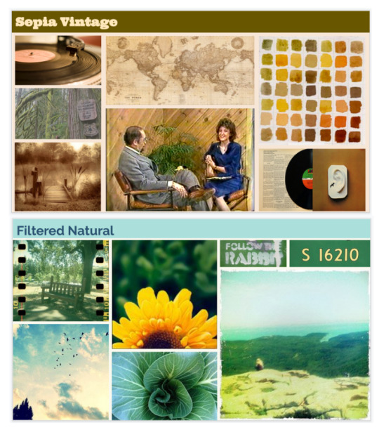
Step 3: Independently, we created two different visual directions based on our own interpretations of the article. Mine had a more vintage aesthetic, while Yerim’s had a more nature-inspired aesthetic. Based on the feedback we received in class, there were pros and cons to each visual direction, and we were unsure which direction to pursue.
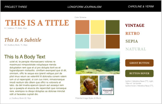
Step 4: We ultimately decided to create a third visual direction, highlighted in Step 4, that is a combination of my ideas, and Yerim’s ideas.
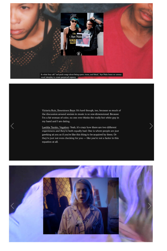
In this step, we also discovered an article written by the New York Times documenting women’s place in Rock N Roll ( https://www.nytimes.com/interactive/2017/09/05/arts/music/25-women-making-best-rock-music-today.html). We were both inspired by the way that New York Times utilized media in new and diverse ways to create an enjoyable and interesting site. We decided that we would explore using similar interactions in our site, in an attempt to incorporate both audio and visuals into our long-form article.
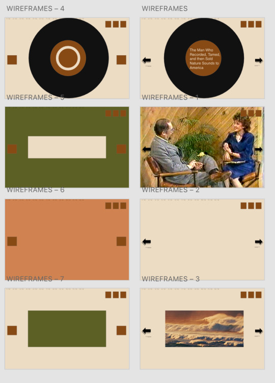
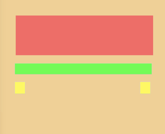
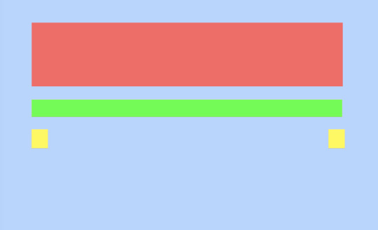
Step 5: We created multiple wireframes in Adobe XD with about 7 different main slides that we would be able to easily replicate for different text throughout the article. We then used these sketches to produce coded wireframes in HTML and CSS.
Step 6: We coded static digital wireframes in html and css for a mobile, tablet, and desktop device. We were able to use the Interneting is Hard tutorial, in addition to our in class exercises to create this simple responsive website. With our digital wireframes complete, we were then ready to add our styles.
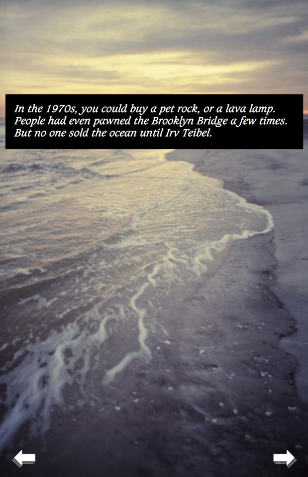
Step 7: We turned our digital static mockups into our final site. Using the mockups was incredibly beneficial, however our end product differed slightly from our initial ideas.
Project Discussion: I really enjoyed working on this project, as it gave me the opportunity to showcase everything that we learned in the classroom and explore new types of code. There were definitely elements of this project that we struggled with, as it took time to discover the best way to share our code, and we were ambitious with the number of interactions we wanted to incorporate into our site. Ultimately, we hope to have highlighted the incredible work of Irv Teibel through creating an interesting and user-friendly website.
1 note
·
View note
Photo

Part 1: To begin Project 2, in which we were tasked with making a game or learning tool, I began by brainstorming a list of topics that I learned in elementary school.

Part 1: Next, I made a list of activities and routines that I do almost everyday.

Part 1: Third, I created a list of my favorite activities and hobbies.

Part 1: Finally, I chose one of my favorite activities, cooking, and wrote down directions on how to create one of my favorite dishes: egg tacos. This was beneficial as it helped me to realize the importance of being specific when providing directions to someone else who is unfamiliar with your topic.

Part 2: After going through the initial brainstorming process, I began the second stage of this project, in which I chose my six favorite ideas. With these ideas, I created six incredibly simple wireframe sketches, which I then shared with a small group of classmates. Using the feedback I got from in class, I discovered that the most well-received ideas were teaching about telling time, the California missions, and the solar system. From these three ideas, I was personally most interested in teaching about the California missions.
As a California native, I recall my first research project being in fourth grade focused on an assigned California mission. As a young student, I was unfamiliar with how research projects worked, and was overwhelmed by the dense material on the internet. I decided that my target audience for this project would be fourth grade students, who are writing their first report on a California Mission. The goal is to not only teach them more about their own mission, but also to provide an introduction to the basic skill of research.

Part 3: Having chosen my idea, I drafted a low-fidelity prototype for the user experience. I created my home page, which would display a map with each of the missions, allowing for the user to select a mission to learn more, or to test their knowledge with a quiz.

Part 3: I created a low - fidelity prototype of the information page for each of the missions on the map, with a navigation panel to return to the main page at any time.

Part 3: I created a low-fidelity prototype for the quiz, allowing for the user to test their knowledge, check their answers, and return to the map to continue studying.
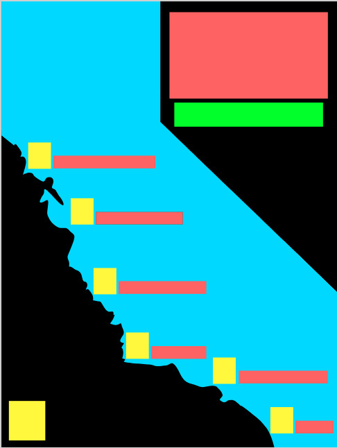
Part 4: Now it is time to create a static digital mock-up using the inspiration from the low-fidelity prototypes. First, I created my main page which displays the map of California.

Part 4: Then I created my information slide for each of the missions.
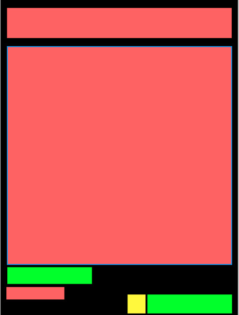
Part 4: Finally, I created a static digital wireframe of my quiz.
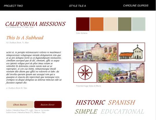
Part 5: Next, I developed three different style tiles to be applied to my wireframes. This Style Tile emphasizes a Spanish style, and remains sophisticated without being overwhelming to a fourth-grade, and also provides a feeling of being educational.
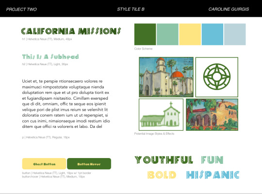
Part 5: This style tile uses a bolder and more exciting font, that is slightly more childish. Though I enjoy this font and color-scheme, I felt that my audience is transitioning from juvenile projects to more advanced research-projects, and was interested in conveying a more sophisticated style.
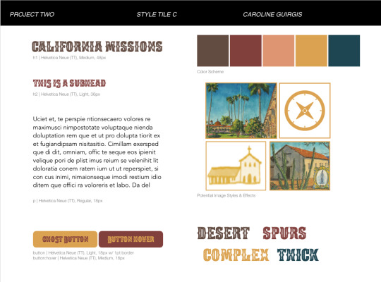
Part 5: My third Style Tile emphasizes the desert in California and utilizes a more neutral color palette with an exciting font. Though this Style Tile is a medium between the most serious, Style Tile A, and the most juvenile, Style Tile B, I ultimately decided to use Style Tile A, as I felt that it was the cleanest and best-fitted to my target audience.

Part 6: Having decided on my Stile Tile, I created a digital wireframe, utilizing the chosen style.
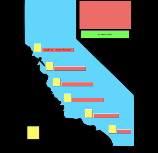
Part 7: Next I utilized my coded wireframe, shown above, to bring my website to life.

Part 7: Using the coded wireframe, I was able to insert the icons I created myself and the style I had selected to create my vision for the homepage.
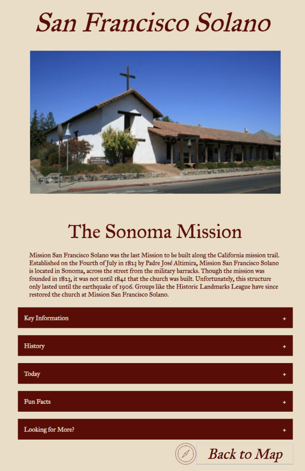
Part 7: I was able to use the same technique for my information pages.
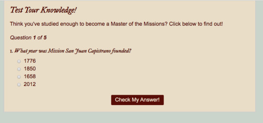
Part 7: Finally, after multiple iterations of a quiz, I transformed my wireframe quiz into a user-friendly way for my audience to test their knowledge, and return to the main page to study some more, if necessary.
Part 8: The final iteration of my project can be found on my github at cguirgis.github.io. I would love for you to take a look, learn more about the California Missions, and test your knowledge to prove that you are a Master of the Missions!
Reflection
At the beginning of this project, I felt overwhelmed by the idea of having to create multiple webpages that taught something to a very specific audience. I was unsure of what I was interested in teaching, who I was interested in teaching to, and how to create a multi-page website.
These feelings of being overwhelmed were quickly eased by going through the process step-by-step. The process of brainstorming yields a variety of options that may not be the most advanced or well-thought-out, but are beneficial as you can build from each. It was through this process that I was able to recall my experience as a fourth-grade student learning about the California missions, which served as a catalyst for my project.
Having used HTML, CSS, and Javascript before, I was pleasantly surprised at how much easier created static wireframes were than they were during Project One. In this project, I was able to try out more advanced concepts that I was interested in learning about, including scrolling through a slideshow of pictures, using an accordion to hide and reveal information, and developing my own quiz.
Though I ran into difficulties along the way with my code, I felt more confident in my ability to troubleshoot and solve the problem. Additionally, this project gave me the freedom to use some of my design skills to develop my own icons for each mission, a task which I thoroughly enjoyed.
The end result of my website is something that I am truly proud of, and would love to send to my fourth-grade teacher back home.
1 note
·
View note
Photo


PROJECT ONE - LETTERFORMS
The purpose of this project was to create a digital poster showcasing an interesting font of my choosing. After researching various fonts on both Google Fonts and Adobe Typekit, I discovered six fonts that I found to be visually appealing. Of the selected six, I was particularly drawn to Monoton, as it reminds me of the fonts found in neon theater lights I have grown up with in Los Angeles. After researching more about Monoton, I discovered that the designer, Vernon Adams, modeled this font after Prisma, another font with a distinctive retro style.
After choosing my font, I conducted a visual analysis highlighting the different features of Monoton. What I found to be most interesting, was the combination of asymmetry and symmetry. Dividing the letter “M” into four quadrants reveals the letter’s midpoint to be slightly skewed. However, further analysis shows that all of the angles, and the distances in spacing between parallel lines, are all equal. Additionally, it is interesting to note the use of lines which vary drastically in length. While some lines are short, others dominate the letterform.
After understanding the features of Monoton, which I am most interested in highlighting, I created five hand-drawn wireframe sketches, with the intent of choosing one to make into a website. I then talked amongst my peers to receive valuable feedback about which wireframe sketch was the most successful. With this information in mind, I then created one digital wireframe sketch to model my website after.
At this point, it was time to begin coding. Through using Brackets, I was able to utilize HTML and CSS to develop a live website, which features Monoton. When a user clicks the on switch, neon lights appear showing the user the features of Monoton. When the user clicks the off switch, the letter analysis disappears.
This project taught me valuable skills that I will use throughout the course of this class, and in my future as a designer. I can now say that I am able to successfully code a website. During this project, I encountered difficulties in linking various sheets, and had to go through the troubleshooting process. This process helped me to identify simple mistakes that I was making which had serious effects on the website. After successfully fixing my errors, I am proud to add HTML and CSS to the list of coding languages that I am now familiar with.
1 note
·
View note