
Statistics
We looked inside some of the posts by ccarmona77 and here's what we found interesting.
Average Info
Notes Per Post
2
Likes Per Post
2
Reblog Per Post
0
Reply Per Post
0
Time Between Posts
1 day
Number of Posts By Type
Text
11
Photo
6
Last Seen Tumblr Blogs


Fun Fact
28.6 is the average number of monthly visits per US mobile user.

Text
Project 2: The Elder Project
Final Point Reflection
The process of researching the typography and colors that were visually impaired and colorblind-friendly, and interviewing Anne Basting, we got more insights on what to do and avoid during our iterations for these cards. I planned to do different themes for my cards instead of sticking the same style throughout all four, the process of doing the designs it was easy because I knew what kind of questions, and activities I wanted to incorporate. However, there was one card where I struggle the most, and it was the last music theme card. For that card, I wanted to include photography and then add vector drawings around it or just the vector drawings throughout that card. But after our teacher said to avoid photography especially copyright, so I decided to ditch the photography idea and include a silhouette of a figure singing with vector drawings surrounding it. The making of the kindness cards was really fun, I got to add my own photography and some funny positive puns to brighten someone’s day, accompanied by big and fun typography. Overall, the process of making the postcards and kindness cards were really fun to make, it was an experience where we all got to work being empathetic and work for the elderly community. It was a nice experience, I genuinely learned about the process that’s targeted towards a specific group of people and have that mindset of creating something that they can enjoy, especially right now all of us being in quarantine and how things have gotten worse with healthcare providers being in the front lines and the number of deaths that this virus, unfortunately, has claimed. Overall, it was a nice experience personally and I hope that the elderly community can enjoy these postcards and the activities we’ve provided for them to enjoy for a moment.
0 notes
Photo


Project 2: The Elder Project
Final design of Postcards
I made a few changes in the music postcard and also changed some elements in the back of each card, by adding the address text or simplifying a drawing. I decided to include an element of the front of the card in the postage area.
0 notes
Photo

Project 2: The Elder Project
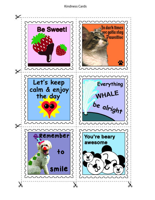
Final Design of Kindness Cards
Mild changes for some of the designs. Especially the photography ones, I feathered out as much as I could the images. Incorporated some more elements or spaced out the type and made it bigger to take out the space provided.
(Some of the colors of kindness cards are not true to file, perhaps due to the CMYK file being on a RGB space.)
1 note
·
View note
Photo


Project 2: The Elder Project
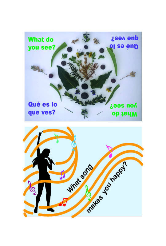
Refinements of Postcards
After refining the designs of the back and front sides of the cards. I made some mild changes in some of the cards and in others a big one.
For example, the superhero postcard, I changed the figure to a more recognizable pose, and including some of the comic graphics in the background and symbols throughout this design.
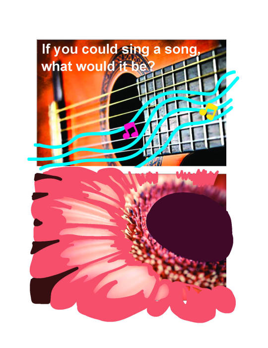
The second design, I changed the “color me in” instruction to an inviting quote of what to have the reader do with this postcard, than to make them feel obligated to do it. In the back of the postcard I included a space for them to write why they chose those colors to color in the flower.
In the third photography postcard, I included a rearranged postcard that I did with natural elements I found in my backyard. I was inspired by the Rorschach test and by the Andy Goldsworthy’s work by incorporating both into this card. I decided to put the type both in English and Spanish in a side up and down, so they can be able to flip the card upside down and view the image differently, and in other sides as well.
The last design, I had trouble working with this card, because I had many ideas for the music theme, but I didn’t know how to approach it exactly. IO started out with an image and using vector drawings and adding type to the image but I had to avoid it because of copyright. So I decided to go with a silhouette of someone singing and evoke that energy with vector drawings. On the back side of the card, I provided a positive quote that my intention is to hopefully brighten their day.
1 note
·
View note
Photo


Project 2: The Elder Project
Digital Roughs of completed kindness cards (12 total). I wanted to include a mixture of vector drawings and photography in some of the cards. Also I refined the first six of the kindness cards by adding and taking out details in some of the designs. Also, I made some of the fonts larger to take up more space within the area. (Still need to refine the last six).
0 notes
Text
Project 2: The Elder Project
Kindness Cards (Digital Roughs)

Critique: Check Grammar! Use more fonts, bigger text size, and remember that it has to be visually pleasing.
0 notes
Photo


Digital Roughs.
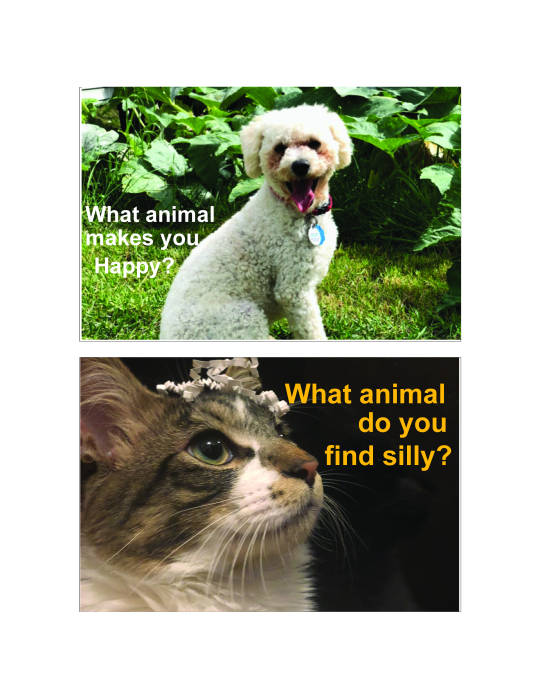
I wanted to have different themes for each postcard design instead of having one throughout all of them, however I think either way could’ve worked perfectly fine. But I thought having a different theme for each one could potentially give more variety.
The critique I received for these designs was to reword the question “If you could sing a song what would it be? and also use different imagery than musical notes. With color me in, probably used a quote or something that would intrigue the reader to engage with the activity.
0 notes
Text
Project 2: The Elder Project
Midpoint Reflection
During this pandemic that’s happening, it’s really hard for all of us to work from home and limit our resources (school, work, traveling, etc) by going outside very little as possible. However, the elderly community that is more prone to be exposed by this new virus, it’s understandable for them to stay indoors, and limit contact by outside activities and visitors from family and volunteer work. But by doing so, they are also in danger of their emotional and mental health. This opportunity of creating empathetic postcards for them to have an escape from reality for a while, it’s a great way for all of us to embrace the power of art and empathy during these difficult times. For this project, it was my first time designing for the elderly community. We had to focus on what kind of typography we could use for the postcards, that were helpful for visually impaired individuals, and also look up specific color palettes to avoid incorporating in our postcards for color-blind individuals too. After, browsing the Time Slips website, I really liked the “300 beautiful questions answered” examples and wanted to incorporate this idea into my designs. Also, being able to browse the website I learned more about the community and what kind of activities they do during the day. I had various ideas of what I had in mind, but my main goals for these postcards I wanted them to be engaging in visual forms, or in activity-wise, and include color and also how I can be able to utilize typography in other mediums of art within the postcard designs.
0 notes
Text
Project 2: The Elder Project
Reading Assignments:
It’s about Legibility
Typography comes into two flavors
Legibility vs readability
Legibility: Function of typeface design. Informal measure of how easy it is to distinguish one letter form from another in a particular typeface.
Readability: Dependent upon how the typeface is used. It’s about typography. It’s a gauge of how easily words, phrases, and blocks of copy can be read.
Most legible typefaces contain big features and have restrained design characteristics.
What These 4 Key Type Design Trends Mean for the Future of Fonts: It’s a surprising mix, from designing for dyslexics to big-name brands
Brands are looking to custom typefaces in order to stand out.
Comic Sans is the best font for people with dyslexia.
Dyslexic fonts make the task more playful to look at and provides ease to the struggling reader.
These fonts lessen fear and stress for them.
Why Accessible Design isn’t a Niche Market.
Accessibility can mean a lot of different things, especially in the context of public space.
Products are often poorly designed toward people with disabilities because they are designed through a medical lens that is associated with other assistive devices to help them.
The Uno Card game paired up with ColorADD a color Identification system to include symbols to represent colors to help color blind people also enjoy the game.
“BlindWays, for instance, provides vision-impaired users with reliable navigational clues to bus stop locations where GPS fails.”
One in five people currently have some form of disability, and as our population age, we have to create more accessible products, and services throughout the years.
13 Concepts Picasso and I Agree On, Quotes from the Master on Living a Creative Life
Your creativity is not limited to one form of art, it’s a way of life.
Picasso didn’t limit himself to a paintbrush and canvas; he allowed his visions to come alive in many forms.
Creative living is the consistency of thinking of a new way.
Successful, happy people take time for “visioning.” The process of deep thinking gives birth to life-changing ideas, extraordinary works, and major life achievements.
It isn’t just about art, it’s about stimulating your ability to be innovative, and imagining new possibilities.
Embrace chaos as an opportunity and a season of change.
0 notes
Photo

Digital Roughs of Postcards.
I wanted to include photography within these postcards. Also, I had an idea of including a Rorschach test with natural elements within the postcard. The flower postcard I was experimenting to be a color in activity.
0 notes


Text
Project 2: The Elder Postcard
Moodboard link:
https://www.pinterest.com/carmonacindy9/mood-board-empathy-type-ii/
0 notes
Text
Project 2: The Elder Postcard
Research Insights (shared in small groups)
-Depression affects older adults, it affects 6 million Americans (69 years+) It also it’s a factor to give them side effects of other certain diseases.
- Public isolation affects everyone from each generation (emotionally and mentally) is a health risk equivalent to 15 cigarettes a day.
- They also included 300 examples of questions that visitors, volunteers, and family members can read to have an example of asking questions towards the elderly.
- In an article by Pimentel, he stated with an interview with Kari Walker the director of education at Alzheimer’s Orange County, said: “The last part of the brain Alzheimer’s affects is the part that is responsible for artistic and creative expressions.
- Anne Basting’s book titled “Forget Memory”, and her TEDx Talk that “Creativity is not dependent on memory.
0 notes
Text
Project 1: Oracle
Final design of business card


Colors are off. I checked my document and it displays correctly on my desktop, program, and USB document. I apologize for the change of color here :(
0 notes
Text
Project 1: Oracle
Final design of cover and interior cover, and pages of handbook.


0 notes