
carolinelinn233-blog
9 posts
Don't wanna be here? Send us removal request.
Statistics
We looked inside some of the posts by carolinelinn233-blog and here's what we found interesting.
Average Info
Notes Per Post
2
Likes Per Post
1
Reblog Per Post
1
Reply Per Post
0
Time Between Posts
25 days
Number of Posts By Type
Text
9
Last Seen Tumblr Blogs


Fun Fact
Tumblr.com rank in the US is 25.
Text
Travel App Ideas
Interview/ survey Data
https://miro.com/welcomeonboard/ifChdhTKDKnsumIfllcHVAGnHVYaLWdUQNQQcVLwANbTL2W0gIv9nEzFJepypkys
Key finding
1.Many interviews spends 4 hours and plus to do the research on the trip
2. No signal when visit some places
3. Go around near the hotel when low on budget
4. Save money on transportations when traveling when low on budget
5. Ask family to transfer money to them and use credit card
6. Frustrating when have to fill out every single information on different website to book tickets
7. Most interviewers choose book tickets online than app because website provides more filters and information about the destination
8. Travel seasons and weather are connected
Problem/ Pain points
Many interviewers said that they spend more than four hours to search for hotels and booking tickets for themselves. One interview said that she hated to retype her information for each different website. Some places have no signal which made it hard for traveler. And most interviewer prefer to use website for research and booking
What I would do
For my application I want to include a filters and questionnaire that help us crate customize trip guideline for my user. Provide offline maps for places with no signals. Add a price range features for those who are low in budget travelers. Lastly, think more about how to make this app more standing out so the user wants to download our app and use it or create a website version for the app
Insights and solution
Insight #1:One interview said that she have to retype credit card information every single time
Insight:#2: Hours of browsing internet for information
Insight #3: worry about budget
Solution #1:Add a save credit card information and address
Solution #2: filters and question based a personal preference set up a trip guideline for them
Solution #3: set a range of price you have and provide guideline based on that
Personas

User Journey Map

Storyboard

Possible Competitors
The Hooper (Tickets and hotels)
Airbnb (Hotels)
Expedia (For hotels and tickets)
Triplt (Trip organizer)
Roadtrippers (For Road trips)
APP Feature Priority
Book flight tickets ( Tells traveler when the price of the plane tickets will drop or rise by how much)
Car Rental, Booking tours, activities,
Gps ( Provide location app when offline can customize your epic road trip if renting a car)
Memorizing Card information and Address
Customize trip guideline for individuals based on their interest and their willing of price spend.
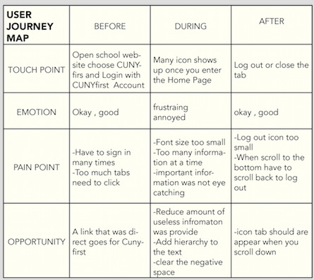
User Journey Map

Low-fi Wireframe
https://www.figma.com/file/4a1kJ2azNXXfOyNvxXKyqJ/Travel-app?node-id=0%3A1
High-fi Wireframe+ Prototype Link
https://www.figma.com/file/cwtJEoMa8AsaZHdvvtv2F3/Together?node-id=0%3A1
AB Testing
MoodBoard
https://www.are.na/jiayi-lin/app-design-3zjsoc2ejyc
0 notes
Text
Can design change society? – Gui Bonsiepe: Technological Transformation
I think the designer has the ability to change society. Lets take an example of how would the drivers drive on highway with painted stripes to mark lanes, than compared to the same highway without lanes. How would a small crowd or a group of people sit in a public place, if the furniture was well organized like a chair and table arrangement, or a bench , or a specifically designed arrangement, than compared to randomly placed chairs, or chairs which are movable. Designers influence in people’s everyday life
0 notes
Text
Travel Suggestion App idea
As a travel, lover each time i book a ticket to other cities i would spend tons of hours looking for what places, restaurant, or scenery that i need to go. So i had a idea for this travel suggestion app that will automatically scan and find the best places to visit and things to do in a particular location new to the user. It can also have the features to suggest the best restaurants, hotels, etc. and reviews feature.
As you first download this app, it will tells you to signup for an account. The display pages will list cities area with different restaurant and hotels associate with it. on the top their is search button to research places you want to go. Second page is a wishlist you added and wish to go. Third page is a communication area where you can contact the restaurant, hotel, and book tickets for a play area.
0 notes
Text
INTERACTION DESIGN- App Critique
Target app (IOS system)

UX Design: The UX design for this app uses different shapes to divide the information. I can easily access the things that i want to search immediately.
UI Design: The color of this app uses their logo color which is red and white. For the typography is very readable, clean, and the important information stood out. There are hierarchy between texts for example title tend to be bold and big and follow the secondary text.
My experiences: I usually goes to the store or visit the website to shop things on target. I would say i am not a fan of this app compare to other shopping apps. For example: i want to remove an item on my cart i can not swipe left to remove item. I must tab the three dots on the left side and remove. It’s not that convenient. On the discover tab too much information was provide sometimes i don’t want to scroll down to read more. Also, discount won’t automatically activate when you checkout.
0 notes
Text
INTERACTION DESIGN- School& Department List Redesign

VERSION ONE: A scroll down list that has all the school and department that user need to find. There is a search bar when you type the fist letter it will jump out the best match.
VERSION TWO: This is an expand or non-expand tab bar with plus or minus signs. There will be four main categories and with the plus button you can expand to see what in there. It also include a search bar that does the same function as version one.
0 notes
Text
A/B Testing& script testing report
Script Interview
Pretend you are enrolling for class today:
1. Today is the day you want to enroll for class. Go check out the classes you need to add to you cart.
2. You want to search specific course with the professor you want to take with.
3. After the enrollment you want to check your financial aid or sign up for fafsa.
4. pretend you want to check access different links that need for school.
From the tasks
0 notes
Text
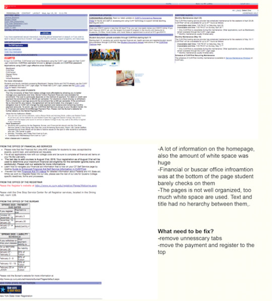
Cunyfirst website redesign
Overview: Cunyfirst is a website that all CUNY students used to enroll their classes, review financial aid, make payments, and all other pieces of information that were provided by the website. This site can also link us to the blackboard, CUNY portal or FAFSA, etc. I decided to redesign the CUNYfirst Website. The problem with this website is many contents and navigation that we never used before. Too much white spacing, no grids or structure was used, and there is no hierarchy on text or icon. Some of the links we don’t even know when to use it or how to use it. This redesign would be easier to use and more readable to the users.
I interviewed several different CUNY students. And the activity that related to my topic. My target is the CUNY staff, student, and teacher. My goals are to find out what is their opinion about CUNYfirst overall design, what sites they usually used, what are some pain points they have.
Questions& Answer
Q: How’s your experience with the home page of the Cunyfirst website?
p1: It's alright since I mostly use it to access my student center p2: A LOT Better ever since they fixed the oracle sign in issue p3: Terrible, error on login sometimes p4: It’s ok. p5: It’s complicated p6: My experience with the CUNYFIRST homepage isn’t much since I go straight to the student center. I don’t have much experience exploring the homepage.
Q: Have your ever scroll down the page to see what is below?
p1: yes p2: no p3: never p4: Yes, I did but only once for a project. I usually just go straight to the student center of CUNYFIRST.
Q: What do you like or dislike about the Homepage?
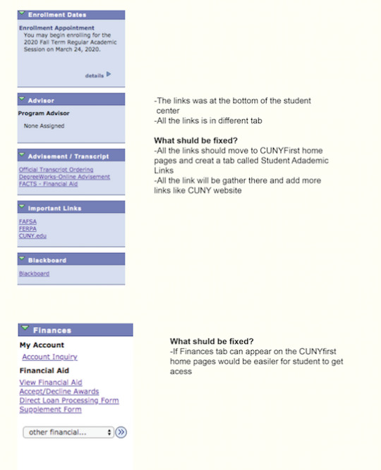
p1: I dislike that the layout of the contents is pretty much squished together p2: I like that it looks clean and simple p3: The font size is too small p4: It has multiple information. p5: Too messy p6: I dislike the layout of the CUNYFIRST homepage. All important dates and information are at the bottom of the page which isn’t viewed often. I think all the important information should be at the top of the homepage.
Q: Are there specific things that bother you?
p1: The layout looks messy p2: Sometimes I still have to log in twice p3: Too much information, and some information I don’t need to know p4: Sometimes it shows error. p5: Login p6: The layout is the only thing that really bothers me about the CUNYFIRST homepage.
Q6: Is there anything you would like to be changed?
p1: I would want the information to be spread apart so I won't be looking at a screen full of text. It might be more comfortable with my eyes if I can focus on one thing at a time. p2: Not really p3: Yes, make the font bigger and stay the section that mostly used p4: N/A p5: the whole thing p6: I would like the layout of the homepage to change so that it’s easy to find important information.
Q: Have you ever read the information that was provided for the Cunyfirst website? For example Cunyfirst Alert, IDNYC card, or CUNYfirst notices, etc
p1:no p2: no p3: no p4: no
Q3: Based on question #2 which information tab do you think is the most important?
p1: roll p2: Cunyfirst Alert p3: Student center p4: QC announcements
Q5: When you want to check your Financial Aid or blackboard at the cunyfirst website what do you usually do? Do you prefer the links to be at Cunyfirst website or the Student center?
p1: On the CUNYfirst website so it’s easier to find rather than having to search through the student center. p2: yes p3: Student center p4: I would go into the student center to access degree work or blackboard. I would prefer the links to be in CUNYfirst
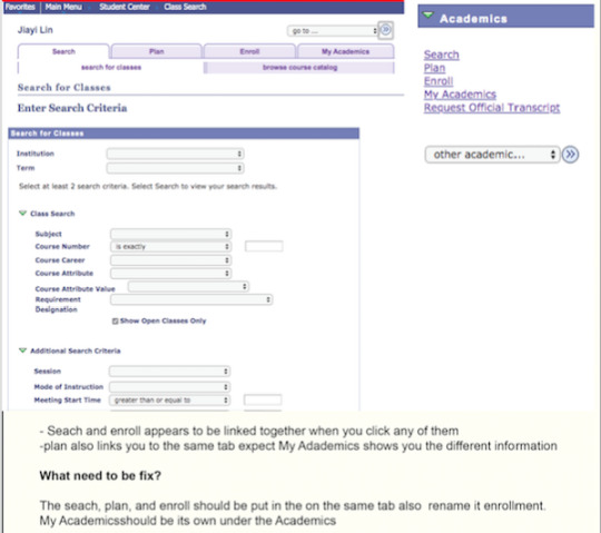
Q6: What is the process that you take to enroll a class?
P1: I usually go the student student and click search to find my class and enroll p2: Student center,enroll, select the term, and click the search button on the left corner p3: Login to Cunyfirst click student center and search P4: student center and search
Q7: Is there a website function or format that you like? And wish it could appear on the Cunyfirst website?
p1: Don’t know p2: A website function I wish appeared on CUNYfirst is a link to the CUNY campus homepage. Since each school has its own homepage, each student at the school should be able to access their school’s homepage from any CUNY site including CUNYFIRST. p3: N/A p4: It would be great if we can also access our school email at CUNYfirst
Key Findings
Users wish that the font size of the pages would be bigger
Users wishes it needs more navigation links to other school relate links
Users said the layout is confusing and misleading
Users wish some content that needs to removed since it won’t respond
Users wish they would click less tabs to find things
Here all the problem that the users has a problem with:
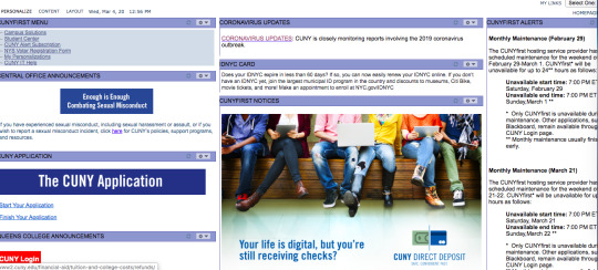
Pain point: One of my interviewers said the layout is too messy and there is a lot of pieces of information that we don’t need. There is too much white space that is used and some important things that were list below and people will never check. overall, the problem is that the layout is too messy and all the information all squish together. When you scroll down the page there is information about payment due dates and registration to vote tabs that the student would never know because they barely scroll down.
Financial aid service and enrollment of the classes are inside the Student center and you have to click multiple tabs to get what you want. My interviewer felt misleading and not user friendly. Some of the tabs links to the same places which is not necessary.
What I would DO:
So, the information on the bottom should move to the top of the page to balance the layout. Plus there should be a hierarchy between title and the font size. All the letters look way too small and not readable. Delete some information that is not necessary and kept the important information that student wanted to have in a eye catching spot.
Focus Point
After the interviews, I want to do more focus on the the navigation tabs and make it easier for users. Also, some website functions they would or wish to have on the home page.
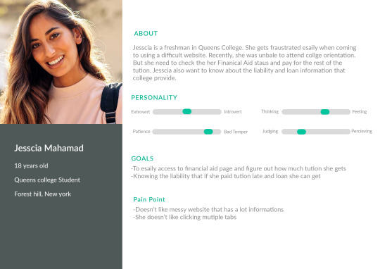
Personas


Empathy Map
Think
CUNYfirst is inconvenient to use for users
Why is all the important information was placed at the bottom of the website?
Why squished all the information together
Why are tabs links to same thing
Why do we have to click so many tabs just to access the information user wants
Feel
Annoyed
Terrible
Dissatisfied
Anxious
See
Most of the CUNY student complaining about the layout of the Hompage
Most design Professors don’t like the design and its hard to find things
There are people want to make changes to the site but no one wants to do it
Hear
They have to refresh the website multiple times
It's hard to go the Home page
All they need is the student center
Want links to appear on the Home page of the CUNYFIRST
Say
Make the layout neater
Removed some useless tabs
Play with the negative space that was around
Create hierarchies between the icon and the text
Doesn’t have to click multiple tabs to get access
Do
They don’t access to Cunyfirst too often
Always go to the student center if they need something
Ignore all the announcement that was provided
Never scroll down to the bottom of the Page
Pain
Unable to read the information that was provide by the site
Some doesn’t know the tuition liability because they never scroll down
Won’t be able to access links to different website (BB, Degree work, etc) at the Home page
Hard to go back to Home page when they want to
Have to restart over again when clicking the wrong tab
Gain
Want to be able to access the important information quickly
Easier way to access the links
A neater looking website with text hierarchy
Point of view
CUNY students want a more effective website for the homepage and would be able to read the important information/links that was provided or needed because the layout of the page make everything squished together not readable
How might we
use the grid system to make CUNY homepage more convenient for the student/ professor?
provide links to different sites for the students?
arrange the information that is most important for students?
Make the site easier to access?
create hierarchy within the tabs ?
HOW/NOW/WOW
How: I want to redesign CUNYFirst Homepage so that the user would get rid of the worry that they have and easily to get access to it
Now: Apply grid system for the website and rearrange the information
Wow: redesign the icon tabs and the top of the website
Low-fi Wireframe

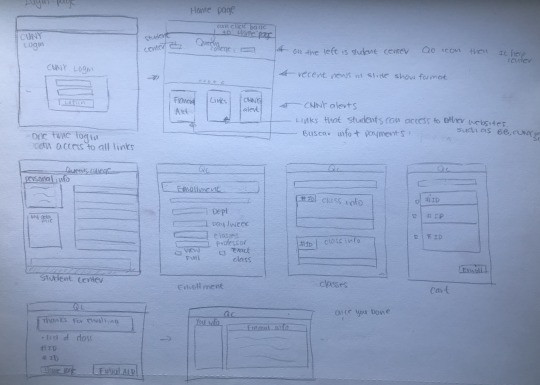
Hi-fi Wireframe + Prototype link
https://www.figma.com/proto/xACdrae6spR87dgOZBkb0V/SCHOOL?node-id=79%3A59&scaling=contain
moodboard
https://www.pinterest.com/zzzzzzz1285/interaction-design
AB testing

APPCrit: https://carolinelinn233.tumblr.com/post/618032946768642048/interaction-design-app-critique
INTERACTION DESIGN- School& Department List Redesign:
https://carolinelinn233.tumblr.com/post/617403365728681984/interaction-design-school-department-lis
0 notes
Text


My ideas was inspired by the turns paper cup that i assisst make during the arts and craft in the summer. You need to use to two cups one inside and one outside. For the outside part you can decorate whatever you want and outside you draw your emoji for the day. In here, I designed two outside part an female and make version. The front side is the emoji and when you look back it will show you the phrase “HELLO” and “YOU’RE HAVING A ...” with a black space below to let you write down the answers. For the front you can decorative the face you like. The inside part is just a regular white coffee cup


1 note
·
View note
Text
UI Experiences
APP: Wechat
I personally like this app than all other communication apps because they really work hard on their privacy. I felt secure using Wechat and not being scared that my personal information would be share with strangers. Also, when you post something on social media only your friends or certain people you tag will see the post and see your comments.
Website: Bustime.mta.info
I use this website a lot to check the bus arrival time. This website give a straightforward point you can hear enter the bus number or the stop sign code. once you enter it will direct you to two way track of the bus you search for. Refreshed bottom will always be there for you when you scroll down or up. They also have nearby stops or routes for you to get easy access to the transportations. when you type something wrong they will provide you a suggestion of what you might search for.

Website: Youtube
Youtube is a platform where i watched all my videos from during free time. It has variety of videos from education to gaming streaming. The main website follow a system of grids 4 videos in a line with the same gutter. All the titles are bold and bigger and down below are the publisher and amount people watched. When you watch a video on the right sidebar it will be similar video relate to what you watch
Facebook
I don’t really like Facebook that much anymore. It stole too much information from the user. I felt like the overall design is very messy especially for website. For the login page, the login is way small than the sign up page. Too much blank spaces that was not used. Grid structure was very wired.


1 note
·
View note