A show-and-tell blog devoted to the whys and wherefores of book cover design.
Don't wanna be here? Send us removal request.
Text
A Couple of New Covers
One for Lois Bujold McMaster and another for G.W. Morgan...


0 notes
Text
Thinking Outside the Box When Creating Cover Typography
I'd like to encourage people to think outside the box when it comes to the typography on their covers. There is an inclination to always have the title at the top and the author's name at the bottom--or vice versa---or to always have the type centered. But playing outside these conventions can add a great deal to the overall effectiveness of the cover. One trick is to not think of the cover as art with type added. You need to think of the cover as gestalt: every thing on it adds to the total effect. (One caution: being creative with your typography does not mean going nuts with special effects such as embossing, sparkles, textures, etc. or in seeing how many curly serifs you can have intertwined with one another: readability is still the main focus. If a potential reader can't make out the title at a glance---and at any size the cover might appear---the design has failed.)
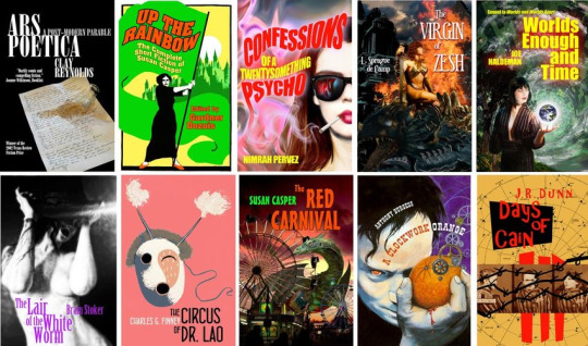
One thing that I strongly recommend doing is allowing for the title from the very inception of the cover. Here, for instance, I roughed in the placement of the type when first sketching out the cover concept. This ensures that you will always have room for the title--that it is always considered a part of the entire composition and not something that is added in later.


4 notes
·
View notes
Text
Being Genre-Specific and On-Market
Take a look at the following collection of rectangles. Does any one of them stand out? Is there one your eye went to directly?

They are all blue, of course, but one is not the same blue as the rest. And I suspect that you spotted that right off.
Far too many authors when commissioning a book cover---and far too many would-be designers for that matter---worry far too much about being "genre specific" or "on-market," that is, making sure that their book cover looks as much as possible like other books in the same genre. The problem with this thinking is, of course, the danger of the book looking so much like every other book on the same page or shelf that there is no special reason for the potential reader to chose that book over any other one. There is nothing setting one book apart from another than the title. There is a not unreasonable fear, of course, of being too "different." No one wants to be the one to introduce a new direction in cover design. Of course, every current style once had to have had a first cover. And the reason that style became the norm is because of that first cover's success. Think of all the Star Wars clones that followed the original movie. Cozy mysteries, for instance, and romantic comedies didn't always look the way they do now. But it's not really necessary to be the vanguard of an entirely new style. All that's necessary is to, first, inform the potential reader what sort of book you have then give them a reason to pick up your book instead of the one next to it. You can follow a trend without being so slavish that your cover is little more than a rubber stamp. It just needs to look that little bit more different, that little bit more intriguing than the cover next to it.
Think of all of the products sitting on the same shelf in a supermarket. That's all that a book cover is: packaging. It's really no different than the label on a can of peas. When you scan across all the different brands of peas in the grocery, there is a necessary sameness: the labels are all trying to sell a similar product. But at the same time they are also trying very hard to make you pick up one particular brand. There's a good reason that all of the labels don't just have the word "peas" on them and nothing else regardless of the brand.

All of the rectangles are blue---but one is a different blue. That's the one your eye went to and that is exactly the point. It didn't have to be red or green or plaid, just a little different.
0 notes
Text
Having Some Fun
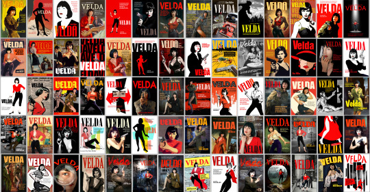
My own novel, Velda, is going to be reprinted this year after being out of print for a couple of decades. I will be expecting to create a new cover for it eventually and, well, I started having too much fun coming up with ideas. Here are more than sixty of them!
4 notes
·
View notes
Text
Some Good Advice from Ivan Zanchetta
Cover designer Ivan Zann includes some good advice for both designers and clients on the FAQ page of his BookCoversArt website:
=========================
A good cover should hint, not say. It should be perfectly "on genre", so that potential readers will be able to say what the book is about at a glance. When we browse a list of books we don't really care what the main character is wearing or what the room looks like if the whole artwork meets our expectations for the genre. Remember the cover is the most important marketing tool for a book and its main purpose is selling the book, not telling the story. Shall it lie a little bit? Yes, if it serves the purpose, all advertising does, it's just how advertising works. It obviously has to be consistent, so if in your fantasy book the only race is humans you shouldn't have an elf on the cover. I can make some other examples but you got the point. Same for the situations: there's no need to depict "that exact scene from the third chapter," if that scene is overly complex and would make the cover cluttered. Simplicity is key: remember most of your potential readers will see your cover in thumbnail size so it has to be appealing and making they want to click on it to take a closer look. If you get that click you are closer to a sell, but if they don't understand what they are seeing they will skip to the next one. Readers of K9 thrillers look for a dog. Epic Fantasy readers look for a warrior in armour. Military sci-fi enthusiasts love spaceships. Readers of action thrillers will stop by if they see a tough guy with a gun. What is a post-apocalyptic cover without a yellow sky? I could go on and I may have been a bit simplistic but, again, you got the point. I'm not saying all covers should look the same, I'm saying the OVERALL LOOK of your cover is by far more important than the scene itself.
=============================
Here are few examples of Ivan's work. Many more can be found on his site.

0 notes
Text
Some Fine Covers from Weird House Press.
Weird House Press is a small publisher specializing in horror. I think their covers have received some of the best illustrations in the genre. Below are a few examples---

0 notes
Text
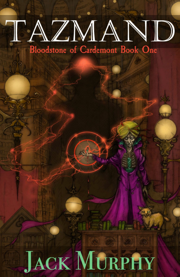
The Evolution of a Book Cover by Tom Brown
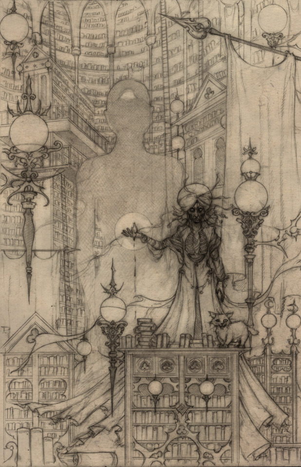
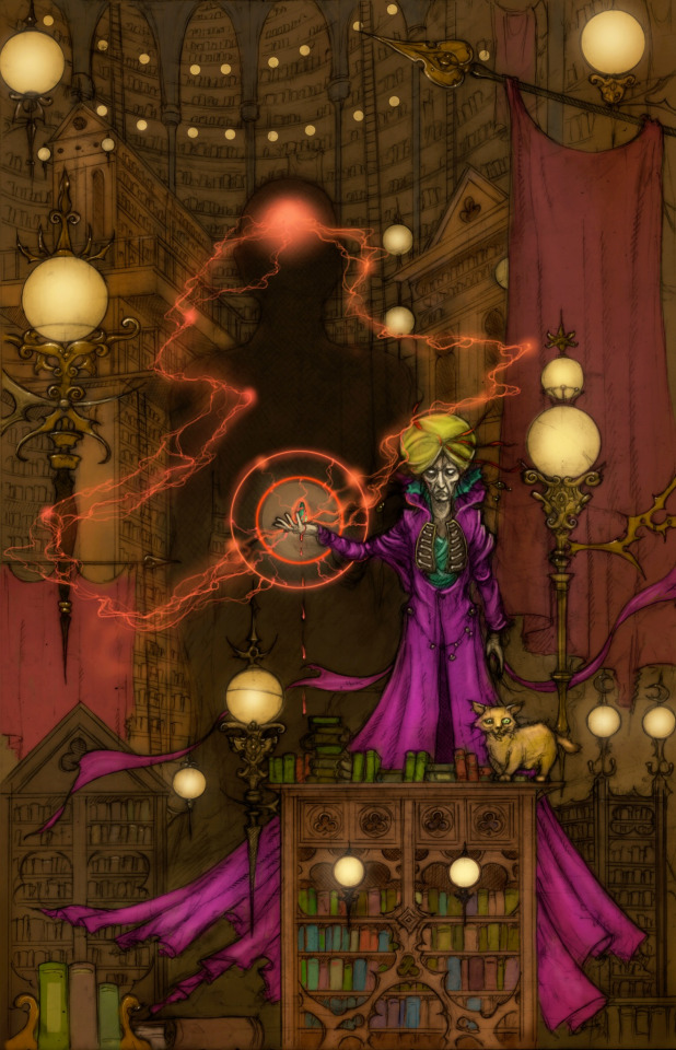
Here are three of the steps cover illustrator Tom Brown took in creating the cover for Tazmand, by Jack Murphy.
5 notes
·
View notes
Text
An Interesting Take On the Importance of the Book Cover From the SFWA.
0 notes
Text
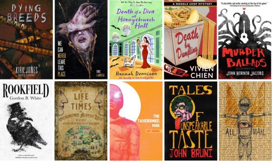
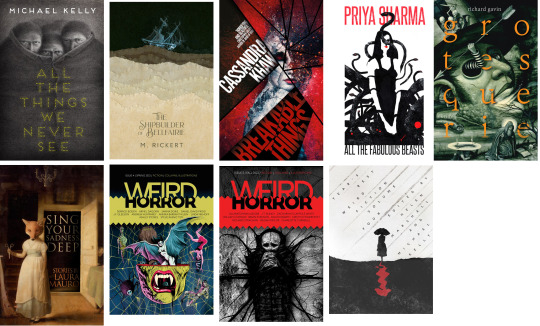
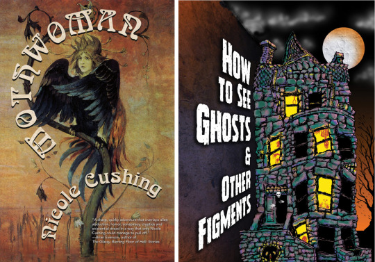
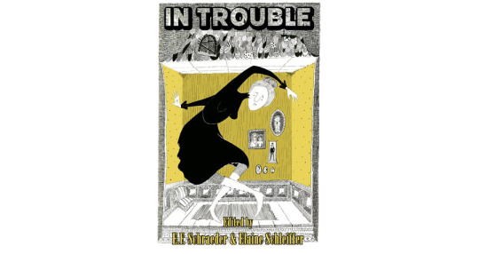
Covers for Horror and Mystery Novels From Small Presses
Here are some good examples of covers for horror and mystery novels from three or four small publishers specializing in the genre...
The first are from Journalstone...
These are from Lethe Press...

And from Raw Dog...

From Undertow...
Two from Word Horde...
And one from Omnium...
1 note
·
View note
Text
LitHub's 10 Best Book Covers of October
Some very nice covers. However, I would have wished the title of Hermione were a little larger, that the editor's name on It Came From the Closet didn't look like it had been tacked on as an afterthought (while the rainbow manages to look grim), the art in The Abuse of Narrative looks a little murky, lacking a little contrast and saturation, not 100% sure about Singularities while the designer of Heretic was either trying too hard to be clever and missed the mark or simply didn't bother to try at all, either way it only vaguely suggests a possible genre but nothing more than that.
0 notes
Text
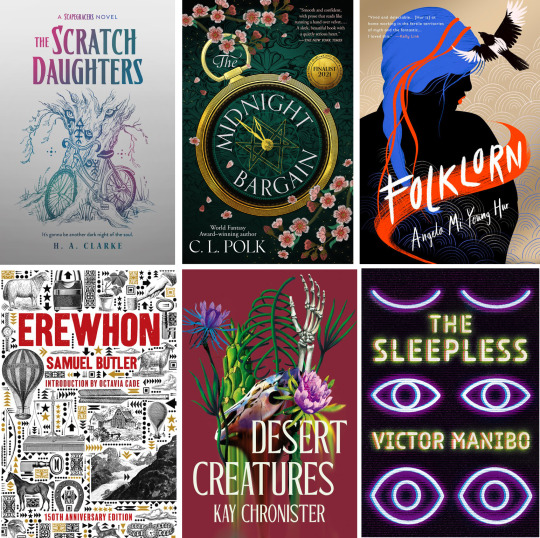
Some Nice Covers from a New Publisher
Erewhon Books is a relatively new independent publisher specializing in science fiction and fantasy. While their list is necessarily still quite small, they sport some very nice cover designs. I'm certainly looking forward to seeing future Erewhon titles.
0 notes
Text
A Few Words from Miblart
Miblart is a Ukrainian-based company that specializes in providing cover design and cover art for both traditional publishers and, especially, self-published authors.
Katia Balab, of Miblart, has kindly offered to provide our blog with a little history of the company and its design ethics and philosophy.
Over to you, Katia---
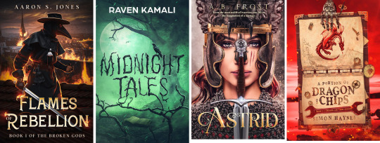
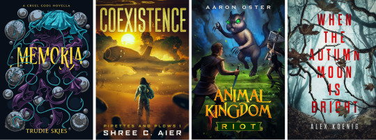
The MiblArt team came into existence in 2015, in Ukraine, with only three people in charge, driven by their love of art and the excitement of telling stories through visuals. Over the following years, MiblArt has expanded the range of services, and the team now consists of nearly 20 people responsible for customer relations, marketing, social media, etc. MiblArt has become a part of the Mibl Group which includes MiblArt (premium cover design), GetCovers (budget friendly covers of all kind), and GetPremades (an online shop of premade covers).

How can an author know that their book cover is successful? A good cover should be both visually attractive and marketable. As for the first factor, some may think that it is enough to just download a picture from the internet and put some text on it using a simple editing software like Paint. However, it is never a good approach if you don’t have any knowledge of graphic design. Creating eye-catching cover art requires background knowledge of art rules, color theory, principles of design, composition, working experience, etc. The good cover should evoke certain feelings, look appealing, sometimes giving a hint of what the story is about and why it’s worth someone’s time to read it. It is just like a story, which is told through visuals. Another point is marketability.

Unfortunately, the success of selling any product nowadays centers around how good you are at promoting it, or how good your marketing campaign is. With these questions, cover designers first identify the target audience of the book, answer questions such as: who will read it? what are their preferences? what makes them excited? what are their worries and fears? The cover art should also correspond to the genre, otherwise a potential reader may get confused and will simply scroll past the book. It is also highly important to know current design trends and analyze covers in top lists on different publishing platforms.
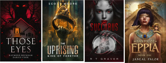
In order to share the accumulated knowledge which we’ve gained over years in the self-publishing industry, we have created a blog as well as a recently launched free email course called “Everything an indie author should know about book cover design.” This was created to help the self-published author who may have little or no experience in working with a designer.
1 note
·
View note
Text
A Few Words from Kevin J. Anderson and WordFire Press
Kevin J. Anderson is not only a world-class science fiction author he is also the publisher and art director of WordFire Press, which specializes in (not surprisingly) science fiction, as well as fantasy, horror and mystery.
Among WordFire's latest releases are some striking cover designs---

Mr. Anderson has kindly offered to illustrate some of the processes involved in the evolution of the cover for a forthcoming WordFire book.
------------------------
I am the artist director for WordFire Press. I've art-directed over 400 book covers , and I'm at a point in my traditional publishing career where I can demand input on my covers as well. I don't necessarily have any artistic talent to create the covers, but I do have artistic vision in that I can figure out what I want a cover to look like. Once I know what I want on the cover, I then convey that to my WFP designer (who really "gets" me and understands what I'm asking for), and she produces finished work.
Here's a process for a cover we released, and I'm very happy with it—DISAPPEARED, a YA thriller along the lines of GONE GIRL, a teenage brother and sister trying to solve the mystery of their mother's disappearance ... and they grow more and more sure that their dad had something to do with it. The author hunted through stock art services and found this creepy image, which we both found haunting:

In this genre, the covers generally have big, blocky sans serif type, and the way this art is staged, I envisioned a big word DISAPPEARED vertical down the side along the right cover edge. This was easy enough for me to mock up myself in Pages. This is my home-grown attempt:
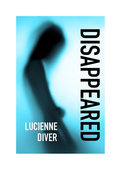
I gave that to the designer, who then produced the "real" cover. Note, the font is a little different and more compact, which allowed her to make it bigger to fill the vertical space.
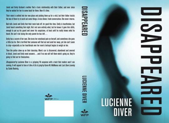
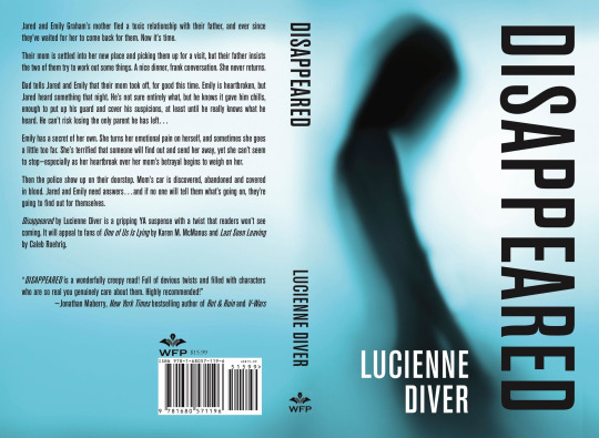
This is almost exactly right, but we had just received a glowing cover blurb from Jonathan Maberry, so that HAD to go on the book. And, ummm, do you see it? Thanks to the awkward positioning of the model's hand on the original photograph, we have what we call the "embarrassing crotch bulge problem" (it's a technical term in publishing). Fortunately the designer knew how to fix that. Here's the new one, with Maberry quote and no crotch bulge:
0 notes
Text
Four New Covers for Lois McMaster Bujold
For several years now I've been providing the covers for the ebook editions of Lois McMaster Bujold's novels and novellas. Nearly fifty to date! Here are the latest four---

The look of the covers was inspired by the silhouette illustrations of Arthur Rackham, which I discussed here:
Here is an unused first attempt at the cover for Legacy---

1 note
·
View note
Text
A Few New Covers for Lois McMaster Bujold
I haven't had much time to do covers for anyone this past year, but I always try to find time to do something for my friend Lois. These are for the ebook release of five early novellas in her Vorkosigan series.
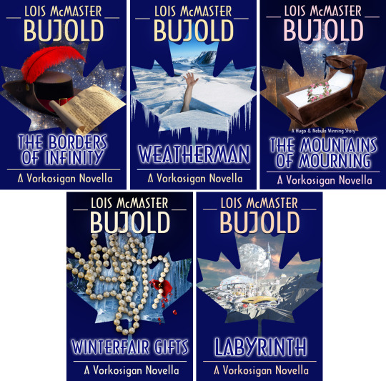
They were created in a variety of techniques. "Borders" was a combination of a costume hat, a painted feather and a photo of a distressed print-out of a page from an old book. "Weatherman" was created from photos I had taken of a frozen river and the arm of a friend. "Mourning" combined a cradle found in the Library of Congress image collection with hand-painted elements. "Winterfair" is a photo of some pearl my wife owns, hand-painted blood and ice from my photo files. "Labrynth" was created entirely by hand.
1 note
·
View note
Text
A Few New Covers from Baen
Baen Books is one of the oldest and most respected publishers dealing exclusively in science fiction and fantasy.
Here are a few outstanding covers from next month's releases.

0 notes
