Text
EVALUATION
My partner and I decided to complete brief three, a promotional music video as we felt that media in music is a big part of our generation and believed we would be able to reflect our skills the best and make it appealing to our target audience by using a variety of techniques inspired by familiar music videos. As well as that, I decided to produce an A3 double spread magazine article to promote the band, again with all the research I chose I felt that by doing an A3 instead of four A5’s I could show off the skills I had learnt over the course so far.
Our target demographic was young people, as we believed that music videos play a prominent part in culture at the moment with current inspiring young creative directors like Yoni Lappin specifically in teenagers and we tried to reflect that by following a group of young friends around Bristol and making that the pinpoint of our video, making it relatable and homing in on the audience needs of community and transparency. We researched music videos that were aimed at our target audience and tried to imitate techniques used as well as camera angles/shots, these included Nao’s Girlfriend, ASAP Rocky’s Love Sick. Our videos’s researched had a theme of following a group of young people as well as telling a story which we were inspired by.
Our song for our music video was Mura Masa’s ‘What if I go’ we wanted our video to fulfill the gratification theory of personal relationships and the audience need of community so to do this we chose to film in familiar urban places around Bristol, hopefully so the audience were able to relate. We also decided to shoot some point of view shots while riding a bike around Bristol, to further the idea of making the viewers feel as if they were apart of it. We used other codes and conventions including more came angles like close ups to the ‘artists’ in our music video to make it seem more personal as well as extreme long shots of the city and panning views out the train window to feature views of Bristol. Our video featured a group of young people doing day to day activities to make it seem as relatable as possible and also in hope to fulfil the gratification theory, by involving the demographic we wanted the video to be aimed at, hopefully they would be able to identify with it more. In preparation of making the music video, I researched 3 music videos and analysed the forms and conventions to help me with our own video. What if I go inspired us to use view shots of the city and we used editing techniques that we were inspired by the Justin Briber ‘i’ll show you’ music video, we reversed shots of members cycling and walking and reversed these shots to look as if the members were going back on themselves. This appealed to our target market because technological effects appeal to this young teen age demographic as this age groups it’s more visually engaging than basic shots. Our video contains non diegetic sound as it produces a clearer more professional sound however we edited close ups of the members of the band occasionally singing to the audio to appeal to the audience and meet the forms and conventions of the music videos we had researched. We decided to chose a non-linear narrative as we wanted it to represent the memory of the human brain which would allow the audience to feel as if the video could be their own memories and ultimately make them feel as if they played a part in the video. We filmed our footage on different days which made it difficult to edit the lighting so it flowed smoothly, the fact that it was a non linear storyline meant we were able to put the day and night shots at random order and it not matter as much as If it followed a storyline. Despite this we tried to relate the song to the footage to the audio as much as we could for example when the words, ‘blue and icy’ are sang blue LED lights appear and after the lyrics ‘smoke and mirrors’ are sang there is footage played with a band member blowing out smoke alongside those lyrics, this allowed the video to be more visually engaging when watching. We placed the name of the band and audio at the begin before the beat drops and the shot fades out to keep it simple and eye catching and have it as the first thing they see draws more attention. However our video could have included more visual representations surrounding out chosen institution, the most accessible site to view music videos is youtube which many artists decide to place their work, usually getting promoted by institutions like VEVO, we could have added an institution logo to make it seem more professional.
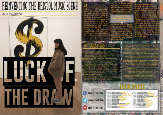
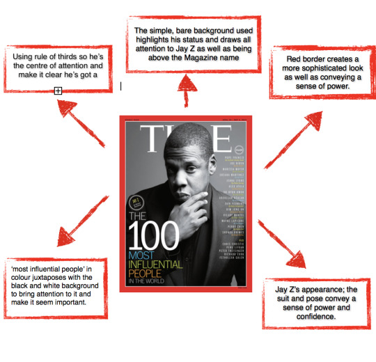
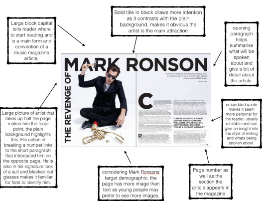
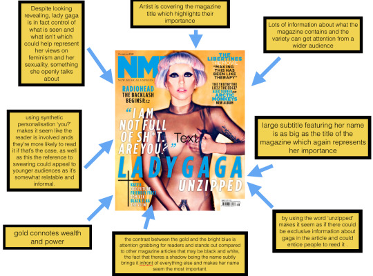
For my print i decided to create it on pages as it’s something i’m familiar with using and i believe it creates a more professional looking final magazine cover, to make it more personal and easier to appeal to our demographic i chose not to use a template as i wanted to edit it myself and show off the things I had learned during the research period. I decided to include the bands name in large lettering almost as a banner across the page to make it eye catching and make them the main focal point of the print, something i had researched when looking at the forms and conventions of other articles. The band members featured in the music video are also displayed in the magazine article which creates a direct link between them which allowed my target audience to relate the print and video together. I tried to make the mise- en - scene of my print seem visually engaging including large pictures and font’s that would appeal to the eye instead of simples ones like arial, i used graffiti as the background of one side of my page which links back to the video and was gives a more urban vive, on the other side is a large picture of one of the band members which is something i was inspired by when looking at other articles. I spent time experimenting on pages and looking at the different techniques including the instant alpha setting which allowed me to delete the background of pictures, this meant i was able to put my artist above the writing and again make her the focal point of the article. There is also a interview with the girls following a journalism style of writing which allows the article to be slightly more informative and interesting ands gives more information about where the band originated from. I included some behind the scenes pictures as well as a ten questions about me section to make it seem more exclusive and appealing for the target audience as they feel like they can get to know the artist on a more personal level and also I included page numbers and the date on the print to make it look more realistic. I collected a variety of different urban magazines like Crack and I-D magazines from different sources around Bristol which inspired me swell as analysing the forms of conventions of 3 different articles i found online, looking at the typical forms and conventions found in music magazine articles created a leap board for our own and i felt more confident in making it myself after. The page displays different institutions that the band can be found including their Facebook, Twitter and Instagram page which connects the fans with the artist, our demographic was young adults which have a strong understanding of technology and social media as they’re grown up with it and is a prominent part of their everyday life so having these links was vital. By using YouTube as one of my institutions, our film directly fits with the brief of being a music video as this is a way many artists and band display music videos.
If I had made a band website i would have put in different sections about the band including a photo gallery, tour dates and about us section. I would have made the site aesthetically pleasing and eye-catching and included a behind the scenes article about how the band's music video was made. This would have made the site informative and interesting. There would also be a section surrounding each band member with pictures of them. There would also be an option to buy merchandise or audio from the band. My website would follow a colour scheme so it looked tidy and professional. The site would be very easy to navigate around also so that viewers found the website accessible and easy to use.
All in all i found doing the practical as well as the research a great learning experience and I was able to learn and develop a range of new skills, i’m pleased with the outcome of our video and print but am also aware of improvements I could have made had there been more time.
0 notes
Text
SHOOT 1
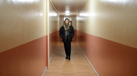
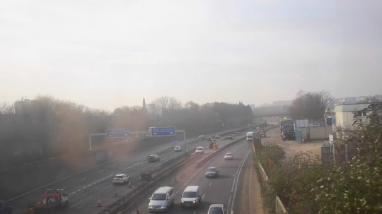
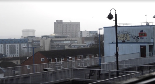
Before Abi and I decided to go out and film we sat down together and made a list of all the forms and conventions we wanted to include in our music video, for example camera angles, locations and wether we wanted a linear or non linear storyline. We then made a list of all the props we needed to get hold of including LED lights as well as equipment like a tripod.
We did our first shoot around Bristol going to all the locations we discussed , we wanted to get pan shots to accentuate the views. At first we did it by hand because we wanted to see if it would give a more personal feel similar to a point of view shot however we soon realised that it would be too shaky and wouldn't produce a stable shot so we used a tripod for the rest of the. We went to locations like Nine Tree Hill, Stokes Croft and Car Parks above places like Castle Park, each location had about 15 minutes of footage because we wanted to edit them all down and choose the best bits and a lot of what was filmed that day wasn’t included in the main cut. We enjoyed walking around with the camera and experimenting for our first shoot however we wanted to wait for a clearer day to shoot more.
0 notes
Text
SHOOT 2
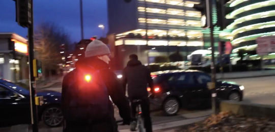
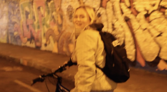
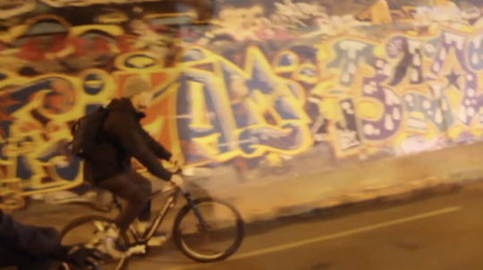
Our second shoot was done on a bike ride, we cycled around Bristol and I filmed behind them as we went, it was obvious that because we were on a bike the shots would be shaky however we experimented around with iMovie and found a stabiliser setting which helped us a lot when it came to the final cut. We wanted the video to feel relatable and familiar to the audience again to give our video a sense of community as that appeals to our demographic, therefore, we wanted to the people involved less like actors with a particular storyline and more like a group of friends just doing day to day activities. We wanted close up shots of their faces to make it seem personal and give a sense of transparancey as well as wide angle pan shots to make it seem as if you were cycling with them. We decided to shoot at a time to catch sunset to give a softer, natural tone to the video, making it seem not as harsh and hopefully more intriguing to watch by the viewers. We did a lot of shoots out side the cabot circus car park when it was lit up with blue LED lights in hope to make it match our planned next shoot using LED strip lights we had bought, we also planned on putting the cars driving past in reverse in hope to get a long exposure/ bokeh type feel. We had ideas to do time lapse shots in these areas and insert them throughout the video however due to time we were unable to shoot them, this is however something we both plan on doing in future projects. On this shoot we also took advantage of the sunset views to film more pan shots as we wanted more footage to work with. Overall the shoot was successful, we filmed a variety of shots in a number of different places around Bristol while following a group of our friends around in order to appeal to our particular demographic. Our only flaw would be the shakiness of the video due to it being filmed on a bike however we were able to improve this when we edited so it was a good learning experience.
0 notes
Text
SHOOT 3
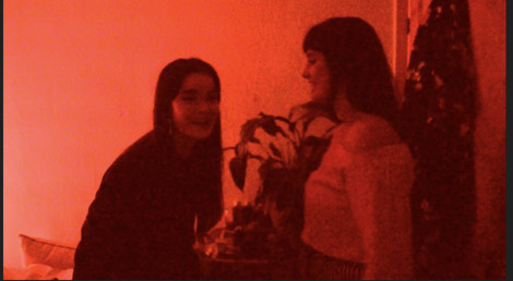

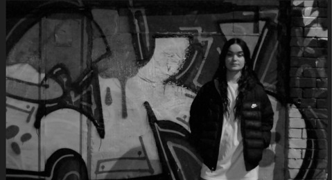
Our final shoot was going to be used for lip syncing as we hadn’t been able to get any yet, despite being challenging to edit it into our video due to them not knowing the lyrics properly and only getting a couple seconds each verse, we’re both glad we spent a few more hours filming to collect this footage as it made the video feel more professional and was great practice on IMovie. We filmed the shoot in a small dark room to make it easier to accentuate the lights we used, by using a small room we were also able to make the close up shots seem more personal/relatable as well. In Richard Dyer’s Utopian Sensibilities he talks about how audiences prefer to watch something that may be missing from their own lives including a sense of community or energy so we wanted to make sure the people being filmed were having a good time, a lot of them being candid shots. Using the LED lights was a good chance to experiment with focus on the camera and choosing different colours to convey a different kind of atmosphere. One of our ideas was to have a couple of individuals stood infant of some graffitti around Stokes Croft and mime the lyrics however after going out and filming we realised it looked more clear from the shots in the bedroom, however we got similar shots without the miming as well as shot over Gloucester road which we liked. Doing it in public meant that we had quite a few people interrupt our filming and try and be apart it became difficult to get the shots we wanted but it was still a fun experience and we experimented with the colour gradients of these shots on iMovie after as it was shot in a much darker lighting than the rest of our shots.
0 notes
Text
Justin Bieber - Life Is Worth Living
In Justin Bieber’s music video for, ‘Life is worth living’ there are only two dancers in the video, one male and one female and they're performing a routine together. The female dancer is dressed in a black sports bra and black dance shorts. She also has makeup on her to look as though she has a wound or gunshot to her chest. The male dancer is in a pair of black track pants and both the dancers have bare feet. The simplicity to the video made it very effect and emotional to the audience. The song is about his past, purpose and faith. The video was meant to be an expression of the song he had created and was directed to not only his fans but also himself. The wound on the female dancers chest is used to represent the dancers problems and the hug the two dancers share at the end of the video shows the resolution of these issues. The video has a worried yet calming undertone to it but allows the audience to be open to interpretation to what the video means. The mood of the video starts off as sad yet becomes brighter towards the end through the hug at the end of the video. The piece of media became very popular as theme of moving forward from past problems is show in an elegant way through the mies-en-scene (makeup of wound) and then resolved creatively through the duet between the two dancers. The female dancer in the video is called, Emma Portner and is a professional dancer. The styles of dance shown in the video is mainly modern. The narrative of the video fit clearly to the song. As Emma Portner takes centre stage there is a close up of a wound on her chest but as the end of the video it has amazingly healed. This represents moving past a struggle and resolving your issues.
The video was filmed in a single location that being, a single small room with white walls and a stone looking floor. The room had skylight and lighting on the ceiling and there were also door opening in the room. The location was like this so the viewers attention would be on the dancers and not distracted by anything else in the mine-en-scene. The room in the video is quite brightly lighted to put attention directly on the dancers. The video starts off which a close up of the female dancer. This is so the audience can directly see the emotion she portrays. The camera follows the dancers as they move through tracking shots but closes ups are used throughout the video to show the dancers facial expressions. The video also contains long and high angle shots. The video only contains non-diegetic sound which meant there was no lip syncing in the video. This was to give a more emotional and deep tone to the video. There was no props in the video apart from the makeup used to represent a gunshot. This helped keep attention on the dancers in the video who are meant to be the main focus of the piece of media.
This video appeals to the target market because the media has an minimalistic approach, giving the video depth and a clear narrative making it easy for the audience to follow. The video also carries a lot of energy which relates to Richard Dyers theory which he calls ‘Utopian Sensibilities’ which means that people like to view things they don't have a lot of in their live, one of these things includes energy.
0 notes
Text
Mabel - Thinking of you
I chose to research Mabel’s ‘Thinking of you’ as like Love sick it fitted the forma and conventions we intended to achieve in our own video, again it’s shot with a vintage feel as if it’s a 35 mm and includes the artist herself which makes it more personal for the audience. A diverse amount of shots and locations are used to make it appealing for the audience also.
The mise- en scene involves mabel surrounded by bright colourful environments which connotes an energetic and bubbly feel to the video and would be attractive to an audience as well as putting the artist in a more enhanced look as well as that there are still shots of a couple hugging which is significant to the lyrics and can represent the mood of the song used.
The video tens to focus on close ups to emphasis the artists and create a more personal relationship for the viewer as well as highlight emotions she’s trying to convey, the locations filmed are familiar to the demographic - outskirts of London - which is relatable and will appeal more than if it was set somewhere unrealistic. However there is a sense of abundance as she’s seen to be leading a glamorous lifestyle with the drop top car surrounded by friends, this conveys a sense of enjoyment for more sensuous and material things. Rather than just following the artist around and focuses on a linear storyline, the range of different shots makes it exciting and more enjoyable for the viewer to watch.
This music video stands on mallows hierarchy of needs in the sense of love and belonging, the video highlights the importance of relationships as well as giving a sense on community which viewers can relate to on a certain level making it more appealing for them. The bright colours and props used are all conventions of a typical hip hop/pop music video which again will appeal to the specific demographic it’s targeted at.
0 notes
Text
Mura Masa - Lovesick
Mura Masa’s ‘LoveSick’ is the updated version of the 2015 release featuring ASAP Rocky and has soon become one of Masas biggest singles yet with over 6 million plays on Spotify alone. The video is shot on a 35mm by director Yoni Lappin, it follows a group of young people around London and a range of shots are used including front camera phone shots, close ups and track shots.
The video is filmed in a variety of familiar locations as the group move around and the fact that its shot on a 35mm camera gives it a warm, organic feel which could also attract their particular target audience. The use of front camera phone shots added at the beginning and end of the video and the close up still shots of peoples faces make it more personalised as we feel as if we can get to know them on a more personal level however combined with the shots of the party and the use of jump cuts used the video is kept upbeat and faced paced. The video also contain a few flashbacks to a party which has a dim red lighting which relates the the theme of ‘love’ which juxtaposes with the calm shots of a stationary car just before, this keeps it interesting for the viewers and creates a sense of energy.
There are many examples of Richard Dyers Utopian Pleasures including sense community, audiences like to have a sense of belonging which can sometimes be met from a media source as Dyer suggested audiences consume media products because they with to escape reality. As well as this, the prominent idea of love gives a sense of intensity and may be relatable for some audiences from the specific demographic. Each of these things, combined with the conventions used throughout the video will help the audience feel as if they play an important part.
0 notes
