Don't wanna be here? Send us removal request.
Photo
American Landscape
Throughout American history, we see the transformation from the America we found years ago to the America we know today. We see the shift of capturing the American landscape from painting on a canvases to photography.
Landscape painting arose as a distinct genre during the 17th-century Dutch Golden Age as religious art fell out of favor in a Protestant society. In Europe, landscapes evolved from backgrounds in portraits of wealthy landowners to a prestigious art form embraced by Romantic painters in the 18th and 19th centuries who invested the natural world with allegorical and mythic significance in reaction to scientific advances of the Enlightenment.
Landscape painting began to dominate American art in the early part of the 19th century with idealized images of a vast, unspoiled wilderness that reflected a nation whose identity and belief in its boundless prospects were deeply interwoven with its natural environment. As the American frontier was pushed further westward, landscape artists chronicled the disappearing wilderness and the expanding presence of modern civilization in paintings that glorified industrial development for their patrons or served as reminders of the price of progress.
The painters of Hudson River School, founded by Thomas Cole in the latter half of the 19th century, created works of mammoth scale that attempted to capture the epic scope of the American landscape that favored contemplation of natural beauty. Other Hudson River School artists like Albert Bierstadt created works that placed a greater emphasis on the raw, terrifying power of nature. Thomas Moran’s paintings of the Yellowstone River in the 1870s helped to persuade Congress to set aside the Yellowstone area as a national park.
By the dawn of the 20th century, romantic views of nature were beginning to be replaced by themes of urbanization and a yearning for the tranquility of pristine natural spaces. In the 1920s, a group of New York artists led by Robert Henri (the “Ashcan School” or Urban Realists) focused on gritty urban scenes. The Regionalist Painters, a group of artists working primarily in the Midwest during the 1930s that included Grant Wood, Thomas Hart Benton, John Steuart Curry as well as lesser-knowns like Marvin Cone, created portraits that glorified the labor and lifestyle of agrarian rural America.
Modern American artists have approached landscape with a variety of strategies influenced by European art movements such as abstract expressionism and cubism; Charles Sheeler painted industrial landscapes in a style that presaged photorealism; Edward Hopper applied a looser painterly style to both urban and rural landscapes; Georgia O’Keeffe created works that distilled the natural world to organic abstractions; Milton Avery’s reductive style led to the pure color fields painted by abstract impressionists like Mark Rothko, where light and color interact brightly together.
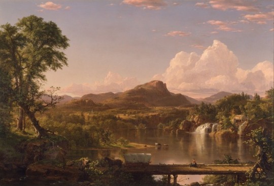
1. New England Scenery
This masterpiece by Frederic Church includes a covered bridge, waterfall, mountain and mill to express the essence of pastoral New England. Like his early teacher Thomas Cole and other Hudson River School artists, Church believed that the vastness and beauty of the American landscape conveyed moral significance. The Conestoga wagon crossing the bridge in this idealized, panoramic vista symbolizes westward expansion and a growing country flourishing in harmony with nature.
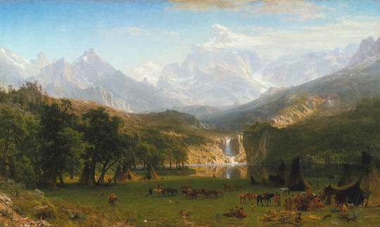
2. The Rocky Mountain, Lander’s Peak
It is based on sketches made during Bierstadt's travels with Frederick W. Lander's Honey Road Survey Party in 1859. The painting shows Lander's Peak in the Wyoming Range of the Rocky Mountains, with an encampment of Native Americans in the foreground. It was among the first of his paintings to be exhibited publicly as a paid-entrance piece, with an accompanying pamphlet for sale that described the significance of the work. The success of Bierstadt’s western paintings has been attributed by the art historian Linda S. Ferber to “public curiosity and excitement about these remote national territories” and to “the powerful idea of Manifest Destiny”, a phrase gained currency in the 1840s and that implied the inevitability of the continued territorial expansion of the U.S, to the west and south, an expansion made more attractive in the early 1960s by anxieties about the future of the Union.
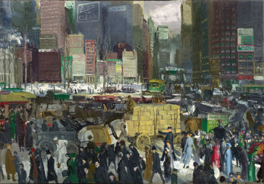
3. New York
While the Ashcan artists were creating new images of urban America, their styles remained relatively conventional. Stylistic innovation was, however, being taken up by many as the formal experiments begun in Europe in the middle of the 19th century spread to the U.S. This “Modernist” art encapsulated a relatively wide range of styles and subject-matter, all of which challenged traditional conventions of visual representation and often created new images in response to contemporary developments such as the expansion of commercial imagery and industrial technology.
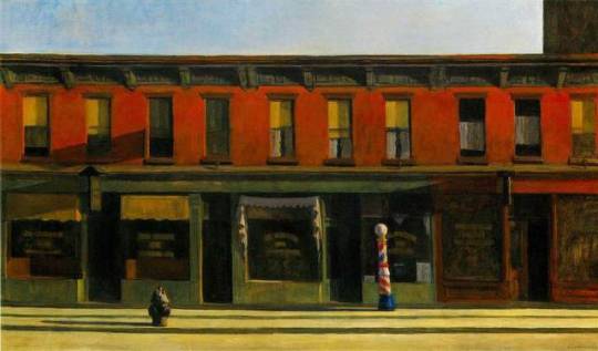
4. Early Sunday Morning
This painting shows not the usual bustle of human activity but an empty street and empty buildings. His choice of a hard, white light, which creates striking contrasts between light and dark, emphasizes the emptiness of the scene – you cannot see into darkened windows. The attention to detail in the moldings, window frames, and window coverings and the starkness of the buildings gives the painting a sense of isolation and loneliness.
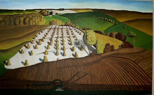
5. Fall Plowing
In Wood’s painting the viewer stands atop a hill, behind the plow lodged firmly in the rich soil, looking out over fields dotted with stacks of freshly harvested grain. The farmhouse and barn nestle in the distance among a grove of trees.
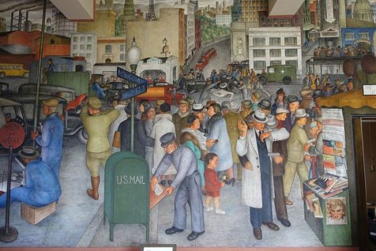
6. City Life
This piece shows the chaos of the streets of San Francisco. While striking, workers are absent – to have included them would surely have resulted in strong objections from committee members -there is at least one reference to the city’s radical, Pro-Communist cadres.
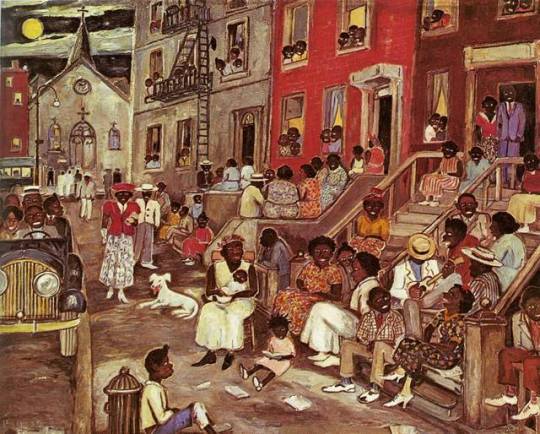
7. Midsummer Night in Harlem
Midsummer Night in Harlem was meant to embody the community in Harlem. Palmer Hayden portrayed a high-energy community sitting outside of their houses to cool off on a hot summer night. This painting shows the energy and positive attitude through vibrant colors and the expressions of the people. They all have smiles and nice “Sunday church” outfits on. It is fair to assume that the people had just come from church because Palmer Hayden has people still lingering out of the church in the background. Midsummer Night in Harlem was another one of Palmer Hayden’s paintings that got a negative reaction from some black Americans because of how interpreted their physical features. The people in this photo once again had features that were comparable to the minstrel characters. They all have very dark skin, big white eyes, and big mouths. James Porter criticized Palmer Hayden’s painting of “Midsummer Night In Harlem” because of the minstrel characters; he called the artwork “talent gone astray”.
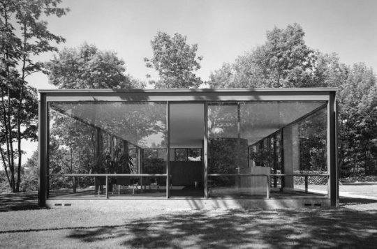
8. Philip Johnson House (The Glass House)
This architecture photograph shows the degree to which architectural forms could be reduced to their basic cubic shapes and then opened to the surrounding environment.
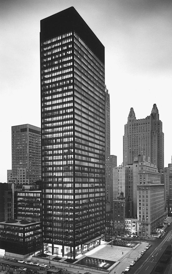
9. Seagram Building, New York
This building was designed by Miles van der Rohe with Philip Johnson, became the prototype four urban sky scrapers whose structural steel framework was revealed in the geometric patterning of the windows and the reduction of the walls to mere curtains of glass. Mies can, in fact, be the counterpart to the critic Clement Greenberg in his emphasis on the purity of forms. The architect boiled his philosophy down to the phrase “less is more”, which represented his search for the essence of architecture, which he found in the rational structure of the building itself.
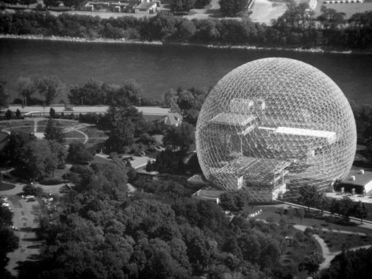
10. Montreal Exposition
Fuller was given the opportunity to construct a prototype of a large dome when he was commissioned to design the US Pavilion at the 1967 Montreal Exposition marking the 100th anniversary of Canadian confederation. Seen as a celebration of US technological ingenuity, it provided Fuller a platform from which to remind people that the world’s resources were limited, and that the technological might of the nation should be devoted to developing sources of renewable energy and ways to live both comfortably and lightly on the earth.
3 notes
·
View notes
Photo


Artist Presentation: Marlo Pascual
Inspiration for final project.
Using amateur photography found in vintage stores and online, Marlo Pascual creates images and installations that give photographs a new life as objects removed from the context in which they were taken. Pascual cuts, folds, impales, and situates the enlarged prints with props such as rocks, plants, and fluorescent lights. These works highlight the fragility of the image and lure the photograph out of the realm of the two-dimensional into the three-dimensional world.
http://www.artspace.com/marlo_pascual
https://www.artsy.net/artist/marlo-pascual
0 notes
Link
Project #4 - Photography and Stop Motion
0 notes
Link
0 notes
Photo

WIP #5: "To take a photograph is to participate in another person's mortality, vulnerability, mutability. Precisely by slicing out this moment and freezing it, all photographs testify to time's relentless melt." - Susan Sontag
0 notes
Photo


Project #3: Studio Lighting Copy Cat
1 note
·
View note
Photo


In-Class Lighting Assignment
1 note
·
View note
Photo


WIP #3
1 note
·
View note
Text
Five Rules for Project #2
1. This project involves some traveling. 2. Must take pictures outside. Take during the day in the afternoon. 3. Cannot take pictures outside of your house, in your neighborhood, or at UCF. 4. Find an organization or company and take a picture of the building. 5. Travel around and find the same company/organization; however, the building cannot have the same design. Inspiration – Ed Ruscha
0 notes
Photo


WIP 2 - Future Art
“Blast from the Past”
When we see something historical or old, we think it’s art. There is a quiet little town I know in Winter Garden that still uses old buildings that were built in the early 1900s. In a 100 years, I’m pretty sure these old buildings would be destroyed and something new and futuristic would replace it. I feel that people years from now won’t have anything this old in the future so photographs of something old like this could be considered art.
0 notes


