
Statistics
We looked inside some of the posts by benredington and here's what we found interesting.
Average Info
Notes Per Post
5
Likes Per Post
5
Reblog Per Post
0
Reply Per Post
0
Time Between Posts
2 months ago
Number of Posts By Type
Text
9
Last Seen Tumblr Blogs


Fun Fact
Tumblr Inc. is funded by 13 investors.
Text
Select an artwork that represents conflict, you can select from any art form. Consider the message being conveyed and how the use of material supports the message.
'Guernica' is a 1937 oil painting by Pablo Picasso.
Commissioned by the Spanish Republican Government for a pavilion at the 1937 fair, Guernica is a large scale (349cm x 776cm) monotone oil painting by Pablo Picasso. The republican government sent this commission in order to prove a legitimacy against the Spanish nationalists, their civil opponents. Multiple months after first being commissioned, the Germans bombed the Guernica city, leaving citizens, infrastructure and homes demolished.
Picasso used this opportunity presented to him via the republican government (to show his works at a large scale fair) to display his and the whole countries anger and devastation after the bombing.
The painting mixes Cubism (a key style of Picasso) and various texturing techniques through dotting lines and contrasting shades. Every subject of the painting is depicted as distressed, crying or emotionless. Horses and people are contorted and shaken up, with their arms thrown in the air, mouths agape and eyes wide. Picasso used the subjects expressions and emotions to reflect the public's reaction to the senseless bombing.
Painted in a monotone palette of oil paints, the painting features scratchy lines imprinted over it. The oil is soft on the canvas, which could reflect the innocence of public, with the harsh contrasting shades of grey and the strong bold lines placed on the painting. The whole painting being black and white allows for the forms and expressions of the characters in the painting to speak for themselves and tell the story and emotion of the conflict.

Sources:
Britannica. (Unknown). Guernica | Description, History & Facts. [Online]. Britannica. Last Updated: 8th February 2024. Available at: https://www.britannica.com/topic/Guernica-by-Picasso [Accessed 12 February 2024].
1 note
·
View note
Text
How have contemporary values and media impacted upon the 16th C interpretation?
Comparing 'The Rabbit Hunt' , 1560 by Pieter Bruegel the Elder and 'Stormy Passing' , 1987 by April Gornik.
Bruegel's 'The Rabbit Hunt' is an ink print based off of one an own drawing by Bruegel, and the only print of his works he made himself. The work was etched and many of the small, detailed lines and dots reflect this on the shown print. It depicts a vast valley, with a river/estuary running through the inside. The foreground features 2 men - one spear wielding and the other bearing a crossbow - pointing downhill at, presumably, some form of game. Despite the difficulty and usual rigidity to etching, Bruegel's piece features a flowing, free feeling. Similar to the valley it depicts, there are a lack of harsh lines and rather many, smaller, curved lines that make up its landscape.
Similarly, Gornik's 'Storm Passing' has a smooth, wavy atmosphere to it. While depicting a less open and or expansive subject, the photo managed to create the same open and comforting feeling to its craft. Being painted with oil, atop a linen base, the painting depicts a grey clouded storm passing over a grouping of fields in the foreground, and a forest positioned behind. Both works lack harsh lining and contain a free and loose atmosphere, reflecting their airy subjects.
Many of the great landscapes of the 16th Century are able to reflect this open, vivid and expansive feeling despite the material, positioning and timeframe (due to lack of photographs to work from) restrictions. Contemporary landscape paintings, specifically Gornik's work as a point of reference, contain this similar atmosphere of an open world being shrunk down to a canvas. In my opinion, the oil on linen often used by Gornik and peers works incredibly well to reflect this.


Sources:
April Gornik. (Unknown). 1980 - 1987 Large Paintings. [Online]. April Gornik. Last Updated: Unknown. Available at: https://www.aprilgornik.com/artwork/1980-1987?view=slider [Accessed 16 December 2023].
The Metropolitan Museum of Art. (Unknown). Peter Bruegel the Elder : The Rabbit Hunt. [Online]. The Metropolitan Museum of Art. Last Updated: Unknown. Available at: https://www.metmuseum.org/art/collection/search/366870 [Accessed 16 December 2023].
0 notes
Text
Select an artwork that can be described as an example of installation or performance art.
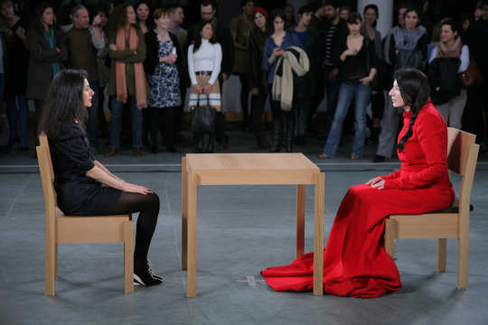
'The Artist Is Present' , a performance art exhibition by Marina Abramović. Performed in 2010.
Hosted from March 14th 2010 to May 31st 2010, 'The Artist Is Present' is a performance piece hosted at the Museum of Modern Art (MoMA) by artist Marina Abramović. Abramović sat on a chair with a small table in front of her and a chair opposing her. Silently, Abramović sat and viewers of the show were encouraged to sit silently across from her for a 'duration of [their] choosing".
Despite the seemingly dull activity for the artist, Abramović is trained with Tibetan Buddhists in the act of meditation, and is able to leave the current limits of her body through this.
Abramović sat and stared, reciprocating the viewers silent demeanour.
From my interpretations of what experiencing this exibihiton would be, I imagine it would humanise a figure seen as so polarising and pioneering as Abramović. Through many other performative pieces, Marina has accumulated many titles and associations through her unique artistic medium. Feminist. Artist. Pioneer. However being sat eye to eye with someone, no words spoke, I feel would make you truly see them as just like you. Real. You'd see the wrinkles in their face, the clovers of colour to the eye, the way their stare makes you feel. All of this combined makes me believe how impactful this performance was. Most art is viewed in galleries by thousands daily, while they do have their own interpretation and emotions attached, its still the same artwork in front of them. Being made to sit and stare at someone in silence for durations (from articles read normally 50-75 minutes per person), you get your own interpretation, your own artwork and your own personal attachment.
Sources:
Khan Academy. (2010). Marina Abramović, The Artist is Present. [Online]. Khan Academy. Available at: https://www.khanacademy.org/humanities/art-1010/conceptual-and-performance-art/performanceart/a/mari [Accessed 28 November 2023].
MoMA. (2010). The Artist is Present. [Online]. MoMA. Last Updated: 2010. Available at: https://www.moma.org/interactives/exhibitions/2010/marinaabramovic/index.html [Accessed 28 November 2023].
MoMA. (2010). Marina Abramović: The Artist Is Present. [Online]. MoMa. Last Updated: 2010. Available at: https://www.moma.org/calendar/exhibitions/964 [Accessed 28 November 2023].
0 notes
Text
Select an artwork that employs assemblage and discuss how the techniques informs the meaning.
'Beyond the Pleasure Principle (Freud)' , a sculpture by Sarah Lucas. Made in 2000.
‘Beyond the Pleasure Principle (Freud)’ is an arrangement of everyday objects that each signify a meaning of either sex or death. The work depicts of: a red mattress hung by 1 corner to a clothing rail, in which the rail suspends a clothes hanger that holds 2 light bulbs at its peak alongside a bucket and lightbulb towards its bottom. This figure hung from the clothes rail represents the female form and specifically the genitalia. The coat hanger forms the shoulders and collar in which the breasts ( 2 light bulbs hung beneath) are held from. The bucket and lightbulb is a portrayal of a vagina on the figure. The use of lights for this can show how the figure is mostly looked at for these specific parts in a sexual setting, “shining light” on the issue.
A hole is cut in the hung red mattress, with a long fluorescent light tube pushed through, and 2 light bulbs hung over the light tube at the point it meets the mattress. This form is a metaphorical form for the male's penis. Alongside the mattress, these 2 interpretations of nude human form entails the viewer the piece is based around sexual relationships. The genitals being represented by lighting tubes & bulbs tells the viewer that normally in a sexual setting the participants will be guided/ only looking there. The light is telling you to look there, especially in a normally darker environment of sexual relations.
To the side and just below the mattress, is a white cardboard coffin. This is a material representation of the closeness between the relationship between death and love. Sex can create life, it can strengthen relationships. Yet our time is limited. Death is always there and looming. Theres danger to love, theres going to be heartbreak and arguments.
Lucas references the essay written by Sigmund Freud of the same title as her own through this work. Freud writes about the relationships in life between the drive to work at thought of death and power in the will to survive. Lucas replicates this sentiment through the closeness of death imagery and sexual imagery.

Sources:
Elizabeth Manchester. (2002). Beyond the Pleasure Principle (Freud) 2000. [Online]. Tate. Last Updated: April 2002. Available at: https://www.tate.org.uk/art/artworks/lucas-beyond-the-pleasure-principle-freud-t07820 [Accessed 20 November 2023].
James Putnam. (2000). Sarah Lucas – The Pleasure Principle. [Online]. Freud.org. Last Updated: 21 January 2000. Available at: https://www.freud.org.uk/exhibitions/sarah-lucas-the-pleasure-principle/ [Accessed 20 November 2023].
Phaidon. (Unknown). Sex, Death, Sigmund Freud and Sarah Lucas. [Online]. Phaidon. Last Updated: Unknown. Available at: https://www.phaidon.com/agenda/art/articles/2018/october/22/sex-death-sigmund-freud-and-sarah-lucas/ [Accessed 20 November 2023].
0 notes
Text
Select a sculpture and discuss how its patination informs the visual appearance of the work.
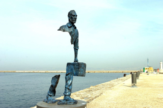
'The Travellers' (also known as 'Les Voyageurs') are a series of bronze sculptures by French artist, Bruno Catalano. Made in 2013-2014.
Each of the sculptures within Catalano's series are kept outside, in public view. They are primarily made of bronze and display people holding suitcases, with what appears to be their vital organs missing. To the normal viewer, they look like they are floating, however usually the suitcase connects the top half to the bottom to create the illusion of instability.
As the sculptures are each displayed outside, and built from bronze, oxidation and discolouration will naturally happen. Some grow a dark brown tinge to the outer line of bronze, some begin to grow green. This gives the appearance to the viewer that these travellers have been there for a lot longer then they might think, that these travellers are experienced and monumental. The blue tinge specifically will normally lead viewers to think of the Statue of Liberty, which was originally a bright bronze colour, only turning turquoise from its environments. The figures in 'The Travellers' series have been oxidised, tarnished and affected by their environments. The oxidation gives them credibility, and a passport of locations behind them as you assume from their age they are well-conversed.
Written by Benjamin Redington
Sources:
Wikipedia. (Unknown). Bruno Catalano. [Online]. Wikipedia. Last Updated: Unknown. Available at: https://en.wikipedia.org/wiki/Bruno_Catalano [Accessed 23rd October 2023].
Bruno Catalano. (Unknown). Bruno Catalano (official site). [Online]. Bruno Catalano. Last Updated: Unknown. Available at: https://brunocatalano.com/sculpture-bronze/bruno-catalano-bio.php [Accessed 23rd October 2023].
Wikipedia. (Unknown). The Traveller (sculptures). [Online]. Wikipedia. Last Updated: 7 November 2022. Available at: https://en.wikipedia.org/wiki/The_Travelers_(sculptures) [Accessed 23rd October 2023].
Vidar. (2023). https://streetartutopia.com/2023/05/16/9-fragmented-travelers-amazing-sculptures-by-bruno-catalano/. [Online]. Street Art Utopia. Last Updated: May 16 2023. Available at: https://streetartutopia.com/2023/05/16/9-fragmented-travelers-amazing-sculptures-by-bruno-catalano/ [Accessed 23rd October 2023].
Ravagnan Gallery. (2022). Salone Nautico Venezia 2022. [Online]. Ravagnan Gallery. Last Updated: Unknown. Available at: https://www.ravagnangallery.com/en/events/bruno-catalano-3/439 [Accessed 23rd October 2023].
0 notes
Text
On your blog write about the qualities of paint in an image you have selected.
'Thermal' by Peter Lanyon is a piece made from layered oil paints, apart of a collection titled 'Soaring Flight' which explores Lanyon's experience with gliding. Created in 1960.
In 1959, painter Peter Lanyon began gliding. His experience with gliding came as a way to find thrill and explore the 3rd dimension. The new found thrill in his life made him appreciate the elements more, which allowed him to add new methods into his landscape paintings. This piece comes as apart of a collection titled 'Soaring Flights' which, as the title states, is about his feelings on gliding and the new found appreciation for his environment it gave.
Lanyon is stated as saying 'The thermal itself is a current of hot air rising and eventually condensing into cloud. It is invisible and can only be apprehended by an instrument such as a glider.. The basic source of all soaring flight is the thermal'. This quote explains the title of the work, in that without the rising of the hot air and sinking of the cold, we would not have winds, we would not have clouds and much of nature. We depend on something we cannot see. The work depicts this by the layers of colours mixing to create the top layer we see. Without the copious layers of blues and whites, we would not have the blend of colours displayed on the painting. The viewer will miss most the effort of the work, and only see a result on top as layers of paint are covered. Similar to how we cannot see the constant system of hot air rising, and cold air sinking that forms our circulation system.
Lanyon passed away just 4 years after this collection was made, after crashing his glider in Somerset, England.

Sources:
Tate. (Unknown). 'Thermal' Peter Lanyon, 1960. [Online]. Tate. Last Updated: Unknown. Available at: https://www.tate.org.uk/art/artworks/lanyon-thermal-t00375 [Accessed 16 October 2023].
Tate. (Unknown). Tate. [Online]. Layers Coursework Guide. Last Updated: Unknown. Available at: https://www.tate.org.uk/art/student-resource/exam-help/layers-coursework-guide [Accessed 16 October 2023].
Arts Council Collection. (Unknown). Soaring Flight. [Online]. Arts Council Collection. Last Updated: Unknown. Available at: https://artscouncilcollection.org.uk/artwork/soaring-flight [Accessed 16 October 2023].
Tate. (Unknown). Peter Lanyon 1918-1964. [Online]. Tate. Last Updated: Unknown. Available at: https://www.tate.org.uk/art/artists/peter-lanyon-1467 [Accessed 16 October 2023].
1 note
·
View note
Text
Response to an art work using concrete and how the material informs the work.
'Baby's Head' a concrete sculpture by Henry Moore. Dated to 1926.
Henry Moore was a British born sculptor who specialised in stone and bronze works. Many of his works took abstract takes on natural forms, usually by smoothing out their form and figure to remove detail. In which this would leave the viewer to decipher certain body parts or prominent features. One of my favourite works of his is 'Baby's Head'. Made more towards the forefront of his career, the sculpture depicts a small (4 x 4 x 10 inch) infant head, with it's eyes closed and mouth neutral. The sculpture is one of the more realistic takes on human form more did, and sits upon a 2 tier wooden base for display. This piece was made only a year after he spent 6 months in France on an awarded scholarship, given after his time at the Royal College of Art in London. Moore was dipping his toes into his true passion, and this piece was only the beginning of an illustrious life of sculpting, each of which more abstract and impactful then the last.
Written by Benjamin Redington

Sources :
Judith Collins. (2015). Henry Moore and Concrete: Cast, Carved, Coloured and Reinforced. [Online]. Tate Modern. Last Updated: 2015. Available at: https://www.tate.org.uk/art/research-publications/henry-moore/judith-collins-henry-moore-and-concret [Accessed 7 October 2023].
Alan Bowness. (Unknown). Henry Moore. [Online]. Britannica. Last Updated: Last edited 19/12/23. Available at: https://www.britannica.com/biography/Henry-Moore [Accessed 7 October 2023].
Tate. (Unknown). Henry Moore's sculptures. [Online]. Tate. Last Updated: Unknown. Available at: https://www.tate.org.uk/art/artists/henry-moore-om-ch-1659/henry-moores-sculptures [Accessed 7 October 2023].
Artsy. (Unknown). Henry Moore: Baby's Head. [Online]. Artsy. Last Updated: Unknown. Available at: https://www.artsy.net/artwork/henry-moore-babys-head [Accessed 7 October 2023].
0 notes
Text
Response to an example of architecture referencing how the ‘form’ of the building reveals its function.
'Trellick Tower' an architectural work by Ernő Goldfinger. Commissioned in 1966, completed building in 1972. Located in Cheltenham Estate.
Being at the forefront of the Brutalist architectural movement, Trellick Tower is a 31 story high residential tower containing 217 residencies. Connected to the main homing tower is a 7 floor side tower that contains utilities and shops, with its highest 2 floors being used as plant rooms. This buildings form is purely function. For the first half century of its existence, it completely split opinion as brutalist architecture was seen as robust and crime-ridden. In-fact it lacks so much of the term 'form-over-function' it was declared as one of the ugliest buildings in the world by The Financial Times in 1984. Goldfinger shows how this building is a residential building via the balconies strung on the side of each apartment, the repetitive sets of windows that allow for each resident view of Greater London and it's high-rise nature implies it is there to solve its one purpose; the extreme lack of housing & extreme baby-boom in post WW2 England.
Written by Benjamin Redington

Sources :
Alexandra Bullen. (2014). May 2014 - Trellick Tower, London. [Online]. Twentieth Century Society. Last Updated: May 2014. Available at: https://c20society.org.uk/building-of-the-month/trellick-tower-london#dismiss-cookie-notice [Accessed 29 September 2023].
Wikipedia. (Unknown). Trellick Tower. [Online]. Wikipedia. Last Updated: Last edited 6/08/23. Available at: https://en.wikipedia.org/wiki/Trellick_Tower [Accessed 29 September 2023].
Royal Institute of British Architecture. (2022). A Tale of Two Towers: Trellick Tower turns 50. [Online]. Royal Institute of British Architecture. Available at: https://www.architecture.com/explore-architecture/inside-the-riba-collections/trellick-tower-turns-5 [Accessed 29 September 2023].
Trellick Tower. (2022). History. [Online]. Trellick Tower. Available at: https://trellicktower.com/history [Accessed 29 September 2023].
1 note
·
View note
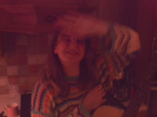
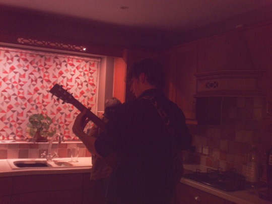
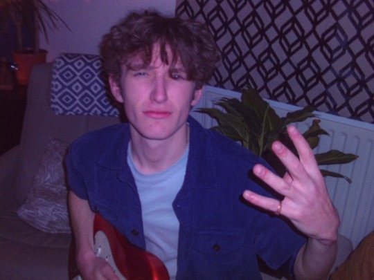
Text
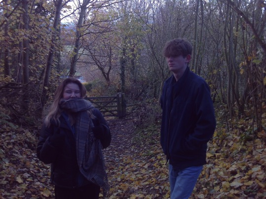
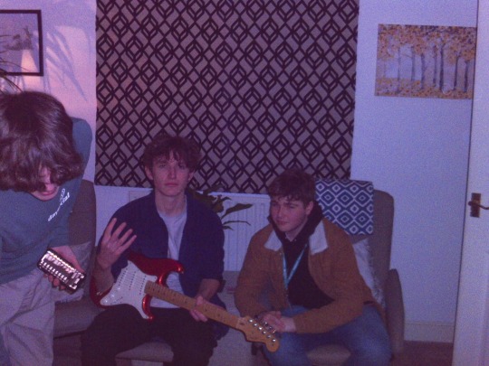
growing old & staying young.
before you read the post below, please consider listening to this playlist while you read and take in the photos below. thankyou,
to live life with no filter. something many strive to do, but many also subconsciously fail in doing. in my personal opinion, this means to live being the realest, most genuine version of you. enjoying things you wish to enjoy, doing what you feel is best for you and not letting social expectations or others opinions get in the way. like who you want to like, create what you want to create and trust your instinct.
because at the end of the day, what's the worst that can happen? someone says they don't like what you've created? ok, as long as you enjoy it, who cares. you ask someone out and they say no? who cares. the one thing you can be in life is genuine. the moment you try mask it to fit what you think others will like, to impress or satisfy them, is the moment you loose sight of your own needs.
I believe that as people get older, they tarnish their lives with more and more filters. they learn from past judgement and hide pieces of them that they believe will be looked down on. when you're sat, taking your final breaths and thinking back over your life, do you really think that the opinion of someone else is going to matter.
living life with no filter is to be a sponge. take in information and get rid of what you don't want. find beauty in day to day life. create something.
a quote from tyler, the creators song 'MASSA' reads, 'whatever brings you that immense joy, do that, that's your luxury'. find your luxury. find what makes you happy, your 'immense joy'.
as kids, we know what we do and don't like. we stick to our beliefs and learn over time what we do and don't like. when did we lose that? why? learn from your culture, embrace the community of people around you.
the adults around me in my life have always said to enjoy my youth. that school days, half terms and no bills were the best times of their life. and while they may have been some of the most enjoyable, the more you tell yourself you're past the "best times of your life", the more that'll become true. kids want to be adults for the freedom and ability to go out and do things, adults want to be kids for the lack of ability to do things and a more carefree life, room to make mistakes and learn. the only reason we've lost the ability to make mistakes and learn is ourselves. we think others will push us down, we will loose it all over one risk. this simply isn't true.
i've loved my youth, each part for different reasons. the naïve years from 0-9 ish, the tween years of learning of 10-12, the growth and change from 13-16 and now the next chapter of maturing and finding out who I truly am. house parties with no parents, drinking slightly alcoholised apple juice in a field and thinking that's being drunk, being dumb and making mistakes, uncontrollable laughter at the back of a science lesson, sharing music with your friends. I have barely delved into my youth. there is a huge difference between getting older and getting old.
getting older is natural. it is the years passing by and the candles on your cake increasing. getting old is staying put. not changing as you grow, stopping learning. many ask why people who are in their 30s and 40s seem so young and full of youth. the simple answer is that they didn't let themselves stay static. they truly lived life with no filter, and let themselves grow, learn and make mistakes no matter the number on their birthday card. that, that is the no filter life I strive to have.
below are images that relate to this eternal youth structure of my blog. thankyou for reading, I know I am by no means a poet, and that my analogies can sometimes be a little off the rails, but I hope this displays the theme I intended.
love.
-ben


2 notes
·
View notes