
Statistics
We looked inside some of the posts by belindakeyte and here's what we found interesting.
Average Info
Notes Per Post
2
Likes Per Post
1
Reblog Per Post
1
Reply Per Post
0
Time Between Posts
4 days
Number of Posts By Type
Text
8
Photo
9
Last Seen Tumblr Blogs


Fun Fact
Tumblr.com is the 103rd most visited website in the world.
Text
My Genealogy

My genealogy in photography is not linear nor do all the themes and elements of photography, or the individuals traced through these lines that have influenced my practice reside in an isolated space. It is more, cross pollination, throughout the years. Andres Gursky and Gregory Crewdson borrow heavily from the grandfather of colour, William Eggleston, but they are clearly situated in the constructed pictures genre. Todd Hido’s work is also heavily influenced by colour and narrative, yet I would place him, in relation to my practice, in the genre of ‘the human condition, home & belonging’. One influence borrows from another and in turn, feeds out or back into the beating heart that is photography. Yet, I would argue all my influences make work that is primarily about people. Regardless of their influences.
I have used the human heart for this reason and designed my genealogy around the themes, aesthetic elements and the literature that supports my photographic practice.
I have ordered my lineage by the individual’s birth, as historical Architectural, musical and art periods are. The exception to this is literature that has informed me or my predecessors work, or has been influenced by it. This is ordered by publication date.
My photographic work is concerned with loss, isolation, temporality and, most importantly, the human condition. Primarily, it is about people, yet reflects an interest in social and community consciousness and I attempt to convey this through experiences in my own life including my subconscious. I use reflection, blur and multiple exposure to evoke memory, time and emotion. Recently I began constructing my images by compositing and this marked a significant shift in my representation. What I could represent was no longer limited to what I could find in the world, budget, crew and models. I could perform, light, shoot it and build up my own milieus from my imagination.
Surrealism opened up my mind to designing my work, using perspective, light etc. and this naturally led to Andreas Gursky and Eric Johansson, who design their own photographic worlds to contribute to the discussion on social, environmental or political consciousness. Johansson is a touchstone in regards to technique, colour and emotion.
Yet my work I feel is really steeped in the human condition. Todd Hido, Gregory Crewdson and Grayson Perry have been critical in illustrating the importance of narrative and emotion and how this can be achieved by the content of the image, ambiguity, light and colour.
The genealogy helps me to situate my practice right now as well as giving me direction and a glimpse as to how and where I may continue.
0 notes
Text
Week 12 Artist Research - Alec Soth
I love it when you are recommended an artist to look at that you are not aware of.
I already like him…He lives in Minnesota (kinship, I did too, for a year), he is very close to my age, he likes to take pictures and make books and the 1st image I saw, on googling, was almost picture perfect same as one I took of my bed / habitation in Trinidad, Cuba. Except for the depth of field. Which is perfect, as a boyfriend once said to me, you fall in love with someone exactly the same as you, without the flaws.

However, he was recommended to me for his use of colour. So let’s stick to that, shall we?
This image came up with the link to an interview about regrets he had…and I LOVED it. This concerned me as my next planned career (for when I am no longer ambulatory) is ‘art / film / wine critic’. His regrets, coincidentally, are those I often have as a photographer. Thankfully, this one is not one of them.

Monika. Warsaw. 2018 is discussed in this interview with Aaron Schuman about learning from failure.
"A common mistake I make while shooting with sheet film is accidentally double-exposing the film. I did this last year while shooting in Warsaw and ended up loving the result." Look at the colour. bold complimentary saturated greens with scarlet reds. Slashes of yellow. Speckles of blue. "Sometimes imperfections make something even better - which is one of the reasons why I still enjoy shooting on film"
I actually go out of my way to multiple expose digitally. Only because it is more accurate / controlled, the losses are minimised and for these and other reasons, its more environmental. But I still love surprises.

Alec Soth, Kym, Polish Palace, Minneapolis, 2002, from the book Sleeping by the Mississippi, Courtesy the artist and MACK
Soth is considered a documentary photographer. I feel Soth uses colour differently than say, Eggleston in that he finds it in the environment, saturated, alliterated or perfectly balanced and either that is simply the shot, or he places his subject into it.


https://alecsoth.com/photography/
0 notes
Text
NGV article on Bill Henson
From my member subscription magazine. You can pay on the website to see the exhibition online but I think I'll wait to see it in a gallery space in the flesh.
Van Wyk, S, Bill Henson, May-June 2020, NGV Magazine Issue 22, NGVIve always loved Bill Henson since I saw one of his large images at the Art Gallery of South Australia. I even did an essay on this huge print for art history. Visually analysing it. Before I chose photography as my major.But he is a photographer, and it turns out this Bill Henson guy is pretty well regarded. And now, from my town, from RMIT!! no less. So his work means even more to me now. The gallery guard years ago in SA told me to look up how this image is controversial. I have got to say I was disgusted at a) the police’s investigation, b) the public reaction and because of both c) the lame arse response by Roslyn Art Gallery, pulling the exhibition at the time, I think, hours before. Ironic, that they also represent Anthony Lister. How’s that working out for them? I think if you know somebody and believe in them, you stand by them. I just can’t conceive of a sensitive, feeling artist (not even Lister) using their work to disguise an incredibly sick, sexual obsession with children. And I can't believe the gallery thought this possible. So how wonderful to have supportive gallery talk to him about love, what DOES obsess him and the power of objects…as simply objects. That power of beauty itself.‘The engine of all great art is love….a by product…or..of longing. The agent of love is beauty’. And it depends upon empathy.’ Yes it does. The words drip over me like honey….tempting me to my hone my craft. Be still, silent and consider.‘(Beauty)…can’t be loved, but you can long for it.’ Clearly, this photographer is obsessed with articulating longing, beauty, something so sad and poignant but cuts through your soul simply by a visual. A photograph. My medium.
0 notes
Text
Dream Theory
I wanted to research dream theory, particularly what I thought was a Freudiian theory, that the characters in our dreams are all parts of ourselves. It tuns out that this theory is not Freudian, yet a contemporary theory. This is hours of research and processing that information, breaking it down to what is relevant I wanted to the investigation of my dreams.
The article by Wei Zhang and Benyu Guo, Freud's Dream Interpretation: A Different Perspective Based on the Self-Organization Theory of Dreaming, 23 August 2018, Research Institute of Moral Education/School of Psychology, Nanjing Normal University, Nanjing, China
https://www.frontiersin.org/articles/10.3389/fpsyg.2018.01553/full
explains how Freud regarded dreams as a ‘royal road’ to the unconscious and therefore dream interpretation has an important role in psychoanalytic technique. His theory of dreams mainly refers to two key points: (a) what are the materials of a dream? and (b) how do these materials work together? The answers to these questions are closely related to an understanding of dream interpretation.
Freud believed that dream content is derived from, but not identical to, real life and thus “a dream is the fulfillment of a wish” He also found that “disagreeable” dreams seem more widespread than “pleasant” dreams hence his hypothesis that dreams can disguise their true purpose (i.e., indirectly fulfilling wishes). You have to remember that Freud was working largely with patients whose current mental health was considered problematic.
Freud identified two types of dreams: manifest dream and latent dream. He stated that the latent (or underlying) dream is the real dream, and the goal of dream interpretation is to reveal it. He said the latent dream can be obscured, causing a dream to appear meaningful, but the presented dream is in fact quite different from its actual implication.
The self-organisation theory of dreaming proposes that the sleeping brain is a self-organising system that can combine discontinuous and incongruous neuronal signals (i.e., different elements of dreams) into a relatively continuous narrative during sleep. It disagrees with Freuds theory, pointing out that dream symbols are too far-fetched. Therefore dreams are not riddles to be translated and the manifest dream is the actual dream.
So this doesn’t help me at all. I did find that emotion is a pivotal factor during sleep. Emotions in sleep are activated and combine to form different emotional scripts, which then serve as templates and replicate a series of images to finally construct a dream narrative. Combinations of dream elements are not random but rather guided by emotion. So dreams are helpful for constructing your emotional memory system and can therefore be the first port of call in comprehending dreams.
Characters as parts of ourselves in dreams, Journey into Dreams - Dream meanings and Interpretation,
https://journeyintodreams.com/characters-as-ourselves/
This source talked about how we ‘displace’ or transform the person or object we are really concerned about in our dreams to someone else.
There are 4 aspects of selves; physical, mental, emotional, and spiritual. When we dream about someone, often times there will be clues in the dream to tell us what part of ourselves the dream might apply to. Co-workers appearing as characters in my dreams are my mental self. They are generally helping me and friendly. People I like.Family members, friends and past relationship characters are my emotional self.Emotional Self in DreamsSome further broken down examples of this is:
Your Professional Self: A boss, coworker or employee
Your Maternal/Paternal Self: Represented by a parental figure or family member/friend who is a parent in the dream
Your Romantic Self: Significant other or lover
Yourself as a Friend: Friendly character or friend
Yourself as a Family Member: Daughter/Son, Brother/Sister, Grandparent, Cousin, Friend in a Family Role, etc.
Your Creative Self: Artist, poet, writer or muse.
Yet I still have to unpack each dream as it appears in regards to the various thoughts and emotions to further realise the inner struggles I am facing.
Yet sometimes the character in my dream is not part of myself but a release dream. In a release dream, you are often processing your own feelings and emotions. Or it may be that you are simply remembering the good things about a person, or our subconscious way of expressing our love/sorrow for a person.
When you dream of a dead person it is important to look at the context of the dream and identify whether you felt a real connection or whether you were simply exploring your own emotions and feelings.
If you have a very vivid dream where you remember fine details or even experience sensations of touch, smell, or sound it is very likely that it is a visitation dream. Most often the message and feeling in the dream is one of love and peace. During a visitation dream, our loved ones most often simply want to communicate they love you.If you dream of a deceased person who is angry or yelling at you, this is more likely a symbol for your own feelings while you process the stages of grief. It’s important to remember this if the dream is not a pleasant one.
Release and visitation dreams, Journey into Dreams - Dream meanings and Interpretation,
https://journeyintodreams.com/visitation-dreams/
0 notes
Text
Boris Mikailov - ‘Yesterday’s Sandwich’ & Red


In this series from the late 60s to early 70s, Mikaliov has overlayed two colour slides, creating “sandwiches" - beautifully composed tableaux of glamorous naked women, surreal urban landscapes and strange scenes of everyday Soviet life.
Yes, I can see why someone mentioned this artist for me to look at for my work. I have been using multiple exposure as a way of exploring memory, temporality and emotion and am drawing on this technique again in my current project about dreams and a journey.
Mikailov has carefully considered colour, composition, emotion, harmony and and discord when constructing the images for Yesterday’s Sandwich.


Red is a group of eighty-four colour photographs taken about the same time in Mikhailov’s home town of Kharkiv (present day Ukraine). The public & private, indoor & outdoor landscapes, portraits, vignettes and milieus trace the banal mundanities of everyday life in the Soviet Union under communist rule.
Shot using colour film, an unusual luxury in the Ukraine at this time, every one containing the colour red, after which the series is named and clearly the colour we associate, politically with the Soviet Union and communism, in general. The art historian Urs Stahel has observed how Mikhailov ‘attentively, seismographically even, traces every little speck of red in the Russian-Ukrainian landscape ... and visualises the saturation and thorough coloration of the social body’. The cumulative effect, according to curator Margarita Tupitsyn, is that of an entire society ‘contaminated by the visual toxicity of red’.
The series bridges the documentary and conceptual aspects of Mikhailov’s practice. Borrowing from formal representations to constructivist photomontage and journalistic photo-essays published in Soviet propaganda publications.
https://www.tate.org.uk/art/artworks/mikhailov-red-t13358
0 notes
Photo


ARTIST RESEARCH - DANIEL CROOKS ‘TIME SLICE’ & MOTION
In ‘time slice’ crooks took ‘thin slices’ from moving & still images and re-combined them to achieve a conceptually similar but perceptually different in our viewing of this ‘space / time’ continuum.
I am looking at Crooks on recommendation after last weeks review. I never set out to make work concerned with the 4th dimension, but this was brought up years ago in my undergraduate degree. I use long & multiple exposure, reflection, blur and the surreal as visual aids to achieve what i want ‘timbre’ (or tone colour….emotionally) wise.
So let’s look at ‘Time Slice’. I actually saw this at Samstag, Adelaide. The included image (Static No. 12) was the one that drew me to the exhibition and was the one I was most enamoured with. Kind of ‘The Matrix’ mixed with digital morphing with 'Plastic Man’ with the visual equivalent of trance music…..an ordinary middle aged man performing martial arts orchestrated to form a kind of a ballet.
I like it…I like how his brown trousers turn into what seems a zen buddhist gown. Perfect. its very cool and I hadn’t seen it before in the art world but I don’t think it really triggers a perceptual shift in our viewing of the space/time continuum. I think the ‘underlying rhythms and patterns of physical motion’ are revealed anytime anybody wishes to slow down and look. Or maybe it’s just the films, videos and general media I watch everyday.
Digital works that use a lot of cool effects to stretch, warp, morph, multiply & lag, Crooks himself said about the work ‘I am not sure what the use of this work is’. I think once galleries get involved sometimes the artists work might get ‘re-purposed’ towards the viewer rather simply an interest of the artist.
I loved ‘Static No. 12’ but I did not like some of the other works of commuters, shoppers, sporting crowds etc that were stretched aggressively bean stalk thin. City pedestrians pixilated to a spectacular degree. Yet it doesn’t alter my perception of space and time at all. In fact, it was super familiar to me. I was emotionally touched on some level, recognising my hometown even in this ‘altered perception’ both by the audio (slowed down train announcements) and the visuals. When you have lived in Adelaide for about 3 years by now, it’s nice for your reality to be shifted to the city you know best in the entire world….by a STA voice over or familiar sites.
In ‘Parabolic’, Crooks explores the cyclical nature of time ‘rotating it on its axis’ by way of panorama’s that swirl around and warp in slow motion. I feel this work was much more successful in exploring time through motion. And just simply being entertaining and interesting rather than changing my perception of something. And that is ok. Art for arts sake. Why do galleries & art critic’s have to ruin it??? Why cant they just say...here’s our new exhibition, its AWESOME, come see it & see for yourself? Like the Buddha did about the new fangled thing he kind of made / invented..Buddhism?
0 notes
Text
Artist Research - Tracey Emin
Another artist suggested to me at Review B to research was Tracey Emin. I also couldn’t see the relevance of Emin’s work to my projecct, except for that she talks about her own life, which I had made a point of NOT doing in this presentation. Or maybe it was the bed, as iconography. Which, actually is from an earlier project where we had to appropriate another artists work and I appropriated Emin’s ‘My Bed’, built it and made it my own…and this iconography was the first thing that made it into this body of work.
Again, any excuse to revisit the work of one of my favourite artists. A contemporary of mine. In revisiting an artists work again and again, you sometimes find something new and although I don’t see the relevance to this project, I may so in the future. And that is the point of an online journal / dossier.
Tracey Emin is a British artist known for her autobiographical & confessional artworks (painting, drawing, photography, video, sculpture, and neon text). Emin’s seminal works Everyone I Have Ever Slept With 1963–1995 (1995) and My Bed (1998) contributed to feminist discourse with the raw, confessional nature of her art. She cites Edvard Munch and Egon Schiele as early inspirations for her expressive style of self-representation, which I can see. For this reason, as we all know her famous tent and bed, I am going to look at some drawings. We see a more tender and childlike playful side of Emin, a sweetness in these works.
http://www.artnet.com/artists/tracey-emin/
Well, my 1st pass at posting the post hidden from public but I could appeal. I did, thinking they would read my text and see it was clearly an artist dossier / journal. Tumblr ain’t that smart. A second later I got another email saying the same thing and my post was now deleted. I feel for painters or drawers in this class. Maybe Tumblr is not the site for them. Well, there is always the links:
Emin, T, I Loved My Innocence, 2019, (image of) Lithograph on Somerset Velvet Warm White 400gsm paper, https://www.artnet.com/auctions/artists/tracey-emin/i-loved-my-innocence

Emin, T, My Heart Is Always With you, 2015, Neon Sculpture, http://www.artnet.com/artists/tracey-emin/my-heart-is-always-with-you-a-kbe3SlJCjyHM3XbR0apgnw2

Emin, T, iPad Sketches, 2013, http://www.artnet.com/artists/tracey-emin/ipad-sketches-a-7TkgAylwS47WjlAAoTuSPw2 Sorry for the small image, yet I always honour when Galleries are protecting artist’s copyright (and their own money). That’s the point of links.
0 notes
Text
Week 10 Research.
I couldn’t really see the relevance of looking at John Baldessari for his use of shape and colour as a way to direct viewer to my work (any more so than any other artist), but any excuse to revisit his work. Baldessari re-evaluated traditional notions of what constitutes art and has an endearing sense of humour.
I saw this at ‘The Broad’ LA

Baldessari, J, Your Name in Lights, 8 – 30 January, 2011, Australian Museum façade, Sydney. http://kaldorartprojects.org.au/projects/project-23-john-baldessari?gclid=Cj0KCQjw-_j1BRDkARIsAJcfmTEOBkBtXIcySvgGKqhtEXLx3Svwli_bA8NPeiUNZAR_KpDKe3b0IxoaAt1QEALw_wcB
The Broad says about this work - John Baldessari never touched this painting. He did not paint it. He did not write the text. “There is a certain kind of work one could do that didn’t require a studio,” Baldessari said, “It’s work that is done in one’s head. The artists could be the facilitator of the work; executing it was another matter.” This concept — that an artist could present an idea rather than a material object from their own hand — was a way for Baldessari to take apart the notion of what art could be. In 1966 art meant painting, sculpture, or drawing, and with wry humor, Baldessari challenges this expectation. The viewer receives a painting in Tips for Artists Who Want to Sell, but the painting is completed by sign painters. The viewer is presented with a painting’s content, but the content is text taken from an art trade magazine dictating what content should be.
This led me to the 1st work in my hometown that turned me onto his work. Way before I was an artist. Kaldor’s (Kaldor Public Art Project) Project 23, Your Name in Lights. Presented in partnership with the 2011 Sydney Festival.
Like earlier works, the new work he created for the 23rd Kaldor Public Art Project, Your Name in Lights, reflects the changing cult of celebrity in modern society, drawing on ideas of fame in the modern world and the conflation of the roles of celebrity and artist.
Using imagery taken from historic symbols of celebrity, such as Broadway neon theatre displays and Hollywood film / lights, Baldessari gives any participant a glittering moment of fame. A snipped up and fastened version of Andy Warhol’s prediction that in the future everyone will have their 15 minutes, Your Name in Lights lasts for just 15 seconds.
It’s colourful, catchy and certainly directs, even intoxicates he viewer…but not by its visual means. By our human nature to seek out immortality. Fame & celebrity is contemporary society’s answer to this. And we are drawn to it like a moth to a flame.


Baldessari, J, Your Name in Lights, 8 – 30 January, 2011, Australian Museum façade, Sydney, http://kaldorartprojects.org.au/projects/project-23-john-baldessari?gclid=Cj0KCQjw-_j1BRDkARIsAJcfmTEOBkBtXIcySvgGKqhtEXLx3Svwli_bA8NPeiUNZAR_KpDKe3b0IxoaAt1QEALw_wcB
So that brings me to Kaldor Public Art projects.
John Kaldor is a philanthropist that established this arts organisation from a vision he had had in the 1960’s. Kaldor Public Art Projects became a pioneering organisation, dedicated to taking art outside museum walls and transforming public spaces with innovative contemporary projects.
Over the years the projects have changed the way the Australian public sees and experiences the art of today.
They are now supported by all three levels of government, as well as a group of corporate, philanthropic and private supporters.
Making Art Public brings together 34 ephemeral (Kaldor) projects, creatively re-imagined and presented together for the first time, always free to the public.
A celebration of 50 years of Kaldor Public Art Projects at the Art Gallery of New South Wales (7 September 2019 – 16 February 2020) it revisited every project since inception including Bill Viola and Thomas Demand.
https://50years.kaldorartprojects.org.au/?gclid=Cj0KCQjwnv71BRCOARIsAIkxW9H63QKTesmsSh1w6wEM2jMMPek2FX76y3CfiEY4DCno2VHZcDdRKdsaArGLEALw_wcB
Viola’s video works utilise sophisticated media technologies to explore the spiritual and perceptual side of human experience. Focusing on universal human themes of birth, death and the unfolding of consciousness, they have roots in both Eastern and Western art, as well as the spiritual traditions of Zen Buddhism, Islamic Sufism and Christian mysticism.


The images don’t do it justice, these works demand your attention for the entire 10-15 minutes and absorb you into their world. I’ve never seen any video art work quite like it. Highly charged emotionally & visually.
Thomas Demand is known for his life-size recreations of environments made entirely from paper and card that he photographs and then destroys. Maybe it’s architect in me, but I love his work, simply as photographs. It wasn’t until I researched him for my undergraduate Vis Arts that I realised the photograph of the aeroplane I was looking at was a cardboard model.


For the 25th Kaldor Public Art Project he presented a new series of images, The Dailies, within a space inside Harry Seidlers fantastic 1970’s space age MLC Centre in Martin Place. The work occupied an entire hotel floor on level 4. His installation, displayed throughout the bedrooms that extend out from a circular corridor, had a disorientating effect.
https://50years.kaldorartprojects.org.au/program/making-art-public
Kaldor’s latest project is ‘Do it (Australia)’. Envisaged in this time of global lockdown, the project invites audiences to follow an artist’s instructions, enter their world and realise an artwork of their own.
This project is the latest incarnation of do it, the longest-running and most far-reaching artist-led project in the world. Initiated by Hans Ulrich Obrist in 1993, the project asks 16 artists to create simple instructions that generate an artwork, whether an object, a performance, an intervention, or something else entirely.
The instructions were not yet up for the artists I was interested in, Tracey Moffat & Glenn Murcutt (I wouldn’t actually call him an artist…we really don’t want to claim someone that is so heavily entrenched in an ‘old school’ patriarchal architecture system), I chose from the 4 or 5 artists that had already included their instructions. The online exhibition only started 4 days ago (May 13th) and has no closing date, as yet.
Rafael Bonachela is a choreographer working across art forms, including contemporary dance, art installations, film and fashion:
Find yourself alone in a place. Play some music (or not). Stand, sit or lie down. Find a position you feel comfortable in. Be still for a while. Imagine you are surrounded by blinding light. It feels heavy. You want to break through. Use as many parts of your body (or not) to physically push the light away from you. Take your time. Move from a gentle state, to a state of frenzy. Explore different possibilities with your body. There is no right or wrong. When you feel you have broken through the light, find your way back to stillness. A state of weightlessness (or not).
Options
Explore this task anywhere by yourself for yourself.
Place your smartphone camera anywhere to record your experience using the slo-mo option.
Share a section of the film on social media, send it to a friend, (or not).
http://doit.kaldorartprojects.org.au/
0 notes
Photo


The Vanity of Small Differences is a series of six tapestries by Grayson Perry. The title ‘The vanity of small differences' is a Freudian term which means that we dislike no one quite so much as our nearest neighbour.
I am looking at this work for his visual storytelling. The tapestries tell the storey inspired by William Hogarth's A Rake's Progress in which eight paintings tell the story of Tom Rakewell, a young man who inherits a fortune from his miserly father, spends it all on fashionable pursuits and gambling, marries for money, gambles away a second fortune, goes to debtors' prison and dies in a madhouse.
The Vanity of Small Differences tells the story of the rise and demise of Tim Rakewell and is composed of characters, incidents and objects Perry encountered on journeys through Sunderland, Tunbridge Wells and The Cotswolds whilst filming a TV series based on taste.
it is the progression I am looking at and the imagery he uses within that almost religious tableau of iconography. A snapshot of time along the rise and fall of a human life. I’m looking for the ‘when’, ‘why’, ‘what’ & ‘how’.
0 notes
Photo


‘Phantomwise’(B&W image 1 above), references a poem of Lewis Carrol, as does a good chunk of Polixeni Papapetrou’s work.
Papapetrou photographs depicts (mostly her own) child as a ‘portal leading into the dark labyrinth’. A labyrinth of infinite possibilities of alien “selves”. This is what interests me about her work and the reason why I am researching her. A little like I have noticed about Erik Johanssons performative photography and also relevant to my project, ‘Phantomwise’ uses photography to depict the ‘ghostly deployment of the self’ and rate identity itself the photographic condition that is above all else.
In ‘Dream child’ Papapetrou again explores the theme of the ‘interpretative possibilities made by the viewer of the images, blurring the boundary of reality and fantasy. Again using ‘the imaginative theatre of childhood’.
‘Haunted Country’ references photographs made by Charles Lutwidge Dodgson (Lewis Carrol) using his favourite models; Alexandra Kitchin, Alice Liddell, Julia Arnold, Irene MacDonald, yet set in iconic Victorian (as in, our State) settings. Dodgson’s Victorian photographs ‘distinguished the role of the child from the rational, active adult world’. It is this otherworldliness, or ambiguity that interests Papapetrou, and Papapetrou’s contemporary depictions of this slightly surreal world of imagination and play that is relevant to at least my 1st image of my project.
1 note
·
View note
Photo
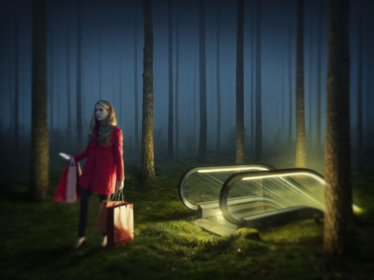
As I am trying to create the surreal landscapes from my dreams for my project, and compositing generally, I am looking at Erik Johansson. His work struck me anyway last week when I researched the surreal, generally. Apart from being seemless optical illusions, they are generally saying something (which is often in the subtitle). About the environment, history, the human condition or humankind generally. And this was my fear with the surreal, it can often come off cheesy and have no purpose in the art world. Johansson’s isn’t, and does. The illusory, reflections, blur multiple & long exposure have been a large part of my practice, with themes of isolation, loss, impermanence and human condition, do Johansson’s work also helps me situate, or contextualise my practice. Erik says he just couldn’t make the work he wants to make if not for this process. It is just easier for him to create his own landscapes digitally. His processes are often documented and included on his website. I also watched a TED talk by him about his process, generally. I feel he is actually very generous about his process and learned a few key things about making plausible ‘impossible’ images. His work is highly planned, like Gursky, nothing is accidental here. It is kind of the opposite of street photography, documentary or even landscape photography. Sketches are an important part of his process. The creation of most images ends with the pressing of the trigger (well, this is a bit of simplification, but I guess he means you can’t alter the content of the image after this), but his images start with pressing of the trigger.
0 notes
Photo


I looked into ‘the surreal’ in regards to visual images, but primarily photography. Of course you can paint fantasy. But with photography, mostly this is concentrated in photoshop composited. Then I realised I had researched the surreal before when doing film photography. Although I am experimenting with multi-exposing today, a technique I have used a lot, I realise I still have to master a lot of compositing techniques. I looked at these artists for the ‘aesthetics’ of surreal photography.
My fears with 'the surreal' is that these images can look very 'commercial', something you would find on pinterest or cheap 'art' prints. Anyway, here are the surreal images I found interesting.
The artists are:
Lara ZankoulI's 'Frenemies'. I had planned to use water. I really like this but I can see a tiny edge that makes it unbelievable on the (camera) right models (camera) left arm.
Road Swimmer (artist unknown). I really like this as an expression of emotion
And Philipe Halsam's famous Dali Atomicus. Wow, this is ONE image. You can see the assistant holding the chair and the wires on the easel / painting, but the water and cats are real!! clearly somebody is throwing the felines from the (camera) right but that water..it is an amazing stream! Halsman employed a technique he called “jumpology.” To capture the true spirit of his subjects. “When you ask a person to jump, his attention is mostly directed toward the act of jumping and the mask falls so that the real person appears,” he once explained. (https://www.artsy.net/article/artsy-editorial-story-surreal-photograph-salvador-dali-three-flying-cats)
Iman Tehranian
Magritte-ish (artist unknown).
Nicolas Bruno. Always loved fire. It's an idea to think about.
Tommy Ingberg 'Crow'.
Erik Johansson.
0 notes
Photo


I started looking at Montage artists, as this might be an optional way to populate myself into an image, which was formerly compositing. Yet mostly I found this technique aesthetically unpleasing to me. I've always liked David Hockney, but his work serves a very different purpose. One exception was Kenneth Josephson. Playful and imaginative.
I also liked these ideas below Kenneth’s first two. Why I find these interesting are they are film (maybe with the exception of the last), so clearly montage, but have the surreal aesthetic I find more visually appealing. Yet I realise in this climate of shooting and editing I am still limited to photoshop compositing.
0 notes
Photo


I've always bought postcards as souvenirs rather than books or...souvenirs. Not only cheap and portable, they are memories of my travels, snapshots of that time, generally support art museums but also I just picked a lot of these highly famous photographs way before I was an architect even, let alone a photographer. In undergrad photography I was like 'oh, Ive got that (famous) photo (and photographer) in my kitchen' when we were shown stuff.
ok, I have a penchant for crosses too. My Costa Rican one fell down the other day and I haven't had time to re-install it on my cooktop splashback. These faded, fat covered Wim Wenders photos from when he was making 'Paris, Texas', 3 states and 8 homes later, still make me happy.
0 notes
Photo


Rinko Kawauchi also came up in the reviews today. When I was doing an artist residency in Tokyo, 2018 part of my plan was research and visiting 2 photography museums, both of which had been closed on my only other visit to Japan as a photographer. The Shoji Ueda museum of photography in Tottori and The Tokyo Photographic art museum in Ebisu. It was here I came across Rinko. An exhibition and a book. A photograph of a stairway that seems to lead to heaven. The light being the focus, not the children, whose heads and bodies are mostly cut off. The cover of the book. It was in Kanji, so I couldn't read the text or remember the artist's name once I got home, but I showed my residency co-ordinator and she said this artist was quite famous. So today I am remembering my time living in Tokyo as a photographer. It was just so wonderful. Productive. I worked so hard. Every day was a shoot, museums or editing in my studio. I produced 7 series of work, 2 conceived there. One of this series was a 50 page book, inspired by Rinko's 'Utatane' called 'Pretty Vacant'. I love how the book is ordered, juxtaposed colours, light or patterns. I'd never done stills before, but making my own book was the calmest and most beautiful experience I'd ever had in making my work so far.
Ive included my copy with a very sun bleached copy of Yoko Ono's 'Grapefruit' on top. These things in my little warehouse studio apartment make me happy and inspire me as I can always revisit them by just picking them up. I will never put my books or art away to protect it from the harsh eastern sun streaming into the entire apartment through the warehouse windows. I've actually taken the curtains up. Because I love both the sun & art in my daily life. Life is for living.
1 note
·
View note
Photo


Jeff Wall came up in our project reviews. I think the reason I love Wall is the retro feel, the nostalgia of ‘A ventriloquist at a birthday party in October 1947′, or ‘Mother-of-pearl’. The visual representation of a physical or emotional situation such as ‘destroyed room’ or ‘insomnia’. Ive always had this thing about ‘the home’, family etc and I guess he speaks to this. Yet I also love his lightbox series’, ‘morning cleaner’ in Mies Van Der Rohe’s Barcelona pavillion. I think even if you can’t voice why a particular artist is pertinent to your current work, an influence is an influence. If you have looked at their work over the years and like them, they are an influence.
0 notes
Text
Statement
The artists’ works in my dossier reflect work that is pertinent to my current photographic project and, indeed, my practice generally.
My work is concerned with loss, loneliness, isolation and, most importantly, the human condition. Primarily, it is about people. It is fundamentally intended have a positive impact on humanity and the world, in general and reflects an interest in people's lives, social, political and community consciousness, happiness, emotion and beauty.
My current project was initially based on dreams I’d had that all were about the same thing. Getting home. A long, interrupted journey of getting home. Which I never did, by the way, in the dreams. Clearly, the idea of ‘home’ was important to me. But also storey telling. How do you weave a storey by way of photographic stills? For this reason, I looked at mainly photographers.
I recently heard something to the effect of ‘a photographer can photograph a cow realistically but can’t photograph, say, a fairy, whereas a painter can paint a fairy.’ So, due to the ‘truthful’ representational nature of photography, I looked at artists that physically represented the theme or idea. Rafaël Rozendaal being the exception, as I was investigating ways of presenting my work online. Pertinent in this climate of self-isolation as well as generally, for a contemporary art practice.
The discussion I want to participate in is, what is this searching for home? Is it a symptom of the fractured society we live in and how does it contribute to this ‘epidemic’ of loneliness? And with this in mind, what is living in this time like?
My project developed along the way as the Covid-19 virus gripped the world and suddenly I was in my own home, self-isolating. Alone. Pretty much one room. The dossier I was creating helped me to find beauty in the painful, sad and lonely.
I found the limitations of these 4 walls were useful as a defining constraint and able to be celebrated. I decided to have fun with this project. I think this really aided the project. It is more engaging for the viewer. Every participant in my project images are true representations of me, yet loss and loneliness (and self-isolation) doesn’t have to be dark. With an engaging aesthetic it can be quite cathartic as well as fun. The dossier guided me in this direction. I think you can see in all the artist’s work a real love of their craft and the making of their work. It is not laborious. Sure, Crewdson’s images are epic in scale and budget, but this does not mean he is not enjoying himself. I’d say that is the thing, besides the themes, that underpins all these artist work and why I chose them.
0 notes