Text
Voice over for video tour
Our Design brief was to create a new biological Sciences Building for the University of Auckland. This building is to replace the Conference centre building where the old Architecture library is situated.
On our site visit of the existing building, there were many issues that were raised.
These included: An excessive amount of restricted access, Difficulty to navigate the building, Excessive use of swipe cards, There was only one communal space which everyone could use No spaces were adaptable spaces Not enough storage Dark, windy corridors No opportunities to encourage interaction
With these things in mind, I came up with 3 user groups who would use the building, The Under Graduates, the postgraduates and then communal spaces which everyone would use. It was this decision which inspired the 3 towers that make up the building.
People are much more engaged in their learning when they are able to interact rather than having strick linear classrooms. The conference centre has many small rooms in it so a decision was made to remove all of the interiors. Only the exterior walls and the iconic central staircase remain as a nod to the history that once enriched the site. Here you can see the exterior wall and roofs extruding through this new structure as well as the iconic glass room which has been left to remain.
Here you can see the interior walls and access to the underground storage that currently exists within the building. The walls, columns and even the existing windows have been left.
A sense of community and communication has been very important within this design. Large open spaces and study nooks are scattered throughout the building. On the southern side, away from places of concentration, a two-story cafe opens up onto the architecture courtyard encouraging not only people of the faculty to interact, but bring the Architecture students back into the building that they once lost. And nobody needs coffee more than the architecture students.
When you enter off Symmonds street the first floor is completely open. To your right there is the administration desk and the cafe. Straight ahead is a vast open space with moveable furniture ables to host functions if needed. To our left, there is a small lounge and study area which acts as a waiting room lecture theatre where large amounts of students can gather waiting for their lecture to begin.
This lecture theatre is the existing theatre which has been retrofitted. Currently, this theatre has an issue with a slight echo a the rear. As a result, the retrofit has been acoustically designed to disperse the sound waves. 515a large skylight on one edge of the room has replaced it allowing daylight in without creating a distraction for the students.
The ground floor houses a large IT LAB where the old architecture library used to be which is open to all the building users.
A strong emphasis has been made on adaptable spaces in this building. Rather than having closed-off rooms, private spaces have been created with moveable tables and chairs creating flexible spaces where tutorial, meetings, workshops or study groups can be held. These spaces are visually and acoustically private while still being open to communal spaces. These spaces come in an array of sizes and house different furniture depending on what the user may require.
Open classrooms like are a modern way of learning allowing groups to interact together and encouraging collaboration.
In saying this, I am also aware that some spaces specifically require privacy. As a response, to this, 3 large rooms have been designed for such meetings
In the existing building, there is a square tutorial room with displays all around the outside which was considered to be successful. I have been inspired by that room to create this large tutorial space which can be adapted for whatever function is required.
This here is one of the Undergraduate labs. This lab has 32 stations allowing work for classes up to 64 people.
Every lab features: Emergency showers, Autoclaves, Refrigeration, Storage, Sinks, Natural daylight, Whiteboard and projectors Access to gas, Hazardous material storage, Ventilation Fume hoods
Each lab has a storage and teacher prep room. Service elevators going from the underground storage facility open up directly into these spaces reducing the distance that these materials need to be transported and stopping them from being transmitted through to the rest of the building.
All of the benches are set at 800mm in height allowing for both standing and sitting work. The undergrad labs rand from 32 stations to 26 stations depending on the size necessary for the class.
Every lab has windows looking from the lab to the communal spaces as well as the storage rooms as a safety precaution
This here is a Postgraduate or a research lab. These labs are different from the undergrad labs as how they will be used is different. Postgraduates may spend all day in the lab as opposed to undergrads who will only spend the duration of their lecture. As a result, a postgraduate will produce a lot more work so In these labs there is a larger bench to storage ratio. In my research, I interviewed some postgraduates and they said that they hated hot the labs were like small boxes that they spend so much time in.. My response to this was to open up the labs with three glass walls. These labs are south-facing, however, to stop overheating.
The features in these labs are the same as the undergraduate labs including the storage room and service elevator.
Outside every post-grad labs, there are computers and spaces for the students to create as their own office to reflect on the experiments they’ve just conducted.
Keeping with the idea of modern work environments, an open plan hot-desking environment has been designed for staff to use. This floor is separate to rest of the building deterring people from accidentally wondering having gotten lost.
Above this is the Staffroom. This again is not restricted access, but on its own floor deterring students from wondering in. This staff room open up onto the balcony for events that staff may need the extra space for.
On the top floor, there are the south-facing animal labs and the North Facing greenhouses which are accessible for everyone. These labs have huge amounts of storage and their own service elevators going straight down to the underground basement.
Through extensive research, careful and thought out design, I have created a modern day learning environment. This building creates many different types of learning spaces catering for different learning techniques. This building holds peoples interaction and collaboration at the core of its values. This sustainable way of design allows for the university to grow into the space now available creating a positive environment. This building has done all of this, with no hallways at all throughout.
0 notes
Text
Discussion board 6
Discussion board 6: The possibilities of contmporary design 06/06/2020
“As technology becomes more sophisticated, more of the human input is delegated to the tool, first, typically, the power source and then gradually the controls, until we arrive at the fully automated black-box machine from which – at the touch of a button – ‘finished products’ magically appear […]
As less and less embodied knowledge is produced during both the educational and professional experience of the practising architect, it is no surprise that [..] Venturi’s ‘decorated shed’ has become one of the dominant architectural paradigms – a supposedly functional but anonymous box wrapped in a slick and seamless signifying skin […]
Given that so much of our productive life is spent in front of a computer screen, it may be that a newly re-embodied digital interface may yet allow us to rediscover it.”
- Hale, Jonathan. 2012. “Architecture, technology and the body: from the prehuman to the posthuman.” In The SAGE handbook of architectural theory. Eds. Crysler, C. Greig, Stephen Cairns, and Hilde Heynen, 513-526. Los Angeles: SAGE
Q) Reflecting on your own design challenges with this project, is it possible to create an educational facility that is not “a supposedly functional but anonymous box wrapped in a slick and seamless signifying skin”?
Through this design paper I was adamant that I was not going to create a building which was a bow with fancy wrapping paper in it. A building needs to have more life to it. It needs to not only impact the environment inside of it but also have a positive environment outside of it also.
My building is very different to other buildings because of its large sweeping curves creating complex geometries. I needed to be careful when creating forms like these in a practical sense. By having one curved wall it eliminated things that I could put on the wall in the room which I then had come up with a solution for.
Successful elements of my design is that I clearly thought about who was going to use the space and how they would use it. From this I was able to create more intricate spaces as opposed to designing a rectangle building and just filling it with whatever necessary.
It is because of this design process that using a computer has been essential to creating my design. Creating boxes is an almost old fashion way of designing in that a lot of technology is not necessarily relevant.
I believe that it is absolutely possible to create an educational facility with complex geometries that performs higher than the average sleek box. Creating a box with a sleek facade is the easy and cheap way to create floor area.
0 notes
Text
Discussion board 5
Discussion board 5: Willis (Parametricism, Tectonism, and Biomimicry...) 10/05/2020
tectonism” was coined by Patrik Schumacher: “the high priest of parametricism (Links to an external site.), a style or philosophy of architecture whose “rationality” and “obvious superiority” means, he believes, that it should and will supplant all alternatives. Among its adherents, parametricism inspires devotion; others view it with mistrust, not to say fear and loathing.” (ref (Links to an external site.))Schumacher worked with Zaha Hadid (Links to an external site.) in her London office from 1988 until her death, and rose to become her right-hand man. The projects that appeared under her name, especially in the later years, were strongly influenced by his ideas and are the main evidence of what parametric architecture might look like.
Consider the masterplan design for Istanbul: https://www.zaha-hadid.com/masterplans/kartal-pendik-masterplan/
Q1) What are the virtues and limitations of parametricism in architectural design?
Q2) Are there building types or locations where parametric design may be inappropriate? why?
One idea that we haven’t really looked at yet - despite its obvious relationship to the design brief - is biomimicry.
(Links to an external site.)
Q3) Biomimetic design is now possible thinks to advances in parametric technologies and, as such, has many of these same virtues and limitations. Would you employ biomimetic design into your new SBS building, and why?
Q1) Parametric design is a new modern day stylistic approach drawing inspiration from finding new forms within the building structure. This has bee as a result of technology advancing. CAD programmes allow us to create forms that previously were not achievable through hand drawings. IT is because of that that this style has become more popular across the world. Architects Are able to push the laws of physics and easily manipulate a form .
These complex shapes may have been foreign in the built environment back when they first started appearing. However, they are not completely alien forms. Nature has curves, and irregular angles throughout whether it’s a cave, an ant farm or a beehive. These complex forms have adapted over time to perform better in the climate conditions. Nature has created these forms to maximise the performance in aiding life. With technology so advanced, We are now able to create structures that will also help aid human life while taking advantage of the climate in which it is situated.
Q2) While these complex curves may be sculptural in some cases, we can also manipulate them to achieve the best performance out of our buildings. Buildings located in severe climates can use parametric design to create spaces mimicking nature. A very simple case of this is an Igloo. Although this design has been used for thousands of years. You don’t often find forms like this outside of the climate region. To create a dome building, huge amounts of engineering is required with the air of CAD design.This style is also evident in the master plan, designing for the conditions and using technology to help create that.
Q3) In some sense I have incorporated perametresisium into my design. There are many large curved walls that may not be able to be created to the same size without modern technology. I could have potentially gone into more depth with the curved walls and made the entirety of the building curved.. However these forms have their limitations. The spaces inside can make the functionally difficult to use. Careful consideration needs to be made during these design phases to ensure that these sculptural buildings not only perform well in their environment, but they also create a high performing environment.
0 notes
Photo


Engineers second presentation.
I have drawn up some details and showed the structure layout so that I could get some advice from engineers.
0 notes
Photo

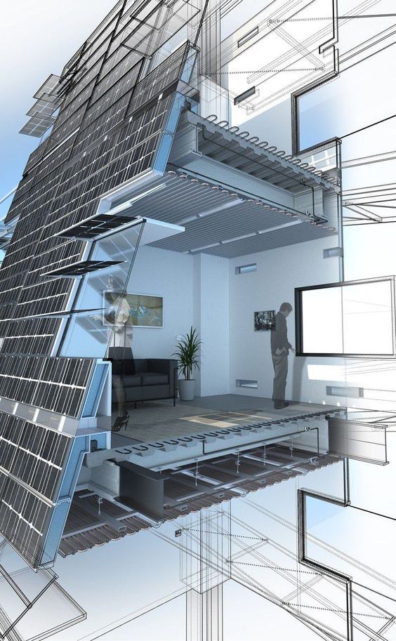

SECTION REVIEWS
IMAGE 1
I chose this axo section because I thought it was a good president on how we could do our Section of the entire building. This is a section of Auckland's International Convention Centre that was designed by Moller Architects.
Elements that I thought were successful:
- The background gave some context however it wasn’t over empowering so that you got distracted by it - The section cut was through the main features of the building giving us the most information possible - The colour intensity allowed us to clearly see into the depth of spaces and give us an understanding of lighting - We are able to read the structure where it is important and understand how it may fit together - It is very legible/ readable
Elements that I thought were unsuccessful:
- It is difficult to understand where the ground line is- what parts are underground and what are not? - A slightly lower camera angle may have allowed us to see more into the spaces and get more of an understanding - Key aspects of the building such as the entranceway have been lost- is this the section cut or was it intentionally not included?
IMAGE 2
I chose this section because I thought that it would be a good president on how we may want to do a call out detail. We are able to get an understanding of not only the space and the scale, but also how that space is put together and how it interacts with the outside.
Elements that I thought were successful:
- The amount of detail that is in this drawing - The structure is very clear and easy to understand - The person in the drawing helps to give scale and helps us to understand the space - It shows the materials very well helping us to understand the space
Elements that I found unsuccessful:
- It is hard to understand what building this section may be from - There is no surrounding context to help us understand anything about the surrounding building - It is a very small room that has been sectioned, what if it was larger?
IMAGE 3
I did not choose this section. This one was uploaded to the shared google drive but I thought that it was important to look at and talk about.
Elements that I thought were successful:
- The level of detail is very good - The render is incredibly life like - It seems to be taken at eye level making you feel like you are in the building
Elements that I thought were unsuccessful:
- There are a lot of things that are going in this image that it is too busy and very confusing, it’s like a sensory overload - You don’t get a understanding of what the building looks like or even what the building is because it is cropped so tightly - It is very informative, however it is providing the wrong information- there is no information on the building itself.
0 notes
Photo


These are some buildings that I found which had elements that I liked and wanted to inspire my design
0 notes
Text
Inspiration Board
This is the link to my Pinterest board that I have been saving images to that I have found inspirationl.
https://pin.it/4Eptfmo
https://www.pinterest.nz/briannabg0721/design-7/
0 notes
Photo
ENGINEERS FEEDBACK AND PRECEDENT STUDY
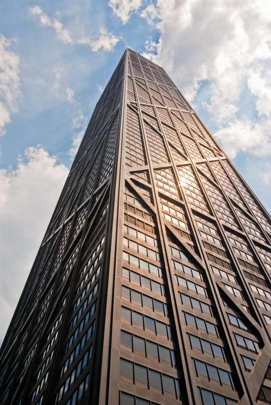
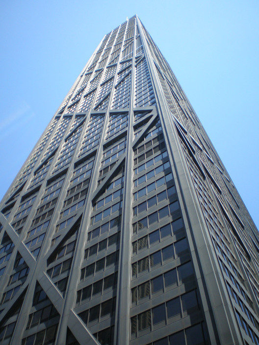
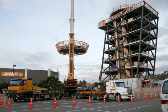
When I was looking at presidents for the building’s structure to talk about with the engineer’s, I was looking at the John Hancock Centre (Images 1+2) and it’s exo-skeleton structural system. The idea was that I wanted my structure to take up less room so that it does not interrupt with the floor area. I was also interested in the interesting forms that this created on the exterior of the building.
When talking to the engineers, they informed me that this type of structural system is called an External diagrid. The advantage to using this on my building is that in terms of stability, it is very successful. Technically you only need three systems and so traditionally that would only mean that 3 sides need the bracing. This allows my large sweeping glass windows to remain with no bracing running across the front.
In order to carry the gravity load of the building. Each of my towers would need an anchoring point built upwards which would allow the rest of the building to be supported off of that. It was recommended that these anchoring points go from the bottom story right up to the top floor. These anchors may reduce in size as they go up in height. These anchoring points may be columns, or they can be doubled as circulation spaces and house the emergency staircases and/ or elevators.
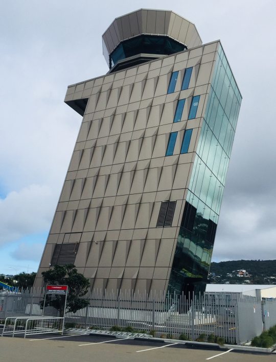
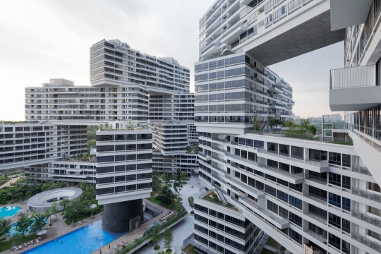
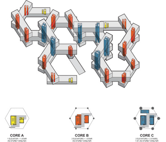
The engineers gave me two presidents to look at, the Wellington airport control tower (Images 3+4) and The Interlace in Singapore (Images 5+6). The structure in the Interlace building uses these ideas of anchoring the building down through central cores. The wellington control tower, although it looks to be on a lean, the structure is very straight and upright. These are two types of structures that I will be using in my building so I found these presidents very helpful.
Overall I found the feedback very helpful. They cleared up questions that I had and really clarified what it was I needed to do to achieve the building.
_______________________________________________________________________
THE INTERLACE Architects: OMA, RSP Architects Planners and Engineers Completed: 2013 Location: Singapore
The Interlace is an apartment building complex in SIngapore. The building is similar to the game jenga with 6 storey blocks stacked on top of one another without much regularity. The idea behind this building is to create something that was different to the high rise buildings that spread across Singapore. The building's aim was to be a building that facilitates social interaction and community bonding while also being relatively affordable” (Moore, 2015). Each unit is passively designed to maximise the performance of the sun, wind and micro climate conditions to use to the building’s advantage.
This building has many cantilevering and suspended elements making the engineering and structural systems very complex compared to your average sky rise building. Each ‘block’ is 70.5 x 22 x 16.5 metres and contains 30 plus homes.(Moore, 2015)
Something that I found interesting in this design was the gaps between the blocks. The Spaces between these blocks “become portals which frame views of more of The Interlace, and of distant views beyond.”(Moore, 2015). This is something That I have tried to achieve in my building. Between the 3 towers there are spaces that you can see through directly to the other side. The spaces in the biology building may not be as large as the space between the blocks in the Interlance, however having them there accentuates the idea of having three towers.
The floor plan of the building is designed around a hexagonal grid. Whenever the ends of the blocks intersect with one another, there are shared cores which anchor the blocks at each intersection. It is this structural system that I am using in my building. By using shared cores, I am able to achieve the stacking and cantilevering effect of the different levels I’ve designed.
WELLINGTON AIRWAYS CONTROL TOWER Architects: Studio Pacific Architects Location: Lyall Bay, Wellington Completed: 2018
The 9 storey building’s unique design is made to look as if it is on a lean from Wellington’s notorious prevailing winds. Because of the building’s high level of importance, It 100% meets the NZ building code making it one of the country’s safest buildings. There are 13 base isolators in the foundations to withstand Wellington’s earthquakes. These “isolators allowed more freedom for more dramatic architectural forms” (Sullivan, McKenzie & Philpott, 2017). Each floor is offset 0.725m towards North from the floor below. This creates a lean of 12.5 degrees.
Because of the building's level of importance, it needed to be designed to withstand a tsunami. The building has sheer concrete filled steel tubes on the ground floor level. Due to the significant vertical irregularity of the structure
The selected structural system is a leaning base-isolated concentric steel braced frame structure. The building’s gravity load pathway is down through the centre of the building and creates a central core like system, much like the one I am using in my building. Resisting frames are around the outside of the building, with two bays of concentric braced steel frame system bracing on each side. (Sullivan, McKenzie & Philpott, 2017).
The main reason that I am using this building as a president is because of how the structure is designed. Although the building is slanted. The majority of the structure is vertical. Part of the undergrad building has an element to it that is on a steep lean. This part of the building will be designed the same way as this control tower along with the concentric bracing.
Reference according to APA 6th Edition:
Moore, R. (2015). The Interlace in Singapore by OMA/Ole Scheeren. Retrieved 19 May 2020, from https://www.architectural-review.com/today/the-interlace-in-singapore-by-oma/ole-scheeren/8679680.article
Sullivan, B., McKenzie, H., & Philpott, A. (2017). Wellington Airways Control Tower – Structural Design for Resilience, Case Study [Ebook]. Wellington. Retrieved from http://db.nzsee.org.nz/2017/O4A.3_McKenzie.pdf
0 notes
Photo


Some quick sketches re designing the spaces above the towers. I was looking at objects that may be less bulky and blend in more with the tower aesthetic
0 notes
Text
Mid Set crit feed back
Feedback:
“a bit of a mess” what's similar to that is that's how Gehry designs asell, The thing that relates to these forms is the mess. What if there was some form of form that relates these parts together, something that looks like a skirting facade. Visually this would link the outside together and look less like an alien form and potentially create spaces that are neither inside or outside. These can be used for spaces that don't need strict planning.
The boxes have imposed a second layer of rigidity
The charm of it is how the 3 towers are so different. You could make them even more different but ties them together through a skirt or cladding work. Quirky energy- make sure it's functionally sound.
The towers are a good way to express the clusters. The communal space is the central pillar- when you can only walk through the first couple of floors, maybe tying things that may wrap around could have something to do with the communal pillar in some sort of form. The existing building that sits on top os, the junctions are very awkward- maybe take off the roof of the building completely. Atm it's not sitting nicely. It’ll give it a bit more believability. It’s very different from what they have seen.
It does look quite random that could be nicels solved with more replication of similar curves or language that ties it together.
My reflection:
I felt that the Mid semester crit was a success. I found the feedback I received very helpful and I agreed with everything that was said. I received positive feedback about the process I took in organising the towers in a cluster like arrangement. It was said that the shape of the towers gave it a “quirky energy”.
Concerns were expressed with the 4th cluster which sits on top of the towers “imposed a second layer of rigidity” that did not blend with the rest of the building. I agree with this statement. It was an attempt to blend the 3 towers together but unfortunately it was unsuccessful. I was given some alternate ideas however to bring this space together which I believe will be much more successful.
An idea of creating a skirt around the building as a second facade was mentioned. I am not sure about this idea and how successful it would be if it covered the entire building. I think that this method could be used to bring together the new and the existing building easier. I am not sure however how it would be successful to just wrap the building in a second skin. I do however like spaces that this design may create which don’t need strict planning. I think that this is something that I am going to explore and look into trying to find an alternative to ridgits of the separation of the new and old spaces.
The German Pavilion by Frei Otto and Rolf Gutbrod was a precedent that I was given for creating an exterior skin. I like this design because It created a lot of freedom in the shape that may be created. Again though, I will need to figure out a way that this becomes harmonious with the new structure which looks rigid in comparison.
Overall I was very happy wit the feedback I received. I found it very helpful and I agreed with everything that was said.
0 notes
Photo

Another massing model made using books and sheets of paper.
I focused on clusters and arranging the building into seperate areas to encourage organisation
0 notes


