Don't wanna be here? Send us removal request.
Text
Evaluation
Evaluation – Alex Butler
Section One: Purpose/ Theme:
My Project for is about saving the arts (mainly theatre) industry through out 2020 as is has been affected massively over the whole globe using materials that are used in the industry to create outcomes visible in my book. Researched that helped me get a better understanding of my theme was researching into how much the industry contributes to the government and made it even more important to me why the industry needs protecting and saving not only to contribute to save millions of peoples lives and years of training to do their passion for a living. For development along the way, I initially had in mind to create illustrated, fine liner drawings based on the arts industry but the more I thought about what I could create, the idea of actually using materials often used in the theatre world became more prominent and sounded more interesting and challenging. My Purpose for my project/ concept is to showcase different skills involved in the industry e.g., make-up, costumes, design, lighting etc for the world to get a sense of how many different elements and teams of people are involved for each single show that is produced and running. Its personally important for me to showcase all of the different areas as there isn’t always enough recognition or appreciation of just how many elements are involved – leading on from how many people all across the globe work in each different department.
My Target audience is focused on everyone in the world so they can see how the industry is being affected but also its for the global theatre industry to show appreciation and recognition for every person’s hard work involved. Also due to this project being a printed book with my outcomes inside, it ties in well with representing the industry for the audience as its fairly standard to have programmes for each production showcasing images similar to my outcomes. Some main problems I faced along the way was mainly the costume making element side of things due to some materials I had not worked with or using a different kind of stich on my sewing machine meaning having to sometimes complete restart some pieces in order to achieve my goal. Other minor problems I faced were drawing based art if I messed up on a particular section of a drawing but was always easily resolved with a rubber and starting again. My project took quite a smooth journey from idea to creation, a few minor problems here and there but nothing serious when reflecting back. I was slightly worried at a certain point if I would complete all of my outcomes in the time I had given myself but I surprised myself and completed it which made me feel successful. In regards to new learning, again it was going back to the costume making side of things due to working with new materials and process but it was achieved successfully in the end.
Section Two: Media, Skills/Techniques, Practical Process
Materials and techniques I used throughout my project mainly revolved around hand-based techniques – hand draw illustrations with pencils, fine liners, posca pens, paper alongside print making in the onsite learning lessons such as lino printing using sheets of lino, lino cutter tools, inks and a press as well as screen printing using my own drawings, inks, a screen and a squeegee alongside etching design printing which involved aluminium 5X5cm plates, inks, acid, ink rollers and a press. The Materials I used to create my final outcomes for my book involved a range of different fabrics from cotton & lycra to faux leather either used with a sewing machine or hand stitches to create the costumes, thousands of glass crystals/ flat back shapes (large crystals formed into different shapes able to be sewn on glued on). 3 lace front wigs (used in the theatre industry allowing the lace to blend in with the actor skin with handtied hairs along the front to create more realistic hairlines) in which alongside these I used lots of hairs grips/ pins, hairspray and heated rollers/ straighteners in order to create the different styled hairstyles for each character. Make-Up was a big part of the transformations especially for my ‘Kinky Boots’ Drag creation alongside my Mrs Wilkinson from ‘Billy Elliot’ and painted the iconic theatre mask symbol on the face. For transporting these creations into my book, I used my phone camera to take to the photographs followed by Photoshop into order to render, retouch and add the final details to each page before sending the outcomes to be printed. One of the experiments/ new skills was learning to use lycra to make the leotard for the ‘Billy Elliot’ transformation. I had never worked with lycra before so it was defiantly a new challenge for to get my head around, always constantly making sure I’ve holding the fabric taught to ensure it was being sewn properly and would look how I expected when being worn. It took a few different attempts to sew the pieces and costume together before I fully got the hang of working with the machine and material together but overall, I am proud of myself and of how the outcome turned out.
Most of development/ journey is documented in journal but all uploaded on my online blog by creating documents/ images explaining the processes step by step to show how I achieved & created my outcomes. Personally, for me I feel like my project has met the purpose of what I had in mind and my message to come across successfully. An artist who I looked in conjunction with my work was Gregg Barnes who is Tony award winning West End & Broadway costume designers. I absolute adore his work and always inspires me to push myself to create costumes with lots of attention to details to hopefully come across as visually exiting like his work.
Section Three: Evaluation Methodology
My strengths of my project definitely are visible in my theatrical outcomes e.g., costumes, make-up, wigs etc as these are my strong points and what I am most passionate about creating and showcasing. My weaknesses of my project are most probably in the areas of documentation and writing/ uploading work in which I need to be more consistent with in the future. For my final presentation, my main outcome will be my professionally printed book and my journal/ blog as well as my sketchbook presenting all of the work I have completed in this one project. During this project I have learnt to push myself in exploring new materials/ techniques to work with in order to create my outcomes as well as gaining confidence in print making and being pleased with the results. For the planning side of the project, I created a visual mock up of what my book would look like/ feature as well as explanation on how I was going to create each page. Feedback helped me to push myself in order to try my hardest in presenting who my audience is as it is such a big part of the project.
0 notes
Text
Week 14 (Offsite)
During my final offsite week, I created digital renderings of my illustrations I had created during my onsite week before hand ready to be included into my publication as well as adding in an extra page or two of typography to fill out the book before sending it off on which I done so Wednesday afternoon. For the duration of the week, I worked on updating my blog and completing my final evaluation ready for assessment week.


0 notes
Text
Week 13 (Onsite)
During our final onsite week before assessment, we spent the 3 days we was in working to complete any outstanding tasks from our first set of feedbacks as well as focusing on creating and finalising outcomes ready to be sent of for our publications to be printed as well as deciding on university or foundation courses for next year. I also worked on creating two extra illustrations for my publication that I will work into digitally/ refine ready to be sent of with everything else. Other than theses two extra pieces, all of my other final outcomes by this point had been finished alongside the typography side of things waiting to be sent off. I think these two extras will look great once they are digitalised and will flow with the rest of my outcomes in the publication. Alongside this, I also went back through my journal just to fill in any missing gaps where I could to ensure I had everything included.


I also researched into two artists Sophie had presented to use as well as one of my own artists


0 notes
Text
Week 12 (Offsite)
During my offsite week I spent the whole week creating most of my main outcomes for my book. The ‘Mrs Wilkinson out come took 3/4 days to fully complete after a few trail and errors having to restart from scratch. The following day I spent around 2 and half - 3 hours completing the make up and then photographing. The ‘Mamma Morton’ outcome was completed in a day being the quickest outcome to be completed. Alongside these, the ‘Phantom of the Opera’ outcome was completed in a day with the make up taking around 3 hours to complete similar to the following day where I transformed myself into the Theatre mask but took only around 1 hour and a half to complete. The final transformation was the ‘Angel’ look which took around 2 and a half hours spent on the make up as I am very particular with my Drag make-up but also drag make up can often take a couple of hours minimum to complete. The Following day was when i spent the day refining and completing there final versions on Photoshop as well as the text pages.


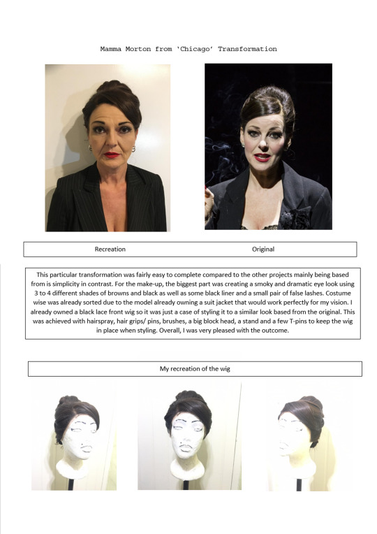


Once the outcomes were finished and photographed, I then moved to photoshop to refine them as their final versions as well as the text pages in which i used prints i had created in class digitalised for backgrounds.


0 notes
Text
Week 11 (Onsite)
During Rachel’s session on Wednesday, we created our etching design plates and prints. First of all I needed to transfer one of my 5X5CM designs onto the plate but before that step could be taken, It was required to attach a piece of tape onto the back of the plate so I could later on place on/ lift off the plate from the hot plate.

The next stage was to cover the plate in a material dark ground whilst keeping the aluminium plate on the hot plate. This was to ensure the material would stick to it and help creating an even cover.
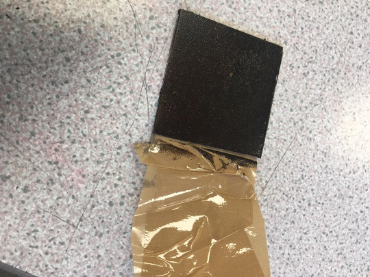
Once the plate was cooled down, it was time to start transferring my design onto the plate in which i done so by using a sharp etching tool and scratching my design to wipe away the ground revealing the metal underneath which would then result in not being printed so in the end it my design would show against an inked background. The other helpful and easy thing about this process was I didn't need to scratch hardly any of the surface away unlike etching into plastic to get lines/ detail to come through.

This my final result. Overall I was very happy with how it turned out for my first time creating a print like this.

After this process had been completed, Liam our technician delt with the acid bath in which my plate was placed into resulting in the acid to each into the lines I etched into the plate and resulting in the illustration to be indented into the metal similar to an plastic dry point etching plate that I would be able to use over and over again to create as many prints as i please and not loose the quality.
Once it was ready to be printed, it was simply a case of inking the plate up with printing ink and a roller, wiping away access ink with scrim, placing the plate onto slightly damp paper (to absorb the ink and detail), put it trough the printing press and ta da my print was complete.

During Thursday’s Session with Sophie we create a series of Collagraphy plates using a different range of materials e.g. tapes, string, carboard, glues etc in order to create layered 3D plates to be used in printing. It was a very straight forward workshop to complete as it was just a case of using ink and a roller to ink up the different textured plates, placing them onto the paper I’d be using and with a clean roller, applying pressure onto almost acting like a human press to transfer the texture/ design onto the paper resulting in a print. It was a good workshop to create an abstract piece of art out of my comfort zone.


During Craig’s Friday session I went through with Craig about my plan for my project outcomes I wanted to achieve on which we then agreed I would work all next week to complete them from home with the resources and materials available to me. Once I had the go ahead I also used some time to carefully research and purchase the extra materials i need to complete some of the outcomes so for instance the lycra coloured fabric for the ‘Billy Elliot’ outcome, sewing threads for my machine and face/ body paints for my planed theatre mask face transformation. For the remainder of the day, I worked back into previous art work produced just so I was able to spend a full week the following week creating the outcomes.
0 notes
Text
Week 10 (Offsite)
During this week for offsite learning, I produced a detailed plan for my book outcomes and on how I was going to be creating each one so that there is a physical representation and clear idea/ plan of action for the project and my vision to come to life.
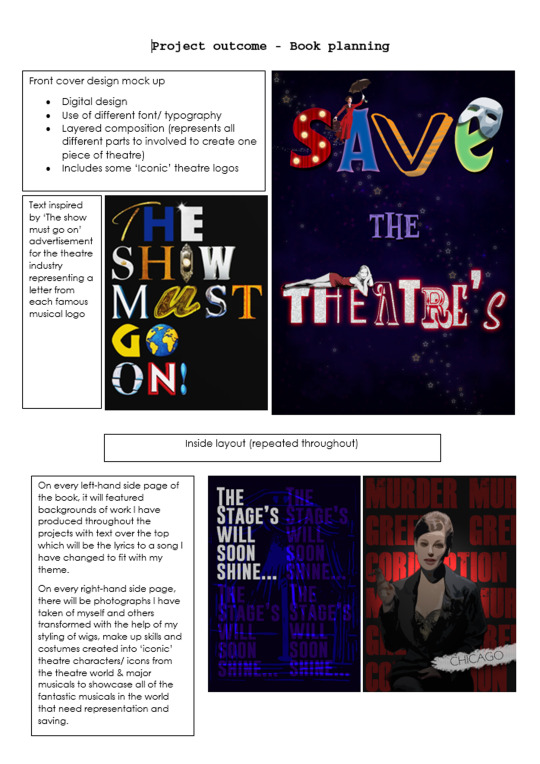
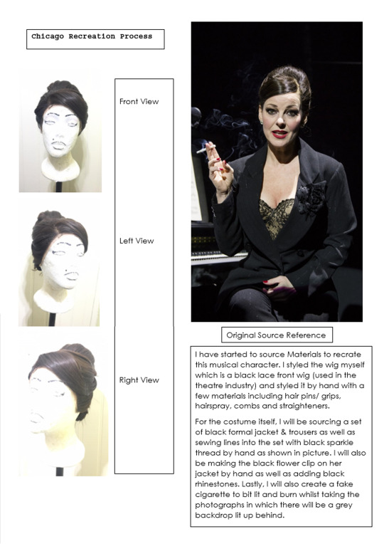


Alongside this, I also completed some artist research that was set.


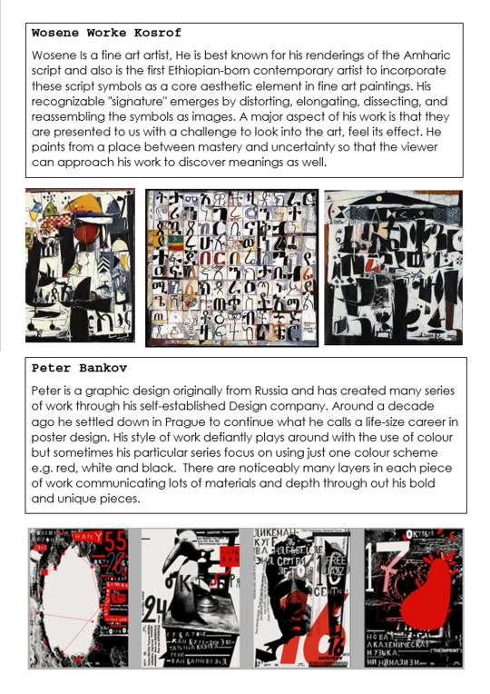
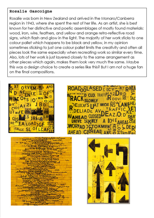
0 notes
Text
Week 9
During this week I was working offsite instead due to family and medical issues which took up most of my time during the whole week. I completed a task that Sophie had set to do on Google Classroom which was to write 100 - 150 words about 6 pieces of our own art work we had produced. I also received my first set of feedback for assessment via Google Classroom from Craig as my assessor.


0 notes
Text
Week 8 Half Term
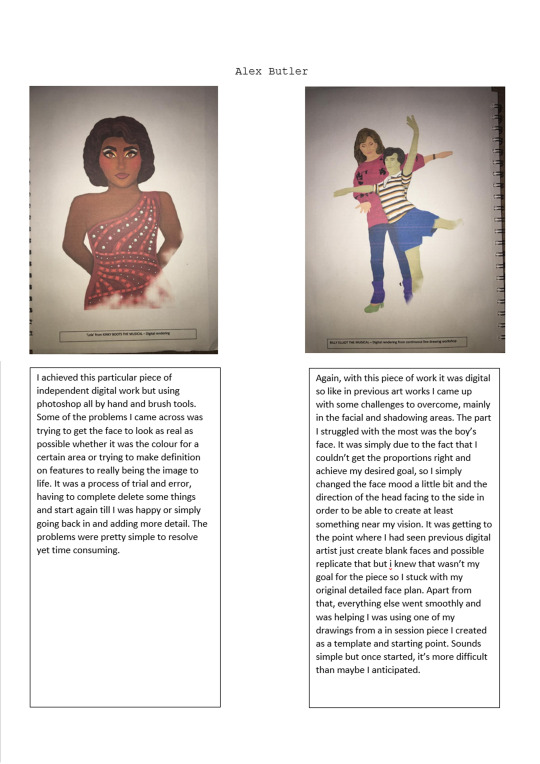
During the October half term, I set myself to create two digital illustrations using photoshop and the main goal was to push myself to create different style of art rather than hand based fine art but still tie in with my project theme which is the arts/ theatre industry. For the Billy Elliot the musical illustration, I took a photo of my drawing from my large collage of musical theatre character I created during one of Rachels workshop sessions onsite. This was to give me a base starting point to work on top of and keep to the original design. It took me around 2/3 days to complete as I wanted to be very particular about detail, colours, shadows and composition. There was many times I found myself having to erase parts and start again but the more I kept pushing myself and practicing, I gained confidence in using this technique of art more. Overall with this piece, I was very pleased with the results especially for my first time creating a proper illustration on Photoshop.

My second piece of digital art was based from one of my favourite musicals ‘Kinky Boots’ from which i decided to recreate the main Drag Queen character ‘Lola’ This particular piece took me less time around a day and a half to complete as it was only a close up shot of the character, although it still had lots of detail, it was less work than a full body ones like above.

0 notes
Text
Week 7 Offsite Learning
Artist Research for Rachel inspired by our typography session for last week


Research on the artists from Sophie’s Session
http://www.lauraslater.co.uk/
http://tomabbisssmithart.com/
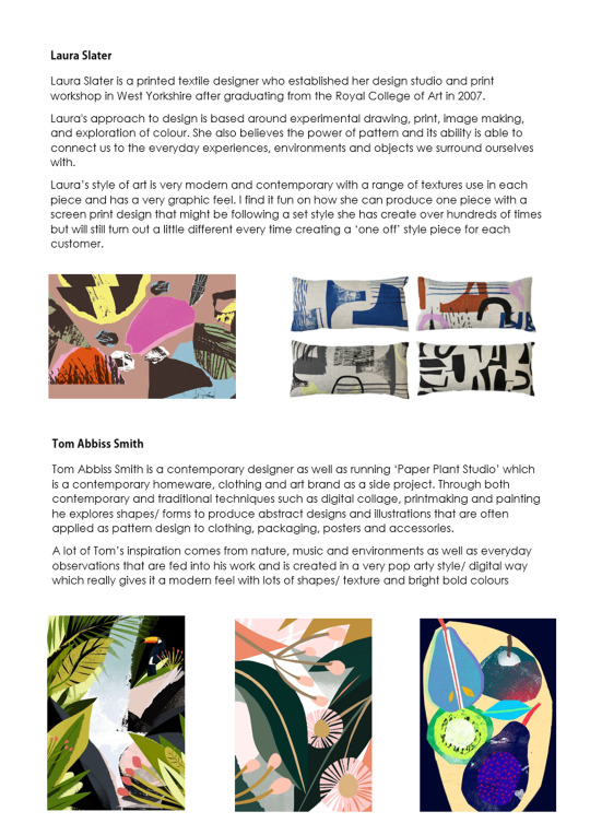
Personally, I find my work I created last week onsite with Sophie defiantly has a similar style of art to Laura’s using bold colours and simple yet effect patterns and shapes but my work could have been pushed further like Laura's and played around with more pattern/ texture work
As some independent art work this week, I thought it would be interesting to push myself to create some digital art pieces featuring work I have produced so far in the onsite learning weeks, I am quite happy with how they have turned out and was a fun challenge to do.


0 notes
Text
Week 6 Onsite Learning
Wednesday session with Rachel:
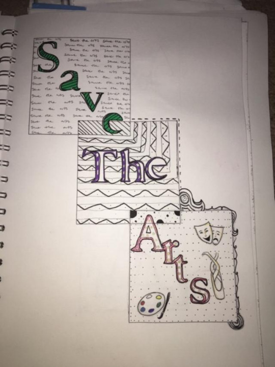
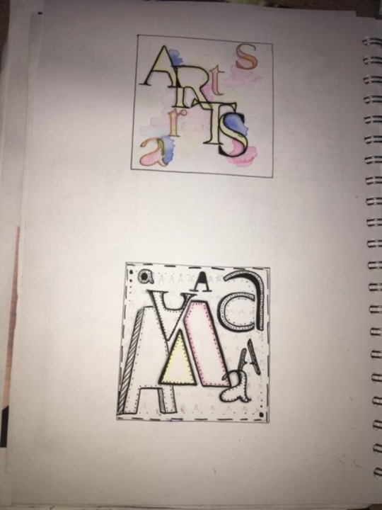
This week we were planed to do our etching workshop but unfortunately Rachel was not in so instead we had a cover lesson and was set to create number and typography experimentation. I based mine featured on my theme for the project which is saving the theatres. I tried to to include patterns and illustrative background to each one to fill in the empty blank space and make it more visually interesting. My favourite piece is my watercolour featured background as it one of my favourite techniques to use.
Thursday session with Sophie:
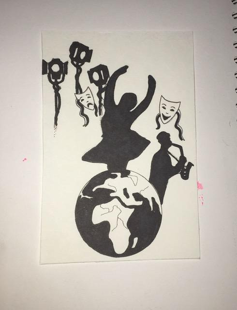
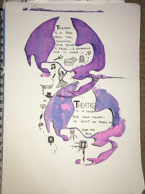
During todays session we firstly looked at some artists Sophie showed us during her presentation - Laura Slater, Tom Abbiss Smith: to give us some inspiration and open our eyes to different pieces of work. For the remainder of the session we created screen prints using a design stencil I created a couple of days before. We needed to copy our design on some photocopier paper ready to make the stencil which I done by using a craft matt & knife to cut out section of the designs where I desired the ink to be. From my design, I chose to do the world as it symbolises that my topic is something that is effecting the whole world not just the UK. From previous years, I'm used to creating screen prints so it was just a case of getting my station set up - tape around the screen edges to stop the ink from bleeding around the edges, paper underneath equipment to stop ink transferring onto the table surface and of course lastly my design, the ink and medium mixed together and the squeegee to pull the ink down on the screen. I am happy how they turned out but I think id use darker ink colours for a more bold effect if I was to do the workshop again.
My original design.
Screen print results
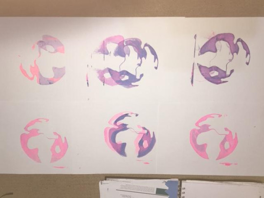
Fridays Session with Craig:
During todays session we created 3 large A2 collage pieces created with magazine photographs/ imagery, red and blue inks, paper, pens, posca pens and inverted imagery for backgrounds. I am pleased with the outcomes and enjoyed the task, although it does not relate to my theatre theme, it is still good work to bulk out my sketchbook and showcase my different skills.
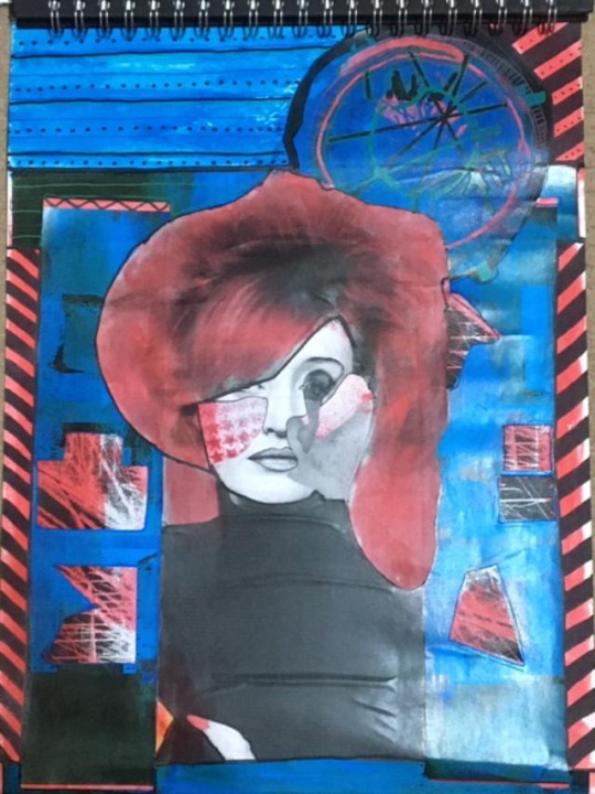
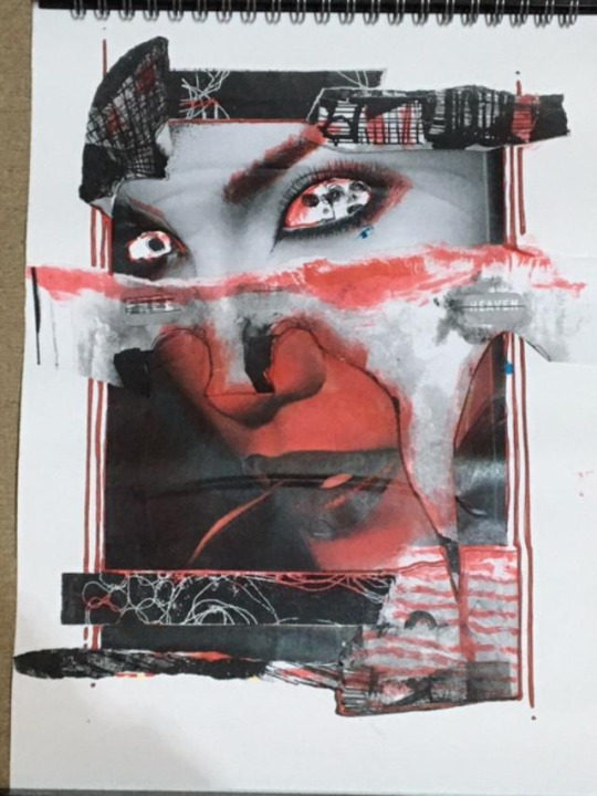
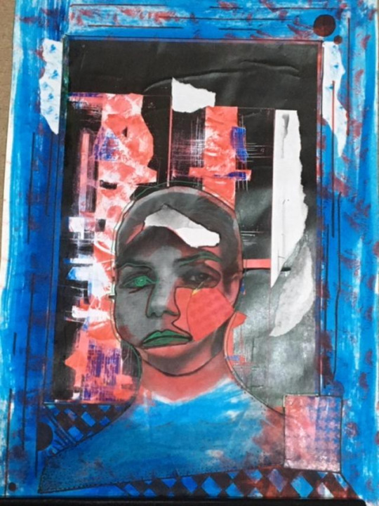
0 notes
Text
Week 5 Offsite Learning
During this week for offsite learning, I completed my continuous line illustration started in Rachel’s session inspired by Martin Wilner. Overall I myself am very pleased with the out come and added in extra little drawings to tie along with featured musicals in my final piece.

Along side this for set artist research, I also researched Martin Wilner which is below.

Ready for next weeks lesson with Rachel, I also completed 5 individual 5cm by 5cm drawings to chosen from for our etching session.

Craig’s offsite artist research -

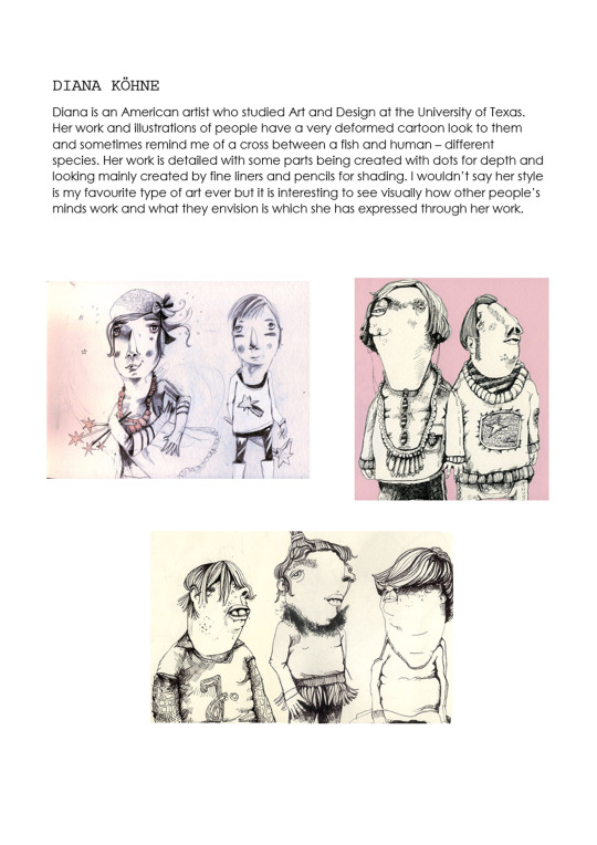
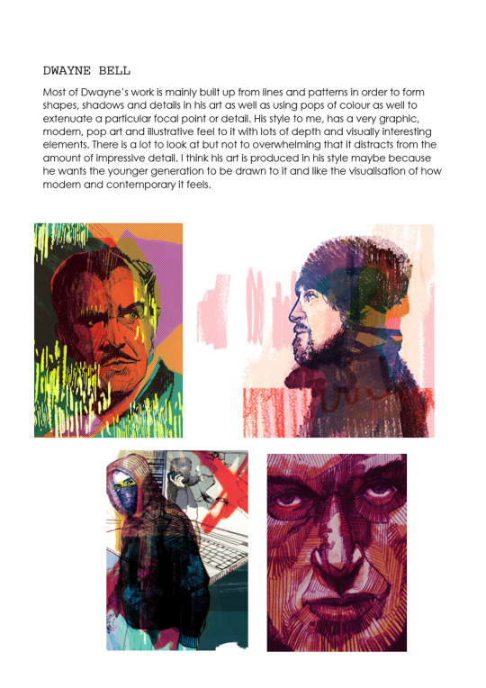

Also this week in my spare time, In keeping with my theatre theme, I recreated one of my personal favourite costumes from my favourite musical ‘Kinky Boots’. I hade made everything you see - blouse, waistcoat, shorts etc, styled the wig myself and done the make up on myself too. It was just for me to have bit of fun and see what I look like as I love the drag queens in the show know as ‘The Angels’

0 notes
Text
Week 4 Onsite Learning
Wednesday Session with Rachel -
During this weeks onsite lesson, I create a large continuous line drawing based on my chosen theme for the project - Saving the Theatres. Our work in class was inspired by an artist called Marin Wilner who creates immense detailed continuous line drawings and illustrations working with fine liner pens. To start visualizing and getting my theme across, I created a collage of imagery I printed out from some of my favourite musicals and theatres. I cut these up, arranged them into a composition i was happy with and proceeded forward. In order to save time, I used carbon paper to trace the large collage onto a long piece of paper than I would work back into later for the main piece. Once I had all of the outlines traced, it was simply going back in and adding lots of detailed to make the outline figures and drawings come to life with more depth and dimension. We spent the whole day doing this as the amount of detail needed takes a very long time and has to be done carefully. I Was really pleased how the outcome looks so far but I will be finishing it for one of my offsite tasks next week.


Thursday Session with Sophie -
During Sophie’s lesson, as a class we discussed the importance of audience engagement and how me communicate through words and imagery. We also looked at artists like Robert Rauschenberg who creates mixed media collages that include photography, mark making, paint/ inks, typography. They are often very colourful and very busy with lots for the eye to look at. On the other hand, Rupi Kaur is an artist how expresses her self through poetry as well as creating small simple line drawings to go along side her messages. Along side them was Eugene Richards who uses photography that is of real life events and people captured in moments which can sometimes be quiet moving or upsetting to see how peoples life's are lived sometimes. For the remained of the lessons i created some mixed media collages inspired by Robert Rauschenberg using white and black paints, fine liners, old magazine imagery and text, paper and pencils. Although I enjoyed the workshop, that kind of quick, busy, collage art isn't my preference but was good to step out of my comfort zone.
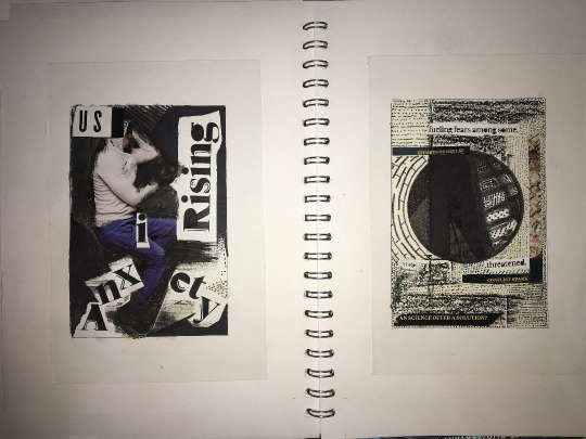
Fridays Session with Craig -
During this weeks onsite lesson with Craig, I spent the whole day create lino prints. As a class, Craig showed us a few lino print examples just to get a visualisation and see what other artists create for inspiration. We got to based our designs off our chosen theme and then it was on to drawing designs into our sketchbooks ready to be copied onto the piece of lino in which I done so by using carbon paper. The process of cutting the lino is fairly simple with the tools but I still had to take my time in order to make sure I cut my design carefully as the down side to lino is once its cut, then there is no going back. Because we luckily had the printing press all day, I was able to create another lino plate and print with that as well onto lots of background that Craig kindly provided us with. Overall I was very pleased with how my two designs and prints came out and gave me the look I had envisioned.


0 notes
Text
Week 3 Offsite Learning Part Two
Craig’s 3 Image Analysis Task - I was asked to Write 150 words on each 3 separate pieces of art in order to showcase how you can critically analysis a piece of art/ photography etc. In order to keep in with my chosen theme for the project, I used 3 photographs from 3 different musicals.


0 notes
Text
Week 3 Offsite Learning Part One
Wed 23rd - Fri 25th Sep 2020
During my offsite learning week, I researched two well known nursery rhymes and lyrics from my favourite musical as starting points for my book as well as research on two events that has happened in 2020 but most importantly to me about the theatre industry struggling. Its something I am incredibly passionate about and has been part of my life since I was three. Along with this, I also researched artists from Rachel’s presentation the other week.


In addition, I also found some of my own imagery to follow from Rachels lesson inspired by Julia Soboleva and created some inspired pieces. I tried to imitate Julia’s white out faces and dark creepy eyes as well as colour over the mouth area which to be looks like blood drooling down as if the ghostly/ demon figure have just eaten some one alive.


In regards to Sophie’s Thursday session, We mainly looked at the artist Egon Shile’s work and started to create work inspired by his art weather it be a continuous line drawing or adding pops of colour to a carbon paper sketch. For the majority of the lesson as a class, we looked into our assessment criteria focusing on critical analysis, development, planning, decision making and research for starting points for the project. In addition to help us, as a class we brainstormed a spider diagram to do with breaking boundaries and what we consider to be associated within the theme. This ranged from anything from physical boundaries e.g. walls, of limit/ private areas, building works etc to mental boundaries to do with mental health and how sometimes people can not escape and try to fight their own boundaries in order for freedom, to breaking the rules - protesting and fighting for change to happen in the world. Alongside this, we created another diagram similar in style but to do with audience and what we have to consider when trying to get our message through art/ work across - involving consideration of age, specific gender targeted audience, race, religion and if the art is to educate people and promote change or make awareness and help support people in need.
We also looked at two female artists - Sherine Neshat who is an Iranian artist who creates work to help women and Iran be protected and heard. Her work mainly involves making sure women are not forced to fight with guns and to be kept safe. The other female artist is Marina Abramovic who is a Russian artist that uses her mind to connect emotional and mentally with her audiences. People often look at her as an escape or view of comfort that she cares about everyone around her and who supports her and her work. Its important that these two artists just like everyone else think about their target audiences because if they did not do so, then their specific messages would not be received by the correct group of people intended. Its very clear that these two artist have a certain target audience for their work to be perceived by, maybe not so much for Marina as she wants to connect with everyone but especially for Sherine as her work is soul dedicated to the women of Iran and their circumstances in their country.

For my concept, I'm certain that I defiantly want to base it on the events to do with the theatre industry during 2020. It is something that is really not being taken seriously by the government and contributes up to £101.5 billion a year to the UK economy as well as creating 363,700 jobs. Nothing can beat the magic of live theatre and if there is no movement or change then we could potentially see hardly any piece of theatre again. Its not just the actors, producers or backstage teams that are struggling with no money, its also all of the buildings themselves with massive bills to pay each month to keep them lit up and working. Because I love the art of make up, for the project book illustrations I am considering painting drawings/ imagery onto my face to do with the industry and events, photographing and presenting them into my book as well as typography and some hand drawn elements over the top.
During this week as well in my free time/ independent art time I worked on something that relates to the theatre industry which was a pair of high heeled boots inspired by another favourite musical of mine ‘ Kinky Boots’ My work was inspired by one of the drag outfits from the finale of the show in which it is based of a cricket uniform. I had already created a jacket the other week to go with it but wanted to create the boots for the final touch. The boots alone have over 800 glass crystals over them and the jacket coming in higher with over 1440 crystals so it will defiantly sparkle! Below is the original costume compared to my inspired version. Everything below was completely plain to start with and I added every variety of material by hand using glue guns, fabric glues, hot fix tools for the crystals, sewing materials, ribbons etc in order to create my desired outcome.

0 notes
Text
Week 2 Onsite Learning
Wed 16th - Fri 18th Sep 2020
During my first week back in college I produced a series of mixed media outcomes in all three different lessons from materials like posca pens, fine liners, carbon paper and acrylic paint to natural objects/ forms, metal wire and watercolours.
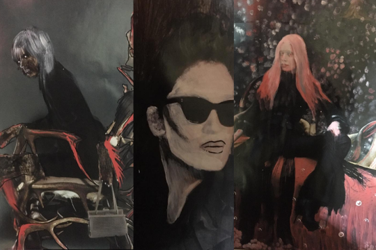
On Wednesday (16th Sep) We firstly looked through our brief in person with Rachel who was there to help us out with any confusion or questions. The majority of the morning lesson was to do with looking into the artist our workshop for the day was based on ( Julia Sobdleva ) in order to get an understanding of her style of art and creation. A lot of her work is very ghostly, dark and dramatic as she whitens out the faces of people in photographs and magazines, this allows her to have a good starting point and transform the pieces into whatever aim she is hoping for. Although I myself am not into dark, creepy - ish art, I was intrigued by how she whitens the faces of people in her work. It does still give of a unsettling feel but also the idea of we are all as humans wearing masks on our faces and can sometimes be seen as ‘two faced’ revealing multiple personality's or hiding what is really underneath.

During the later part of the session, I proceeded to take inspiration from Julia’s work and imitate into my own style. I certainly wanted to maintain the appearance of the white faces, I also continued this on any other body parts that may have been visible in photographs from magazines we found imagery from. I took it upon myself to really highlight/ transform the magazine photographs into something my own with some Posca Pens in which I enjoy working with. Whether this meant colouring in the background, outlining certain body parts or surroundings, this then took my own spin on her classic and unusual style allowing me to add my own touch to it. In the end, I was pleased with my series of outcomes as it was a new style and experiment I think turned out very interesting yet still seeing my style come through to please me visually. I also continued working into these during part of my directed studies lesson in the afternoon.
Thursday 17th Sep
During the morning with Sophie, we looked at our assessment criteria and what it involves us to do whether it be studying a piece of art, talking about how i project relates to our specific audience for our illustrated books (final outcome) etc. Afterwards, as a class we all noted down spider diagrams into our journals about ‘Breaking Boundaries’ picking it apart and expanding from one thing to another e.g. country boundaries & boarders, personal struggle boundaries as well as rule breaking and more. I had already completed a diagram during my offsite week last week on Breaking Boundaries and what I felt it meant as one whole meaning and two separate meanings for both of the words. It was still enjoyable to see what other people and their minds came up with in regards to the subject on the meaning. Shortly afterwards, we as a class created a quick mind map of who are possible audiences could be for this project e.g. age group, gender, to do with specific peoples religion and beliefs as well as the educate and promote our messages. As well as looking into detail regarding the theme, Sophie presented to us three different artists who proceeded to showcase their messages whether it was to do with religion and change inside a culture who Sherine Neshat spoke about everything in her country and life as well as why and who she makes her art for in which this case was for the women of Iran to be able to have a voice and not fight violently with guns. Another was Marina Abramovuc who is a Russian artist that explores the mind of people on an emotional and mental connection just be sitting in an exhibit room, starting into peoples eyes and feeling how they feel. Some cried and felt relate the she wants to help and cares for them and some where just pleased to be in front of her at witness her presence. The last artist was Egon Shile who was our inspiration for the sessions work, looking into his continuing line drawing and portraits whilst adding in pops of colour to stand out.
For the Egon Shile inspired workshop, we had to find imagery from magazines and book (preferably whole length images of people) as use carbon paper to transfer the images onto paper whilst using his continuing line style of drawing. Although I completed one or two, I worked more back into these during the afternoon in directed studies as well as continuing to work back into my art from Rachels Lesson the previous day.

Friday 18th Sep
During Craig’s session, I created a series of natural objects/ form drawings using all sorts of medias - pens, pencils, watercolours, fine liners and Posca Pens. Some of the drawings I produced had an similar effect to Egon Shile’s work from the previous lesson in a way that I used his style of continuing line drawings to produce outcomes I was studying in front of me. Some drawings we large, some small, colour or B&W, overlapping each other as well as using different medias to result in various different outcomes. In class, we continued these drawing experimentations up until the afternoon so it was nice to really spend time working into them.
During the early part of the afternoon as a class, we briefly looked at how to study and analyse artist’s work more deeper looking into potential meanings, stories and scenarios that could be showcased. E.g. look at a woman standing beside her car left running with a shocked expression look at the sky with an night time/ early morning setting with fog could lead to so many questions. What is she looking at that makes her shocked? Has she just quickly got out of her car and seen something that caught her attention immediately? The dark setting and dim lighting with the fog atmosphere creates a mysterious setting. Things like that to really look into a deeper understanding, like people say, a picture can say 1000 words and is always results different ways everyone sees it.
For the remainder of the day, we still continued to work into drawings and create ink like backgrounds with blackberry juice resulting in a purple ink effect that we then left to dry and worked over the top of, especially looking great when I drew the blackberries over the top of the juice ink as it had given of the texture and pattern of the berry. Although we continued with drawings, I also created two mental wire 2D/3D like sculptures based on two of my drawings of any natural object/ form which in this case was an apple and a leaf. It was an easy task but very effective and interesting to see my drawing come to life in a new visual way that I was happy with the results.

0 notes
Text
Week 1 Offsite Learning
Wed 9th - Fri 11th September 2020
During my first offsite learning week for college, I completed research and practical work to do with our first term project brief theme ‘Breaking Boundaries’.
My first piece of research was exploring what I personally thought Breaking Boundaries means as well as analysing both words in their own meanings - what they represent, how we seem them come across in our world … e.g. Boundaries are often refer to a physical or mental stopping point that no longer lets you past a certain point whether than maybe in person (Off limits to public area) or mentally where the mind can control you to not achieve a goal, target or leave a dark mindset. Below is an image of my mind map of my thoughts including what I think the topic could be used as conceptually.

The next lot of research I completed was of 3 artist’s I personally liked the works of that had used the same theme in their work. They are all induvial different and use different materials and medias in their own style to portray their take on the concept. Jason Sanchez created a medium sized sculpture/ instillation that was created using materials like Steel, bronze and Aluminium in comparison to Nano Mortis who is a fine art & digital illustrator only using Coloured pens, Watercolours and Photoshop (for retouching colours). Whereas, the final artist Paul Oz used Canvas and oil paints layered up thick to create heavy texture paintings. All 3 artist’s pieces are so different not only in a visual and meaning way but material wise as well which all stand out to me personally. Below are my thoughts on each artists ‘Breaking Boundaries’ pieces.


My final piece of research was on Book & Illustrator artists who I particularly like the style and work off. Both in their own ways are different, yet still make me feel some sort of magical sense within the way they are designed. Jonny Duddle creates his illustrators in a 2D style yet is able to create a 3D feel to each piece in which he does so with light & shadow not only on the characters faces but on their clothing, any objects or items even down to the details in the background. Shane DeVries creates more of a realistic 3D look to his works as well as playing with the lighting again like wise with Jonny but, DeVries art defiantly makes me look on it as almost similar to a 3D animation film yet still keeping in an element or two the maintain a “2D drawing style” Underneath are some extra analysis on their style.

For a target set by Craig during the week, We needed to photograph any natural objects and forms that we could find, take the photos and draw into our sketchbooks in whatever style we desired. Most of my photographs and drawings are mainly focused on plants and flowers as they appeal to me in a way I find calming to look at but also beautiful even if it is down to a particular petal the has a soft pink ombre effect reminding me of a water colour style which I personally find on of the most stunning styles of art in outcomes. I souly used fine liners and coloured markers due to the fact that I myself wanted to see how well I could achieve the results in these medias. I would have preferred them to be done with water colour and fine liner but it was a challenge to myself and breaking a boundary for me to step out of my comfort zone. With the materials I photographed/ drew from, I also kept them ready to bring to my first Friday drawing lesson next week with Craig to study from.


0 notes