currently mostly pictures of pro cyclists
Last active 60 minutes ago
Don't wanna be here? Send us removal request.
Text


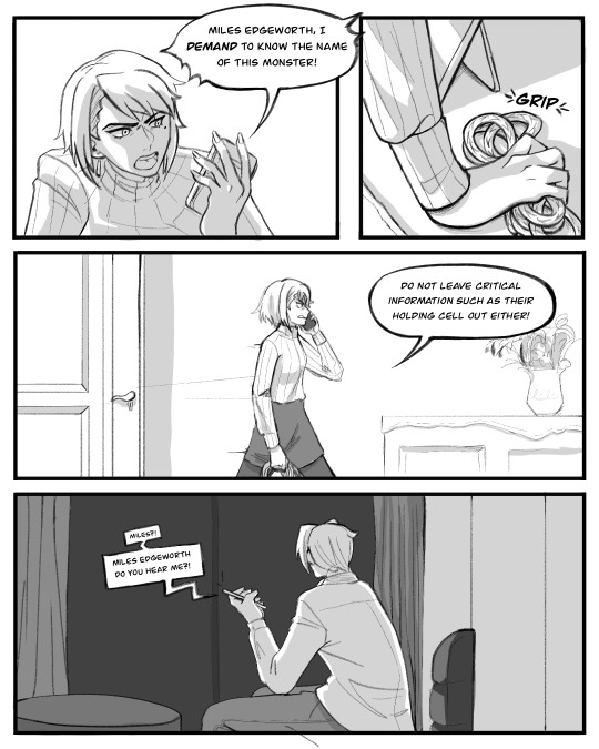

Comic based off of @musashi’s video essay on Franziska!!
I’ve watched it three times and cried really bad on my first watch, so safe to say, this video has affected me. So I wanted to draw something that paid tribute to it!!! It was definitely a challenge trying to get all the descriptive metaphorical writing into a visual medium, but I hope I did it a justice!!
Please go watch the video!
12K notes
·
View notes
Text
I want to be reading fanfic, not writing it. Unfortunately, I want to be reading very specific fanfic which I will in fact first have to write.
5K notes
·
View notes
Text
pardon me sappy emotional post coming up:
egan bernal just won the colombian national road race. now i first started watching cycling properly in 2019 and egan was the first rider i really fell in love with. after that horrific crash in 2022 it’s honestly been so brilliant just to see him racing, i’ve been so excited just seeing him in breaks.
i saw an interview with him at the start of the 2023 tour and he said it didn’t matter to him if he never won anything again, he was just so happy to be back in a peloton again.
and now he’s won the national title in both the itt and the road race. first wins since the giro in 2021. i barely every cry at this sport but this got me.
2025 is the year of egan guys COME ON
36 notes
·
View notes
Text
I need for cx to last the whole year. What do you mean it's a winter sport? There's sand, let's go to the sea and race in summer too ❤️
#pleeeease#i am going to miss them all so much#i want the beach episode#where everyone goes swimming and learns a lesson about friendship while attempting to build the best sandcastle ever#pro cycling
12 notes
·
View notes
Text

illustrated actual reason wout went to worlds
26 notes
·
View notes
Text
I was asked not to spring the prompt meme opening on y'all again...
So here is a 3 week heads up for our schedule for this year 👀
🌻 Schedule 🌻 Prompts open: February 27 Posting opens: March 6 Prompts close: March 13 Posting closes: March 20 Fanworks revealed: March 21 Creators revealed: March 26
More details to come at the end of the month, I'm still refining some changes. Mark your calendars and I'll see you in just under 3 weeks!
50 notes
·
View notes
Text
Being really passionate about something isn’t “cringy” or “stupid” or “immature” or “embarrassing” or “ridiculous” or anything else along those lines. Passion is beautiful and it’s brave and no matter what some mean people might imply, caring a lot is never worthy of ridicule or judgment. Don’t ever let sad people with sad lives who are holding themselves to sad standards of edgy nihilism, “maturity” and aloofness get in the way of you doing your thing and enjoying your life!
4K notes
·
View notes
Text
underrated cycling pairing, go:
#so underrated literally no one but me is shipping them: lars van der haar and eli iserbyt#consider: they race against each other every week#and ride for different teams and different nations#so you have an echo of wout/mathieu on a much much smaller scale#with both of them knowing they are not wout and mathieu#they're not even each other's One True Rival TM and they know it#they are the most red and blue coded couple ever#in personality#eli gets cross and sometimes does the absolute dumbest things while angry and skirts the very edge of the rules to... let his teammate win#lars is a cool-headed analyst prepared to sit back and wait for everyone else to waste their energy but also really funny and chatty#but also in jersey colour this year which is convenient#cx is a much much smaller world so everyone knows everyone and their business#which is fascinating from a fic perspective#they have both lived their entire careers in the shadow of wout and mathieu (lars is a bit older than them and eli a bit younger)#not one of the current crop of cx guys has ever got to wear rainbows (except pidcock who doesn’t count as he's a multi-talenter)#2013/14 was the last time someone who wasn't wout or mathieu won save for the year they skipped worlds snd pidcock took it#how do you live with knowing that? wout and mathieu have long since outgrown cx yet any time they come back they still dominate it#so there is a sort of wistful angle of#can we be happy knowing that ultimately neither of us will ever rise to those heights?#can we still find joy and pride and meaning and purpose living in their shadows?#but also from a fic perspective#the belgian and dutch media would care A Lot if either of them csme out#but the wider cycling world would not#so you can have room for both Big Dramatic Coming Out Angst and also warm and quiet unremarkable domesticity#then of course we have to acknowledge that lars has big brown eyes and an air of quiet suffering#and i am always a sucker for a wet cat of a man#whereas eli has a persistent nerve pain issue down one leg which he just can't do anything about#so they both have themes of living with and accepting suffering#and finding meaning in or through or with the pain#but also: they are the perfect height to kiss
19 notes
·
View notes
Text
quick what is everyone doing right now
#realising i have need an extra dream sequence for this to make sense and wondering if eli would fantasise about gladiators#and regretting the fact i have to go clean my teeth
202K notes
·
View notes
Text
If you have Spotify reblog this and tag what your number one song on your “on repeat” playlist is.
#you have what it takes#by a-ha#soundtrack to lars has a perfectly horrible time#(things will improve but not for at least another few thousand words)#spotify
127K notes
·
View notes
Video
whoa this guy knows how to party
109K notes
·
View notes
Text
ao3 is crazy because you'll read the most gut-wrenching 200k word slowburn that leaves you sobbing into your sweater at four in the morning and the author will be applejacksmonstercock
52K notes
·
View notes
Text
Need home(s) for my reptiles. FLORIDA
this post is already hard enough to write. My family is experiencing housing trouble. We are currently in a hotel and have to be out on the 10th. We're going to be living out of our car soon for a few weeks so I need to find homes for my herps. If you could just house them temporarily that'd be even better, I really do not want to lose them they are beloved family pets.. I have two whole packs of small rats I can supply you for now.
Old Man (20 year old Ball Python) ♂

and Romeo ( 10 year old Argentine black and white Tegu) ♀

If you live around Brevard or Indian River County and can take one or even both of them please, I am begging, please reach out to me. I will provide their enclosures, feeders, and more information on our situation. Thank you for reading.
(if you want to help us another way you could share my ko-fi link. i will do pet doodles for any donations after we are stable. just include a link to a photo in your message. commissions are open as well but may take longer to complete due to our situation.)
499 notes
·
View notes
Text

#i'm in this picture and i don't like it#literally thought this morning i should give lars hallucinations#this poor man is now doomed to s u f f e r for a couple of years until i move onto someone else#fanfiction
3K notes
·
View notes
Text
I'm not okay. Took a mental health day to do my part and make some art about it. No matter the opposition, we won't be erased. A world without trans people has never existed, and it never will! 🏳️⚧️
May this piece be a small light in the darkness for those in need of comfort and hope. Feel free to share/re-post elsewhere if this resonates with you. Just please make sure you include the alt text!

5K notes
·
View notes
Text
Hmmmm hm. Okay. Worldbuilding/story idea.
One million years after humanity disappears, octopi and ravens have independently developed sapience. And one day an octopus child and an elder raven meet at the edge of the ocean.
Where is your mother and father? asks the raven. I have no mother or father, says the octopus, blushing pale. All octopi are children. Once we’re grown, we will mate and we will die. It is the first and the last thing our mothers tell us.
But that’s horrible, says the raven. It’s not all bad, says the octopus. We play, we hunt, we make games for ourselves in the deep. Yes, but who remembers your songs? the raven says. Who passes down your stories?
What is a story? the octopus asks.
And the raven thinks about this question. And finally it says: A story is how you remember things in the past. It is how you know where you come from, and what happened before you were born. A story can be a warning, or it can be advice, or it can be a silly joke told to make you feel good. Someone remembers the story and tells it to the next generation, who remember the story and tells it to the generation after them.
And the octopus thinks about this answer. And finally it says: Can you tell me a story?
And the raven tells the octopus a story. And it’s a good story. And the next day the octopus returns and asks for another. The next day it brings its octopus friends, and the raven brings its raven friends, and many stories are shared on the edge of the ocean.
Months later, the octopus returns to the raven. I am grown, it says. I am returning to the sea to find a mate and lay my brood. I will not be coming back. I’m sorry.
I will miss your company, says the raven.
I have one thing to ask you, says the octopus. In time my children will come to the edge of the ocean. I would like you to tell them a story I have made. And when they have stories of their own, I would like your children to remember them and pass them down to my children’s children.
Of course, says the raven. What is your story about?
And the octopus thinks, and says: It is about an octopus child and an elder raven who meet at the edge of the ocean.
And this story has been passed down to this day.
15K notes
·
View notes


