Foundation art diploma blog for 2021/22 by Georgia Baker
Don't wanna be here? Send us removal request.
Text
Using my marionette for animation

Originally I made a doll of my character Jeremy to stop motion animate, he is still unfinished but nearly complete. Its still likely that I won't end up completing him before the deadline, he still needs a wig and shorts before that but the process has been a really good learning experience

Throughout the process I have taken Jeremy from wood and foam to papier mache to miliput before eventually painting him and making him a hoody. I feel overall he is successful, his body fits with my designs, albeit being relatively boxy, which I could fix with teddy bear stuffing. His skin colour is a bit too reddish but I am happy with the general shade I've got. Should I have had more time and resources I would have made clip on features so Jeremy would be more suitable for something called replacement animation. This would allow for the changing of expressions and while usually done with a 3d printer, it can also be done by hand sculpting. Should I want to venture further into stop motion and model making I think it might be fun to try claymation, which would further my knowledge within the world of 3d animation. Despite the fact that Jeremy might not be used for animation directly, his model has proven to have another use. He provides a perfect reference for my 2d hand drawn animation.
Using his posable body I can check things like anatomy and perspective, meaning not only do I adhere to more accurate drawings of him but I also end up with smoother and more realistic movements.
4 notes
·
View notes
Text


These are my colour studies of autistic people, the first being myself and the second my friend Alicia.
0 notes
Text
I made a painting/air dry clay piece based on the common autistic experience of masking, in which a neurodivergent individual will tend to act more neurotypical in order to blend in and be more accepted. This however commonly comes at the cost of the individuals mental health, leading to problems like low self esteem, anxiety and depression.


I wanted to combine both 3D and 2D elements in order to convey how masking can be a diversion from reality and make what's real seem skewed to the masker. I also wanted to convey how much the person can differ from their mask, I used different tones in the mask and the person to show this; the cooler colours meaning that the person seems hidden and less noticeable. I also felt that the cooler tones conveyed a sense of disparity that was contrasted by the serenity and warmth of the mask.
I tried to blend the mask with the painting, despite them being separate in terms of dimension. I let the cooler colours of the person seep into the mask, my thinking behind this being that the mask often becomes part of the person using it, making it difficult to distinguish between what is truly someone's own personality and what one presents to the world.
I got the idea for this piece both from my own personal experiences and also Paddy Mcguinness' "Our family and Autism". I have had a lot of experience with masking. As a child I was often bullied for being 'weird', which lead me to cover up aspects of my personality, autistic traits and things I enjoyed. In doing this, I found that I was acting half the time and not really as someone I wanted to be. It was an incredibly lonely experience, and sometimes I find that I slip back into masking as a force of habit, but I am making a conscious effort to change that.
In the documentary "Our family and Autism", it is a big topic that Paddy and his wife are concerned about masking and their children, particularly their little girl. Masking is far more prevalent in girls as social convention dictates that girls act a certain way to conform. Their daughter masking actually means that they do not see many autistic traits in her, and later on causes worry that she will suffer the comorbidities that often accompany people who mask.
I enjoyed making this piece and finding ways to fit symbolic ideas into my work, which is not something I often do. It taught me a lot about using colours that feel out of place and how contrast is a great tool. I feel that, should I approach the subject again I would try to execute it better though. I would firstly use a reference for my figure, as the shadow work, lighting and anatomy aren't as accurate as they could be. I would also see if perhaps I could make the 3d mask seem more natural and blend better with the portrait.
0 notes
Text
For my project I want to experiment with different types of animation. To make a 3d stop motion style animation I would need a posable doll. I decided to attempt to make this, using air dry clay, thread and nail glue. I also used a few Internet tutorials to try and understand how ball jointed dolls worked.

I started with sculpting every limb and joint separately, making the head hollow to try and make sure that it could also be adjusted but also so that it was not too heavy. I then left the clay to air dry. I also made the decision to not sculpt it too detailed, only a basic figure, so as not to spend too much time on something that may not work.


When I finally came to assembling my doll, I noticed a few problems.
1) using string meant that it wasn't poseable
2) the parts were too small to be handled properly which also fed into problem 3
3) the glue and string didn't stick hugely well, so limbs had a tendency to fall off
Two of my problems can be sorted by using a posable wire which I will incorporate while the clay is still wet and also I will make the whole of the doll hollow to allow for wire passing through. Hopefully this will mean that my doll will be poseable and hold these poses.
I will also size up the doll slightly to make it easier to build, however I can use the parts that I sculpted previously as a base, also more easily making it hollow.
It also occurred to me that to animate my doll I would need it to stand, and so to combat this I will also be adding a string into the head. I'm disappointed about my first attempt at this doll not being as successful as I wanted, however this has taught me a lot and I feel that next attempt will bring a far more usable doll.
2 notes
·
View notes
Text
I have recently been developing a character for my autism stigma project, which has started with my Foundlings work. I started off by creating a moodboard that would serve as my inspiration for how I would like my own character to present.

I found a lot of cartoons that I felt were child friendly, some with autistic links other's that I felt just had a cool style. They are all, aside from the Scott Pilgrim art, children's characters however the SP art I feel has characteristics that work well too. This moodboard really helped with certain ideas like bigger eyes and ears and also the smaller body.

This is the original idea I had for characters, the top one of which serves as the basis for my main character. He carries a lot of the traits through, such as the shaggy hair and lower eyelashes.

I next went on to develop the style which I will use throughout my project, altho it has to be said that the style I'm using is still consistently evolving as I develop the characters more but it is shown here quite closely to where I am right now. Throughout this I mess quite heavily with the proportions to try and bring a childlike nature that I want to be prevalent.

Next I work with the face and the general proportions of that. I want this to also be very childlike and rounded, so I don't use any sharp lines and avoid anything too close to reality in my proportions.

This is the final stages of my character development, where I make small and gradual changes to try and figure out what fits best with the character and try to flesh out their personality. This was a really enjoyable part of the process as I felt I really came to grips with the character and could have quite a lot of fun with it.
Overall my character, who I have named Jeremy, is still developing and evolving but I feel I am arriving at a point where I am becoming more settled on my style and his personality, so I am quite happy.
4 notes
·
View notes
Text
For my project on the stigma around autism I decided to make an early clay sculpture on what my character might look like based on my Foundlings ideas and characters.


These were my initial sketches based on the collections of urban debris I found, which helped me to find some features that I wanted my character to have. For example I knew I wanted to have short hair, loose bagging clothing and big ears. This actually informed my style which really differed from my original sketches, as I started to gear my character to be more child friendly.
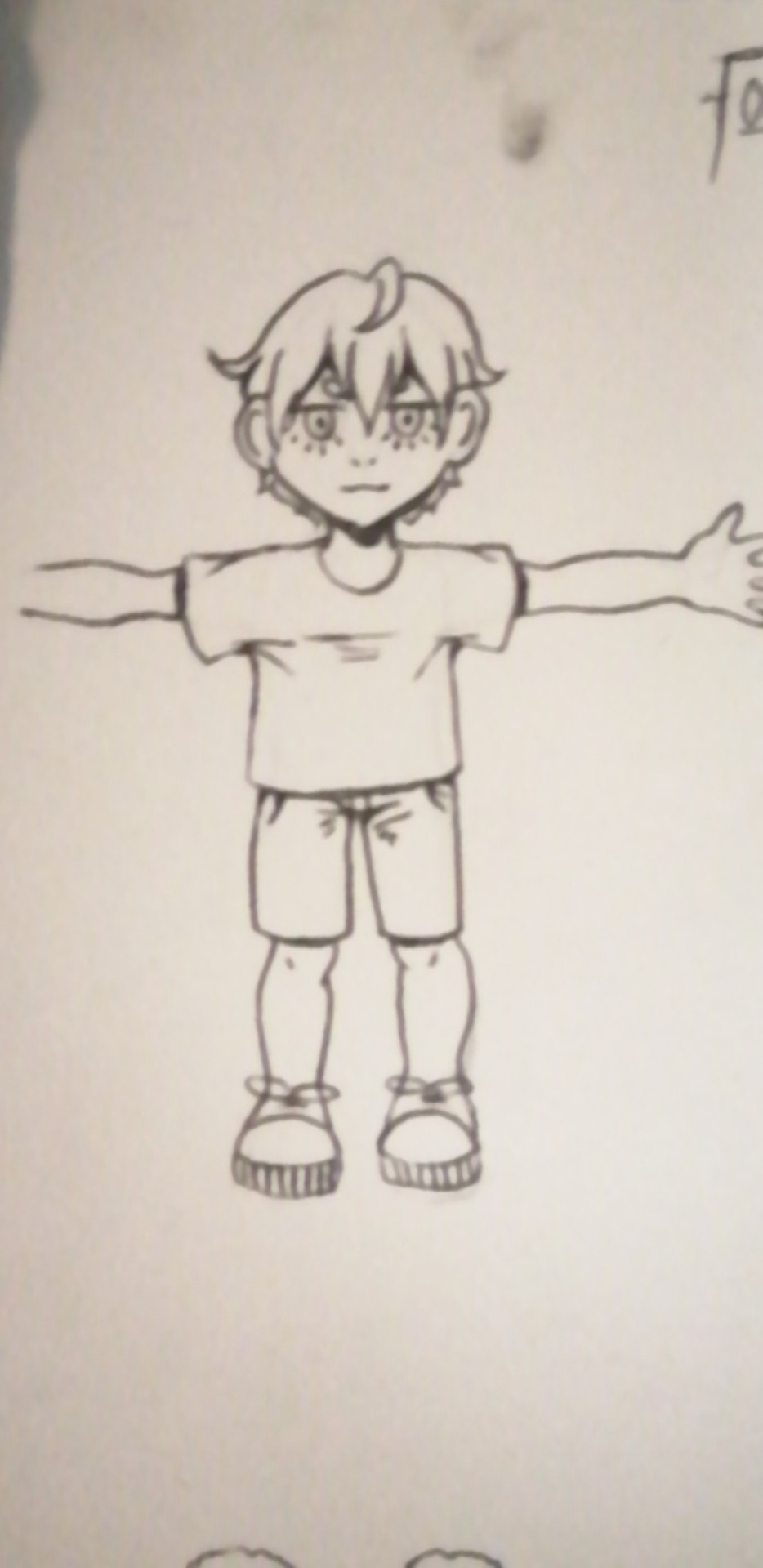
I then came up with this character that was based on my favourite traits, but also tied into my own brief of being appealing to children. As shown, this is a much more stylised version of my art style.

I then started moulding a face with the basic proportions I wanted, being careful to keep the large cartoonist eyes, rounded face and small nose and mouth. This makes for an expressive face that will appeal to children. However at this point I had put too many realistic features into my sculpture and this lead to a creepy look as opposed to the cuter look I was going for. I then decided to refine the features by simplifying and smoothing out the face.

Once I had simplified some more, this is how my character was looking. His eyes are the most apparent difference from before, and give him a far more cartoon like appearance. It was at this point I had also started to smooth the face, trying to make sure that no jagged lines were there. I also wanted to slim his jawline slightly to make his face more heart shaped like my sketches.

This was my finished 3d sculpture of his face. I quickly realised that it wouldn't be possible to make a full body sculpture of him, purely due to time and the fact that I had made his head too large. Despite this, I think this represents a good starting point for more detailed character design, and has taught me a huge amount about working with a 3D form.
0 notes
Text
Autism is me research
https://www.tandfonline.com/doi/full/10.1080/09687599.2020.1822782
Botha, M., Dibb, B. and Frost, D.M. (2020). “Autism is me”: an investigation of how autistic individuals make sense of autism and stigma. Disability & Society, pp.1–27.
This is an well researched article about the stigmas faced by autistic people.and how they make sense of the diagnosis. It features the experiences and opinions of autistic people and also considers scientific opinions however sometimes these opinions are decided to be harmful. It is useful to me as it brings together the experiences and opinions of an array of autistic people that struggle with different things. I will use this research in order to see what is necessary to debunk and demystify the stigmas of autistic people.This will inform various judgements and stereotypes which I can educate people who might view my project. I have learned quite a lot not only from the opinions of autistic people but also the researchers themselves. This includes things like the fact stigma has sometimes been derived from scientific opinion and journals and also can be seen very heavily stigmatised in media. I also learnt that autistic people do not necessarily see autism as a disorder rather something unaccommodated for. I found it interesting to consider the double empathy problem where neurotypical people cannot read autistic people and vice versa however despite this the onus is often on the autistic person. This research taught me that it is common for autistic people to experience such stigma during childhood which has lead me to consider that i might want my project to aim for educating children.
0 notes
Text
For my session in Foundlings, I am going to make a character and story based on scavenged items from a walk. I chose to walk through Hilly fields as that was where I spent most of my lockdown exercise periods.
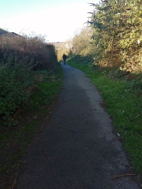

Even at the entrance I managed to find a lot of different debris, where I started to focus on getting a varied amount of material colour and texture.


Some things I couldn't bring with me, because they were too big or I didn't know if they were safe but I wanted to photograph. I especially liked the twisted tree stump, it almost seemed like a home with multiple entrances.

In the end I returned with these findings, all of which I think make interesting subjects.
0 notes
Text
This is my mini exhibition I made using my existing works from across my universally human brief. Some works, like my family inheritance piece I felt didn't need working into however the rest of them I decided to add into. I wanted the composition of all my pieces to be eclectic, to portray the jaggedness and energy of my pieces without detracting. I decided to add in some painting red string dangling to fit in with the theme.

I think largely the colour scheme was the defining aspect that pulled everything together, although the universally human brief was the inspiration for all these pieces. Also, the drawing style is very much graphic throughout, the line art is bold and defining with shading barely present and if it is, also graphic.


While overall I am very proud of my mini exhibition, next time I would like to try the opposite end of composition, with a far more minimalist and orderly approach.
I also think it would be a challenge to try to not relate things through colour, or at least not the same colours.
0 notes
Text
For my second printing workshop I first took view finders again and with graphite sketched out portions of the work, trying to implement different ways of using the graphite in order to get various textures. I accomplished this by using different grips, angles and harshnesses.

We then took perspex sheets and printing paint and made and found various materials to print with. My favourites to use ended up being a ball of yarn to make swirls, crumpled up paper of different sizes and the paint roller. The original graphite sketches I made served as inspiration.
I took a selection of black and beige paper to make my prints with to make a good variation of prints with different effects.


Once we were done making our prints, we started drawing into them. I took an illustrative approach, deciding to make the shapes I saw within my prints into objects, scenes and people.

After having drawn into my sketches, it was then that I cut up my prints, taking objects I'd drawn and also any prints left over from my negatives and undrawn on parts. I decided not to draw on my negative prints, as that left room for adjusts and more creative flow. I used a craft knife in order to cut things out so that I wouldn't ruin the image to get out small portions of images, leaving me with lots to work with.

These are three of my pieces at the end of the session. I very much liked the colour theme running through this, the black, beige, magenta and white pull a very continuous piece. I don't feel that at this point, these are all finished pieces bar my top most one. The top one presents a clear scene, with good contrasts and interesting elements like the eyes among the night sky. This was then something I wanted to add in to my other pieces for continuity.


I feel these pieces are now more successful. I added in more contrast where I felt it was needed, adding more white highlights and black lines, some sketchy and in oil pastels for some textural differents and some of my black lines in pen for a very succinct line, some white marks in chalk so it would be easily blended. I think for a first attempt at this style this is effective at both being continuous whilst also having an element of creepiness throughout. I would like to play more into such a surrealist style, the horror elements make me feel that my work evokes some emotion in my audience, and I would like that to be more evident.
0 notes
Text
For my first print making session, we picked out already done works with interesting lines and marks.


This was in order to use a view finder to pick blown up abstracts from the line work. I picked these three works as I felt that they all had a good variances in shape and line, and could therefore lead to works with those attributes evident.


These were the black and white drawings to come out of my viewfinders, having used two, one smaller than the other. The shapes are all different and each has an assortment of negative spaces.


These are four of my more successful prints, a lot of them combining the negatives with bold relief printing. We started by cutting out the shapes from our blown up images, making sure to keep even the negative spaces from my images as they could provide more shapes but also an aspect of interest using pieces that fit together but are rotated and moved. I tried to keep to a colour theme of the primary colours and green, however next time I would like to narrow my colours down more and maybe play with the opacity of colours. I also feel the white space made the first piece work better, so maybe I would try black and white with a couple select colours.
0 notes
Text
In this workshop we looked at collage and scale. I brought in items and knicknacks that made up me, whether that was simply because I liked them, or they make my life easier or that they were symbolic. I drew out my items, trying to represent them each in different and interesting ways.


I think some aspects of my works are more successful than others. My first work is more interesting composition wise, it has more overlapping and underlapping, a bigger variance in sizes and makes sense in terms of it being almost organised and centred around the cactus. The second image uses more materials which I think brings some level of interest along with the difference opacities used in fabrics. I also like that the second image has some 3d elements. The work in the 2nd collage, however is eclectic with some pictures being too small, like the penny and some places having too little colour. If I was to work Into it more I would definitely add more colour, and overlap with differently opaque things.

With my two collages complete, I decided on posterising my first work. I learned from my first two that I like messing with opacities and colour, so I tried to focus on those. To achieve different opacities I used sheer fabrics and tracing paper, along with drawing over different parts in order to gain bright colours but allow the original to show through. I think that the theme is lost however, and was fairly vague even in the original, and so that is something I would work on next time, and have maybe a clearer plan at first that was then explored through more creative methods.

In my work of collages, I also made one digitally using photoshop. This once had a clearer theme, nature and my favourite animal, badgers. The textures used were collected on my camera from a walk around the college. I feel that this was a huge learning experience in the capabilities of photoshop, particularly its editing, and therefore I think it's successful despite the fact I don't like it. The ground is skewed to fit the perspective which is a nice touch, and textures you wouldn't associate with the given use like the sky or leaves have been implemented leading to a experimental almost pop feel to it. I do think that the image could be more varied in contrast, the sky perhaps lighter than it is. I also think that the work could have been busier with more details, which would have made the work more interesting compositionally.
I overall think my own eye for and ability for collage and composition is at a level that could be vastly improved, and should I practice more I would be able to produce work that I would be happy with. I feel the process is so varied that perhaps more research would help me to understand what makes collages successful.
0 notes
Text
Our task was to make a sculpture in groups that embodied the term "kinetic". The first step was to branch out on that term, listing words like movement, fluidity, energy etc. Listing words like this was useful to get us to think about what the word actually meant and how we could relate it to our sculpture.
Then in our groups, we set out on task. Our group decided on a mobile, as that's some of the first fundamental movement as human would see. We also added springs to ensure extra movement even at the slightest breeze.
We decided on simply making sculptures based on our a to Z from plasticine, focusing on our interests to draw it back to us. Among the sculptures were a leaf, a tooth and Gareth. Gareth was the attempt of mine to do a sculpture of my friends face, but in the end I just made it as creepy looking as possible.


I was really satisfied with how our mobile turned out, the coat hanger we used as the base provided a good amount of turn and the springs were hugely effective when pulled;making our sculpture also interactive.


From our sculpture we were given the task to draw the movement that came from us moving it without paying too much attention to what the fine details were.
Overall I think my monoprint were effective, they don't seem too static and while, not obviously prints of the sculpture, if the two were compare side by side. I think if I tried again I would try to be even more loose with my drawing to hopefully capture some additional movement.
0 notes
Text
When given the brief to make a zine, I wanted to relate it back to the topic of universally human. Mental illness relates strongly to that topic, and it personally has had a substantial effect on not only me, but also my family. Hence my titled project, Family Inheritance.

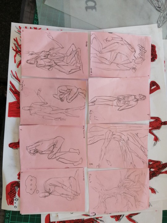
Order is important to me, even if the tone remains the same no matter what. I ordered them from my mother's side to my father, which interests me now because I sit closer to my father's side in mental disorder than I do my mother. This project held a special interest to me because mental illness in general is inescapable but especially in regards to my family, where I have grown up and seen the effects of poor mental health on the sufferer and those around them as well.
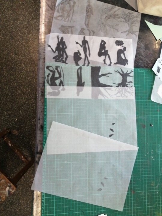

I enjoyed working with the reisograph, I found that it's ability to layer colour from hand drawn images and block images alike mental that I had a lot of freedom, and it's ability to make prints by the many cheaply was a great way to make a zine.

This is the back page of my zine, of which I am yet to finish. I specifically like this page because it represents the possibility for growth, contrasting from the desolate dead tree illustrated on the front cover. I feel the font used for my title is unprofessional, my handwriting is not my strong suit, and so next time I would endeavour to include either a more stylised typeface to lean into my short comings or perhaps use a computer to print out the title, leading to a cleaner look. I am currently unsure what approach I would prefer, a cleaner look would be more professional and lead to a more finished look. However following the sketchy and stylised look of my zine if a stronger front was to be developed, it could further illustrate the message behind my zine.

This is the final outcome to the pages of my zine. I overall feel that it's effective in portraying mental illnesses, the bold colours are stark, and mean the message is more obvious, however I feel that messing around with the colours might have lead to a more interesting look and I could have attached different colours to my impressions and experiences with mental illness, adding a depth to my zine. The stylised figures play on being both humanoid and distinctly surreal, a link to mental illness both being a human experience but also stigmatised and misunderstood. Should I have had more time I would have worked to personalise these figures more and make them more consistent in proportion. I also worked directly from my draft to create my layers, which lead to the layers all being offset. On the one hand, it has quite an interesting effect the disjointing of the colours mirroring the disjointed experience that people hold. On the other hand this is a mistake, and I would at least like to see a print in which the colours align with each other.
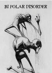
I was inspired by Shawn Coss' work, he represents many illnesses in his work but his works on mental illnesses touched me. I drew from his grotesque take on the human form and stark use of colour. I deviated in that I personalised it more to me and my family, trying to draw on more experiences I had. However Shawn Coss did extensive research on mental illness and I would have liked to do that as well. It is my hope that if I explored the subject more, I could read more stories and talk to people more on how mental illness has affected their lives, as I would not want to cause any disrespect through a subject that devastates lives
1 note
·
View note


