
Don't wanna be here? Send us removal request.
Statistics
We looked inside some of the posts by b1hnd and here's what we found interesting.
Average Info
Notes Per Post
0
Likes Per Post
0
Reblog Per Post
0
Reply Per Post
0
Time Between Posts
3 days ago
Number of Posts By Type
Text
17
Last Seen Tumblr Blogs


Fun Fact
Tumblr has a low social media market share in South America.
Text
3D printing


Finally, we are able to use the 3d printer. I was already so excited to try it but I didn’t know how to until this week, tbh it’s not as complicated as I expected, all we need is the printer program, a usb and of a 3d design.
I’m thinking to make little key rings for the final project when we back after the break but first I’ll have to learn how to use blinder for the actual object.
0 notes
Text
INFOGRAPHIC


That was my first time working on an infographic poster. I made these illustrations to represent each part of the information and to make it look more fun than just a boring written paper.
I didn't like the colours, to be honest. this is not my style, but I had to make it more formal to work with the topic.
Making an infographic was easier than I expected as long as you understand the topic and read it very well before you start.
Not sure if I'm going to use this in the future, but maybe only if needed.
INSPO AND RESEARCH
ALISON KERRY


Alison is a talented illustrator and infographic artist; her work is amazing and really interesting. I love the vibrant colours she's using. Alison is a talented illustrator, and her infographics are stunning and truly engaging. I love the vibrant colours she uses in her work; the illustrations are beautiful, and she is great at transforming basic information into pieces of art.
My work here is different, but we are both still using illustrations, even though mine are more formal; this is only because of the chosen topic.
0 notes
Text
No 3


DEATH WISH
Death Wish is a grounded coffee brand that is based in the United States. Not well known, especially here in the UK.
The first time I saw their website, I was obsessed with the brand identity. They are different from the basic friendly cafes/ brands we see every day; they have their own style, dark and fantsy. Honestly, if I saw it in the supermarket, I would buy it. The packaging is cool enough to catch your attention; they might need only good advertising to make this brand reach more people.
SKETCHES


Here, I started sketching my ideas. I was trying to find something that works with the theme, dark with unfriendly messages to work the opposite way, like ( don't buy it) instead of saying ( buy this). I also noticed that they are using casual language in their brand, and that's what I'm going to do.
The meaning behind the sketches is the idea of presenting the product as something dangerous and toxic but it's good and "worth the risk", and from this, i got the main sentence.
For example, the first image shows a plant being watered by the coffee, and it looks like it's burning.
The next one is a hand with burns and bandages but still enjoying drinking the coffee.
I'm not sure if I'm going to use the third one. I'm not sure if I'm going to use it as it includes a lot of details, but it is supposed to be like someone who fell from their wheelchair and is trying so hard to reach the coffee.
The last one is someone burning and holding a cup of coffee because the coffee is good enough to get your whole attention and ignore everything else.
EVALUATION


I used both Adobe Firefly and Express to create these images before I started working on them in Photoshop. I wrote " mummy holding a coffee" because it looks like someone with bandages.
After that, I added the product. I made the finger to make it look like it's holding it. I made the details like the coffee background to make it obvious that we are advertising a coffee brand and the flames to deliver the main idea of the danger. Of course, I had to add a yellow touch to the bandages to make the fire realistic.
I have changed the text colour from red to white because it looks clearer and easier to read, and I tried different fonts before getting the right one.
TYPEFACE


This is the typeface I used on my posters. I decided to use the same font that been used by the brand to make the advert more professional, and it also works well with the theme.
RESEARCH AND INSPO


I have seen these Heineken adverts, and I really loved them. It's giving the Halloween vibes, and they are quite different than the usual adverts; they are bold enough to stick to the mind and easy to remember. Also, the theme was really interesting; they did a good job bringing back the famous vintage characters like Dracula and Frankenstein. These posters are very close to the idea I'm working on, which is a little bit scary, gothic and unfriendly.
THE FINAL RESULT


I can say that I'm so happy with the posters, and the final income is even better than what I expected.
If I saw these posters somewhere, I would stare at them for a while. The most important thing was that I delivered the message in a very simple way. I used a simple sentence, and I made sure the logo was easy to find.
ADVERTISEMENT


To complete the project, I have used my design to create a GIF animated video, a banner/poster, web design and a social media page. However, the web design was good even though I spent less than 20 minutes making it, but the Instagram page is not the best thing i did.
I have chosen red and back as the two primary colours because these are the colours used for the logo.
WHOS IS THIS ADVERT FOR?
This advert is meant for people from gothic culture, punk, metalheads and for anyone looking for something interesting and different.
0 notes
Text
No 2


BLACKOUT
Blackout is an online urban clothing brand based in the UK. I found this brand interesting because they have their own style and a theme for all their pieces, holding technical and modern vibes, and that is what makes them special than other clothing brands.
POSTER DESIGN


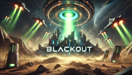


Here, I started to sketch my ideas and work on the advert before the design itself.
I made 4 ideas. 1,2, and 4 included aliens, space and a flying UFO, while no3 was presenting the brand as something dangerous and toxic, i love that one more but i don't think it works with the brand as much as the other three, so i might mix between the three and kick no4 out of the plane.
My idea was to make their product look like a flaming meteor falling from the sky, coming out of space as an indication of how unique and different their pieces are. Like it's something hitting the earth and exploding to show how cool they are.
I chose to use green because somehow green is related to the aliens, and that shade was the main colour the brand used on their website with black and whit to keep the focus on the meteor as the main thing.
As I mentioned before, I'm willing to use Adobe Express again, so I started writing my ideas on the research bar to create the background of my poster, a mix of aliens, spaces and earth. After that, I used Photoshop to add some of the details, like the guy's picture and the brand name. I played a little bit with the colours to get the shade I wanted. I meant to make it clean, so I didn't add a lot of textures and layers and focused on futuristic vibes.
The font I used is called Anotn; it was the same font that been used for the logo.
INSPO


These are the inspirations of my ideas. The first time I visited the Blackout Tech Wear website, these images came to my head, not just the clothes and their product but the web design, which has futuristic and modern vibes, and I think it is also close to the gaming culture.


AM I GOING TO CHOOSE THIS BRAND?
Unfortunately, I will have to work with the third option because this brand has already been advertised perfectly, and I don't think I can do something better than this in a short time.
0 notes
Text


This was the feedback I got from Elli about my work. I made sure that I followed the mentioned things one by one to get a distinction.
0 notes
Text
PERSONAL PROJECT


I thought it would be good if I shared this personal project here because somehow, it is related to the advertisement task by the posters.
This brand identity is one of my favorite works. Even though the logo I created was simple, and the mix between brown and green is not the best, I still like the result.
0 notes
Text
RESEARCH


This was my first try working on Adobe Firefly after trying Adobe Express. I made these cosmetic bottles for mock-up purposes in the future if needed. I loved the quality of the images and how realistic they were. The mix of yellow and blue somehow delivers the feeling of freshness and summer.
However, if I have to compare the two, I would say that these two programs are a bit simpler to each other, but maybe the only one thing is that Adobe Express can be used for free without paying and Express is not.
0 notes
Text
NO 1


HOT CHI
Hot chi is a new skincare brand that I found online while I was searching for unknown brands for my project. I have never heard about them before, maybe because they are still new. What made the brand interesting from my perspective is the serum bottle design, the vibrant colours, the eye-catching images, the bold font they are using in their posts and the advertisement in general. I have also noticed that they are using AI and 3d in their posts to make the images and the products themselves. It actually made me feel excited to develop that side of my skills using AI and 3D.


PRODUCT MOCKUP CREATING
Before anything else, I started creating the bottles. I used Adobe Illustrator to draw the design and then converted them to 3d so I could use them for the mockup instead of using other serum bottles that didn't match the design. There are still a few things to change, like the edges of the bottle cap. The real bottle cap has sharp edges, and mine is a bit rounded, so I need to make them as close as possible. Also, the material here is not good enough; I need to export it and take it to Adobe Dimension to make the bottle look more realistic.


FAILURE
After trying Adobe Illustrator to create the 3d objects, I wanted to work differently and make an image that looked more realistic, so I moved to Adobe Express, trying it for the first time. I made the reference illustration first and then wrote the description of the image I wanted. I mentioned the colours, the style, and the background. I reviewed the details, but the final outcome wasn't as good as expected. I couldn't make the bottle shape look the same as I wanted; it was a different design even though I tried many times. I also tried to use Photoshop to edit the bottle, but it didn't look right.
I might use Adobe Express and Adobe Photoshop in this project because we don't have enough time to make a real photography but to present my idea visually and also to improve my skills, try something new as we can't not ignore the fact that AI is taking a big part in design nowdays.
INSPO


These are the inspirations I used in my work. I know it looks nothing like this, but I loved how fresh and vibrant these images looked. It makes you notice that it is a skincare advert even without reading the information or knowing the brand. I know these images are not only AI but also 3D.
AM I GOING TO CHOOSE THIS BRAND?
No, I will not continue with Hot Chi. First, because I don't know anything about their products, there's not enough information about the brand.
The other thing is the disappointment I get from the final result. Maybe if I have enough time, I can spend more time working on it. Also, the advert ideas are almost not there, not strong enough, it was just a disign.
0 notes
Text
LESS KNOWN COMPANIES


The first activity of the real-world task was choosing a few brands to talk about in general. We actually meant to pick three only, but I wasn't sure which I should choose.
This list of the first unknown companies that came to my head and some of them were unknown even to me. I read about them on Google for the first time.
Each company is different from the other one, but I'm gonna talk about the three I have chosen in detail and why I chose them.
0 notes
Text
TASK 3

The Real World task is actually an advertisement project. We had to choose a lesser-known company to work on, which was the hardest part of the project because if it was less-known to me, it might be very familiar to someone else.
I'm still a bit confused about what exactly we should do because advertising is something totally new to me. In the beginning, I thought it was like a branding task, but it's not because we have to work with a brand that already has its brand identity.
The deadline is not far, and we don't have enough time like we did with the last projects, but I have to manage finishing the project on time. I still don't have ideas, but researching and being inspired will make it easier.
0 notes
Text
ONE DAY PROJECT


For the one day project, we have been asked to go out in a group, taking pictures of the posters and the logos we see there, and then rebranding them, whether it was a poster, a logo, a brand identity, banners or anything else.
I chose B&M logo because i think they could have done something much better than this, also the background is too much if they going to use it with the logo together, the ends of the letters are touching the blue outline stroke and i really find this annoying idk why.
However, i made this logo, i'm not 100% happy with it because i think it needs to be more simple buuuuut still look better than the original one, i loved the & in the meddle, blending with the letters. I also added the dot, sharing to the sun because the original logo got a background looks like the sun rays somehow. I changed the colours shade, it needs to be more vibrant and noticeable.
0 notes
Text
WEB DESIGNING


After designing the website, i tried using the brand identity colours, purple and green. These two colours have been working will with everything i did before, like the packaging, the labels, the posters. however sometimes using the same colours in a different place seems too much, for example: with the website if you want the people stay in your page as longer as possible the web design should be something comfortable for the eyes and less busy. and comparing between the one i did before using black and green only with the one here, purple is just too much and i kinda prefer the black and green, even though it is latterly the same design and i used only the brand colours but lets say i replaced the primary purple by the secondary black colour.
Also one thing i have forgot, the colours i used on illustrator were CMYK so the different was clear when i used the cods on XD.
0 notes
Text
WEB DESIGNING


I can finally say that i got the website done, I'm soooooooo happy with the final result even though it's not 100% perfect because some of the details are missing like the things you can see whenever you press some of the icons on the right side, i still have to learn how to make the scroll thingy works, i have made it but i couldn't make it active as a did with the other options where you can move from page to another by click on them. However, this is latterly my first time making a website and i did enjoy it, it didn't even take me that long to get it done and as i mentioned i have chose XD because it is much easier to use compared to Figma.
I love the black background more that the purple, it made the shapes looks like its illuminated, latterly giving me the wanted vibes of something came from the future. i also added the icons i have created on illustrator, instead of using letters and words as i did with the contact page, the basket on the top, and the other little details.
I used my own products on the Home page, the T-shirt and the tote bag. The actual product should have been done this week but i wasn't able to get them print on time so i made these mockup pictures as an example of how they are going to look like.
I also added some informations on the About Us page, about the brand, telling the story behind it and how it's started.
I used the brand identity font, Creative midnight for the titles and Baloo 2 for the rest of the texts, the brand colours are still the same, i just replaced purple by black, that shade of black i have already got on the secondary colours section.
0 notes
Text
ILLUSTRATOR

Illustrator is defiantly my favourite program, as an illustrator i used to do most of my work there.In this project, we had a lesson about illustrator and then a tutorial about creating this logo so we can create our logos in the future.
I loved how simple that logo look, the blinded blue background was cool and the way we did the cloud out of the three circles.I really enjoyed this activity and i would like to get used to create more logos in the future because I'm a bit interested in branding and making brand identities.
0 notes
Text
in Design


This lesson was like a short tutorial about inDesign, how to use it, the program basics, how to use the tools to make these shapes.
It wasn't my first time using indesign, i have been using it a lot recently but i had fun making this Christmas card, a simple activity just to refresh our minds. I also loved the bear, mine is not that good but still cute.
we took that lesson because we meant to use inDesign for our id project to create the brand guidelines, exactly as how i did down below.
0 notes
Text
BRAND GUIDELINES


I have got the brand guideline for my brand identity done, just to get all the ideas, the explanation, the products together in one place. I explained the reasons behind the chosen colours, how to use the colours together, what we can do and we cnat do, the logo, and what do it mean, and of course i added a mockup things to show how the things gonna look in real.
I made a business cards holding my email and my instagram account with the name of the bran. I also got the packaging done, the bags with a neon green colour and the logo printed on. i made a wrapping paper using the illustrators i made to cover the products, the tag i just used my logo with a green on the background.
I also added a professional letterhead, i made it a bit formal, with a whit background and then i added a little illustrations just to have the brand vibes.
I should mention that, the id project was one of the most interesting projects i have done since i started doing graphic design, i enjoyed creating the logo, choosing the colours, making the products and everything else. It actually shows part of my personality by moving from idea to another, because this is definitely me in real life, i keep changing my mind hundred times until i'm finally confident enough about the chosen thing.
0 notes
Text
WEB DESIGNING/USING FIGMA

I have heard a lot about Figma, and i felt like i should definitely give it a try, i might love i might not, and because part of our id project was creating a website, i thought this is my chance. The design i did looks awful i know that, but i was just playing around with the tools discovering how to use them, and honestly it took me too long to make these two pages, because i should learn the basics first. However i didn't complete it and i moved to adobe XD because it is MUCH easier to use and i don't have enough time to work on new program while the deadline is already close.
But, I would defiantly back to Figma after getting my work done, to learn more about it, i find it interesting and more professional than XD.
0 notes