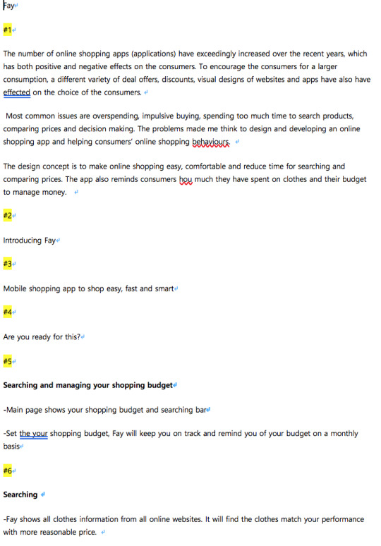
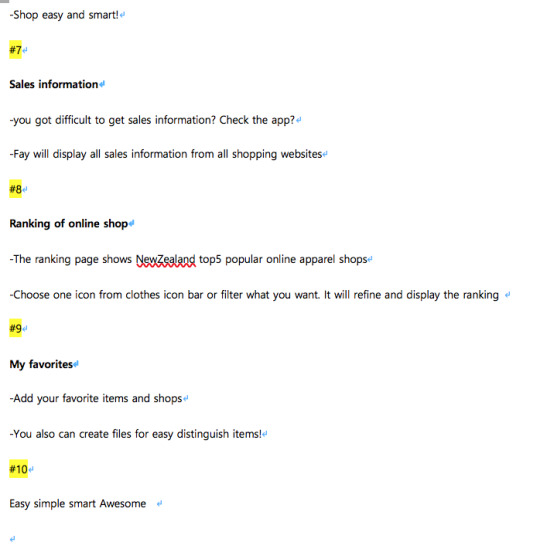
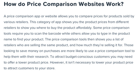
Don't wanna be here? Send us removal request.
Text
Reflection

Before having interviews, most of my interview questions were focusing on overspending and impulsive buying, which are based on my semester one research. I also expected my final topic and app would be the solution of overspending and impulsive buying. However, the results of the interview showed that people do not really overspend and purchase impulsively on clothes. At this point, I was in the state of confusion and panic because I strongly believed people do overspend and impulse-buying. Furthermore, there are many articles about overspending and impulsive buying on online shopping. I also have experienced overspending and impulsive buying and have regretted many times. After gaining this insight, I conducted interviews again, focusing on their real shopping experience and trying to find actual problems and solutions for them. I found out the main problem from the second interview that people sometimes get lost while finding clothes that they want with the lowest price. There are few websites for electronic goods that allow consumers to compare the price but no for women’s clothes. I have thought about this deeply with my experience because I needed to feel sympathy and understand them first. I I also have experienced to spend whole day to find the product I wanted to buy and compared prices from different shopping websites.
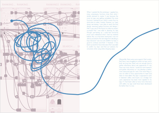
When I created the first prototype, I applied too many unnecessary functions more than what I initially planned to create. It was because the more my app was getting completed, the more functions I wanted to put, which is away from my initial plan to make it simple. However, as I kept doing user-testing, I was able to reach the final design, removing useless functions and design. I think it was one of the factors to make my project successful that I was able to develop my app through user-testing as I could find functional errors and understand what I had not realised before. Also, as it has been mentioned, I was not able to proceed to the next stage from deciding a topic because I was not sure whether my topic is good to continue and finish it. However, it has been successful to have interviews that I was able to confirm my topic and find out solutions for consumers when using online shopping apps.
Meanwhile, there were some aspects I feel unsatisfied. Since I was struggling to confirm my topic and it took me long time, there was not enough time to gather information about user experience. If I can have one more chance, I would do more research and gather information so I can develop a better, more advanced app for users. One more thing is I was not able to have opportunities to meet and listen to more sellers. My app is supposed to work in between sellers and buyers as a bridge, but users’ experience has been more applied to my app. If I had been able to have more interviews with sellers, my app could have been developed far better than it is now.
I once again realised how important user experience is in designing. It is hard to ensure the actual difficulties that users are having by thinking inside my mind alone; thus, I will not start my design based on my prejudgment but will try to listen to more users’ stories and experience.
When I was first given the last assignment in University, I was worried and nervous. On the other side, however, I was happy and excited because it was the last assignment of the course. I had set my mind to do my best to complete the last one. There have been times to become and panic and wanted to give up unlike my initial mind. I worried if I can complete my last assignment and show it to others in the final graduation exhibition without feeling shame. Fortunately, I have been able to finish my assignment, not giving up until the end. I can now graduate my school, but I also need to get ready for another beginning in the real society.
0 notes
Photo
Contextual Document
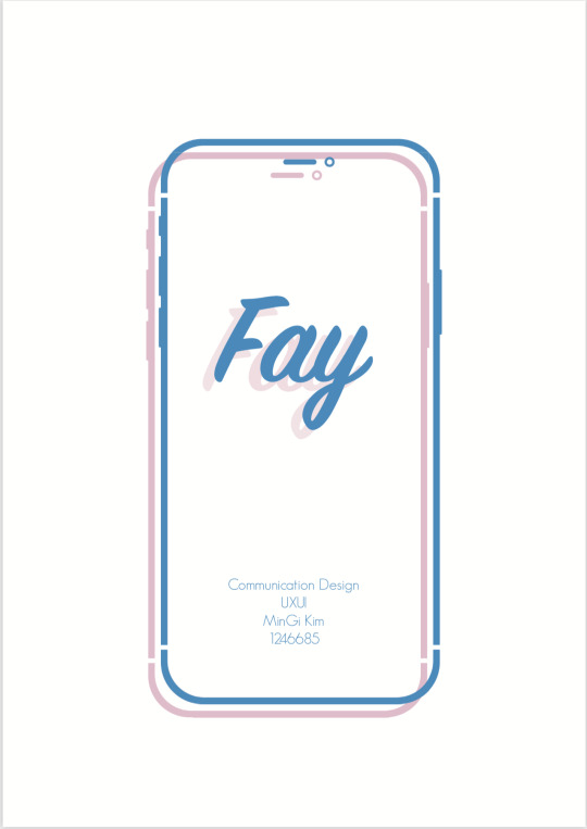
At this stage, I was still developing and improving for better final design. The contextual document was very hard and it took long time to be done because I needed to explain everything with only texts and it was hard to explain what I want to say about the app.
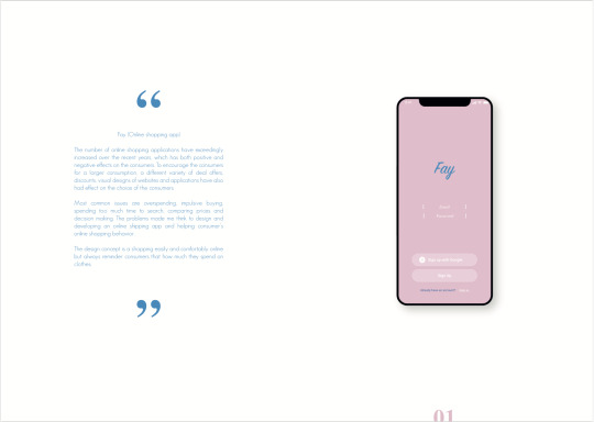
I tried to design simple and used two main colours (blue and pink) which were used on app.
1 note
·
View note
Text
Pitch video

Pitch video making process
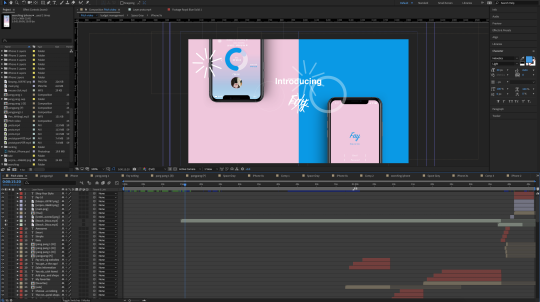
For pitch video, I have used Adobe after effects.
0 notes
Photo

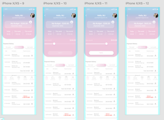
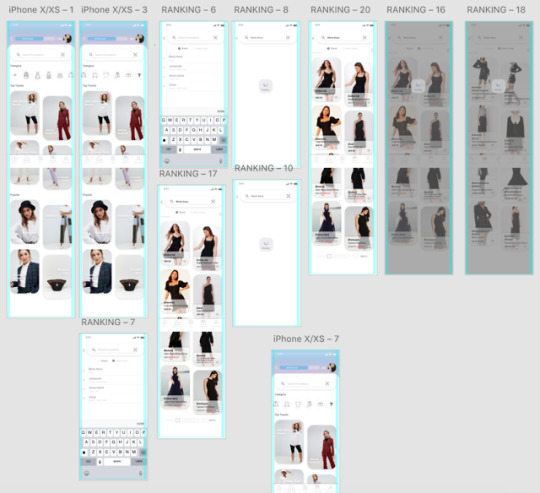
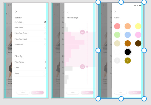
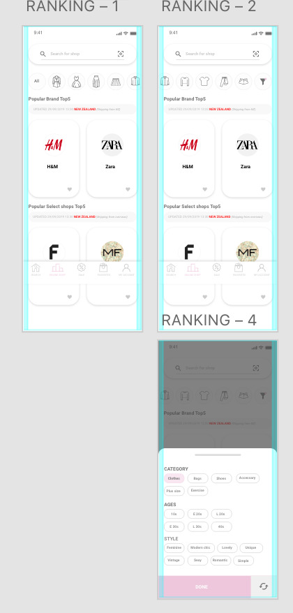
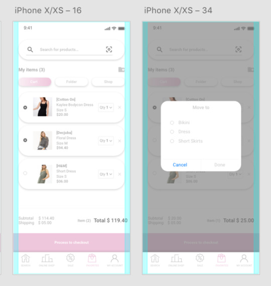
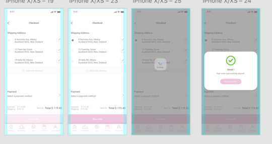
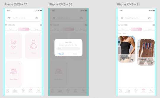
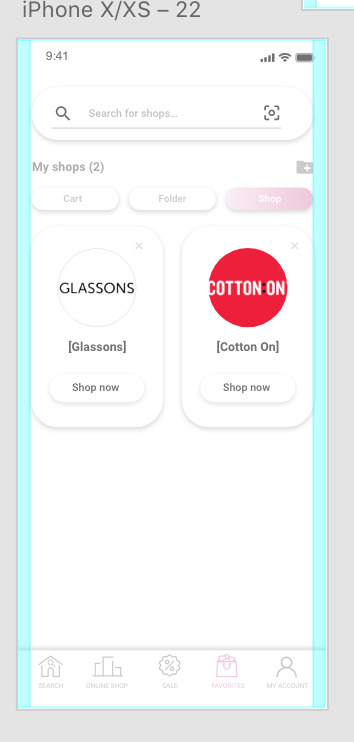
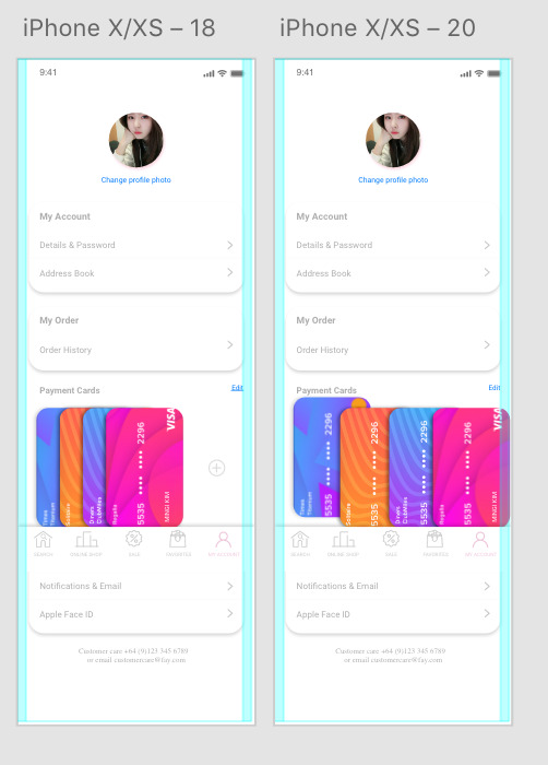
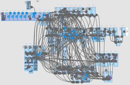
Final prototype
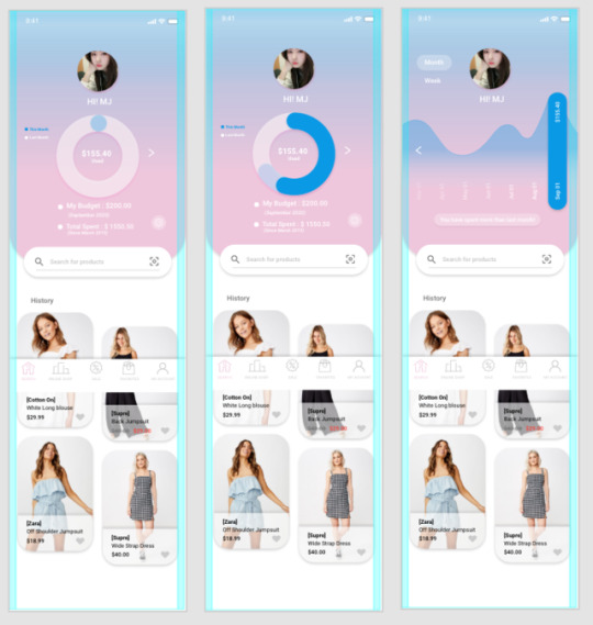
I improved the first prototype based on user testing. User testing was helpful to develop the design and function. It gives idea that I could not think before.
What did I change?
Typeface
Icons
Budget management on main page
less colour on each page
font size
Add explanation page
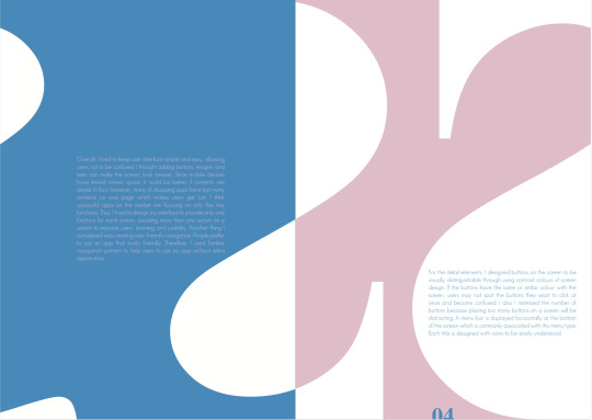
Overal, I tried to keep user interface simple and eas, allowing user not to be confused. I thought adding button, images, and texts can make screen look messier. Since mobile devices have limited screen space, it could be better if contents are simple. (Other many shopping app have too many contents on one pages which makes user get lost)
I focused on only few key functions which are searching, comparing and budget management. Thus, I tried to design my interface provide only one function for each screen, avoiding more than one action on a screen to improve users learning and usability.
Another thing I have thought was creating user friendly navigation because people prefer to use app that looks friendly!
Colours
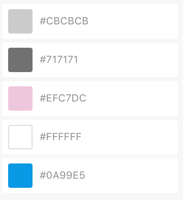
For the colours, I used paster blue (#0A99E5) and pink (#EFC7DC) (Pink has been used to make feminine and bright feeling). Two main colours are being shown only in main pages. Colour greys have been used for texts and icons in the other pages to keep simpleness of over all image of the app.
Images
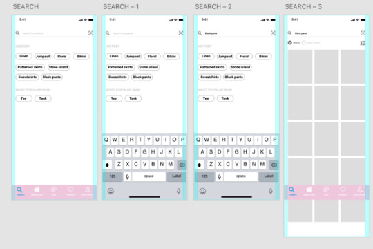
It has been designed to show 2-4 clothes images on one screen because one of the main function is comparing clothes easily so images have to be big. User do not need to click to zoom and see the detail of the clothes


Icon
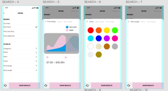
There is a category filtering function on search page and ranking page. This function has been designed in an icon. Not text. User can click easily and quickly.
Typeface
I used “Roboto” for the typeface which is easy to read and most used typeface on app and web!
Fay
I combined two words that Fashion and day.
0 notes
Photo
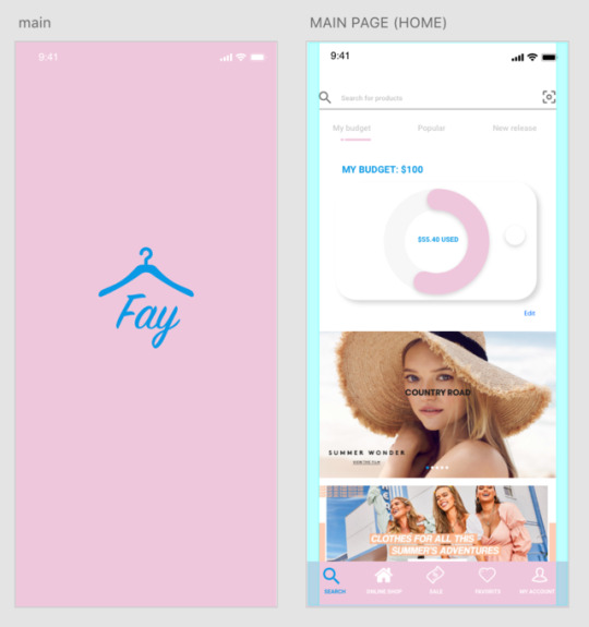

Week9
User testing Testing Summary/Feedback
Home page
Do not understand what the graph is?
The icon on menu bar is for search, but the screen doesn’t look search page
Menu bar- white icons on pink background, cant see icons well
The font size is too small
Don’t know what to click. If it is searching page, focus on search. There are too many unnecessary information
Make the graph bigger
Menu icons too small
Change typeface
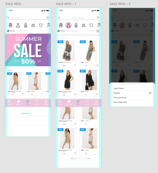
Do not need to put promotion/ sales info on main (Home/ Search) page. That makes me confused
Home page -> Search page #1
There are only txts. Boring
Done care about “most popular now”
Would be nice if there are images
Home page -> Search page #2
Images are too small to compare prices
Want to know how many results I got
Like that there is select button to choose “brand” or “Select shop”
Make image and fonts bigger
Font is too thick and too black
Ranking page
Like user can save favourite shop
Like that refine and display as I filtered
Additional Feedback
Everything is simple and easy
Focus on budget management function. It is very nice
0 notes
Text
Low-Fi Prototype
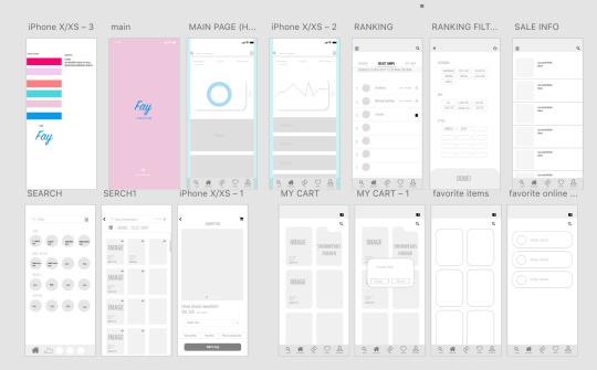
I created low-fi prototype first.
I’ve been using adobe xd as a prototype tool. I have used adobe xd last year but it was quit hard to me so used illustrator last year, however this time, i used adobe xd from beginning to end because wanted to improve xd skills.
0 notes
Text
Week7
Wireframe sketches
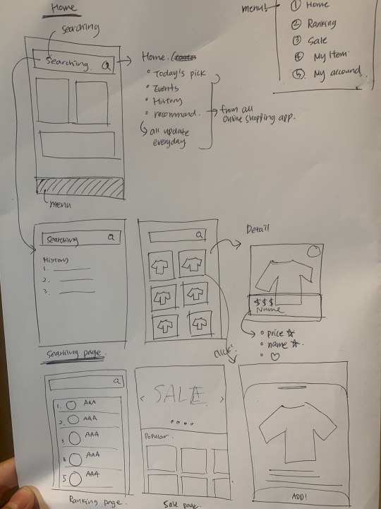
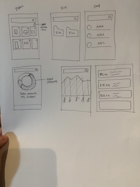
Before prototyping, I have done rough drawn prototype for flow, concepts and contents.
Home
- Budget management (graph)/ Used amount each month
-Searching bar
-Recent history
Ranking
-Ranking of online shop in NewZealand (Ranking will be updated everyday)
-Select shop Farfetch/ Matchesfashion etc & Brands (Cotton on/ Glassons etc) in Newzealand
Sale info
Show all online shop’s sales information
My cart/ Favorites
Can add items and create file for easy distinguish
My account
0 notes
Text
Week6
Crazy eights
Apparel consumer review: This idea came out from the app called “Hwa Hae” in Korea. The app provide ingredient information of cosmetic and beauty product. Consumer can easily check all information about the product and user’s review. Users upload review of product and other people can read.
Sale information:
Price Comparing:
Budget Management
Fashion group chatting
3D VR Fitting
0 notes
Text
Final HMW
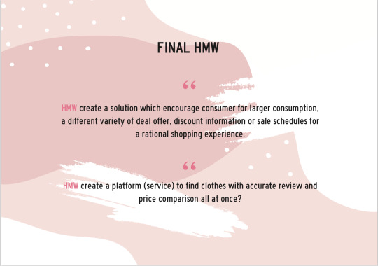
Creating an app that provides a different variety of deal offer, discount information or sale schedules for a rational shopping experience.
Creating an app to find clothes price comparison all at once for good decision making and less time consumption (reducing risks with accurate result and searching).
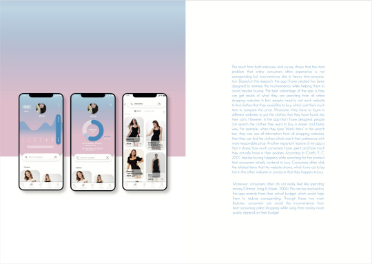
The result from both interview and survey shows that the most problem that online consumers often experience is not overspending but inconvenience due to heavy time-consumption. Based on this research, i want to create a app designed to minimise the inconvenience while consumer’s shopping avoid impulse buying.
In fact, people need to visit each website to find clothes that they would like to buy, which cost them much time to compare the price. Moreover, they have to log-in in different websites to put the clothes that they have found into their carts. For example, when we type a floral dress on Google, Google shows all online websites which sells floral dresses but we need to open each websites. It is very inconvenient and take long time to compare each website.
(Impulse buying happens while searching for the product that consumers initially contend to buy. Consumers often click the related items that the website shows, which turns out to be lost in the other website or products that they happen to buy.)
Moreover, consumers often do not really feel like spending money. This can be resolved as the app reminds them their actual budget, which would help them to reduce overspending.
Through these two main features, consumers will avoid the inconvenience from time-consuming online shopping while using their money more wisely depend on their budget.
0 notes
Text
Crazy eights

Apparel consumer review: This idea came out from the app called “Hwa Hae” in Korea. The app provide ingredient information of cosmetic and beauty product. Consumer can easily check all information about the product and user’s review. Users upload review of product and other people can read.
Sale information: When people are planning to buy something (clothes), they can check sale information
Price Comparing: Do not need to search on google and open all websites to compare clothes.
Budget Management: People do not feel like they are spending money on online purchasing. Keep reminding how much they used and left for online shopping.
Fashion group chatting: One of problem of online shopping is product risk. To reduce the risk, consumer need review or advice! random fashion people can chat and talk about clothes. They can give review and advice each other before purchasing.
3D VR Fitting:
0 notes
Text
Presentation
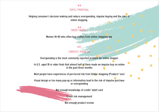

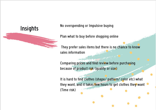
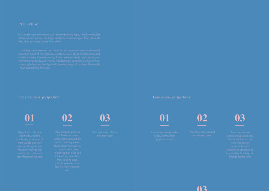
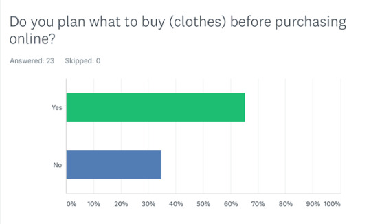
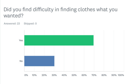
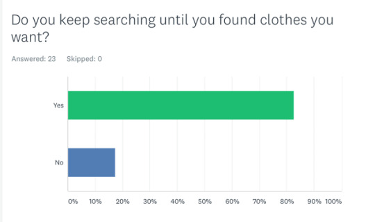
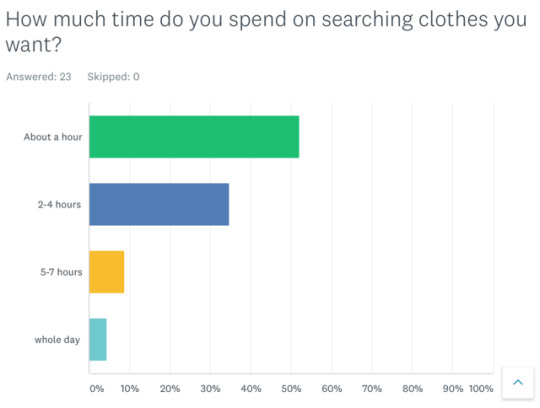
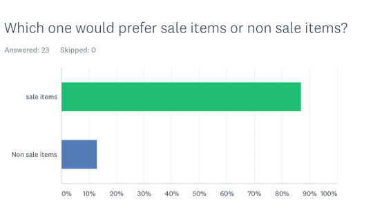
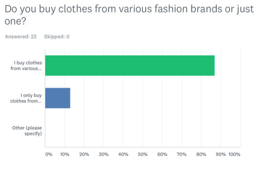
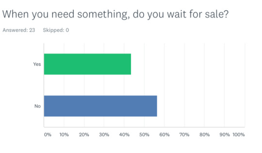
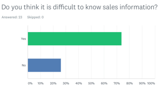
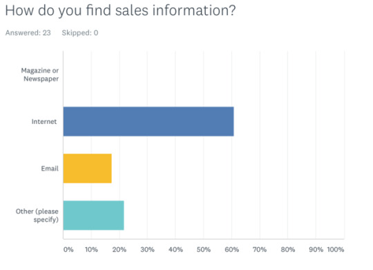
After HMW I had 8 interview and most of my questions were open ended questions. At the beginning of interview most of my interview questions were about overspending and impulsive buying but they do not really overspend or impulse buying, so I added more questions to listen their shopping behavior and I found interesting few insights. They plan what to buy before purchasing and some of them wait until sale and bargain but there are not many chances to know sale information or schedules. Also, before buying clothes they find review and similar body type for their size decision but there are not enough review so they often got wrong size. And most of participants said it is hard to find clothes what they exactly want, and they keep searching until they found clothes they want. They usually use from three to twenty fashion apps and they check each app to find clothes and it takes 2-4 hours averagely.
0 notes
Photo
Survey
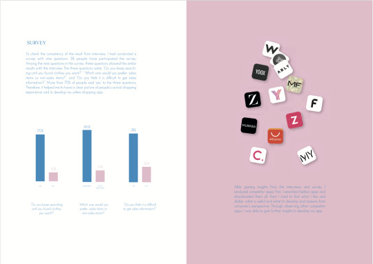
To check the consistency of the result from interview, I had conducted a survey with nine questions. 38 people have participated the survey. It helped me to have a clear picture of people’s actual shopping experience and to develop my online shopping app.
0 notes
Text
Final Insights
From consumers perspective
They plan in advance what to buy before purchasing, and some of them usually wait untile sales and bargain start. However they do not really have a chance to get information on sale.
They compare prices a lot. There are many similar clothes around the world, and they prefer lower price. However, to compare price, they need to search a lot and it takes long time. Also they need to open multiple websites. They feel it is very inconvenient.
It is hard to find clothes that they want.
After interviewing consumers I had 2 interview with seller. There were not many seller around me so I only did two.
From sellers Perspective
Consumer usually prefer to buy clothes from popular brands.
The stores are crowded only during sales.
there are massive clothes being in stored and abandoned, which are very nice and in reasonable price because people tend to buy clothes that they are already familiar with.
0 notes

