Don't wanna be here? Send us removal request.
Text
Reflection Post
Coming into this class, I was not really expecting to learn much because I had taken many design classes in high school; I was very wrong. I learned so much more than I had ever anticipated. I learned many new skills in the Adobe programs that I was never even taught before. I learned about thumbnail sketches and got into the habit of using a sketchbook to map out my ideas before even opening Illustrator or InDesign. I even made some new friends who taught me about things like drawing tablets. Now, I’m looking forward to getting to play around with one this summer and learn more about it. I also learned a lot about PDFs and how to properly set up documents for printing. However, I still have much to learn in that area. I obtained so many abilities this semester that I never expected would have come out of this class and I can’t wait to learn more.
1 note
·
View note
Text
Week 13+14 (Process Journal)
These past two weeks were spent making our process journal. My design went through many phases and I finally ended at a design that I was proud of. I started off wanting to do this brush stroke design but I was never confident with the idea from the start so when I looked at other peoples designs on that Monday, I immediately scrapped it. I went to a design with a big title page for each section. I liked this design more but I still was not very sure about it. After the in-progress review with Leslie and Meena, I decided to rethink my design once more. I simplified the title page down to basically a logo and spread out my content to make it look much cleaner. The one thing I did notice was that my color scheme remind relatively the same throughout all the designs. I really loved this project and getting to look back at all my project throughout the semester. I’m not going to lie, it was very frustrating and time consuming, but I am so proud that I got it done and how it turned out. I think this is going to be a really fun thing to look back at and see my projects when I am a senior or even older.
0 notes
Text
Weeks 11 + 12
These past two weeks, we finished up our book cover designs as well as began our process journals. From the rough draft of the book cover to my final draft, I made very minor changes. I deepened the blue, shrunk down the bee’s profile, centered everything on the cover, and a few other small adjustments. I am very proud of how the book cover turned out in the end. This week, we also began figuring out a design for our process journal. I think I’ve finalized a design for the project spreads but, it will probably get changed around when I take my sketches to the computer. I want the design to be simple with a two color palette but, I have not yet chosen a color palette or fonts. I am really looking forward to getting this project started because I really loved working on design for my high school’s yearbook.
1 note
·
View note
Text
Book Cover Design (week 9+10)
This week, I worked on coming up with an idea and rough draft for the book cover project. I decided to go with The Future of Botany as my title and came up with nine different sketches. I knew right away that I wanted to do something along the lines of a blueprint, but I was not really certain where to go from there. After the group meetings, I was encouraged to try something along the lines of blueprints and bees. I am not very skilled in Photoshop so initially, I made it it all on Illustrator. Then, Leslie helped me figure out a way to use an actual picture of a bee hive to make the graph paper. To improve my rough draft for the final critique, I am working on how the text is oriented, the shade of blue for the blueprint, as well as how much information is in the blueprint itself.
0 notes
Photo
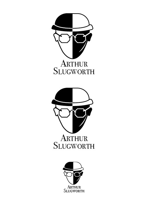
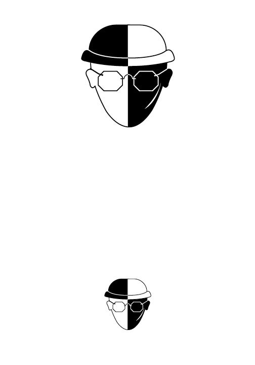
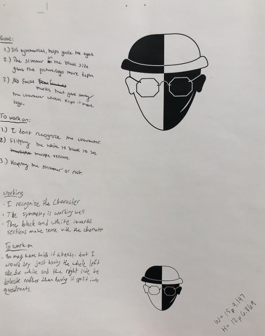
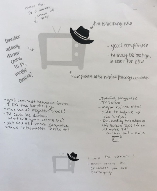
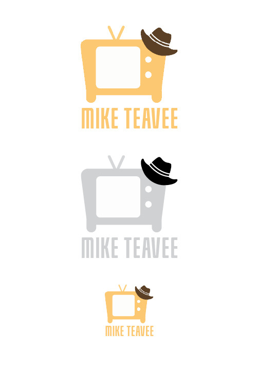

Character Logos Pictures (week 7 + 8)
1 note
·
View note
Text
Character Logos (week 7 + 8)
These past two weeks, I have been working on my character logos for Willy Wonka. I chose to make logos for Mike Teavee and Arthur Slugworth. For Slugworth, I wanted to touch on his two identities. He is a spy trying to steal the gobstopper secret formula but, he is actually a good guy who is working for Wonka to test the kids. It was really challenging to make both sides symmetrical with all the strokes I had used but I think it all worked out in the end, besides his scar, of course. For Mike Teavee, I went for more of a literal approach and made a TV with a little cowboy hat resting on top. I used the eyedropper to take the color from his shirt he wears in the factory, to color the TV. I got lots of helpful advice from my peers on how to make my logos better. While I had some trouble with this project, I am really proud of how my logos turned out.
1 note
·
View note
Text
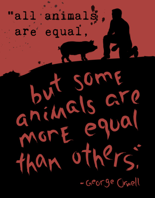
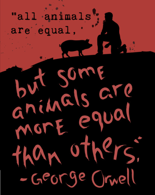
Great Ideas Poster Final Product
This week, I finished up my Great Ideas Poster. As you can see from my previous blog post, I completely changed my idea. My original poster was not turning out how I was wanting it to, so I decided to completely scrap it and start fresh. I went back to my sketches and started playing around with some other designs that I liked much better. I got lots of helpful advice from the class on how I could improve the poster. One thing that they suggested was that I hand write the top text as well, however, I thought that took away from what I was trying to accomplish with the colorful side versus the dark side and the fact the quote is about Animal Farm. I did utilize the other advice I got like drop the horizon line, make the silhouettes more “sketchy”, shift the drawn text to the right, etc. I am much prouder of this poster then my previous one.
1 note
·
View note
Text
Great Ideas Poster Progress
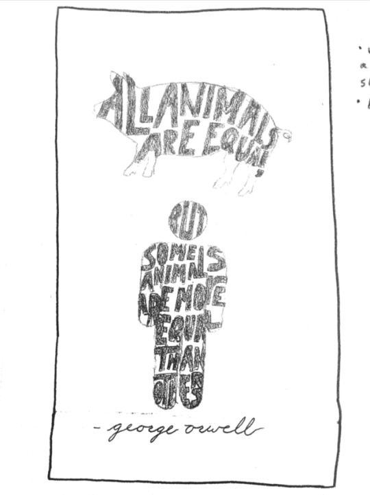
This week, we progressed further on our Great Ideas Posters. After talking with my group on Monday, I decided to change focus to a different sketch I had done. They really liked the idea of me making the quote out of the shape of a pig and a person. I was kind of hesitant about this because I have attempted this technique before and found it challenging. However, I decided to give it a go and sketch it out anyway. As of right now, I am not very far with the computer work. I have the pig shape made but, it still needs lots of touch ups so it can successfully portray a pig shape. I received lots of helpful advice on the placement of my objects during the crit on Wednesday but, I think I’m just going to worry about getting the shapes made for now. I will for sure play around with their placement when I am closer to being completely done.
1 note
·
View note
Text
Great Ideas Poster Thumbnails
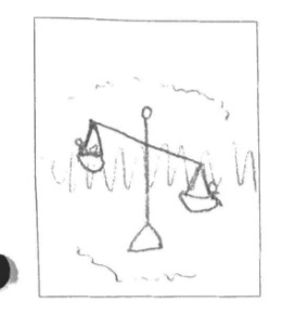
This week, I worked on coming up with ideas for the Great Ideas Poster. I narrowed it down to two quotes. One from Dalai Lama and the other from George Orwell. My favorite right now is the George Orwell quote which states, “All animals are equal, but some animals are more equal then others”. I chose this because I remember reading Animal Farm in eighth grade and really enjoying it. For this one, my initial idea is to make a scale and on one end, put a bunch of different animals, and then on the other end putting one stick figure man. The man would weigh more than all the other animals which goes along with the quote. I feel very passionate about this idea so hopefully I am able to successfully complete it.
1 note
·
View note
Text
Syntax and Semantics
This week, I worked on a layout to demonstrate syntax and semantics. This was something very familiar for me because I worked on design and content for my high school yearbook for three years. Going along with that, I decided to separate everything on my spread using one pica like we did in high school. To me, this just looks clean and organized. I used one of my favorite fonts, Bebas Neue, to do headlines. I matched it with a more standard font, Avenir Next Condensed, for the body. When trying to come up with an idea for this project, I was watching a video where a man went a whole day without looking at a clock once. This made me realize how important clocks are in my life, so I decided to do time pieces. I chose four that really stood out in my life and used them for the project. This project was a good refresher for me on how to use the basics in InDesign.
1 note
·
View note


