Exspectata! Praetor of Camp Jupiter. She/They. At this point, I'm no longer a cosplay blog and simply whatever my heart longs for: books/musicals/films
Don't wanna be here? Send us removal request.
Photo

a transparent version of the magnus archives logo which took me approximately a decade to make; go forth and edit!
84 notes
·
View notes
Text
TW: POLICE BRUTALITY, DEATH
The footage circulating on social media shows three officers intervening against a young Romani man who keeps trying to get out from under them. One officer holds the man's feet, another then kneels on his neck for several minutes.
A third officer helps handcuff the man, who is shouting. Several Romani people who are bystanders can be heard in the footage commenting on the intervention.
"They're smothering him," a woman's voice can be heard to say. "That's their job," a man's voice says, defending the police intervention.
~~~
Michal Mižigár, a Romani student of history and Romani Studies who won the Aspen Central Europe Leadership Award in 2019 from the Aspen Institute Central Europe, commented that the footage shows "The Romani Floyd today in Teplice!" Recalling the attack on Romani children at a summer camp run by the Romani musician Ida Kelarová and the death of a Romani man in police custody inside a pizzeria in Žatec, he added: "I feel genuinely powerless and sad. This is not the first case."
899 notes
·
View notes
Text
i learned that in the 1936 Olympics two Japanese pole vaulters (Shuhei Nashida & Sueo Oe) tied for second. Declined to compete against each other, Nashida was awarded silver and Oe bronze. On return to Japan they had the medals cut in two & joined together to make two ‘friendship medals’ out of silver & bronze (x)


11K notes
·
View notes
Text
How to edit traditional art for social media
Being a mainly traditional artist myself it always irks me a little when I see sketches or even full illustrations being posted without any proper editing, making for a terrible presentation of an otherwise great piece.
So here are my tips for making your art not look shit in just a few easy steps.
You don´t need a fancy scanner for this, but if you have a digital camera at home I´d recommed you to use that instead of your smartphone. (However smartphone photos are also okay! Use whatever you have on hand)
Take a photo of your piece during the day in ambient lighting and try to make the paper lie as flat as possible. Avoid direct sunlight and artificial light as both will lower the quality of the picture. The inital photo will look something like this:

Not exactly breath-taking, huh? but don´t worry, we´ll get this prettied up.
Open the photo on your computer and turn + crop it

For the following editing I use Adobe Photoshop CS2, which is legally available as a free download, so there really is no reason not to get it. It comes with everything you´ll need for the edit.
(Unfortunately I have it set to German but I did my best to make my steps understandable)
Now, let´s get on with the edit! Select “Image” (Bild) in the top bar, go to “Adjustments” and first of all set the “Saturation” to zero (if you have a black and white drawing)


After that, pick “Brightness and Contrast” (also found in “Image” –> “Adjustments”) to brighten up your piece some more

Aleardy much better, hm? But as you can see, the bottom-left corner of the image is quite a lot brighter than the upper-right one, which prevents you from getting an even result.
Thankfully, this problem is easy to fix.


This way you can even out the brightness of the overall piece and finally use the “Brightness” and “Contrast” sliders one last time to get a clean result

This is already pretty good, but if you want to go the extra mile, you can use the eraser tool as well as filters (such as the liquify tool and sharpness) to remove little sketchy lines or fix small mistakes (classic example: adjust the position of the eyes to make them look more symmetrical)

And that´s it! With just about 5 - 10 minutes of editing you can get your drawing to look clean and presentable! (Coloured illustrations are usually easier to edit, just play around with “Brightness”, “Contrast”, “Color Balance” and “Saturation” until you manage to emulate the original look of the piece.)

I hope that this tutorial will help you level up your own editing from now on. Play around with new settings and see what works; you might discover even more useful options in the future!
7K notes
·
View notes
Text
I know y’all are not shipping Loki x sylvie that is the same person they’re literally siblings.
54 notes
·
View notes
Text
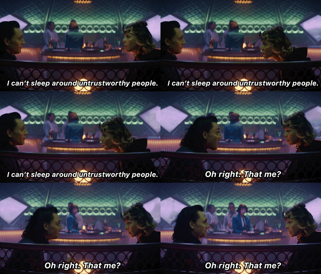
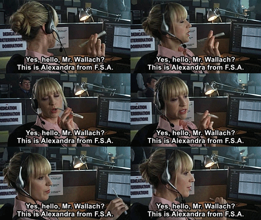
After seeing the first... how quickly my brain switched on the second...
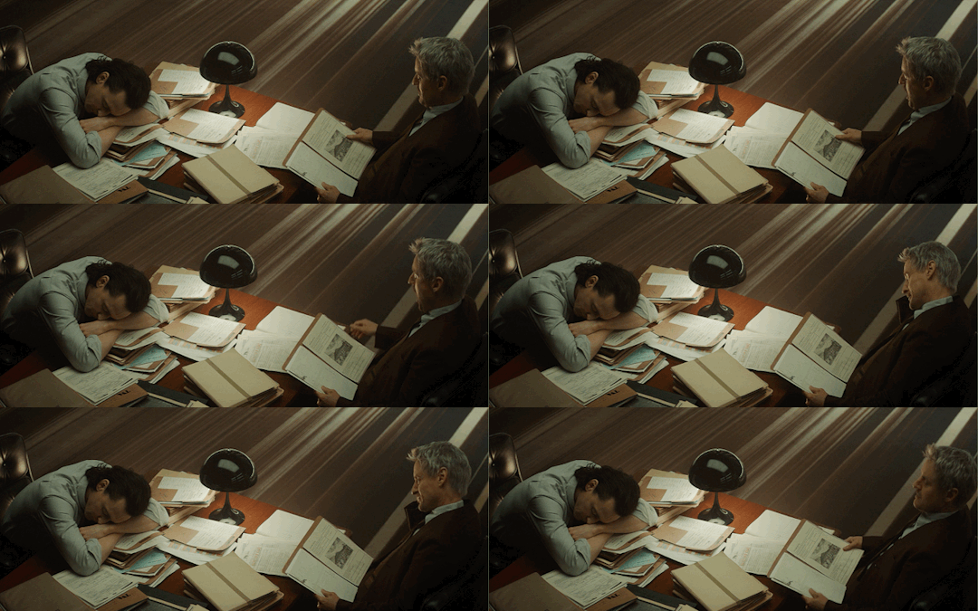
Talk about being obvious...
6K notes
·
View notes
Photo
926 notes
·
View notes
Text

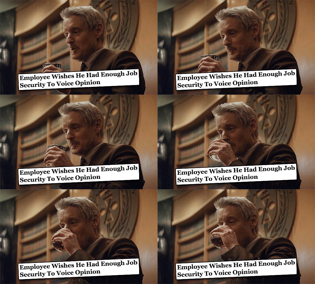
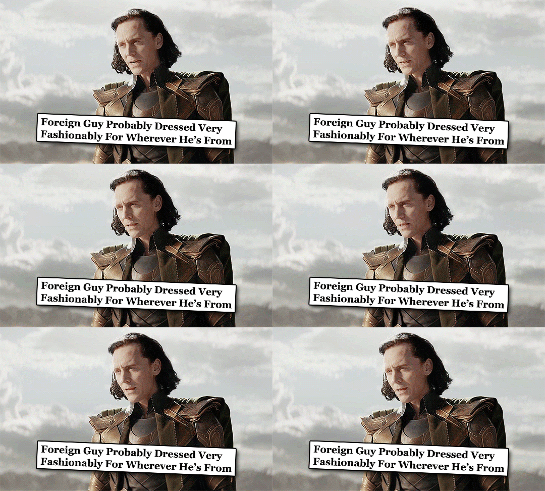
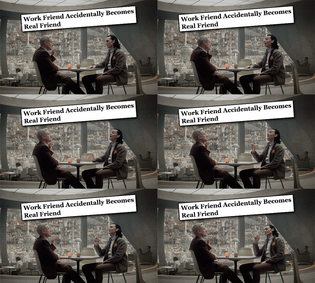

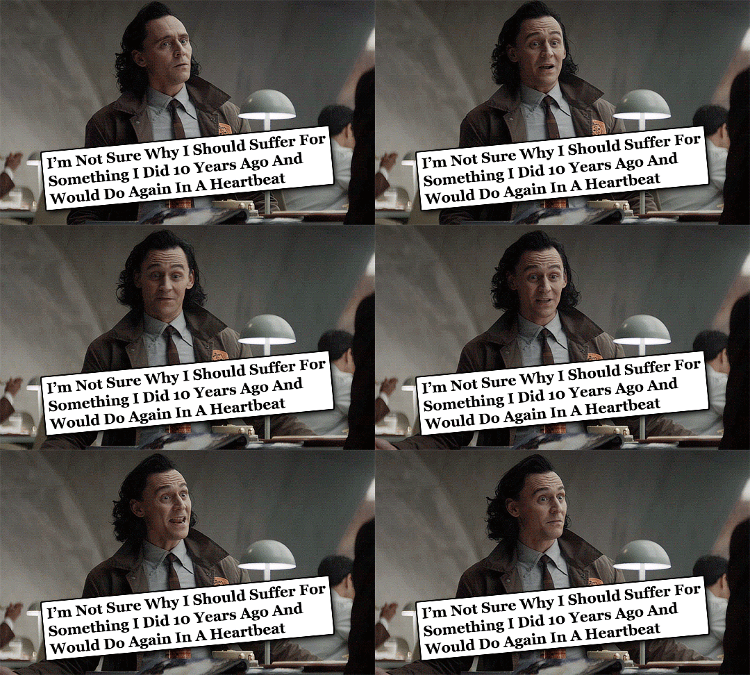
loki + the onion headlines (1/?)
5K notes
·
View notes
Text

this mf has me by the heart again
12K notes
·
View notes
Text

Just realized I only ever posted this on Twitter! Three Kings of Asgard, inspired by JC Leyendecker.
2K notes
·
View notes
Text
Loki: I was just standing up to make a point
Mobius: I’m sorry go ahead
Loki:

2K notes
·
View notes
Text
im bout to trigger yalls fight or flight reflexes
“i baked you a pie”
“oh boy! what flavor?”
86K notes
·
View notes

