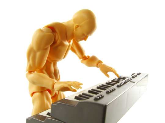
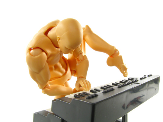
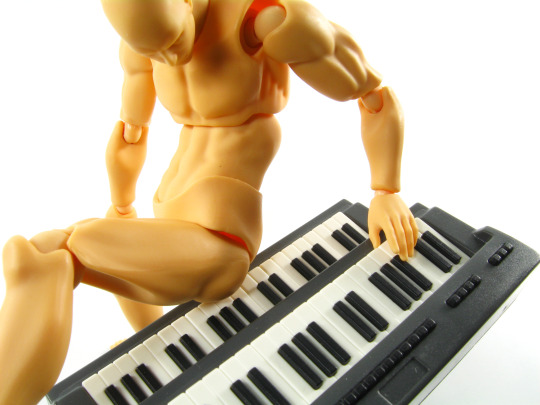
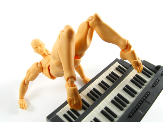
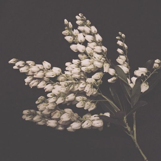
I see a lot of good art and craft tutorials but i always forget about them by the time i get some time to create. If you want i good project/ reference id be happy to look some up for you.
Don't wanna be here? Send us removal request.
Photo
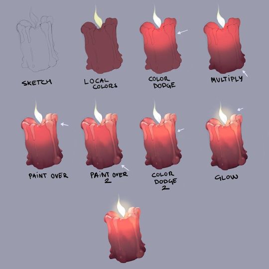
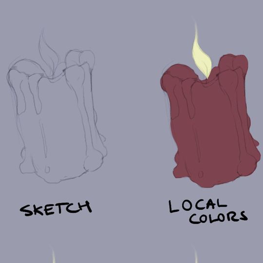
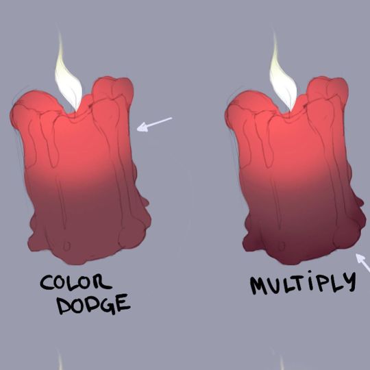
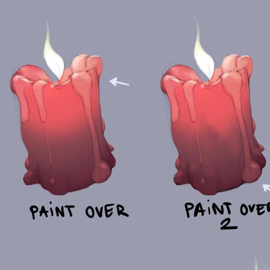
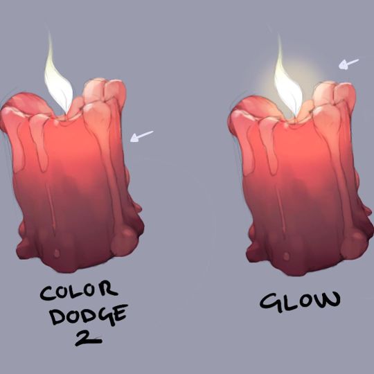
Candle Tutorial by slagbjorn.art
Support the artist and check out their prints!
4K notes
·
View notes
Photo
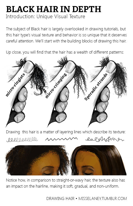
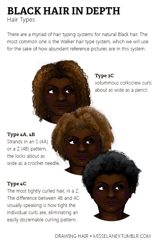
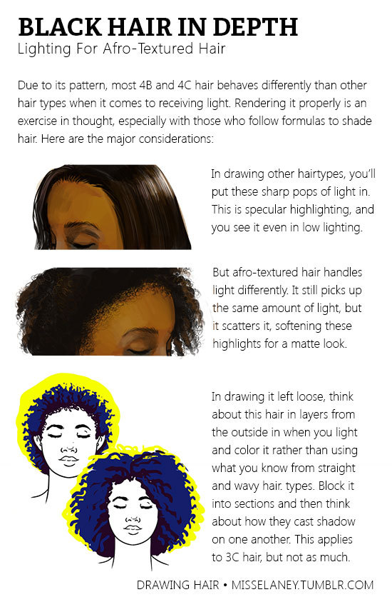
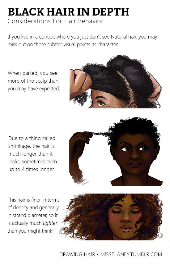
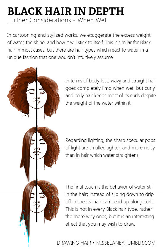
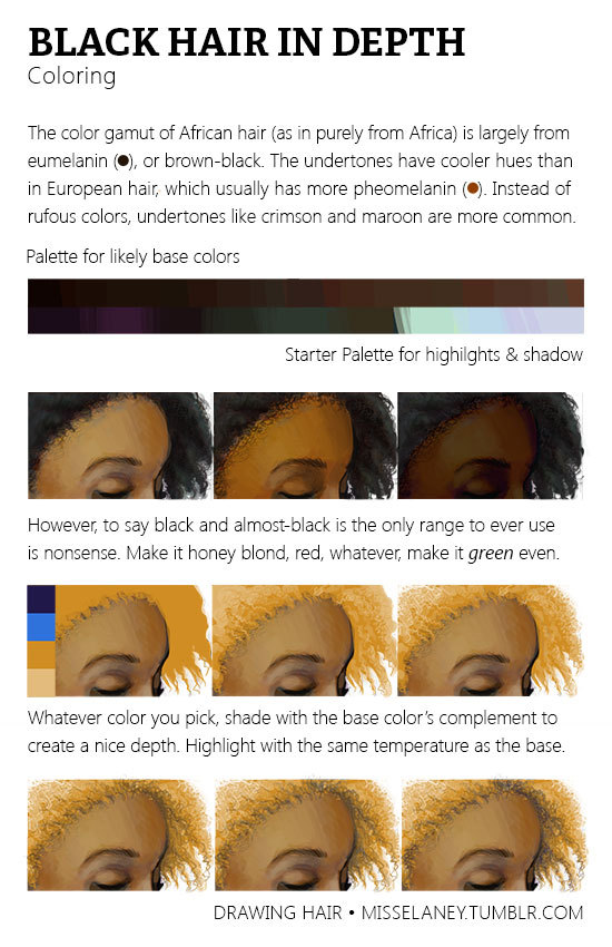
Natural Black Hair Tutorial! Usually Black hair is excluded in the hair tutorials which I have seen so I have gone through it in depth because it’s really not enough to tell someone simply, “Black hair is really curly, draw it really curly.”
The next part of Black Hair In Depth will feature styles and ideas for designing characters and I will release it around February. If you would like to see certain styles, please shoot me a message!
270K notes
·
View notes
Note
Sorry, if you've answered this before, but do you have any tips on drawing mouths and lips?
Hello anon! :D I’m not the best at making tutorials and giving tips but I’ll do my best to answer your question! ^^
I sure do love drawing lips! It might be in fact my favourite part of the face to draw.
Let’s see what makes them so irresistible ;)
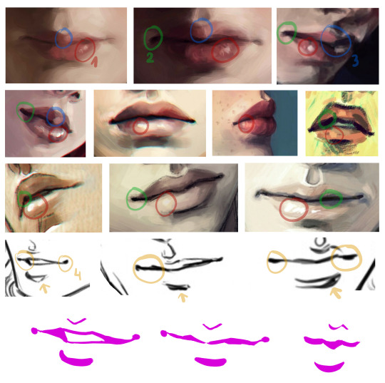
tip 1: let them shine! that tiny shiny spot does wonders for the lips - it makes them fuller, softer and more three dimensional. It also makes the lips look slightly wet. Sexy!
tip 2: Build the depth with some darker spots. Quirking corners are great for that, and if you make the darkest spot in the middle of the mouth it seems like it’s about to part. And maybe whisper something seductive ;)
tip 3: The very middle of upper lip is my favourite area, it gives the mouth its distinct character. It’s also a great spot to play with shadows, one lighter stroke, one darker stroke and you have a very dramatic shading going on!
tip 4: When drawing lineart it’s good to keep the line varying in width and pressure. Equally thin, flat line might look good in anime, but even there it’s rarely the case. Making the line thicker in the shadowy part of the mouth adds depth to your drawing.
General remarks:
I almost never outline the upper lip, it tends to look weird. Just a thin “U” shape in the middle is usually enough.
Upper lip is usually in the shadow, at least half of it. Lower lip tends to catch the light, especially with pouty plump lips. The more shadow you add under it, the fuller the lips look.
When drawing male characters I usually play around with skin tones instead of pink and red (see the third row of examples). But it’s not a rule. Some boys rock them rosy lips. ;)
Never paint the teeth white, never. Gray, yellowish and pinkish tones are great.
And the final tip: use reference! Look for pictures of people with beautiful lips, with thin lips and full lips, try to see which line goes where and how it changes the shape and expression. I hardly ever draw without a reference.
Good luck! 👄
19K notes
·
View notes
Text
So over the last few days I have been working on enlarging the dress pattern for my cosplay costume. It was a bit of a chore, but I secretly love tedious projects.
So before anything else, here is a link to the YouTube video tutorial I used to learn how to grade up a pattern:
youtube
I find her easy to listen to and follow. She doesn’t use big fancy words and goes fairly slow so you can understand what she’s doing. She does use a french curve, but anyone with a little artistic ability could eyeball it fairly easily (like I did).
So anyway, I watched her video tutorial and the next day started doing it myself.

This is the unfinished bodice back. I used white tissue paper since i didn’t have any fancy tracing paper on hand. For a flat surface I used the cardboard insert from my kids’ giant coloring pages (keeps them flat). In black I traced the largest size and all words in english. I am not really sure what the little triangles are for (yes, I am that much of a novice to sewing), but I made sure to include those as well. In purple I made my new measurements. For the curves I did some extra measurements to help me make a more accurate line.

For the skirt I needed a much larger surface to trace on, so I moved to my dining table. I kinda wish I had started off here, but my husband’s Warhammer 40K stuff was in the way at the time, so i had to make do. Anyway, one piece of the tissue paper was nowhere near big enough for this, so I taped 2 pieces together. I did it as straight as possible to avoid bunching when pulled tight, but it’s crappy dollar tree stuff, so a little was unavoidable. It still worked out really well. I used blue in place of purple for measurements this time but still traced over some of the final lines with purple to make them easier to see. I found the skirt to be way easier and less time consuming than the bodice because there were fewer curves and measurements to make.
So that’s it for my pattern grading up adventure! I’m glad it wasn’t too difficult! Now it doesn’t matter if the size is plus size or not because I can always make it work!
On another note, I discovered that this dress needs a lining for the bodice and midriff. I was fussing over whether I had enough of the red to make that happen. But then I did some looking around in my leftover fabric and found that I have a load of the red satin leftover from my last project! I wasn’t sure if I should do the satin inside or outside, but after some thought deiced it should be for the lining to keep the outer fabric the same type (a cotton blend).

21 notes
·
View notes
Photo
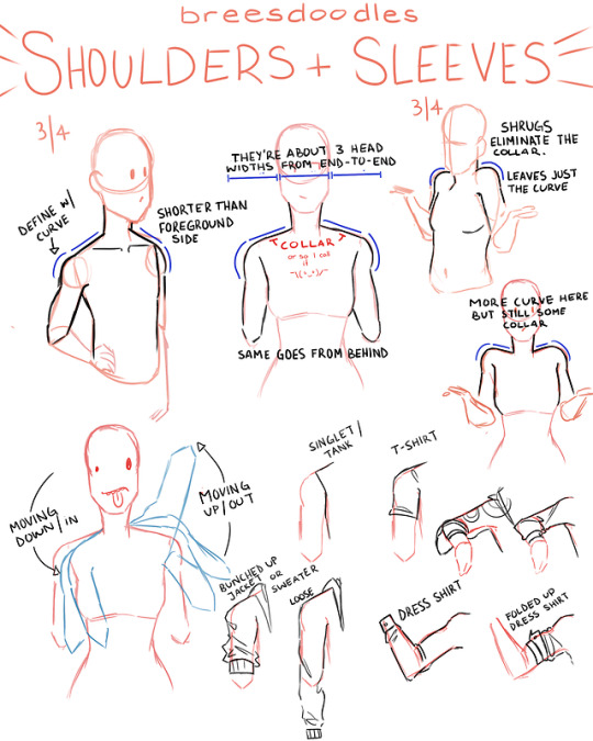
@geckoghostie wanted to know how I draw shoulders and sleeves so I whipped up a quick how-to using my basic methods. I hope it’s easy to follow.
1K notes
·
View notes
Text
Color Theory Primer

I have a lot of fun creating content for this site!
If you want to help me keep the lights on here, I have created a PDF for a clean, offline reading experience!
Check it out here! bmc.xyz/l/colortheory
The original article is here: https://artres.xyz/post/wonderful-resources-to-master-color-theory/
Let me know if this is something you would be interested in for other articles!
Thanks for reading! If this post helped, please consider reblogging it or sharing it with your friends! ❤️
More useful articles and resources / support Art-Res | my art tumblr | Idea Generator | Check out the Art-Res Anatomy Ebook!
2K notes
·
View notes
Note
Uuuugggh, how do you go about head to body proportions? I'm so bad at them and yours look really good!

sorry this took such a long time to answer!! I’m pretty busy but here it is, explained in simplest terms!
I personally draw in the order of head, neck, torso, thighs, calves and feet, then arms and hands! Your head is your measurement unit, and with all the parts together, the body should be 7-8 heads tall for an adult! The average amount of head units for main body parts and written out on the image! If you want me to go in depth to this, please send an ask!
art tag VVVV
798 notes
·
View notes
Photo


a small tutorial I did a while back on how I color my art
621 notes
·
View notes
Photo
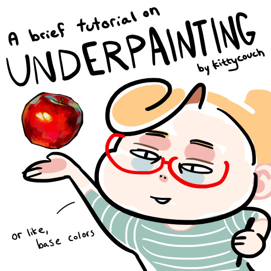
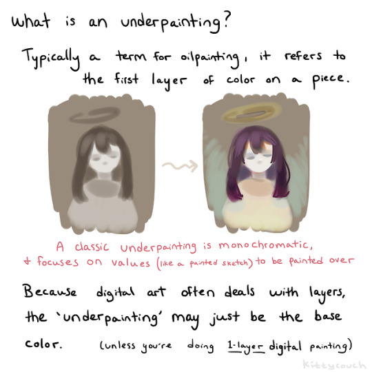
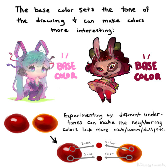
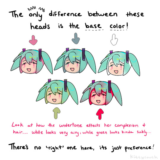
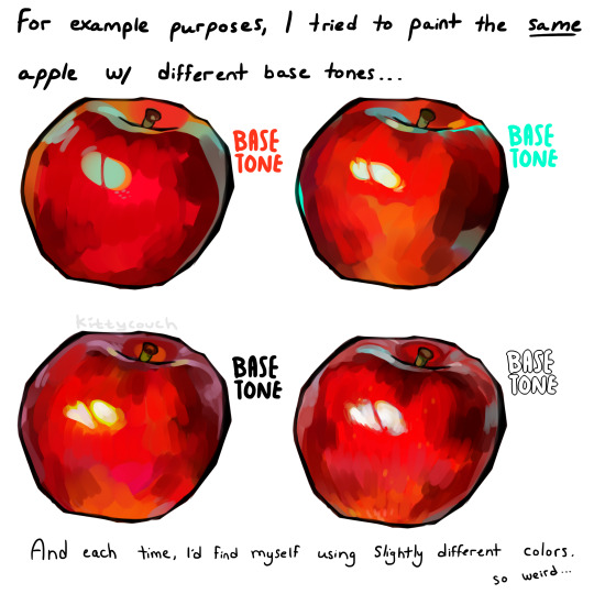
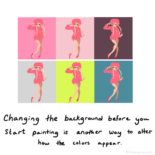
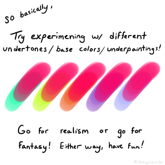
No one asked but here’s a brief tutorial on digital underpainting and how it can add some extra flavor to your art!
(I got asked this a couple times so just to clarify: I used “overlay” in the second slide… but the rest of these examples are JUST painted on, no effects! Try playing with the opacity on your pencil/water/brush tool to allow the base color to show through!)
52K notes
·
View notes
Photo
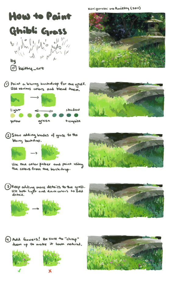
Little tutorial on how to paint Ghibli style grass
49K notes
·
View notes
Photo

Little tutorial on how to paint Ghibli style grass
49K notes
·
View notes
Photo

MAGIC bubble tutorial by Apofiss
2K notes
·
View notes
Photo
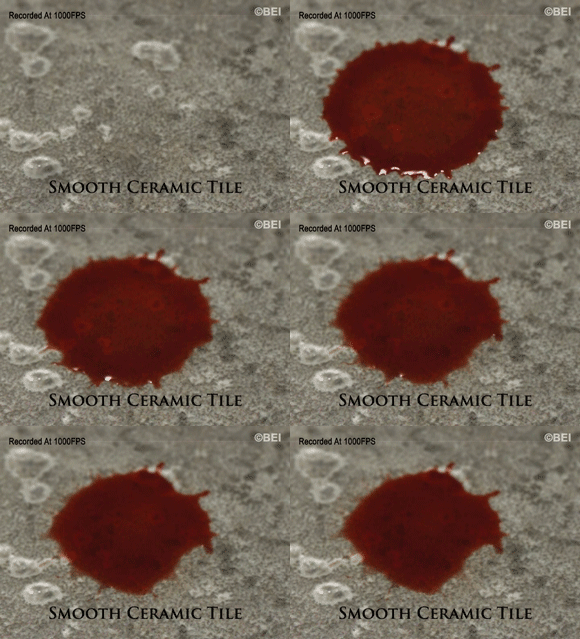
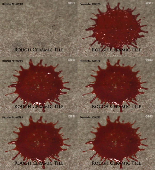


How surface texture affects bloodstain patterns. (Video)
386K notes
·
View notes


