💙Christian💙24✨Digital/Traditional Artist✨🎵Music Creator🎶☁️Professional Daydreamer🫧NO politics allowed | NO hostile/rude behavior | NO AI. Human artists/art only!🪐Current Hyperfixation💫~Fields of Mistria~
Last active 60 minutes ago
Don't wanna be here? Send us removal request.
Text
🦇🦇🦇🦇🦇🦇🦇🦇🦇🦇🦇🦇🦇🦇🦇🦇🦇🦇🦇🦇🦇🦇🦇🦇🦇🦇🦇🦇🦇🦇🦇🦇🦇🦇🦇🦇🦇🦇🦇🦇🦇🦇🦇🦇🦇🦇🦇🦇🦇🦇🦇🦇🦇🦇 ANTI DEPRESSION BAT ATTACK 🦇🦇🦇🦇🦇🦇🦇🦇🦇🦇🦇🦇🦇🦇🦇🦇🦇🦇🦇🦇🦇🦇🦇🦇🦇🦇🦇 🦇🦇🦇🦇🦇🦇🦇🦇🦇🦇🦇🦇🦇🦇🦇🦇🦇🦇🦇🦇🦇🦇🦇🦇🦇🦇🦇
140K notes
·
View notes
Text

Just felt like sharing my art progress over the years. It's kind of crazy how much and how little has changed, lol. If you ever feel bad about your own art, compare it to much older pieces! It might surprise you how much has improved incrementally.
1 note
·
View note
Text

Cutie batpony is cute
Character Lunar (left) belongs to me, Joyous Gem (right) belongs to my bff DragonGuardianXII
2 notes
·
View notes
Text
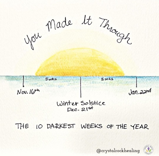
hey, we’ll be ok
27K notes
·
View notes
Text
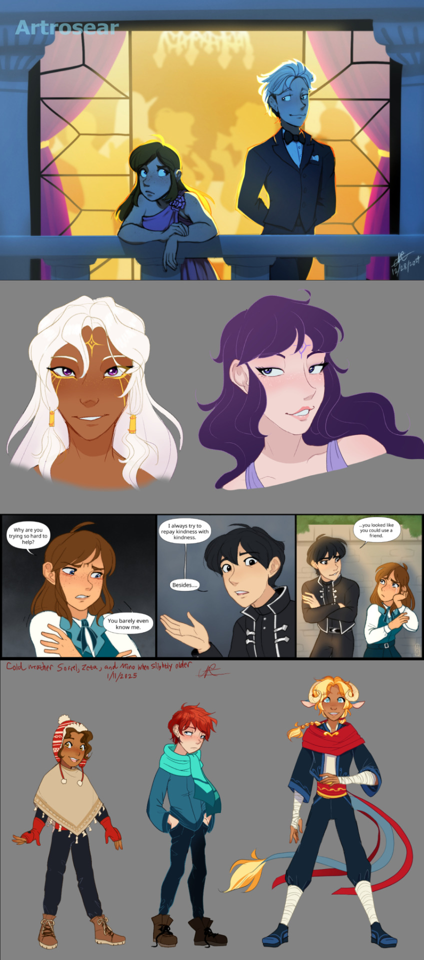
Art dump! All characters except for Asael and Comet (top right and middle right) belong to me.
4 notes
·
View notes
Text
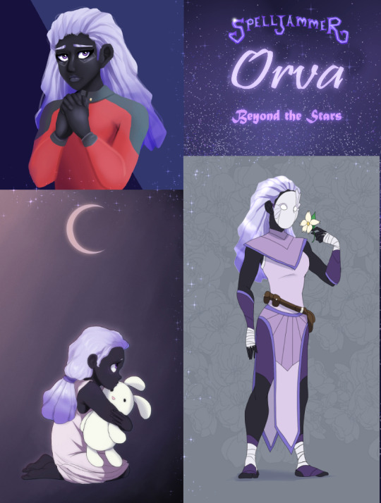
This is a small art dump of my first ever DND character, Orva the Goliath Monk! I really did not enjoy playing as her, but a part of me will always have a soft spot for her.
1 note
·
View note
Text
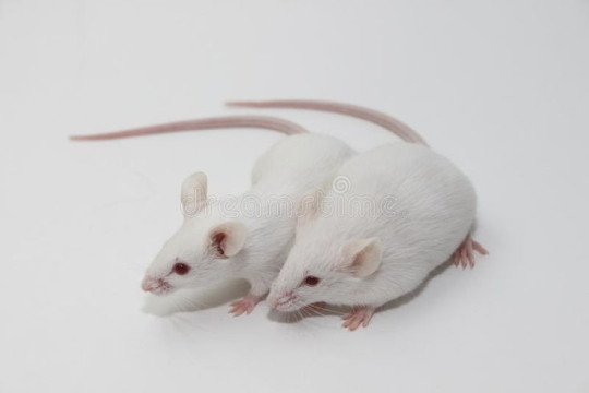
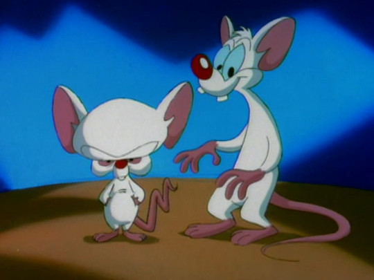
Since we keep getting "live action" CGI remakes of already perfectly adequate animated movies, and because people need to understand that animation is a medium and not a genre, I have prepared this primer about the importance of Visual Language for Conveying Information.
Can you tell what the personalities of these two mice are?
Can you tell now?
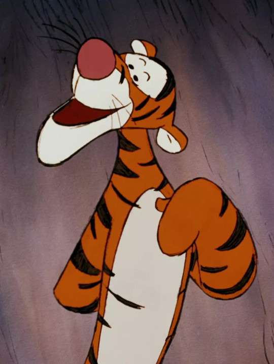
Which of these two tigers feels safer to be around?

Which of these three dogs is the funniest one?
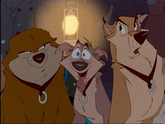
If you can answer these questions, then you already have experience with the idea of visual language and stylistic choices being used to impart narrative meaning. If you can understand why these choices were made to impart meaning, then you can understand why animation is a medium for telling stories that has its own inherent value, and is not merely a "placeholder" for the eventual implementation of photorealistic presentation (aka "Live Action" CGI). Animation does not need to be "corrected" or "legitimized" by remaking it into the most representational simulation of observable reality.
54K notes
·
View notes
Text
Reblog if you're hoping 2011 will be a fresh start.
63K notes
·
View notes
Text
People of the World: Protestant Christian Edition


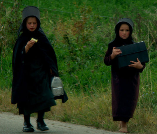


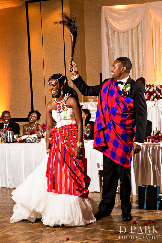
Protestants including the Amish, Anglicans, Baptists, Episcopalians, Hutterites, Lutherans, Mennonites, Methodists, & Pentecostals.
None of the above images belongs to me.
611 notes
·
View notes
Text
"Wow omg you drawwwww? I wish I was a drawer soooo bad omg I suckkkk so bad at arrrt"
me:

52K notes
·
View notes
Text
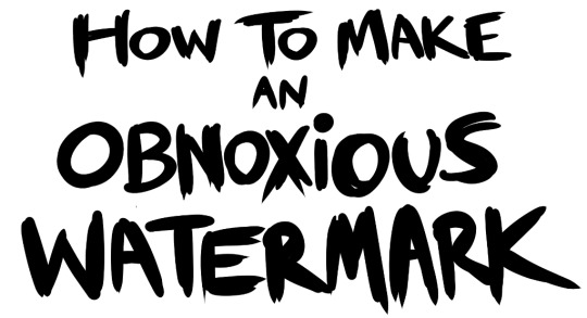
...that your audience won't hate.
This is a method I started using when NFTs were on the rise - thieves would have to put actual work into getting rid of the mark - and one that I am now grateful for with the arrival of AI. Why? Because anyone who tries to train an AI on my work will end up with random, disruptive color blobs.
I can't say for sure it'll stop theft entirely, but it WILL make your images annoying for databases to incorporate, and add an extra layer of inconvenience for thieves. So as far as I'm concerned, that's a win/win.
I'll be showing the steps in CSP, but it should all be pretty easy to replicate in Photoshop.
Now: let's use the above image as our new signature file. I set mine to be 2500 x 1000 pixels when I'm just starting out.
Note that your text should not have a lot of anti-aliasing, so using a paint brush to start isn't going to work well with this method. Just use the standard G-Pen if you're doing this by hand, or, just use the text tool and whichever font you prefer.
Once that's done, take your magic wand tool, and select all the black. Here are the magic wand settings I'm using to make the selections:

All selected?
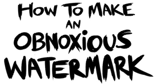
Good.
Now, find a brush with a scattering/tone scraping effect. I use one like this.
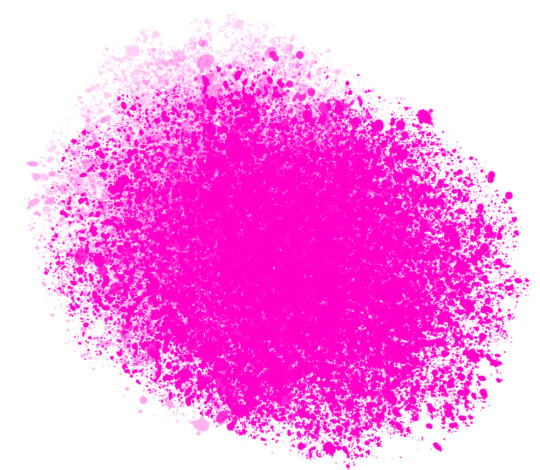
You can theoretically use any colors you want for this next part, but I'd recommend pastels as they tend to blend better.
Either way, let's add some color to the text.
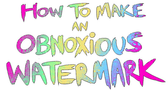
Once that's finished,
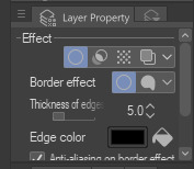
You're going to want to go to Layer Property, and Border Effect

You'll be given an option of choosing color and thickness. Choose black, and go for at least a 5 in thickness. Adjust per your own preferences.
Now create a layer beneath your sig layer, and merge the sig down onto the blank layer.
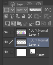
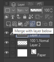
This effectively 'locks in' the border effect, which is exactly what we want.
Hooray, you've finished your watermark!
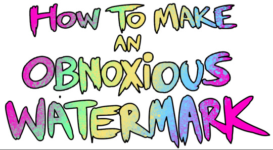
Now let's place that bad boy into your finished piece.
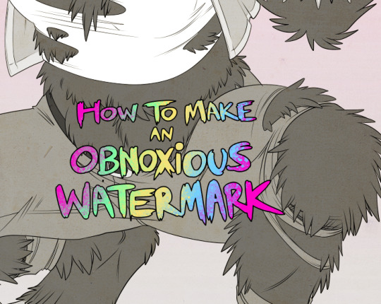
You'll get the best mileage out of a mark if you can place it over a spot that isn't black of white, since you'll get better blending options that way. My preference is for Overlay.
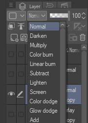

From here, I'll adjust the opacity to around 20-25, depending on the image.
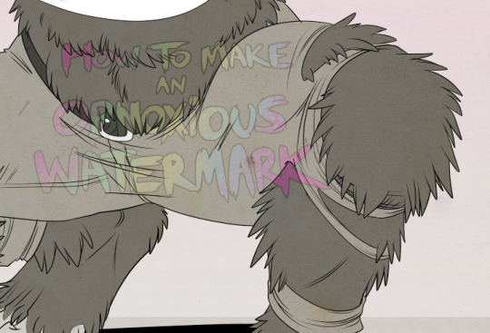
If you don't have a spot to use overlay, however, there's a couple other options. For white, there's Linear Burn, which imho doesn't look as good, but it still works in a pinch.
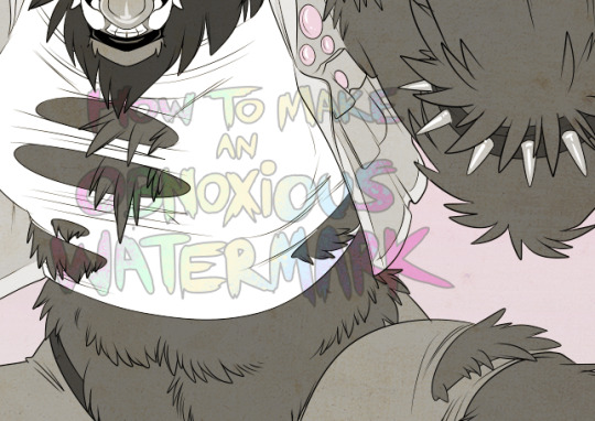
And for lots of black, you have Linear Light
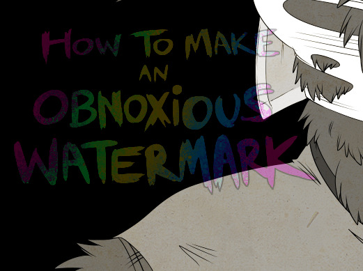
Either way, you're in business!
EDIT since this has escaped my usual circles, and folks aren't as familiar with my personal usage:
An example of one of my own finished pieces, with watermark, so you can see what I mean about 'relatively unobtrusive'-- I try to at least use them as framing devices, or let them work with the image somehow (or, at the very least, not actively against it).
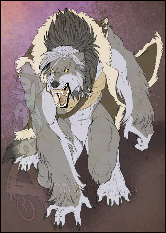
I know it's a bummer for some people to "ruin" their work with watermarks, which is part of the reason I developed this mark in particular. Its disruption is about as minimal as I can make it while still letting it serve its intended purpose.
There's other methods, too, of course! But this is the one I use, and the one I can speak on. Hope it helps some of you!
52K notes
·
View notes
Text
ok wait, reblog if you’ve cried at least once because of math, doesn’t matter which grade i’m trying to prove something
#I have discalculia#so yes#I have had many a crying fit and temper tantrum over math#I'm getting better as I get older though
89K notes
·
View notes
Photo
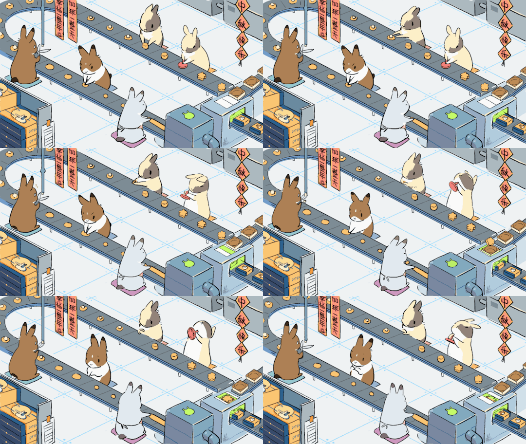


©东予薏米 jade rabbits making mooncakes for mid-autumn festival
135K notes
·
View notes
Text
me: ho ho hum
clouds: ☁️⛅☁️
me: *takes a bunch of pics*
15 notes
·
View notes


