Don't wanna be here? Send us removal request.
Statistics
We looked inside some of the posts by arthiarts and here's what we found interesting.
Average Info
Notes Per Post
514K
Likes Per Post
129K
Reblog Per Post
384K
Reply Per Post
1
Time Between Posts
4 months
Number of Posts By Type
Video
1
Text
2
Photo
14
Last Seen Tumblr Blogs


Fun Fact
Tumblr.com rank in the US is 25.
Video
tumblr
This and the five posts above are from Week 3′s massive user testing
Goal:
Share your story using burger menu or log in
Outcome/Feedback:
User used burger menu --> Share you’re story
Logged in an already existing account (got a bit confused)
Shared the story - kinda successful
0 notes
Text
User Journeys Cont.
Hemi

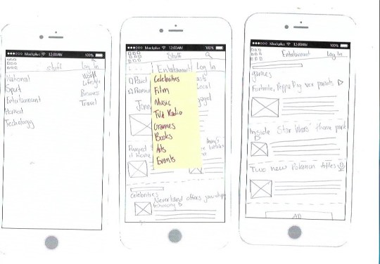
Got confused in going to Entertainment of Technology, so maybe see what works as it was a podcast on a game
Sarah:

Good, just let the user know yes log in with: instagram, twitter or your email and password.
Haiyan:


The what isn’t really necessary of the search as it the current news, unless adding the ‘latest headlines’ in the what too.
Barry:


Failed as they chose Education instead of Politics. However, this was something I should of made note of as I did not mention about Politics. Tim said that was fine, he just needed to have another relating page like education as the article was on “’Racist’ at Tomorrow’s Schools meeting in Auckland
Andrea
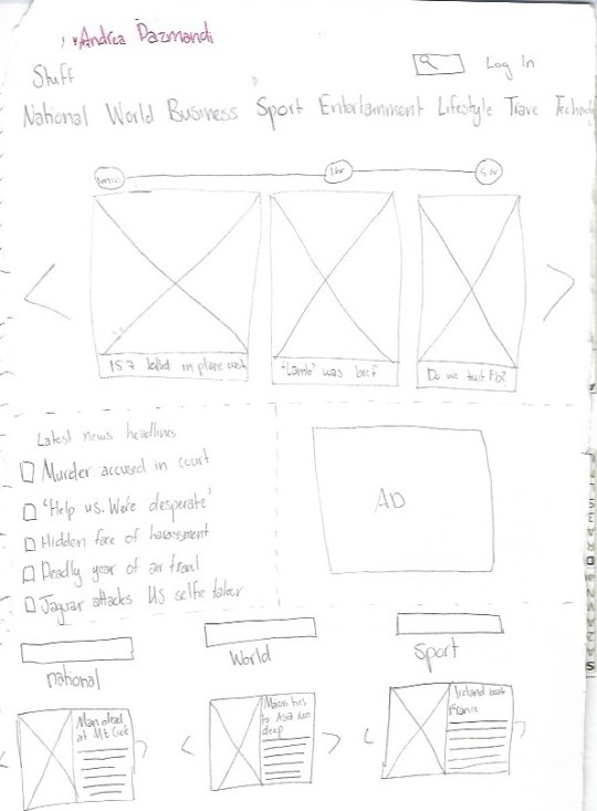


Layout was changing a lot, however I want to still explore
Succeded, however, the scores symbol was on the right whereas the sports symbols were on the left side so it was a little confusing. Make sure you say which is the latest score, it was hard to comprehend
Inspo for Mike:
Adding important news, clicking on important news and then going back to home to view the latest news
0 notes
Text
1.1
1.1
Massive Magazine
To have an opinion and take desicisions, to experiment, to exchange or interrogate the ideas through the work
Active participation
Gain confidence
No prescribed output for sem 2. You choose the right medium for the behaviour
Studio:
Interaction Design
User Experience
Experience Design
Concentrate on the user and website through narrative
Sketch, XD, Photoshop, Invision, Atomic
Do not use InDesign
The User/Human Centred Web Design Process:
Collaborative (working with the user, interviews with testing))
Iterrative (Design, test and making a newer better one)
Comprehensive: (How the person gets to the website, the different scenarios)
36 steps
Wireframes and sitemaps to know how the info is structured
Sitemaps are the pages and how they relate to one another
User Journey: describes all the things that someone does to interact with the website and get to where they want. The user journey is going to describe all the pages they through, and the before to like when, how, where, why.
Persona: fictional person you might want to design for, include (name, picture, who they are?, what they do?)
Persona (at least 6 people) <- then the steps to get to where they want to get to
Paper prototypes to test ideas and lots to be flexible (b&w)
Clickable prototypes (styling of the page, on the page, colours, layout, typefaces)
Style guides (what each element will look like, keeping it consistent)
Build (Html, Css, Js)
At least 1 article page (responsive)
Content Analysis
One Psych
The heading is very catching, big and bold
The layout makes the info look way too long and boring to read
Pull quote with over rule helps know the info is important
Two Six60
Rags are not appropriate for reading, OCD
The text in the image does not make it important. Would be better for it to be a pull out quote
Three flight nurse
Widows at the end of paragraphs
Caption is at the bottom of the image, easier to find
One place has a massive space between two words, typography looks bad
Six60 newspaper vs Stuff
Headline are different
Online has time and date stamps, newspaper only has date
Stuff is much more readable and legible
Photo credit on images in stuff
More ads on the stuff website
Much more easy to read about online since one page is one article
Stuff has a search button which makes it easier to find articles
Related article links on the bottom of the stuff article
Able to zoom in on the article online
Proper image captions, placed right beneath the image
The navigation bar on the website was fixed at the top throughout the page, which mean when scrolling through the article the navigation is still accessible
Psych newspaper vs Stuff
Headings are both different
Images on stuff and not newspaper
Caption included with images
The pullout quote is shown on Stuff but not as a quote, it’s in a the paragraphs
Ads in the stuff article
Related articles included on stuff article
Flight nurse newspaper vs Stuff
Different headings for newspaper and stuff
More images shown on stuff article than the newspaper article
Ads on stuff article
Homework
Learning the difference between newspaper and stuff:
I think personally I prefer the stuff articles much more. This is because the website is much more accessible and free unlike newspapers. The type on the website is much more readable and legible (ability to zoom in too) with nicer layouts for a person with poor eyesight like me. There are much more images to see on the articles on stuff which make it more interesting. All the images have captions to explain what is going on that image which is super useful. The navigation bar on stuff is fixed to the top which makes it easier to navigate to other articles. There are also sections for other articles related to this or the category which makes it easier to learn more about the incidents. There are lots of ads on stuff which I don’t enjoy but its manageable.
User Journey example 1:
Sitting at desk
Open up laptop
Log into account
Open up Google Chrome
Go to stuff.co.nz
Search the article
Read the article
0 notes


Photo
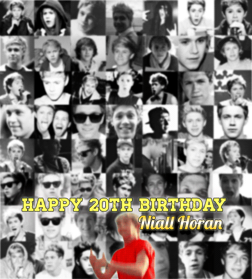
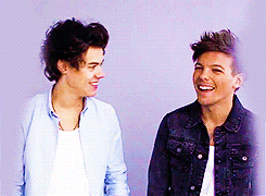
"It’s all about knowing who you are. If you went into this business not knowing who you are and not feeling good about yourself, you’d be a mess. I guess maybe that’s why people change when there’s really no need to. The way I see it, why would you want to become something you’re not? Or someone other people consider to be a diva? -Niall Horan
Happy 20th birthday Niall Horan
1K notes
·
View notes