
A collection of multimedia illustrations. I will try to expand my illustration horizons by experimenting with new media and techniques! Follow this page to join me on this artistic journey!
Don't wanna be here? Send us removal request.
Statistics
We looked inside some of the posts by arielsativadraws and here's what we found interesting.
Average Info
Notes Per Post
6K
Likes Per Post
3K
Reblog Per Post
2K
Reply Per Post
7
Time Between Posts
15 days ago
Number of Posts By Type
Photo
17
Last Seen Tumblr Blogs


Fun Fact
US Tumblr user growth rate is estimated to slow down to 4.1%.


Photo


At Light Las vegas w/ Cirque du Soleil :)
so much fun so much love
237 notes
·
View notes
Photo

Chalk & charcoal. like yr tattoos @whoiselijah
573 notes
·
View notes


Photo

Celestial Vans (x)
really want to get this tattooed tbh
100 notes
·
View notes


Photo


Subject & Material: I painted the windows at the Parksville & Nanaimo Cloverdale Paint stores. I used their “mistinted” latex paints to give the store a little bit of holiday cheer! It was really fun, and I even got a few customers & their kids involved! An 8 year old girl decided to help me, and she added the snowflakes which was really cute and fun!
Challenges & Strategy: There were so many little things that went rogue in this project, it was a really interesting challenge. It was tricky at first, because to make the painting look good outside, I had to make sure that I drew everything in the right order. The outlines all had to be on first, then any kind of lighter shading, then finally the darker bits. Any writing that I wanted to be readable from outside had to be reversed, and if I wanted it to be readable from the inside, I had to make sure to block it out with a solid colour before adding my words (otherwise it would be gibberish outside). I also found that you have to really make sure that the paint is dry before you go over it with a second coat, otherwise it will peel the first layer off. It was a really smooth surface which was nice to paint on, but once it got colder outside, I had to stop painting, because the paint started to not adhere properly. The other interesting thing, was when it was really light outside, the colours all looked grey and dirty on the inside of the building. The white snow looked almost muddy, and I was getting really frustrated trying to fix it. Once it got dark outside, the multiple layers of white paint brightened right up, and looked great. I was using thick paint brushes that were meant for cutting in paint on the walls, so it was tricky doing the tiny details, but after a little while, I figured out how to use it to my advantage.
0 notes
Photo


PSA: I keep accidentally posting my illustration blog posts to my other class blog. Doh!
Media: Wood burning on wood craft board.
Process: I started off with a doodle that I pulled from my sketchbook to look at for style inspiration. I really like the way that this drawing flows together, and I wanted to repeat some of the same shapes and details. I didn’t draw anything out first, I just it happen as I went, which was really freeing. I had to take some breaks still because the handle was overheating and burning my hand, but it was overall a way better experience than when I was trying to burn hard wood.
Strategy: I decided to go completely different with this week’s post. I have had this wood burner tool for a while, but I find it a little frustrating to use normally, because it gets really hot, and it works really slowly. I was reading about how I could make it work better, and someone suggested using this wooden craft board from Michael’s. It is a softer wood, and it burns way faster! It makes things way easier, and my lines were a lot smoother!
Takeaways: I found at the end that I wasn’t sure whether I wanted to leave it as it is, or add more. Sometimes I add more and more on to my illustrations, and end up overwhelming the piece. I really like how it can be hung up at any different angle and still make sense.
0 notes
Photo


Theme & Goal: Draw simplistic, icon style shapes. Refrain from using shading or transparencies to create detail.
Media: Procreate script brush
Process: Here are a few drawings of simplistic fruit over the week. First I drew an illustration of a blackberry branch, and then I played with some patterns. I wanted to keep to a really minimalistic style, with no shading, and as little colour as possible. I tried to keep it as simplistic as I could, which was pretty difficult to me because I always go straight to shading, or filling things in to create a realistic style.
Strategy: I started with the outlines, and then would go through with an eraser and eliminate any unnecessary or distracting details. Then I filled in the shapes with one solid colour. Once I simplified the drawing enough, without losing the clarity of the drawing, I played with putting them into patterns. For the blackberry branch, I decided to use two colours, because when it was all black, I found that the different berries blended together too much. Adding a second colour really made them pop against each other.
Takeaways: It was an interesting challenge to draw in this flat, simplistic style. I found it difficult at first to simplify things so much, because I was afraid the illustration would lose its clarity, but it ended up becoming really satisfying.
0 notes
Photo
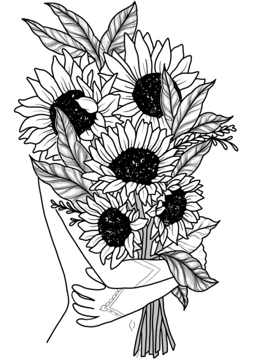
Weekly Challenge: Draw an indoors scene.
Media: Procreate brushes: script brush, pencil, soft airbrush, and a speckled texture brush.
Process: I started off with the girls hands and body. I used a photo of an artist that I admire that I have printed in my room as a reference. In the photo, she is in her underwear, in this sort of pose. I had a hard time with the hands, and I still think they look a little glove-like, but I had the best results when I used straight, simple lines. Then I drew in the sunflowers. I had a page of photography of sunflowers from google on my desktop to look at for a reference. I filled in the centres black, and used a white speckled texture brush to create the centre. I did all of the shading on a seperate layer, and focused on the leaves and stems only. Finally I used a pencil brush to create the little tattoos and the belly button, because I thought it looked nicer slightly lighter.
Strategy: The reason I drew the hands and body, because I wanted the way her body is positioned to convey a certain type of emotion. Since the illustration is mainly a line art style, I wanted to create contrast between the flowers, the body, and the leaves by only shading the leaves, and leaving the body and flowers white.
Takeaways: I have always loved sunflowers, and I think this illustration represents myself. I loved this illustration so much that I decided to get it tattooed! Each week I try to use different brushes on procreate and illustrator for different effects, and I think that it has helped me become a lot more confident as an illustrator.
1 note
·
View note
Photo

Media: Magazine cutouts, sharpie, illustrator, procreate
Process: I took the illustration that I had from last week, and brought it into procreate. I put it overtop of the different threshold images of him. I used the procreate tools to sample the colours, and then paint on top of the image to clean up any rough edges. I used a white paintbrush tool to “erase” any places that I had gone over the desired lines, and filled in any missing spots with black.
Strategy: I wanted it to look more like the person that I was trying to replicate, so I used the original photos at a low opacity as a stencil to correct any mistakes that I made.
Takeaways: Last class I spent a long time cutting out each part, and pasting it in the exact spot. It took a long time, and I was happy to be done, but it wasn’t quite the way I wanted it to look. I really like the way that the final piece is choppy, and pop art like, and I think it looks a lot more like him that before!
0 notes