Text
Vocabulary
Additive Color- the mixing of two colored light sources
Analogous Color- three colors next to each other on the color wheel
CMYK Color- a subtractive color model used in printing
Color Depth- the number of bits used to indicate the color of a pixel
Color Wheel- a diagram that organizes and shows the relationships between colors
Complimentary Colors- colors opposite of each other on the color wheel
1-Dimensional- only one dimension, length
2-Dimensional- composition with only length and width
3-Dimensional- has length, width, and depth
4-Dimensional- artwork that uses reality as part of its composition
Asymmetry- if split down the middle both sides are not the same
Balance- all the elements of art coming together in a piece
Chiaroscuro- light and shadow that have a heavy contrast
DPI- dots per inch, measurement for printing
Image Resolution- the number of pixels in an image
Cool Colors- blue, green, and purple
Grayscale- only white, black, and gray values
Hue- color
Monochromatic- variations of one color
RGB Color- additive color model, primary is red, green, and blue
Saturation- intensity of color(s)
Contrast- opposite elements being put together
Focal Point- where your eye is naturally drawn to in a piece
Juxtaposition- comparison of two elements next to each other
Leading Lines- what leads the eye to the focal point
Modernism- art movement that broke classical form
Motif- a distinct feature or pattern
Negative Space- empty space in a composition
Pixel- the small illuminated spaces that make up a screen to display images
PPI- pixels per inch, image measurement
Shade- add shadow
Subtractive Color- begin as white and form black when all primary colors are mixed together, absorb light to reflect different colors, primary is cyan, yellow, and magenta
Tint- adding a specific color to shift the tone/underlying color
Tone- light and dark values
Triadic- color scheme using colors that are evenly spaced around the color wheel
Warm Colors- red, orange, and yellow
Opacity- level of transparency
Postmodernism- art after the modernism era that questioned the values of modernism and authority and focused on innovation
Unity- a harmonious composition where everything comes together in a way thats balanced and cohesive
Rhythm / Pattern- visual repetition
Rule of Thirds- a grid dividing an image into thirds thats used to create compositions that are not centered but retain balance
Transparency- the ability to see through some layer of the composition- the way a piece is arranged
Value- using the lightness and darkness of colors to create an illusion of depth
Raster Images- representation of the grid of pixels that make up an image
Vector Images- image format using a math based composition that can be resized without losing quality
Style Guide- documentation that lays out the design assets for a project
Trapped White Space- white space surrounded by elements of the design
White Space- purposely empty space in a piece that balances out the composition
Above the Fold- the upper section of a newspaper, magazine, or website that’s reserved for the most important information
Branding / Brand Identity- recognizable design elements that establish a business
Gutter- inside margin of a book close to where it will be bind
Logo- icon that represents a brand
Lorem ipsum- placeholder text when the original text is not available
Manicule- pointing symbol used to draw attention
Logotypes (give examples if you can): a graphic that represents a company name such as the NASA logo
Abstract Mark—- an abstract shape that represents a brand
Lettermark- type based logo usually based off of an abbreviation
Emblem- a font inside a symbol or icon used as a badge or seal
Pictorial Mark or Symbol- icon designs that require no explanation, ex: Apples logo which just an apple
Mascot Wordmark- logos that include a character that represents the brand
Soft Proof- step in the printing process that checks for double accuracy
Substrate Trim- manufacturing trimming process
Web Press- a press that continuously prints a roll of paper
Points- mark positions of a space
Serif / Sans Serif- type with or without extending features
Slab Serif- type with thick block letters
Small Caps- uppercase type that is smaller than the beginning height of the first type letter
Tracking- letter spacing
Widows- a very short line usually consisting of just one word
Serif- type is extending parts of the design
Spine- the main curved stroke of an S
Stem- main vertical stroke in a letter type
Terminal- spurs, ears, and swatches in type
x-height- height of a letter
4-Color Printing- printing that uses 4 different layers of ink
Bleed- extra margin area that takes in account where a print. will be trimmed
Direct to Digital Printing- printing process where the image goes directly from a printer and onto a film
Hard Proof- printed prototype produced with a less expensive printing process
Inkjet printing- type formed by jets of ink
Letterpress- oldest form of printing using a surface with raised letters
Offset Printing- printing process where the ink goes from a plate to a rubber blanket to the printing surface
Pantone Colors- color codes for specific shades
Recto / Verso- front and back or right and left sides of a paper
Screen Printing- printing process where the ink is forced through a screen
Display Font- type that is used for large headings, sometimes with a more eccentric design
Drop Cap- Large capital letter used as a design element
Em Dash- long dash
En Dash- short dash
Font family vs. Typeface- typeface is a specific font while a font family is a group of similar fonts
Glyph- symbol used as a readable character
Hierarchy- font size used to establish importance
Parts of Type:
Apex- point at the top of a character
Arm- horizontal or upward sloping stroke that doesnt connect to a stroke or stem on both ends
Ascender- part of a letter that extends above the mean line for a font
Baseline- line where the letters sit
Bowl- closed rounded part of a letter
Cap height- height of a capital above the baseline
Justified Text- adjusted text that aligned equally between margins
Kerning- space between characters
Leading- distance between lines of text
Legibility- readability and the ability to distinguish type
Monospace- type where each letter occupies the same amount of horizontal space- the amount of space type occupies horizontally
Orphans- lines at the beginning and end of a paragraph that are separated from the rest of the text block
Picas- typographic measuring unit
Counter- I closed space in a letter
Crossbar- connecting stroke between two strokes
Descender- part of a letter that extends below the baseline
Ear- upper right design flourish on a letter, typically on a g
Finial- tapered curve at the end of a letter
Ligature- when multiple letters are joined in a single type
1 note
·
View note
Text
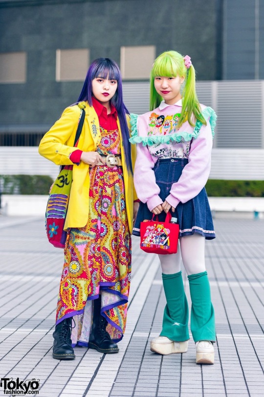
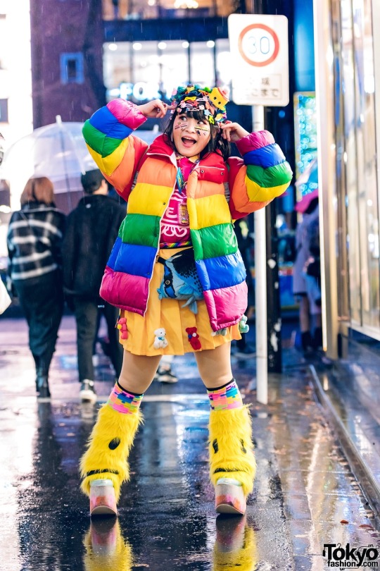
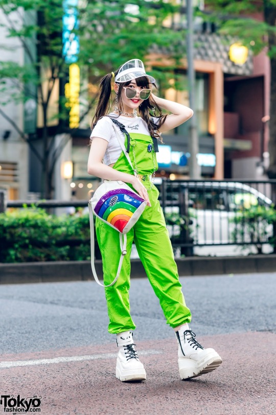
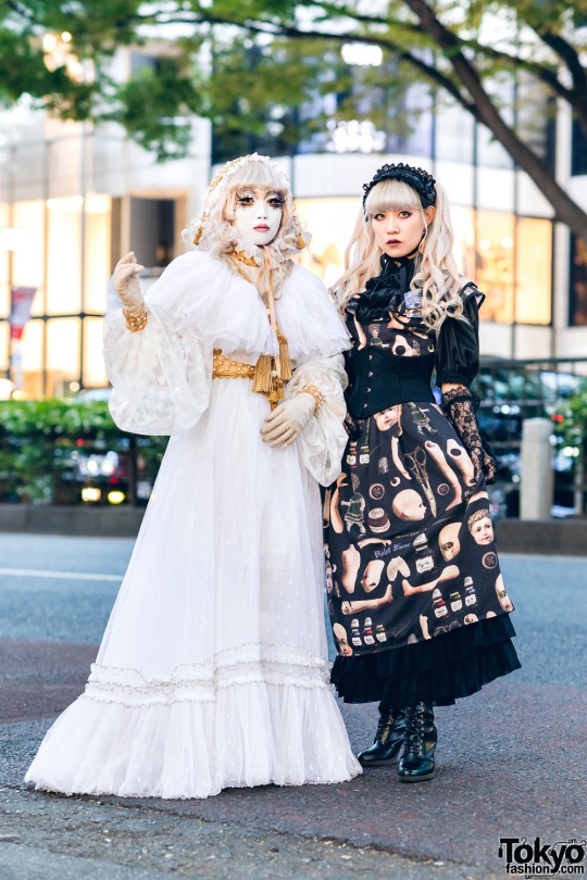
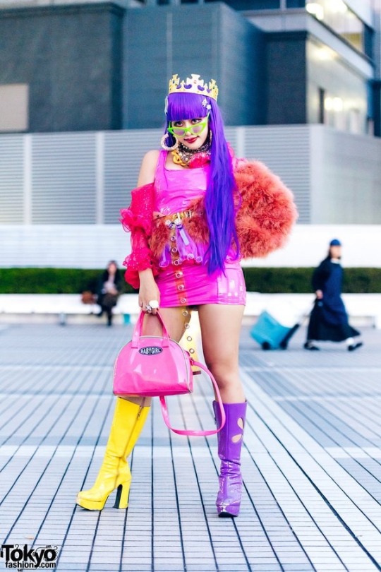
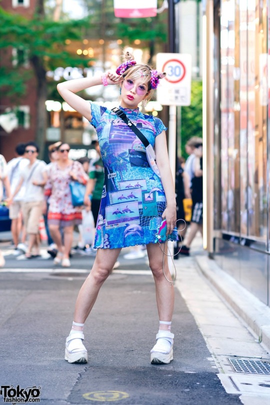
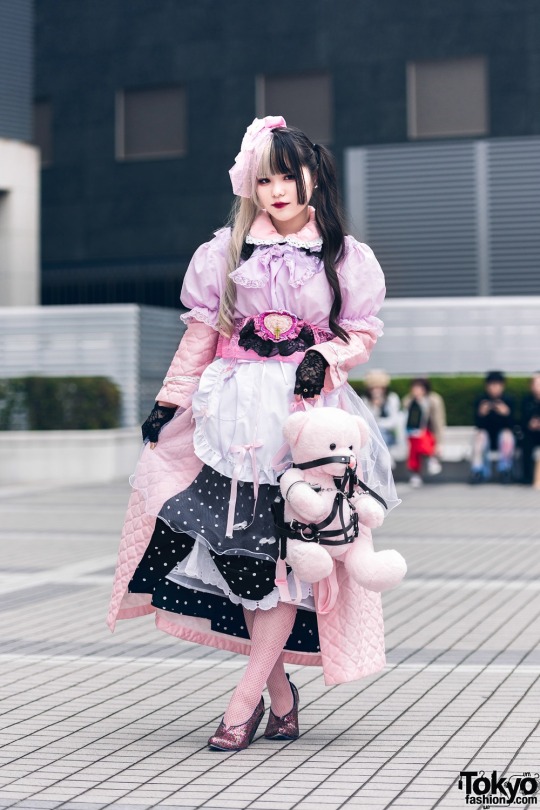
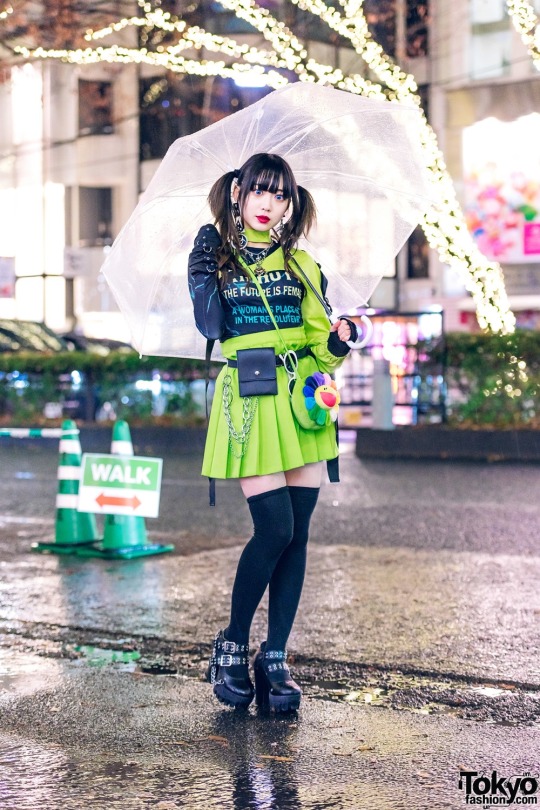
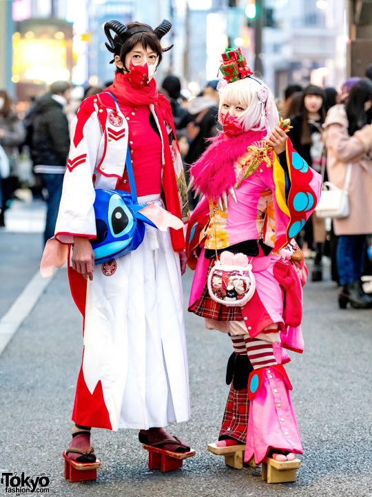
One of my favorite twitter accounts to keep up with is @ Tokyofashion they also have a website at Tokyofashion.com
They’re dedicated to giving updates on the Tokyo fashion scene while also sharing photograpy of the street fashion that Tokyo, especially Harajuku and Shibuya, is known for. A lot of Tokyo street fashion is very avant-garde and showcases a lot of vibrant colors, with an exception for gothic lolitas, and interesting accessories. There are a lot of wild combinations to be seen, especially with the amount of fashion students that wander the area who also make a lot of their own clothing. I love how unique every outfit is and I’m always look forward to their next post. Tokyo street fashion is one of the many things that I find visually inspiring since I have a big interest in fashion in general. This type of fashion is something that I would love to incorporate into some of my future illustrations since I always pick specific fashion movements when designing characters.
0 notes
Text

Tips for artists with attention problems/disorders
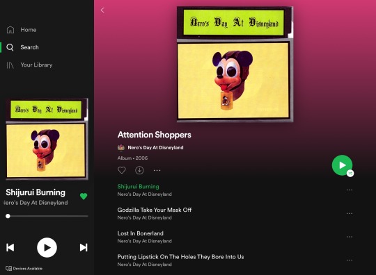
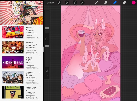
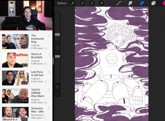
On my worse days when I struggle to concentrate on even the most simple assignments I try listening to breakcore while I work. It’s difficult to keep my brain on a single track so I have to either multitask or find other ways to stimulate my brain while I work so my mind doesn’t wander. Breakcore is a genre of music that’s an overload of different beats, sounds, and random audio clips. A lot of breakcore has no discernible pattern but some do have more melodic undertones. One of my favorite breakcore albums is Attention Shoppers by Nero’s Day At Disneyland, their breakcore is more melodic. You can also find breakcore mixes on youtube. Another way that I multitask is by splitscreening my ipad so that I can watch something while I work without having to exit out of procreate or look away from my screen. I also love watching livestreams because with the Twitch app i can minimize the video player into a small window that I can drag around my screen and pin over Procreate. I also have over 20 long Spotify playlists dedicated to cataloguing music that I can listen to while I work, I try to curate them so that they’re songs that I wouldn’t itch to skip so I’m not just DJing instead of working.
0 notes
Text
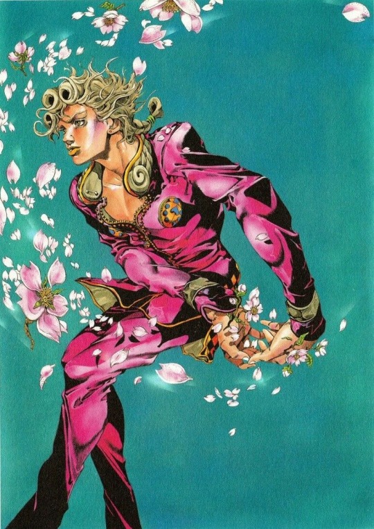
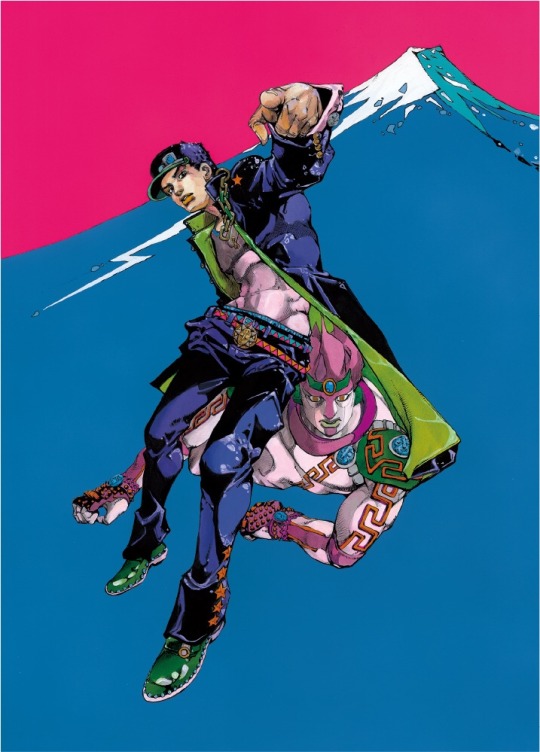
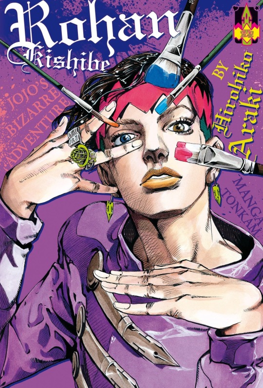
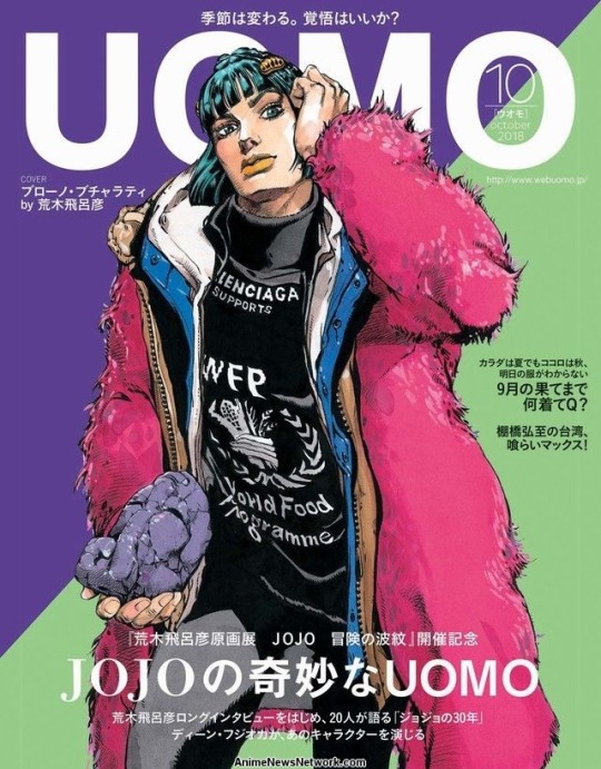
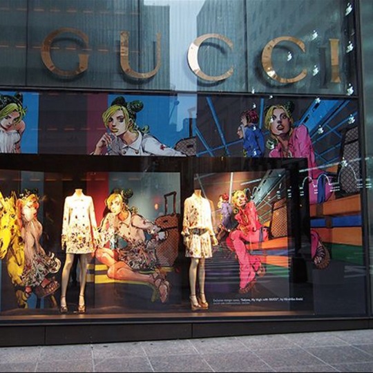
Hirohiko Araki is a Japanese manga artist, as well as one of my favorite artists alongside Takashi Murakami. He was one of my earlier inspirations since I’m a big fan of his most popular series Jojo’s Bizarre Adventure. He’s known for designing characters with avant-garde fashion, and takes a lot of inspiration from the high fashion scene and western pop culture. A lot of the extreme poses he draws his characters in are direct nods to different celebrities and fashion models. Araki has even done collaborations with fashion brands like Gucci and Balenciaga. His manga Jojo’s Bizarre Adventure has been around since the 80’s and has become a big piece of pop culture, especially in Japan. References to his work can be found in a lot of media, even here in the west where it also gained a lot of traction. A common theme between some of my favorite artists is them being able to do fun illustrations and build narratives while also showing their work in galleries. Araki has been apart of his own exhibitions and has exceeded the title of Mangaka.
0 notes
Text
Tarot Card Upright Meanings and Character Connections
Orion
Card: The Fool- beginnings, innocence, spontaneity, a free spirit
Background: dead circus performer
Character Trope: Zombie
Lovett
Card: The Empress- femininity, beauty, nature, nurturing, abundance
Background: spoiled dog
Character Trope: Werewolf
Mordecai
Card: The Hermit- soul-searching, introspection, being alone, inner guidance
Background: dead ventriloquist
Character Trope: Evil Puppet
Di’Angelo
Card: The Devil- shadow self, attachment, addiction, restriction, sexuality
Background: cult leader and son of Satan
Character Trope: Antichrist
Phoenix
Card: The Lovers- love, harmony, relationships, values alignment, choices
Background: dead pyromaniac
Character Trope: Evil Spirit
Mortemer
Card: Death- endings, change, transformation, transition
Background: farmer that reaps souls and crops
Character Trope: Grim Reaper
Tripp Twins
Card: The Magician- manifestation, resourcefulness, power, inspired action
Background: vengeful twins, formerly triplets
Character Trope: 80s Slasher
0 notes
Text

King Falls AM is another podcast that I’ve recently started listening to while I work to help me concentrate. I wouldn’t consider it to be in the same realm of horror as The Magnus Archives, but it does deal with the paranormal. King Falls AM is a podcast that’s styled like a late night radio show hosted in a small town called King Falls, and this small town turns out to be a hotbed for paranormal activity. Every episode deals with a new incident and they take calls from townsfolk and a local police officer that has run-ins with the paranormal. One of the radio show hosts is new to the town and often brings up topics or people to purposely pick fun at or fan the flames of these incidents since he’s more of a skeptic and is just looking for a good show. The other host is a longtime resident that takes the paranormal very seriously and is hesitant to test the forces at bay. I find this to be more entertaining to listen to than a podcast with a similar concept called Welcome to Nightvale just because it feels more genuine. There’s no wink at the camera moments and the hosts don’t act knowingly cool about absurd events. It just feels like two guys reacting to crazy things that go on in their town, but also with a side of comedy.
0 notes
Text
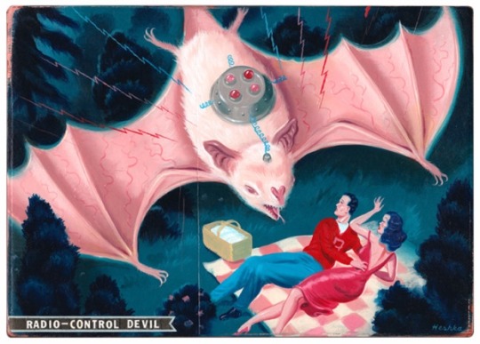
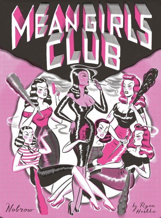
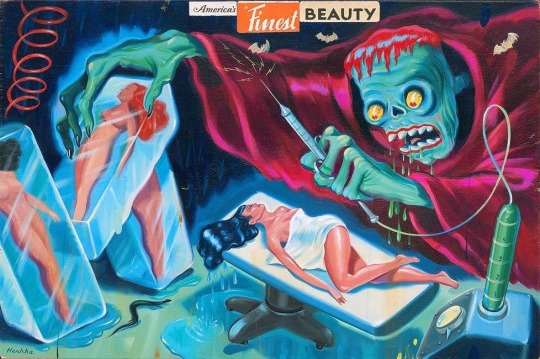
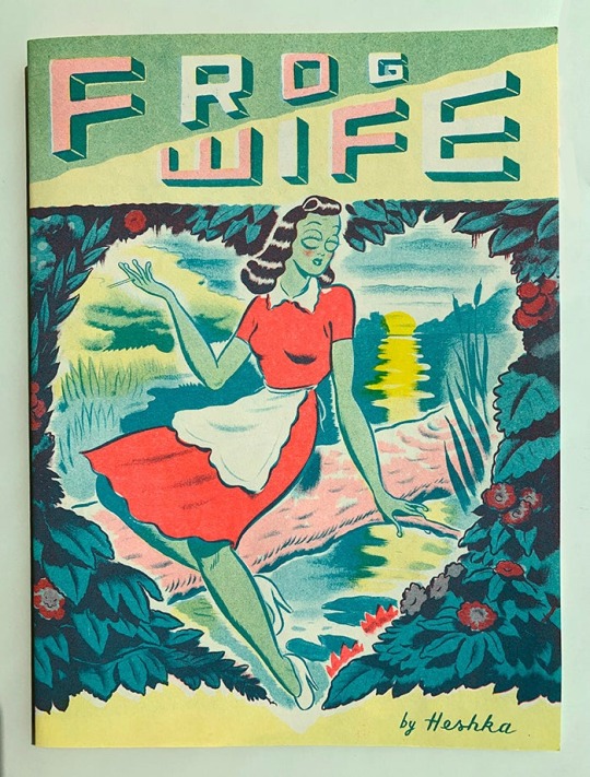
Ryan Heshka is a Canadian artist that grew up in Winnipeg. His early pop culture influences were pulp magazines and comics. He's released his own comics and graphic novels as well, such as Frog Wife and Mean Girls Club and has features and many exhibitions such as "Ryan Heshka: Neo-Pulp" and "Teenage Mutant Age." His neo-pulp art is a very fun spin on old pulp illustrations, his work had a similar charm while also still being unique and interesting. Heshka manages to put his own spin on these familiar aesthetics, his art style is very recognizable as his own. His color palettes seem to be very carefully chosen to flow well with the concept and be aesthetically pleasing. His art features a fun mixture of supernatural themes and dark humor. I enjoy the poster style of some of his work, and how playful and well executed his concepts are.
0 notes
Text
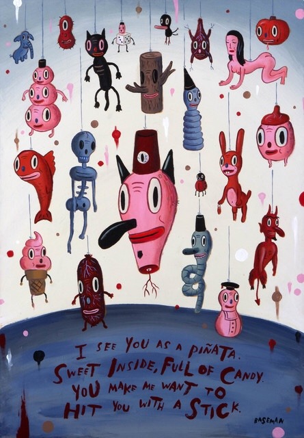
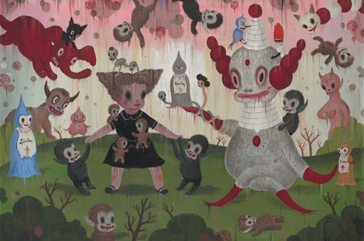
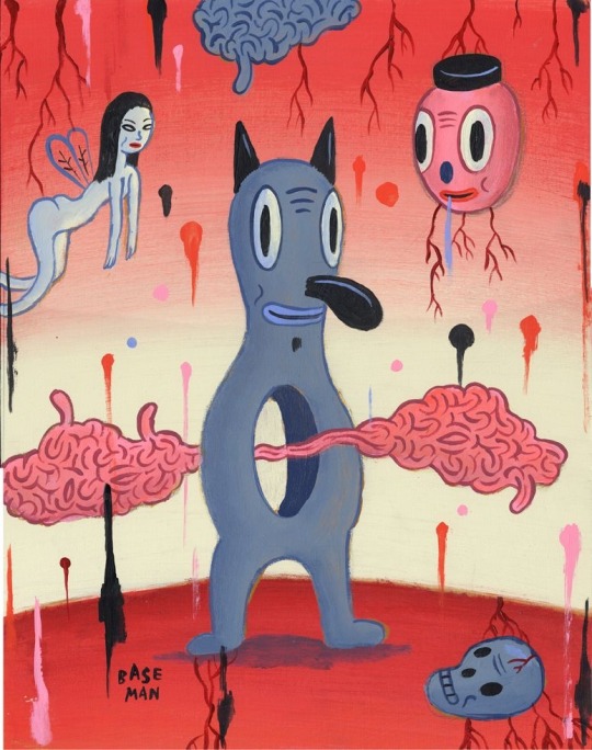
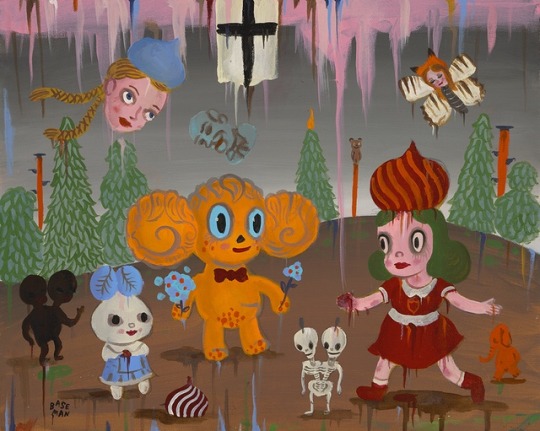
Gary Baseman is an artist that grew up in Los Angeles and drew a lot of inspiration from said city from the art scene to the mixture of different cultures among the community. He gained a very early appreciation for drawing and animation as a child as he grew up watching a lot of cartoons while home alone. After being in the commercial art scene for a while he wanted to begin pushing his illustrations further. He's opposed to the labels that some art critics like to pin on his work, and prefers to refer to his work as "pervasive art." I enjoy his view of his genre, because it concentrates on the art having a strong concept and aesthetic that can extend across multiple forms of media and still work well. I've always concentrated on similar ideas with my own work, and always enjoy seeing artists with strong pop culture influences that refuse to pin themselves down. I also enjoy the aesthetics of his work, he takes inspiration from older styles of cartoons while creating something totally unique to himself. Which again, is similar to what I try to do as an illustrator. His compositions feature a lot of interesting color palettes, recurring characters, and surreal environments. There's also a very playful sense of morbidity in his work.
0 notes
Text
A resource that I’ve found particularly helpful for my project is biddytarot.com
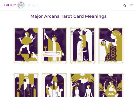
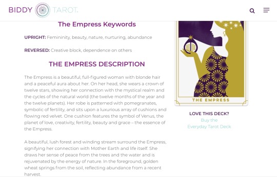
This website is helpful for getting some broad descriptors for the cards as well as a moderate delve into the meaning, so you can get a decent idea of what each card represents. I used this website to get the basic keywords so I could begin to assign each card to multiple characters. I then went back in and read through all the descriptions for the cards before picking which card best suited each characters personality and backstory. The descriptions for the cards offer a breakdown of some of the symbolism which helps when you’re trying to conjure how to best represent the card in your own composition. This is also just a helpful website for beginners that are interested in the concept of tarot readings, and may even wish to do their own.
0 notes
Text
Entry 5: Paint 3D
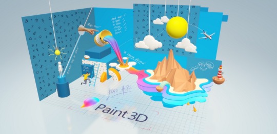
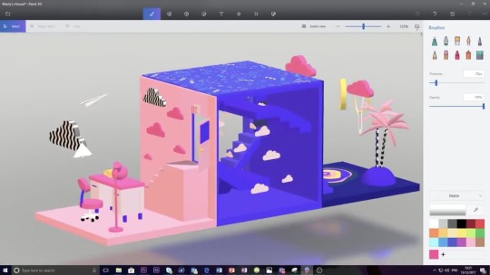
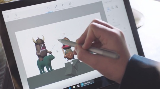
Paint 3D is a Microsoft application that one can use for 3 dimensional modeling. There are several art programs available for both Windows and IOS, but this program in particular one is more user friendly. This application allows artists to draw 3 dimensionally in a way that feels more natural than in applications like Blender which is better suited for slightly more experienced artists. Paint 3D is a fun application to use for artists that are more accustomed to illustration and want to begin broadening their skills. Creating a 3D model for a character design can also be very helpful as a resource when you need a reminder on how a piece of clothing wraps around them, or how their hair would look from a different angle. This is a program that I want to work more with in the future so I can work more with 3D character animation in the future and building more in-depth environments.
0 notes
Text
Entry 4: Podcast
The Magnus Archives is a horror anthology podcast that I’ve recently taken to listening to while I work. Consuming different media in the horror genre before or during work sessions helps me concentrate and get into the right mindset to contribute to the genre with my own artwork and analysis. The stories told in this podcast are all very immersive and often unsettling. It all fits under a greater narrative being told through the narrators who are making these recordings of horrific statements in character. The narrative they build gets more complex with each episode as they establish different supernatural beings and phenomenons that exist in the universe they’ve built. Seeing things tie together and new imformation being brought forth about different creatures inspires me to look at my own characters more in depth. They make very good use of the audio medium by making every episode seem as though it was recorded on a tape player by the archivist that serves as the main character. I find the writing of this show to be pretty phenomenal compared to some of the other more casual horror podcasts i’ve listened to.
0 notes
Text
Entry 3: TV Tropes
Tvtropes.org is a useful website for anyone looking to do any sort of film study. As someone currently doing studies on the horror genre and its culture I’ve found that this website offers various helpful resources. This site is a database of almost any film trope you can think of that gets passed from movie to movie. Whether you're looking for common character traits, plot pieces, or entire sub-genres you’ll be able to be able to find a rabbit hole of information. Every trope page typically lists several other related tropes in their descriptions, and offers lists of media that uses said tropes. From that you can also view pages for different films, books, comics, and etc. I’ve found in my horror research that there’s even an interesting nightmare fuel tab that outlines highlights of the different factors in the movie that are meant to instill fear.
Even if you’re not particularly interested in film study this is also a good resource for artists. This site can help you flush out characters with traits that would better suit the genre you’re working with, or give your audience a better sense of familiarity with your character type. If you’re looking to take inspiration from some of your favorite media you can likely find it on this site with various outlines featuring tropes you could borrow from.


0 notes
Text
Entry 2: Digital Art Hardware & Software
Procreate is an art program that most artists use when working on an IPad with an Apple Pencil. It’s an easy and portable way to work on illustrations. Some digital artists prefer to use hardware that allows them to illustrate the same way they would when working traditionally.


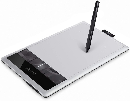
When using drawing tablets like the Wacom Bamboo tablet there is no screen on the tablet itself. This means over time you’ll have to get use to coordinating yourself in a way where you can look at the screen in front of you rather than your hands while drawing. All the tablet does is pick up your hand motions with pen and transfers that information to the cursor. Some digital artists find the feeling of using these type of tablets to be too clumsy, or over time they just begin seeing them as being too tedious to work with.
Tablets like Cintiqs and IPads allow digital artists to draw on the screen just as they would on paper. This feels much more natural, and makes illustration a bit easier. IPads work especially well because they’re more mobile than cintiqs which usually have larger screens and stands. As far as software goes I’d say these are all evenly matched just because while its easy to find quality art programs in the App Store, computers (especially windows computers) are more customizable and offer more variety since they can handle heavier software like 3D modeling programs.
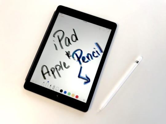
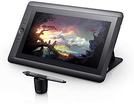
My favorite art program to use on my IPad is easily Procreate. It has a very simple but effective layout without limiting what you can do. It’s a very universal program that’s easy to use for both experienced and beginner artists. Along with the color wheel and hue picker you can also save colors you’ve used into separate palettes that you can come back to later when working on a new piece. Just like in other art programs you can adjust the resolution and DPI of the canvas Incase you’re working on something that you intend on making a print of. There’s also a feature where you can watch and upload a time lapse of your work after you’re done.


0 notes
Text
Entry 1: Lu Yang Solo Exhibition
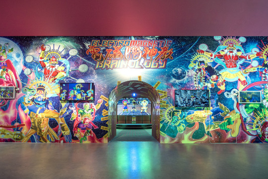
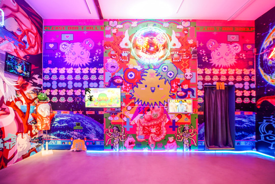
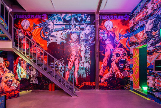
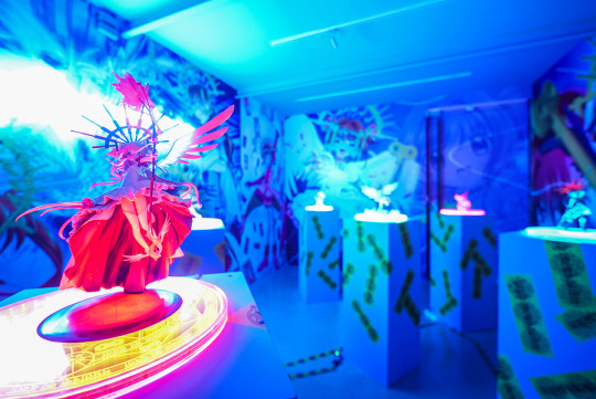
Lu Yang “Encephalon Heaven” at M WOODS, Beijing is a solo exhibition that took place in 2017-2018. Lu Yang displayed a variety of her work that spanned from video, computer programming, installation pieces, sculptures, and more. Despite the large variety of mediums they all tie together well, as they all share a similar but chaotic aesthetic. Her inspirational sources vary as much as her medium, including things like hip hop, anime, gaming, and glam rock street fashion.
I’m very much drawn to her work because of her various usage of the digital medium, and because we draw from similar sources of inspiration. Upon discovering her work she immediately became one of my favorite artists. The complexity of her exhibit and her ability to make polished work across multiple mediums and cohesively fit it all together while collaboration with other artists is beyond impressive. Aesthetically this type of work is also the exact thing I like to see from other artists. Dynamic anime and video game styled art, sculpture, and video. I also admire her usage of the space, custom wallpaper installations are always one of my favorite things to see in solo exhibits. Some wallpaper installations can give the exhibit a very maximalist aesthetic, not allowing for negative space around the pieces. The resulting awe from this can be very rewarding when executed well, like it was in this exhibition. I also enjoy seeing extreme saturated color palettes. I’d like to work with more bold neon palettes myself, but I always end up softening the hues into a more pastel work by the time my piece is finished.
Artists like Lu Yang and Takashi Murakami encourage me to push my own work further and further. I love seeing contemporary artists like these who don’t have the standard work you’d typically see in a gallery but still come out with these amazingly whimsical exhibitions.
0 notes