Don't wanna be here? Send us removal request.
Photo
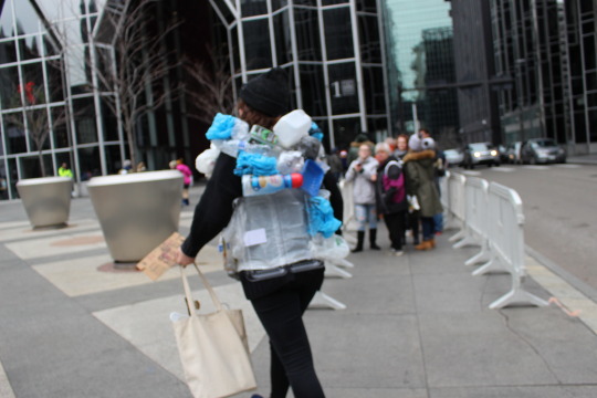
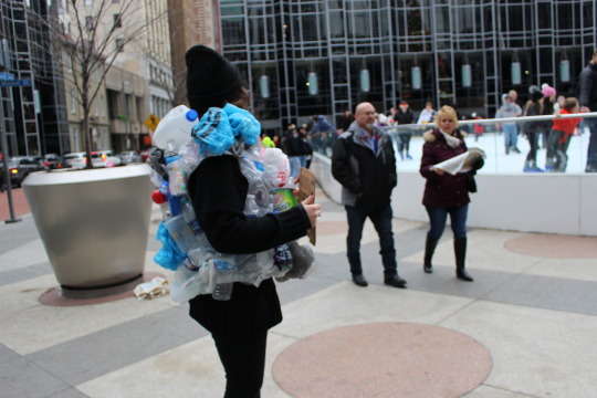
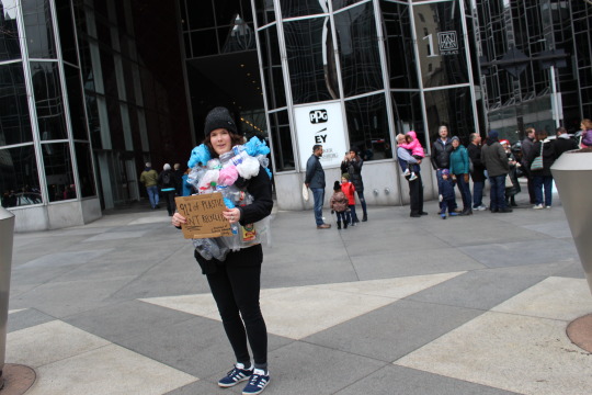
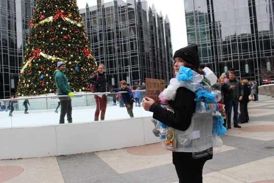
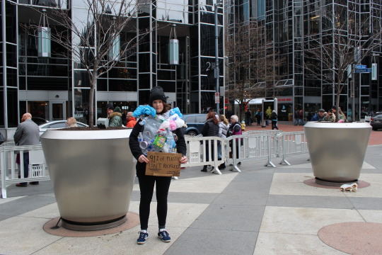
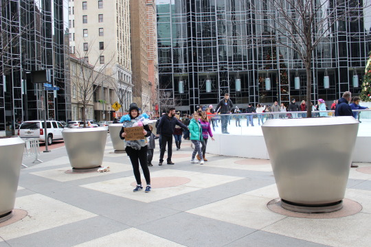
For my final project, I wanted to alter the way people see plastic. Specifically, the way they see their consumption of plastic, or rather, the way the choose not to look at their consumption. I chose to create a suit composed of all found plastics that I personally consumed over a two week period. I wanted to up a time line on the collection period to exmplify the accumulation over a short period of time. Plastics occupy every single aspect of human existence. I chose to present my suit during a busy Saturday in downtown Pittsburgh, a place bustling with busy care-free Christmas goers, who are purchasing things and enjoying their life without thinking about their purchases. Varient forms of this type of seeing, or rather lack of seeing are pervasive and exist in every miniscule daily task– from brushing teeth with plastic toothbrushes, to purchasing a coffee that comes packaged in a plastic, disposable coffee cup. My critical visions project is in lines with a project done by Rob Greenfield, who wore 30 days of trash, attached to his body, around NYC to generate attention. He used trash of all kinds, bound in plastic garbage bags and fashioned to his arms, legs, and stomach. I used a plastic trash bag that was previously used (washed since use), and glue to attach all of my consumed plastic articles. The project went well. I was so anxious to stand there, and claim all of the stares, like someone with a visable disability or “otherness” that deals with these stares daily. However, after initial embarrassment, I felt empowered. I feld strong watching people watch me. I was embrasing it. I was choosing to be scene. The words of Rosemarie Garland Thomson echoed in my mind. The best part was that kids were so interested in me. They walked by and tugged at parents coats, “Look at that! Look at all that plastic”. Adults walked by and made comments that were in support of my performance. I felt happy that environmental concerns surrounding plastic were sentiments beginning to be felt by all. I felt hopeful of our planet’s future. The suit itself took no time to construct. Fashing the plastic went better than expected. If I could improve upon this project, I would have collected for a longer period of time, so that I would have been able to add arms and legs to my suit. I think a more overwhelming amount of plastic would have driven the importance home more. I also held a sign of cardboard that read, “you eat a credit card’s worth of plastic a week- WWF” and “91% of plastic is not recycled” on the other side. In the future, I would like to incorporate dialogue into my operation. I think standing stoic-like was good, but dialogue would be really impactful. Overall, I am very happy with my project and I hope anyone reading this is too. :)
5 notes
·
View notes
Photo


For my final project, I wanted to alter the way people see plastic. Specifically, the way they see their consumption of plastic, or rather, the way the choose not to look at their consumption. I chose to create a suit composed of all found plastics that I personally consumed over a two week period. I wanted to up a time line on the collection period to exmplify the accumulation over a short period of time. Plastics occupy every single aspect of human existence. I chose to present my suit during a busy Saturday in downtown Pittsburgh, a place bustling with busy care-free Christmas goers, who are purchasing things and enjoying their life without thinking about their purchases. Varient forms of this type of seeing, or rather lack of seeing are pervasive and exist in every miniscule daily task– from brushing teeth with plastic toothbrushes, to purchasing a coffee that comes packaged in a plastic, disposable coffee cup. My critical visions project is in lines with a project done by Rob Greenfield, who wore 30 days of trash, attached to his body, around NYC to generate attention. He used trash of all kinds, bound in plastic garbage bags and fashioned to his arms, legs, and stomach. I used a plastic trash bag that was previously used (washed since use), and glue to attach all of my consumed plastic articles. The project went well. I was so anxious to stand there, and claim all of the stares, like someone with a visable disability or "otherness" that deals with these stares daily. However, after initial embarrassment, I felt empowered. I feld strong watching people watch me. I was embrasing it. I was choosing to be scene. The words of Rosemarie Garland Thomson echoed in my mind. The best part was that kids were so interested in me. They walked by and tugged at parents coats, "Look at that! Look at all that plastic". Adults walked by and made comments that were in support of my performance. I felt happy that environmental concerns surrounding plastic were sentiments beginning to be felt by all. I felt hopeful of our planet's future. The suit itself took no time to construct. Fashing the plastic went better than expected. If I could improve upon this project, I would have collected for a longer period of time, so that I would have been able to add arms and legs to my suit. I think a more overwhelming amount of plastic would have driven the importance home more. I also held a sign of cardboard that read, "you eat a credit card's worth of plastic a week- WWF" and "91% of plastic is not recycled" on the other side. In the future, I would like to incorporate dialogue into my operation. I think standing stoic-like was good, but dialogue would be really impactful. Overall, I am very happy with my project and I hope anyone reading this is too. :)
5 notes
·
View notes
Text
Pl34SUR3S
While working, I chose not to intervene with Christian institutions in lower-income or underprivileged areas. A lot of learning has resulted from this project as it has been conducted. Out of that knowledge, I’ve generated newfound respect; not just of people’s faith, but of the community that surrounds these institutions and its function as a still-beating-heart within Cincinnatian gentrification. Out of respect, I set one hard restriction within the parameters of this project.
Goal: Discussion and action towards sex education reform in public schools by challenging one of its biggest stakeholders, religion.
Topic: Sex Censorship
Audience: Institutions and congregations of the Christian faith (primarily in well-functioning districts)
Disruption: Public Art/ Performance and documentation of blow-up doll No.2 (Betty) juxtaposed with religious institutions
By investigating how religion, Catholicism, in particular, has cultivated an air of taboo around sex, this project urges its faculties to reconsider their quasi-archaic conventions through public art disruption and discourse. The end goal of this project is to advocate for sexual education reform in public schools through the implementation of a blow-up doll. This project proposes that if you can have a dialogue about sex in church congregations, then it shouldn’t be unreasonable to have the same dialogue in schools; opening up discussion more freely and unburdening awkwardness.
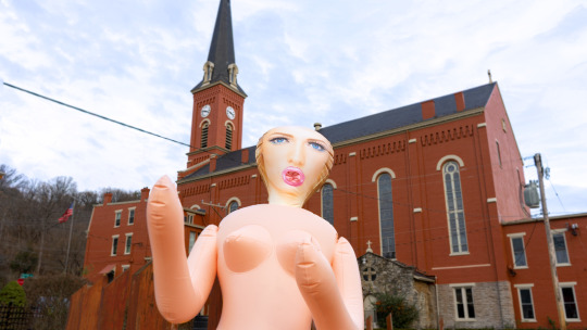
This project comes down to the fundamental battle and restraints that pro creationism has perpetrated over the years and how institutions such as the Vatican, prevent progressive social reform from ever being discussed; preventing access by censoring or ignoring the topic through various loopholes/misdirection. For instance, catholic families can omit their children from participating in sex-ed classes entirely by writing a note.
On Catholicism and Religion & History
It’s a widely accepted faith with a lot of history and influence. So, when we think of the very beginnings of civilization, procreation was necessary for safety in numbers, working offspring, food gathering, and innovation. Since language was invented, procreation as been one of the binding values that belief systems, governments, and institutions all share.
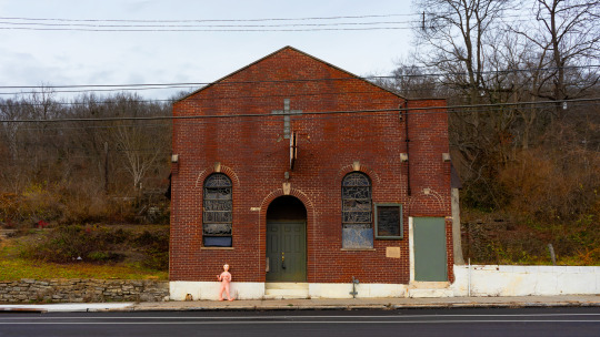
Catholicism used it as a way to create more followers (I mean this in a sincere way) and keep family members united; which is a good thing…until you get to the 21st century. “In the past decade alone, online dating has had probably the biggest single impact on our sexual lives. Websites and apps designed to facilitate sex and romance are everywhere”. This isn’t to say that Catholicism is inherently bad; in fact, it’s done a lot of good: inspiring goodwill, charity, faith, and rules that keep people from harming others. The problem with the way that religion perpetrates procreation now is that any partner-seeking individual within a congregation is expected to keep up with orthodox. The unfortunate, but true fact is that many members of the Catholic faith don’t follow these restrictions. Forced into secrecy, this then creates even more problems. Catholic women are 5X more likely to have an abortion in unsanitary conditions, often resulting in permanent damage to their reproductive organs.
By implementing a blow-up doll, I was able to stage a disruption that facilitated immediate dialogue. I armed myself with facts, statistics, and my mantra-my reason for interrupting their form of seeing-“IF you can talk about sex in church, then you can talk about sex in schools”, which was my way of simplifying advocacy for sex-education reform in public schools. What I’m advocating for in particular is more transparency and access to intermittent sex-ed courses and the inclusion of gender and sexuality studies. Sex-education is treated as a one-and-done course; with the majority of public schools only making it mandatory for a quarter portion of school year studies. Sex-education should be taught repeatedly and intermittently. Teenage and adolescent bodies change drastically throughout cursory education. These physical and emotional changes should be addressed chronologically in tangent with lessons on sexuality and gender; garnering an understanding of attraction, cross-gender, and sexual preference, would generate acceptance of the self and surrounding classmates. This would generate lifelong learning and positive habits for understanding diversity both in school and in alternative environments.
Why a Blow-up Doll?
I chose a blow-up doll for this project because of these points which ascribe its relevance and activation as a device for disruption in this case :
Blow-up dolls were popularized by men and have a historical prevalence of sex. Primordial versions date as far back as Greek Mythology: The story of Pygmalion which was eventually turned into a play by George Bernard Shaw [of the same name].

Females are heavily scrutinized and overlooked in the Bible. In fact, Wikipedia’s list of biblical female names used in the Bible says “This list contains persons named in the Bible of minor notability, about whom either nothing or very little is known, aside from any family connections.”Blow dolls throughout history consistently depict a female form [which is what I am]Contemporary, radical feminism has been facilitated by females and the female form has been viewed as a vessel for change; which I think authenticates its existence. Many of today’s hot debates are centered around female rights, pro-choice, women’s health, etc., all of which Catholicism plays a major stakeholder in and against. (This reason most of all, I enjoy because it forces femininity into the banal foreground; gloriously nude and proud). It’s symbolic of modernity, change, and acceptance. Finally, blow-up dolls are hilarious and brutally forward. They are indexical of sex in private quarters, but questionable in public forum. Something as puzzling as a ‘rogue blow-up doll’ incites query automatically.
In Action: The Disruption
youtube
First attempts at launching Blow-up doll worked in provisional trials but not by simply filling the doll with helium [blow-up dolls made from PVC cannot simply be filled with helium and float. Buoyancy rates when using helium rise and fall according to the material and surface area]. I had to resort to using multiple balloons, fishing wire, stock helium, and strategic timing which made the project far more foreign when just starting out. Using the balloons and floating a blow-up doll A) happens far too quickly to time intervention with congregation B) requires a larger strike force of people that I didn’t have C) Any rogue wind would result in misdirection of the doll and instigate a search and rescue mission. Floating the doll was canceled after rogue winds caused the doll to come in contact with the steeple of the church; popping balloons and dislodging harness from doll resulting in minor panic from bystanders [and also getting chased off church property]. The doll hit the cross adornment at the top of the steeple of the church and fell, as made barely visible in the photograph.

Parameters
A lot of learning has resulted from this project as it has been conducted. Out of that knowledge, I’ve generated newfound respect; not just of people’s faith, but of the community that surrounds these institutions and its function as a still-beating-heart within Cincinnatian gentrification. Out of respect, I set one hard restriction within the parameters of this project. While working, I chose not to intervene with Christian institutions in lower-income or underprivileged areas. Out of respect for the community, I chose not to intervene with these buildings because of their role in lower-income areas as not only a place of worship, but a place for community gatherings, faith, outreach, charity, and goodwill. Many of these areas don’t have places for community outreach except for places of worship. Latoya Ruber Frasier’s work calls for awareness of gentrification in the Braddock area of Pittsburgh. Similarly, she notes that factions of a dilapidated community infrastructure often cling to a building, area, or meeting place that serves as the community’s only existing place of refuge. In the series, Campaign for Braddock Hospital (Save Our Community Hospital) (2011), Frazier curates a series of photographs with written recountments and repurposed advertisements from competing industrial investors; those who were wanting to purchase the hospital. This series shows the hopeless, last stand of a community fighting for the essence of their existence to remain intact. Intervening in these areas with this disruption practice would make people less likely to talk or even feel motivated to discuss sex-ed reform. I wanted people to be able to laugh at the end of conversations; not feel disenfranchised, violated, or looked down upon more. All of these concerns tie in with the “Stranger with a Camera” screening which discussed how an outsider’s objective of intervening within an environment can potentially belittle it further and put the outsider in a dangerous position.
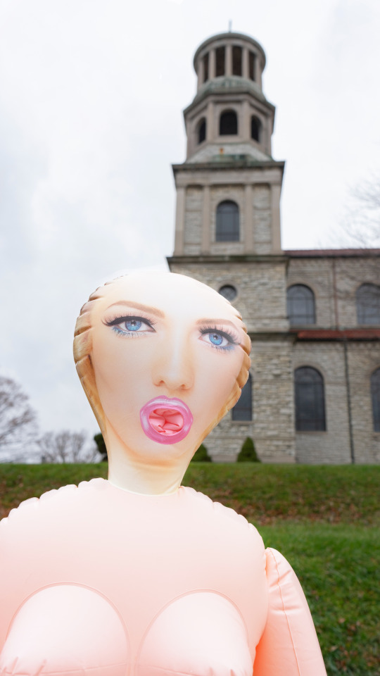
Intervention/Disruption
Once the blow-up doll was in position, people came to me quickly. Initial rage was common amongst the conversations I had. Typically, people were outraged and would begin conversations by questioning who was responsible. In the Videos presented in class, every incident is represented/documented by an intervening photographer. Specifically, I think that the work intervenes on a level that could be considered risky’. Not only is it an intervention of visual culture, but it has the potential to disrupt critical cultural values in a specified area or group. For these interventions, caution is a must, but also the consideration of values that are being devalued. Interestingly enough, most of these people never actually saw me placing the doll in position. They were making assumptions based on prejudice; unrealistic expectations to lead them to the perpetrator of the incident or placing blame on me automatically based on proximity and associative stigma. This is where another reading comes into play. Karen Strassler, Refracted Visions, photographer as a ‘witness to history’ and the expectations of photographers as inherent record keepers. Where this intervention documents a specific disruption, the members of the congregation wish to omit this type of history from ever taking place.
Interviews
Once Initial reactions transpired and commonalities exchanged, I had questions I would give:
-Can you explain why this makes you upset?
-Why isn’t sex talked about in church and why do people pull their children out of sexed classes in school? Do you think this is beneficial to them in the long run, why/why not?
-If sex-ed was reformed, would you allow your children to attend?
-What do you think about the dismissal and coverups of sexual predators within the institution?
-Do you see similarities between priest defilement and sex aversion in Catholicism? If yes, what needs to change? If no, are you aware of either issue?
-I miss participating in Catholic ceremonies, mass, and the sacraments, but I feel that the infrastructure is wildly corrupt. The priest I grew up listening to for 18 years was accused of sexual assault. I now consider myself a pansexual. How could I ever return to this faith and why aren’t many of these men serving crime in person?
-Do you agree with sex-ed reform in public schools to include more, intermittent classwork and development? Would you condone gender and sexuality studies in this class?
-Do you think the Catholic Church will ever consider reformation for the inclusion of more progressive practices, inclusion, and accommodations that meet modern advancements?
Works Cited
Frazier, Latoya Ruby. Campaign for Braddock Hospital . Pittsburgh, 2011.
Garland-Thomson, Rosemarie. Staring: How We Look. Oxford University Press, 2015.
“List of Women in the Bible.” Wikipedia, Wikimedia Foundation, 3 Dec. 2019, en.wikipedia.org/wiki/List_of_women_in_the_Bible.
Strassler, Karen. Refracted Visions: Popular Photography and National Modernity in Java. Duke Univ. Press, 2010.
#alyssamaurerphoto#alyssamaurer#alicegraphy#alicegraphyy#daapmfa#daap#criticalvisions#intervention#disruption#blowup
2 notes
·
View notes
Text
Vape Free UC
Bethany Campbell
For this project, I wanted to bring attention to tobacco use on Cincinnati’s campus. Many people don’t realize that someone can easily get more tobacco in their system by vaping then by smoking. Vaping has made it easier and more accessible to smoke. A few years ago smoking was at an all time low. Today, it is at an all time high among teens and young adults. To raise awareness of this issue, I placed posters of old cigarette ads all over UC’s main campus. Within these ads I featured vapes and juuls instead of cigarettes and cigarette cartons.

This first ad demonstrates how vaping is supposed to be milder and has a better taste. Regular cigarettes do not have flavors like mango. They are more mild because it is “just” water vapor. In reality, it is not just water vapor. Juuls and vapes in general are filled with chemicals, for the taste, along with tobacco and nicotine.

This ad also talks about how these are more mild and have a better taste. This also shows how doctors use to recommend smoking cigarettes to their patients. This ad pushes this brand of cigarettes with the same marketing that Juuls do. With their promise of more flavor and less nicotine.
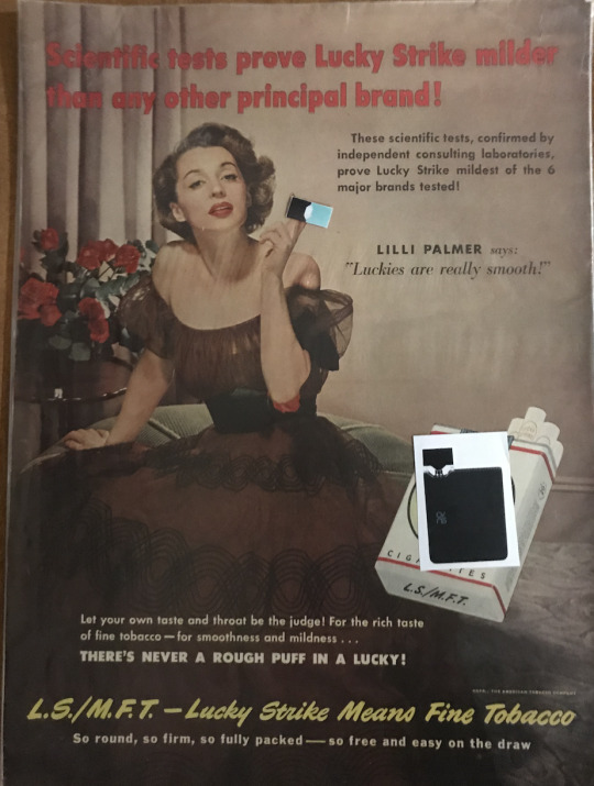
This ad claims it has scientific evidence, but fails to produce what that evidence is. It focuses more on the celebrity selling the product.

These last two ads talk about the scientific evidence that these cigarettes were the “best” for you. The people in the ads talk about how much they smoke and how great these are for them. With only 10 months of evidence, Chesterfield claimed that it had no side effects to the nose, throat, and sinuses. Ten months is not enough time to fully understand the side effects of any chronic thing.
There is not enough evidence to show what the long term effects of vaping are. However, people have become very ill and some individuals have already died with their death linked to vaping. E-cigs were meant to get people away from smoking actual cigarettes, instead they have become a gateway into smoking. Teens and young adults, who never smoked before, are becoming addicted to nicotine with this new age smoking device.
Most of the outside posters where taken down/ stollen within the first 24 hours of them being up. This could also have to do with the weather and cannot be truly known. The posters that were placed inside of building lasted longer. This could be because the posters were placed in areas with other poster hanging. These are bigger poster that were put on top of other posters, but they did blend in a little bit. If I were to do this project again, I would go for a more direct and stronger approach. I would do this by actually handing these posters to people I see vaping on campus. This would interrupt the action of vaping on campus quite literally.
0 notes
Text
Mixed Media
As a non-white-passing mixed person, I have lived my life with a constant need to explain myself. I am not in the most conventional position in society, and therefore it can be hard to understand. I made this project to combat many of the ideas that surround mixed race people. Many of these ideas serve to benefit people who are avoidant of thinking, talking, or learning about race. I think it is important to make a nation that has prophesied its own future to be racially ambiguous brown-ness that understanding of race is not a temporary necessity.
I did my research by reading the writings of people who study and seek to understand race, including Ta-Nehisi Coates, Rachel Cargle, and Muqing M. Zhang. I also looked on social media at different instances of mixed identity (fake and real)—including the criticism of those who have used racially ambiguous aesthetics to further their careers and ride trends. I also talked to mixed people and people in mixed relationships around me.
There is definitely a tension around mixed identity. It makes people uncomfortable for many different reasons—the slightly westernized look mixed people can have that gives them different privileges from white people and non-mixed people of color, the lack of easy categorization of mixed people, etcetera. Mixed people often have to come to an understanding of these tensions alone because mixed presentations are so varied and the cultures that mixed people have to reconcile are also varied. However, the mainstream view of race and miscegenation does not even attempt to show this nuance.
Miscegenation is often portrayed as post-racial and utopian, or at the very most detailed, hippie-dippy. From conservative to white liberal and white progressive, there is a perpetual narrative of a raceless future that people of color know will never exist. Mixed people, as people of color, do not serve to test or prove theories of post-raciality. Miscegenation has, in fact, historically dictated the opposite—the control white men had over women of color. This is just one example of the use of mixed people to misconstrue reality for white benefit.
I want to change the way people view mixed people to be more accurate and holistic. I have presented a flow of thoughts that help an incorrectly conditioned person understand mixed positioning more accurately. I then decided to show a list of mixed people that could be represented in media instead of those who manufacture their appearance to be mixed. I think that there is a lot of work to do to make media represent the reality of mixed people and people of color, this is just one idea. Miscegenation has a long history of pain and civil rights victories (i.e. the Loving decision), which definitely needs to be better addressed. I hope that non-mixed POC and white people can both see mixed people as an important demographic in the dismantling of systematic racist oppression, rather than an anomaly that helps or hurts racist arguments. I think in the future I would also like to address the way mixed and non-mixed POC are made to compete for success and approval in white systems, but this was a pretty good start.
here’s the link: https://www.instagram.com/mixed_freaking_media/
0 notes
Text
Critical visions
For my project I decided to bring awareness to the issue of trans and others who do not fit sex and/or gender stereotypes being harassed in bathrooms. Along with the issue of harassment I also want to raise awareness of the need for gender neutral bathrooms and give support to other trans people during Trans Day of Remembrance.
I chose this topic because I do identify as non-binary and I have a lot of friends who are also trans. While I do use both she/her and they/them pronouns I don't always feel comfortable in the women’s bathroom. Sometimes I would have to walk 10 minutes across campus to find a single stall restroom I felt comfortable using. While this seems like a trivial thing having access to a bathroom that a person feels comfortable using is a real issue. Using the bathroom of your gender identity is often seen as part of the transitioning process, and serious infections can result from “holding it”. The day I put up the posters were also very important, November 20 was Trans Day of Remembrance. Trans Day of Remembrance is the day that we remember all of the trans people who died in the past year. It is often a very emotional time. I wanted to share my support encourage other trans people to use the bathroom of their gender identity.

This first poster was the lead poster of my campaign. I put this poster on all the stalls in every restroom I put posters in. Putting it in the stalls made the poster very visible and meant that people couldn’t ignore the poster very easily. I wanted it to be straight and to the point. The main text reads
Trans, genderqueer, nonbinary, agender, and others who do not fit sex and gender stereotypes have a right to safe bathroom access,but many face interrogation and harassment which can make using the bathroom a daily struggle.
This paragraph is addressing the issue and letting the reader know that harassment in bathrooms is a serious problem that does occur, sometimes on a daily basis.

My second poster was more provocative than the first. This poster was meant to confront people about what they thought was normal, 2 sides. By putting this poster over the signs that said “male” and “female” I was confronting the idea that there is something outside the gender binary.


These last two posters were meant to uplift trans people and make aware that trans people exist and do not have the same rights as everyone else. The first poster was placed on the front of the bathroom door so that people walking into the bathrooms and those outside could read it. The second poster was place inside the door and places outside the bathroom.
My topic relates the Gralnd-thomon’s idea of separated staring. She describes separated staring as “more than simply looking away out of civil inattention. It is visual fleeing, often the wideeyed, looking-over-one’s-shoulder retreat of the fearful. In separated staring, discomfort overwhelms both attention and curiosity so that baroque staring collapses under its own weight” (Garland-Thompson 2009: 115). Bathrooms are a place where people are not supposed to stare in. There is a large emphasis on not starting and respecting people’s privacy within shared restrooms. When someone walks in who doesn’t look “feminine” or “masculine” enough to be there the curiosity is overwhelming. The curious person will stare but look away because the uncomfortableness of the situation is too much.
Thomson, Rosemarie Garland. Staring: How We Look. Oxford University Press, 2009.
0 notes
Text
Got Desensitization?


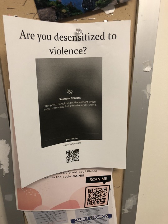
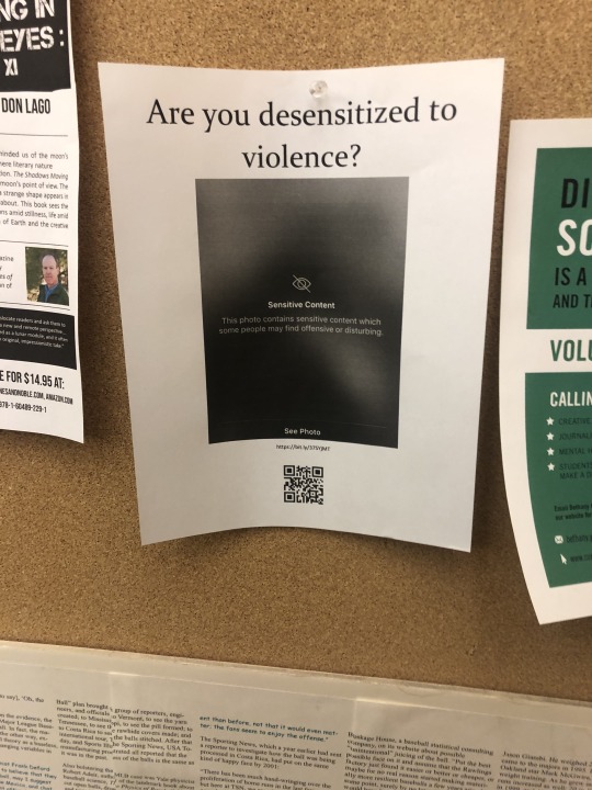
Pictured above is the website, the image I used on the poster, and two installments of my poster.
Mikaela Williams
Critical Visions Project: Got Desensitization?
The topic of my final project was the desensitization of violence in popular media. A lot of time the desensitization of violence is brought up in discussions of how video games make kids more violent. That is not the focus of my project. I initially became interested in this topic back in my senior year of high school. That February, the Parkland School Shooting had been all over my social media feed. I was seeing snapchats from people I’d never met before depicting the tragedy in Florida. There are plenty of events that go viral on the internet that can be applied to this project. What I wanted to address was how this type of media content has become normal, as gruesome as it may be. I believe that this normalcy can have harmful social effects.
A lot of my project works to reverse the effects of mystification that we talked about in class. We are bombarded everyday with images, so much so that we cannot “see” them all. What stands out to us is what looks different than our perception of normal, as Garland-Thompson explains in Staring. Those in power might explain away atrocities by making these types of images normal in everyday media. They try to take away the vision of the contemporary viewer and reinvent history to make their acts seems less than what they are. All images of violence are not attempts at mystification, rather those in power take advantage of our oversensitive media outlets to control the narrative. My project attempts to make people stop and question whether what they are looking at is truly “normal.”
I installed posters around campus that included a QR code that led to a webpage I had made. The posters are just on simple printer paper in black and white because I am cheap, but there are big bold letters to catch you eye. On the webpage, there were a few different sources that explained this desensitization and its implications. My intent of this project was to draw attention to the possible desensitization of violence people may be experiencing through media. Though my audience could broadly be anyone, since we all consume media, I target college students because this generation of students have grown up with these types of images being plastered all over the internet. Also, students often play roles in activism and I wanted to bring attention to how they may only be contributing to the problem if they blindly follow the narrative. Similar to the culture in Java that Strassler discusses in Refracted Visions, our culture today is constantly documenting life through the use of images and videos. Because photos and videos are ambiguous, the viewer can easily be directed to see differently depending on how the narrative is presented. Goodwin’s Professional Vision discusses this through the Rodney King’s trial. Examples of the violence being explained continue to happen today, even with the spread of viral videos. Bringing attention to how desensitization works might help activist learn how to shape their narrative to stand out against everything else that seems normal.
After 12 days of having ten posters in buildings around campus, I’ve only had 4 visitors to my website. So, the webpage part of my project wasn’t a huge hit, but I believe that the question presented at the top of the poster does enough to make the viewer stop and think if only for a second. I wasn’t expecting radical change to happen from my project, all I wanted to do was make people think differently about something. Now, even if it a small, passing thought, people will think differently about an image of violence that pops up on their feeds.
0 notes
Text
Critical Visions
For the critical visions project, I stuck with a similar topic to the first assignment of the semester. I focused on homeless awareness as I feel it is a widespread issue across the country. After living in Clifton for 5 years I noticed that people tend to ignore when someone asks for help. While I do not agree giving money to someone that you do not know the intentions of, I do believe in helping someone out with a meal. During my time in Clifton I have always denied someone money but have offered up a hot meal or even whatever left overs I happened to have, pizza wings, etc.
I wanted to bring to attention the fact that there are people out there that truly need help and not everyone asking for money is faking being homeless. To help bring awareness to this I did something very different from what was in my original proposal. After the proposal presentation everyone steered me away from doing some sort of flier to bring awareness. While I was brainstorming other ideas, I ended up buying a truck. I decided to use this to help with the project.
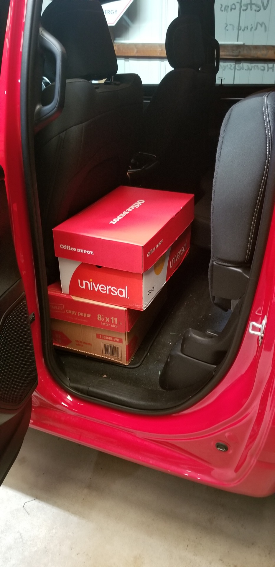
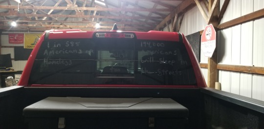
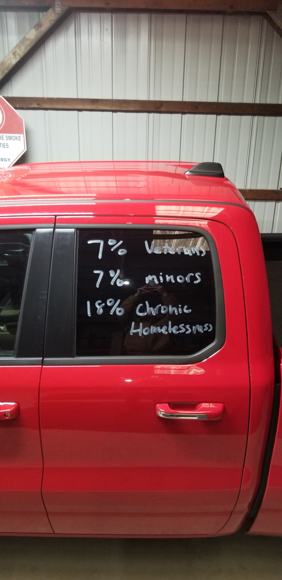
I ended up going to the store and picking up some window paint, brown bags, case of water, variety pack of snacks, and supplies for sandwiches. I took everything home and started packing meals. Once this was done I took the truck over to my barn and started working on the window paint. Since the truck is one of the bigger things on the road, I used it almost as a billboard. I painted a handful of facts about homelessness on the windows of the truck. I plastered on the windows some facts from the US Department of Housing and Urban Development or HUD. Some examples of what I used are that 1 in every 588 Americans is homeless, 194,467 people will sleep on the street in the USA, 18% are chronically homeless, 7% are unaccompanied youth under 25, and 7% are veterans. With the information on the truck I filled two cardboard boxes with bagged lunches and took to the streets.
I chose to do this during national homeless awareness week. To better reach an audience I drove around the city and surrounding neighborhoods during rush hour traffic. I figured the combination of the fire engine red pickup truck with white lettering on black windows would catch people’s attention. If that did not do it the rare sight of someone interacting with a homeless person on the street would get people to stare.
Some problems I ran into was the paint sticking to the rear window. I am not sure if there was still some sort of wax on it from the dealership that was repelling the paint. This made the writing on the rear a little harder to read than i would have liked.
Despite this, I drew a lot of attention from fellow motorists. While it is hard to tell if this made any impact on how people driving on their daily commute view and interact with homeless people, I know that it impacted the people I was helping during the holiday season. One thing I hope people that saw me got from this is, just because they are living on the street ‘begging’ they are still people and deserve to be treated as such especially now as we enter the full swing of the holiday season.
0 notes
Text
Critical Visions Project
Elizabeth Madison
Anth 3074
December 6
For my critical visions project I decided to expand on my looking prohibitions project and further explore Garland-Thompson’s idea of “Intentional Inattention” and how that relates to people’s interactions with panhandlers. While researching and brainstorming my topic I decided to start with why? and what I realized was that there are many reasons why people avoid looking at panhandlers. 1) It makes people uncomfortable and makes us question our understanding of “good” in the world. 2) The avoidance of looking is an unspoken, culturally constructed rule that we are socialized into beginning as children with a simple phrase: Don’t stare. It also relates back to the discussion of “Civil Rules of Looking,” from Staring. 3) To look at someone beneath your own status in society is a violation of middle class rules of politeness.
So I talked briefly with any panhandlers that I passed during my days and the responses were all painfully similar, every conversation included some variation of: “Most people just don’t see us,” or “The hardest part is feeling invisible.” After this, I began researching the homeless situation in Cincinnati as reported by local organizations like the Homeless Coalition.
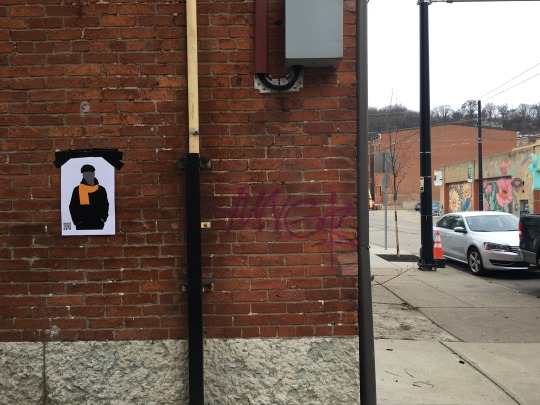
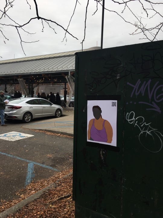
I knew that I wanted to do a poster of someone with no face but I didn’t know which direction to take because I’m an Anthropology major, not an artist. Originally I wanted the posters to be shocking or disturbing or have an image of someone experiencing homelessness to really disrupt people’s vision, but after discussions in class I realized that maybe ambiguity was the way to go.
I then created two images of just regular people on Adobe Illustrator, using my new best friend the curvature tool, then put gray blobs over their faces. Originally I wanted to use reflective metal for a mirrored effect but due to size limitations, the images weren’t life size so it seemed like the effect would be wasted. The posters could have meant anything: a new indie band or book.
A M B I G U I T Y
Since this is a sensitive topic in our community I didn’t want to use guerrilla tactics and call people out, so I created a website with information about homelessness in Cincinnati and an explanation of the project. Then I created a QR code to put on the posters, which lead to the website and would be monitored by a Google Analytics account. My plan was to use people’s inherent curiosity to get them to interact with the poster.
https://look-at-me-cincinnati.my-free.website/
My overall goal was to prove that people aren’t walking through life oblivious or like robots. All year we talked about how people look at things that are unfamiliar and that we either stare at or avoid looking at things that make us uncomfortable. It was my hope that people would realize their biased looking and how their avoidant stares take away the dignity of our fellow humans. I wanted to prove that people would interact with a regular old joe drawing of someone with no face, and that they don’t look at a real person asking for help.
The only two people that scanned the code immediately clicked off the site once they realized what it was, which was interesting because even when the information was presented to them in a private and respectful way they still did not want to pay attention.
I learned a lot from this project about a lot of different things like: ways of looking, human tendencies, project design, time management and interacting with and not running away from discussions of theory. I could write about this project for days but I think that’s the jist of it within the 600 word limit.
0 notes
Text
Critical Visions - The Female Gaze
Maggie Caulfield

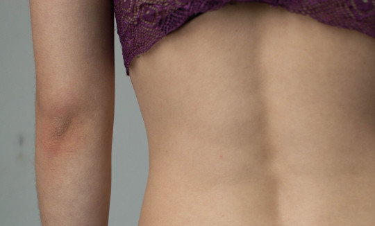
Even as we become seemingly more progressive as we move through the years, the male gaze continues to derail what women work so hard to disprove. The male gaze has been a long-lasting idea put on women that ignores anything but their sex appeal. This idea is most recognizable in film and photography in the way it represents women as sex objects, rather than paying any mind to literally any other characteristic. Thus came the female gaze, a rejection of the male gaze and a strong feminist movement in film, photography, and the arts to show women as more than their sexual nature. While it is not a direct antonym of the male gaze, the female gaze is representative of the way women perceive other women. By implementing the female gaze, the perspective of an art or photography piece completely changes.
My main focus was to add to the discussion and see how we can define the entire idea of the female gaze. My inspiration for this topic and my intervention came from the book Girl on Girl: Art and Photography in the Age of the Female Gaze by Charlotte Jansen. This beautifully crafted book lays out the work of many different female photographers and artists who focus on embodying the female gaze.
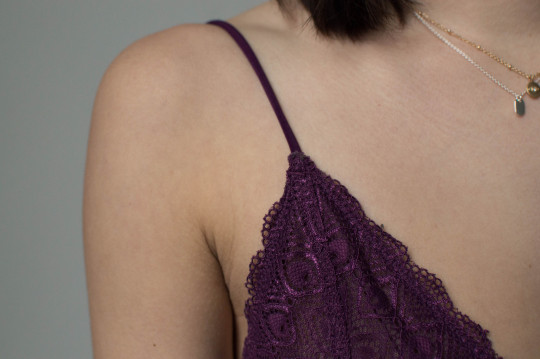
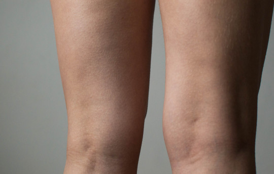
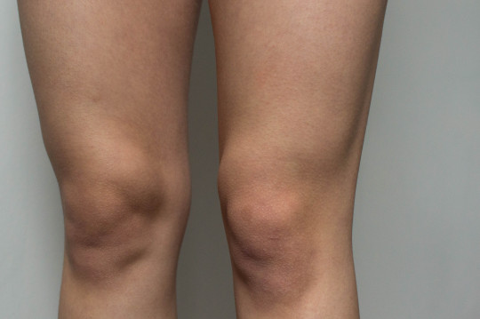
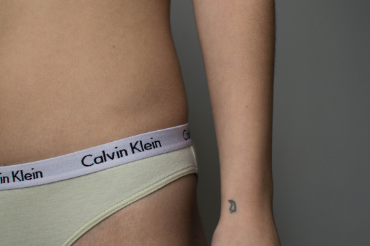
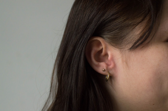
I also wanted to focus on the baroque staring that comes with anything that is set in the male gaze. How can the female gaze take that same baroque stare and turn it into something different? The female gaze is all about what the photographer or artist wants to show in their photos, allowing people to look and stare. Some of the art and photography also shows visual activism in the way it says “look at me,” instead of trying to turn away the viewer. If I were to continue this photo series, I would want the visual activism to be strong, keeping the viewer looking and wondering.
I decided on my intervention being photography, which I would then post on social media. My planned audience was women and those affected by the female gaze. I chose to post my photos on my small design Instagram account, which has more female followers than male. Because I am not a photographer, and most definitely not a good one, my goal was not to add anything special to the photography world, but continue to add to what the female gaze represents. Through my photography, I chose to photograph my friend in segmented parts. I was curious to see how the body looks when it is broken into pieces, especially when some of the segments are body parts that are not typically seen as being sexual. Photographing my friend’s knees, elbows, and ears was interesting because it made me think of how beautiful these parts of the body can be. As I continue to think about these photographs, I wonder if it’s my own female gaze that appreciates these body parts as non-sexual, or if it’s the disconnect each has from the rest of the body.
My goal for this project was to add to the world of art and photography that pays homage to the female gaze. I wanted to see how segmenting the body could change the overall feeling of a photo. I really appreciated this project, and would love to continue this and maybe turn it into something larger.
Jansen, Charlotte. Girl on Girl Art and Photography in the Age of the Female Gaze. Laurence King Publishing, 2019.
Thomson, Rosemarie Garland. Staring: How We Look. Oxford University Press, 2009.
1 note
·
View note
Text
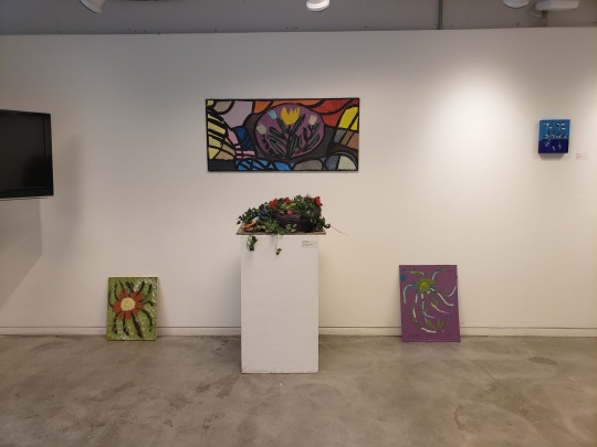
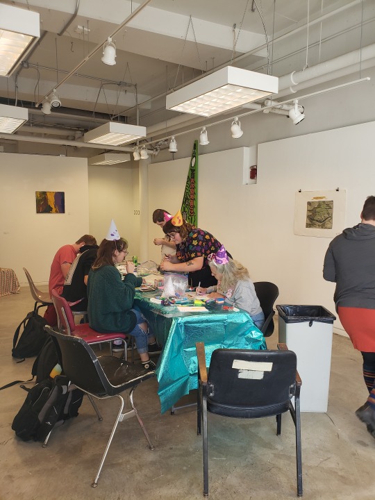
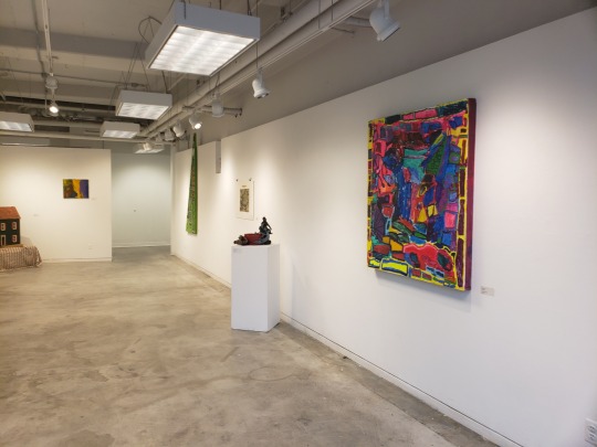
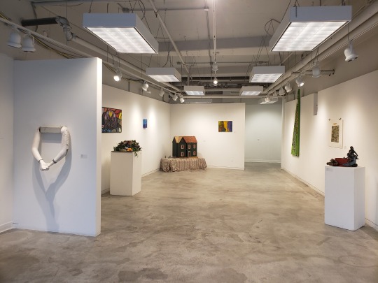
The Critical Visions Project challenged the dominant form of seeing people with disabilities as less capable than most of us. If you look around a typical college classroom, you don’t often see anypeople with observable disabilities. I challenged this way of seeing by curating a Visionaries and Voices exhibition and jewelry making workshop in DAAP’s Tabula Rasa Gallery. The workshop and art exhibition were open to the public but most of the attendees were college students and faculty.
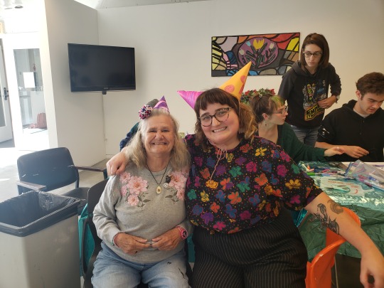
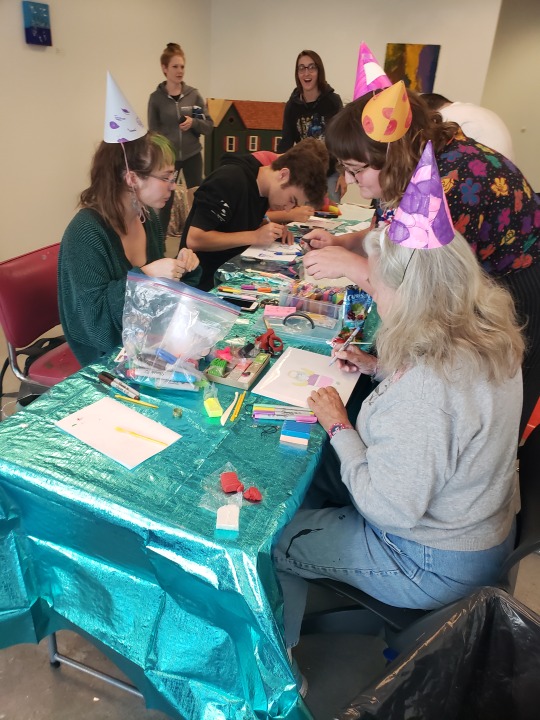
Visionaries and Voices already challenges this dominant form of seeing by giving artists with developmental disabilities support in making and sharing their art. They also have a teaching artist program in which teaching artists are brought into schools and businesses to facilitate creative workshops. I worked at V&V last summer so I felt confident that I could create a safe and comfortable environment for the artists and audience. The art exhibition served as a platform to share V & V artwork, while the jewelry workshop gave the V & V artists and DAAP students and teachers a chance to interact with one another. This one on one interaction was meant to further break down barriers.
Much like Chris Rush’s “Swim II” portrait, my project invited viewers to stare rather than look away. In this environment, where people with disabilities were the teachers, participants would look and them and interact with them as peers. Chris Rush treated this female subject with dignity, as I did with the V & V artists.
Garland-Thompson notes the brutal visibility of a wheelchair. We actively look away from people with disabilities, “a deliberate obliteration of… personhood.” (p.83) By putting artists with disabilities at the forefront, we have a reason to look at them and listen to what they are telling us, taking away the social stigma that some may feel when looking at those who are perceived as different.
This intervention was successful because it made a meaningful impact. The art exhibition received many genuine compliments with one person commenting that it was the first “real” exhibition that had been held in the gallery all year.
The jewelry workshop was such a success that we had a hard time cleaning up because people wanted to keep making jewelry.
My time at V & V opened my eyes to new ways of seeing. One of the artists, Brian Dooley is mostly nonverbal. He brought his sketchbook with him to the workshop to help him communicate with people through art. These types of interactions can directly show people new ways to see. This relates to ideas about visual language that was discussed in Roanna Heller’s article Becoming an Artist Ethnographer. Using images/ art can help us overcome limitations of “textually dominated methods” (or language dominated methods) that force us to keep “an analytical distance from [the] subject.” (p.135) So, basically, art and images can help us communicate what we can’t say with words. This sort of new language helps people see in new ways by expanding how we currently see/understand the world and also bridged the gap for those who don’t communicate in the same ways.
I was also pleasantly surprised with the impact this project had on the artists. Before the gallery show ended, the V&V artists came to see the exhibition as a group. I showed them parts of the school and the gallery. Some of the artists expressed interest in taking college courses, which seems entirely possible. One of the artists even shared that she is currently studying horticulture. I already saw them as empowered and confident, so I hadn’t considered that this project could expand how they saw themselves.
I showed the artists some of the student work and school facilities, and answered questions about the school. One of the artists informed me that she is currently taking classes in horticulture and two other artists began asking questions about taking college level classes. While taking college courses might not be possible for all V & V artists, I do believe that the artists who are interested could benefit and even thrive in this environment.
Overall, this project helped me to expand my own way of seeing. I feel that Heller’s ideas about engagement through community art can be applied to my practice as an artist and as an art educator. Being able to see in new ways and help others see in new ways will help me create a supportive and collaborative classroom environment.
0 notes
Text
UNPAID LABOR OF BEAUTY
Diana Soto Contreras
For this project the topic that I explored was beauty and more specifically the process of beautification that most women go through on a daily basis. Furthermore, I wanted to explore the ways in which different women experience and relate to beauty. While I was doing some preliminary research I came across a movement originating in South Korea known as the Escape the Corset Movement.
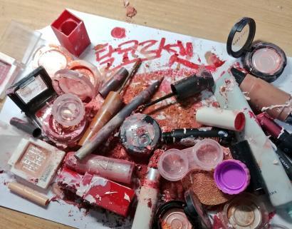
This movement became known for their viral campaign in which they were encouraging women to destroy and trash their makeup/skincare products. The overarching argument of this movement is that beauty is unpaid labor that women are expected to perform on an everyday basis without any form of recognition or acknowledgment. I found this argument to be quite compelling. It dealt with different aspects of experiences that women have on a daily basis.
Building off that argument, I wanted to emphasize the fact that the process of beautification is a process that is not at all visible or transparent. The only aspect of that process that is visible is the end result after large amounts of time, money, and energy are spent. Furthermore, women’s experience and relationship with beauty are largely ignored or dismissed. Beauty plays a vital role in our lives whether we notice it or not. Goffman’s concept of Face-Work illustrates the importance of the “face” or “mask” we put forth and a lot of that relates to how we present ourselves physically (which for women has a lot to do with the beauty products we utilize on a daily basis). Physical appearance is one of the first things people notice about us. When you are out face you must work to reconcile the fracture of that. Beauty has become something to strive for and women tend to have contentious relationships with it. The time, money, and effort spent on embodying unrealistic beauty standards placed upon us is often overlooked. No one wants to see or talk about the strain and stress that is caused by these unrealistic beauty standards. Instead, the end-result is all that matters, as long as you are deemed to be “conventionally beautiful” then that’s what matters.
For my intervention I wanted to create a small platform that would make the process more transparent and visible. I decided to create a blog that allows women to showcase their beauty routines and discuss their own personal experience with beauty and the beauty industry. This blog was meant to serve as a way to intervene in the ways people view beauty and more specifically to garner attention for the complexity of it.


I decided to start off the blog by doing a short introduction piece that introduces the project, my reason for choosing this topic, and synthesizes all the information that I was able to collect from interviews, observations, and research. Following that post I did a short autoethnography to detail my own beauty routine and my own experience with beauty. The next posts that are up on the blog are posts created in collaboration with friends who were willing to share their beauty routines with me and candidly discuss the topic of beauty.
One of the biggest themes that I saw arise from the interviews was that beauty is a complex concept that people have strong and at times contradictory opinions about. Throughout different interviews a specific concern kept coming up; the notion that if you are not deemed to be “conventionally beautiful” by society then the imperative is for you to strive to become beautiful, but you must do it silently, in private, and with a degree of embarrassment. Furthermore, frustration was evident throughout a lot of the interviews. The notion that beauty should be natural and effortless impacts the ways in which women view their day to day routines. Zen, one of my friends that I interviewed, expressed frustration about having to put so much effort in order to just “look presentable”. She resented the ways in which beauty impacted her day to day life. In one of the interviews she stated that her morning beauty routine impacts the way she feels throughout the day. If she doesn’t have enough time to go through her whole routine she feels “gross” and like “she should have done more”. She stated that at times she views beauty as empowering and as a form of self expression but on days when she starts to feel down about the way she looks she views beauty as a hindrance. Her relationship with beauty, similar to other women, is complex and intricate. These experiences need to be further explored and made visible.
1 note
·
View note
Text
Rubbish Reused
Maggie Hicks
For my critical visions project, I chose to focus on how litter is often overlooked in the passive scanning that everyone does when evaluating their environment. Sorting visual stimuli, seeing what belongs versus what does not is one of the main processes that leads to the act of staring. When seeing something that does not belong, or is out of the ordinary in the context of the scene, most people stare and form questions surrounding what their vision and mind interpret as incorrect. By using litter, something that is oftentimes overlooked and not processed in conscious thought, and creating into a five-foot five-inch human-shaped sculpture, I was able to transform it into a visual intrusion. The sculpture was made entirely of discarded trash minus the tape and staples used to keep the whole thing together.
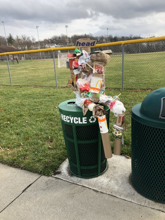
I took Mac, my trash man, to McDonald Commons in Madeira that was also formerly used as a dumping site for residents. I carried him around the main part of the park where families, joggers, and youth sports teams were in order to create the biggest visual impact I could make. Most simply looked on in confusion, but I had a few individuals come up to me to ask about Mac. when I would explain how I was attempting to create a disruption with litter in a process that often ignores improperly discarded trash, most would begin to engage in conversations with meowed the topic, which was very fun to do, as well as very enlightening for both parties on how most people don't see garbage until it is literally transformed into something else.
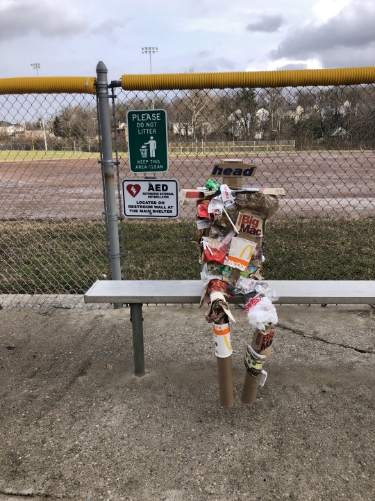
By reshaping what is known into the unknown, it elicits a response. The human mind is constantly scanning in order to learn and gain information. Trash is known and does not act as an intrusion for most, therefore no questions or active staring occurs. When the transformation into sculpture occurs, it registers as an unknown, even when crafted with common objects that would not spur the same ideas or stares if on its own.

Next, I carried Mac into the wooded area of the park where residents of the town used it as a place to dump glass, ceramics, metals, plastics and other miscellaneous trash. When walking on the path, one can look not too far away to see said dumped trash littering the landscape. The people on the trail were especially interesting to talk to, as when they questioned Mac, I was able to point out the garbage on the forest floor that was literally within arms reach that they did not seem to notice or question. That led to a few conversations on what one woman described as a type of selective blindness that ignores things that do not tend to disrupt any visual processes until it has been transformed. This project was very enjoyable, and I went through many different ideas on how to go about my intervention, and I think my final choice of a trash man was a good way to create that disruption.
0 notes
Text
#NotVandalism
Alexi Frick
I’ve always found it very fascinating that the people in charge of inner cities and urban areas are rarely people who are actually involved with the urban community or even live in the inner city. This split results in a large disconnect between the lawmakers and overseers of the urban environment and the actual inhabitants of the environment. To me, this disconnect between two vastly different communities can lead to a wide arrange of problems, including police brutality and profiling. So for my critical visions project I chose to focus on an aspect of urban culture that I’ve always loved and have been fascinated with, and attempt to recontextualize it.
My project puts a focus on graffiti, and the culture that surrounds it. My goal was to directly change the way that graffiti and street art is viewed by a large majority of people, and maybe help to bridge the disconnect between disparate communities. It is rare for street art that isn’t a commissioned mural on a specified building (which I wouldn’t really consider street in the end) to be up for long. Landlords, building owners, the city planners, etc. always have it washed away or painted over because they see it as an ugly mark on their buildings. On a side-note, I think that white splotches randomly painted on a wall just to cover up street art looks way worse than the street art itself that they are covering up. And while the legality of street art is still up in question, my project deals more with the “looking down” on the culture surrounding street art.
Garland-Thomson discusses staring as “an ocular response to something we don’t expect to see”, so when people not necessarily acquainted with urban/youth/inner city culture sees street art on the side of a building that was definitely not a commissioned mural, it is unexpected. And that furthers the disconnect between the two cultures, as the unexpected marks on the side of building fall under scrutiny and are seen more as vandalism than anything else. So the disruption of that unfamiliar, looking down form of staring is what I attempted to do with this project.
I began to think about how I could get people to notice street art, and then realized the main aesthetic of street is that it is noticeable. Graffiti and tagging usually involves a lot of bright colors, bold images, and large, noticeable shapes. Street art itself already is a disruption, the artists want their work to be seen. So then I began to think about recontextualizing how street is viewed, and making people question whether it is art of value. My plan eventualized with the purchasing of shiny gold frames of various sizes (on a black Friday deal at Michaels because I didn’t realize how expensive frames could be) and then the scouting out of graffiti in known places. I thought that by placing these noticeable gold frames around specific street art that was more than just “jeff was here” written on a wall, people would view them differently and maybe change their opinion on what is art and what isn’t. And I also hoped that I could bring some awareness that street art can be done by talented people and be more than just a random tag.
My audience was directed at middle aged people who don’t come to the city that often, because in my eyes they are the community who looks down on street art as a legitimate art form more than the youth do. So I scouted out areas around OTR, Northside, and some parts of Clifton, to maybe draw in views from the FC Cincy crowd of people. Most people my age I talked to generally didn’t think too much about street art, most people seemed to see it as something they walk by every day but didn’t really have an issue with. When I started talking to my parents, and a few of my older managers at work, the opinions generally changed and I began to get negative feedback. Mostly they claimed it was dirtying up our city and they thought most graffiti they saw was more ugly than artistic.
I pretty much expected those opinions from the two different groups of people, so I wasn’t shock. The last few days I’ve actually noticed that some of my frames have already been taken down, so they themselves are seen as a form of vandalism. I had two up in Northside, four up in Clifton, and two in OTR. There are only two still up in Clifton since I last checked, none in OTR, and one in Northside. While I don’t think my project did a whole lot in changing the viewpoints of street art overall, I hope I was able to make some people see the medium differently and realize that it was made by an artist who spent time and dedication to make an actual, creative piece of work.
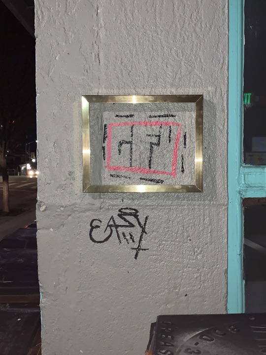
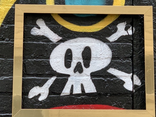
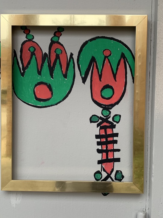
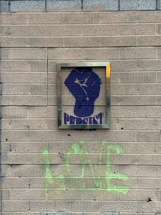
0 notes
Text
Equal Pay in the Workforce
The year is 2019 and women are still having trouble getting equal rights these days. They say women have equal rights as men yet women still only make 79 cents to a man's dollar. The Gender pay gap has become a predominant issue in the world today but many people do not even know how they are affected by it. My main goal of my critical visions project was to open people's minds to the issue that men and women have the same jobs and do the same work, yet women are discriminated because of their gender and paid less.
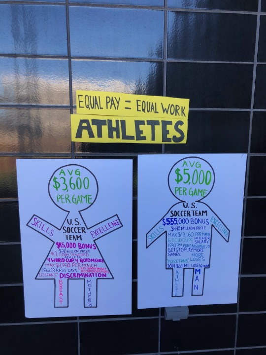
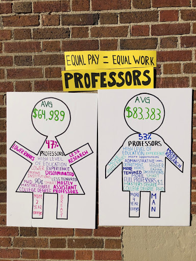
Using poster board infographics I focussed on three professions that are directly affected by the gender pay gap: lawyers, professors, and athletes. For each profession I used two poster boards, one for women and one for men. On the women poster board I drew the commonly known image of a female which is a body with a triangle center, kinda like the girls bathroom sign. The men's image was a widen stick figure. I used these common figure to represent a woman and a man so people could easily look and read without having to decipher what I was talking about. Above the posters I had a sign with the profession and a sign that say equal pay = equal work. You can find the Lawyer posters outside UC College of Law, the Athlete posters are outside Lindner Athletic Center, and the professors posters are outside of UC Teachers College.
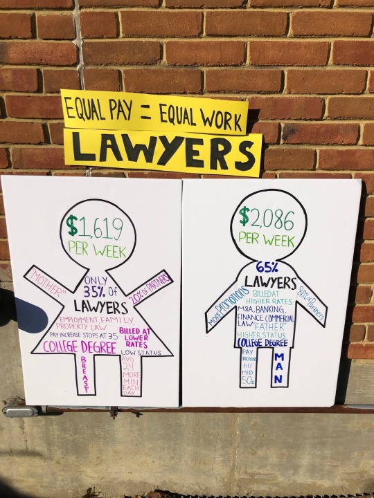
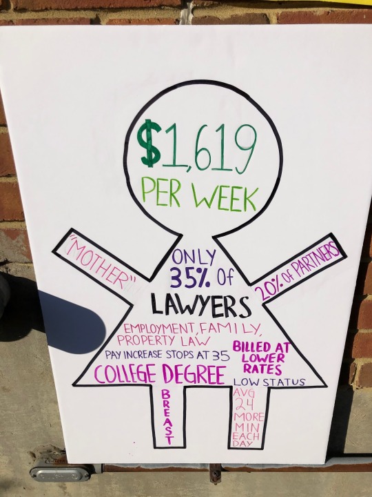
In the head of all the poster boards are the most important issue which I wrote in green the average pay of the particular profession. Also I made the mens hands down on the poster board to show how they tend to look down on women in the workforce and the women hands up to show them trying to rise up in the workforce. For the female I used the gender stereotype color of pink and for males I used blue. This was because on the bodies of the poster boards I was using ideas that people used to describe female and a male in that profession. Like for lawyers the woman had “low status” and “family law” while the man had “executive” and “promotions”. These are still the common thoughts today of women in the workplace that they are low status and its absurd when on average women work 24 mins a day longer than a man. If you look on the women's lawyer poster it has that fact in there.
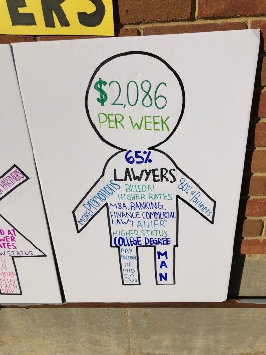
My Athletes and Professors posters were set up the same way as the lawyers poster with the average pay in the head and stereotypes about each gender and then real hard facts that show the truth. I received really good feedback from athlete poster. People were saying it's ridiculous that certain female sports like the US Women's National Soccer Team, which I used as my example, win more and work and play just as hard as the men's team are not paid the same because “people do not think they have enough fans”. When in reality the US Women's National Soccer Team was named the number 1 team in the world. And on the other hand I had some negative reactions from male students who yelled at the women's Lawyer poster and said “they do not deserve to get paid more” and “who even cares”. Well as a female student who will someday be joining the working class, I care because it affects so 50% of this population and people should know that the gender pay gap is still here and we need to do something about it.

0 notes
Text
Critical Visions Project
Laura Pin-Chen Su
ANTH3074
December 06, 2019
Critical Visions Project
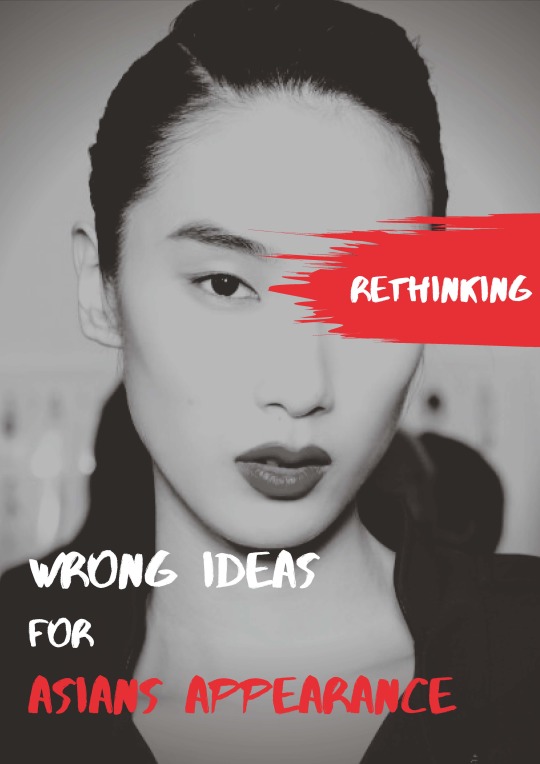
Now in America, which is a huge country with a lot of different people, different backgrounds, different cultures, and different races. There are more than 5.6 percent of the total American population is Asian American, it is not included the people who is living is the United State with the visa, which is student visa or working visa. American actually start to know something from Asian cultures from very early of time, maybe knowing some information from movies, news, or images that people can see. However, in some of the information are stereotyped or just misunderstand for Asian. Also, the other biggest way for people having the wrong information is that mix or confused the different countries of people. There are 48 countries in Asia, different country of people will have the different type of look, different languages, different cultures. Even though, there are not many racial discrimination in our society now, people have enough inclusive and become multiculturalism, there are still many stereotypes and wrong knowledge for the Asian need to be changed.
Focusing on the stereotype and wrong knowledge for Asian’s appearance, which is like many people think Asian has small eyes, single eyelid, and huge ears, and black hair. The best example will be the Mulan from Disney, for many people who don’t live in an area or city have many Asians, they might think about that is what Asian look like.
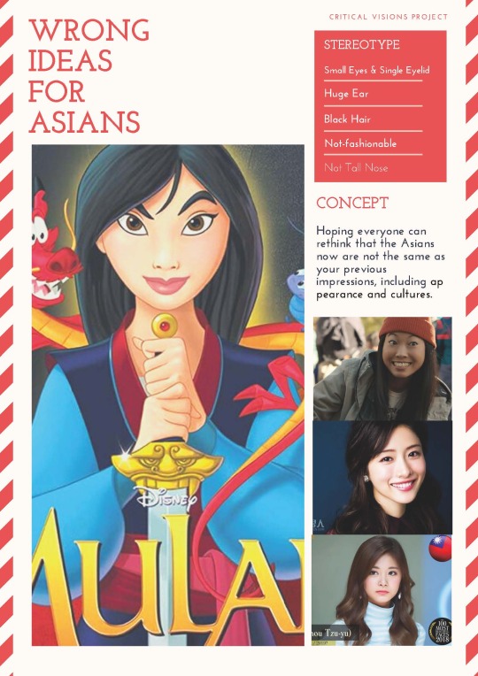
I used the posters with the comparing photos; which are one stereotype photo of Asian, another one is the photo that hoping can change people’s mind. Also, add some big words, such as “stereotype”, “rethinking” to catch people’s attentions when they see the poster in the UC campus, and can know the main idea that I want to talk about in a second. Sharing with people and my friends who see those 3 different styles of posters and who have confusing questions for Asians.
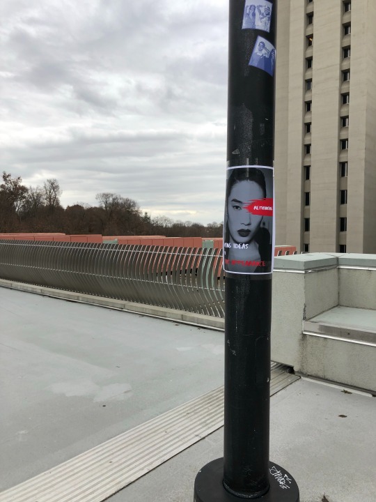
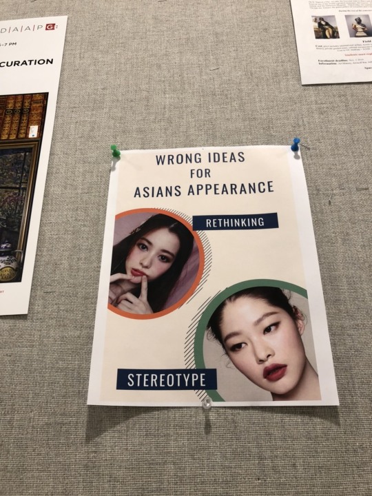
I asked them after they saw the posters, someone gave me some feedback and saying that, there are still some Asian people look like the same with the stereotype photos that I have in posters, and some people say those posters are good ideas, but make them hard to distinguish which country they come from in Asia. However, that is the point that I want to argue because Asian mostly don’t look like what we have in the past, people might get wrong if they use the stereotype to distinguish Asian. That’s why, hoping people can understand and know more fact about Asian.
Taking a proof from “The 100 most beautiful faces” by TC Candler, it will make the most beautiful face for both man and woman, and people in that list are all around the world. People will find the interesting fact from that chart compare to the stereotype people have. Physical appearance plays a vital role in face-work, and most first impressions are based on physical appearances or the “face” one puts on, thus, hoping people don’t get the wrong information or impressions when they first time meet a new person as an Asian. “Face-work is a staring encounter through which we perpetually renegotiate our self-esteem and status, making us exceedingly vulnerable to one another.” (p. 104) Every person is different, even if they are living in the same country or same community, people might have Asian people in their lives as a classmate, friends, or colleagues, so understanding more and knowing more about each other will help our society become better and easier.
Work Cite:
Thomson, Rosemarie Garland. Staring: How We Look. Oxford University Press, 2009.
0 notes


