Text
CTEC709 Semester 2 Week 2 (v2.0) - Sitesafe AR
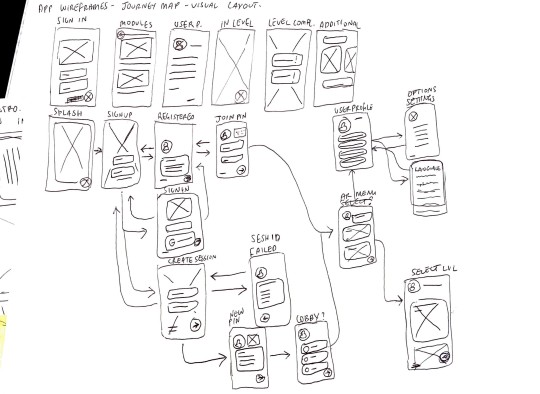
I worked on doing app mock ups free handed following the App User Journey with Ray. The beginning stages were intro pages like Sign in, Sign up, splash screen etc. but I had trouble the most with the content pages such as create session and lobby because they were the hardest to keep consistency in design especially when it comes to multiple user accounts fitting into a single wireframe and not much visual space to select opions.


0 notes
Text
CTEC709 Semester 2 Week 5 - Sitesafe AR
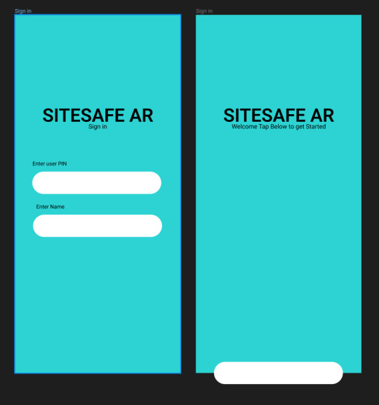
This week was the first week of creation where I took a lot of the research and planning done and followed the layouts for the user journey based on the information designed in the app mockups. This was my favorite week because I could design freely within the research collected. In terms of progress I think it is going slow because the AR portion is already in functioning state while I am still working on the designs of the app. I also haven’t finalized the app color scheme because there is conflict between dark accent colors and bright backgrounds.


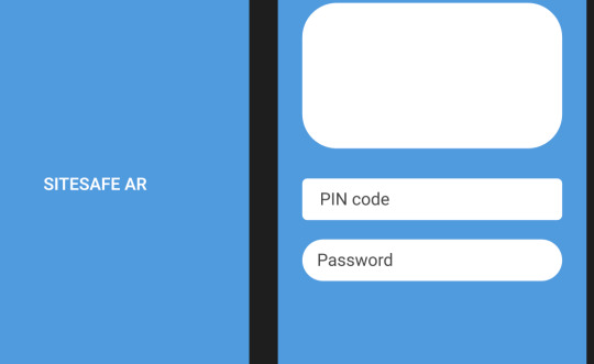
For now I’ve gone with dark accent colors to keep the color scheme consistent throughout the pages and non-distracting while I complete it . I decided to add shapes as a placeholder because the app layout lacks depth, there is too much white space that distracts from the center of the app (Login and general content is centralized in our design) In the beginning I was having trouble with app fields being inconsistent and not looking like mobile fields, I took inspiration from Google and a few other examples in my Mood Board which used a stroke around the fields instead of a colored field padding. This way the user doesn’t need to worry about the colored field being visually distracting when entering text. My buttons had the same issue and found that instead of curved sides like I initially did, I used slightly rounded ‘edges’ but the side swerve still straight in the center (left and right sides) This gave the illusion of a keyboard like visual footprint in the app which psychologically could be interpreted as an interaction button.

0 notes
Text
CTEC709 Semester 2 Week 4 - Sitesafe AR
We found that both feedback were relevant and useful to improve the Site safe app. We already had an idea of including emergency procedures and fire evacuation assembly points or similar but it also introduced every other aspect that we never thought of such as Drowning and Suffocation dangers. Ray mentioned about the AR being more of an interactive technology compared to a traditional technology where the interactive technology maintains the user’s attentiveness more effectively than a traditional technology does (i.e paper or offline encyclopedias) I was thinking in response that it would be much more of a unique advantage for us using AR because not many companies have ventured within the MR and there was a lot of potential to using it - For example using it to teach foreign or non-english speakers. This way of training becomes digital and personalized which ensures a unique experience.

More detail at my Weekly LOG
0 notes
Text
CTEC709 Semester 2 Week 3 - Sitesafe AR
A pitch deck presentation occurred during class by Hannah Rogers, one of the teaching team assistants. We looked at different ideas and pitch layouts. I made an initial pitch deck based on similar ideas for headings as Hannah while also maintaining Ray and I information.


Some screenshots from our pitch deck which is available to view HERE. We discovered the impact a pitch deck had on our public display. Often presentations gave a ghastly or daunting build up but this pitch deck focused on reducing information to the minimum while also being legible and understandable without a narrator.

This week I began following inspiration from Hannah’s mood board and designing my own for the app layout. I used Canvas to create my mood board rather than Miro or Figma which have the option to create it or similar diagrams because there is no sharing cap/limitations. Full Mood Board can be accessed HERE.
0 notes
Text
CTEC709 Semester 2 Week 2 - Sitesafe AR
This week was spent on mainly content ideation, planning and Project timeline creation. Ray set up a Trello board for us to track our progress overtime while I was filling out the Lotus Blossom and features list. Progress at this stage is still slow since we are looking for more members and a better defined project structure.


We decided to use Figjam instead of Miro because of the ability to share it with edit permission for a single editor. Miro has a few caveats while offering pricing. In the screenshot Both are Lotus blossom diagrams. the main difference is the colored blocks are dissected from the central topics which made the dissected Lotus Blossom more effective in generating ideas. The regular Lotus Blossom was more confined so it was hard to stay focus on a particular topic despite each grid being different color.
0 notes
Text
CTEC709 Semester 2 Week 1 - Sitesafe AR
This week I spent with Ray seeing what his ideas and skill shortages were for a project and his proposal was an Augmented Reality app targeting New Zealand's Construction Industry. I decided to hop onboard and provide my skills to design an app layout for the product to function. The main activity I completed solo was brainstorming ideas about the app including features/modules, target audiences etc.


Some captures of the brainstorming I did offline about end users, features or modules, target audiences etc. The construction industry is broad even in New Zealand so this activity was done solo to help me develop a project scope for design.
0 notes
Video
tumblr
ENEL599 Assignment 2 - Semester 2 2021 Demonstration Video
0 notes
Text
BCT Blog Entry #18
references to assets used in CTEC501 Assignment 2. Semester 1 2021.
Icon pack author: https://www.flaticon.com/packs/essential-collection?k=1622714849941 Iphone X 2D Mockup template: https://mockups.se/iphone-mockup-erstellen/
0 notes
Photo


BCT Blog Entry #17
May 1 2021, My idea for Creative Tech Studio I assignment 2 is an application prototype revolving around connecting people with places. My approach is very primitive but I really enjoy following this process because it allows me to think about my idea/submission in segments as explained a while back in Week 2/3. I’ve invested around 15 hours of time into this project so far and seeing as it is due in less than a month, I am not too sure whether it will be possible to get this idea out to Adobe XD as a prototype in time. So far, I’ve decided to maintain an in depth concept. One major decision I made before making low fidelity mockups/wireframes is to keep my color palette monochromatic because it challenges myself to produce my design with more attention to the user experience than user interface. Later on, I can continue with more attention to user interface but I am positive looking at the user experience makes my idea functional to users.
1 note
·
View note
Photo


BCT Blog Entry #18
I wasn’t able to make it into studio for week 2 but I decided to compromise the board game into a popular hand game Rock Paper Scissors. For Week 2′s Hack a Board Game I chose to make Rock Paper Scissors more interactive by making the input options a rock, paper and scissors. I used MakeyMakey and Scratch to make my game interactive as well as a tutorial from YouTube to help with the coding of RPS.
YouTube Code Tutorial: https://www.youtube.com/watch?v=C47IwQuMQJY
Full Plan Image: https://drive.google.com/file/d/1JMNzLkeZ_SSrqB7ICZDmaWXnu4UR0RNm/view?usp=sharing
Changed Scratch Code: https://scratch.mit.edu/projects/514681843/
Test video: https://youtu.be/Ysonif5dcAA
1 note
·
View note
Photo


BCT Blog Entry #17
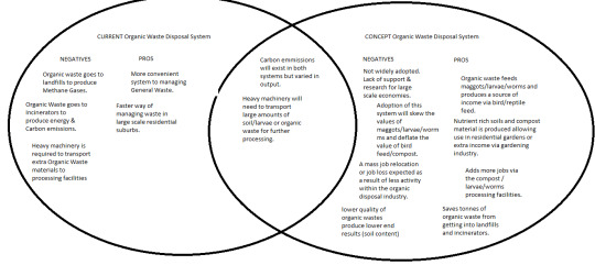
Week 1′s activity was creating a loopy about an idea or system and using systems thinking to analyze the idea/system. The system I chose was NZ’s waste disposal system and in particular I looked at how the system disposes of organic waste. I was intrigued to find out that the way we currently disposed of organic waste was with our general waste, this meant that it either went into landfill to produce harmful methane gases when it breaks down or it’s sent to the incinerator to create energy and harmful carbon emissions. The way I addressed this problem was by introducing larvae/grub/worm farms into urban households; by using this method we are saving tonnes of organic waste from creating harmful emissions. I also looked at how this new system could affect our society such as a mass job relocation if these farms become a popular household tool. This activity was interesting because I was influenced by an internet personality about the positive effects of these farms.
Sources:
Full Venn Diagram: https://drive.google.com/file/d/1iQr8U-PpE-ebPxjKyILe3BtLkumQE6ed/view?usp=sharing
Waste Disposal Article NZ: https://www.mfe.govt.nz/publications/environmental-reporting/waste-generation-and-disposal-new-zealand#:~:text=Estimated%20composition%20of%20landfill%20waste,Construction%20and%20demolition%20waste%2017%25.
Idea influenced by GrubTerra: https://www.facebook.com/tiktokmalaysiaofficial/videos/270085087762495
GrubTerra Campaign: https://www.youtube.com/watch?v=HXnYU5Ti8zk
Loopy: https://bit.ly/3wJY43l
1 note
·
View note
Photo


BCT Blog Entry #16
Week 2′s ice breaker activity was creating circuits with papertronics, however I wasn’t able to attend the second week so I did the work online. This short activity was a great way to job my memory on how circuits worked.
Tool: https://www.brainpop.com/games/circuitconstructionkitdc/
1 note
·
View note
Photo


BCT Blog Entry #15
This project for week 3 (musical instrument) was very fun to create. In the first and second image, I tried to make my instrument like a piano but it was awkward to lean my left hand onto the grounding point (fork) so I made the instrument onto the box using a spoon for the grounding point, the grounding on the box was more natural this way as it felt I was already naturally holding onto the instrument box. The butter knives sticking out like prongs would then be activated using my right hand.
MakeyMakey Kit: https://www.jaycar.co.nz/makey-makey-kit/p/XC3750
test video: https://youtu.be/7VnWAqw4l5s
1 note
·
View note


