Hey hey! name's Jay! this is my main account where I reblog alot of shit and talk a bunch too. I'm sorry- mostly reblogs. art acc: AndreDoodlz
Don't wanna be here? Send us removal request.
Text
Comic Pages Storyboard Tutorial
OKAY SO! @biazerod asked me a little help on storyboarding and i decided to make this tutorial���i’m not a professionist. so don’t take these as golden rules��just advices! and as always sorry for the english FIRST THING FIRST! the storyboard part is the most important phase in a comic page ! you can spend an entire day storyboarding! because it’s the structure, the essence of the page! here’s some tips : 1- a page can start from 1 panel/frame (called splash page!) until how many f*cking panels you can fit ! (some pages , especially in french comics/bd can reach 24 panels/frames!) Exaple of splash pages:


(these are from the green lantern,DC and the newest Thor ,marvel ) Splash pages are a priority of American comics, you rarely can find them in french Bd ! they represent a scene of impact! a fight! a revelation! be careful! use it only one if two times on a range of 50 pages! cuz it cut the narration! instead in french bd you find this :
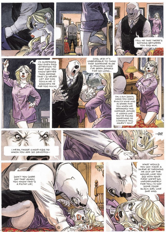

first one is from Blacksad 2# and second one is from Atar Gull see how high the number of the frames is?? the number of frames is very important in a page because it decide the narration time! :D also it all depends on the kind of ‘’direction’’ you want to use on your comic! so be really careful when you decide the number of the frame! LET’S PASS ON THE CREATION! 1- when you have a page that contains more than 3 Frames ALWAYS. ALWAYS HAVE AN ESTABLISHING SHOT!
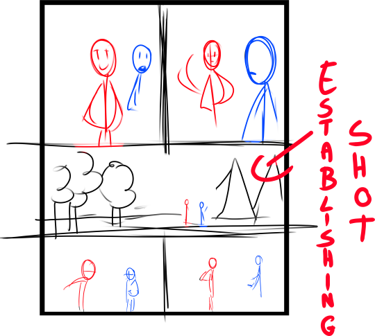
the establishing shot is fundamental! BECAUSE READERS CAN UNDERSTAND WHERE THE CHARACTERS ARE! DON’T DO A COMIC PAGE FULL OF FACES !

DON’T DO THIS! LET THE CHARACTER BREATH! LET THE READER BREATH! PLAY WITH YOUR CAMERA! YOU HAVE THE POWER! in a comic page, is important to put the camera far away from the character most of the time! play with the different shots!

(found this on google) WATCH MOVIES AND TV SHOWS. lot of them can help you so much you have no idea! a comic artist and a director do the same job when creating a story 2- Candy eye this is a tricky trick that can help you with the audience! when a character is saying something important or you have to introduce them , USE THE CANDY EYE DUDE.
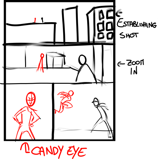
the candy eye is , basically, a bust shot where you show the character,their features , usually with a cool or a funny expression ( or of course it depends from the situation) and believe me WORKS 10/10 with the audience ;) 3- HIGHLIGHTS THE IMPORTANT SCENE IN THE PAGE!
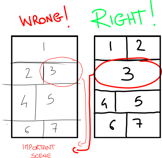
FINAL TIPS: - when you’re doing dinamic poses try and try again! the first one isn’t always the best! -USE REFERENCES. -A STORYBOARD PAGE CAN REQUIRE EVEN 4 HRS IF NOT AN ENTIRE DAY IF NOT AN ENTIRE WEEK. REMEMBER THAT THE STORYBOARD IS THE ESSENCE. AND THE REST IS DECORATION. - IMAGINE THE SEQUENCE! NOT THE SINGLE PAGES. THINK IN SEQUENCES! imagine what would happen after the page you are creating! connect the various pages NOT THE SINGLES FRAMES ! YOU’RE CREATING A STORY! NOT A SINGLE ILLUSTRATION! -AGAIN DON’T DO PAGE OF FACES. most important thing:

if the page you’re creating it stresses you! STOP. continue it when you are in a better mood ,dude. our job requires lot of time and effort, but it should be the job we love. so don’t stress yourself and keep calm. hope this is useful. don’t take this as golden rules, this is just the way i work :)
20K notes
·
View notes
Text
Shorthand Google Reference Guide
I’m gonna type this up while it’s fresh on my mind because some of y’all don’t know how to use Google
SO YOU WANT TO DRAW A woman sitting in the grass.
IF YOU SEARCH: female sitting

Very vogue. Very male gaze. Good for fashion or model pictures, not very good if you’re wanting to draw a natural looking pose on a woman who isn’t a model and whose camera certainly didn’t fucking turn on by itself.
IF YOU SEARCH: female sitting pose

Arguably worse, depending on the use. My experience with “female + pose” searches is that you get a lot of IMVU and The Sims pose sets, and artists making sketch compiliations that… don’t always have great anatomy and are frequently just more stiff model poses. I do use similar searches for pinup sketches, ie, “female sassy pinup pose,” though “posing for pinup photography” and “how to pose for” will give different results if you aren’t finding what you need.
IF YOU SEARCH: woman student relaxing sitting on grass crossed legs
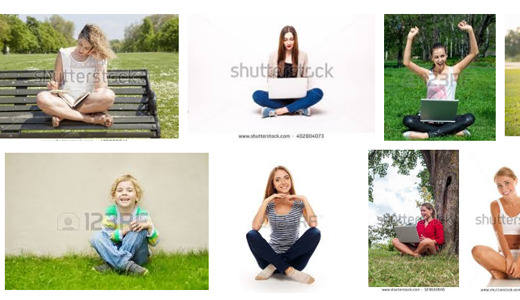
Closer. Still kind of staged looking. Maybe we don’t want her studying. Maybe we just want her relaxing. Still, you start to see how specific keyword searches will really get you results.
IF YOU SEARCH: woman sitting under tree grass relaxing nature summer

Nice. This is only a small handful of the results, but most of them more or less fit my mental image. Mostly stock images, but good for gesture sketches or figuring out a pose. Still… we could go further, and I think I will.
IF YOU SEARCH: woman sitting under tree grass relaxing nature summer senior photography
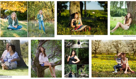
Jackpot. Senior pictures aren’t always awkward kids in braces. Look at how much more natural a few of these look? Compare that to the “Female sitting” search. Google Search tip #1 is basically “use more and specific keywords.” But just… one more thing I just… can’t get off my mind… what if I… just…
IF YOU SEARCH: black woman sitting under tree grass relaxing nature summer senior photography

Uh oh. So let me level with you, if you just google “dreadlocks,” expect a lot of white people. I spent over 30 minutes adding keywords to this search, and every page was still white people. Breaking it back down to “black woman sitting on grass” helped but gave me all the boring pose issues of the female sitting search. So basically, Google Search tip #2 is: Google image search is as White as the rest of the damn world. How do we find what we’re looking for now, then?
IF YOU SEARCH: black woman sitting in grass nature tumblr blackout
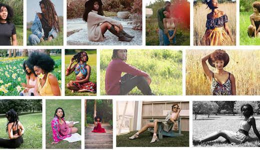
Beautiful, natural poses. Adding “photography” whitewashed it. Adding “summer” gave me bikini pinups. Searching for POC models using Google image search is infinitely more frustrating than finding a million thin white women, and you’re usually going to be better off supporting POC modeling blogs themselves than fighting with Google all day. Using “tumblr” and “instagram” as keywords may also get you a lot more natural, less Vogue Was Here hits. Pinterest too, on occasion.
But keep in mind that these are real people–especially using tags like “tumblr” or “blackout.” There’s a difference between referencing a pose or drawing different face shapes, and outright copying someone’s exact likeness without their permission. Maybe also consider liking/reblogging/following them if they’re a model or photographer. Use some common sense. You don’t own images found on google yadda yadda don’t be a dick.
Have fun being better at search engines and learning how to draw stuff!
35K notes
·
View notes
Photo
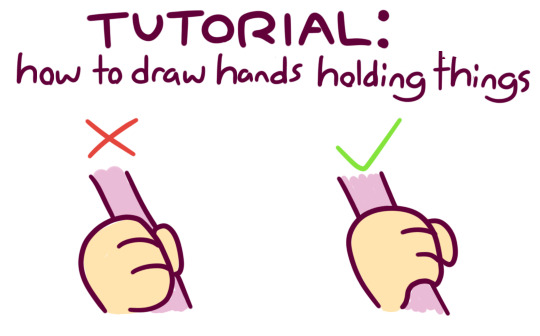
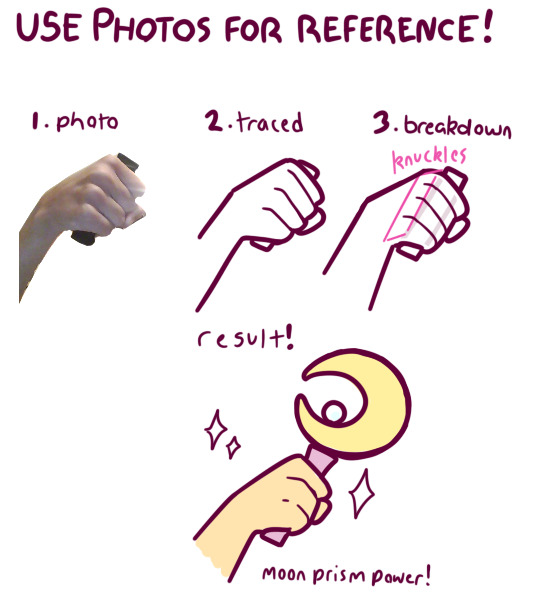
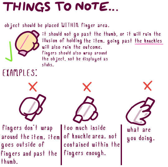
just a lil pet peeve i’ve seen around artists !!! i hope this helps!! (note: i like using cartoon-y 4-fingered hands, but this applies to 5 fingers too !)
21K notes
·
View notes
Photo
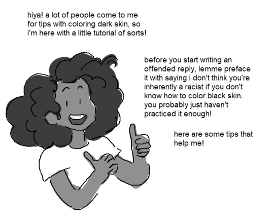
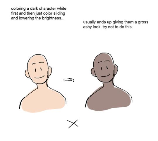

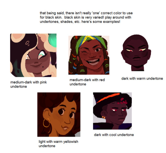

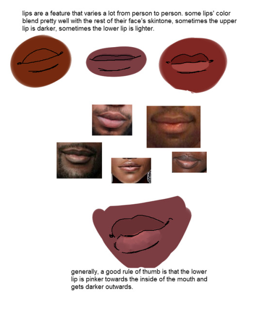
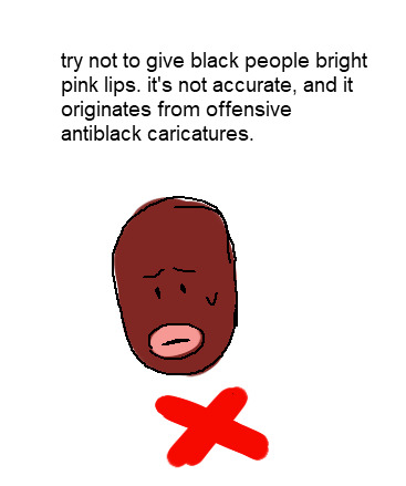
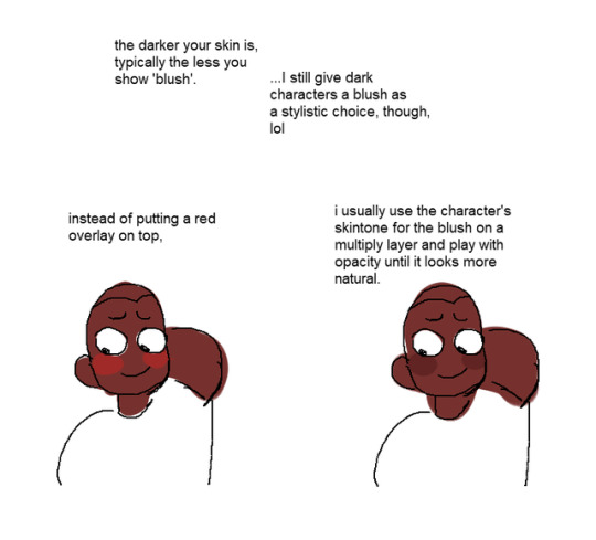
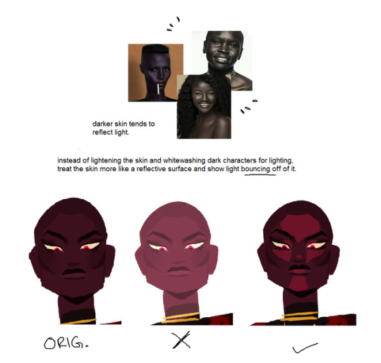


I get asked a lot for tips with coloring black people, so i put together a little tutorial! (and bumps my kofi if you found this helpful)
223K notes
·
View notes
Text

i made a tutorial on how to draw beach water or somthing idk
29K notes
·
View notes
Photo

tw scars ///
After seeing too many OCs with dark skin and light pink scars, I felt the need to make this short guide– if you can call it that. This doesn’t focus on the different types of scars (and their shapes) but on the color of scars with regard to skin tone.
I also want to add that scars on darker skin will generally be hyper-pigmented due to the higher chance of developing keloid scars.
I’m white so please feel free to add more input or correct me.
13K notes
·
View notes
Text
Some quick tips for head angles.

The head rotates on an axis, where your spine meets your skull. That axis is where your jaw ends and your ears begin.

Since the head rotates around the ear, the ears actual position will rarely ever change. It will always be at the center of the head, only the face moves. The location of the face vs. the ears is what truly conveys the angle the head is at.
(Reblogs > Likes)
7K notes
·
View notes
Photo


Patreon: [patreon.com/lunaartgallery]
My last drawing tutorial was back in 2017, whoa, welp it looks like my drawing skills have gotten better. Since I have some more spare time, I will be doing new/updated art tutorials revisiting some of my previous topics.
I’ll post the tips publicly but my reference material and examples will be Patreon exclusive. If you like these tips and want to see more, support my Patreon! It allows me to focus on more material like this and I would really appreciate it .
Thanks! ——-—— Devi: [deviantart.com/miss-noidentity] Twitter: [@LunaArt_Gallery] Instagram: [@lunaartgallerys]
4K notes
·
View notes
Note
are you able to show how you color? i really like it
Aww, I'm glad you like how I color! I'll try to explain it in the better way I can! <3
Frist of all I use Paint Tool SAI but you can have similar results with any graphic program! It's pretty easy! ^^
SO! Let's start from the basic stuff!
On the lineart layer with the Magic Wand I select the background, then invert the selection.

I create a new layer (set on normal) under the lineart layer (set on multiply). With the bucket I fill the selection with the base color, that since I'm lazy in this case is the skin color of my character!

Now I create a new normal layer over the base color layer. This will be the layer for the flat colors. I tick the box that says "clipping group" (this option allows you to color only on what is present on the level below.) I use the pen for put the flat colors.

Then it's the turn of the shading! I create a new layer set on multiply, with the opacity around 50/60% and I fill it with one color.

With the eraser I delete the parts that must be in light, then I use the marker, the blur and an eraser with low density for a softer shading.


I add another layer on multiply for the darker shadows. I use the marker here!

More shadows! The opacity of this layer must be very low. I use the marker and the blur.

The shading part is done! Not bad, but all the lights are still missing!

On a normal layer with very low opacity (20% maximum) I put a light color with the marker and then I blur it. This level must be under the shadows ones!


Let's go back over the shading layers! Now let's add a normal or overlay layer for the lights! The opacity of this layer can change.

Under the flat layer I add a layer set on multiply for put some blushes (always with the marker and then with the blur).

It's almost finished! Now it's time to color the lineart!

Above the lineart layer I make a new normal layer, I check the clipping group box, I fill it with the bucket of the color I want and I lower the opacity.

I add another layer above, this time with 100% opacity, to color specific parts of the lineart (such as irises, hair, clothes folds, seams, etc.)

Let's put a touch of light on the eyes on a normal layer above all, and tadaaa finished!!! :D

I hope it will be useful! ^^
(And here you can find the settings of my lineart brush!)
2K notes
·
View notes
Photo
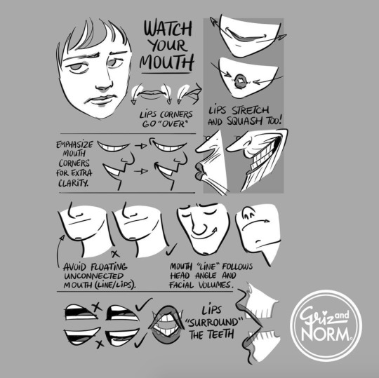
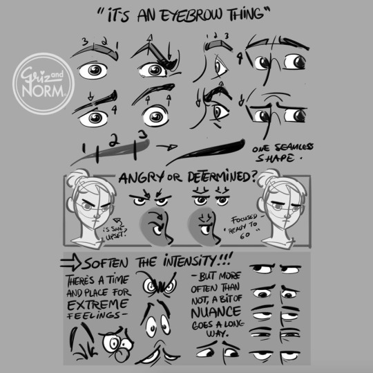
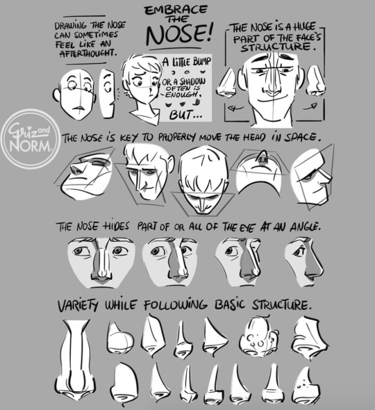


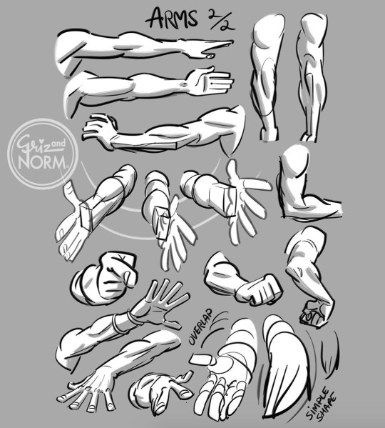
Art tutorials by Disney artists Griz and Norm Lemay
94K notes
·
View notes
Text
mutherfucking chainmail brush
How to make a super awesome easy cheating chainmail brush for photoshop or any program that lets u make brushes
step one
draw a fucking loop

step tw0
take ur loop. go to edit > define brush preset (or whatever u use to make brushes idk man i use photoshop)
bam. now u got a brush.
but it does this shit.
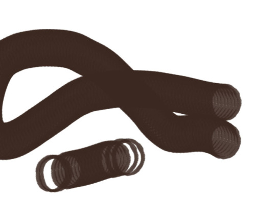
and we don’t want it to do that shit.
so what u gotta do is
step 3
go to ur lil brush widget thingy

(this guy)
and he;ll take u to this sweet toolbox menu thingy
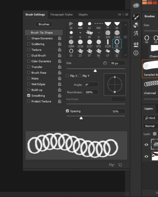
and then all u gotta do is fuck around with the spacing until it looks vaguely chain linky
and then u can do sweet arts like this

this tutorial has been brought to u by sleep deprivation
dont do art kids
now go forth and create beautiful chainmail without bawling you r eyes out as u singlHANDDLY draw every single fucking loop
41K notes
·
View notes
Note
Do you happen to have any tips for drawing horns?
Hi, Anon! I’ll definitely try my best. Horns are a little tricky since they’re so subjective and the styles/textures vary so drastically.
Mostly I’m going to be talking about texture here and I’ll try to keep it simple since they’re time consuming to draw.
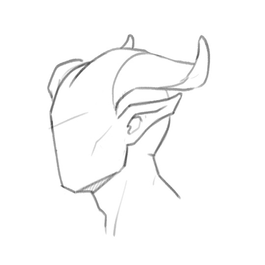
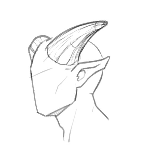
Smooth horns are great and easy, can come in any and all shapes, but if you want to add more interest and character to the horns, it all comes down to how you texture them. Here’s a simple smooth horn. It’s okay, it’s basic, but it works and will especially work better once it’s colored if it has a sheen or a matte look.
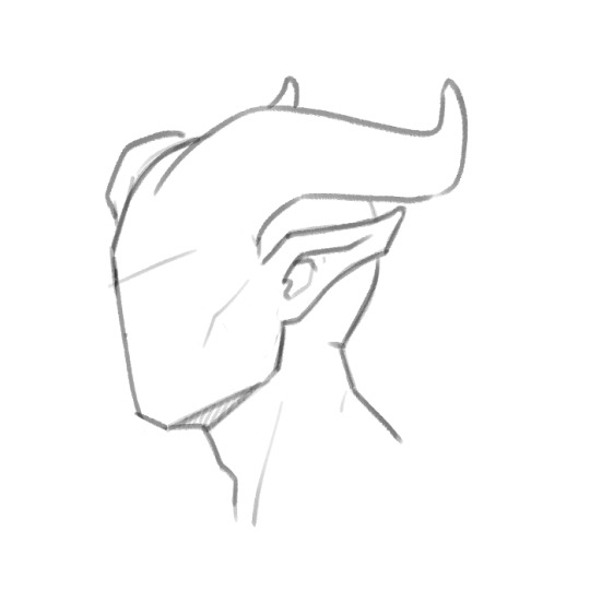
You can add simple lines to it to give it a bit more interest, but you can take it farther than just the cylinder look like drawn here. The lines give it the easy, quick illusion of being more dimensional, but it’s not the most interesting or dynamic.
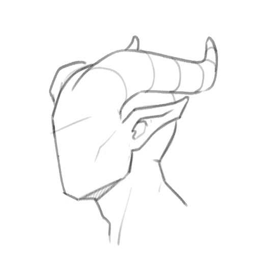
You can play with the lines however you like to give the horns more uniqueness, such as a line down the center to sort of pinch it inwards. Still more dynamic than the smooth horn, but more interesting than the rounded one.
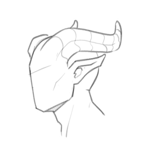
You can leave the lines as they are for an easier horn, or take it a step farther and use them as guides to texture them. This is where it gets fun, but time consuming. Definitely look up references of what you want to go for if you’re not sure. I highly recommend Ram, Ibex or Antelope references, Antelope being my favorite. They have so much texture to them in the forum of smaller and larger ridges, so here’s a horn based loosely (artistic liberties taken) off a mix of Ram and Antelope.
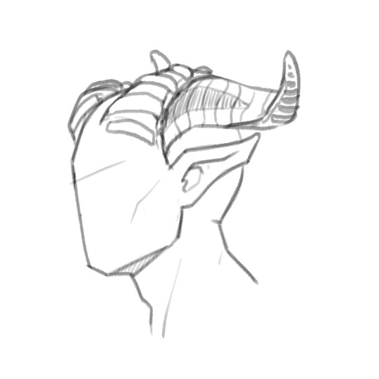
Getting into plates which are my favorite, there’s little to reference off of. Here’s a more dynamic, spiky look with plates using the guide lines as a base to get an ideal direction you want the horn to shape into.

Just take your guide lines and then extend outward. Add as little or as much wear, tear and damage as you want. Horns can get dry and crack, they can take a hit and break, age can cause grooves, your imagination’s the limit.
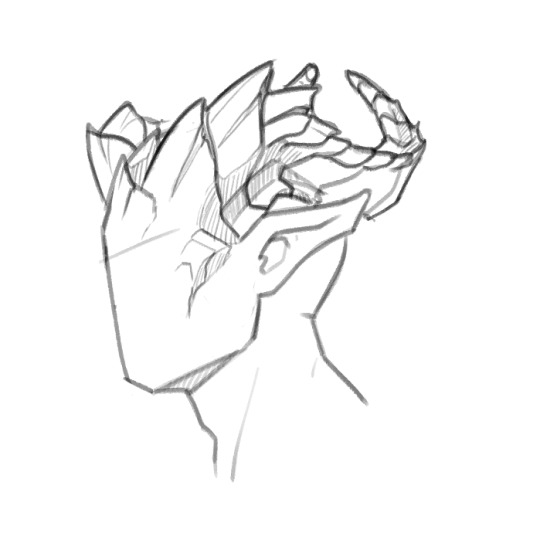
Outside of plates, you can look up any horned animal to get ideas for texture, anything from steer to deer and elk (if you want to get more into the antlered look), or mix and match textures from a few horn styles you like. Hope this helps! Sorry I can’t go more in depth, but I tried to explain it as best as I know how. Good luck with your horns!
20K notes
·
View notes
Photo


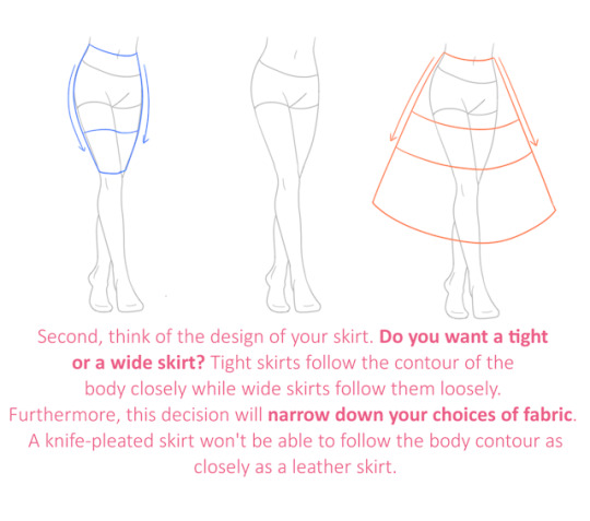


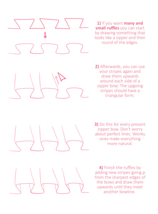
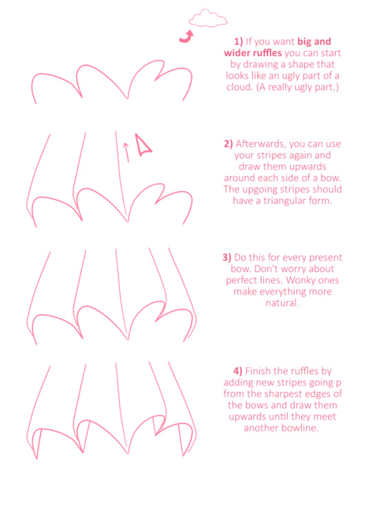
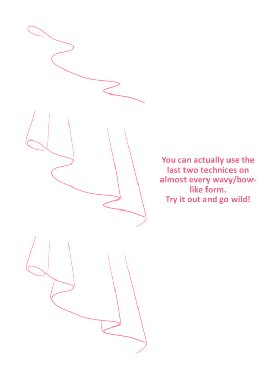

I am sorry for the delay! I hope this will be helpful!
30K notes
·
View notes
Photo

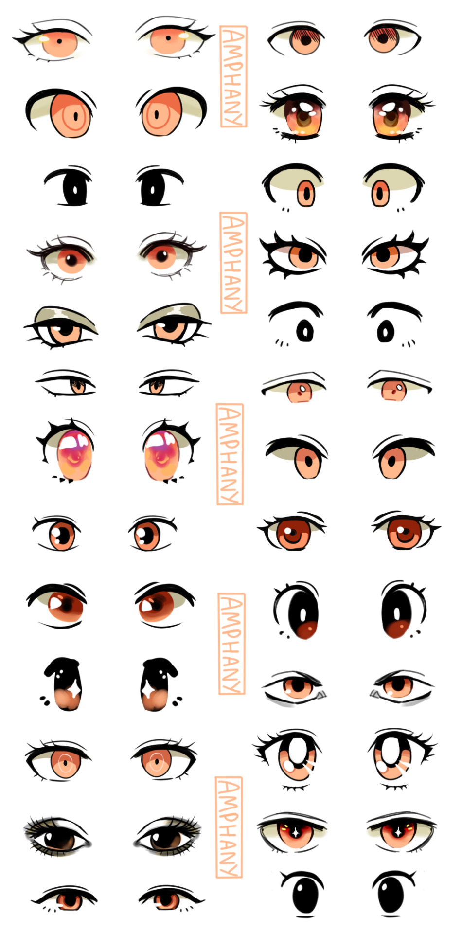
I made a tutorial! I hope it is helpful. Some of the styles of eyes are from Studio Ghibli,Sailor Moon, Pokemon, Dangan Ronpa, Fire Emblem, Ace Attorney.
Please ask me if you have any questions! <3
24K notes
·
View notes
Photo
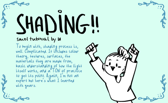
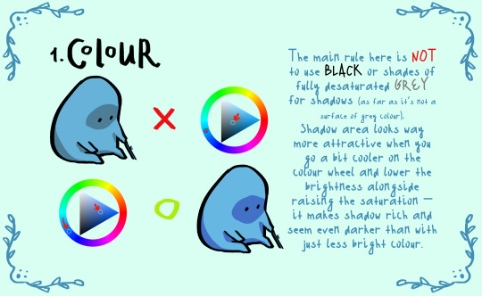

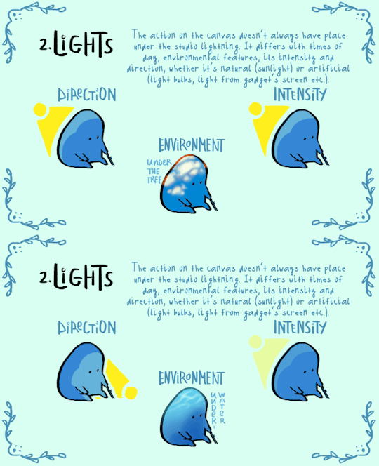
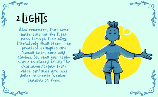

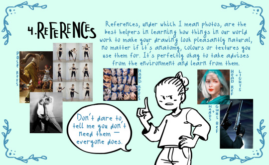

here comes small shading…tutorial? set of advises?? name it whatever you want. hope someone of y’all will find it at least a bit helpful!
special thanks to @cozy-capybara for literally inspiring me to make this thing
25K notes
·
View notes


