Don't wanna be here? Send us removal request.
Text
Stage 4. Explore and Find
During 13 weeks of isolation I’ve found it difficult to find inspiration in my current surroundings, I live��right in the middle of the countryside and typically nature should be my first inspiration however, I feel as if it would be too easy to use my first option but also I don't feel inspired enough.
After time and consideration I like the idea of using my current daily routines to also be seen like an isolation diary to look back on. I think creating certain symbols that relate to the current day would be something a young audience can relate to. Even though this year has been a real struggle to everyone I feel that I could bring humour into the designs so it wouldn't be such a daunting memory.

Above are some examples of my daily routine that I could create into symbols, furthermore I know there's more people who do entirely different things so I think it would be good research to ask people of the same audience what they’re doing to fill up their day and that I could incorporate into my designs.
I’ve started to draw some initial design concepts, when thinking about possibly choosing my daily routine as my inspiration I was able to picture a few symbols. I started to explore different angles and think of possible colour palettes but I do feel using black lines in different widths would help shape the symbols perfectly. At the moment I really like the idea of using a light pastel colour scheme more than a bolder one as I feel that using a black outline as well as bolder colour scheme will look too overpowering.

0 notes
Text
Stage 3. Bruno Manari
Bruno Munari was an Italian artist, designer, and inventor who created faces out of numerous different mark makings. He predominantly worked in black and white however due to the types of marks he drew it created so much depth within his work. When analysing Munari’s work I notice that the faces can either be roughly or neatly drawn which I think gave a lot of personality towards the faces, almost making it feel real. You can tell he experiments with different media, as there’s faces that look like they have some sort of fabric layered which creates different tones, there's also a watercolour face in the top right corner which creates a more realistic approach than his usual style.

0 notes
Text
Stage 3. Keith Haring
Keith Haring was an American Pop/Graffiti artist whose work thrived in New York during the 1980′s. Keith’s style was creating cartoon-like figures in different positions and poses which showed this unique artistic style which fundamentally became his brand. He would transition between pieces of black and white or a range of bold colours however used the same style of drawing the people in a thick black lines which created bold eye-catching pieces.

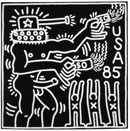
Haring decided to use his platform as an artist to build awareness or AIDS as he himself was diagnosed with the illness in 1988. He began creating sexual images to advocate for safe sex and AIDS awareness which then turned into a social activism. His work is well known for it’s diverse style versus it’s meaning, below is one of many pieces similar to this style of work where it portrays an AIDS awareness it also connotes general statement against the transformation of humans into targets (the ‘X’ on the people). This is a response to the killing of John Lennon by a crazed fan in 1980, sometimes beheaded or with their arms raised in a “don’t shoot” gesture, the artist takes a strong stand against events of the time, like the AIDS crisis.

I really like Haring’s work due to his modern, cartoon-like style that also allows him experiment with colours aside from black and white. Experimenting with this contemporary style it would be really interesting to see this technique in an old art time period such as Cuneiform.
Haring did explore and experiment with the style of Hieroglyphics and used it as his inspiration for one of his pieces. It is really interesting how he used his own style with historic symbols and it’s almost quite humorous with the mix of modernism and prehistoric artwork.

When considering my target audience for this project I feel as if Young Adults would attract to this style more than Bruno Munari due to the contemporary, humorous style Keith Haring gives out and as someone who is a part of a young audience I do prefer this type of style.
0 notes
Text
Stage 3. Discover and Research
For this stage we were told to research the context behind mark making through different time periods, such as; Neolithic, Aboriginal, Hieroglyphics, Tribal Art, Parietal Art and Cuneiform.
What is the history of marks, signs and symbols as a visual language?
Neolithic art’s visual language consists of mostly of thick, black, lines of different angles and lengths. The Neolithic symbols aren't as easy to understand as it’s mostly seen as mark making.
Aboriginal symbols are easier to read as they’re symbolic and easier to understand to what they stand for, they have a range of thick and thin black lines so it’s easier to tell apart from different symbols which also shows more depth.
Hieroglyphics are the most well known type of symbols due to their uniqueness as they based their symbols off of Religion and real life. Their Pictographic's were used as their writing system with a total of some 1,000 distinct characters. In their visual language they have range of thick, thin, straight, cursive lines and tend to use colours such as red, blue, white and gold.
Tribal art originated from Africa and has created this really beautiful ethnic ancient style, Tribal art is very colourful and used a wide variation of patterns such as; dots, lines, zig zags, and much more. Parietal art, also know as “cave art”, is the earliest type of art known, it’s found within the walls and ceilings of caves, the marks and drawings are used with the colours Red and Black as it was limited with colours they could use, the lines created are quite thin however there are some areas that appear to be drawn over to make thicker which gives off this real rough texture.
Lastly Cuneiform was one of the earliest systems of writing, invented by Sumerians in ancient Mesopotamia. Their way of communicating consisted of a lot of shapes and mark making of lines which really showed its simplicity.
What are the characteristics of these marks, signs and symbols and what are the differences between them?
Each of these time periods originate from different countries around the world and its styles have impacted from it. Hieroglyphics are very well established, each symbol is straight and neat but also varies from symbols of animals, objects and marks. They also use a lot of colours like Tribal art however, Tribal art varies over images, patterns, sculptures, masks, etc, rather than just as a flat wall art. Aboriginal Art has a lot of abstract art within its style but creates this unique, ancient type of artwork that is very clever and original.
Who or what could I research next? Eg; once you have established your chosen time period, what artists/designers/photographers could you research that use marks, signs and symbols in their practice or have connections to your findings?
The next stage of this project I am going to research two artists called Bruno Munari who is artists that creates faces through a wide variety of mark making, and another artist called Keith Haring, he was famously known for his pop/graffiti-like work of people in a cartoon style. Both artists are both very different so this is a good opportunity to see what kind of style I prefer that I could potentially explore further.
What interests you about this research path and why?
I’m interested into finding new ways I can approach designs, the last time I used mark making into my designs was back in my first project ‘Iconography’. I haven't used mark making since as I was overly pleased with my final result so this will encourage me to explore and expand my ideas further.
0 notes
Text
Stage 2. It’s a Sign

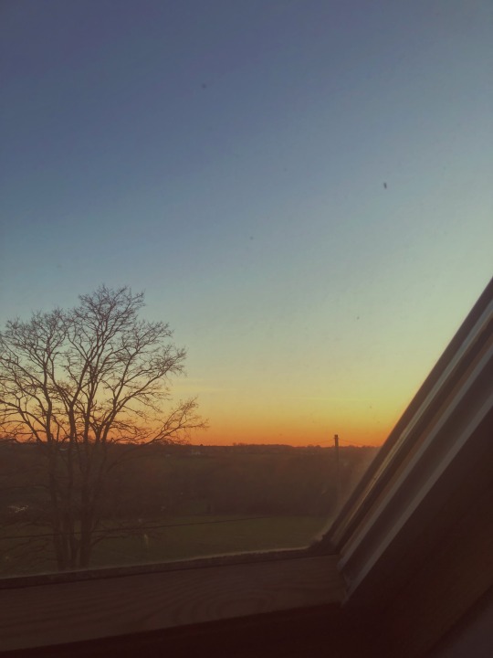
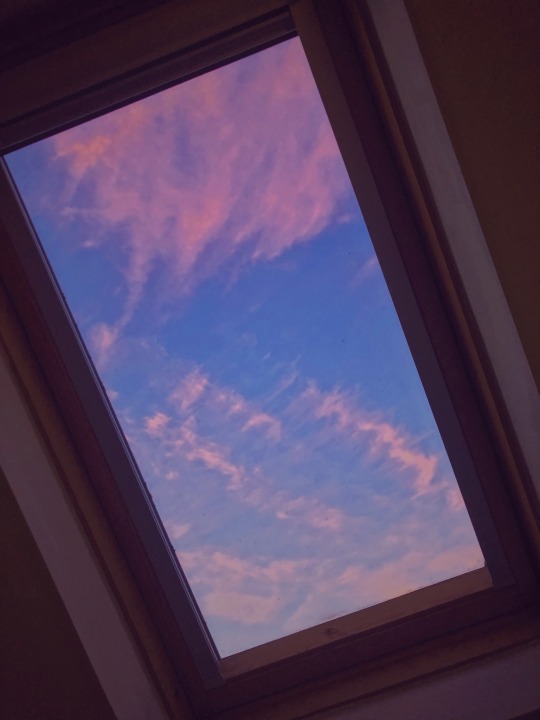
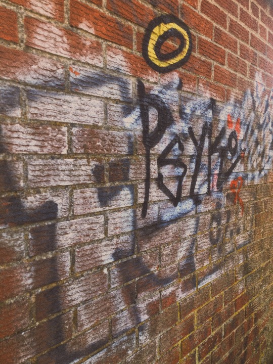
All original photos above
For this task I was told to gather primary images of signs of my everyday life and how they impact people on a daily basis, I was very limited to what I could collect as I live in a small village in the countryside.
How do we remember the signs and symbols around us?
We see signs and symbols everyday, wether it’s a road sign or even on your tv remote, they all have two elements that make a sign and symbol which is Colour and Shape. As an example the ‘No Smoking’ sign uses a bold red circle with a line through the middle to indicate it’s not permitted in the area, also the colour red is used throughout a lot of signs to specify wether it’s to stop, to indicate danger or to look out for. Overall the colour Red is very bold and eye catching so it can be easily spotted when necessary.
What elements are required to make a successful sign or symbol?
To create a successful sign or symbol it needs to be simple but easily understood by it’s audience so if it were to be on a tv remote it needs to show what it does when pressed, otherwise it’s going to be confusing when trying to use it. As a really good example, the power button is easy to understand because it shows what it does (turns on and off).
Another way to create a successful sign is to really consider the colour palette. If creating a road sign the most predominant colours are used are black and red as when said earlier they’re the most eye catching but also show more warning than any other colour, therefore if there were a road sign that used green and orange no one would understand the meaning behind it because the colours have no indication behind them nor relate towards each other.
What visual language has been used to create this sign/symbol? Why?
Colours helps explain the meaning behind the sign or symbol but also helps stand out so it’s easier for people to see. Shapes help form the sign or symbol to show what it’s trying to say. Lastly Scale varies in signs and symbols due to where they’re placed.
0 notes
Text
Stage 1. Communication is Key
For this task I was told to create 5 quick 1 minute sketches for each of the following words; love / hate / day / night/ religion / hope / direction / small / large / explore / nature / relationship / journey / respect / power / animal / creativity / family / space / seeing / repeating / separation / reduce / loud / quiet / cold / hot / slow / fast / lost.
During this task there were times where I did struggle to find ideas however I feel this was a really good opportunity for me to think outside the box. In this process I feel I did create some really interesting designs that I'm really pleased with. Here are some of them below;
0 notes
Text
‘A World Without Words’
Level 3 EXT. Diploma in Commercial Design / Summer Preparatory Project Year 2
For this Summer Project, I'm excited to refocus my mind back into my design work while being isolated at home, and also to start Year 2, so it gives me an idea of what kind of work we will be doing when we return in September.
When I first reviewed the brief, I was quite sceptical, due to the fact I haven't received a brief like like this as most of the briefs I have received have been client-based whereas this brief is just to help us prepare motifs which we could use in September and so on.
We’ve been told to create 6-8 final prints in a commercial Spring/Summer 2021 collection look book, aimed towards a Young Adult audience. We also have to experiment a range of analogue approaches before digital application. In previous projects I usually create quick sketches from my first idea and then create digitally, I never explored more possible ideas further as I was always more comfortable sticking to my original idea, so for me I think this is a really great opportunity to step out of my comfort zone.
This project units 10-12 are based on understanding the Characteristics, the Context, the Audience and the Progression routes and applying them to my work as well as being able to talk about them through the process in my evaluation. Having analysed each point I have more confidence in myself believing I can create a great outcome by following these steps.
UAL Link - https://www.arts.ac.uk/__data/assets/pdf_file/0014/14243/Level-3-Diploma-and-Extended-Diploma-in-Art-and-Design-specification-v11.pdf
UNIT 10
Understand the characteristics and context for a chosen art and design activity.
Be able to use knowledge of the characteristics and context of an art and design activity.
Be able to use evaluation in support of art and design activity.
UNIT 11
Understand progression routes and related application processes.
Understand communication skills and knowledge for progression routes.
Understand presentation skills and knowledge required to make application to progression routes.
UNIT 12
Understand the audience for a chosen art and design activity.
Be able to plan and implement art and design activity for an identified audience.
Be able to use evaluation in support of art and design activity for an identified audience.
0 notes
Text
NHS Poster

When receiving the task I wanted to incorporate the NHS as they have played a massive part helping during this Pandemic.
I had the idea of using an image and some how using tones of blue to contrast to the NHS logo. Previously in Project 2, we designed Risograph posters by print and digital format (on Photoshop), I remember using shapes and experimenting with different Transparency which created a range of different tones and colours based on the photo beneath.
0 notes
Text
Week 4 Review
Reflecting back on this week, I feel very prepared for the upcoming weeks ahead now knowing my project idea and having a time plan which makes me feels much so more organised on what I need to do and where I need to be at certain times.
Also having this 30 day challenge is really motivating me to take as many photos as possible as this is helping me find posssible colour palettes and locations I can use for my campaign photos. I’m really enjoying taking the photos as it’s a challenge of finding new locations, different types of weather and different times of the day. Furthermore this is also helping me gather Primary Research which is really helping me expand and develop my ideas.
0 notes
Text
30 days + 30 Nights
For this challenge I have decided to take 30 photos of my current surroundings for 30 days. Due to the isolation I am limited to where I can go, however as I live right in the countryside I thought I would use this opportunity to take pictures of the nature around me.
One of my main inspirations is encyclopaedia illustrations and I am focusing more of the nature/flowers side, this gives me a great opportunity for finding primary research. I also thought while taking these pictures I could also explore different colour palettes from the images I collect that I could possibly use when designing my products and packaging. This challenge also can give me ideas to what scenery I can use when I start shooting the campaign photos.
My challenge is to take photos at different times of the day so I have range of different outcomes.
Here are days 1, 2 and 3.


0 notes
Text
Mantra Task
For this task I wanted to explore a range of visual language within designing my Mantra. Since the visual analysis task it helped me remember each individual aspect of Visual Language; Colour, Texture, Tone, Line, Form, Shape and Pattern.
For this mantra I knew I wanted to create a colourful, fun and uplifting design as the message from this is to inspire and motivate the person reading the poster.
Finding a quote was quite difficult because I didn’t want to use a cheesy overused quote but something that a lot of young people would understand like some sort of pop culture reference. My quote is famously said by Kris Jenner during a reality tv episode, a lot of young people would recognise the quote due to the modern pop culture of it, which is what I really liked because I wanted something that young people can relate to but also understand the humour side of it to show not to take everything so seriously.
When designing the layout of the page I had the idea of using a repetitive design for the background so it would fill the page to almost look like a wallpaper. At first I had the text background just bold white and it was very overpowering, I added a shadow effect to the text to add depth within the design which worked really well, however, I didn’t want to leave it like that I wanted to add something else to it but my problem was my repetitive quote was too bold so I turned down the opacity giving a lighter, softer tone which enabled me to add the square so then it wasn’t as full on.
Adding the square to the design was key because I needed to show the quote in a more direct way to show the true message to it but to also expanded my range of visual language. I knew I wanted to explore with colour a little bit more so using a range of colours in my quote would really lighten the mood of this mantra. I knew I didn’t want each word to be a different colour because to me it would’ve been a basic style choice and not much thought into it. Highlighting the word “amazing” really emphasises the message going out to the audience rather having the whole sentence highlighted because it wouldn’t have given the same feel. I chose to have “amazing” in it’s outline because thats the part of the quote that’s supposed to motivate the audience, I didn’t want a fancy calligraphy type because it didn’t suit the style I wanted to portray, I preferred more of a modern, straightforward, sans serif type to contrast to the modernised pop culture reference. Having the outline of “amazing”, instead of its block style, creates a whole new different interesting perspective of how I can develop a new style with the same typography. I chose to use the repeatitive style because having just one “amazing” looked quite basic but repeating it and using a multi coloured effect I think showed more style overall.

0 notes


