Text
web design — final
This class has shown me a very different side of graphic design. I have primarily worked in print, even before college. Web design and print have many differences I never realized before this class. It took me almost the whole semester to really grasp everything and learn how to utilize the technical skills (such as XD and inVision) while also implementing good design methods.
My favorite project we did this semester was the Non-Profit redesign. It really helped me understand the differences between web and print. While there were guidelines, we were still given a lot of creative freedom. The redesign definitely has flaws (sizing, color, etc.) but after completing the course I am confident I could rework the site a second time and improve the areas that are lacking.
My favorite guest speaker we had was Caitlin Cambron. Like I said in my last blog post, I ended up really enjoying UX. I like the reasoning and data behind it and it is a field I would highly consider going into.
There is so much I could write about how much I learned in this class — but mainly I am excited to have this knowledge under my belt and utilize it in my future.
1 note
·
View note
Text
web design — charrette

This week Caitlin Cambron visited our class to speak and to facilitate a web design charrette. Not only was Caitlin great at giving advice about what the design world can really be like after graduation but she was also able to teach us a lot about UX design in a short amount of time.
For the charrette, we were paired in groups and given a website that struggled to provide a good user experience. In our groups, we were able to conduct user interviews and usability studies with friends/family in order to gather data that helped drive the plans we made to develop the website to be more user-friendly. It was cool to see how users interacted with the site and whether or not they confirmed the initial thoughts I had about the UX — most did but also skipped over areas that I thought needed a lot of help.
I really enjoyed this charrette because our web design class has been hard for me in terms of concept development because I don’t have this data to back up my design decisions. I had pretty much ruled out web design for my future but UX is actually pretty interesting and is definitely something I could see myself getting into. Shoutout to Caitlin for a great week!
1 note
·
View note
Text
web design — project three


This project was definitely the hardest we have done this semester and my least favorite. Starting out, I thought I had a really solid plan in place regarding my law and campaign. NO. It was very back-and-forth and I had a hard time making the campaign friendly while also incorporating elements of a prison.
After visiting a bingo hall and lot of sketchbook exploration, I found a way to make the campaign seem more inviting. I chose to tone down the colors by deciding to go with a light gray and adding elements that included a more muted orange and black — making sure it wasn't so in-your-face.
XD was the least of my worries this project (thank the heavens that I finally feel comfortable in this program). I actually was able to have time to play around in Invision to prototype, which was awesome because I ran out of time on the last project and was unable to. I don’t dislike XD but Invision seems to have more capabilities in terms of prototyping.
Overall, I feel the project came a long way from where I started. I don't 1000% love it, mainly because it isn't necessarily my style or aesthetic BUT I am happy with the way it turned out and think it was successful in conveying the message of my campaign. Bring on project 4.
1 note
·
View note
Text
type II — project four

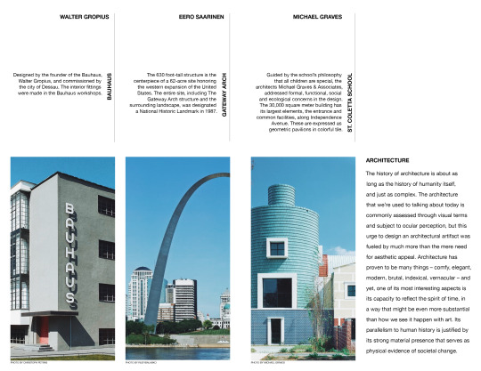
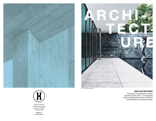
★ Use a fractional grid 8.5x11 folio that will act as an information piece on that field. The audience is college students who are trying to decide on a major. Include information about the field as well as any illustration material, photos, or other content that you think would excite students. Find a tone that advocates for the field but but is informational more than persuasive in intent.
0 notes
Text
web design — project two


★ I am honestly so proud of how far this website has come. My initial goals for this redesign was to reiterate the white space used in the initial website but use it in a more effective way, increase readability by making text more web-friendly, and increase the overall cohesiveness of the site. I feel like for the most part I was able to accomplish these goals.
★ I decided to redesign the logo to make it more cohesive with the new branding. I wanted to keep a circular symbol much like they had, but have it relate more closely with the company name. I decided to incorporate the paw that was in the original logo and change the heart shape to a horseshoe because the company is based in Kentucky and has Derby in their name.
★ I noticed after critique that sizing was an issue that a lot of people had, including myself. It has been tough transitioning from print to web design, but I think after this project that I have a better understanding of it. The most mentioned flaw for my final project was that the white text over the pale blue was hard to read. I agree with this, however, I do think it was more eligible on my computer screen than the TV. If I made any edits to this project, I would work out some sizing issues and darken the color schemes just a bit in order to make text easier to read.
1 note
·
View note
Video
tumblr

Hello wireframes — nice to meet you.
★This was my first time working in Adobe XD. Before I got started, I thought I would be extremely intimidated by the program. It seems, though, out of all the Adobe programs I have used, that XD is the most self-explanatory. I played around a little in InVision. Needless to say, it did not go well, and I will be spending an inconsiderate amount of time on YouTube attempting to learn how to use it. ~send coffee~
★ The hardest part about formulating wireframes for me was solely focusing on layout instead of design. Boxes are just not aesthetic enough, okay? I am feeling good about where I ended up though. During crit, classmates gave me feedback on some of the technical aspects of my wireframes. Fixing these few technical things required me to adjust the layout of my wireframes a bit, which is a little tedious but will overall be extremely beneficial when the design aspect of the website comes in.
2 notes
·
View notes
Text
final reflection
★ During my time in Foundation Design Methods this past semester, I have been given the opportunity to further what little knowledge I had prior to the class. I can now understand the meaning and reasoning behind specific design choices that I use to pay little or no attention to. I have more in-depth experience with creative software and am beginning to learn the different methods I can use to bring my ideas to life. Leslie and Meena have been very present throughout the course, which is something I am not use to, but am very thankful for. Having a close mentor is something I needed, and all beginning designers need, in order to grow. They helped me regain my passion for design and realize this is what I want to pursue. With their help, I was able to improve on each project throughout the semester and I believe with their continued guidance that I can reach proficiency in the field.
1 note
·
View note
Text
week 13 + 14


★ The Semester Journal has been stressful, yet so revealing. It has allowed me to see patterns in my work and how I have improved my understanding of concepts and design. It has also revealed to me things I might not be so great at, and where I can improve. For the journal, I chose a simple layout just because of personal preference. I wanted to play around with white space but still have design elements that were unique to my journal. I learned more tips and tricks on InDesign throughout this project and incorporated a few of them into my journal (the paragraph rule to be specific). I had to adjust my layouts several times due to the fact that I had pictures that were not working with the layout. The biggest worry I had going into this project was that I would not have enough personal work to include because I haven’t had the opportunities to build up my portfolio like some others in the class have. I mainly included works from my drawing class this semester.
1 note
·
View note
Text
week 11 + 12
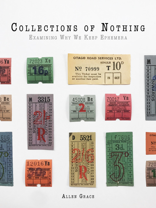
★ Week 11 consisted of finishing up the Book Cover Design project. I was able to photograph the tickets once they came in the mail and because I only bought 10, I had to use Photoshop to place a few more into the frame. I personally thought that aspect went exceptionally well given my brief knowledge of Photoshop. I did not receive as much feedback as I had liked during our final critique but do feel like my piece was successful after seeing it compared up to other people’s work. ~above is the final outcome~
★ Week 12 has taken us into our last project: the Semester Journal. I am very excited for this because it ties in with my yearbook background. I am excited to see how I have taken on different types of assignments and similarities/differences in my work. I have chosen fonts for my journal but am still playing around with layouts. I am trying to have a simple approach in order to keep the main focus on the content while still having an interesting layout/design.
1 note
·
View note
Text
week 9 + 10
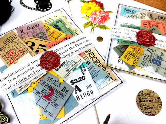
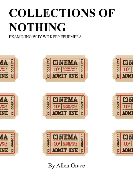
★ During week 9 +10 we started to work on and develop the Book Cover Design project. After doing more research on each of the options, I chose to create a cover for the "book” Collections of Nothing. Ephemera quickly became of interest and I wanted the challenge of trying to show how things that have no meaning can be important to someone. Above is what I have come up with so far. I still have a long way to go, but I have a few more ideas in terms of composition and color. I am not in love with the font or text placement - that will be worked on in the upcoming days.
~side note~ the cinema ticket currently shown on the cover is a picture I found online, but I ordered the pack of tickets shown from an Etsy shop to photograph myself in order to make the book cover more original, so I will be updating that when those come in!
1 note
·
View note
Text
week 7 + 8
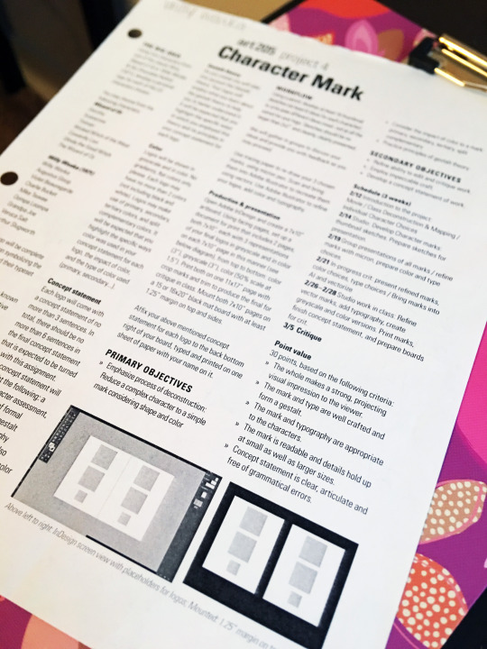
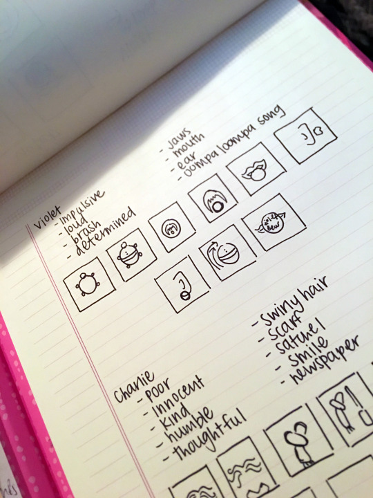
★ During week 7 + 8 we started to work on and develop the Character Logo project. It requires us to choose a character from Charlie and the Chocolate Factory or the Wizard of Oz. I chose to do Charlie and the Chocolate Factory because it is one of my all-time favorite movies. We created thumbnails (shown above) for two characters we were interested in. I immediately knew I wanted to work with Violet B. because she has so much personality. I also chose Charlie because he seemed to be a more of a challenge to me. We then took our ideas over to Illustrator. What I turned in for midpoint critique did not get the feedback I expected. My idea for Violet was too simple - which I thought it was supposed to be. This project has made me think outside of the box, which is something I need to get better at (because it is necessary for design). Since the midpoint critique, I have developed a new concept and am continuing to work out that idea to turn in on Monday for our final critique.
1 note
·
View note
Text
week 5 + 6
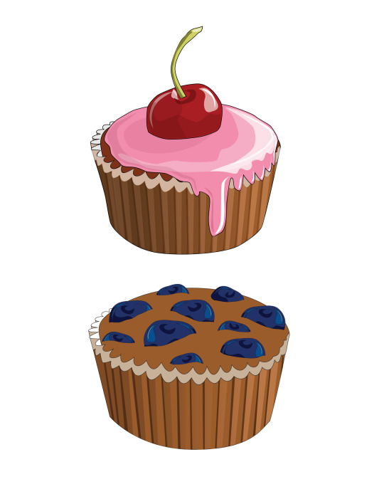
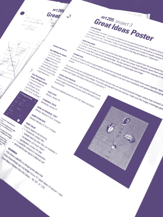
★ During week 5 + 6 we continued to work on/turn in the Great Ideas Poster. I was very nervous for it when we were given the handout. After working with Photoshop more I felt a lot more comfortable and confident in my ability to succeed on this project. I redid my project quite a few times before I felt like it was where I wanted to be. Printing was definitely the most stressful part of the entire project. I printed my poster at least seven times and it kept printing the wrong size and a weird color. I will definitely plan on printing taking more time the next time. Overall, I think my project was a success and I got several compliments on it.
0 notes
Text
week 3 + 4
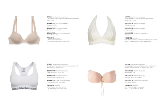
★ The pace has started to pick up in ART 205. We just finished our first project, Syntax and Semantics. The design aspect was something I am very familiar with, so that part was relatively easy. However, I had a hard time picking a subject because I wanted to choose something no one else would. I ended up choosing bras as my subject and I feel like it was good choice in terms of making mine stand out from the others. The only downfall to choosing bras was having to decide where they had presence and where they did not. Overall, I feel like my final product was successful.
★ Week 4 has brought on a new project: the Great Ideas Poster. I can honestly say I am a little nervous for it. When we were given the handout, it seemed like all I could come up with were ideas that were cliche. However, after talking with Leslie and a few classmates, I was able to narrow down my ideas and it seems like I am headed in the right direction. I am also not very familiar with Photoshop, so I am hoping to get up to speed as soon as possible. Meena’s in-class tutorials helped quite a bit - I tried to imitate some of the things we learned on the photo attached - but I still need to play around. We have in-progress work due on Monday and I am excited to get feedback on my work and see work from others!
1 note
·
View note
Text
week 1 + 2
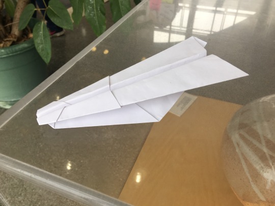
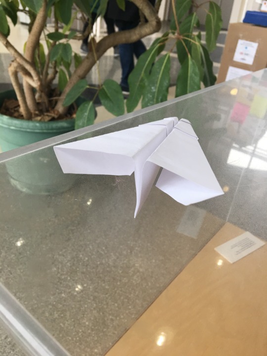
★ The first two weeks of ART 205 have been fairly introductory, but have gotten me very excited to continue on in this course. I haven't worked with Adobe much since high school, so getting back into it and using my creativity in an outlet other than drawing/painting is going to be wonderful. I am highly looking forward to all this course has to offer!
★ I really enjoyed the paper aircraft project. When we first received the assignment, I thought it would be something fairly easy that didn't require a lot of thought. However, when I started to work on the project, I began to realize how important the design process was not only in art, but in every aspect of life. I liked that we took a simple task of making a paper aircraft and turned it into an approach to design problems. Sometimes in life, and even in my art, I forget how important it is to articulate my design thinking and figure out the “how” and the “why”.
1 note
·
View note