Somewhat of a sandbox/playground for unconvential skill challenges and experiments.
Don't wanna be here? Send us removal request.
Text
UX Writing Challenge *Bonus* Day 15 - Banking app 💸
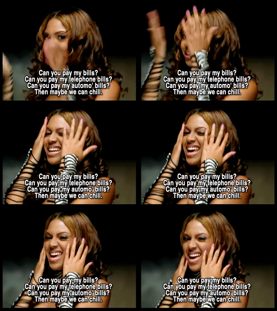
Challenge 3: Write a multi-screen onboarding experience for a banking app that automatically pays a user's bills every month—as long as they set it up correctly.
Character constraints per screen:
Headline: 45 characters
Body: 100 characters
Button: 25 characters
Time limit: 1 hour
Include a short explanation of your design decisions. Defend and rationalize your work.
User journey - UX flows (sequential; order is intentional)
intro screen - think of entry point (coming from what screen?)
alt: home screen on initial load (all-in-1)
alt: integrated into bill payment component (context)*
step 1: select recipient (payee)
Select payee (Where will this payment go towards? Who will receive this payment?)
challenge: where/who ... risk of sounding P2P-oriented
step 2: pick source (account) / category (rent/mortgage, phone, electric, car) - thanks Destiny’s Child for the inspo
Select payment source (Where will this money come from)
Select category - optional. (Rent, Mortgage, Phone, Electric, Car, etc.)
step 3: pick cadence (date repetition)
Select frequency (monthly calendar dropdown) subcopy: Monthly, 15th every month
step 4: preview (confirmation screen)
Review and confirm your monthly recurring bill payment.
You can edit these settings anytime.
CTAs: Edit (takes you back 1 screen) | Confirm
states: progress / success* / error message (happy path)
Your monthly bill payment has been scheduled. [display summary]
CTA: Continue banking [taken to homescreen]
Other notes:
initial onboarding is complete (skip up front admin overhead like signing up for a new account and logging in)
banking app has other features and functionalities; this is a new feature they are promoting
when presented a choice between manual bill payment vs. automatic recurring -> user selected the latter
Final results
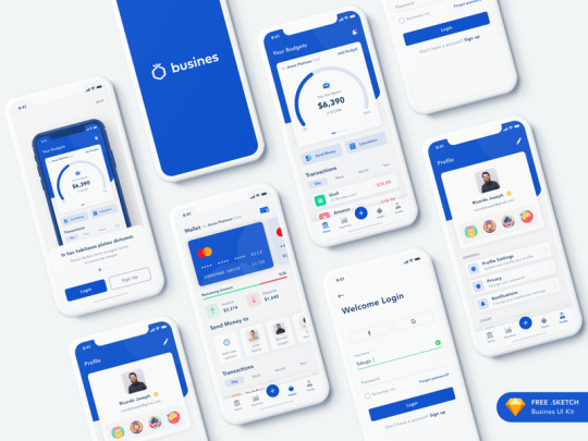
(For decorative purposes only) Credit: Dribbble
Headline: Select payee
Body: Who will receive this payment?
CTA: Save | Cancel
Headline: Select payment source
Body: Which account will these funds come from?
CTAs: Back | Save | Cancel
Headline: Select category (Optional)
Body: Where will this payment go towards? Rent, Mortgage, Phone, Electric, Car, etc.
CTAs: Back | Save | Cancel
Headline: Select frequency
Body: Your bill will be paid once a month on your desired date.
CTAs: Back | Save | Cancel
Headline: Review billing details
Body: Confirm your monthly recurring bill payment.
Subcopy: You can go back and edit these details anytime.
CTAs: Edit | Confirm | Cancel
Success: Your monthly bill payment has been scheduled.
CTA: Continue banking
UX flow rationale, content design decisions and approach...
Notes
UX flow rationale:
payee - user can enter contact information (i.e., existing contacts on file, or by entering an email or phone number)
payment source - assuming the user has at least 1 valid source with sufficient funds
frequency - a calendar interface where the user can select their desired recurring billing date (cadence: 1x/month)
review screen - summarizing billing details parsed from the data inputs
feedback loop - real-time notifications depending on the state of activity
CTA paths - giving users the ability to revert back to previous screen, save changes along the way, or cancel at any time
Approach
light R&D - pulled out my mobile banking app to familiarize myself with a related interface, flow, and terminology used as a benchmark
user journey mapping - outlined series of events from start to finish
identified assumptions to streamline flow / keep it focused
imagined all possible states, but focused on a successful end-to-end user journey: onboarding = complete the tour, finish the task
1 note
·
View note
Text
UX Writing Challenge Day 14 of 14 - problem unknown 🤷♂️
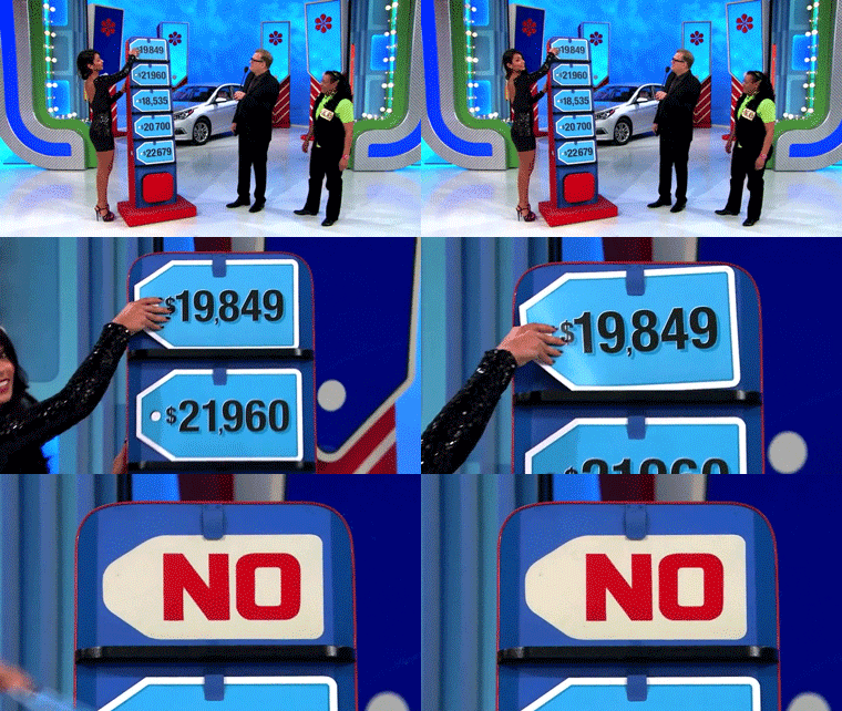
Scenario: a user is shopping using a price comparison app that boasts “real-time” pricing on items. As they are checking the price of an item, something goes wrong. The problem is unknown.
Challenge: write a message that informs the user that they cannot access the app right now. You cannot specify "why" the app doesn't work, you also want them to continue using the app.
Constraints:
Headline: 30 characters max
Body: 120 characters max
Button(s): 15 characters max
Notes
if the problem is unknown, then so is the solution, right? Hmmm...
we wouldn’t want to mislead the user or get their hopes up by steering them in the wrong direction
Final results
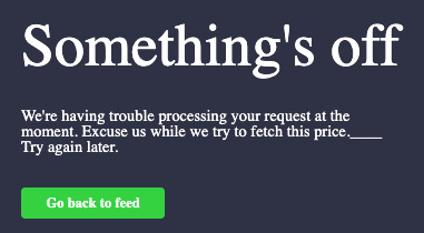
My approach, challenges & learnings…
this was an interesting one as the problem is unknown. It’s easier to write a content solution when the problem is clear but when there is this level of ambiguity, it gets a little tricky
“you also want them to continue using the app” - this part had me conflicted... do we really want them to continue using the app? the obvious answer is yet but if so, what value can we offer at this unique stage of the experience?
CTA: I decided to lead them back to their feed of products (imaginary) so as not to interrupt their browsing experience completely
my assumption here is that there are other features the user can make use of. otherwise, I don’t see the point in getting them to navigate an app whose sole functionality is broken indefinitely (figure it might be too soon to prompt them to try again immediately)
🙏🏼 Used this pen and modified a 404 page, reworking into an error modal.
0 notes
Text
UX Writing Challenge Day 13 of 14 - logistics variables & complexity 🤯

Scenario: A short-haul truck driver has a phone app that monitors his route, schedule, fuel & deliveries.
He has 6 more deliveries before stopping for fuel and lunch. Due to unexpected traffic, he’s behind schedule.
He can choose to stay on his planned route for a few more stops, but risk running low on fuel and missing lunch, or he can get fuel and lunch now and finish the deliveries later. Challenge: Write a push notification alerting him of this dilemma and options.
Constraints:
Headline: 30 characters max
Body: 45 characters max
Button(s): 25 characters max
Notes
emotions: tired, probably borderline hangry, flustered he’s running late
think through all scenarios:
IF continue route, THEN could run out of fuel / but miss lunch / still late on delivery
IF stop route, THEN get fuel / and lunch / but still late on delivery
main repercussions: fuel remaining and on-time delivery
Final results
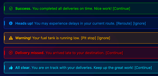
My approach, challenges & learnings…
Due to the complexity in logistics associated with this user journey, I really struggled to think through how to communicate the alert in a way that was all inclusive of the repercussions. As such, I decided to map out disparate alerts for each unique instance rather than try to combine them.
What helped was in imagining the best case scenarios, to balance out the worst case scenarios, which this challenge posed, as well as all the in-betweens. Here is the rationale behind each:
Success - assuming all went swimmingly without any hiccups or speed bumps (literally or figuratively)
Heads up - a passive warning which gives the user the option to reroute and recalibrate at that point
Warning - a more explicit warning about the fuel situation, prompting them to make a ‘pit stop’ (presuming this feature would reroute the user to the nearest gas station)
Missed - at this point, there’s not much the user can do but I felt it was still important that they are notified that they missed the mark
All clear - this was meant to be an intermittent ‘you’re on track, keep on keeping on’ type positive reinforcement
[CTA] flavours:
Continue / OK (passive acceptance)
Reroute / Pit stop (recalibrate)
Ignore (dismiss and stay on current route)
Thanks to this colourful set of alerts 🙏🏼 Something about seeing the colours often associated with these messages really helped me arrive at my copy in a more fluid, intuitive way.
0 notes
Text
UX Writing Challenge Day 12 of 14 - user name input 👋🏼
Scenario: A user is creating an account. When they come to the step where they are asked to enter their name, they get an error message. A fraud detection software thinks their name is fake—but it’s wrong 5% of the time. Challenge: Write an error message that prompts them to fix the error without shaming them for having a fake-sounding name. Constraint: 45 characters max
Notes:
this isn’t technically fixable... it’s a system error, not a user error
it’s not you, it’s us mentality (put blame on system side)
don’t blame or shame the user
Final results

My approach, challenges & learnings…
Error message - I know, I know. I far exceeded the character limit on this one. I could not think of a more graceful way to communicate this. That aside, I wanted the message to frame this edge case (5% rarity) in a positive, endearing way :) Why not celebrate this rare occasion?
Error title - ‘System Error’ may not be the prettiest title, but it’s also in line with blaming the system rather than the user
Pen used for manipulating faux flyout error message 🙏🏼
0 notes
Text
UX Writing Challenge Day 11 of 14 - website meta description 💻

Scenario: An elderly user is doing a Google search to find an easy way to buy contact lenses online.
Challenge: Write a title and meta description for a website that sells subscription contact lenses delivered to a user every 30 days—convince them to try it.
Constraints:
Title: 60 characters max
Meta Description: 160 characters max
Notes
Assumption: target audience may not be very tech savvy; need to make messaging as simple and straightforward as possible
Answer to question/goal (user story): How can I easily buy new contact lenses online?
Value prop: subscription, monthly delivery, try today!
Rough initial meta description: Offering you quality products for all your eyewear needs. We sell contact lenses, glasses, and stylish frames. Browse our selection in our online store.
Issue: Almost forgot about plugging the promo, d’oh!
Final results

My approach, challenges & learnings…
Case studies: Clearly and Warby Parker
C - clear and concise title tag, main meta description seems to focus a lot on price point and value deal
WP - presents multiple value props up front
A lot of my focus was centered around outlining the generic value prop of the store in a clear and straightforward way (tailored to our target demo), nearly losing sight of the promo that needed to be plugged. I took a cue from Clearly and Warby Parker and went straight into the deal, hoping the title would do most of the heavy lifting for answering “what is Spectacular Specs” ?
My assumption was that a more generic description like the one I originally came up with could be used all year round, whereas these one-off seasonal promo messages could be saved for specific campaigns...
One creative liberty I took here was the wordplay: “look no further” - not sure if a line like this would go right over people’s heads, or if it would be at all enticing. Alternatively, it could be condensed to just say “Looking for contact lenses? Try our new...”
Had fun manipulating a faux Google search results page for this exercise 😎
Had even more fun coming up with a terribly punny store name 😏
0 notes
Text
UX Writing Challenge Day 10 of 14 - geolocation 📍

Scenario: The user is trying to view a website to help them buy a car. But, the content can’t load without the user’s location. They need to enter their ZIP code and first name.
Challenge: Ask them where they live and who they are without sounding like you're unnecessarily mining their data.
Constraints:
Headline: 25 characters
Body: 45 characters
Button: 15 characters
Notes
Need to demonstrate value of a personalized experience which relies on mining some user data
Would be nice to gracefully explain what they’re missing out on by not providing their location details (without guilt tripping them)
Would be nice to assure them that this info won’t be used for any purpose other than serving up a better experience suited to their needs
Assumption: an option to opt-out or gracefully surface other content (albeit not personalized) exists, but out of scope for this challenge
Final results

My approach, challenges & learnings…
In terms of framing, I decided to approach this with a “Help us help you” mentality. My headline evolved from “Find your next car” to “Help us find your next car” making it collaborative effort / two-way street (pun intended)
I attempted to make the body copy validate or substantiate the mining of data
For the entry fields, I wanted a way to include prescriptive microcopy to help guide the user as I know there’s a whole nother science around that. I personally love it when apps include microcopy to serve as a guideline. This caused me to exceed the character limit, sue me (jk, please don’t)
While it didn’t account for this in the scope of the challenge, in actuality, I would hope there were room to add some sort of disclaimer in the form of either fine print or a tooltip/infotip (what’s this? why?) to more directly address any potential questions or concerns a user may have around the usage of their data
(Sandbox modal via Codepen)
0 notes
Text
UX Writing Challenge Day 9 of 14 - credit card expired 💳

Scenario: The user is trying to rent a car using an app but the credit card on file has expired.
Challenge: Write them an error message so that they can correct the problem.
Constraints:
Headline: 30 characters
Body: 45 characters
Notes
what is the problem - credit card on file has expired
what are the repercussions - unable to complete booking
what is the solution - user needs to update credit card info with a valid card (any alternative methods or workarounds?)
Final results
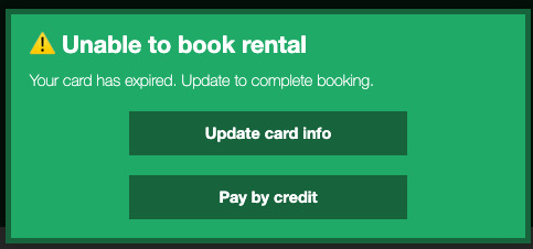
My approach, challenges & learnings…
The list of constraints didn’t include CTAs which I found unusual, so I took the creative liberty to include some. Regardless, I think my body copy would be instructive and suggestive enough...
Update card info (ideally would deeplink to Settings with a choice to either add a new card or activate a secondary card on file)
Pay by (alternative method) for a quick one-time workaround
I’ll admit, the body copy runs a little over 45 chars 😅. I struggled to keep it brief as I didn’t feel like telling the user the credit card has expired would be sufficient. I wanted a way to quickly tell them that such a hiccup will prevent them from successfully completing their rental booking.
The latter CTA ‘Pay by credit’ was an attempt to explore an alternative method. An assumption I made was that credit card wasn’t the only supported method of payment for this app.
0 notes
Text
UX Writing Challenge Day 8 of 14 - local concert alert 🎸
Scenario: The user is a casual music fan and (on occasion) goes to live concerts. They have a music player app on their phone.
Challenge: Tell the user that one of their favorite bands is playing live in their town. How would you compel them to want to go?
Constraints:
Headline: 30 characters max
Body: 45 characters max
Button: 25 characters
Notes
Info to present:
who (artist, maybe special guests or opening acts)
when (date timestamp)
where (venue, city)
Compelling bits: sense of urgency (happening soon! almost sold out!)
Status types: pre-sale, early bird, general sale, almost sold out (low tickets), post-show (opt to subscribe for
Final result
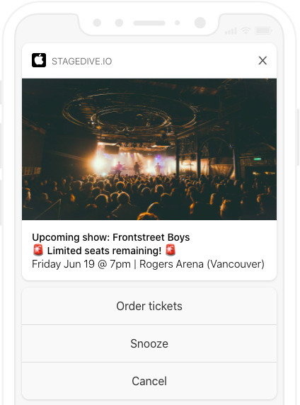
My approach, challenges & learnings…
As a music lover / avid concert goer myself, I’m a big fan of Songkick (their product, as well as their endearing copywriting) so I looked to them for inspiration and absolutely loved taking this challenge on!
Compelling bits: The one factor I decided to capitalize on which I thought would bring a sense of urgency was the fact that the “status” of tickets may sway the user to act fast. For instance, if the music fan were one of those early bird “I need to get front of the line VIP tickets” users, they may be compelled to jump at that point. Or for the procrastinator, “I need to cop these last minute tickets before they run out”
CTA: Order tickets (clear and concise) / Snooze (maybe later)
Supplementary media: I played around with adding in a random venue image. In actuality, I think it’d be cool if the system were to pull in a photo of either the venue or the artist to surface at the notif level (perhaps some A/B testing could be done to inform which is more compelling: venue or artist?)
I challenged myself to think of all possible states of the journey as it’s often a long cycle by the time the show itself rolls around, considering states such as pre-sale
I also thought of the potential of a user opting in to receive ongoing notifs for the same artist (or venue, even) in the future
0 notes
Text
UX Writing Challenge Day 7 of 14 - sports score updates ����
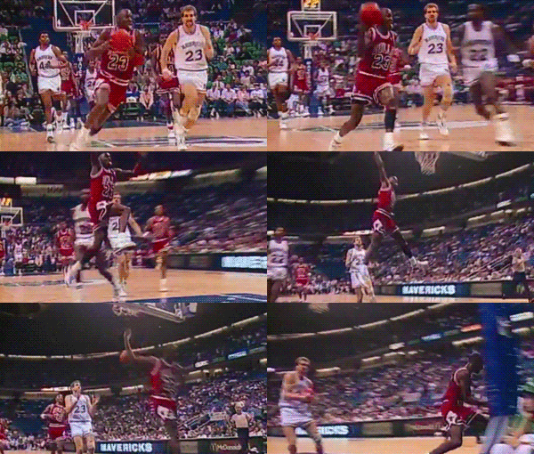
Scenario: A sports fan is at a wedding while their favourite team is playing against their arch-rivals. Their team scores.
Challenge: How would you, quickly, let the sports fan know about the latest play, the current score, and the key players?
Constraints:
Headline: 30 characters max
Body: 45 characters max
Notes
IA - breaking down information bits; what should be in the headline vs. body, sequence of data
lingo - what abbreviations / short form terms are globally recognized within the sports community?
Final result
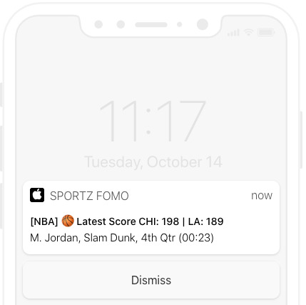
My approach, challenges & learnings…
Point of reference - theScore’s iOS alerts - observing the way they organize data
Lingo - terminology in general would need to be standardized and as succinct as possible. Here is the naming conventions I landed on: [First initial, Last name / Goal type / Quarter / Time of play]
Stress testing - some players may have lengthier names, some plays may be complex and long, what if there is overtime? and other oddities to consider when working within certain parameters.
Cadence - I was wondering how often these notifs would pop up - especially for fast-paced games like basketball, every new point may be excessive but I guess it’s ultimately up to the user to decide how frequent they would want their updates to appear (or if digests are possible). That would be another scenario to plan for (how would a bulk amount of updates look like?)
As I was working through this, it begged the question: what would standardization look like across different sports? Each sports has its own quirks... #sports!
0 notes
Text
UX Writing Challenge Day 6 of 14 - traffic alerts 🚦

Scenario: It’s Monday. A user has just gotten into their car to drive to work. They plug their phone into the car and start driving.
Challenge: How would you let the user know there’s a fire happening in a nearby town that is causing road closures? The effect on their commute is unknown, but there is a definite danger if the fire gets closer. How do you communicate this to them? When?
Constraints:
Headline: 30 characters max
Body: 45 characters max
Notes
Framing - fire (cue: panic) or accident? or keep generic? (just know there’s a road closure–for whatever reason)
Emotion - the last thing you want to find out on a Monday morning (or any morning, for that matter) is that there is a fire nearby. This can induce fear and anxiety and irrational behaviour, which is the furthest thing you’d want your messaging to do when your user is behind the wheel
Urgent vs. Important - which bit of information requires a level of urgency? Action required (primary) vs. Key info (secondary)
Body copy alt: Expect nearby delays on [Road] to [Destination].
Button CTA alt: OK (passive acceptance/dismissal)
Final results
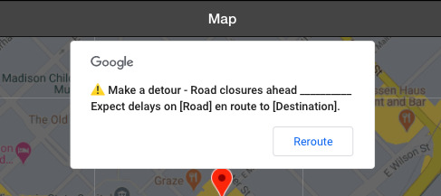
My approach, challenges & learnings…
Reference - I used Google Maps and Waze for reference, to see how they treat communicating alerts around delays and accidents.
Call to action - the key behaviour to influence here is to persuade the user to make a detour. This is why I placed this front and center, as part of the headline
Information architecture - there was quite a bit of information to deal with in this scenario, and I found myself having to triage what information in order to discern between what required a level of urgency (which can be communicated in different ways) and what was considered secondary yet still important to surface
CTA - I was torn between passive acceptance (OK), Dismiss (not recommended but still a viable option), and Reroute (alternative), though another route (pun intended) would be to serve up separate CTAs so as to not have to compete against each other.
🙏🏼 Thanks to this pen which allowed me to play around with modal copy in context of the Google Map interface (you can ignore the weird ___ syntax - I needed placeholder empty space to force a line break).
0 notes
Text
UX Writing Challenge Day 5 of 14 - data loss & recovery ☠️

Scenario: The user works in graphic design. While critiquing a design in a mobile app, their phone abruptly turns off. When they restart the phone, they reopen the app. Challenge: Write a message that the user will read immediately upon opening the app. What do they need to know? What steps (if any) do they need to take to recover their content? What if they can't recover the content?
Constraints:
Headline: 40 characters max
Body: 140 characters max
Button(s): 20 characters max
Notes
Scenario 1: IF can recover, THEN acknowledge and move on
Scenario 2: IF cannot recover, THEN apologize quickly and make it right
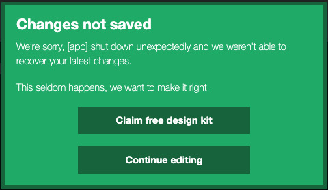
Scenario 2, CTA: It was cool to explore how this particular offering would probably involve coordinating with the sales team to see what kinds of “freebies” would be appropriate and available to surface in this instance.
Final results
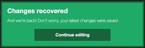
Scenario 1 (saved - huzzah!)
Scenario 2 (unable to save - d’oh!)
My approach, challenges & learnings…
Scenario 1:
Headline: summarize good news succinctly
Body: “Don’t worry” assures user immediately
Body: “And we’re back... continue...” set the pace and allow the user to seamlessly pick up where they left off
Scenario 2:
Body: Don’t beat around the bush to try to sugarcoat the issue, just explain what happened and outline the repercussions. I was definitely tempted to be playful with the language, but no amount of cheeky language can bring back the data that was lost. I decided to keep things straightforward.
CTA: Lead into “freebie” offering by communicating the commitment to make things right with the user (endearing).
Shout out to this pen from CodePen that made it easy for me to manipulate the copy in situ on the fly.
0 notes
Text
UX Writing Challenge Day 4 of 14 - promo for subscription service 🚛
Scenario: A user is in their favourite supermarket. They open the supermarket’s app on their phone to see what’s on sale and are greeted by a promotion.
Challenge: Write a promotional home screen for a subscription service that delivers groceries to the user once-a-month for a flat fee.
Constraints:
Headline: 45 characters max
Body: 175 characters max
Button(s): 25 characters max
Notes
Get your groceries delivered straight to your door. Subscribe to our monthly service. *(Pay a flat fee).
*Are there any other hidden caveats worth noting? Does this bit belong as a subscript less prominent than the body copy (think: fine print)?
Sign up now* / Cancel(Continue/Proceed to browse?)**
*What about later? Is there a step in between where the user can decide to revisit this option at a later time? Is there a place elsewhere on the app where they can learn more about this offering?
**Is cancel clear enough, or should it be more contextual? How would I describe the alternative (what does cancel denote here?)
Final results

My approach, challenges & learnings…
Emojis - Had a little fun with visual signals (I was a little limited by how the headline was formatted in this quick and dirty mockup)
But wait there’s more - I wasn’t convinced that “paying a flat fee” was the only single piece of information to call out in this modal, so I decided to include a “Learn more” link which would, in theory, direct the user to an informational landing page with more details about this offer.
UX consideration - I know how confusing ‘cancel’ button copy can be, so I decided to make it contextual and think about the user’s perceived behaviour before and after this modal were to pop up
0 notes
Text
UX Writing Challenge Day 3 of 14 - enter email 📩

Scenario: The user entered the wrong email address to sign in to their account.
Challenge: Tell the user to enter the right email.
Constraint: 40 characters max
Notes:
brief: define “wrong” email; solve for all possible cases
potential scenarios: invalid (defunct or unrecognizable email format), incorrect (different email associated)
emotions: I forgot, I want another way in, I just want to log in without having to jump through this hoop
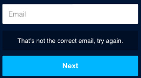
Final results:
invalid scenario, alts:
Enter your email linked to this account.
Enter your email address.

incorrect scenario, alts:
That's not the correct email, try again.
That's not it, try another email.
My approach, challenges & learnings…
The way this challenge is framed is inherently set up to make you feel inclined to blame the user and put the onus on them (user error alert, you did something wrong, make it right!). I tried to think of ways to communicate negative reinforcement in a graceful manner
In the invalid scenario (i.e., if a user enters a string of characters that don’t make up a valid email format), I was flip flopping between possessives: should it be: your email / this account OR the email / your account?
🚨 Can I call a lifeline? UX/UI/tech support needed! I wasn’t quite satisfied with this content solution as I felt we’d need to offer a solution beyond instructing the user. No matter how clear the instructions are, we wouldn’t want the user to become blocked and for their journey to end here. In the event that the user simply cannot retrieve the correct valid email required to complete this action, I was thinking we could present an alternate path; an alternative way to allow the user to log in in a way that doesn’t involve email entry so they aren’t left feeling trapped and helpless. Something along the lines of subcopy, for instance: Not sure? (maybe triggered after 2-3 consecutive user errors) <alternate path here>
0 notes
Text
UX Writing Challenge: Day 2 of 14 - promo screens 🔥

Scenario: A user is a working parent, and a big sports fan, in the midst of their favourite sports season who can no longer attend games. Challenge: Write a promotional screen for an app that lets a user choose teams, sends game reminders, real-time score updates and highlight videos.
Notes
For inspiration: App Store screens (think: promo gallery) > look at standards and examples (ESPN, Bleacher Report, Sportsnet, TSN, etc.)
Assuming order isn’t intentional (sequential list of benefits)
Final results
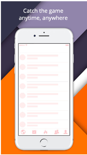
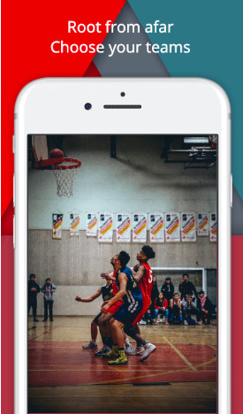
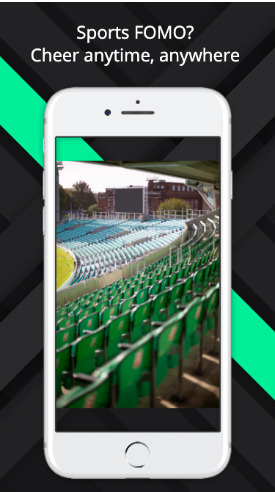
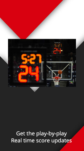
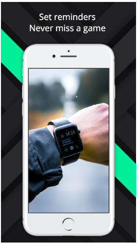
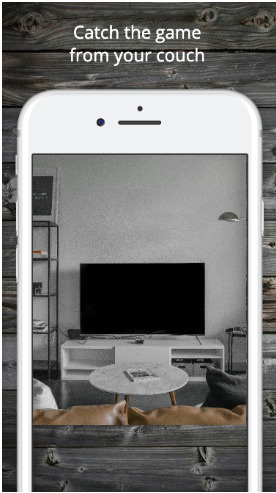
My approach, challenges & learnings…
This exercise definitely exposed my knowledge and expertise gap in this niche (#sports!)
My first pass of content creation (words-first approach) focused on driving clarity into the benefits, and then trying to convey that in a human readable way (colloquial, familiar language)
I tried playing with a few different phrase structures like question-and-answer / call-and-response (rhetorical), phrases that ran two lines, or 2-part phrases that paired well when stacked together
I found I spent the most amount of time reworking the utmost generic screen (meant to be all-encompassing of the primary value prop)
After the fact ~ I resisted looking at actual App Store promo screens as a point of reference until after I had taken a stab at it myself (blind attempt). After cycling through a few best-in-class examples, some patterns I noticed:
Keywords: news, alerts, real-time, personalized/custom, follow, highlights
Tone: ALL CAPS for the most part. Can’t tell if brand style guide standards, or if the capitalization represents the voice/tone of sports announcers (loud)
Missed the mark: clear and actionable CTAs. I found that much of my attention was drawn towards closing the gap and finding the right words that would speak to the audience (imposter syndrome) that I didn’t direct enough of my attention towards the user behaviour I wanted my copy to influence.
Tool used: AppLaunchpad, a custom screenshot builder (free demo)
0 notes
Text
UX Writing Challenge
I’ve recently landed a new gig as a UX Writer for a tech company!
In the spirit of living out my mastery mantra of “always be practicing”, I’ve decided to take on the 14-day UX Writing Challenge.
Thanks for following along!

0 notes
Text
UX Writing Challenge: Day 1 of 14 - flight cancellation ✈️

Scenario: A traveler is in an airport waiting for the last leg of a flight home when their flight gets abruptly canceled due to bad weather.
Challenge: Write a message from the airline app notifying them of the cancellation and what they need to do next.
Constraints: Headline: 45 characters Body: 175 characters max Button(s): 25 characters max
Assumptions:
Environment: Mobile app
Language supported: English
Notes:
Perceived emotional state of user: tired, flustered, frustrated, impatient
User goals:
get informed about news of cancellation
understand what next steps and options are available
provide easy to understand, actionable ways to get informed
Messaging structure / format (thinking):
Headline: ABC > XYZ (personalization) 001 Flight is cancelled.
Body: Due to local weather conditions, your flight from ABC > XYZ has been cancelled.
Buttons: Rebook your next flight (self serve) / Talk to a rep (route to customer service) / Refund policies (tool tip / info screen)
Final result:
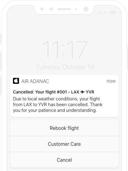
My approach, challenges & learnings...
Considering the perceived emotional state of the end user, communicating with empathy, and recognizing their patience and understanding was key
Did not want to dwell on the news of flight cancellation, tried to keep it concise and to the point. Deliberately placed ‘cancelled’ up front. Sidenote: was tempted to capitalize CANCELLED to draw attention, but I wasn’t in love with that tone / volume, so I decided to keep it in title case.
Personalization, assuming it is technically feasible, is a nice-to-have in this scenario. Assuming the user has a ton of other app notifications turned on, it is important to be as specific and accurate as possible, sooner than later
the 2 CTAs I netted out on were essentially 1) DIY (self serve) and 2) relying on customer service to support the user in reaching their goal. 1 is meant for more savvy users, while 2 is meant for those who either aren’t as tech-savvy, or simply don’t have the time to do it themselves.
It was a challenge to keep these buttons limited and focused, so as not to overwhelm the user with too many options or actions to take. I was tempted to tacking on an additional CTA (even as a deeplinked footnote) to link to Refund Policies for further information, but it didn’t fit.
I’m still not quite satisfied with ‘Customer Care’ as it isn’t very actionable. Perhaps something more direct like ‘Call / Talk to an (customer) agent’.
Sidebar: I came across this nifty tool that lets you preview placeholder copy in the context of simulated app interfaces (iOS / Android / web) in real-time.
0 notes
Photo
🎃
1 note
·
View note