Text
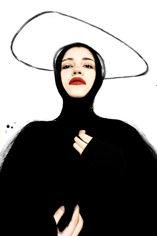
GRADED UNIT FIRST SESSION RESULTS

9 notes
·
View notes
Text
0 notes
Text
EDITORIAL FASHION


0 notes
Text
CATCH ME IF YOU CAN


3 notes
·
View notes
Text
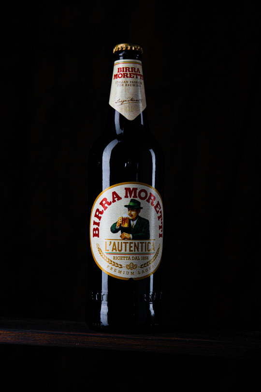
GLASSWARE

3 notes
·
View notes
Text
FASHION COLAB


1 note
·
View note
Text
BTS/ANTIFASHION SHOOTING
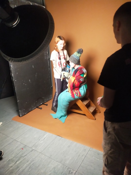
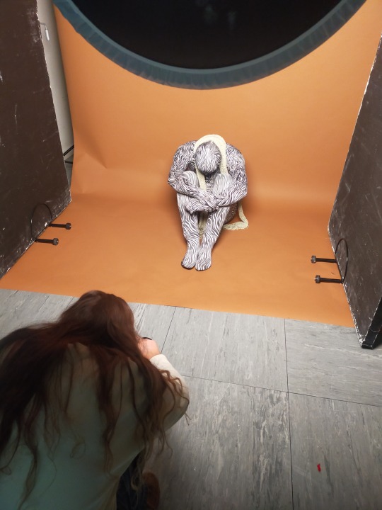

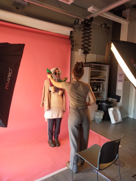
For my antifashion shoot day i took quite a few extravagant hats, some colorful shirts, big sheer scarfs with interesting textures, yarn/wool and some funky heels.
2 notes
·
View notes
Text
MONDAY CLASS
DAVID PRATT


David Pratt is a documentary and war photographer that used to be an art teacher. He is also a journalist, broadcaster and author. In this exhibition in particular he shows us his work from his previous and recents visits to ukraine.Taking pictures that document the state of the people still there and the places after the horrible violence. He brings awareness to a war reality that affects all of us in different ways some more than others.
This exhibition was in Sogo Art Gallery. Overall there was a reception at the entrance and then the exhibition was displayed in a circle you could follow around the space of the gallery. My favourite images where those two that i've uploaded. Although the one that impacted me the most was probably the first one, the missing poster of and old lady. It felt personal for a second since i could just feel the pain the people looking for her where going thru not knowing where she was or if she was even alive. I felt sick just imagining me in that situation looking for my granny specially they are even more vulnerable having restricted mobility.
As for the photographer i loved how he used to be in the arts section and moved to photography because its curious to see how a lot of photographers went thru the same, as well as me where we kind of discovered the passion for photography thru art. I also admire how brave he is because i could never do his work. I feel like i'm to sensitive to be in those situations I would be overwhelmed by so many emotions.
0 notes
Text
MONDAY CLASS
PHOTO EXHIBITION-ZENELE MUHOLI-SOMNYAMA NGONYAMA


This exhibition was incredible. I loved the location inside the University of glasgow and how the size and display they chose for the images. I loved the fact that they where all self-portraits, and what they each represented, using common objects to tell a powerful story. She said that her mission was to re- write the black, queer, and trans history of south africa in a visual way. to showcase to the world the existence of hate crimes in south africa and beyond and their resistance to it.
“The black body that is ever scrutinised, violated and undermined”
I really admire how she expresses herself while she defends what's hers, and i like how the images are beautiful even without knowing the meaning but they have this intriguing way of making you curious to know what else is she saying with each image. I think that this type of images are my favourite because they educate in a topic that has been way overdue while at the same time being art.
0 notes
Text
SAY WHAT YOU SEE TASK
We where asked to find a couple of art pieces in the kelvingrove museum in glasgow, and it could be a sculpture, painting etc. After locating it we had to describe them. I chose this two paintings:

To begin with the painting has a big wooden frame that catches your attention. The overall color palette is very warm and has an autumn feel to it. There are oranges mainly and browns although there is a bit of blue/white/greens giving it contrast from warm to cold colors.
There are 4 girls, 2 are quite prominent and the third and specially the fourth one almost blends with the nature in the background since they are surrounded by a forest. Overall giving a very peaceful and playful vibe. The girls seem to be distracted playing with the flowers and wilderness. All of them wearing nice dresses and bows in their hair.

This painting has a pale wooden frame. There are 2 main characters who seem to have a close bond, probably interpreted in different ways by different people.I would say they look tense about the situation around them. But at the same they look like they have an understanding on what to do and could be lovers. The color palette is warm. And it's a tight frame in the interior of the plane. I like the perspective in which its painted, giving it quite a lot of depth of field.


0 notes
Text
DOCUMENTAL ZINE
FIRST ATTEMPT
https://express.adobe.com/post/vqaTWACwuxNKo/
2 notes
·
View notes
Text
Monday class- zines
For this class we went to street level photogallery to hear about zines from John Farrell.In his talk he gave us a an overview on what zines are and in what occasions they are convenient to use as well as the best materials to choose in each situation.
Among other things what I thought was extremelly helpful was that they gave us a list of places where we could get them printed, published etc.
TO PRINT
Newspaper club, risotto, tender hands press, sunday’s print, merchant city print, publication studio, J thompson.
TO SELL
Glasgow zine library, good press, street level photoworks, aye aye books
ONLINE ZINES
Mixam, blurb, Sharman and company, Footprint workers and co


0 notes
Text
E-ZINE RESEARCH
What is a Zine?
A zine is typically a small self published book, often printed at home and folded into 6-8 pages. It can contain photos, text, poetry and all sorts. Zines are a form of self expression and have often been used in protests and to spread awareness of certain causes. They are self published, imperfect, and often made at home with basic photocopiers, this hand finished style gives zines a unique and rebellious quality!
In recent years photographers have published their work in zines using a number of different online printing companies. These can offer a more professional end product than most people’s home printers.
A Brief History of Zines
Zines have been present throughout history in socially marginalized groups. Some state that the first zine was Thomas Paine's 1775 pamphlet Common Sense.
1930s- 1960s
Zines were popular with science fiction fans who would make ‘fanzines’ (short for fan magazine). This allowed them to collaborate with each other and share ideas around their community.
1970s
The time of the punk zine came in the late 70s. With the emergence of household printers and software people were able to create these cool DIY publications which became vital in spreading information about music around the UK.
1990s
Emerging from the DIY punk subculture was the Riot Grrrl movement in the 90s. This was the same time as the American era of third-wave feminism which saw many feminist documents able to circulate ideas that would simple not have been published in mainstream media.
“BECAUSE we girls want to create mediums that speak to US. We are tired of boy band after boy band, boy zine after boy zine, boy punk after boy punk after boy . . . BECAUSE in every form of media I see us/myself slapped, decapitated, laughed at, trivialized, pushed, ignored, stereotyped, kicked, scorned, molested, silenced, invalidated, knifed, shot, choked, and killed ... BECAUSE every time we pick up a pen, or an instrument, or get anything done, we are creating a revolution. We ARE the revolution.”
- Erika Reinstein, Fantastic Fanzine No. 2
By the mid-90s zine makers were also publishing their work on the internet as e-zines.
2000s
The internet obviously changed the way people get information; being able to share ideas in a web forum, in msn or AOL chat, myspace. So the zine started to die out a little.But here is truly nothing like experiencing your photography in print form, and holding a print in your hand.
How Would You Define The Difference Between A Zine and A Photo Book?
The difference is simple. One is handmade, short run and limited page count, containing content that is more ephemeral in nature and put together simply but with consideration for the quality of the work more so than the quality of the final end product. The other is from a considered specific body of work, generally of some substance when it comes to size (number of pages), printed professionally and made with the intent for sale and promotion of the photographer’s portfolio and current artistic endeavors.


0 notes
Text
FRONT COVER
CLOCKWORK ORANGE


After making changes on the image and experimenting with it, I decided to go for the last one since I prefered the simplicity of it. I think overall it came out well, although I’m not sure if I could get the expression quite right, I tried.I thought about editing the lashes to look less full but again I wanted an inspired shoot not an exact recreation so I feel like a false lash like that gives it the “fashion” look. While still been inspired since it’s in the bottom lash instead.
1 note
·
View note
Text
FRONT COVER-PLANNING


0 notes
Text
ENVIRONMENT 360
FINAL IMAGE

3 notes
·
View notes
