Text
Final Portfolio
Midterm

Final


Museum Pieces


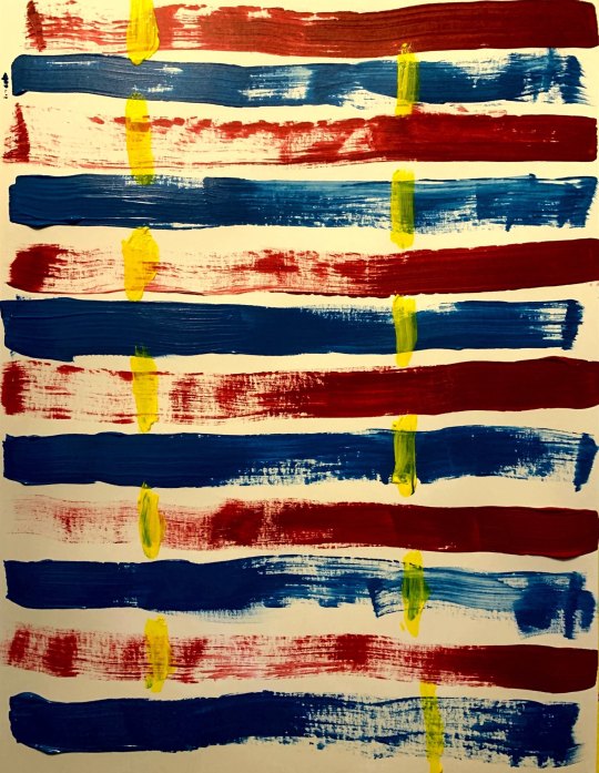
Pages from my Sketchbook


10 of my Artworks (Progress)


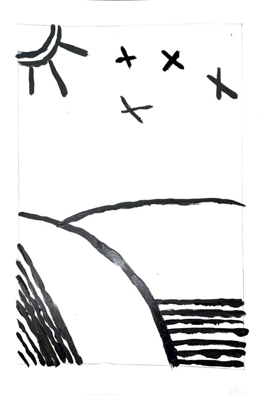


To be honest, I was mostly behind on so much work because I had never painted in my life before, so this class brought about a hefty challenge. I underestimated the course, and my time, and because of it suffered a considerable amount, but I have since then learned my lesson.
Other than this, the professor’s passion was not overlooked by myself, she definitely loves art and it 100% shows and comes across that way. It’s a great motivator, and it did help me keep going even if I had been behind.
From now on, if I ever have an art class again I feel like I know the first steps to having everything completely set up so my experience goes a lot smoother. My favorite materials happened to be the acrylic paint, which was really messy for me personally, but I definitely made it work. My favorite project happened to be my midterm, messing up so bad allowed me to reflect and try even harder when I re-did it.
There were many challenges that I came across and fortunately I beat them all, and I’m ready to keep on going and striving towards my end goal, finally finishing college.
Thank you.
0 notes
Photo
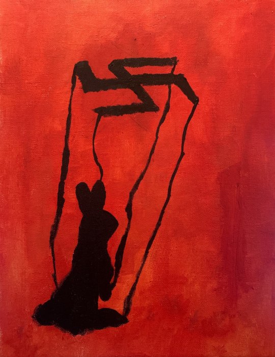
A final redo of my final book cover, it is Jojo Rabbit, the infamous dark comedy that was made into a movie about 2-3 years ago. There is a bunny, heavy use of the color red, and the bunny (which happens to be Jojo) is being “puppeteered” by a swastika. I’ll keep my other final up, The Great Gatsby, but I prefer this one more.
0 notes
Photo

The Great Gatsby was my favorite book in highschool, I did this using the glasses as symbolism and the teardrops in the official cover of the book, tried to keep this simple so it is effective.
0 notes
Photo

Final - Album Cover
Based on Tame Impala, on the left you can see a “man and woman,” before a relationship. The man had been bruised already from past relationships,
The middle shows their current relationship, notice how the man is “fuller” than the woman, but by the end of it (on the right,) he is skinnier than she is. She left with more out of the relationship, and unfortunately let him decay.
I used colors commonly associated with tame impala while trying to keep the gentle symbolism alive, this can also be seen as the “past, present, and future.”
Black is used as “bruises,” to someone’s conscious, while the color purple is used as a metaphor for a relationship.
0 notes
Photo


“Virginia’s Wonderland,” “The Thinker,” and “RGB” all by me, these are the museum inspired works.
0 notes
Photo

;LGoing around and looking at the pieces of the museums was really eye opening, here’s a sketch of KO Younghoon’s “Stone,” a curious piece that caught my eye suddenly. I looked up KO Younghoon to research a bit more on this piece, to try and catch a glimpse of what it could mean, apparently it’s stones that are resting atop of several newspapers. This is a great example of hyper-realism, and to me it may symbolize how some articles on newspapers are “set in stone,” while others are lies.

Lee Sang-Beom’s art, “Restoration,” from the 1950′s caught my eye as well. Though these are objects that are easily identifiable, but this art was just too beautiful to let go. It looks like a village was destroyed and it is being restored gradually, but who is restoring it? Could it be nature; taking back what its lost, or the people that once lived here?
0 notes
Text
There we go.
All updated and caught up, I’m getting the hang of painting now, and I can’t wait to continue forth and do the midterm. I’ll prioritize that before the 2 projects I have yet to finish. I’ll be all caught up afterwards (:
0 notes
Photo


Cut and Paste, Multiple Color splotches, and illusion assignment, getting the final assignment done today as well! (Analogous colors)
0 notes
Photo


Finally caught up on everything, this is my chaos/harmony projects, I have yet to do the white on black which I will be finishing today.
0 notes
Text
My first 4 paintings.. Ever.
I sketch way better than I paint, but here goes!
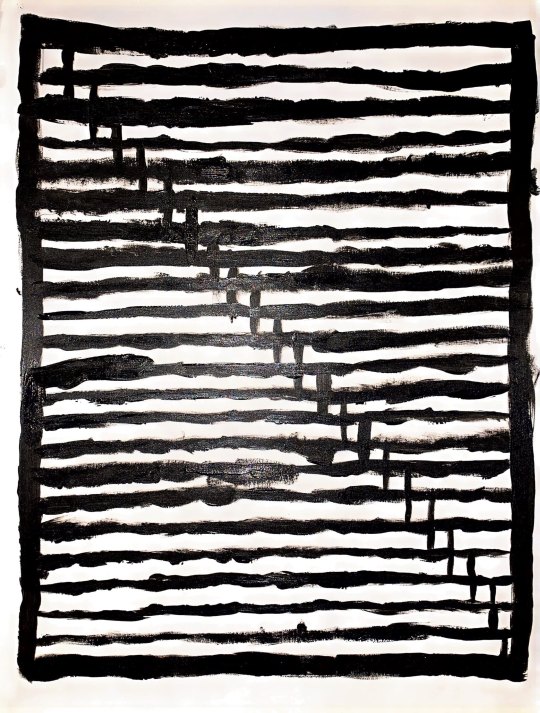
Horizontal and Vertical only
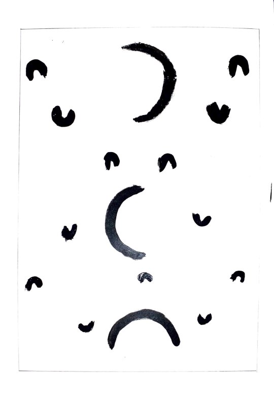
Curved Lines only

Diagonal Lines

All lines mixed into one piece.
0 notes
Text
5 Sketches of everyday items
1/5 -- Sharpener
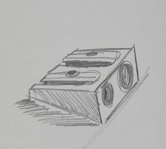
2/5 -- Thermometer
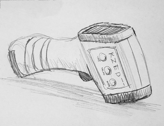
3/5 -- Screwdriver

4/5 -- Battery Recharger

5/5 -- Flashdrive

0 notes
Text
The Principles of Art (And Examples)
There are 7 principles of art that are essential in most of artists work to convey their feelings and/or messages in a piece. In this post, I’ll explain my own definitions for each of the principles with examples!

Junji ito is a horror manga illustrator that uses Repetition in his work, Uzumaki to convey a feeling a fear AND curiosity. This man, who happens to be the main character’s father, falls ill to the “spiral disease.” One in which he is exposed to spirals, and enamored by their shape. You can see that the spirals are in every inch of this illustration, which is repetition.
When a single element is used over and over in an illustration to convey a message or to “drill” a message into the viewers mind, they will be repeated.

Van Gogh, which happens to be my favorite mainstream artist, used Rhythm in many of his works including this one, labeled “Wheat Fields with Cypresses.” As you can see, everything is seemingly moving in a certain direction, not a single element of this painting is standing still- That’s where the Rhythm is.
Rhythm in art, is the direction in which several elements are moving, it gives off a “rhythm.” This allows viewers to view a painting and move their eyes along with it for a better understanding.

Satoshi Kon’s illustration for one of the many covers of Paprika is a beautiful example of variety. In this film, a women by the name of Paprika that can travel through the dreams of anyone she wishes. All of these dreams are clashed into a single canvas in this illustration. There is a lot of variety, and Paprika is the canvas.
Variety in art is several varying elements that can add to an overall central message. As you can see in the example above, there are several elements inside the woman- This may mean that she has a lot on her mind, or that she sees people’s dreams.

This is an illustration found in the popular book “The Gift of the Magi.” A book by O. Henry. The illustrator's name is Lizbeth, and lucky for me, she had the perfect example of emphasis right here. We can see that there are several girls with red hair, they all look the same. Same eyes, nose, mouth, even the same hair clip. In the center of the image however, there is another girl with blue hair. Our eyes INSTANTLY go to her, that’s because she is the emphasis, the “main character,” so to say.
Emphasis in art is when a single element looks different from the rest of the elements in a work of art. This allows for viewers to instantly find elements in an illustration or painting.

These paintings unfortunately do not have an author, or I could not find him or her anywhere that I looked. This is balance, using the space in a canvas to find asymmetry or symmetry- Or, balancing all of the elements on a canvas to have a perfect harmony in a work of art.
Balance is harmony in art. If there is so much happening on one side, on the opposite side there could be a lot going on too- Or nothing at all.

Saatchi, an artist that works with vibrant colors shows off compositional unity in this illustration. As you can see, there are three main characters in this work- But they intertwine with similar colors to become one at the same time. It is a beautiful example of unity. Unity can have viewers second-guessing their first interpretation of a painting.
Compositional Unity is to have different elements in a work of art unify to create a single figure/form/object.

Finally, Sea Monster by NgJas is a beautiful illustration that shows scale and proportion. This piece of work compares a human to a fictional monster, a large one at that. This work can easily strike fear into viewers, and it seems that this was the intention behind this peace. The first thing I asked myself is, “What would I do in this situation?” Which filled me with dread, (Of course.) And the only answer I could conjure was “Give up.”
Scale and Proportion in art is used to give the viewers an idea of how large or small objects may be. In the work above, the serpent/eel is compared to a human.
2 notes
·
View notes
Text
First Reflection
Figurative Art refers to modern art that showcases the human figure, the examples in the article and videos listed were beautiful and extremely detailed, showing off the human anatomy in its natural (and sometimes abstract) forms. There are many ways to take a piece of art, artists show off their personality and mentality when drawing, and figurative art is one of the most unique ways to approach this. Personally, I found myself attached to works like “Mr and Mrs Clarke and Percy” by David Hockney. A piece that has so much detail in every single inch of its canvas, whilst still being calm and.. Neutral (for lack of a better term.) You see two people, a man and a woman, seemingly going about their daily lives. There is not much going on in this painting per se, but to me, that calmness adds to the overall message of the piece. This is real, and this is the life we all live, showcased on a simple canvas with many beautiful colors. Another piece that really stood out was Emily Mae Smith’s “Brooms with a View.” A much more abstract piece that toys with and bends the human anatomy around two broom-like humanoid entities. I love the creativity here, and personally found myself taking it all in. The view, the “people,” the colors, and so much more. There was a lot to unfold here, but again, it was a calm painting that showcased one’s imagination.
1 note
·
View note


