"Paulit ulit lang ang destinasyon, ngunit di pa rin kabisado ang direksyon" | Arkitektong walang plano
Don't wanna be here? Send us removal request.
Quote
There’s a lot of strength in weakness.
Leona Lewis, Stone Hearts (via music-and-quotes)
214 notes
·
View notes
Text
#5 Ligaw
Piniling takpan ng musika ang ingay ng kalsada Parang dingding na pilit pinapatungan ng palitada Paulit ulit lang naman ang destinasyon Ngunit tila hindi makabisa ang direksyon
0 notes
Text
#4 Kupad
Malamig na umaga'ng bumungad Sa buhay na napakabagal nang usad
0 notes
Text
#3 Paghihimagsik
Galit at poot ay namumuo sa kalooban; Tulungan mo akong maging marahan sa pagtanggap ng nararamdamang hidwaan, sa pagitan ng aking puso at isipan
2 notes
·
View notes
Text
#2 Saranggola
Matayog pa sa kinalalagyan ng araw Ang mga ninanais na tila unti unting pumapanaw. Kung bukas mundo'y gugunaw, Sana hindi ka tuluyang masilaw Sa kinang na nagmula sa patay-sinding ilaw.
3 notes
·
View notes
Text
#1 Bugso
Sumiklab muli ang alab sa puso, inisip ba kung nais lang makiuso. Ngunit lahat ng apoy ay nagbubuga ng usok; Susubukan kung kaya bang damdami'y mausog
1 note
·
View note
Quote
How many ears must one man have before he can hear people cry? Yes, and how many deaths will it take ‘til he knows that too many people have died?
Bob Dylan; Peter, Paul, and Mary, Blowin’ In The Wind (via music-and-quotes)
188 notes
·
View notes
Photo
THIS. IS. HELPFUUUL.


A lot of you have been asking how I go about making my graphics, i.e. how I do graphic design, so I thought I’d make a guide - or perhaps a series of guides if you would like - on how to design graphics! First off, I’d like to introduce you to the fundamental elements of graphic design, and hopefully this will help you gain a new perspective. and improve your own design skills.

Lines are structures that connect two points. They make up everything that we see, even the letters and characters we read every day. But more often than not, we take them for granted. In reality, lines are one of the most rudimentary components of graphic design, and they serve to channel ideas and emotion.
Lines can:
Organize pieces of information or elements on a page
Serve as guidelines to lead the viewer’s eye
Provide movement such as using wavy lines to represent moving water
Emphasize certain parts of the page
Set a mood, such as how straight lines evoke order and neatness while zig-zags convey excitement and tension

A shape is any two-dimensional area with a recognizable boundary. They can add interest to designs (such as in backgrounds), organize visual content, and be used to make illustrations.
Shapes exist in three categories:
Geometric shapes are regular shapes like circles and squares
Organic shapes are more freeform, such as a blob or a leaf
Abstract shapes have a recognizable form but are not exactly natural shapes, such as alphabet glyphs, spirals, and stick figures
When brought together, these shapes can form helpful illustrations that will help convey meaning to your work or add some decoration to it.
The effects achieved by the shapes are determined by its form, color, size, and other characteristics. For example, triangles often show excitement and risk, while circles are seen as eternal and often feminine.
In the example illustration below, which is one of my January wallpapers, I use triangles to convey a feeling of vivacity and excitement.

Different shapes may also be used to structure content or create a layout, making it easier for the user’s eyes to find information. This is often the case in blogs and websites.

Color can be used to make an image stand out, convey information, enhance meaning, or group things together, but how do you know what colors ‘fit’ together? When you’re starting out, you might find it easier to look for color schemes from pinterest or wherever you can find inspiration. It also helps to look for images or photographs that evoke the same vibe you’re going for, and then using a similar color scheme.
But what if you want to make a palette yourself? Learn color theory!
Before I elaborate, here’s some terminology for you:
Hue is the color itself
Value is how dark or light the color is
Saturation is the intensity of the color
Now, how do you go about making a color scheme? Here are some types of color schemes you should know about:
Monochromatic color schemes only use one hue but vary in value and saturation.
Analogous color schemes use colors adjacent to each other on the color wheel, such as red, orange, and yellow, or blues and greens.
Complementary color schemes use colors opposite each other on the color wheel. To add complexity, play with the value and saturation of these colors.
Split complementary color schemes use colors on either side of the complement.
Triadic color schemes use three colors that form an equilateral triangle on the color wheel. These are often very stark and in-your-face, so you might want to use this type of color scheme in moderation.
Tetradic color schemes use four colors that form a rectangle on the color wheel. These are more effective if one color serves as the main color and the other three colors are just accents.
When choosing a color scheme, the main thing you should keep in mind is balance. Using fewer colors means it’ll be easier to balance and thus it is less likely that the piece will appear messy and discordant.
Color has the power of evoking emotions and moods, and each hue and shade has certain connotations associated with it.
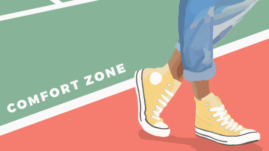
In the illustration below - which is part of my April wallpaper set - I use the color green to convey the safety and familiarity of the comfort zone. The color red, on the other hand, shows risk and danger, but it also represents the courage required to get out of the comfort zone.

So the next time you’re thinking of what colors to use in your project, think of what kind of message you want the audience to receive.

Like the other elements we’ve discussed so far, type conveys meaning beyond what is written. Type can communicate a mood, style, vibe, or feeling. A curly or script font might appear fancy and extravagant, while a handwritten font may seem raw and playful.
Different types of fonts are also suitable for different contexts. For example, sans-serif fonts are more readable on screen while serif fonts are more readable in print. Display fonts, on the other hand, tend to be fancy and decorative, and thus should only be used for small amounts of text, like titles.
Audience and purpose also serve a role in deciding what fonts to use. Large, bubbly text is suitable for a children’s birthday party invitation but probably not for a business card.
In graphic design, different fonts are often used in tandem with each other. The main principle or rule behind this is that you should choose fonts that complement each other. Large, bold fonts should be paired with small, subtle fonts. Oftentimes, you’ll have to rely on your instincts, and that’s okay.
Remember, though, that you wouldn’t want to overwhelm your readers by using too many fonts. Stick to one or two per project. To add variation, change the weight or style of the existing fonts.
Finally, your text would be more effective if you establish some sort of visual hierarchy. This essentially means sorting out your text in order of importance, using different typefaces and fonts. This includes adding a certain weight (or boldness) or increasing the size of texts that are more significant.
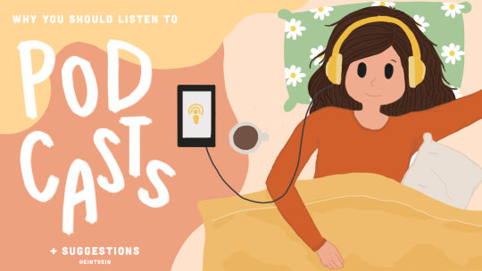
In the title graphic below, the word “podcasts” is handwritten and larger than the rest of the title because that’s what I want to draw attention to, so that readers know what the post is about. My name, on the other hand, is smaller than the other texts.


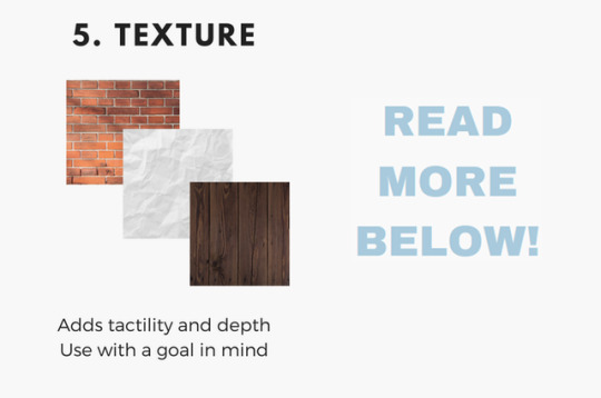
Texture adds tactility and depth and can also be used to evoke a certain feel. In this graphic from my March desktop wallpaper, I used a tape texture and a paint texture to achieve a scrapbook-y vibe.

Some other common textures used in designs are foil, watercolor, and paper textures. Although there are many textures to experiment with and choose from, you should also be careful not to overwhelm your viewers with too many textures in one piece.
Lines, shapes, color, text, and texture are the five basic elements of graphic design, and by understanding how these elements work together, you’ll be able to make more effective designs.
Now, the question is, do I think deeply about all of this when I make my designs? To be honest, not really. A lot of my designs are instinctual, but knowing the theory behind what I’m doing has helped me improve those instincts, and you can do the same!
That’s all for now. Hope this helps, and let me know if you would like me to continue the series or if this brief blog post is enough. Happy designing :)
Disclaimer: I’m not a graphic designer, just a stressed-out senior who sometimes likes to design and stuff.
9K notes
·
View notes
Text
Nope
I’m turning 21 on the last day of this month, and I say, it’s never too late to create a new tumblr account ahahaha
0 notes
