Don't wanna be here? Send us removal request.
Text
Arts 102 Blog Post 7
Throughout the year in ARTS102 I have continued to cultivate my skills within Photoshop, Illustrator, and InDesign. ARTS102 made waking up first thing in the morning worth it, for a very not morning person, and I was always excited to show up to class to find out what project we would be working on next. Within this class I’ve learned to look beyond the “good enough” mentality and strive to create something that is truly impactful. Im proud of my improvement throughout the semester, as tasks that were once very difficult or impossible now seem trivial. My biggest takeaway from ARTS102 is that I can, in fact, be an artist.
0 notes
Text
Arts 102 Blog Post 6
During weeks 11 and 12 of Arts102, we completed project 5, and began working on the final project of the year, project 6.
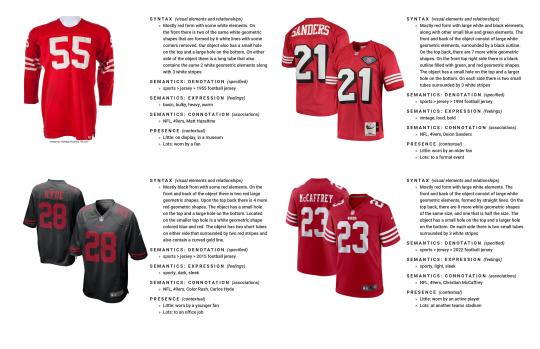
Project 5 was focused on the syntax and semantics of multiple versions of one item of our choosing. I decided to view the development of the 49ers Home jersey throughout the year. While a jersey doesn't vary greatly in looks from year to year, it is interesting to observe how the fonts, colors, and small details change. This project served to help us get more practice with InDesign, and to learn about text hierarchy.
We have since begun work on our final project of the year, project 6. Project 6 serves as a Process Journal & Portfolio for all of the work we have completed this year. We spent one day at Thomas Cooper Library to take time and read through many design books to help inspire us on how we would like to create our project.
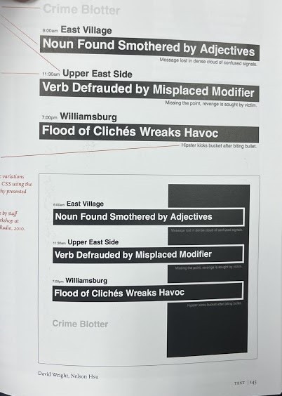
This style stood out to me. and I will be attempting to implement it within my project. So far we have only just begun upon the intro and table of contents, but soon I will bring in both work in progress and completed photos of each project from this year.
Chapter 18 continued to talk about the relationships between artists and programming, which is particularly interesting to me as it is the combination of classes that I currently take. Chapter 19 listed many important skills and traits that are crucial to acquire during school to be as successful as possible in work beyond school. It then comes full circle to the very start of the book with a Q&A segment. Overall I enjoyed reading the textbook and I feel like often I was interested in the topics, making it a more fulfilling, and better educational experience.
1 note
·
View note
Text
Arts 102 Blog post 5
Within weeks 9 & 10 of ARTS102, we completed project 4 using Photoshop, Illustrator, and InDesign. The first step once we moved our original sketches into photoshop was tracing them with the pen tool to reproduce the sketch digitally. This step helped straighten out a lot of jagged lines and ensured all lines were the same weight. Once I had both pieces successfully loaded in, I began to experiment with different color palettes to find colors that would fit the character and the design.
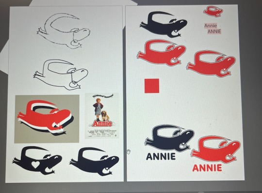
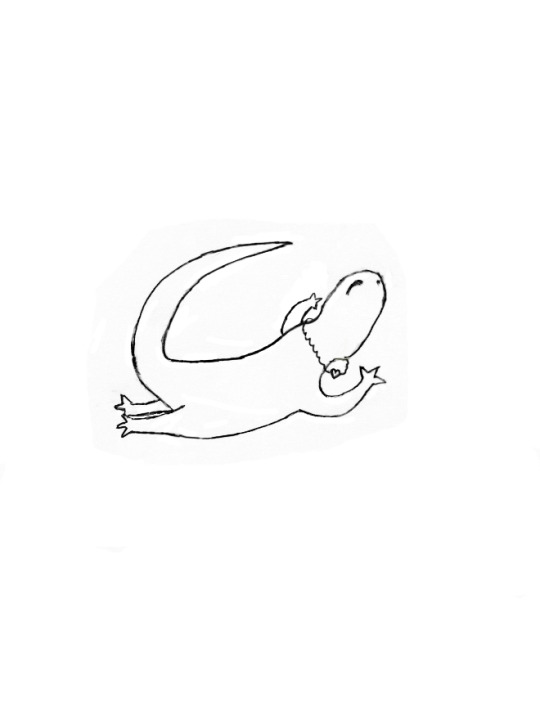
For Annie's "leaping lizard" I went through multiple iterations but quickly found that filling the body in would be the most effective way to create a strong logo. I then used closure to place a heart on the lizards beard where her heart locket would be placed around her neck. Finally, I decided to use the red color from the movie poster as the main color of the lizard, with the same with and black outlines.
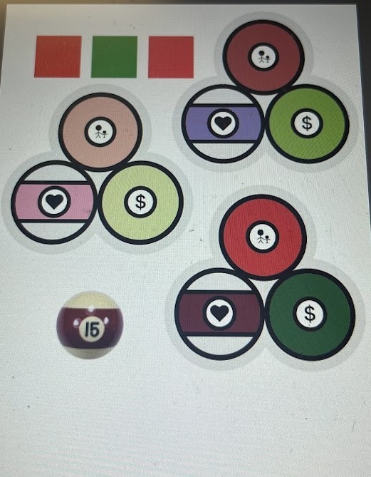
For Daddy Warbucks, I didn't alter my image much from the initial sketch, and in the end I had more trouble finding a color palette that I thought was effective.
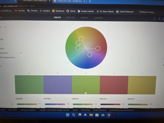
I ended up finding a "money" like green and used its double split complementary to find a purple to represent how he learns to love and a red to represent his relationship with Annie.
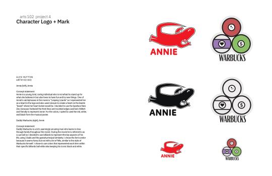
We Wrote concept statements to include on the final project and attached our objects from Illustrator to the InDesign template to create our final project.
Chapter 15 talked about designing apps for mobile devices. Within my classes for Computer Science we have made mock ups for several apps, usually with much more focus on functionality than ascetics. Chapter 16 talks about giving our projects a "soul". It was interesting hearing from higher ups at different Ecommerce cites and the similarities and differences between how they run things and their beliefs. UX is another topic I have expertise in, as I believe it goes hand and hand with UI.
"I would not say that programming skills are required as much as they are extremely advantageous to the user experience designer." - Bruce Charonnat
That's me! I figured the combination of programming and graphic design would be a good combination!
1 note
·
View note
Text
Arts 102 Blog Post 4
Within weeks 7 & 8 of ARTS 102, we have begun project 4: "Character logo and Mark". In this project we were tasked with watching one of 4 movie selections and creating a logo for two of the characters within the film. For my project I watched my favorite Christmas movie, Annie, and decided to create logos for Annie herself and Daddy Warbucks.
To begin the project we started by creating concept matrices for our characters. This method helped create 100 unique ideas by crossing over defining traits about our characters.
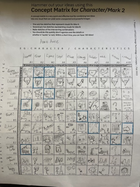
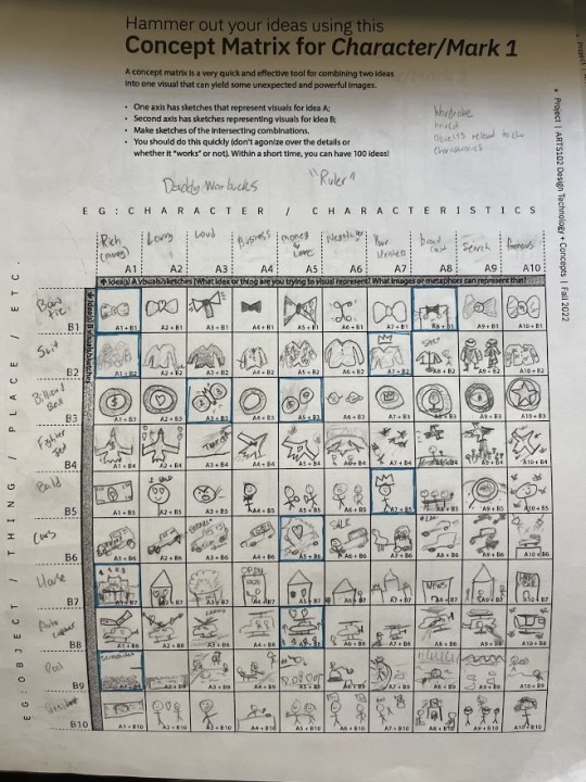
We then chose some of these ideas to resketch in a larger scale within the sketching process.
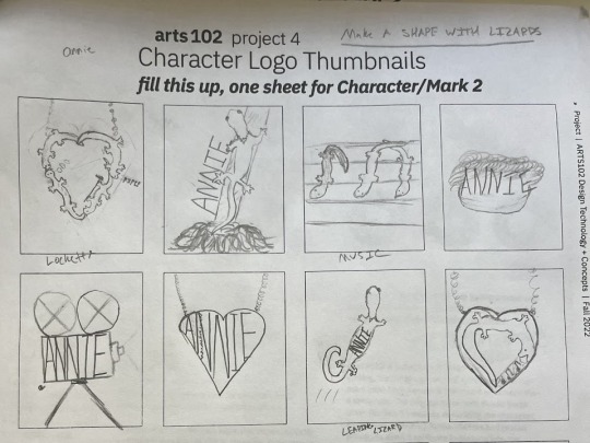
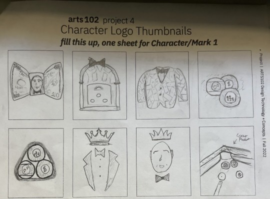
Within the film, one of Annie's catchphrases is "leaping lizards" I thought that utilizing this quote as a mark for Annie would be both interesting and unique. Likewise, within the film Hannigan referred to Warbucks as a cue ball, and I think that the high class sport of pool fit his character so I decided to pursue a pool theme.
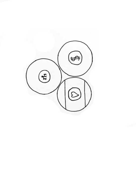
I am excited to move into illustrator and continue to work on my logos. I hope to use a friendly soft round font for Annie and a straighter taller font for Warbucks.
Within this weeks reading we learned about the backbone of a ted talk, which had 9 ~easy~ steps laid out for us. I think if I had to give a ted talk to people, I would probably talk about motivation and what drives me as a creator, pushing my viewers to pursue things they genuinely enjoy and living a fulfilled life. I am not how impactful my TED Talk would be, but it would be an interesting process to write one, even just for myself. The idea of Eccentrics are very interesting to me, those who wish to create unique pieces and to be the first. Within my time as a content creator, I've heard the advice: "either be the first to do something, or do something that everybody else is doing, but do it better." While I feel it is easier to build on and improve an already created idea, it is much more satisfying to create your own unique creation as it will often stand out that much more. Chapter 13 mentions something that I was worried about for a while. As applications become more user friendly, it can be worrying that a once elusive skill is now becoming more assessable, making that skill you own less unique. Of course, the difference between someone who has a decent amount experience such as myself and a professional is massive. My professor has shown me 4 or 5 solutions to a problem that I wasn't even sure how to approach. I believe that this idea of oversaturation still holds some merit between those in a similar skill level. More and more students are beginning to pursue computer science degrees such as me in hopes of accessing the lucrative field. Within a sea of talented applicants, the best way to stand out is to showcase your own personal experiences and interests. Many people can share a skill and solve the same challenge, maybe even in the same way. But that doesn't make them the same person.
1 note
·
View note
Text
Arts 102 Blog Post 3
Within weeks 4 & 5 of 102, We worked on our "Get out the vote / great ideas" poster.
While working on this project, we were fortunate enough to have multiple rounds of peer / professor critique which helped us create an effective idea, and execute it well. I progressed through many different ideas on this project thanks to critique, and while it can be discouraging at first to return to the drawing board so many times, I know it was worth it to create and effective product.
We begun the project with sketches, and while hand drawn art isn't my strong suit, I also struggled to create any effective ideas.
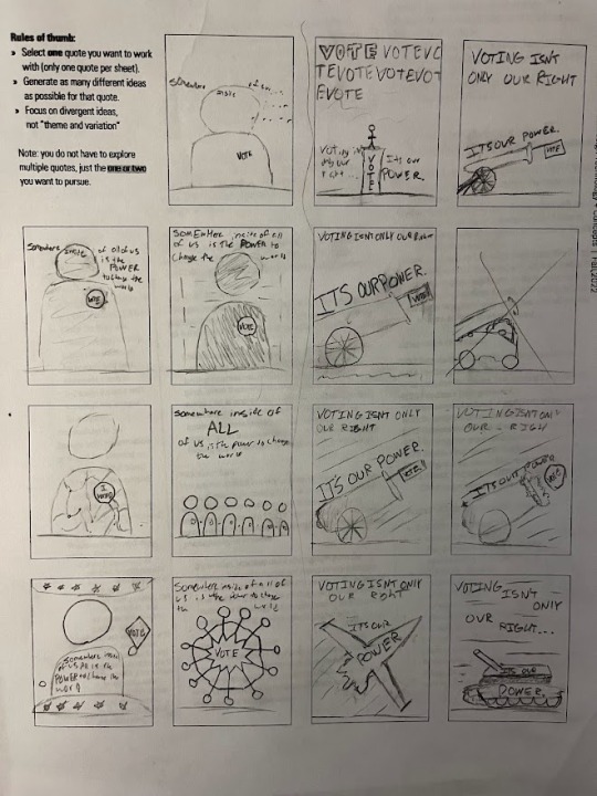
My initial ideas, of trying to show voting as "our power" using artillery doesn't really make sense, as how would a tank help convince someone to vote. If I could do the sketches again, I would try and do a completely different concept in as many boxes as possible, rather than just focusing on two.
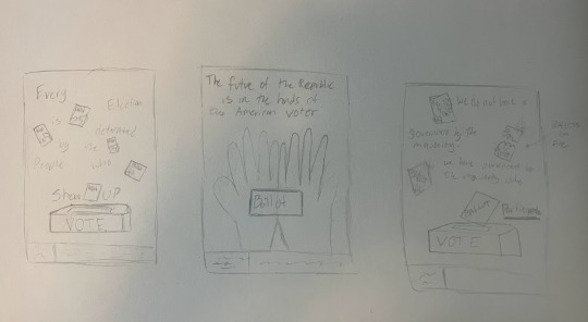
I then decided to switch to photography as my medium rather than drawing on paper or digitally and that helped lead me towards some new ideas. I liked the quote "Every election is determined by the people who show up", and the idea of showing the contrast between votes that do and don't make it to the polls. My initial idea was lighting ballots on fire to signify those that were never cast, as some refer to not voting as "burning your vote".

Unfortunately, lighting votes on fire seems to be anti-voting, rather than for it. It was still a fun time capturing the photos in this stage, though.
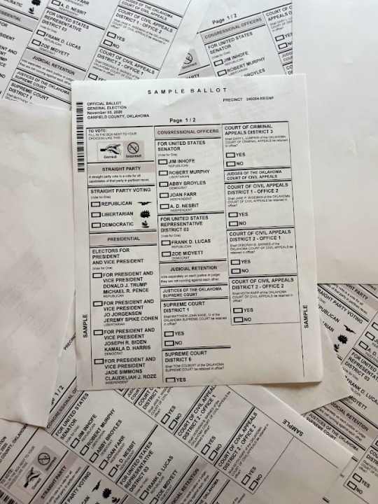
I then moved onto the collage idea, using blank sheets of paper to signify votes that didn't make it.
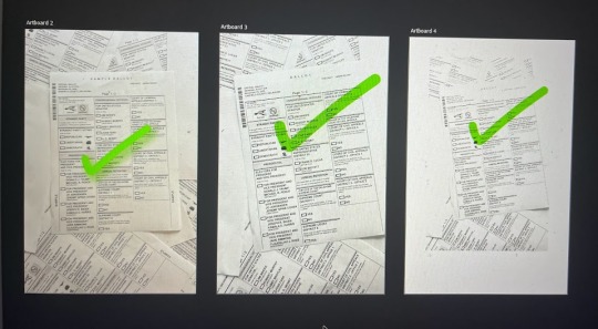
building off the collage idea, I added in a green check on the ballot to show that it has been completed/submitted. I originally thought about filling out the ballots to show they were completed, but that would force me to choose a side which we don't want to do with this project.
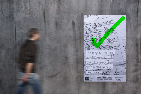
Finally, I moved around the check until I liked its location & size, and added the quote to finish the project! This project truly challenged me as a creator by forcing me to return to the drawing board so many times. Now that its complete, it feels much more satisfying than if I had just gone with my original idea.
Within the reading this week we read chapters 6-10. Within chapter 6, we learned about books and book jackets. While many people say not to judge a book by its cover, people still often do, some choosing one book over another based on the imagery, and others steering completely away from certain books based on their cover. Also, the text on the interior of books needs to be designed too, and while most books probably see the same some, such as textbooks have extremely unique design from one to another. Chapter 7 referred to the editorial design within newspapers and magazines. As someone who doesn't often read these forms of media, it was interesting learning about how they are made. Chapter 8 talks about Social innovation, which seems to be close to a synonym to making a positive social impact. The project we just did would probably fit into this category, helping bring more people out to vote! Chapter 9 on branding and packaging was an interesting read to me. I have a box of Wheaties in my room which I bought only because their packaging had Lebron James on them. Chapter 10 goes over illustration design, which was a fun read looking at all of the different pieces featured in the chapter. Illustration design would probably be a skill I would like to work on to improve in!
1 note
·
View note
Text
Arts 102 Blog Post 2
Within the third and fourth weeks of Arts 102, we were able to complete project #2, our abstract typography, and have begun project #3, the GoTV & great ideas poster.
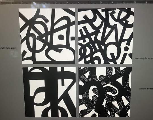
In project two, I brought my 3 designs I had completed to critique. (top right, top left, bottom left). Thanks to the class, I found that my bottom left was the weakest, due to the font I chose having varying line weights. So, when I wanted to move on to make my new design to fit the third slot I knew I wanted to go with a font that was a little more unique. I ended up going with "Pinecone MVB Round" which had dimples within the letters that were unique. Overall, I was very proud of my 3 final images, as usually I struggle with abstract but I believe these came out well! I think that the restrictions, (same font, same size, same color), helped me stay focused despite not working towards one particular picture or goal!
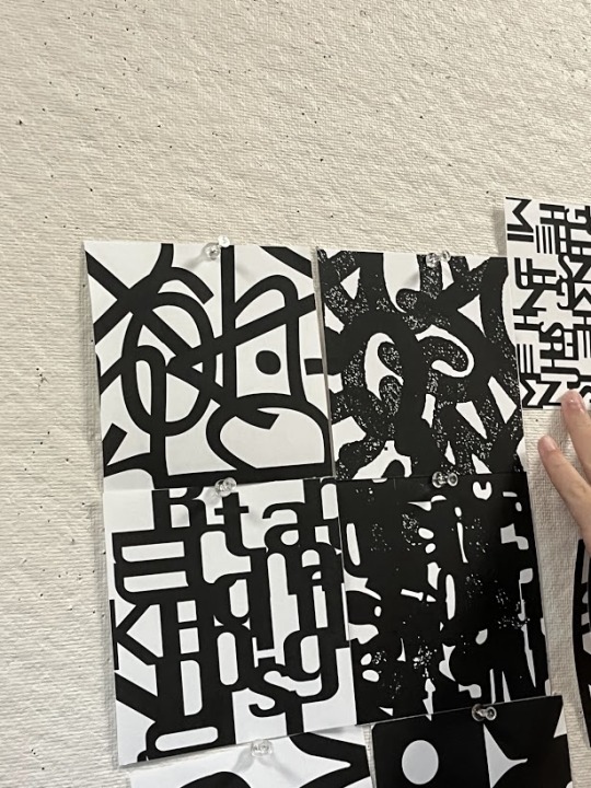
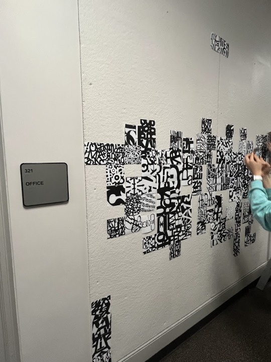
Additionally, we got to hang our art on the wall in McMaster which was exciting because I've never had my work on display before!
As we have begun project 3, I came out to a slow start with my sketches, and I was unable to create anything particularly impactful initially. As we learned in the presentation, a good idea with poor execution will never reach it's true potential, so I returned to the drawing board.
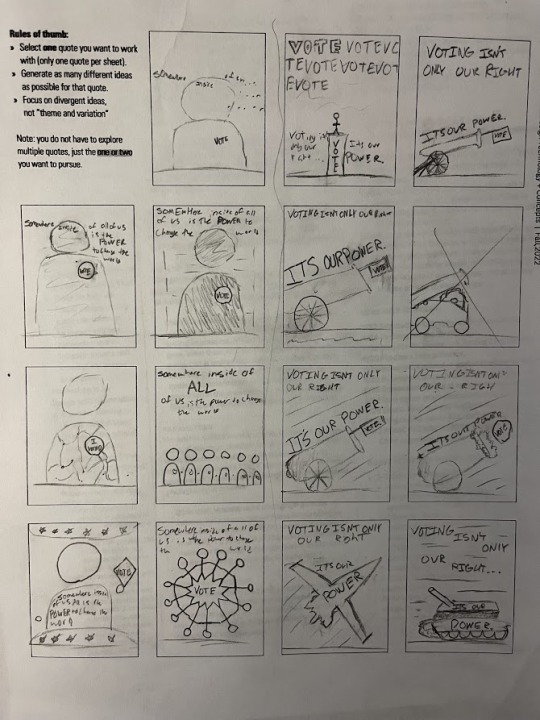
While reviewing everybody's sketches, I began to think deeper into how I could make a more impactful poster. One idea that was presented was photographing real life images and using them for the final poster. I thought about how sometimes people refer to not voting as 'burning your vote' and I decided I would be lighting some ballots on fire. I haven't begun on my imagery yet, but I think that using real photos will help me make a more impactful image in the end. (left and right image)
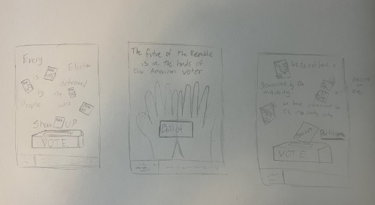
During the reading I was able to learn about the effectiveness of partnerships and teamwork in the field of graphic design. I personally enjoy working in groups, but in the computer science field many prefer working alone. I think that the ideas between working together on code and art is similar. If you have a large idea you wish to implement, it can be tough to collaborate with others who may have a different idea on how to do things. It all comes down to respect and sharing the load at the end of the day. Chapter 4 was an interesting read, learning about Letters and Type just after our typography abstract was particularly topical. Accessing a font today is a simple as clicking on a drop down menu and picking so it is interesting to see behind the scenes how they can be made. Chapter 5 had to do with logos. I had always thought logos were just a picture made to represent a company but It was interesting to find that they can often represent a larger narrative as well.
1 note
·
View note
Text
Arts 102 Blog Post 1
Within the first two weeks of Arts 102, we have completed Project 1, started on project 2, and read Chapters 1&2 of "Becoming a Graphic & Digital Designer".
For project 1, we used an AI photo generation tool, DALL-E mini, to generate thumbnail phots that represented a 6 word memoir we had written. The AI is truly fascinating with its ability to create anything you ask it too, albeit sometimes it doesn't know what you are asking for or it produces the image in low quality. If I could redo the project I would probably use DALL-E to generate at least one landscape or painting style image because I believe it is best at creating those. I chose to leave the images as DALL-E created them, as I wanted to showcase the raw creation of the AI and incorporate the text as best I could.
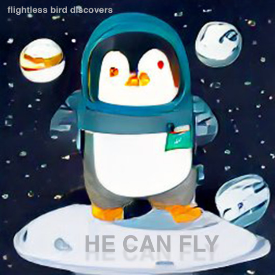
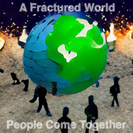
So far, in project 2 we have begun to work on a typographic abstraction. Typically I struggle with abstract because I like to make pictures of things I know, or create towards a vision I have in my mind. The limitations of project 2 (one font, one size per artboard) have really helped me work to create something truly abstract without having so many options to choose from.

Within the reading, we learned about what motivates many graphic designers, along with what inspired them to become graphic designers. As somebody who has only recently began to pursue graphic design within school, it was interesting to read almost a Q/A with many experienced designers, because I didn't really know anything about the 'pros' in the field before or where most of them begin. Chapter 2 begins to answer the split between working for an existing studio or firm, or starting your own business. As a computer science major, this reminded me a lot about how many need to choose between joining a huge company, like the Google or Amazon of the world or joining/creating your own startup. For me personally, Its not a question I think I am ready to answer myself. The idea of a startup, creating my own product or business and sharing it with the world seems like the coolest thing, but the security and stableness of joining a preestablished company is surely the 'safe' option. I overall really enjoyed the Q/A style of the book as it made it more fun for me to read as we bounced from topic to topic!
1 note
·
View note