Don't wanna be here? Send us removal request.
Text
Course Reflection
Although I came into this class with a large amount of experience with art and (based on what I know now) design, there was much to learn through each of these projects. Each project challenged me in their own ways, and learning what I did and did not know along the way was very rewarding and challenging. I have thoroughly enjoyed this class due to its ability to expose me to new technologies and tools that I had not used before. Now having new experience with these technologies and tools, I am able to create pieces of art and design that I may not have been able to execute the ideas as accurately without the tools.
This class also allowed me to deep-dive into who I am as an artist or designer. I explored what my “style” was and what types of shape, colors, and fonts I naturally gravitate to. In a time where I do not make enough time outside of school to create, this class reminded me how much I love to create and design things in my life. Since starting this class, I have started to incoorporate more designing and creating into my every day life.
Coming into this class not knowing what to expect, I was very thankful to be able to participate in this class and further develop my skills in design.


0 notes
Text
Reflection 6
These past two weeks, the class competed a fifth project and started on the sixth and final project of the semester. The fifth project involved developing and executing an understanding of syntax and semantics. Individually, the students were asked to pick an object where four subobjects could be identified. I chose to do housing. At first I considered doing different types of architecture for houses from different time periods/cultures (Victorian, Colonial, French, etc.). However, I found that it would be much simpler and easier to understand and relate to as a viewer if I chose more contrasting examples as housing. The final objects I chose were an igloo, a barn, a cabin, and a castle. Using my new understanding of syntax and semantics, I demonstrated how these types of housing contrasted from one another and how their roles as housing has impacted society’s view on them. I found this fairly easy compared to if I had chosen the Victorian, Colonial, French, etc. examples. Overall, I found this project very interesting and useful as I now am more aware of the syntax and semantics of objects and products all around me. I can see how products are marketed to certain audiences and consumers and has made me aware of why I have a specific style/liking of particular of products.


0 notes
Text
Reflection 5
These past two weeks, one of which being spring break, remained focused on the development and completion of our character logos. My main struggle when completing this project was navigating Adobe Illustrator and learning how to use the tools to create the logos I desired. It took lots of googling and working through obstacles. I eventually came to my finished products and was proud of how far they had come and my ability to execute my intended designs effectively.
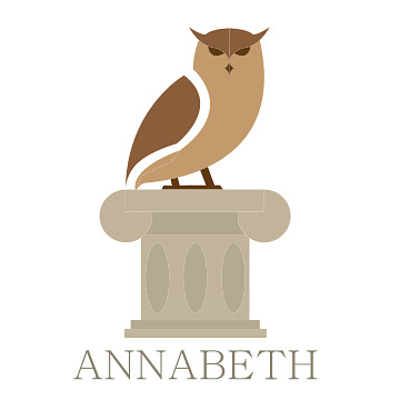
Following critique, there are only a few changes that I would implement into my work. Regarding Percy’s logo, I would go back and make the different colored layer of the trident/sword larger and provide them more space in between each layer to allow the viewer to distinguish the different colors, even from far away. Another change that I am considering is changing the break in the trident/sword into a lightning bolt to reference the first book of the Percy Jackson & the Olympians series: The Lightning Thief. Overall, I was very happy with my designs and look forward to the rest of the semester in hopes of further improving my design skills.


0 notes
Text
Reflection 4
The class started a new project in these previous weeks. We, as students, were tasked with designing logos for two characters from a movie, television show, video game, book, etc. The goal is to display specific identifiable characteristics or objects associated with these characters. I was very excited for this project because I enjoy designing pieces similar to those we are working towards. I enjoy expressing unique personalities and storylines in ways not already developed by the original designers of the characters. Ever since I was young, I had a love of Greek mythology. When I read the Percy Jackson books and following series by Rick Riordian, I created bookmarks based off of some of my favorite characters. I drew elaborate designs unique to each character, cut them out, and laminated them. The realization that I could choose the characters from these books to base my logos off of was relieving, as I had spent a longer period of time than appropriate trying to choose what movie, television show, etc. I should base my project after.
After finally landing on Percy and Annabeth, the designs began to come to me pretty naturally, as I had done something similar to this before 8 or so years ago. First deciding to incorporate symbols from their godly parents was easy because these characters take a lot of pride in their lineage. Having created 16 different design ideas for each character, I am still currently unsure which I would like to take on further in this project. I feel as though some of the designs are stronger than others, and my current goal is to determine what features about these designs give them this quality.
What I like about this project is the feeling and understanding that will be unique to each viewer of the logos. I look forward to seeing my classmates’ logos, especially if I do not recognize the movies, television shows, etc. I think that it is such a fascinating thing that we are creating something that will give the viewer an idea about the character without knowing anything about them. The reading this week discussed graphic designers’ ability to manipulate “understanding” and create a clear message for any viewer to enjoy and interpret. In the reading, Erik Adigard emphasizes the importance than “experience matters more than information”, and this statement has changed my perspective on this project. It matters very little what you know about the characters when compared to the experience the piece gives to the viewer. My goal is to not make viewers who are unfamiliar with the characters feel as though they cannot quite grasp what the logo is supposed to display in an experience sense.


0 notes
Text
Reflection 3
These past two weeks, the class has been working on a designing their own poster promoting voting. A list of quotes concerning voting was provided, and the student was to chose one to base their project on. The quote I chose was “Every election is determined by the people who show up” by Larry J. Sabato. When starting the process of designing my poster, I created 10 sketches of different ideas I could pursue. I decided early on that I wanted to create something that would speak to the common citizen. As a common citizen, it is easy to feel as though you have no say in elections. That your vote is such a small number in the millions of others. This feeling can be discouraging, and a large number of people have decided that they do not wish to participate in elections. My goal was to inspire those people and remind them that their voice is what determines the output of the elections and therefore the state of their city, state, country, etc.
After lots of consideration, I decided to create a poster displaying a colorful kitchen with magnets on the fridge spelling out “gone to vote”. I felt that this would give the viewer a warm, homey feeling. In the beginning, I thought that I was going to go more of a digital route with my execution. Either through drawing images myself or putting pictures I found together to make a collage-like image. Neither of these spoke to me or felt that I would be able to execute my idea in a way that would give it justice. Then came the idea to cut out and construct my image using colored construction paper, gluing the pieces together, and scanning the project to make a digital image. Although this method took lots of time and effort, I was very satisfied with the results. I think that the effect of a physical project has a different impression on the viewer which can be connected to our reading for these past two weeks.
The reading for these past two weeks discussed physical books versus e-books. It explained how physical books are still relevant and desired in today’s society due to the want for an “experience away from the glowing screens” and the “sensation of something real”. I think that this feeling is the reason that my chosen method was so successful in creating a different felt for the viewer.


0 notes
Text
Reflection 2
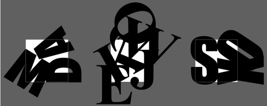
During the past two weeks, the class worked on our second project that focused on typography. In the beginning, I found it difficult and strange while attempting to create art out of letters. I tried to make different shapes or incorporate contrast or emphasis with the different curves, lines, and dots. All I saw were letters. Most of my attempts even looked like logos to me. I eventually came to a couple ideas that played with negative space and the relationship between the letters through having them appear as though they were leaning on one another. I found, when comparing my designs with those of my classmates, that I like bold fonts. All three of my designs were created with bold fonts. This was humorous to me because this design choice was not made intentionally.
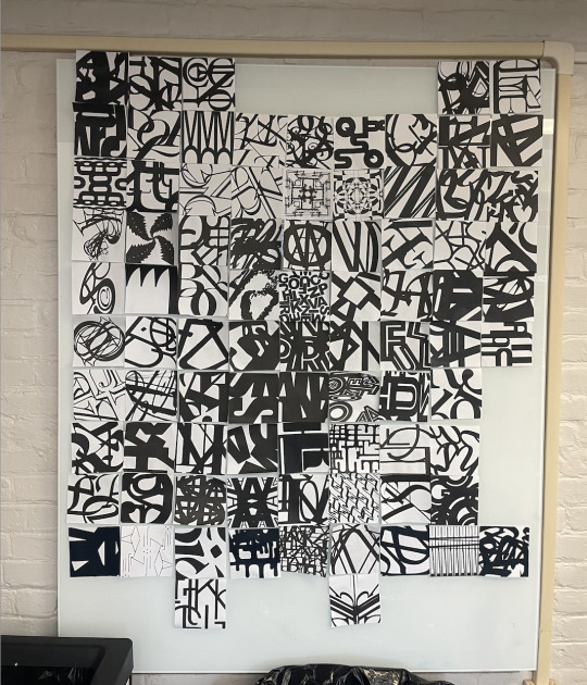
After cutting out our designs, we taped them up on a board in the classroom, attempting to create a new, larger piece of art. I felt a small sense of pride when all three of my pieces were chosen to serve as the foundation for the larger piece as my classmates and I decided we wanted to create a sense of movement by separating the lighter and darker pieces (thinner and bolder fonts). The darker parts were blended into the lighter parts, and I personally liked how the collaborative piece turned out.
The reading for these past two weeks connected to this project in its discussion of partnerships. The designers in this portion of the textbook discussed how partnerships required trust, respecting each other’s point of view and opinion, asking for feedback, and creating opportunities for each other. I found that the process of creating the collaborative piece used all of these aspects as I worked with my classmates. Each person had a different angle on the project that had a valuable contribution to the overall picture. I found that flexibility allowed for me to encourage ideas that I would not have chosen myself, and, in the end, put another’s work in the spotlight in its own way. I found this project very rewarding as I was pleasantly surprised with my experience in the end as I collaborated with my classmates compared to how I felt during the execution of my own pieces.


0 notes
Text
Reflection 1
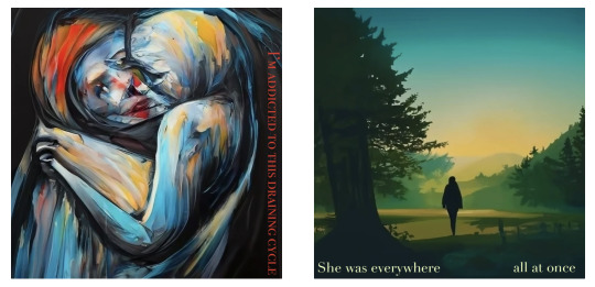
The first two weeks of class in ARTS 102 have been both frustrating and rewarding. The first project involving a 6-word memoir and an AI generated photo challenged me in more ways than expected. I was forced to reflect on my life and condense all its meaning into 6 words. It felt impossible. I wrote down multiple ideas, most of them feeling childish and radiating self-pity. Most of them did not even seem to describe me. They expressed short phases of my life that, even having a large impact on who I am today, didn’t seem to capture who I feel I am as a person. Finally coming down to “She was everywhere all at once” and “I’m addicted to this draining cycle”, I was mostly satisfied. Then came the task of finding AI generated photos that perfectly embodied what I was trying to say with these 6-word memoirs. Nothing was right. There were components of each photo I sorted through that needed to be changed. However, I eventually put my perfectionism aside and selected two photos that I felt gave the viewer the feeling I intended. The textbook reading for these past two weeks resonated with me, even having only worked on these past two design projects and not having any other experience with design. Within the reading, Michael Bierut discussed “finding your own voice” when being tasked with a project and working in the design world in general. I would say that this is going to be my greatest battle. How I want to present myself through my work, how I plan to make my projects mine. It’s a long road ahead, and although I have been met with challenges and frustration, I can confidently say I cannot wait.

1 note
·
View note