Don't wanna be here? Send us removal request.
Text
Test a Logistic Regression Model
Full Research on Logistic Regression Model
1. Introduction
The logistic regression model is a statistical model used to predict probabilities associated with a categorical response variable. This model estimates the relationship between the categorical response variable (e.g., success or failure) and a set of explanatory variables (e.g., age, income, education level). The model calculates odds ratios (ORs) that help understand how these variables influence the probability of a particular outcome.
2. Basic Hypothesis
The basic hypothesis in logistic regression is the existence of a relationship between the categorical response variable and certain explanatory variables. This model works well when the response variable is binary, meaning it consists of only two categories (e.g., success/failure, diseased/healthy).
3. The Basic Equation of Logistic Regression Model
The basic equation for logistic regression is:log(p1−p)=β0+β1X1+β2X2+⋯+βnXn\log \left( \frac{p}{1-p} \right) = \beta_0 + \beta_1 X_1 + \beta_2 X_2 + \dots + \beta_n X_nlog(1−pp)=β0+β1X1+β2X2+⋯+βnXn
Where:
ppp is the probability that we want to predict (e.g., the probability of success).
p1−p\frac{p}{1-p}1−pp is the odds ratio.
X1,X2,…,XnX_1, X_2, \dots, X_nX1,X2,…,Xn are the explanatory (independent) variables.
β0,β1,…,βn\beta_0, \beta_1, \dots, \beta_nβ0,β1,…,βn are the coefficients to be estimated by the model.
4. Data and Preparation
In applying logistic regression to data, we first need to ensure that the response variable is categorical. If the response variable is quantitative, it must be divided into two categories, making logistic regression suitable for this type of data.
For example, if the response variable is annual income, it can be divided into two categories: high income and low income. Next, explanatory variables such as age, gender, education level, and other factors that may influence the outcome are determined.
5. Interpreting Results
After applying the logistic regression model, the model provides odds ratios (ORs) for each explanatory variable. These ratios indicate how each explanatory variable influences the probability of the target outcome.
Odds ratio (OR) is a measure of the change in odds associated with a one-unit increase in the explanatory variable. For example:
If OR = 2, it means that the odds double when the explanatory variable increases by one unit.
If OR = 0.5, it means that the odds are halved when the explanatory variable increases by one unit.
p-value: This is a statistical value used to test hypotheses about the coefficients in the model. If the p-value is less than 0.05, it indicates a statistically significant relationship between the explanatory variable and the response variable.
95% Confidence Interval (95% CI): This interval is used to determine the precision of the odds ratio estimates. If the confidence interval includes 1, it suggests there may be no significant effect of the explanatory variable in the sample.
6. Analyzing the Results
In analyzing the results, we focus on interpreting the odds ratios for the explanatory variables and check if they support the original hypothesis:
For example, if we hypothesize that age influences the probability of developing a certain disease, we examine the odds ratio associated with age. If the odds ratio is OR = 1.5 with a p-value less than 0.05, this indicates that older people are more likely to develop the disease compared to younger people.
Confidence intervals should also be checked, as any odds ratio with an interval that includes "1" suggests no significant effect.
7. Hypothesis Testing and Model Evaluation
Hypothesis Testing: We test the hypothesis regarding the relationship between explanatory variables and the response variable using the p-value for each coefficient.
AIC (Akaike Information Criterion) and BIC (Bayesian Information Criterion) values are used to assess the overall quality of the model. Lower values suggest a better-fitting model.
8. Confounding
It is also important to determine if there are any confounding variables that affect the relationship between the explanatory variable and the response variable. Confounding variables are those that are associated with both the explanatory and response variables, which can lead to inaccurate interpretations of the relationship.
To identify confounders, explanatory variables are added to the model one by one. If the odds ratios change significantly when a particular variable is added, it may indicate that the variable is a confounder.
9. Practical Example:
Let’s analyze the effect of age and education level on the likelihood of belonging to a certain category (e.g., individuals diagnosed with diabetes). We apply the logistic regression model and analyze the results as follows:
Age: OR = 0.85, 95% CI = 0.75-0.96, p = 0.012 (older age reduces likelihood).
Education Level: OR = 1.45, 95% CI = 1.20-1.75, p = 0.0003 (higher education increases likelihood).
10. Conclusions and Recommendations
In this model, we conclude that age and education level significantly affect the likelihood of developing diabetes. The main interpretation is that older individuals are less likely to develop diabetes, while those with higher education levels are more likely to be diagnosed with the disease.
It is also important to consider the potential impact of confounding variables such as income or lifestyle, which may affect the results.
11. Summary
The logistic regression model is a powerful tool for analyzing categorical data and understanding the relationship between explanatory variables and the response variable. By using it, we can predict the probabilities associated with certain categories and understand the impact of various variables on the target outcome.
0 notes
Text
Test a Basic Linear Reggression
Simple linear regression is used to estimate the relationship between two quantitative variables. You can use simple linear regression when you want to know:
How strong the relationship is between two variables (e.g., the relationship between rainfall and soil erosion).
The value of the dependent variable at a certain value of the independent variable (e.g., the amount of soil erosion at a certain level of rainfall).
Regression models describe the relationship between variables by fitting a line to the observed data. Linear regression models use a straight line, while logistic and nonlinear regression models use a curved line. Regression allows you to estimate how a dependent variable changes as the independent variable(s) change. Simple linear regression example .You are a social researcher interested in the relationship between income and happiness. You survey 500 people whose incomes range from 15k to 75k and ask them to rank their happiness on a scale from 1 to 10.
Your independent variable (income) and dependent variable (happiness) are both quantitative, so you can do a regression analysis to see if there is a linear relationship between them.
If you have more than one independent variable, use multiple linear regression instead.
Table of contents
Assumptions of simple linear regression
How to perform a simple linear regression
Interpreting the results
Presenting the results
Can you predict values outside the range of your data?
Other interesting articles
Frequently asked questions about simple linear regression
Assumptions of simple linear regression
Simple linear regression is a parametric test, meaning that it makes certain assumptions about the data. These assumptions are:
Homogeneity of variance (homoscedasticity): the size of the error in our prediction doesn’t change significantly across the values of the independent variable.
Independence of observations: the observations in the dataset were collected using statistically valid sampling methods, and there are no hidden relationships among observations.
Normality: The data follows a normal distribution.
Linear regression makes one additional assumption:
The relationship between the independent and dependent variable is linear: the line of best fit through the data points is a straight line (rather than a curve or some sort of grouping factor).
If your data do not meet the assumptions of homoscedasticity or normality, you may be able to use a nonparametric test instead, such as the Spearman rank test. Example: Data that doesn’t meet the assumptions.You think there is a linear relationship between cured meat consumption and the incidence of colorectal cancer in the U.S. However, you find that much more data has been collected at high rates of meat consumption than at low rates of meat consumption, with the result that there is much more variation in the estimate of cancer rates at the low range than at the high range. Because the data violate the assumption of homoscedasticity, it doesn’t work for regression, but you perform a Spearman rank test instead.
If your data violate the assumption of independence of observations (e.g., if observations are repeated over time), you may be able to perform a linear mixed-effects model that accounts for the additional structure in the data.
Prevent plagiarism. Run a free check.
How to perform a simple linear regression
Simple linear regression formula
The formula for a simple linear regression is:

y is the predicted value of the dependent variable (y) for any given value of the independent variable (x).
B0 is the intercept, the predicted value of y when the x is 0.
B1 is the regression coefficient – how much we expect y to change as x increases.
x is the independent variable ( the variable we expect is influencing y).
e is the error of the estimate, or how much variation there is in our estimate of the regression coefficient.
Linear regression finds the line of best fit line through your data by searching for the regression coefficient (B1) that minimizes the total error (e) of the model.
While you can perform a linear regression by hand, this is a tedious process, so most people use statistical programs to help them quickly analyze the data.
Simple linear regression in R
R is a free, powerful, and widely-used statistical program. Download the dataset to try it yourself using our income and happiness example.
Load the income.data dataset into your R environment, and then run the following command to generate a linear model describing the relationship between income and happiness: R code for simple linear regressionincome.happiness.lm <- lm(happiness ~ income, data = income.data)
This code takes the data you have collected data = income.data and calculates the effect that the independent variable income has on the dependent variable happiness using the equation for the linear model: lm().
To learn more, follow our full step-by-step guide to linear regression in R.
Interpreting the results
To view the results of the model, you can use the summary() function in R:summary(income.happiness.lm)
This function takes the most important parameters from the linear model and puts them into a table, which looks like this:

This output table first repeats the formula that was used to generate the results (‘Call’), then summarizes the model residuals (‘Residuals’), which give an idea of how well the model fits the real data.
Next is the ‘Coefficients’ table. The first row gives the estimates of the y-intercept, and the second row gives the regression coefficient of the model.
Row 1 of the table is labeled (Intercept). This is the y-intercept of the regression equation, with a value of 0.20. You can plug this into your regression equation if you want to predict happiness values across the range of income that you have observed:happiness = 0.20 + 0.71*income ± 0.018
The next row in the ‘Coefficients’ table is income. This is the row that describes the estimated effect of income on reported happiness:
The Estimate column is the estimated effect, also called the regression coefficient or r2 value. The number in the table (0.713) tells us that for every one unit increase in income (where one unit of income = 10,000) there is a corresponding 0.71-unit increase in reported happiness (where happiness is a scale of 1 to 10).
The Std. Error column displays the standard error of the estimate. This number shows how much variation there is in our estimate of the relationship between income and happiness.
The t value column displays the test statistic. Unless you specify otherwise, the test statistic used in linear regression is the t value from a two-sided t test. The larger the test statistic, the less likely it is that our results occurred by chance.
The Pr(>| t |) column shows the p value. This number tells us how likely we are to see the estimated effect of income on happiness if the null hypothesis of no effect were true.
Because the p value is so low (p < 0.001), we can reject the null hypothesis and conclude that income has a statistically significant effect on happiness.
The last three lines of the model summary are statistics about the model as a whole. The most important thing to notice here is the p value of the model. Here it is significant (p < 0.001), which means that this model is a good fit for the observed data.
Presenting the results
When reporting your results, include the estimated effect (i.e. the regression coefficient), standard error of the estimate, and the p value. You should also interpret your numbers to make it clear to your readers what your regression coefficient means: We found a significant relationship (p < 0.001) between income and happiness (R2 = 0.71 ± 0.018), with a 0.71-unit increase in reported happiness for every 10,000 increase in income.
It can also be helpful to include a graph with your results. For a simple linear regression, you can simply plot the observations on the x and y axis and then include the regression line and regression function:

Here's why students love Scribbr's proofreading services
Can you predict values outside the range of your data?
No! We often say that regression models can be used to predict the value of the dependent variable at certain values of the independent variable. However, this is only true for the range of values where we have actually measured the response.
We can use our income and happiness regression analysis as an example. Between 15,000 and 75,000, we found an r2 of 0.73 ± 0.0193. But what if we did a second survey of people making between 75,000 and 150,000?

The r2 for the relationship between income and happiness is now 0.21, or a 0.21-unit increase in reported happiness for every 10,000 increase in income. While the relationship is still statistically significant (p<0.001), the slope is much smaller than before.

What if we hadn’t measured this group, and instead extrapolated the line from the 15–75k incomes to the 70–150k incomes?
You can see that if we simply extrapolated from the 15–75k income data, we would overestimate the happiness of people in the 75–150k income range.

If we instead fit a curve to the data, it seems to fit the actual pattern much better.
It looks as though happiness actually levels off at higher incomes, so we can’t use the same regression line we calculated from our lower-income data to predict happiness at higher levels of income.
Even when you see a strong pattern in your data, you can’t know for certain whether that pattern continues beyond the range of values you have actually measured. Therefore, it’s important to avoid extrapolating beyond what the data actually tell you.
0 notes
Text
Running a Lasso Regression Analysis
My task today is to test a running a lasso regression analysis. A lasso regression analysis was conducted to identify a subset of variables from a pool of 8 quantitative predictor variables that best predicted a quantitative response variable measuring country democracy score. A lasso regression analysis was conducted to identify a subset of variables from a pool of 8 quantitative predictor variables that best predicted a quantitative response variable measuring country democracy score.
Quantitative predictor variables include:
income per person - Gross Domestic Product per capita in constant 2000 US$;
urban rate - 2008 urban population (% of total);
employ rate - 2007 total employees age 15+ (% of population);
alcohol consumption - 2008 alcohol consumption per adult (age 15+), litres;
armed forces rate - Armed forces personnel (% of total labor force);
CO2 emissions - 2006 cumulative CO2 emission (metric tons);
oil per person - 2010 oil Consumption per capita (tonnes per year and person);
electric per person - 2008 residential electricity consumption, per person (kWh).
All predictor variables were standardized to have a mean of zero and a standard deviation of one.
To run a lasso regression analysis, I wrote the following SAS code.
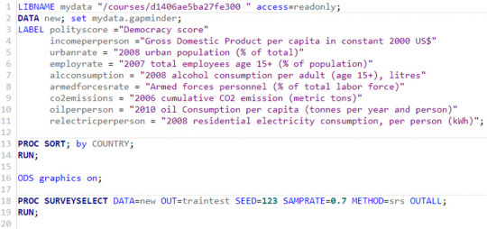

Data were randomly split into a training set that included 70% of the observations (N=37) and a test set that included 30% of the observations (N=23). The least angle regression algorithm with k=10 fold cross validation was used to estimate the lasso regression model in the training set, and the model was validated using the test set. The change in the cross validation average (mean) squared error at each step was used to identify the best subset of predictor variables.
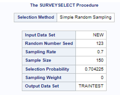
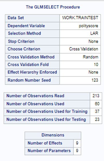
Of the 9 predictor variables, 3 were retained in the selected model. During the estimation process, polity scores were most strongly associated with income per person followed by alcohol consumption and employment rate. Income per person and alcohol consumption was positively associated with the polity score and employment rate was negatively associated with the polity score.
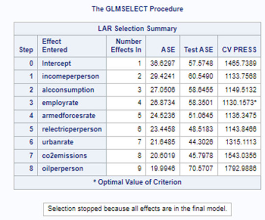
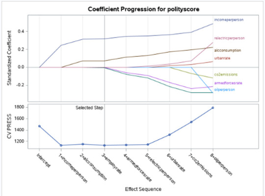
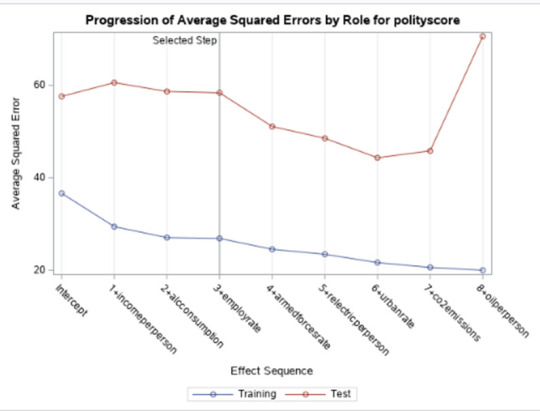
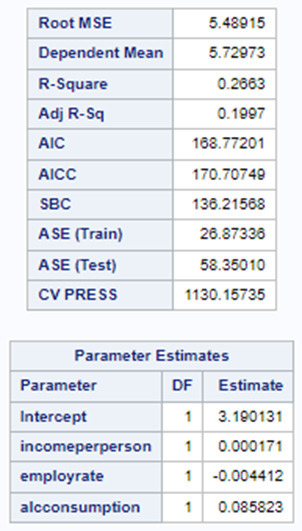
In the following screenshot, we can see the values of the coefficients in the linear regression equation. Thus, the beta sub zero is 3.1901, beta sub one equals 0.0002, beta sub two – (-0.0044), beta sub three – 0.0858. Now we know that our equation for the multiple regression line is:
polity score = 3.1901 + 0.0002 * income per person – 0.0044* employ rate + 0.0858* alcohol consumption.
0 notes
Text
Creating a graphs for your data
CODE
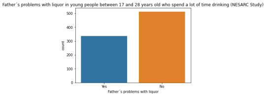
#Univariate bar graph for categorical variables sub2["S2DQ1"] = sub2["S2DQ1"].astype('category') seaborn.countplot(x="S2DQ1", data=sub2) plt.xlabel('Father´s problems with liquor') plt.title('Father´s problems with liquor in young people between 17 and 28 years old who spend a lot of time drinking (NESARC Study)')
sub2["S2DQ2"] = sub2["S2DQ2"].astype('category')
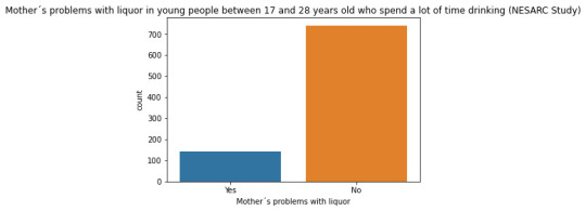
seaborn.countplot(x="S2DQ2", data=sub2) plt.xlabel('Mother´s problems with liquor') plt.title('Mother´s problems with liquor in young people between 17 and 28 years old who spend a lot of time drinking (NESARC Study)') #Univariate histogram for quantitative variable: seaborn.distplot(sub2["S2BQ2D"].dropna(), kde=False); plt.xlabel('Age of onset of liquor dependence') plt.title('Age of onset of liquor dependence in young people between 17 and 28 years old who spend a lot of time drinking (NESARC Study)') sub2['S2BQ2D'] = pandas.cut(sub2.S2BQ2D, [7, 13, 17, 20, 23, 27]) c5 = sub2['S2BQ2D'].value_counts(sort=False, dropna=True) print(c5) sub2['S2BQ2D'] = sub2['S2BQ2D'].astype('category')
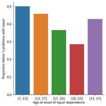
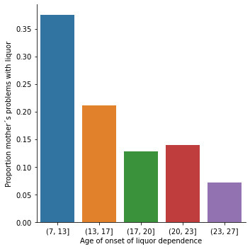
sub2['S2DQ1'] = pandas.to_numeric(sub2['S2DQ1']==1) seaborn.catplot(x="S2BQ2D", y="S2DQ1", data=sub2, kind="bar", ci=None) plt.xlabel('Age of onset of liquor dependence') plt.ylabel('Proportion father´s problems with liquor') sub2['S2DQ2'] = pandas.to_numeric(sub2['S2DQ2']==1) seaborn.catplot(x="S2BQ2D", y="S2DQ2", data=sub2, kind="bar", ci=None) plt.xlabel('Age of onset of liquor dependence') plt.ylabel('Proportion father´s problems with liquor')
OUTPUT
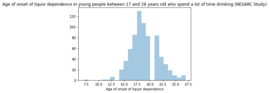
DESCRIPTION
Regarding the graphs of the quantitative variable that represents the age of onset of liquor dependence, it has a symmetrical unimodal distribution where the mode, mean and median are approximately 18 years of age. Regarding the categorical variables, 337 young people stated that their father had problems with liquor and 141 stated that their mother suffered from alcoholism. I made two bivariate graphs taking as an explanatory variable the age of onset of alcohol dependence and comparing it with the proportion of fathers and mothers who had problems with alcohol. In the case of the father, the data follow a bimodal distribution where the modes are found at ages 7-13 and 23-27. On the other hand, the graph where the mother's condition is represented shows a skewed right unimodal behavior. In conclusion, it can be observed that both mothers and fathers who suffered from alcoholism influenced their children mainly at early ages (7 -13) had problems with liquor. For future analyses, the influence that other family members such as grandparents, uncles, or romantic partners have on alcohol consumption could be taken into account.
0 notes
Text
Activity 02
Running Python Program in Visual Studio
Following up on my previous analysis, today's task involves executing Python within the Visual Studio IDE.
1) Your program.
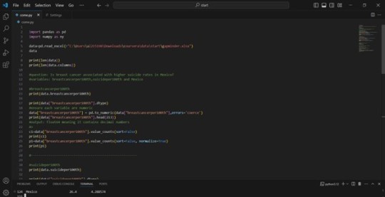
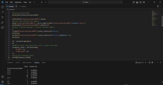
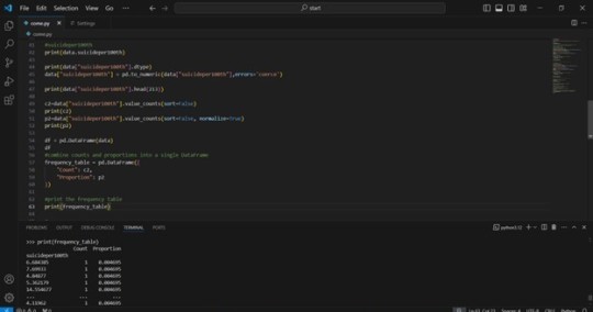
2) The output that displays your variables as frequency tables.
3) Describe your frequency distributions in terms of the values the variables take, how often they take them, the presence of missing data, etc.
An examination of the frequency table reveals a significant presence of repeated values across both "breastcancerper100th" and "suicideper100th" variables. This suggests that each data point appears only once within the dataset. Furthermore, there is an estimated 25% of missing data for each variable under investigation.
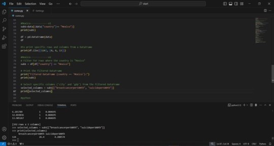
In accordance with the suggestion of my colleagues, I have incorporated a specific country into my analysis for enhanced detail. Mexico, my home nation, was chosen for this purpose. As illustrated in the final image, I concentrated on the data pertaining to breast cancer and suicide rates in Mexico specifically. Through this analysis, I discovered that the prevalence of breast cancer is 26.4%, while the rate of suicide is 4.2885%.
#coursera #data analytics #data
0 notes
Text
About
Course
Basic Stats
Machine Learning
Software Tutorials
Tools
K-Means Clustering in Python: Step-by-Step Example
by Zach BobbittPosted on August 31, 2022
One of the most common clustering algorithms in machine learning is known as k-means clustering.
K-means clustering is a technique in which we place each observation in a dataset into one of K clusters.
The end goal is to have K clusters in which the observations within each cluster are quite similar to each other while the observations in different clusters are quite different from each other.
In practice, we use the following steps to perform K-means clustering:
1. Choose a value for K.
First, we must decide how many clusters we’d like to identify in the data. Often we have to simply test several different values for K and analyze the results to see which number of clusters seems to make the most sense for a given problem.
2. Randomly assign each observation to an initial cluster, from 1 to K.
3. Perform the following procedure until the cluster assignments stop changing.
For each of the K clusters, compute the cluster centroid. This is simply the vector of the p feature means for the observations in the kth cluster.
Assign each observation to the cluster whose centroid is closest. Here, closest is defined using Euclidean distance.
The following step-by-step example shows how to perform k-means clustering in Python by using the KMeans function from the sklearn module.
Step 1: Import Necessary Modules
First, we’ll import all of the modules that we will need to perform k-means clustering:import pandas as pd import numpy as np import matplotlib.pyplot as plt from sklearn.cluster import KMeans from sklearn.preprocessing import StandardScaler
Step 2: Create the DataFrame
Next, we’ll create a DataFrame that contains the following three variables for 20 different basketball players:
points
assists
rebounds
The following code shows how to create this pandas DataFrame:#create DataFrame df = pd.DataFrame({'points': [18, np.nan, 19, 14, 14, 11, 20, 28, 30, 31, 35, 33, 29, 25, 25, 27, 29, 30, 19, 23], 'assists': [3, 3, 4, 5, 4, 7, 8, 7, 6, 9, 12, 14, np.nan, 9, 4, 3, 4, 12, 15, 11], 'rebounds': [15, 14, 14, 10, 8, 14, 13, 9, 5, 4, 11, 6, 5, 5, 3, 8, 12, 7, 6, 5]}) #view first five rows of DataFrame print(df.head()) points assists rebounds 0 18.0 3.0 15 1 NaN 3.0 14 2 19.0 4.0 14 3 14.0 5.0 10 4 14.0 4.0 8
We will use k-means clustering to group together players that are similar based on these three metrics.
Step 3: Clean & Prep the DataFrame
Next, we’ll perform the following steps:
Use dropna() to drop rows with NaN values in any column
Use StandardScaler() to scale each variable to have a mean of 0 and a standard deviation of 1
The following code shows how to do so:#drop rows with NA values in any columns df = df.dropna() #create scaled DataFrame where each variable has mean of 0 and standard dev of 1 scaled_df = StandardScaler().fit_transform(df) #view first five rows of scaled DataFrame print(scaled_df[:5]) [[-0.86660275 -1.22683918 1.72722524] [-0.72081911 -0.96077767 1.45687694] [-1.44973731 -0.69471616 0.37548375] [-1.44973731 -0.96077767 -0.16521285] [-1.88708823 -0.16259314 1.45687694]]
Note: We use scaling so that each variable has equal importance when fitting the k-means algorithm. Otherwise, the variables with the widest ranges would have too much influence.
Step 4: Find the Optimal Number of Clusters
To perform k-means clustering in Python, we can use the KMeans function from the sklearn module.
This function uses the following basic syntax:
KMeans(init=’random’, n_clusters=8, n_init=10, random_state=None)
where:
init: Controls the initialization technique.
n_clusters: The number of clusters to place observations in.
n_init: The number of initializations to perform. The default is to run the k-means algorithm 10 times and return the one with the lowest SSE.
random_state: An integer value you can pick to make the results of the algorithm reproducible.
The most important argument in this function is n_clusters, which specifies how many clusters to place the observations in.
However, we don’t know beforehand how many clusters is optimal so we must create a plot that displays the number of clusters along with the SSE (sum of squared errors) of the model.
Typically when we create this type of plot we look for an “elbow” where the sum of squares begins to “bend” or level off. This is typically the optimal number of clusters.
The following code shows how to create this type of plot that displays the number of clusters on the x-axis and the SSE on the y-axis:#initialize kmeans parameters kmeans_kwargs = { "init": "random", "n_init": 10, "random_state": 1, } #create list to hold SSE values for each k sse = [] for k in range(1, 11): kmeans = KMeans(n_clusters=k, **kmeans_kwargs) kmeans.fit(scaled_df) sse.append(kmeans.inertia_) #visualize results plt.plot(range(1, 11), sse) plt.xticks(range(1, 11)) plt.xlabel("Number of Clusters") plt.ylabel("SSE") plt.show()
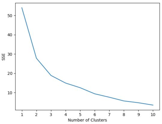
In this plot it appears that there is an elbow or “bend” at k = 3 clusters.
Thus, we will use 3 clusters when fitting our k-means clustering model in the next step.
Note: In the real-world, it’s recommended to use a combination of this plot along with domain expertise to pick how many clusters to use.
Step 5: Perform K-Means Clustering with Optimal K
The following code shows how to perform k-means clustering on the dataset using the optimal value for k of 3:#instantiate the k-means class, using optimal number of clusters kmeans = KMeans(init="random", n_clusters=3, n_init=10, random_state=1) #fit k-means algorithm to data kmeans.fit(scaled_df) #view cluster assignments for each observation kmeans.labels_ array([1, 1, 1, 1, 1, 1, 2, 2, 0, 0, 0, 0, 2, 2, 2, 0, 0, 0])
The resulting array shows the cluster assignments for each observation in the DataFrame.
To make these results easier to interpret, we can add a column to the DataFrame that shows the cluster assignment of each player:#append cluster assingments to original DataFrame df['cluster'] = kmeans.labels_ #view updated DataFrame print(df) points assists rebounds cluster 0 18.0 3.0 15 1 2 19.0 4.0 14 1 3 14.0 5.0 10 1 4 14.0 4.0 8 1 5 11.0 7.0 14 1 6 20.0 8.0 13 1 7 28.0 7.0 9 2 8 30.0 6.0 5 2 9 31.0 9.0 4 0 10 35.0 12.0 11 0 11 33.0 14.0 6 0 13 25.0 9.0 5 0 14 25.0 4.0 3 2 15 27.0 3.0 8 2 16 29.0 4.0 12 2 17 30.0 12.0 7 0 18 19.0 15.0 6 0 19 23.0 11.0 5 0
The cluster column contains a cluster number (0, 1, or 2) that each player was assigned to.
Players that belong to the same cluster have roughly similar values for the points, assists, and rebounds columns.
Note: You can find the complete documentation for the KMeans function from sklearn here.
Additional Resources
The following tutorials explain how to perform other common tasks in Python:
How to Perform Linear Regression in Python How to Perform Logistic Regression in Python How to Perform K-Fold Cross Validation in Python
1 note
·
View note


