Text
Finishing up
These works of contemporary art are showy, playful and have been very successfully enticing. Reactions of shock, laughter followed by more presses, the “that’s cursed” or the “oh cool” from the odd person noticing the invisible ink. As they are hung for Exposure, there is much to be desired still. By the time Grace’s projections finally got going there wasn’t much time to better resolve the relationship between that and the works. She invited me to join her project for Fringe next year with the paintings though so it seems that there will be another chance to show them in this way (even if it is in a performance context). I had a last minute technical error of my own with the lights in Pink Genie being slightly darker than they should, which was noticeable when I put the two works side by side. I replaced both lots of batteries and redid the wiring before Exposure but the problem persists. This isn’t helped by the fact that the lights aren’t that bright to begin with which makes it difficult at times to notice the ink. I definitely want brighter lights for future showings or to at least have more control over the environment. I like the idea of having them shown in a naturally lit room, where the invisible ink can only be viewed in the dark at night, like a bedtime doom scroll. Even with the lights as they are, the ink is still very vivid in darker spaces. Better yet would be to have them in a darker area with colourful moving spotlights that only sometimes illuminate the paintings. I think lighting like this would also give the colours more of an opportunity to really pop, which I feel is one of the main downsides to the current lighting situation. Overall I am happy with the responses to my work and the conversations that have risen from it.
0 notes
Text
Exposure hang (Wednesday Progress)
In my initial request form I had asked for a space that was dim. Dark, but not so dark that you couldn’t see the paintings without bringing your own light in, but not so bright that it completely conceals the invisible ink. When it came to the meeting in which we were told whether or not we got what we required, I was glad to hear that I was good to go. I thought it was a bit weird that I was put in one of the brighter spaces (2E, center space) but anticipated that I was put there because I would be able change the lighting somehow. This ended up not being the case so I quickly moved down to the computer room with Grace and Davin.
There is a bit of a shared sentiment that the space itself is pretty shit, and even though it’s workable, it has been a lot of work. There is a joint frustration in the fact that we’ve been told that we’d receive help on certain things, such as blacking the space out or being supplied with spare curtains to cover the door, only to be told that we’re not getting them today (day of hand-in). The carpet had a bunch of paint splatters on it, a massive smudge by Davin’s work even and the walls were in a bit of a state. You cant exactly paint over carpet so I gently rubbed away some of the paint with a file. This did create a couple of small tufts in the carpet but they weren’t nearly as noticeable as the flecks of white paint. The one by Davin’s work looks like it will be sticking around due to its size. It definitely rubbed us the wrong way when we were told that we were “cutting it close” after Grace and I had spent much of the last few week trying to get the room into a presentable state and Davin helping out where he could between difficulties with his own install. Grace’s projector is currently failing which is making it difficult to sort out my final hang as I want them to respond to Graces lighting. I have them in placeholder spaces as we are yet to see the place with the projections going. On the bright side Mike seems to be pretty onto it in getting a replacement projector. One of the other fun little quirks of the room is that since we got the light sensors turned off, there has been no way to turn the lights on in the room on nights we’ve been in past sunset.
Between Davin, Grace and I, we all seem to be pretty happy with sharing the space with eachother which is great. We’ve all been pretty supportive. In a way I feel like my work acts a missing link between theirs, with Davin’s caricatures and Grace’s playfully interactive Zoetrope and light implementation. In discussing how the works would exist together, Davin seemed to want his own space so we haven’t disrupted his little nook but Grace’s projections will reach the wall opposite them which will help connect the spaces. There weren’t many options of where to put mine. I basically wrote off the wall left of the door as any wall space that wasn’t in Davin’s bubble would be sitting above the heater which just didn’t look good. Grace and I decided that at least one should go near the projector in a way that encourages people to enter the light beam and cast shadows on the main wall. I thought that having it near the projector would also be a nice segue into some of the properties of my own work. Pink Genie sits between the zoetrope and Graces fabric hang in a dim little nook. I find it appropriate that the “rabbit hole” work would be the least accessible, only visible once the space is properly navigated.
0 notes
Photo
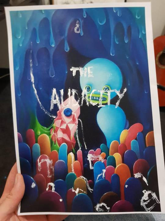
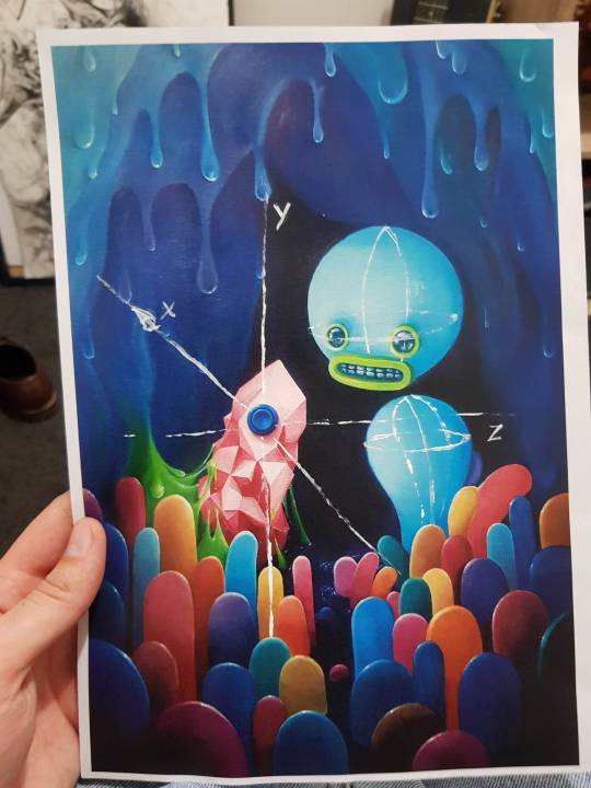
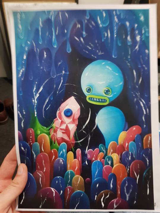
For Pink Genie I went through a few variations on what to include with invisible ink as pictured. The final version combines elements of the three pictured above as I wanted it to be quite jarring. Lines to indicate a 3D axis protrude from the crystal while Naught-naut’s basic geometry is given minor plane contours. The colourful bulbs have veins. Spread throughout, the words “My dancing partner is a brick, a hologram I couldn’t stick. But naught that I could ask - too needy, all would come by way of genie” lyrically personifies that which can provide any comfort and pleasure with the catch of being entirely superficial.
0 notes
Text
Frames
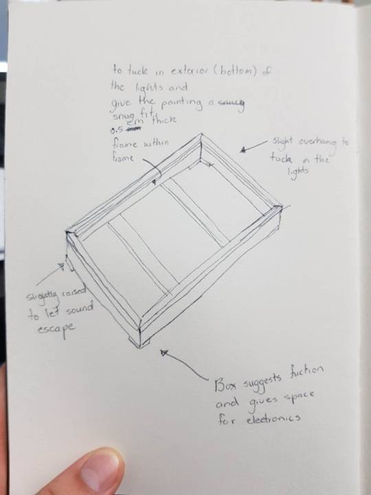
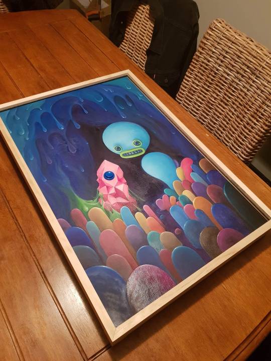
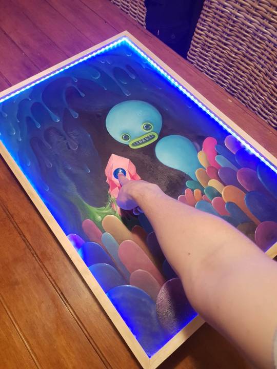
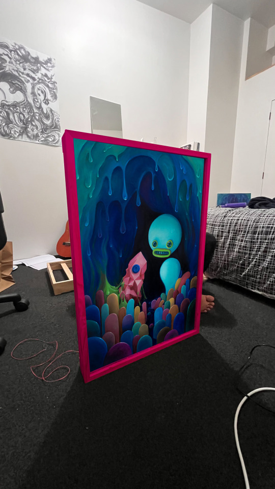
I’ve spent the last while building frames in the workshop. The design I ended up with consists of a tall outer frame upon which two smaller frames are attached, made from pine. One is placed on top with a slight overhang to give a cleaner appearance and to hide the lights when viewed front on, while the other sits 1cm below that below the lights, tucking them neatly. The lower frame is as thick as the paintings so that they may sit levelled as it snuggly holds the edges of each painting in place. The paintings themselves can also be inserted through the front. There is a gap in each of these smaller frames to run wires through, as well as elevations on the back of each frame to allow sound and potentially residual light to pass through. While I have some chrome spray paint lying around from my last projects and could lean into the glossiness more, I decided to play around on photoshop, editing the frame to be different colours to see what would make both paintings really pop. I have decided on getting a candy-like pink, preferably gloss.
0 notes
Text
Prefrontal control and Internet addiction notes:
Brand, Matthias, Kimberly S. Young, and Christian Laier. "Prefrontal control and Internet addiction: a theoretical model and review of neuropsychological and neuroimaging findings." Frontiers in human neuroscience (2014): 375.
“The prevalence rates reported in the last years have a wide variety from 0.8 in Italy to 26.7% in Hong Kong (see the excellent review by Kuss et al., 2013). Reasons for this extreme variance are most likely some cultural effects, but also the fact that until now, no standard assessment tool, no clearly defined cut-off scores, and even no fully accepted diagnostic criteria have been established”
“When going online, the user receives reinforcement in terms of (dysfunctional) coping with negative feelings or problems in everyday-life. At the same time, the Internet use expectancies are positively reinforced, because the Internet acted as anticipated (e.g., reducing feelings of emotional or social loneliness). Given the strong reinforcing character of certain Internet applications, the cognitive control about the Internet use becomes more effortful. This should be particularly the case if Internet-related cues interfere with executive processes.”
“We also hypothesize that specific person’s predispositions increase the probability that an individual receives gratification from the use of certain applications and overuses these applications again. One example for such a specific predisposition is a high sexual excitation (Cooper et al., 2000a,b; Bancroft and Vukadinovic, 2004; Salisbury, 2008; Kafka, 2010), which makes it more likely that an individual uses Internet pornography, because he/she anticipates sexual arousal and gratification (Meerkerk et al., 2006; Young, 2008). We believe that the expectancy that such Internet applications can satisfy certain desires increases the likelihood that these Internet applications are used frequently, as assumed in addictive behavior in general (Robinson and Berridge, 2000, 2003; Everitt and Robbins, 2006) and that the individual can develop a loss of control over his/her use of such applications. As a result, gratification is experienced and consequently the use of such applications and also the specific Internet use expectancies and the coping style are reinforced positively. This has already been shown, for example for cybersex addiction (Brand et al., 2011; Laier et al., 2013a) and is most likely also a mechanism for online gaming”
“The functional changes in prefrontal and striatal areas are primarily observable when individuals with Internet addiction perform certain tasks, in particular those measuring executive functions and cue-reactivity. These results, together with those emerging that prefrontal control processes are reduced in individuals who are addicted to the Internet and may be related to the patients’ loss of control over their Internet use. “
0 notes
Text
Week 11 Progress
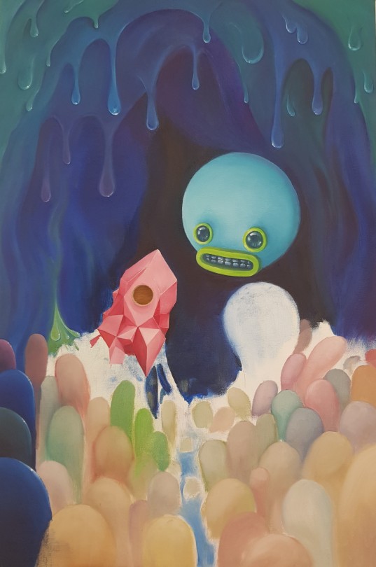
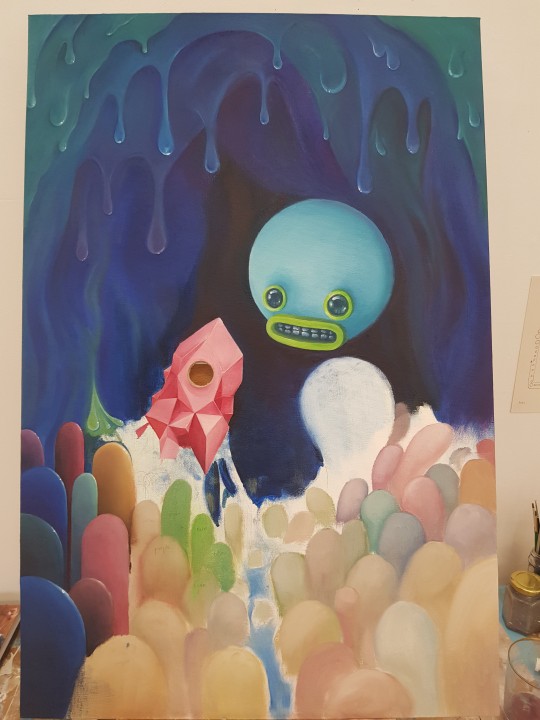
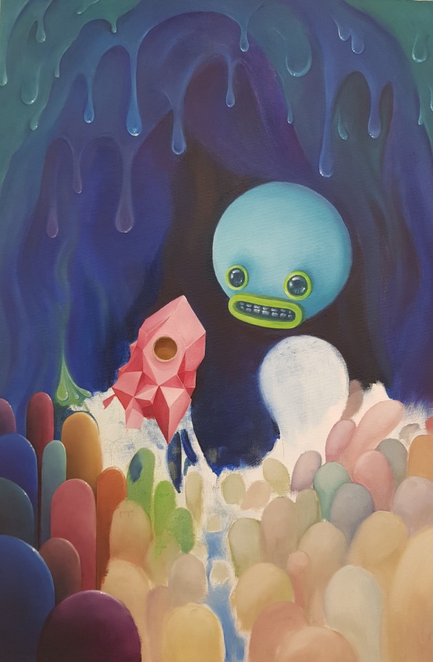
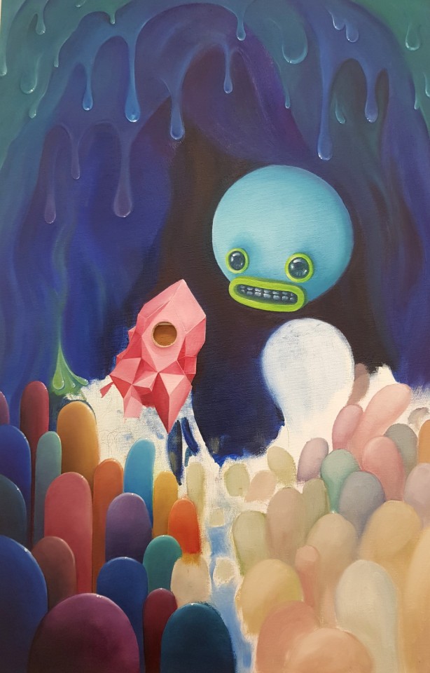
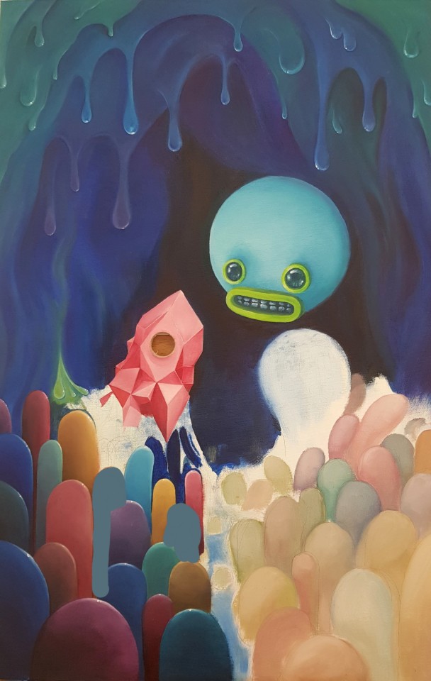
These bulbs take much longer to paint than you’d expect.
0 notes
Text
PINK GENIE
I had initially wanted to name these paintings after popular E-cigarette flavours that take inspiration from lollies; The first painting being Pink Lemonade with the second being either Sour Apple or Blue Raspberry. I thought that the convention of giving flavours specific colour associations separate from the fruits’ natural colour hints to artificiality. Beyond that there are allusions to addictions, craving and sweetness. Having pink in the title would give added importance to pink areas within the painting drawing extra attention to the crystal. I ended on Pink Genie as it sounds more fantastical, something out of a direct to VHS Aladdin knockoff. By referring to the button’s vessel as a genie I’m alluding to wish-fulfilling properties, the genie is the AI “assistant” of yesteryears sci-fi, a stand-in for devices and search engines or the vice itself. In the context of the entire painting I feel that it makes it seem more adventurous, like Naught-naut has gone into this cave and found a magical lamp.
0 notes


