Text
Final Product- Trailers 1 and 2
The links to both the trailers are given below-
Link for Trailer- 1:
https://drive.google.com/file/d/1d0x8u6xa0jOuYTfrLK2tIu619Sxq1D_k/view?ts=643a3221
Link for Trailer- 2:
https://drive.google.com/file/d/1JesbMu6Hkh8MWv9vsa65gtZTW4-_RUc_/view?ts=643a3237
0 notes
Text
Creative Critical Reflection-
Link for Creative Critical Reflection:
https://docs.google.com/document/d/1lV_AUHbX2rvY76tPwXexdRxJK6ZtR80DC3W9O5RP_Po/edit?usp=sharing
Images of our merchandise:
Scented candles-


Diaries-


Pouches-


Phone Cases-


Images of the brand partners we chose:
Zara-

Starbucks-

Ikea-

Nykaa-

Apple-

Nike-

0 notes
Text
Poster for Our Trailers-

Jiya made the poster for our film after discussing with me what I wanted her to do. Both Jiya and I had gone through many film posters for inspiration. After getting an idea Jiya began editing the poster for our trailers. We made all the four characters who kill Suhana look away from the camera and only Suhana who is in the middle is directly looking in front. As the director I wanted to show that all the four characters looking away are the ones who have some secret that they are hiding. Whereas Suhana is staring straight at the viewer. I also wanted to put Suhana in the middle as he is the main character and that the entire film story revolves around her.
Images of some of the posters we saw-
Stranger Things Season 3 poster-

source of image:https://www.amazon.in/Trends-International-Netflix-Stranger-Things/dp/B07SVZV7C1?th=1
One of Us is Lying Poster-

source of image: https://www.kobo.com/in/en/ebook/one-of-us-is-lying-1
Joker Poster-

source of image: https://www.vintagemovieposters.co.uk/shop/joker-movie-poster-6/
0 notes
Text
Social Media Page For Our Trailers-
We have an Instagram account for our trailers as it is one of the tasks for our media portfolio.
The handle is case_182.
Link to the official Instagram account: https://www.instagram.com/case_182/
For our social media page Jiya and I took inspiration from other film or television shows social media accounts on Instagram so that we could get an idea of what content we had to post.
Images of the social media accounts that we went through before making ours-
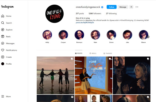


After going through these accounts Jiya and I made wrote down what posts we should we make, what reels or videos we could make and to split the work between the both of us.
Image of the notes we made while discussing what content to post for our social media-
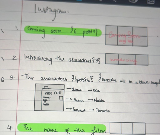
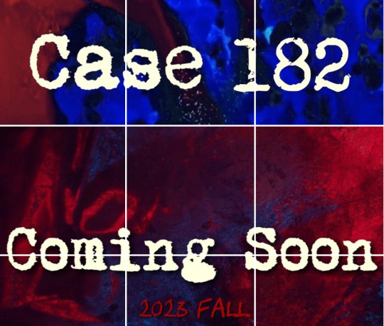
We first decided to have a coming soon post and then the film’s name post. Jiya made these two posts by splitting the image to make it look appealing and interesting.
Image of the coming soon and film name posts that Jiya made-
The next three posts were the meet the crew posts which I made on Canva. I made these posts look captivating and related to the theme of our trailers-murder mystery/thriller. As the director I decided to make these posts to introduce ourselves to the audience and so that they are aware of who worked behind the scenes on this project.
Image of the meet the crew posts that I made-

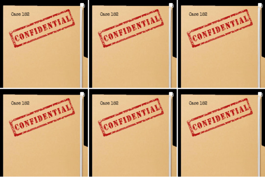
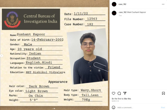
After that we decided to have introducing the characters posts. Jiya made theses posts. She made case files on the first slide and the characters information on the second slide when you swipe to view the next picture. Since we had to keep posting three pictures in a row to make our social media page look aesthetically pleasing and neat we decided to post a find out who the detective is post.
Images of the introducing the characters posts that Jiya made-


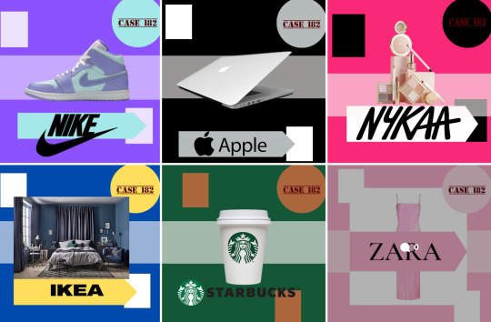
Then I made the next six posts which were our branding partners. On all the film social media accounts we saw that most of them promoted their branding partners. So as the director I decided to do the same thing to make it more authentic and realistic. Jiya and I chose six brands that made sense to partner with for our film and I made individual posts for each brand.
Image of the branding partners posts that I made-
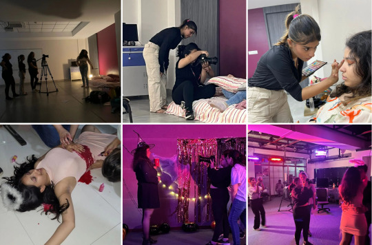
Jiya then posted three picture of behind the scenes shoot day-1 and I did the same for shoot day- 2.
Image of the BTS posts we posted-
Jiya then made posts for our very own merchandise and the final poster for the trailer. Our merchandise was diaries, pouches, beaded bracelets, scented candles and phone cases. Many films/T.V. shows promote their own merch. Since our film comes out on Halloween which is during autumn season we decided to have pumpkin scented candles. Also our main target audience is young adults and older teens who would be attending college or high school so pencil pouches and diaries would be useful for them and they would want to buy those items. Also the film story takes place in a school which helps promote the merchandise. The beaded bracelets and phone cases are also targeted at older teenagers and young adults. By adding the film name on the merchandise we create a sense of branding for our trailers/film.
Image of the merchandise posts-

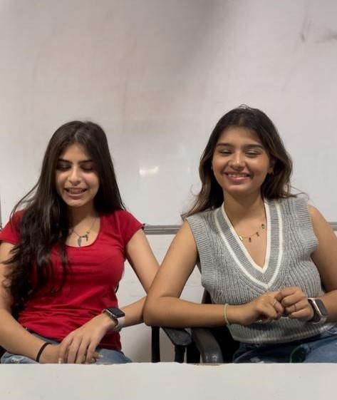
Since we needed some fun content all of us decided to record cast and crew interviews, games with the cast ad crew as well as the casts reaction to the trailers. So as the director I called the entire cast and crew (except Sandesh as he was not available) to shoot all this content. The cast and crew played fun and common games that actors play on the film/T.V. Show accounts that we saw. Some of the similar games we played were cast and crew friendship test, guess the song using emojis, guess the Gen Z slang and lots more. We also interviewed the cast individually and asked them some fun and serious questions about the filming process. We also made the cast talk about some of the serious issues (sexual assault, violence, physical and mental bullying and cyberbullying) that are present in our trailers and filmed them saying some facts about those serious topics and how to reach out for help if the person or someone is going through it.
Images of behind the scenes of filming the cast and crew social media content-


After we filmed all the videos Jiya and I split up what videos we should edit and post.
Images of the videos and reels that I edited and posted-
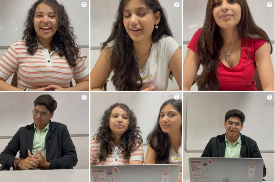

Jiya edited the serious reels and the games which required more editing work.
Images of the videos and reels that Jiya edited and posted-

I also posted a few behind the scenes pictures (shoot day and editing), our merch, branding partners and photo shoot of the characters in highlights as well as the editing process as time lapse videos.
Image of the highlights stories I posted-

0 notes
Text
Coursework Development/Production (Sound/Music Links)
Trailer 1 Sound Links-
Page Turn Sound:
https://www.youtube.com/watch?v=tAADqtTtT7k
iPhone Ringing:
https://www.youtube.com/watch?v=oui7g5frCL0
Trailer 2 Sound Links-
School Bell Ringing:
https://www.youtube.com/watch?v=X15iMnSHtj4
Camera Flash:
https://www.youtube.com/watch?v=C6fRB-ce-vk
Trailer 1 Music Links-
I Did Something Bad by Taylor Swift (instrumental):
https://www.youtube.com/watch?v=PjLgt6cDLBk
Trailer 2 Music Links-
Scary Horror Cinematic Background Music:
https://www.youtube.com/watch?v=RoVVwGncYWs
Memories (Sad Music Box) by Michael Ortega:
https://www.youtube.com/watch?v=5Z3h0T-LJAM
0 notes
Text
Why We Added Captions For Both Our Trailers-
Last year we wanted to use captions for our opening of a short film- ‘A December To Remember’. Due to time constraints and multiple arguments we ended up not doing it. Now when look back I really wish I had for multiple reasons.
This year I had decided that as the director I wanted to add captions no matter what. Captioning is defined as the process that involves dividing transcript text into chucks, known as ‘caption frames,’ and time-coding each frame to synchronize with the audio of a video. Captions allow viewers to follow along with the audio and video or captions interchangeably. It is widely known that captioning a video, trailer, televsion show or film not only promotes digital inclusion for those viewers with hearing impairments but that it also greatly improves the user-friendliness of your content.
Here are the reasons why I decided as the director to add captions for both our trailers-
1) Accessibility-
More than 5% of the world’s population experiences hearing loss — that’s approximately 360 million people. When you make your content accessible, you allow people who might be deaf or hard of hearing to have access to the content you produce. Access is a universal right. And accurately captioning content is a small inclusive step with dramatic impact on a significant portion of the population.
2) User Experience-
Give your audience the ability to enjoy your content, regardless of the environment they are in. That means if the viewer is in a public setting they can still watch the your content and understand what is going on without the audio.
3) Easier Comprehension For Non-Native English Speakers-
Captioning content provides a vital resource for non-native English speakers to elevate language skills. Viewing videos with captions over the spoken audio of native speakers is a fantastic way for learners to develop an ear for more nuanced features of the English language, like idioms and slang terms.
Images of the captions in our trailers-


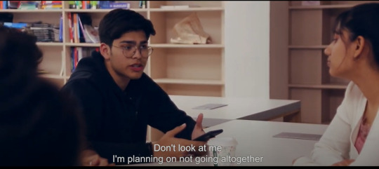


Even though writing the captions for each scene was a very tedious job it was completely worth it in the end as the viewer could understand the dialogues better in case the audio was not clear and it promotes digital inclusion for those viewers with hearing impairments.
0 notes
Text
Coursework Development/Production: Editing Trailer- 2 (Part- 3)
On the fourth day of editing we did only the colour grading for second trailer. As explained before as the director I wanted this trailer to look mysterious and follow the the conventions of how a thriller trailer should look like. That is why for all the scenes all of us decided to have cooler and darker tones. We had already planned this while deciding the colour palette for our second trailer. We used a blend of colours like blue, purple and grey to give a dull and icy look. Cooler tones are also mostly used in suspense and murder mystery films.
Inspiration for cooler tones from the T.V. Show Euphoria-

source of image: https://in.pinterest.com/pin/599189925430934996/
Image of Jiya colour grading our trailer 2-

Images of the final colour grading-


Timelapse of us colour grading the second trailer:
https://drive.google.com/file/d/1ZPKm3v_xjqnToKFEKPvguabAMTPuhXAW/view?usp=share_link
On the last day of editing which we got as we had to finish the colour grading for the first trailer, I made a content warning slide to be added in the beginning of the second trailer. I made this slide as our trailer explicitly shows blood and has a lot of lights that might be harmful for photosensitive viewers. The audience is aware of what the trailer contains and can choose to watch it or not. Trigger and content warnings also allow safe viewings for survivors of trauma. We do not want anyone watching the trailer to suffer from PTSD or become distressed. That is why as the director I decided to have a content warning slide. Since we did not have a lot of time I did not list out all the trigger warnings in our trailer but instead made a universal content warning slide so that the viewers are aware.
Image of the content warning slide that I made-

After adding the content warning slide we were finally done with editing for our second trailer!
0 notes
Text
Coursework Development/Production: Editing Trailer- 2 (Part- 2)
On the third day we decided to add the end slate to both our trailers that Jiya had made at home.
Inspiration for end slates design-

I also made a ‘Case 182′ round stamp logo for the end slate.
Image of the Case 182 stamp logo I made for the end slate-


Sir told us that the end slate had to include all the actors names, the crew members names, the film name and what our in-house branding partners like Zara, Netflix, Nykaa and Ikea.
Image of the final end slate that we used for both our trailers-

After that we moved on to the title slide that was at the end of the trailer. Jiya had done her research and found the perfect font for our title. The font was called ‘Top Secret’. The font looked like a stamp with two lines- one above the letters and one below. As the director I chose a dark red colour to symbolise danger and also because on case files the ink colour of the stamp pad they use to stamp with is usually red. The ink if the stamp pad is usually a lighter shade of red but I chose dark red which is the colour of blood.
Jiya editing the Title for our trailer 2-


The final title for the trailer 2-

After our title was made we Jiya edited a few of the scenes which required any audios like the blood dripping on the floor from the bloody knife, the flash sound for the photograph scene and the school bell ringing sound in the beginning.
Timelapse of Jiya and I finding the audios for certain scenes:
https://drive.google.com/file/d/1ZPKm3v_xjqnToKFEKPvguabAMTPuhXAW/view?usp=share_link
Image Jiya adding the blood dripping audio-

Jiya then started to work on the sound mixing which took about 40 minutes s we had to match certain beats to the cut of the scenes.
Images of Jiya sound mixing-


We also added the captions for both our trailers as it helps many viewers (details explained in blog post above called why we used captions for our trailers).
0 notes
Text
Coursework Development/Production: Editing Trailer- 2 (Part- 1)
Our second trailer which was longer and which I thought would take the most time to edit was surprisingly done first. The vision of the trailer as we had planned before was that we wanted the trailer to start slowly and then have a high point where it picks up pace (fast cuts) and then goes back down to slow. This would help create a sense of suspense, seriousness and mystery.
On the first day Jiya finished the line up of the second trailer with all the edits.
Image of us choosing what shots to use-

To help us edit the fast cuts better and understand how each scene should be edited we decided on finding the soundtrack first. As the director I wanted the soundtrack to start slow but also sound creepy and eerie. Then in the middle I wanted to soundtrack to build up by having a crescendo and lots of beats for the fast cut scenes. This gives a sense of thrill and excitement. Then I wanted the soundtrack to slow down the pace of the trailer to give a eerie and ominous feeling at the end. We listened to many horror or thriller soundtracks on YouTube until we found the perfect one. Since we had the line up ready I could visualise how the trailer would look with the soundtrack. The one that went perfectly with our trailer was called ‘Scary Horror Cinematic’ background music. It was exactly what I wanted. When I heard it the first time it could visualise how the beats perfectly synchronised with the scenes and fasts cuts. When Jiya put the music over the to see if I was right about it. The music was the perfect match. We hardly had to edit or chop off anything as it was on beat with the scenes and it made our trailer look mysterious, engaging, serious and ominous. I was so happy that we came across this soundtrack as it really helped us get a sense visually ow the trailer was going to look.
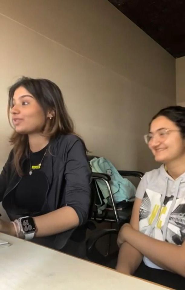
Images of us listening to different music backgrounds for trailer 2-


Images of Jiya and I choosing the background music-

Links to some of the background music we heard for trailer 2:
Cinematic Tension: https://www.youtube.com/watch?v=dN3ltKrp2t8
Ticking Tension: https://www.youtube.com/watch?v=xN6y84DCAxk
Horror: https://www.youtube.com/watch?v=fhVWDc1Zawo
Suspense: https://www.youtube.com/watch?v=ctSjHpgu6j8
Heartbeat Countdown: https://www.youtube.com/watch?v=BdDQnT6i1t4
Dark Tension Thriller: https://www.youtube.com/watch?v=M-vazrsRALg
Link to the final background music we chose for trailer 2:
https://www.youtube.com/watch?v=RoVVwGncYWs
Timelapse of us choosing the music background:
https://drive.google.com/file/d/1AWRJiMEN4hxrATk4TfMdGYAzl4pJUru7/view?usp=share_link
https://drive.google.com/file/d/1I7IBQSo7nHRmRlR5vv5j7SWfjTGYOa4P/view?usp=share_link
For the ending part of our trailer I wanted to find something slower to give a creepy and eerie feeling. So we searched on YouTube for creepy lullabies, nursey rhymes or eerie sounding musical box.
Image of us listening to creepy and eerie slow music-
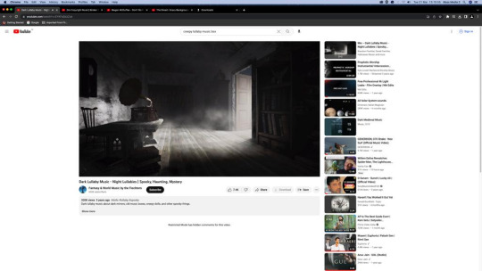
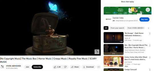


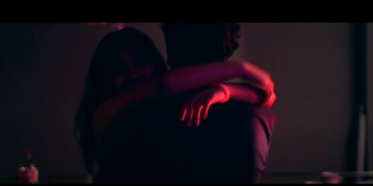
After researching and listening to multiple songs, we finally found one that blended well with the first background music for the end part of the trailer where we see Suhana and Sushant slow dancing and the next scene is of the dead body. This would make the audience curious and it creates a sense of mystery.
Links to the creepy and eerie background music we heard-
Melancholia- sad and creepy music box : https://www.youtube.com/watch?v=u9WsZoceais
Broken Piano: https://www.youtube.com/watch?v=ln_a4bwRF9o
The Music Box- horror music: https://www.youtube.com/watch?v=1GUJVSbsv28
The Music Box from The Conjuring: https://www.youtube.com/watch?v=Py5KL5vZIWU
Link to the final background music we used for the end part of our trailer-
Memories (Sad Music Box) by Michael Ortega:
https://www.youtube.com/watch?v=5Z3h0T-LJAM
On the second day of editing we decided to add a few more shots for the fast cuts scenes as there were very few. We also reduced the timing of the shots as I wanted the cuts to be quicker (a second long). This would create a sense of thrill and excitement. For the fast cuts I also made sure to include at least two shots of each character and to not have the same character’s shot back to back.
Image of us adding more shots for the fast cuts-

Images of some of the shots we used in fast cuts-


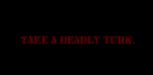
We then moved onto adding the texts in between the scenes for the trailer. Jiya, Annika and I decided that we wanted the text to be in red on a black background and the font would look like the text has been stamped. We first wanted the font to be in 3D but Jiya suggested we should go for 2D as it looks more like a stamp, which is what I wanted to create a sense a branding for our film. The texts we out in between scenes helped captivate the audience and also gave them a break from the constant visual content. The text had to be very appealing to audience and had to make them curious to want to watch the fest of the trailer as well as the film.
Image of Jiya editing the text-

Image of our final text in between scenes for the trailer-
We also decided to add fake film reviews towards the end of the trailer to make the trailer look more realistic and this way we follow the conventions of how a trailer is made. As the director I decided to add them as it also captures the audiences attention when they see famous film critics write good reviews of the film. It automatically makes them want to watch the film.
Inspiration of film reviews in trailers-

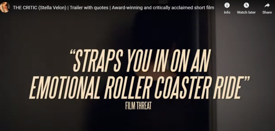
For our trailer we made up some one liner good reviews and then wrote real famous Indian film critics names- Taran Adrash and Rajeev Masand. This helped make the trailer look authentic and realistic.
Images of the film reviews we added in trailer 2-


0 notes
Text
Coursework Development/Production: Editing Trailer- 1 (Part- 3)
We had about two hours to finish the colour grading, make a few tweaks for the title and adding one thing in our second trailer.
Since Jiya had to leave by 1pm the editing day was a bit hectic. We first adjusted the key frame for our title so that it appeared perfectly in the centre. I wrote down the key frame numbers so that Jiya told me to write down so that she could then just type them out quickly.
Image of the key frame numbers that I wrote-
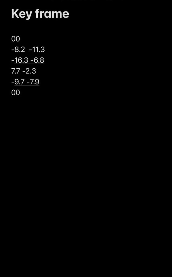
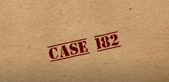
Image of the final title for our first trailer-
Link to timelapse of Jiya and I adjusting the key frame for the title:
https://drive.google.com/file/d/18brSqwuVTZImmhYtX1lHfBL4ZUcL7TqF/view?usp=share_link
Jiya wanted to also try writing the characters name in a separate bubble on the other side of the personality bubble. Jiya tried to do this but for some reason it was not working out the way we wanted it look so instead of wasting time I told her to not do it and move on to colour grading.
Annika and Jiya had to work on the colour grading together while I overlooked them. After discussing what to do, as a group we made a unanimous decision to have the first trailer colour grading in warmer tones as it was a more fun and quirky trailer as compared to the second trailer where we had already used cooler tones. We used a blend of red, yellow and orange as we had planned for our colour palette while making the producer’s ppt. All the scenes had warmer tones except for the case file scenes. I wanted the case file scenes to have a cooler and darker tone as I wanted to remind the audience that this film was still a thriller murder mystery even though this teaser trailer looked fun and bright. Another reason why I chose to use warmer tones was that I wanted to misdirect the audience. Anyways the trailer is a misdirect as the background music is upbeat and the scenes are not tense or suspenseful. So when the audience watches this trailer they will believe it is a fun and quirky movie. However, when they watch the second trailer they will be shocked to see how dark and serious this film is. This way I am breaking the conventions by having the teaser trailer edited in a unique way from a normal thriller film trailer. This will also grasp the audiences attention and make them excited to watch the film.
Images of us colour grading the scenes with warmer tones-


Images of us colour grading the case file scenes with cooler and darker tones-

Images of Jiya colour grading-


After everything was done Jiya realised that the transition (swipe) from the case file shots to the personality scenes of all the characters looked odd as we could see the change in the colour palette- from cool and dark tones (case file scenes) to a warmer and brighter tone (the personality scenes). This was very jarring and even the audience would also be able to notice it. So Jiya had to make the swipe transition faster in order to make the transition look smoother- from cool tones to warm tones and not obvious.
Image of Jiya editing the transition-
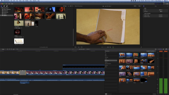
Finally after that we were done with editing!
0 notes
Text
Trailer 1 Issue With Editing Date-
We had already used four days for editing our trailers and there was still some stuff left for Trailer 1- colour grading and making a few tweaks. I really wanted to stay back and finish editing the trailer but we had to leave school as it was getting late and we had already stayed longer than what we were supposed to. I even tried to call Ms. Sonali (our head teacher) to grant us permission to stay back and finish the work so that we would not have to come back again to school. However, she was not picking up and Shritej Sir told us he would ask if the editing room was free the next day for an hour so that we could finish our work. The issue was that the next day Jiya had a doctor’s appointment at 1 pm so we had to come before that to finish the editing and we could not go on any other day as I had to travel the day after.
I was extremely stressed out and upset that we could not finish our editing on that day as planned. I was also panicking that they would shift the editing date to the week after and I would not be there to over look everything that is why I was really hoping we would get the editing room the next day before 1pm so that we could complete our work. Thankfully, we managed to get the editing room from 11:30 a.m. to 12:30 a.m. the next day. Jiya even pushed backer her doctor’s appointment just in case we needed a bit more time.

0 notes
Text
Coursework Development/Production: Editing Trailer- 1 (Part- 2)
On day 3 of editing we found the perfect song for first trailer. We decided to use the song ‘I Did Something Bad’ by Taylor Swift (instrumental version). The lyrics matched perfectly with the film story. The song is about how the person did something horrible but felt good after doing it. This portrays all the four characters emotions when they kill Suhana. Even though what they did was horrible (murder) they did not feel guilty, instead they felt good about getting their revenge.
Image of Jiya editing the sound-
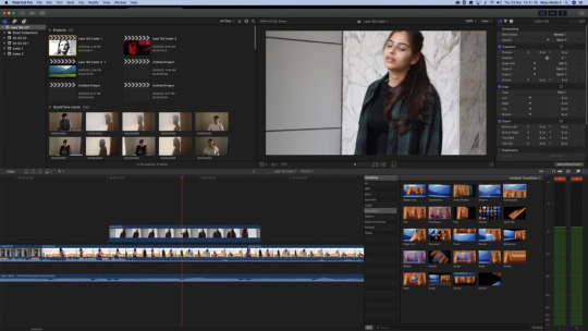
Link to the song ‘I Did Something Bad’ by Taylor Swift (instrumental version): https://www.youtube.com/watch?v=PjLgt6cDLBk
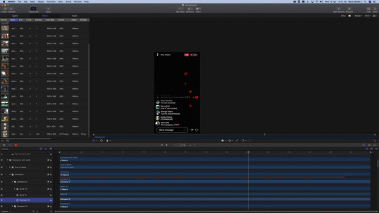
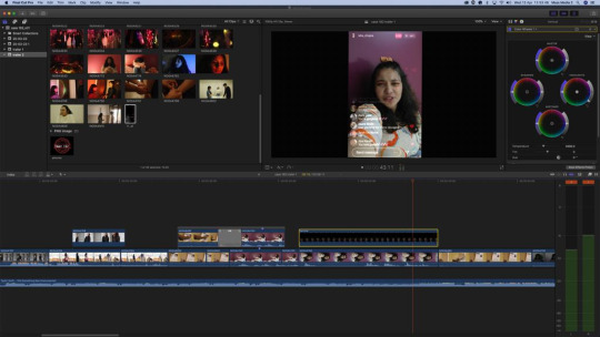
Since we had a lot left for our first trailer we had to have a fourth day for editing. Jiya first cut all the extra parts of the scenes we had lined up as the trailer was 3 minutes long. After cutting out certain parts the trailer was 1 minute and 40 seconds long which is what I wanted. I wanted this trailer to be shorter compared to the our second trailer. This is because our second trailer was our main trailer. After that Jiya had to add the Instagram filter over Isha’s personality scene as we had taken a vertical shot to show from the viewer/phones pov. After finding an Instagram live filter on YouTube, Jiya had to edit it. As the director I told Jiya to rename the account handle to Isha’s name. I also told her to change the account handles of the comments to our names. An observant audience might notice our names while watching the trailer which will be like fun easter egg or hidden element in our film. I also told Jiya to change the comments to- ‘You look so pretty’ or ‘you look amazing’ so that they match with the Isha’s response. We finally applied the filter to the vertical shot of Isha and it looked very realistic. I was extremely happy with the result.
Images of us editing the Instagram Live filter for Isha’s personality scene-
For Sushant’s personality scene, I had requested Sandesh to send a voice message of him saying his dialogues for the phone conversation part. However, the voice messages that Sandesh sent were not clear and the audio sounded a bit muffled. That is why as the director I decided to voice record myself saying the dialogues on my phone voice recorder. Jiya then added it to the scene and also made my voice sound like I was talking on the phone.
After all the sound was added Jiya decided to finish the sound mixing which took about 20 minutes. Since she finished sound mixing that fast we quickly moved onto transitions. This took a long time to do as we could not find what we wanted. We wanted a swipe transition from right to left. After we see the characters case file we wanted a swipe transition from right to left to reveal the characters personality scene. Since we could not find it Jiya was experimenting with a page turn transition or a upward transition but non of them looked good. It made the scene look tacky. After a lot of searching we finally found the swipe transition we wanted.
Image of Jiya editing the transitions-
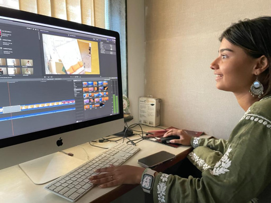


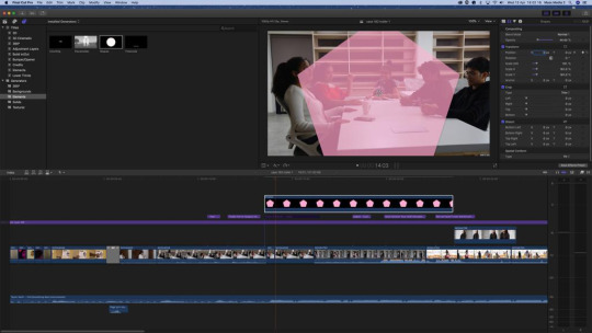
We then moved on to make the bubble for each character with the adjectives written in it to describe them. This took took a long time as well as we had to create the the bubble from scratch. We assigned different colours to each character for their bubble. Suhana was light pink, Isha was orange, Naisha was blue, Varun was red and Sushant was black. We specifically chose these colours to showcase their personality. The shape we went for was a pentagon so that we could hide a part of it on the edge of the screen to make it to the shape we wanted. Jiya and I also wanted to make the bubble look opaque. We decided to freeze the frame of one part of the scene and then the bubble would slide in with all the adjectives written. Initially we wanted to write only two adjectives for each character but decided to use four as the bubble looked incomplete and empty. We listed the adjectives for each character as pointers (one below the other). We also made sure that the bubble was on screen for at least 4-5 seconds so that audience could read it in time before the scene continued. As the director I also wanted some form of uniformity so I told Jiya to place all the bubbles on the right side of the screen when they slide in. This way there is some structure to the trailer.
Inspiration for the bubble we wanted in our trailer-
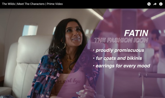
Image of Jiya editing the bubble-
Images of how the final bubble looked-
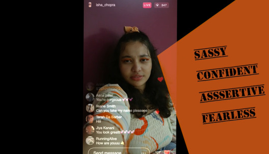

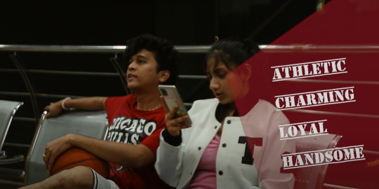

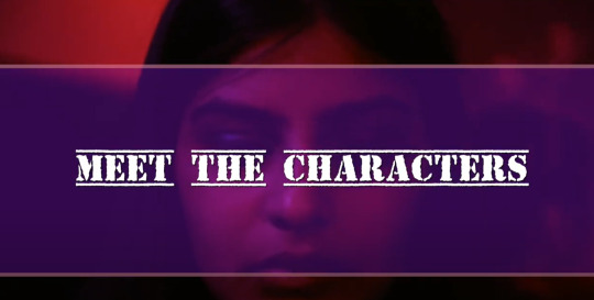
We were going to use a different font to write the characters personalities but instead as the director I decided to stick to our font that we chose for our title (Top Secret font). This way we create a sense of branding by using this font everywhere. We also decided to make a ‘Meet the characters’ title in the beginning with random individual shots of the characters playing in he background. This way the audience will know what type of trailer they are watching.
Image of the font we used for our title and text-
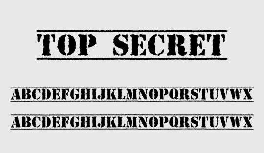
Image of Meet the Characters Title-
Since we wanted captions in our trailer I made Jiya do it quickly as we were running out of time We chose to use captions in both our trailers as it has many benefits for the viewers (explained in detail in why we used captions for our trailers blog post above).
We then moved onto to do the title. We had already chosen a font as mentioned above. This font looked a stamp which was perfect for our trailer. Jiya and I both decided that we wanted the title to appear like it was being stamped on paper. Jiya took a brown colour background which looked like a case file and then edited the title to appear like it was being stamped. Jiya also added a loud stamp sound effect when the title appeared to make it look and sound more authentic.
Image of Jiya editing the title for Trailer 1-
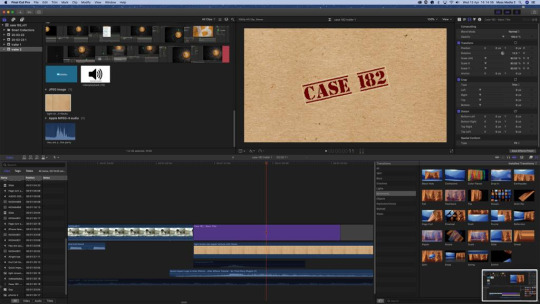
Since we spent a lot of time on the bubble and the title we could not finish colour grading that day and had to come the next day for two hours only to finish the colour grading and to work on the key frame of the title as it was not positioned correctly.
0 notes
Text
Coursework Development/Production: Editing Trailer- 1 (Part-1)
We had four days of editing in which we worked on both trailers on all days. So to make the process easy to understand I have split the posts into parts.
Same as last year, Shritej Sir, explained to us how we were going to do the editing of our trailers. Sir imported all of our footage onto a pixel based, layer based software with a magnetic timeline, Final Cut Pro. We used incremental saving for all of our footage on each day, in three separate folders:
Footage- all input files we were working on
Project (software files)- all FCPx files
Render- all edited files and final output
Jiya (editor) and I first organized all the footage and selected all the best shots for each scene in order for trailer 1 (meet the characters). I then told Jiya to start the line up while Annika and I shot the case file scenes. By the time I came back the line up for the first trailer was complete.
Image of us viewing the shots we wanted to use for our first trailer-

Image of Jiya lining up for the first trailer-

The first day was mainly us figuring out what scenes we want and what scenes we don’t need and creating the main timeline of the first trailer. We then moved on to the line up of the second trailer and decided to continue the work on the first trailer on day two of editing.
On day two of editing we worked only on finding music for the first trailer. Since it was a a meet the characters trailer Jiya and I decided to have different songs as the background music for each character. The song would be related to the characters personality. For instance, for Suhana we decided to use the instrumental version of Ariana Grande’s ‘7 Rings’ song. The lyrics of the song capture Suhana’s personality. I decided to use the instrumental version and not the original with lyrics as I wanted this to be a fun hint or easter egg for the audience when they watch the trailer. Also this trailer involves a lot of scenes with dialogues so the lyrics of the song and the dialogues would clash. So for all the characters we decided to use the instrumental version. For Isha we thought of ‘Me Too’ by Meghan Trainor as the song brings out Isha’s bold and confident personality For Naisha we decided on ‘Jealousy Jealousy’ by Olivia Rodrigo as the lyrics perfectly match her envy towards Suhana. For Varun we thought of ‘Look What You Made Me Do’ by Taylor Swift as the lyrics are about taking revenge and becoming a different person. The same way Varun was bullied by Suhana for being weaker and then years later he is a completely different person- handsome and charming, who wants to take revenge on Suhana for the way he was treated by her in middle school. For Sushant we thought of ‘Teeth’ by 5 Seconds of Summer. The lyrics of the song talk about how a person’s sweet outward appearance is completely different from what they truly are. The same way Sushant looks like a shy, quiet, hardworking and studious boy but deep down he is a horrible person.
Images of us listening to the songs-


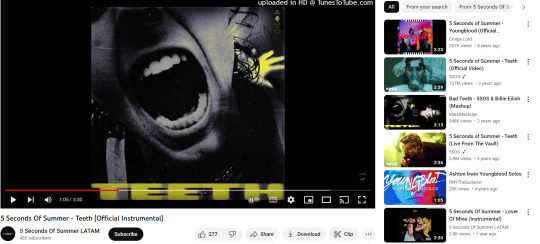
Links to the music we were going to use for the first trailer-
7 Rings by Ariana Grande (instrumental version) for Suhana: https://www.youtube.com/watch?v=0FEzf597ieI
Me Too by Meghan Trainor (instrumental version) for Isha: https://www.youtube.com/watch?v=7cfy2Kbnr3o
Jealousy Jealousy by Olivia Rodrigo (instrumental version): https://www.youtube.com/watch?v=-ypLBvogjkk
Look What You Made Me Do by Taylor Swift (instrumental version): https://www.youtube.com/watch?v=mJk1ValiK-w
Teeth By Five Seconds of Summer (instrumental version): https://www.youtube.com/watch?v=N6QvfT3dE_g
However, we did not end up doing this as the beats for all the songs did not match the scenes and the sound mixing would be an issue as well. That is why I decided to find one song that fit for the entire trailer. On day 3 we finally found the perfect song for our first trailer.
0 notes
Text
Shooting the Case File Scenes-
Since we did not have enough time on shoot day -2 to film the case file scenes so we decided to shoot it on our first day of editing.
This scene was required for the meet the characters trailer so we had to shoot it before we started to edit. As planned we wanted a high angle shot of the detective opening the character’s case file (individual shots for each character). We used Sir to play the role of the detective. Only his hand was shown opening the case file. I made Annika stand on a high chair to get the shot. We shot this scene in the media studio as the lighting could be easily controlled. I wanted the lights to white as it would give the feeling that this was taking place at a police station but we had to use yellow lights as the white light would take too long to set up. So we had two yellow lights on above the round table where the case file was placed we also made sure that Annika’s shadow was not being casted on the case files while shooting. Again Annika found it difficult to focus the camera and the shots came a bit shaky. But we ended up deciding to stabilise the shots during editing as we had only 30 minutes to shoot the scenes. I also took an additional shot of one case file being thrown onto the other case files. I wanted to use this shot for the fast cut scenes in trailer two.
BTS of us shooting the case file scenes-
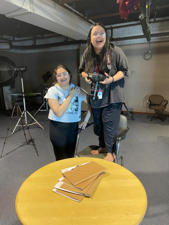


After shooting this we moved on to editing.
0 notes
Text
Coursework Development/Production: Shoot Day- 2 (Part- 4)
We then shot the scene where Sushant gets handcuffed by the police. This scene was also part of the fast cuts in the second trailer. We shot this scene outside in the corridor on the sixth floor. Annika had to take a close up shot of Jaden being handcuffed by our media Sir. We requested our media studies Sir to handcuff Jaden with the handcuffs we had bought. I instructed Sir to to just lock the handcuffs for the close up shot. Only Sir’s hands could be seen locking the handcuffs on Jaden (only Jaden’s handcuffed hands could be seen in the shot). This way in the trailer the audience will not know who gets handcuffed until they watch the film, this creates a sense of suspense.
BTS Images of is shooting this scene-

This simple scene was in fact the most frustrating to shoot as the shot kept defocusing. For some reason Annika could not focus on the shot for a long time. Also our Sir could not lock the handcuffs fast enough for the shot so we had to keep re-taking it until he got the hang of it.
Footage of Sushant being handcuffed for the fast cut shots-
https://drive.google.com/file/d/1RfXG6se7KrVaFkJwvPmC8Ssh6QAHVu8r/view?usp=share_link
https://drive.google.com/file/d/1nWi7GtiZFWgUT6eQmiDBunHx9uduuGLT/view?usp=share_link
https://drive.google.com/file/d/1eE2Jmfib74cpwOkPhF7zQ9M67y3rVI4v/view?usp=share_link
https://drive.google.com/file/d/1Q5HD6utetIvu_yxHwm3qytcYD8OLYjOL/view?usp=share_link
https://drive.google.com/file/d/1zTsKCQgMO8ew2jTmfHJbSBz3JPCSCePo/view?usp=share_link
After that I decided to shoot the scene of Isha (Ichcha) screaming- “But we are all responsible!” I took one close up shot of Ichcha yelling this dialogue o that we can only se her facial expressions and a medium shot of the same scene but with Naysa, Jaden and Ichcha. This also took a long time time to shoot as the shots looked jerky and unstable. Also the actors kept laughing as they found Ichcha yelling funny. I had to instruct Ichcha how to yell while banging her hands on the table to create impactful performance and to convey to the audience that this was a tense scene. After multiple re-takes we got the shot.
BTS Images of me explaining Ichcha what to do for the scene-


BTS images of us shooting Isha screaming scene for the close up shot-


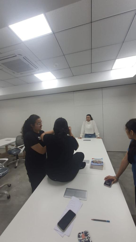

BTS images of us shooting Isha screaming with Naysa and Jaden in the scene-


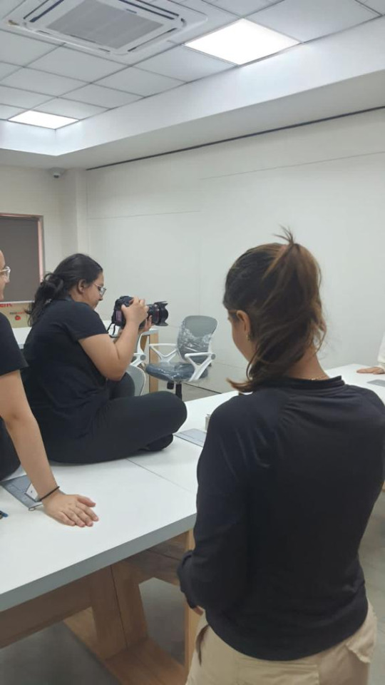


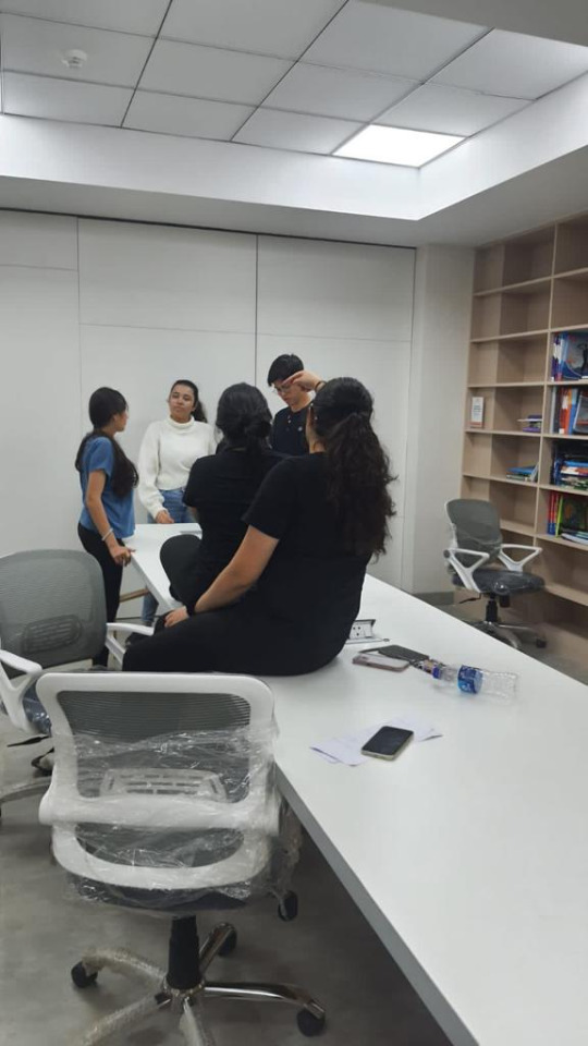


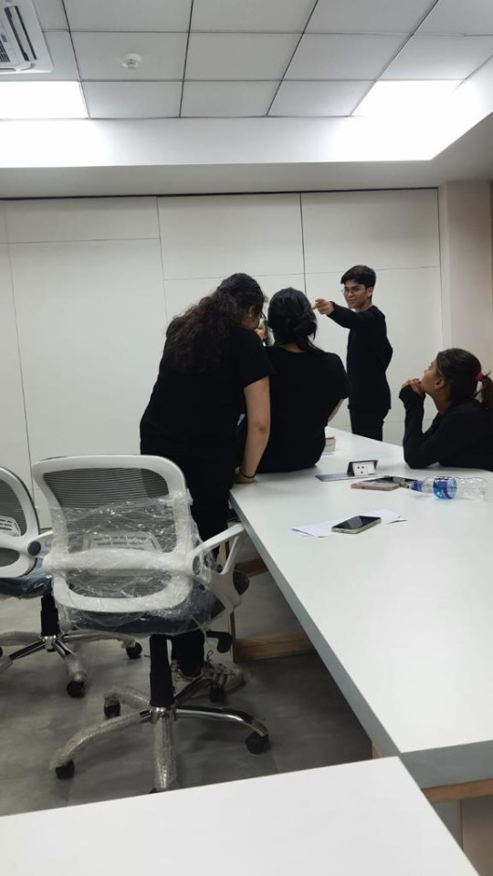
Footage of Isha screaming scenes-
https://drive.google.com/file/d/1BM4Yxff6B4gzWxD2M13U9E2xXPR83xR0/view?usp=share_link
https://drive.google.com/file/d/19Rp_cb4C39bWNgAAr8ORwOwVbhxQbEmi/view?usp=share_link
https://drive.google.com/file/d/1tSBMu8b3k1od9oKhlNRqJ7T8OFyqwc8m/view?usp=share_link
https://drive.google.com/file/d/1iaDULqMfoajWlnc0XNDuXhJ9dOyubZS1/view?usp=share_link
We then shot the scene where Suhana slaps Sushant. This scene was again needed for the fast cuts. I shot the same scene in two different locations- on top of the staircase landing and also the below staircase landing near the balcony. For the on top of the staircase landing Annika set up the camera on a tripod so you got a low angle/upward medium close up shot. For the below staircase landing Annika sat on the stairs and took a medium close up shot (handheld) of the characters for the scene. Both shots looked as if the audience was there while the scene is taking place. This way during editing I could decided which shot I wanted to use. For the shot I only needed the slap but to make the scene more realistic and easier for the actors to act I told them to say a few lines before Sakshi slaps Jaden. For example Sushant (Jaden) would say- “But I’m not gonna tell them!” and Sakshi would reply- “Either you do it or I will!”. This gives a bit context to scene as well, where Suhana confronts Sushant about him sexually assaulting a young girl at at party as Suhana had witnessed it. She tells Sushant to go tell the police but he won’t so Suhana threatens him that she will report the crime. I also told Jaden to pull Sakshi’s arm when she tries to walk away and in that moment Sakshi would fake slap him. This was the most fun scene to shoot. I had told Sakshi to fake slap Jaden but in the first take she in mistake actually slapped him across the face. This made a loud slap noise and left Jaden looking shocked. Everyone behind the cameras were laughing hysterically and it really helped us all distress from the hectic day we were having. Even though Sakshi actually slapped Jaden by mistake, the scene looked very authentic and raw. I was very glad we caught it it on camera and I decided that I might use it for the trailer. Still I took another shot of Sakshi fake slapping Jaden just in case.
Footage of Sakshi actually slapping Jaden-
https://drive.google.com/file/d/1agGLn9GiyvgVCeB-97ySTWH1vHfd54DD/view?usp=share_link
BTS images of me instructing the actors what to do for the slap scene-


Footage of Sakshi fake slapping Jaden for the slap scene-
https://drive.google.com/file/d/1HF8yEJvVksYLiEFfSD8xOgNGTWSCqtc7/view?usp=share_link
For extra shots I told Annika to take a pov shot for Isha’s second personality scene that we had written in the screenplay. We had originally written two personality scenes for each character but I thought one personality scene except for Suhana was good enough. But since I wanted a few extra shots I decided to shoot this scene which could be used in the second trailer instead of the first. In this scene we see Naisha looking scared and worried while walking back slowly as she is being bullied and then Isha comes to stand up for her. This shows Isha personality- brave and bold. Annika decided to shoot this scene from the pov of the bully- so we took a medium close up shot of Naysa backing away and then Ichccha comes in front her looks at the camera (bully) and says- “Hey! Quit teasing her!” We also took a close up shot of this scene. However both shots looked very funny and made the scene look like a comedy. We tried these shots multiple times but because both actors kept laughing or the line delivery was sounding more comedic than serious. We shot this scene multiple times as the actors were adamant on getting it right but after some time I decided to move on to the next scene.
Images of the bullying scene-
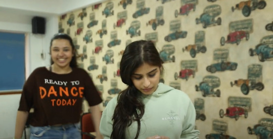

Footage of bullying scene-
https://drive.google.com/file/d/1VZm25nPanLFsWYu-24xC12p2RyD2QUvT/view?usp=share_link
https://drive.google.com/file/d/1sPURLSUlOSt3jfIJAo4WI-qNosLkbqYN/view?usp=share_link
https://drive.google.com/file/d/1D86FQiqb1zxVShkd2JrEzDOdTdScq0y1/view?usp=share_link
The last scene that we shot was Suahant’s personality scene. The scene shows Sushant doing some school work in the library with many textbooks on the table. He sees that Varun is calling him on his phone so he picks it up. Varun asks him if he is attending the part but Sushant responds saying- “No...I have lots to study.” This shows us that he is a hardworking and studious boy. Again I visually show this instead of saying it outright in the dialogues. This scene we had planned to shot from various camera angles and use whip pan but due to time constraints we had to take this shot as fast as possible. As the director I had to come up with a solution so instead of taking a static shot I told Annika to take a medium close up shot of Jaden acting out the entire scene while I pushed her slowly from the right to left on a rolling chair. This way there is some movement in this shot and it does not make the scene look boring and plain. The audience will be pay attention to scene as well. Since we did not have Sandesh to speak on the phone for this scene as he could not available on the second shoot day, I had to say his lines while the scene took place to help Jaden act the scene out better. We would add Sandesh’s voice over during editing. It only took two takes to get this shot as Jaden acted well.
Images of Sushant’s personality scene-

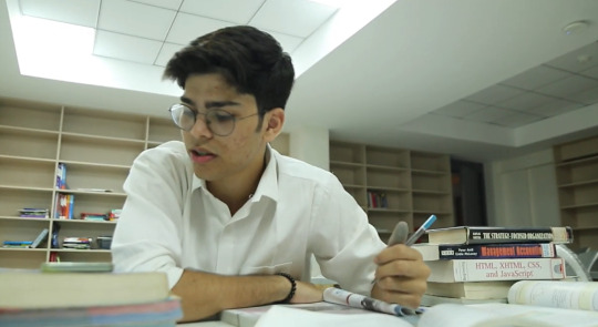

Footage of Sushant’s personality scene-
https://drive.google.com/file/d/1VdGpW23qHOqWPEyhk6rsPV3QDwGZxHYc/view?usp=share_link
https://drive.google.com/file/d/1SuKv5SBQXsXLBEKXbXe3FUi9n7TSUAPz/view?usp=share_link
We were finally done shooting for both our trailers. I was exhausted but also satisfied with the shots we got. After a lot of challenges we managed to work together and help each other out so that we could achieve the best results.
0 notes
Text
Coursework Development/Production: Shoot Day- 2 (Part- 3)
The next scene we shot was of Suhana crying for the fast cut shots. For this scene I told Jiya to smudge Sakshi’s mascara around her eyes and Sakshi requested us to spray water on her eyes to make it look like tears were running down her face as she would find it difficult to cry in front of so many people. After her make-up was done I instructed Sakshi to sit on the floor with her back leaning against the wall. She had to have sad but emotionless look on her face. She had to have no exaggerated look on her face. To make this scene look more unsettling and aesthetic I told Jiya to shine the RGB lights (red, green and blue lights) that she had got, on Sakshi’s face. This also created a shadow on one side of the wall, which symbolised her cruel and mean side that engulfed her always. The slow changing of the lights from red to green to blue made the scene look eerie but also captivating.
I wanted to get Sakshi’s facial expressions and a shot of a single tear falling down her face. Therefore, I told Annika to take an extreme close up shot of her (camera on tripod). While shooting the scene as the director I gave Sakshi instructions on what to do because in editing my voice could be cut out. I told Sakshi to turn her head slowly from right to left or the other way round and to look down or up. My guidance helped Sakshi make the correct movements that I wanted for the shot.
This scene took some time to shoot as we had to keep re-touching up Sakshi’s make-up or spray more water in her eyes. We had to also take a few breaks as Sakshi’s eyes were burning slightly and I did not want my actor to be uncomfortable. Sakshi also found it very hard to stay serious as she was getting conscious of all of us staring at her. even with al these tiny setbacks I was very happy with the shots we got for this scene.
BTS images of us shooting Suhana’s crying scene for the fast cuts-


Footage of Suhana’s crying scene for fast cuts-
https://drive.google.com/file/d/1BnrWO3RgeLWp9q83ccH1n_9LGSoL9I5J/view?usp=share_link
https://drive.google.com/file/d/1e5wcIYKxb74JYhzWgEP3ovIaHVgs8a6V/view?usp=share_link
We then immediately moved on to shoot Sushant’s party fast cut scene as Ishika had arrived. This scene was of Sushant banging his hand against the wall to corner a young girl at a party (sexual assault). We had planned to use this scene in the fast cuts. We shot this scene in small corridor near the bathrooms as it was a confining space which was what we needed for this scene. I again used the RGB lights to show that this happened at a party but also I wanted the shot to be taken only when the light turned to red. The red light symbolises danger over here and with the use of a dutch angle for the shot the scene looks unsettling and creates a sense of distortion. It also makes the audience feel uneasy. I told Annika to take a dutch angle by tilting the camera quickly at the same time Jaden bangs his hand against the wall and leans in towards Ishika (the same way we had practiced during camera workshop). This uneasy and fast movement is very jarring and will frighten the audience.
I instructed Jaden on how to bang the wall and lean in to make the scene look frightening and creepy. I also told Ishika to turn her head to side when he bangs his hand and leans in to show that she is terrified of him and wants to leave this situation immediately. I wanted to show how scary and awful sexual assault is for the victim. Even though the audience does not know what is happening in this scene I wanted them to feel the fear of the girl.
Jaden was a bit awkward in the beginning as he was a bit uncomfortable while shooting this scene that is why we had to keep re-taking this scene. As the director I told him to take a deep breath and to start whenever he was comfortable. Once he was ready it only took a few more times until we got the shot.
BTS images of us shooting this Sushant’s fast cut scene-


Footage of Sushant’s fast cut scene-
https://drive.google.com/file/d/1HQZdczo2hS5NyHBLOEANJxMGDx3MGqsd/view?usp=share_link
https://drive.google.com/file/d/152Kmly4JFK-qICQTbbSWmGdo81EIlLta/view?usp=share_link
https://drive.google.com/file/d/1gYu3z8gzdOccA_jj8F_HkBmLSEVsTfil/view?usp=share_link
https://drive.google.com/file/d/1fkDnV_rr8jDke3Zuic61hmBJnVbiF0BW/view?usp=share_link
Then we moved on to the handcuffing scene.
0 notes
Text
Coursework Development/Production: Shoot Day- 2 (Part- 2)
The next scene we shot was Suhana’s second personality scene. As the director I decided that Suhana should have two personality scenes was the main character and the entire story revolved around her. This scene was of Suhana and Naisha walking out of a elevator with shopping bags (high end brands). Naisha says- “Gosh Suhana! Your retail therapy exhausts me!”. Then Suhana replies- “But we haven’t even started yet.” This indicates that Suhana is rich and aloof. Before we shot this scene, we made stuffed all the high end brand shopping bags that Jiya and I got with random items so that they looked full. As the director I also instructed Sakshi and Naysa what bags to carry and placed them on their arms in a certain position so that the audience could read the brand names. Some of the brands on the bags we used were- Naykaa and Zara as we had decided that those would be our in-house branding partners. This way in the trailer you could see the names during this scene. Before postioning the shopping bags on both of them I also showed them individually how their characters would hold the bags. I showed Sakshi that her character would carry her bags gracefully on her arms whereas Naysa’s character would hold them in her hands. As the director I wanted to show even the tiny personality traits of the characters so that the audience can observe the differences.
BTS images of Jiya and I stuffing the shopping bags with items-

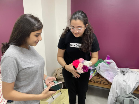
BTS image of me positioning the shopping bags on Sakshi and Naysa for Suhana’s personality scene-

BTS images of me showing Sakshi and Naysa how they should carry the shopping bags-

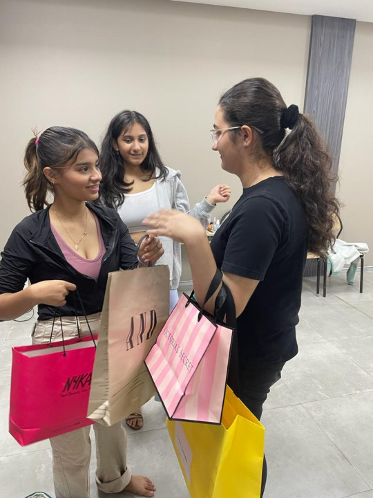


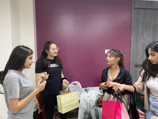
After that we went down to the elevator lobby to shoot the scene. This scene took the longest to shoot as there were many people walking in and out so we would have to keep re-taking the shots. The elevator doors showed our reflections so we had to take the shot of the elevator opening from a certain angle. I told Annika to position herself slightly to the left side of the elevator so that the camera and us behind were not being reflected on the elevator doors. S I had to also ask the lift man how to operate the elevator for the scene so that we could close and shut the doors for the shot. I also instructed Jiya to knock on the closed elevator doors to give a cue to Naysa and Sakshi when to open the elevator doors as they could not here us from inside. Also to make the audio clear for this scene I decided to use the tiny hidden microphones that Sir showed us during camera workshop. One mic was on the camera and the other two mics were clipped onto Sakshi and Naysa’s clothes. Jiya positioned them in such a away that the audience wont be able see the mics while watching the scene.
Image of the mics we used-
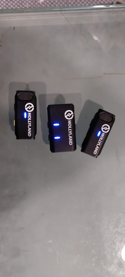
Once the mics were set up I reminded Naysa and Sakshi about how they should walk and hold their bags and how they should deliver their dialogues. I wanted to make sure that the actors portrayed their characters perfectly. This shot took a a while to shoot as the elevator doors would not open on time, the actors would laugh, the actors would also get tired of holding the heavy shopping bags or someone from outside could be heard talking. I was getting a bit stressed as we were falling behind schedule. Thankfully, we managed to get the shot I wanted.
Footage of the first shot for Suhana’s personality scene-
https://drive.google.com/file/d/1DnXq28nTft1vLx7kmtdxUyDVAwHcdX9A/view?usp=share_link
https://drive.google.com/file/d/19g-uzkOwocsM52bn8lMnlJvC5S4MpiTK/view?usp=share_link
I also told Annika to take a long shot of the same scene so that we had a shot where the location could be seen (indicating that it is a shopping mall).
Images of the Long shot I told Annika shoot for Suhana’s personality scene-


After that I decided that I wanted to take the next few dialogues using the other side of the lobby. On the other side were large glass windows and a orange couch and chair that made the setting look more like a shopping mall. I told Annika to position the camera (on the tripod) facing the other side of the room and to take a medium close up shot of Sakshi as she walks into the frame. I instructed Sakshi to walk again from the elevator as Naysa says her dialogue and then she she twirls around to look at Naysa and replies back. As the director I wanted to capture a separate shot of her twirling/flipping her hair with attitude so that the audience can sense what type of person she is by just a few actions and behaviours. I also took one take where both of them sit on the couch after Sakshi says her dialogue. I took this take as I wanted to show how tired Naisha was from all the shopping they did and that Suhana wants to shop more.
BTS images of Sakshi getting ready to act for this shot-


Footage of this shot for Suhana’s personality scene-
https://drive.google.com/file/d/129WM8CKECY9L4FP2Q9YkmREzRWqHm2ju/view?usp=share_link
https://drive.google.com/file/d/1R5h1t2aED75YkYN8wM5Utmb-A41INPUq/view?usp=share_link
https://drive.google.com/file/d/1-xtnEcUdpFnj-VRwLflbEskj4onwtedz/view?usp=share_link
I wanted to take one extra shot of Naysa groaning to show her exhaustion before she sits on the couch. This way the audience can get a glimpse of what her character is like as well. Annika positioned the camera behind the orange sofa so that we got a Naysa’s reaction clearly (medoum close up shot). I also put a tape on the floor as a marker so that Naysa knew where she had to stand and give her reaction. I wanted to take this shot as quick as possible but Naysa kept laughing or did not react the way I wanted her to. It was either too bland or too exaggerated even though I showed her what I wanted. Finally I decided to move onto the next scene as we had to start shooting the other scenes. I decided to take a call during editing whether or not I wanted to use the Naysa’s reaction scene. Naysa’s reaction shot made everyone laugh and lighten up the mood so it was a lot of fun.
Footage of Naysa’s reaction shot-
https://drive.google.com/file/d/1Ig58mfoiQOvvsBPMn0I36aCmIf52mTiI/view?usp=share_link
https://drive.google.com/file/d/1ZobItbDHGZaZgjvo4hdmgjPpxzk_Vjb9/view?usp=share_link
After finishing Suhana’s personality scene we moved onto shoot Isha’s fast cut scenes- Isha throwing her phone on the bed, sliding down the wall and crying. I instructed Ichcha to do all those things but with anger. I wanted to show the audience how furious Isha is when she finds out who was cyber bullying her (Suhana). The crying scene shows how betrayed and hurt she feels as well as Suhana is her close friend. For this shot I used the same bedroom setting but to make it look more unsettling and to fit the mood of the scene I switched off all the lights in the room and only put on a small yellow night lamp near the bed. This way Ichcha’s shadow was casted on the wall to symbolise that she is having dark thoughts. I told Annika to position the camera on the tripod and to take a medium close up shot of Ichcha walking up and down the room and when she throws her phone on the bed. I chose medium close up to show the background as well as to capture Ichcha’s facial expressions. The second shot was a high angle shot of Ichcha sliding down the wall and crying. I used high angle shot here to show that she is weaker in this moment and that she is in a vulnerable state (as she is crying). I also allowed Ichcha to improvise provided she did all the actions I instructed her to do (walking up and down, throwing phone on bed, sliding down slowly against the wall and crying softly with her). We finished this shot in a few takes as Ichcha acted very well. I was very happy with her performance for this scene.
BTS images of us shooting Isha’s fast cut scenes-


Footage of Isha’s fast cut shots-
https://drive.google.com/file/d/1fU3OT0d9ayIs-NRX8pWrwtwo2E4YSDDJ/view?usp=share_link
https://drive.google.com/file/d/1lcdem9RUray6tUWowNDtI7Mpa05VndeY/view?usp=share_link
https://drive.google.com/file/d/1fGG2LLejXOeU2GlEUYBfndUZmT1wu6jj/view?usp=share_link
https://drive.google.com/file/d/1z_QOFYKdh-P4IuGzdV9VxOIMDVId_aEt/view?usp=share_link
We then moved onto Suhana’s crying scene for the fast cuts.
0 notes