Link
Useful article on the types of different apps that people want. For example, people are more likely to download an app if it is aesthetically beautiful, and is free.
4 notes
·
View notes
Link
Useful article on UX (User Experience) of an app.
3 notes
·
View notes
Text
Charlotte Fowler
An iOS Mobile Application designed, and produced. With a simple yet engaging - crisp interface. Discover an App, which has been produced for you, its here to make your life easier with the touch of a button.This is your discovery hub, which will use its own brain to find out what’s right and what you need to experience the best night of your life. With this app there’s much more where that came fromThis “App” has been through many research and design processes to ensure the product and its interfaceIs at the highest standard that can be done in the hands of a student.
It feels right, looks good and more importantly does the job.
This is an example of my artists card that i would like to display on my exhibition. Looking into the future!
looking into the future with my artists' card.
3 notes
·
View notes
Link
Useful article on the types of apps that people want.
For example, People are more likely to download an app that is free.
4 notes
·
View notes
Photo
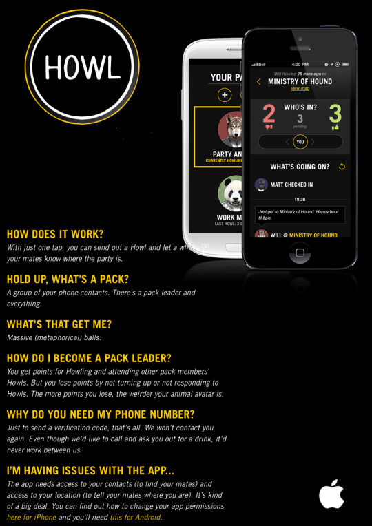
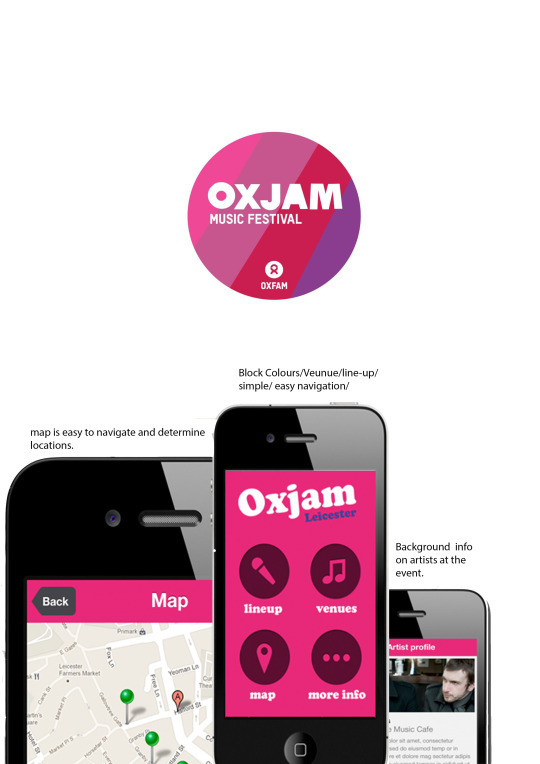
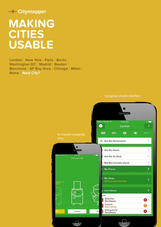
Comparing Lifestyle Apps.
During my research, i have been looking at a series of mobile apps. I have chosen 3 out of many, and I’m going to evaluate the pros and cons of each app.
Howl
What is it?: howl is an app that you and your pack (friends) would all have, it is all connected through phone contacts. A pack leader will check into a venue with the click of a button, and it will send out a notification to the rest of the pack. The Pack will either slide left, or right if they will be attending on the night out. Kind of like a tinder style night out app
Interface: the interface for howl is big and bold. dark colours with big bright colours. the app looks smart and sleek, and more cool instead of happy and funky.
Likes: great interface, concept and it works well.
dislikes: i can imagine it can get annoying with all the notifications.
8/10
Oxjam
What is it?: oxjam is an event throughout the uk where small bands play in small venues for the oxfam charity. the app is an events guide to where it is showing and what time
interface: the interface is simple. but not in a good way simple. the colours are boring and it doesn’t look smart. the buttons are skewed and it looks unprofessional. but it is very. very easy to navigate
likes: really easy to navigate and does the job properly
dislikes: looks unprofessional and cuts out sometimes
4/10
City Mapper
What is it?: city mapper is a real time transportation app around big city’s such as London and New York. it supports real-time date on buses tubes, cycles and rail.
interface: the interface for city mapper is really nice. it runs really smoothly and the contrast of colours isn’t too harsh on the eye. it has cute little symbols and is very idiot-proof too.
likes: city mapper is a very well designed app, and if it where in manchester it would be very helpful for me!
dislikes: it does’t include manchester.
10/10
4 notes
·
View notes
Photo

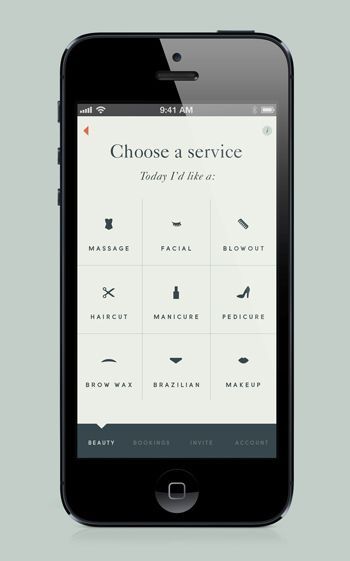
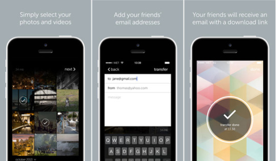
Some examples of beautiful app designs. ( in my opinion!)
2 notes
·
View notes
Link
4 notes
·
View notes
Link
Creating intuitive navigation for your iPhone app can be a nightmare. The folks behind iPhone app gallery MobileMozaic select 10 examples of apps that get it right.
4 notes
·
View notes
Link
Native App
Native App has been developed for use on a particular platform or device. .A native mobile app is a Smartphone application that is coded in a specific programming language, such as Objective C for iOS and Java for Android operating systems. Native mobile apps provide fast performance...
4 notes
·
View notes
Photo
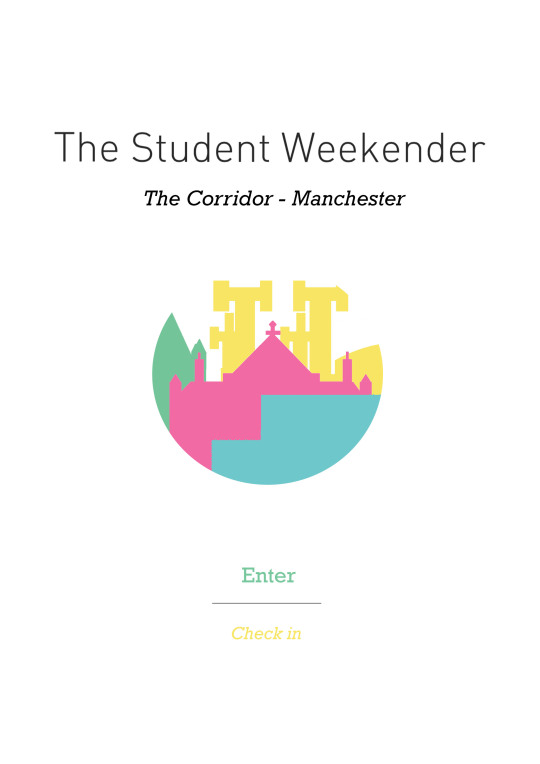
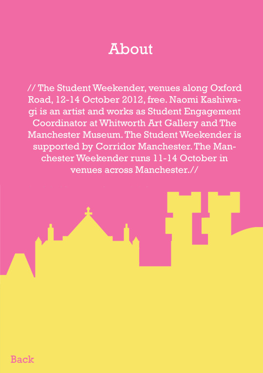
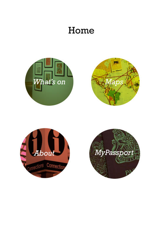

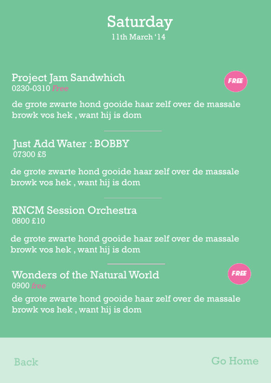
First App prototype draft
4 notes
·
View notes
Photo
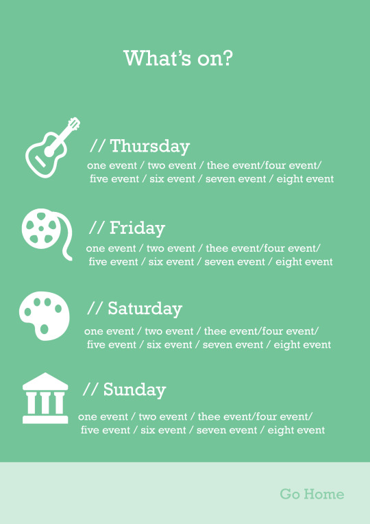

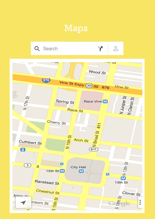

some screen shots from the first prototype of my Student Weekender App ( a lot more progress to be made ofc)
3 notes
·
View notes


