Don't wanna be here? Send us removal request.
Text
Final Project
For my Final Project, I chose the self-branding option. I feel that it allows me to explore about myself and tap on my creativity without any restrictions.
I started off by analysing key traits and adjectives that I associate myself with. I resonated more with the adjectives fun, creative, curious, positive and being strong. I am also at the stage where I am constantly trying to figure out more about my culture and its roots, and was deeply intrigued by the Javanese culture, being that is where my ancestors were from.

To start off my brand, I decided to work on the logo first. I’ve used a mixture of two elements – one being the silhouette of a mythical creature, the makara, and the other a reinterpreted version of a batik motif, the parang rusak.

Using the Pencil tool, I traced out the Makara, a mythical creature that is known for its protective nature. I chose the Makara as I personally felt that the creature symbolizes strength and creativity. It is made up of the different parts of different animals, signifying the endless possibilities of exploring and being creative. I decided to go with the Makara on the left, after seeing its grandeur in real-life (it is a permanent exhibition at the ACM!). Furthermore, I was awed by the intricacies of the woodcarving.


From stage 0 of the traced out makara, I made a few developments and exploration of my logo. I’ve also explored writing my name in Javanese and incorporating it into the logo, as can be seen in the Final stage. However, after much consideration, I felt that the logo looks too traditional. The cutout parts could also potentially pose a problem when integrating the whole logo onto my namecard, affecting the readability. Also, as my Final Stage logo consists of my Javanese name written using the pencil tool, I felt that it was too light and might affect the logo.
I decided to reference the other aspect of my inspiration, batik and batik designs. As each different state in Indonesia has their specific motif that is unique to its own state, I focused on the motif unique to Yogyakarta – the parang rusak motif. Having went there recently for a holiday, I find that the culture and the nature of the people there were very intriguing – it is one of the few regions in Indonesia granted a special status and is being run by a monarchy. I love how originally there is a form of playfulness and flow in the motif. I wanted the flow to be separated, allowing me to focus on each of the “flow” as an organic shape, further highlighting the “fun” aspect, which I have reconstructed the original into my logo.

For my name card, I wanted to go with something of an unconventional design. I was inspired with the wavy flow of some batik motif and referenced that as the card’s shape. While it breaks away from the conventional rectangular design, I felt that it does not look practical, with the potential to condense the information in the card.


Then I thought about how I could incorporate the card to look like batik. I tried using the background of the card into a similar batik motif. After putting in my contact details, I realized that the information looks too condensed. The use of a patterned background also reduces the readability of the card. Thus, I have decided to keep it minimal and replicated the parang rusak motif onto the other side of the name card.


These are the colours that I have chosen for my colour scheme. The primary colours are found in the logo and I have retained the use of #BC2419 and #E73C27 as the main colours of the makara silhouette. These two are the boldest colours hence my intention of fixing them to the makara and signaling strength, fun and creative. #E0a626 and the secondary colours can be used to create variations to the logo if need be.


These are the typeface pairs that I have chosen for my typography – Poiret One and Blanket. Both are from the Sans Serif family. I felt that this pair complements each other nonetheless as Blanket has a slight mixture of Serif from the way the strokes of the letters are presented. Poiret One represents my forward-looking motto in life as this clean-looking Sans Serif font gives off a futuristic vibe. For Blanket, other than the unique strokes of the alphabets, I felt that it also represents my aura of always balancing between being serious and light-hearted regardless of the situation.

During the critique session, one of my classmates suggested implementing my logo into my resume. At first, I did not want to as I felt that there were many icons in my resume. But, I realized that there wasn’t any visual anchor. So, after tweaking the size and rearranging, the logo did help in creating a visual anchor for my resume. I’ve also implemented the feedback on the alignment of texts. Initially, I thought that by using the Justify function, it can help in reducing the instances of orphans in my text information. However, there were awkward spacings, hence I used the left or right alignment instead.

Overall, I think that this Final Project really gave me a chance to fully experience the affordances of both AI and ID. In creating the brand guide, I appreciate how ID helped in ensuring the neatness and comprehensiveness of the whole guide.

0 notes
Text
In-Lecture Exercise F


5 hues: green, yellow, brown, beige, orange
In my opinion, this colour scheme works well, as they are complementary to each other. Personally, I would use this colour scheme as it brings out a well-balanced cheerfulness - colours that are not too bold nor too muted.
0 notes
Text
In-lecture Exercise E
3 reasons why the typographic example seems like it is off:
Typeface family chosen
Lack of complementary typeface fonts
Alignment
The typeface family chosen makes the paragraph hard to read due to the nature of the fonts and the amount of words in the paragraph. Both the header and the main body looks like they consists of the same typeface family, hence not allowing readers to draw any form of distinction. Lastly, with a centralised alignment, there isnt a clear flow when one is reading the paragprah. Therefore, with these thrree factors, it made the overall paragraph hard to read.
2 suggestions for improvements:
Using a complementary sans serif typeface for the main body/paragraph of the example.
This would help in drawing a distinction for the reader to identify which is the header and the accompanying text. It also allows the reader to comprehend the information logically.
2. Changing the paragraph into left-alignment
This would create a form of visual hierarchy when the reader is consuming the information, guiding them through a natural flow. Also, with the change and variation in the typeface used, it would help attract and retain the readers attention to consume the information.
0 notes
Text
Assignment 3
For Assignment 3, I've decided to do an infographic based on the topic of Food Security in Singapore, as this is a current issue with the recent ban of live chicken imports from Malaysia and the rising food prices.
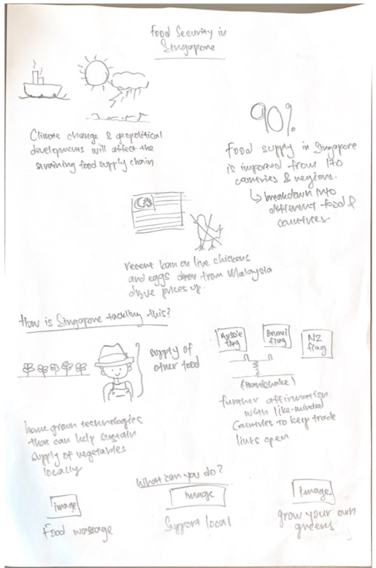
Before embarking on my infographic, I did a rough sketch on its flow so that I will be able to plan my information accordingly. Most of the information was retrieved from SFA's website (https://www.sfa.gov.sg/food-for-thought/article/detail/world-food-day-2022-joining-forces-to-ensure-our-supply-of-safe-food) with additional information for individuals retrieved from DBS' website (https://www.dbs.com/livemore/food/5-things-you-can-do-to-boost-singapores-collective-food-security.html)
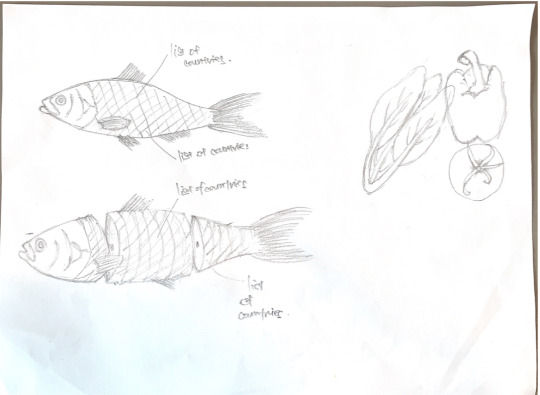
From researching on the SFA website, there was a myriad of information that I would need. I did a rough sketch exploring the different types of icons to represent my information in the infographic.


Throughout the planning stage, I realised that there were a lot of icons that I needed to draw and it would be time-consuming for me to draw them physically, take a photo and trace using the pen tool on Illustrator. I decided to explore the different affordances of the app, such as using the Shape Builder tool to create my icons.

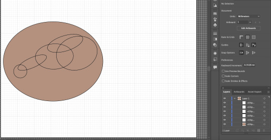

For example, in creating this raw chicken drumstick, I referenced the real version on Google and planned out roughly on what are the basic shapes and how do they intersect. After a rough guide, I included the base colour first, followed by the chicken skin, and then proceeded to use the Shape Builder tool to remove the unnecessary intersecting lines.
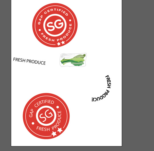

During the critique session, I had no idea on how to portray the icon for "Supporting Locally-Made Produce", as this is one of the recommended actions for individual to take. My tutor suggested using the "Made in SG" sticker, and advised that I could trace it. As there were texts in the sticker, I decided to use the "Type on a Path" tool to recreate the texts. Initially, I created a circle and then use the "Type on a Path" tool. But the result was different as the text produced was convex (1) rather than concave as per the real logo. To rectify, I explored creating a concave line using the "Pen" tool, followed by the "Type on a Path" tool, creating the desired outcome (2).
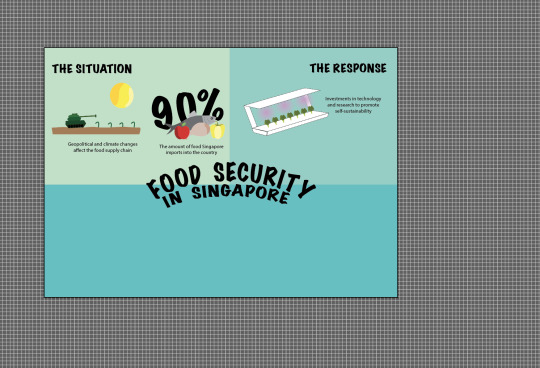
Despite my initial sketch being done vertically, I explored using a horizontal canvas when laying out my infographic. I wanted to focus on the portion of what individuals can do to contribute as the main information of my infographic but I realised that it does not allow me to put a visual hook, plus with 3 different icons in one section being placed together, it might make the whole infographic messy.

This was the first prototype done, presented during the critique session. Shifting from the horizontal experiment earlier, I decided to adopt the vertical approach, per my initial sketch. Piecing this up, I realised that there were considerable amount of spaces in between each icon. With regard to the visual hook, there was also no space to put it in, despite me realising that it is the most important feature missing. Further, as the intent for this infographic was for the use by SFA, I was not satisfied with the fonts used as it did not bring about a sense of professionalism.
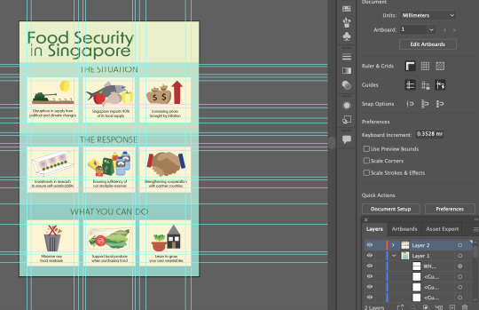
I explored further in using a "box" to encapsulate each icon and the accompanying information to make the infographic neater. I changed the font family to sans serif to keep the whole infographic clean, while making it contemporary and professional-looking as well. The visual hook, which is still missing, was intended to be placed on the top right hand corner of the whole infographic. Again the space looked small and I felt that the font sizes for my sub-headings and the accompanying icons could still be further minimised. Also, I felt that the dark green title against the lighter green background was a little bit like Grab colours, possibly creating a misrepresentation that this infographic was produced by Grab.


In this first version of my final prototype, I chose the teal colour family. I was initially inspired by the use of the colour in SFA's website, as they provide information to their users. I also felt that this colour combination was soothing however, upon further scrutiny, I felt that this combination was not able to drive the urgency of the food situation.
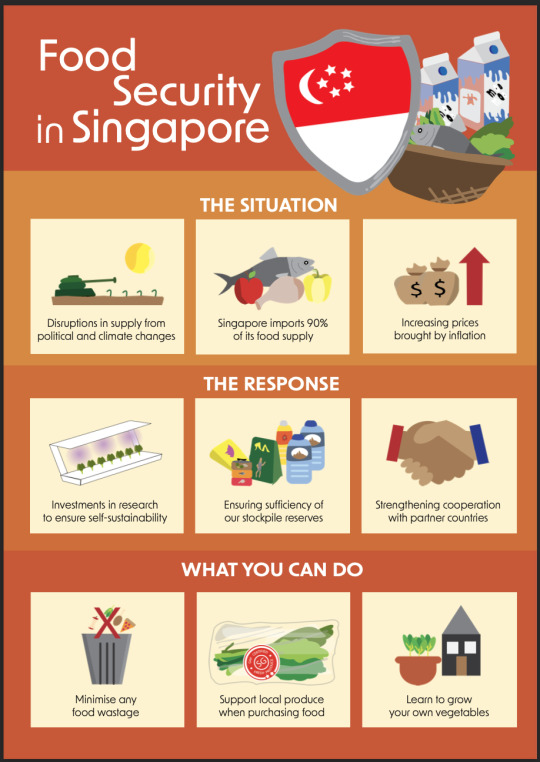
To bring across the urgency of the situation (which is brought about by the ever-changing political and climate landscape), I decided to adopt a colour scheme based on SFA's orange. Also, the adoption of this colour scheme allows the infographic to command a certain level of credibility as it represents SFA.
0 notes
Text
Assignment 2 - Storyboard

Using InDesign, I created the storyboard for Assignment 2 - which was inspired by the tale of Jack and the Beanstalk and from a kids' storybook "Rainbow, Rainbow".

The main challenge that I had for this storyboard is the limited space. As the story revolves around elements of height, I struggled to display different perspectives to reach this objective without affecting the quality of the image. Another issue that I faced was with the representation of near VS far, which also resulted in darker images captured.


As an example would be this scene. Initially, the image on the left was chosen for the critique session. However, one of my classmate mentioned that the rainbow was quite hard to discern. Hence, I've decided to replace it with the image on the right. While it focused on the rainbow, it made my image darker and inconsistent from the other images in the storyboard.

Since the prompt for the assignment allows the use of Photoshop to correct colours for the storyboard, I used it to fix the exposure and contrast of my image. However, due to the low angle that I took this photo of and the glare from the light, it resulted in the flare spot in my image, which I am unable to clear using the Clone Tool in Photoshop.


Another important factor of my storyboard was to show the enormity of the plants, to depict that the land at the end of the rainbow is a land of giants. My initially shot that I took of the lion climbing halfway resulted in the plants looking "normal" in size. With the left image, I was able to show their height factor in which the lion is overcoming. Also, the enormity of the plant leaf against the small size of the lion in the shot helps in achieving the "land of giants" concept.
0 notes
Text


For assignment 1, my take on abstraction is the process of simplification while retaining its meaning as close as possible. I took inspiration from icons as the end goal of my abstraction process to ensure that the meaning of my abstraction retains.
Using AI, I utilised the pen tool to trace the original photo of my fan for this assignment. For the different parts of the fan, I created different layers which helped me trace the fan clearly. I also learned that by adding colour to the fill of my Pen tool, it allows me to create a coloured portion of my abstraction easily.
I've received 2 notable comments during the critiqued session.
1) The first was to adjust the size of the different parts of the fan on Stage 4. I've made the changes accordingly on the final work as it makes sense to show the consistency of my abstraction process.
2) The second being to consider applying a background colour instead of to the blades of the fan. I've tried doing so but it makes the abstraction unclear. For example, the first image below doesn't show the cover of the fan as in reality it is see through, thus showing the background. For the second image, it brings out the fan clearly, but the blades are not able to stand out.


Following the critique session, I've made changes to the process in Stage 4 to showcase the consistency.
0 notes
Text
In-lecture Exercise D


The reason that I have chosen this technique, the rule of thirds, is to bring into focus my subjects. For the first frame, I wanted to show the humongous size of the monstera leaf in comparison to the other smaller plants around it.
For the second photo, the focus is the trailing plants, which helps to break the monotony of the other plants.
The third photo is focused on the new unfurling leave, highlighting its fragility and daintiness.
Lastly, the last image is focusing on the height of the flat in comparison to the tree.
0 notes
Text
In-lecture exercise C

Signifiers:
Tomato at the top of the object
Heinz tomato ketchup
Stacking of the red pieces (resembling tomatoes) into a figure of a bottle
“No one grows ketchup like Heinz”
Signified:
Heinz tomato ketchup is made with quality tomatoes, with the bottle being filled to the brim, emphasising value for money
0 notes
Text
In-lecture exercise B

A short History of Modernism, 1982, depicts three scenes - first is a woman, wearing a sun hat and spraying water through a hose at the window of a house, second is of a man, seemingly pushing his head against a brick wall and lastly, an image of a chicken at the top of a flight of stairs staring at its reflection from a full-length mirror.
The images are presented side by side, with the image of the woman being first, the man in the middle and the chicken as the last one. All seem to relate to one another in the sense that they are outward looking with no emphasis on the surroundings.
An interpretation of the painting as a whole could point out to the sense of reflection that the main character has towards her/him/itself. It could have an intended meaning on the importance of self-reflection against different time periods.
Overall, the painting is effective in bringing across a sense of self-reflection of oneself, however, a shortcoming of the painting could be specifically to the middle frame of the man, as it did not seem that the time period was the same as that of the woman’s.
0 notes
Text

Something that always keeps me going: my plants! They rejuvenate me and always remind me the importance of taking a break.
However, to ensure that my plants remain healthy, I need to water them and provide them adequate sunlight and wind. Thus, this self-like machine that I've drawn helps me to overcome this problem. With a tank at the bottom to store water and grow-lights and air-vents around the shelf, this helps in providing my plants with all the things that they need. The buttons at the shelf-machine allows me to control the light and air as required and the last button will help to ensure that plant-watering is an effortless affair.
0 notes
Text
Hey, welcome to my Tumblr. This will be my platform to details my experience throughout NM3217. Happy reading!
1 note
·
View note
