
My name is Isobel Chilberto. I am an exploratory photographer specialising in atmospheric photography and photo manipulation of the surreal and horror, with a dash of fascination with the macabre. I have explored ideas of the unseen and seen world, played with concepts of feminism contrasted with the horror genre and worked with subjects to examine the world of self-portrayal. My approach combines classic photographic principles with playful humour and a journalistic approach. I enjoy manipulation before and after shooting and taking photos that give the illusion of being manipulated.
Don't wanna be here? Send us removal request.
Statistics
We looked inside some of the posts by 2025thedirectedimageisobelc and here's what we found interesting.
Average Info
Notes Per Post
0
Likes Per Post
0
Reblog Per Post
0
Reply Per Post
0
Time Between Posts
1 day
Number of Posts By Type
Text
17
Last Seen Tumblr Blogs


Fun Fact
The Tumblr app for Google Glass was released on May 16, 2013.
Text
Week 12_Positioning Statement


The only thing worth mentioning for my statement was that I was unsure how to properly reference images in the context that they were found on a webpage with no original author. All the sources I found weren’t clear on how to do this. Therefore, I decided to reference them by combining multiple sources and what I deemed made sense for APA formatting.
0 notes
Text
Week 12_Final Outputs_Mockups
To aid in the imagining of my campaign in an art gallery setting, I made multiple mockups of the pamphlet and posters. This allowed visualisation when I was unable to create a physical output. I have credited the sources of the mockups down below.


Mockup Sources:
https://www.facebook.com/akteotia, & https://www.facebook.com/akteotia. (2024, December). Free Canvas Art Gallery PSD Mockup. Photoshop PSD Mockups. https://www.photoshopvideotutorial.com/free-canvas-art-gallery-psd-mockup/#google_vignette Mockups Design. (2018, February 26). Free A4 brochure mockup. Mockups Design. https://mockups-design.com/free-a4-brochure-mockup/
0 notes
Text
Week 12_Final Outputs_Campaign Booklet
One of my final outputs was a booklet that supplemented the posters and allowed a keepsake for those visiting the gallery setting it would be used in. I was able to honour the research I had done on each poster's themes, which I was unable to use within my reflective statement due to the word count and continuity.


0 notes
Text
Week 12_Final Outputs_Final Posters
My main final output was a poster ad series showcasing the themes of the project, both in archetypes and the cost of beauty. I am happy with how they came out, even though I am still unsure if the lighting is one hundred per cent the same across each poster, as well as the colour tones/hues. I am happy with the 50s feel they have and the overall effectiveness of the ideas portrayed in each. I hope to continue making feminist pieces like these and explore the portrayal of women in media.


0 notes
Text
Week 12_Final Outputs_Final Poster Edits
Editing:
When I edited my photos for my posters, I wanted even, neutral lighting with slightly intensified highlights on the face, inspired by editorial lighting. This meant they could easily be edited in tones and brightness, etc, in Photoshop later without losing much detail.


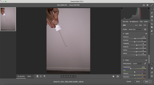

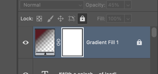
I added of grain and dust to backdrop to give a vintage feel but not the image to keep them crips and honour the focus within them. I felt this added a slight ode to the time period without being overly aged. I also added a radial gradient to give the appearance of weathered edges and bring intention to the image in the middle of the poster. For the type, I used Futura and script typeface to give a vintage feel in a deep red to keep it hyperfine but not overly bright.

Final image selection - swapping the femme fatale image
Rationale: I felt the second image felt more objectifying, versus the first felt too powerful (horrifying to say as a woman). The lipstick on the lips is also more pronounced in the second. Therefore, it feels more like a lipstick ad. The movement of the second also gives a sexy feel as well as wraps around the posters nicely, creating eye movement.
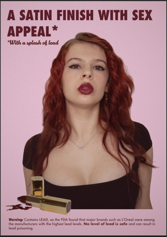

I was also conflicted on the colour treatment of the product shot, so I tested both gold in tone and more neutral. Initially, I liked the neutral, but in the end, I felt the gold was stronger as it points your eye to it, and the contrast is quite pleasing.
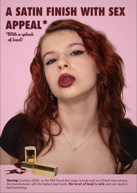

Minor enhancements of the images were done with a bit of generative AI to fill in hair and remove a patch of white on a button. Alongside an enhancement of a tear drop with a pink overlay, and turning the tape measure pink through masking.
0 notes
Text
Week 12_Feedback
This week, we presented our current work to the class and our lecturer. This was valuable to gauge where I was in terms of completion. It seemed to be pretty positive in that my final output idea was working well in the gallery context. My reshoot had also paid off, as it seems the new images are working well, which is a relief! I also was able to get some peer feedback and she liked my corset poster, which I was happy to hear. Finally, my lecturer reflected on the importance of highlighting the importance of Cindy in my photographic journey in the minor as a massive inspiration in my work.
0 notes
Text
Week 11_Booklet/Poster/Mockups_Drafts
For my final output, I will be submitting 4x posters, 1x booklet, 2x mockups and finally my positioning statement. This week, I worked on getting a refined draft of my four posters alongside a rough draft of my booklet and mockups. Overall, I think my outputs are making sense, and the context in which they will be viewed correlates. I find feminist pieces in museums are a draw point for me to go visit, and to take home a booklet would be an added bonus to visiting and something to keep and relook at.
The writing within the booklet will showcase my research I did about the archetypes, advertising/female portrayal and then the cost of beauty on the consumer. I also want to aid the posters with an example of the misogynistic ads of the past to really drive home my point.


0 notes
Text
Week 11_Artist Model_Eli Rezkalllah
For inspiration on others who had done a similar idea before, I looked at photographer Eli Rezkallah's project 'In A Parallel Universe', which took a gender twist on vintage sexist ads. I found these pretty effective in the way they took really disturbing pieces, flipped them on there head and would make someone think as it feels unexpected. As the ads of the past would put women in these roles and not the men.
I also wanted to look at their treatment of type alongside image and the colour treatment as well. In the ad below, it seems to have some grain over it as well as saturation brought out slightly. The pastels aid in the feel of the past and heighten the feeling of "typically feminine" roles of the past. The type also feels very 50s with the bad leading and not sitting on an even line. The other two follow a similar style but with bright colours that feel slightly artificial.


Images sourced from:
IE Online. (2018, January 19). This artist’s GENDER twist to old ads gives men a taste of their own SEXIST poison. The Indian Express. https://indianexpress.com/photos/trending-gallery/artist-eli-rezkallah-old-sexist-ads-men-women-gender-twist-5030052/9/
0 notes
Text
Week 11_Vintage Ads + Campaign Output Change
For my layouts, I looked at deeply misogynistic vintage ads from the 40s to the 80s. I examined some of the emerging languages and the emergence of archetypes. The treatment of type in relation to image was on the more sporadic side in comparison to today. And the use of radial gradients seemed to be typical (Could also just be the scan and signs of ageing).
I am planning on having these alongside my posters in a booklet outlining the context and content within my posters. I want this booklet to be something they can take away when visiting the posters in a gallery as a keepsake and a way to preserve the messaging. Therefore, my final outputs will be posters + a booklet.


All Images Sourced From:
Rare Historical Photos. (2021, September 9). Sexist and offensive vintage ads that would never fly today, 1940-1980 - Rare Historical Photos. Https://Rarehistoricalphotos.com/. https://rarehistoricalphotos.com/offensive-sexist-vintage-ads/
0 notes
Text
Week 11_Reshoots
This week, I focused on retaking two of my shots with better lighting using an LED ring light and a white reflector. I placed the reflector on the right side of my wall initially, but had to put a white sheet over it as it wasn't working well. The white sheet definitely improved it, thankfully. I also had chosen a ring line for more even lighting (it did leave a ring in my eye, but I kind of liked the effect, it feels like exposing the behind-the-scenes of advertising with the glitz and the glamour of professional shoots, or maybe I'm just being abstract!).
The use of this lighting approach improved the dynamic range of my images, allowing for a soft, even lighting that reflected editorial and ad photos. I also really like how neutral the lighting is, as this will allow for easier editing in post.
I took the shots from a further distance and at a higher angle to allow the proportions of hands, shoulders and face to feel cohesive. As well as look at how women are often portrayed from a higher angle to make them appear smaller and more small/submissive. This especially improved my mother's shot as she felt smaller and vulnerable, as well as her hands weren't massive! I also think the fem fatale shot feels more powerful as well as editorial in comparison to the last shoot.
Lighting set up:

Favourites (To be used in compositions):


I am currently conflicted between these two shots as they all feel like they could work with my compositions in different ways. The first feels more seductive but submissive with a lower angle. While the second feels more powerful and clean. I will test both and see which is strongest.

(Unsure if I will use for final as only reason would be to submit a raw instead of a JPEG, but the other image from the past shoot is stronger compositionally and in posture).


I managed to get a shot with both the hands and face in focus, alongside even lighting and a clear tear on the cheek. This will work well for my final composition as it feels like the mother archetype as well as an editorial shot. The dropper will give clues to the tear being both a drop of product and a tear, and is both in focus on the hand and dropper.
Contact Sheets:


0 notes
Text
Week 11_Class
Notes:
Blog content
_Creative practice
_Conceptual engagement
_Research
_Reflective anyalsis
_Skill acquisition
Selecting from images
_Position your work in a theoretical context
Alexis hunter – models revenge��
Feminist critique of advertising
Lecturer Feedback
After talking to Natalie, I know I ned to improve on the lighting in two of my compositions. She gave me some advice on keeping the camera further away and on a downward angle (leans into the women's portrayal in media). As well as using an LED light and reflector at 3/4 angles to get even angles to avoid getting intense shadows on one side and highlights on the other. Therefore, I plan to retake my anti-ageing and femme fatale shots this week. She also recommended that I use the shot of the corset that had my head in it, I assume, for consistency and context.
Notes from talk with peer:
Printed out with 4 side by side
No monotone – part of it is the pink, as its historical with a modern twist
Stick to A4 – a2 is too big, work well toegther
Secondary pink – try deepening it, third, dark pink, on the outside
No grain
0 notes
Text
Week 10_Poster Drafts
In preparation for final feedback, I made some rough mockups of my four posters. I used two 50s-style typefaces to give them the 50s appearance. Alongside this, I used bright pink backgrounds to give the feminine appeal, alongside pink outlines of the photos to make them pop (not sure if this detracts, though). Finally, I treated the posters with even neutral lighting so they felt cohesive (not sure about the femme fatale on though!) From this point, I want to get feedback to know if they work together and if the photos feel cohesive. I think the shaving and Ozempic posters are my strongest both photographically and thematically.


0 notes
Text
Week 10_Photoshoot
This week, I redid my career women's shoot with the approach of a 50s pin-up style/general 50s skinny-shaming ads. I wanted to create a feeling of suffocation alongside a sexualised approach where I looked pretty uncomfortable and unappealing. I went for a pencil skirt and glasses to give the feel of a career woman alongside 50s hair and makeup. The shot types I did were face shots, alongside knee-to-head shots, to showcase the whole body, including the feet, to have all the visual clues I'm trying to convey.
For the second shoot, I tried creating a mature look with a headscarf and coat alongside some intensifying of eye bags to showcase an element of stress, but not too much as ads sell a "desirable lifestyle". I wanted to play with my hands, looking like they were holding something like the mother arch is often portrayed as (usually a child!). I also wanted to play with a drop of product, looking like a tear. So I used eye drops and had the tedious process of trying to get a shot where it rolled down perfectly on the self-timer. I am noticing now that a lot of my shots from this shoot are from a downward angle that makes the proportions feel awkward and do not convey how women are usually portrayed in media.
For the lighting for the shoots, I used natural lighting on both sides via windows and then a lamp at a 3/4 angle away from the wall I was using as a background. I found this gave somewhat even lighting overall with a bit of intense highlight in places. I used a white background for easy editing of the photos after.
I am debating redoing these shots as my camera decided to only process half the photos with both JPEGs and raw files. However, I really like the corset shots and am unsure I will be able to produce something with the same look and feel. From these shoots I need to create better mockups so I can see all four compositions side by side to make sure they're working as a set, especially in lighting.
Lighting Diagram

Favourites:
I really like the two shots from the Ozempic shoot as they feel uncomfortable and over sexualised. They remind me of 50s pinups but with a slightly disturbing twist. They feel like they match my project so far with the hyper-feminine aesthetic and movement of the body within a composition. I also like the one shot from the mother shoot as I timed the tear perfectly and it feels pretty effective in emotion. She feels strong and grounded, but she is also in distress. I also like how the hair frames the face to create an interesting silhouette.


Contact Sheets:
Shoot 1 (The mother)

Shoot 2 (Career Women)

0 notes
Text
Week 10_Research (The Mother, Anti-aging and Ozempic)
The mother archetype
The caregiver embodies a nurturing, selfless nature often portrayed in a domestic setting, where they have the responsibility for caring for others (Atieno, 2023).
The downside is that it fosters the perception of womanhood with an emphasis on self-sacrifice and servitude. With a link to femininity, it cements the belief that women are innately caregivers, limiting their role in society (Atieno, 2023).
Link to the origin myths of goddesses. The mother is seen as a nurturer, teacher, she protects, feeds and shelters. She gives all she has (Trippeer , 2021).
The mother archetype seeks psychological wellness for themselves and those around them, providing much of the emotional work for them (Macey, 2008).
Atieno, E. (2023, June 27). Feminine Archetypes In Literature And Film: How They Shape Womanhood Perception – Affinity Magazine. Affinity. https://affinitymagazine.us/2023/06/27/feminine-archetypes-in-literature-and-film-how-they-shape-womanhood-perception/ Macey, D. A. (2008). Ancient archetypes in modern media: A comparative analysis of “Golden Girls”, “Living Single”, and “Sex and the City.” https://scholarsbank.uoregon.edu/server/api/core/bitstreams/f74f81c2-e4d6-4deb-b411-9a8b3abbdcdd/content Trippeer , J. (2021). Exploring Female Character Archetypes – The Mother. Creative Screenwriting. https://www.creativescreenwriting.com/cswcms/exploring-female-character-archetypes-the-mother/
Anti-aging
Girls as young as 11 using harmful anti-ageing products they see on social media - Causing harmful effects to their mental and physical health (Gecker, 2024).
Extensive data suggests a fixation on appearance can affect self-esteem and body image and fuel anxiety, depression and eating disorders (Gecker, 2024).
According to data from Euromonitor International, the anti-aging market grew from $3.9 billion in 2016 to $4.9 billion in 2021 in the United States alone. The global anti-aging market went from $25 billion to nearly $37 billion during the same period (Stewart, 2022).
"The minute women hit their 20s (and in some cases, even younger), they’re told they’re in a race against time they’re destined to lose. And still, they’re encouraged to spend thousands of dollars to try to win." (Stewart, 2022).
The tone of advertising aimed at women for years has said misogynistic comments like if you age, your husband won't want you anymore, or what if your husband looks younger than you (Stewart, 2022).
Advertisers have weaponised this fear to market products that won't make a massive difference or sometimes are even a placebo, to make money (Stewart, 2022).
The target age for anit-aging producst have gotten even younger to those in their 30s and 20s (Stewart, 2022).
Gecker, J. (2024, August 31). Girls as Young as 11 Using Harmful anti-ageing Products They See on Social Media. The Independent. https://www.independent.co.uk/news/girls-beauty-anti-ageing-tiktok-youtube-influencers-b2604933.html Stewart, E. (2022, July 28). How the anti-aging Industry Turns You into a Customer for Life. Vox; Vox Media. https://www.vox.com/the-goods/2022/7/28/23219258/anti-aging-cream-expensive-scam
Ozempic (For career women):
Typically, most side effects of Ozempic are short-term, but it is possible to experience long-term side effects. It can include side effects that won't go away after taking the drug (Danapilis, 2021).
Possible long-term side effects of Ozempic include:
diabetic retinopathy (damaged blood vessels in the eye)
gallbladder disease, including gallstones or cholecystitis (gallbladder pain and inflammation)
pancreatitis (inflammation of the pancreas)
thyroid cancer
(Danapilis, 2021)
"This drug is not approved by the Food and Drug Administration (FDA) for weight loss." (Danapilis, 2021) - Concerning given it is being used as such.
The drug acts in the brain to reduce hunger and delays the stomach from emptying, so you feel full for longer, causing weight loss. It is typically been used to treat type 2 diabetes for about two decades (Catanese, 2024).
The rapid loss of fat can cause physical side effects such as: a hollowed look to the face, changes in the size of the lips, cheeks, and chin, wrinkles on the face, sunken eyes, sagging jowls around the jaw and neck (Catanese, 2024).
Only Wegovy is FDA-approved for weight loss, but individuals such as celebrities and online influencers have been taking Ozempic off-label for weight loss (Mayer, 2023).
“Discussions surrounding weight loss drugs contribute to disordered eating by encouraging weight loss at all costs,” says Ashley Moser, LMFT, CEDS, the clinical Education specialist at The Renfrew Center. “It reinforces the message that all people should strive for thinness and be willing to do so with whatever means are available, even if there is a cost to their physical or mental health. Those in eating disorder recovery are especially vulnerable to these messages as they can normalize disordered behaviors in the pursuit of a smaller body.” (Mayer, 2023).
“The main issue is the focus on these medications for cosmetic reasons perpetuates this idea of weight stigma,” Hymowitz says. “It also brings us back to this thin ideal and the idea that individuals should be evaluated based on how they look.” (Mayer, 2023).
Catanese, L. (2024, February 5). GLP-1 diabetes and weight-loss drug side effects: Harvard Health. https://www.health.harvard.edu/staying-healthy/glp-1-diabetes-and-weight-loss-drug-side-effects-ozempic-face-and-more Danapilis, S. (2021, February 5). Side Effects of Ozempic and How to Manage Them. Healthline; Healthline Media. https://www.healthline.com/health/drugs/ozempic-side-effects#long-term-side-effects Mayer, B. A. (2023, March 15). Ozempic and Eating Disorders: Why Experts Are Raising Concerns. Healthline. https://www.healthline.com/health-news/ozempic-and-eating-disorder-risks#Why-experts-are-concerned-about-the-focus-on-new-weight-loss-drugs
Weight-loss and Workplace:
"When a job applicant is overweight, one of the biases that arise is whether this person has a series of health problems or mobility issues that could prevent them from doing the job well,” Matias says. This bias is further compounded by a misconception that weight gain is solely a consequence of poor dietary choices and inadequate exercise, and that a person should be blamed for their inability to keep the weight down. Framing it as a personal failure gives this harmful narrative a veneer of legitimacy, making it harder to confront and dismantle." (Pinugu, 2025) - Relates to professionalism and weight - unconscious biases in the workplace?
Pinugu, L. (2025, April 28). How Lookism Shapes a Woman’s Workplace Success. Allure Philippines - Beauty Tips, Trends and Product Reviews. https://allure.ph/news/fairness-or-fairest-how-lookism-shapes-a-womans-workplace-success/
So why Ozempic?
The recent rise in Ozempic perpetuates the thin ideal and individuals going to extreme lengths to lose weight. The whole process of Ozempic leans into disordered eating and the normalisation of these means. This links into the career women as she is expected to look good to
So why anti-aging?
When a woman reaches her 20s, she is exposed to a world of anti-ageing marketing telling her that it's a race against time. Putting her worth into her physical appearance, shaming her for a natural process like ageing. I felt this correlated with the mother as she is a figure of strength, but with constant shaming, she could break down. Her busy, full-on life could link to stress/wrinkles and how an anti-ageing ad could weaponise it.
0 notes
Text
Week 10_Shoot Plans
Shoot 1 - Career Women + Ozempic
Goal - Portray an ad that feels over sexualised and uncomfortable for the viewer and subject. For lighting, I want it to be even and with a bit of highlight for emphasis.
Equipment + Props:
Tripod + Camera
Tape measure
Corset
Glasses
Lamp
Shot list:
Knee to head shots with corset and tape measure
Head shots winking
Head shots look smart!?
Mood board:
50s hair, makeup and costuming (pencil skirt and corset)
Black and red
The career woman/pin-up attitude/poses
50s ads - pink tape?


Images sourced from: Whitfords. (2023, November 25). Surface Tensions: The Underlying Truths of Skincare Advertising. Whitfords. https://www.whitfords.co.uk/surface-tensions-the-underlying-truths-of-skincare-advertising/
Shoot 2 - The Mother + anti-aging
Goal - Portray an ad that feels sombre and reflective on the inner turmoil of those affected by anti-ageing and external stresses. For lighting, I want it to be even across the face without shadows.
Equipment + Props:
Tripod + Camera
Lamp
Dropper skincare product
Eye drops
Shot list:
Head shot with arms like mother archetype look
Head shot with arms like mother arch but with tear/product drop
Product shot
Dropper on its own (from product)
Mood board:
50s hair, makeup and costuming (headscarf and coat)
Pinks and blacks
Goddess look with arms
The career woman/pin-up attitude/poses
50s ads - pink tape?
0 notes
Text
Week 10_Class
Feedback:
For my group feedback, I asked some questions on areas I was struggling with. I asked if I should push back and just do two archetypes, but they said that doing the four was stronger. I agree, as it covers all the bases on female stereotyping in the media. We also discussed the composition itself, and it was suggested that I mix up the type and add more for 50s visual references. And also try a range of type layouts across my compositions. In terms of the colours, they were working well, especially the red. Overall, I'm happy with my feedback, but I hope next week I have more to share with the class.
Notes: Improving blogs
References apa
show us the environment
show image selection
put who we are at the beginning of the blog
Artificial light - show - lighting diagrams
0 notes
Text
Week 9_Final Output Ideas/Output Tests
This week, I tested some possible outcomes in terms of compositions. The text is working well as Futura was popular during the 50s but I want to add a serif that reflects some of the text on 50s ads. This will enhance the images to give them a 50s feel. The colour palette, however, feels a bit dark, and I want to lean more into pinks in the future. Especially in the background, as well as detailing in the photos.
The colour treatment needs improvement, the yellowish glow that I wanted to take inspiration from 50s ads wasn't working as I felt it drifted away from the hyper-feminine aesthetic I wanted to portray. I am also unsure if the lighting on the femme fatale shots is working. I may need to reshoot, but I will see if I have time.
I still need to do multiple shoots, so I have four posters, and I need to consider how they will work together and where they will be displayed. Will they be printed in large format or online?


Why the hyper-feminine aesthetic?
The choice of using pink as a central element to the campaign relates to a current trend in the use of hyper-feminine aesthetic to portray feminist pieces of media, such as in films like the substance and companionship. The project uses it to reclaim an aesthetic of hyper-femininity from the 50s and the perceptions of what the ideal woman is. The 50s feel like a low point in the modern period of how women were perceived, and her femininity was weaponised to keep her in a position of submission. This was why I wanted to choose this approach, as I felt it added thematic depth as well as reclaimed something I felt put me into a box even in childhood.
0 notes