
Statistics
We looked inside some of the posts by 10266435 and here's what we found interesting.
Average Info
Notes Per Post
16
Likes Per Post
10
Reblog Per Post
6
Reply Per Post
0
Time Between Posts
2 days
Number of Posts By Type
Text
8
Photo
4
Last Seen Tumblr Blogs


Fun Fact
In 2020, 44% of users from Denmark used Tumblr daily.
Text
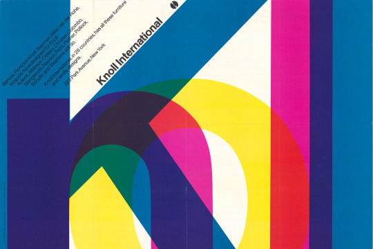
massimo vignelli
massimo vignelli is an incredibly influential designer - anyone who’s interested in design, or just about anyone at all, has seen at least one of his pieces. with simplistic shapes and lines, overlapped and expanded to make interesting shapes, vignelli has inspired and influenced design in every aspect, and i personally like his work from the colours used, and how ‘simple’ the lettering tends to be, but is adapted and moved to create something more than that, something more exciting and interesting to look at.
1 note
·
View note
Text
yusaku kamekura
i enjoy japanese culture and design a lot - as a whole, it tends to mix traditional elements with clean, minimalistic lines, and kamekura is no exception. their work looks beautiful whether monochrome or filled with colour, and i am inspired by the ability to fill every gap with something interesting or satisfying to look at. sometimes the work contains illusionary effects, which add to the intrigue his work already contains. in my work i would be inspired by this as i love the cleanliness of each and every line, and the consistency yet slight alterations between each letter when using type.
0 notes


Text
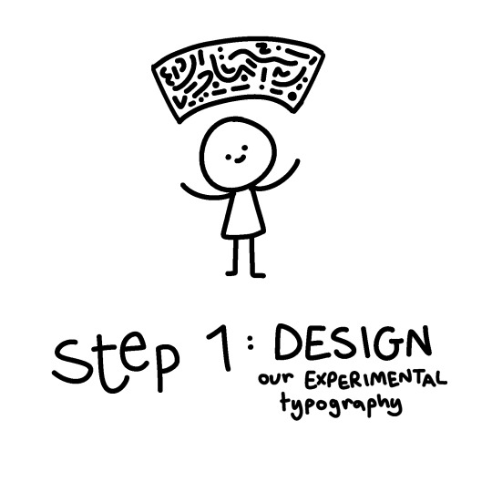
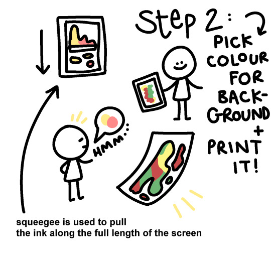
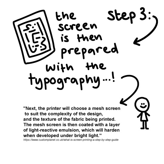
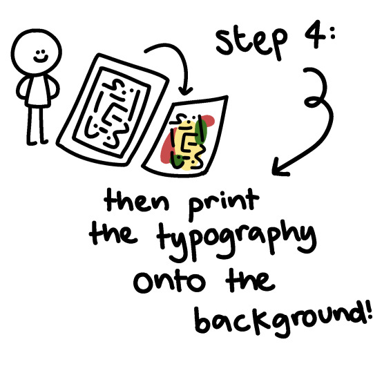
10/21 SCREEN PRINTING EVALUATION
i will be detailing and documenting the process of my screen prints in another post, for the sake of evaluation i will be splitting it into 3 parts.
1. EXPERIMENTAL TYPOGRAPHY
i liked doing this a lot, despite it being my first time. i think one thing that went well is the uniqueness i added into my typography, and the layout i chose for both my pages was fun, without being too overwhelming or busy. however, if i were to redo it, i would try to be more ‘free’ with my work, as i felt like i was thinking too hard in what i was putting onto the page and it showed. 2. BACKGROUND
i liked the colours i chose a lot- pink and yellow were fun and playful, and red, green and yellow were vibrant yet earthy. this was fun to do, however in the future i would likely add more ink/paint to my screen, as there were areas that seemed a little empty on my page, and i might try less conventional colour combinations depending on the project. 3. PRINTING THE TYPOGRAPHY
i think this was the stage i was least familiar with, and therefore i see as going least successfully- i think i could’ve added more variety to the positions i chose to print on my page, and the colours i used weren’t as complimentary or contrasting to my background as i would’ve liked, however, the process itself went fairly smoothly and i’m happy with both my test pieces and final prints.
0 notes
Text
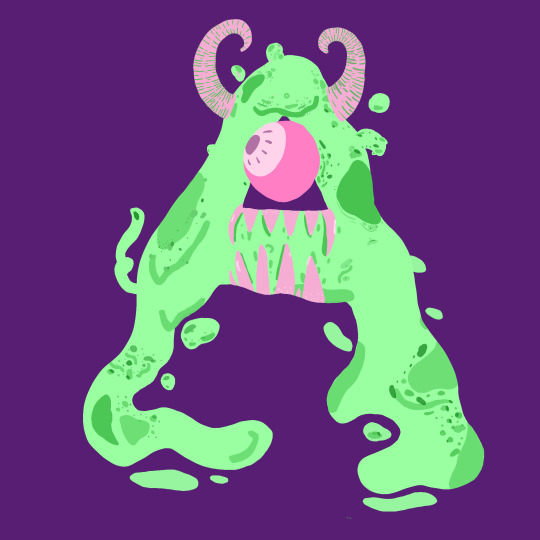
Leyla Gokcek
leyla gokcek - @leylagraphicdesign - is again, another graphic designer i found here on tumblr, who caught my eye with her experimental typography specifically. her monster typeface drawings specifically inspire me a lot, as using letters to portray characters and ideas in such a themed, unique way, is something i’d like to consider using in my artwork. in regards to our screen printing project, i feel the colours she uses in her work could be really effective and inspiring- they’re often playful, and bright, and arguably most importantly, engaging and eyecatching. her laser cut work is also something that i liked a lot, the creativity and usage of lighting and opaqueness is something i hadn’t really considered, and in both sculptural work and prints, i feel this could be a really interesting technique to work with. this can be found at https://leylagdesign.com/Sculpture !
0 notes
Photo


火山 (kazan) is Japanese for volcano. Composed by the kanji signs for fire and mountain.
3 notes
·
View notes
Text
annelien snyers
annelien snyers is a creative employed in graphic design/audiovisuals/music whom i found here on tumblr - @anneliensnyers - and her work in visuals, particularly her current project on kanji and it’s meanings/translations, consistently caught my eye whilst researching different designers. although perhaps working on a different scale of popularity to other designers suggested to research for this course, annelien’s work has an undeniable, individual, eye-catching identity and branding, no matter the project, and i’m inspired by her work for my own projects particularly for the personality shown in every piece of hers i’ve seen. whether it’s sticking to an already solidified identity, or a specific idea- e.g. her 2017/18 work with OFF- or injecting her personality and aesthetic into a piece, such as her poster for raion’s ‘ladies on board’ event, annelien is a designer whom i admire very much and will continue to be inspired by throughout the course and past that. also think her skating is super cool, so that’s a plus too. :-)
0 notes
Photo

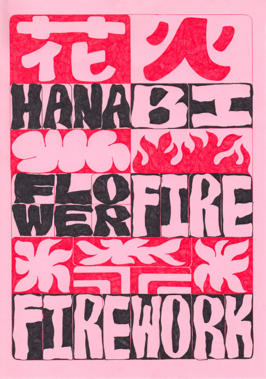
花火 (hanabi) is Japanese for firework. Composed by the kanji signs for flower and fire, makes it a real treat to learn the language.
4 notes
·
View notes
Text
david carson
david carson is a 66 year old graphic designer, born on the 8th september 1955. he didn’t really have formal education for graphic design and typography, and describes his work as ‘experimental, intuitive and personal‘. he uses this lack of formal training as inspiration, as he was never taught ‘right’ from ‘wrong’ when it comes to design. combine this with his life experience in surfing, & growing up in california, he’s familiar with having an open mindset toward design. he’s known for his ‘anti-grid’ approach- ‘i’ve never used grids; i still don’t. i never studied or learned about them, and when i did i saw no reason to use them.’, and in the context of researching david carson for specifically experimental typography, i found this particularly inspiring. his work is a great example of art and design being means of communicating creativity, without limits, and since looking at his work, i’ve felt that my future experimental typography projects, or something similar, could be greatly inspired by him- the idea of ‘reaching within [and finding] your uniqueness’ is something that could be applied to any project, and the freedom, and emotion portrayed in all his work from his magazine ‘ray gun’ to album covers just really are something to admire and be inspired by. the main takeaway i have from learning of him, is, don’t try force creativity, and instead work with what you know, love and feel- you’ll learn more this way.


3 notes
·
View notes