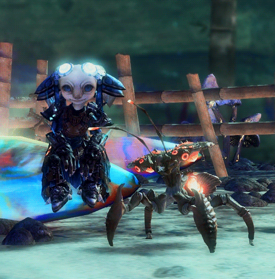
#After Effects for animating everything else + compositing
Text
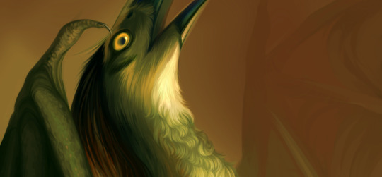
a little animation I made as my contribution to the Kaleidoscopic Absolution @silverfanzine! [Go download it for FREE here!]
I think he should be allowed to just chill and let time pass by :^]
#sonic#silver the hedgehog#sth#sonic fanart#animation#my art#clip studio paint#dragonbones pro#this took me like 2-3 weeks I think and like 3 different programs#Clip studio paint for actual illustrations#Dragonbones Pro for silver's animation#After Effects for animating everything else + compositing#god. what an effort that was but I'm happy with how it turned out
681 notes
·
View notes
Text
My Brother's Keeper (I)
So, uh, I have seen the complaints that Stampede is "poorly-written". Often enough, really, to get... somewhat overly bent out of shape about it. Stampede was my entry into the story and I may have mentioned once or twice that I like it. You know. Just a little. This is not to say it's without its flaws, but it's technically very skilful, at least to my eyes. It's just… skilful in roughly twenty-two minute chunks, so it crams a whole lot into those chunks.
Vash tells Wolfwood he can "see [kindness] in his eyes" half an hour tops after hitting him with a truck. It's assumed that they're relying on previous characterisation of the two to carry this beat.
They're not.
See, animated shows or films (and definitely in the case of Stampede) aren't only written. They're story-boarded, rendered, scored etc. and all the parts interlock with the other parts. It has to be taken as a whole: spoken, written, visual, musical, situational, compositional. These are twelve instalments of a single story where everything in it develops, comments on, or reflects what lies at the work's thematic heart, but you have to figure out how. It's not going to explain it to you. If the relationship between two characters appears strange, that's because there's more to it. And whenever you see something in it that visually echoes something else in it, get out your pasteboard and stick in two thumbtacks connected with string because the show's letting you know it's important.
Now, because I viewed Stampede first, my reaction to this part was very much like Wolfwood's ("???") but the more of the show I watched, the more sense it started to make, and the more I appreciated what it did for Vash's characterisation. Having since read the manga, in my opinion the boys aren't at all interacting like they're accessing past-life memories. Vash is too busy silently reeling over Jeneora Rock and dreading his confrontation with Knives to keep up the whacky act that the older WW pierced. Wolfwood is too young and trapped by his own hurt to empathise by seeing through Vash's false smiles.
There's something else going on with these two, and if you think carefully, it's clear what it is. There were two loved ones that Vash lost tragically early in life, and we can assume it's not Rem he's thinking of.* The heart of this series is "the song of the brothers."
Whose side are you on?
I have to choose.
Lo and behold, through that lens the character interaction made a whole lot more sense. And I want to talk about how.
So, according to the show's language, right from his very first appearance Wolfwood has a connection with Knives.

In the ensuing scenes/episodes, it was then clear to me that Wolfwood isn't just connected to Vash's brother. He's a representative, serving as a sort of understudy while Vash journeys to confront the real thing. Anything and everything Wolfwood does or says is with that role in mind, because he's either playing along or fighting against it. It dictates his development as the show unfolds. He's got a job and he'll do it, but which of the twins' agendas is he ultimately serving as he does? Even he can't yet be sure.
This is a significant change. It has a huge effect on Wolfwood's characterisation; it's why he comes across as less confident, more surly - he's rebellious, but conflicted and immature. In the manga, the first time we meet Nick he's (mostly) his own man and he (mostly) makes his own decisions. While he isn't honest about his agenda, he is trying to temper Vash's idealism for honest and well-meaning reasons, albeit in a bitchy way. When he reveals himself, throwing down the coin halves, you feel the man is protesting too much so it'll make what's coming easier on Vash. Despite how deeply the two came to love each other they couldn't communicate their forgiveness, but Wolfwood is at his core a good man first who lost his way, then finds it again in Vash. **
Again by contrast in Stampede, Nick's identity isn't his own to shape (yet). He standing in for Knives, and he doesn't much like it. He does know more about the actual shape of things than the reporters - for instance, he doesn't bat an eyelash when Brad mentioned how long they've known Vash. So he can readily talk with Vash and test his convictions. They basically both know each other's biggest secrets already, so they don't have to make a whole production of getting to know each other.
But standing in for Knives is also why the introductory aw-look-he's-nice-really scene is so quickly revealed to be staged. Knives is the primary antagonist, not a neutral agent - he's the most dangerous and personal opponent the protagonists face. He's also cruel, controlling and manipulative. His "help" is anything but. Any gift he seems to freely give, like a protector, will either extract an awful cost down the line or have some hidden purpose (if he isn't "solving" a problem he himself created). Approach with caution.
(You know how Nick did something no one asked him to do then hit Vash, Meryl and Roberto with a massive bill for it like a dick? You know how he then violently rescued them from a situation he himself engineered so they'd have gratitude? Those are Knives's most basic manipulation tactics, when he isn't just hurling verbal abuse: I help you/I love you so I'm entitled to take this from/do this to you. Wolfwood is causing problems on purpose by acting out because it's funny, and knows he won't get whatever he's demanding. Knives thinks he's helping, and rarely hears when he's told "no".
Also, both the English and the Japanese have Roberto calling Wolfwood someone who kills with a smile on his face. He doesn't, really, but we have met someone else who does.)
That means like every other character, Wolfwood isn't quite himself. Not yet.
And that's actually awesome. Because it speaks to who the other characters are - specifically, about Vash.
(Part II)
(Part III)
(Part IV)
(Part V)
(Part VI)
(Part VII)
* OR COULD IT BE, as inevitably assumed on tumblr when two men are in proximity, unspoken romantic desire????
I'm not saying it can't be a factor, but it doesn't explain why they start having discussions over their principles like they've known each other for years. Or at least, to me it doesn't. As I've said I don't ship them. If you disagree, it's totally fine! Hear me out and decide for yourself. There's no reason to believe both can't be true.
** By what's coming, I mean the same development that eventually comes to every iteration of Wolfwood. You know the one. And by "they loved each other" I don't mean necessarily mean romantically. My personal belief is that there were mutual feelings along those lines, but they're both too emotionally reticent to acknowledge them and might not have regardless. But that's just me!
#trigun stampede#trigun meta#vash the stampede#nicholas d. wolfwood#millions knives#not sure when to add the next part#there are at least three more. maybe four. help it's so long#day? two days?#tristampparty#meta: my brother's keeper
96 notes
·
View notes
Text
now that i have recovered from the emotional shock of seeing *that* akutagawa scene from chapter 88 animated in HD 4K (i thought i’d have another week to emotionally prepare myself LMAO), i just wanna be a little bit of a nerd and say that i really liked the cinematography/composition this episode.
in particular, i really enjoyed the anime’s decision to draw visual parallels between this fight and previous fights (in particular, the fight against francis, which is important because it is the first time they worked together).
after all, this fight is the culmination of everything they’ve done together. from the combining of their abilities, coming to an understanding with each other, realising the potential of beast-beneath the moonlight-rashoumon… bringing back similar shots that were used in previous fights is SUPER effective at highlighting the parallels and how far they’ve come, in my humble opinion.
here are a few things i noticed:
- first of all, both of them activating their abilities one after another is an explicit nod to S2’s fight;


- the confrontation/conversation in the hallway from S2 (to an extent! they’re on the same sides, which caught my eye);

- akutagawa blowing up the engine room on the ship, and kyouka doing the same during the first fight between him and atsushi (S1);

- and a similar angle being used for black tiger claws / koukko zessou as a nod to the fight in the S3 finale.
the parallels — though maybe less explicit, *are* still there in the manga? like, the entire “structure” of the fight so to speak is very similar to the francis fight in S2 — akutagawa finding atsushi, taking place on a(n air)ship, breaking away from the fight to strategise before confronting the final boss (then, francis, and now, fukuchi) is undeniably a nod to that fight? i love that this is given its due in the anime as well.
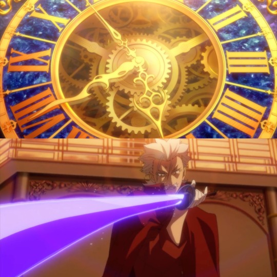
another thing about the cinematography this episode i loved was them using the clock as being the indicator of fukuchi’s fuckass space-time sword doing its thing. that was a really nice touch, in my opinion; the cuts in between were jarring and disorienting and really helped put us into sskk’s shoes.
and as for the background design alongside the clock itself — there were a couple of things about them i enjoyed:
- the number of floors / levels of the ship in the back (5, as a nod to the five ways an angel decays, the DOA)
- the blue of the clock is meant to be reminiscent of fukuchi’s sword, i’d argue, with the way both of them pops out of the sunset/orangey-red lighting
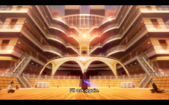
- the clock’s design being super ornate and gold plated reminds me a *bit* of a tabernacle (where they keep unused eucharist in a church) — and thus brings up connotations of sacrifice. that white bridge-thing beneath the clock as well reminds me a lot of an altar, too (see the image above the last to see what exactly i’m referring to, because image limit)
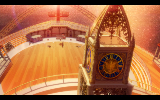
okay, yeah, that one might be a bit of a stretch, sure. but its placement as being above them, combined with the two tables/boxes to the left and right of the ship’s bow (which looks very much like a cross, btw) gives it a distinctly religious, altar-kinda feel, i’d argue. and crosses have been used in S4 as symbolism as well!
(tbh, there could even be a bit more imagery i’m missing, because — the angels of the DOA refers specifically to the buddhist conception of an angel. i’m not too familiar with buddhist imagery, but i thought that this was worth pointing out regardless!)
the last thing i want to say is that the red and blue symbolism went CRAZY this episode. i don’t have much else to say because it was super obvious — they even reused the same “black tiger claws” shot from S3, after all — but i do wanna point out that the symbolism even went into the carpets. the fucking carpets.
like, the shift: it’s red when akutagawa’s leading the conversation but changes to blue after atsushi’s suggesting of the submersible as a strategy? i mean, i don’t know if this (or anything i’ve said, to be fair) was intentional or not, but it’s a cool detail anyway!
personally, i enjoyed this episode, the action was great, and all of this too was a really neat addition as well! and now… uh. we wait for the chaos to get worse i suppose !? (laughs nervously)
#while i haven’t been enjoying S5 as much as i did S4 i think they still did pretty good w this episode#there was a lot i really enjoyed about this episode!!#studio bones will always deliver on the action. we can count on that bit at least LMAO#next week though…. it’s shin soukokover#bsd#jem rambles#bsd s5#bungo stray dogs#bsd spoilers#atsushi#akutagawa#shin soukoku#bsd atsushi#bsd akutagawa#bsd sskk#sskk#i do mourn the loss of some of the nuance of their characters but. they did say at the panel the anime focuses more on action sooo 🥴#you win some you lose some i guess#only reason i was able to make this post btw is because ive watched bsd so many times to the point shit’s literally engraved into my brain#it’s bad for me NDLDGAJ#bsd analysis#bsd anime analysis#bungo stray dogs season 5#bsd season 5
118 notes
·
View notes
Text
What I've been up to...
So if you remember, I've been quite busy over the past 3 months because of a class I was taking. I promised to show you some of my work, so here are a few of my favorite assignments!
(lots'o pictures and video under the cut)
I took a 3D animation boot camp, and naturally before we started animating we had to learn how to model. The program we learned was Cinema 4D. I know a lot of you have learned Blender, and your first project was making a donut. Well...we had to make a freakin' ramen shop...with the ramen! 😂 I added the textures later once I discovered there was a library, but I didn't quite know how to edit them at the time, so they're not the best choice, but hey. I learned something.

I forgot to grab the pic of the ramen close up. Oh well. All of this was made with basic shapes. Nothing fancy. That comes next.
Next, we learned different modeling methods. The method used in this next pic is called volume modeling. Always sims on the brain lol.
After we got our feet wet with modeling, we moved into materials and "lights, camera, action," which was half the reason I wanted to take the class. I still haven't gotten the hang of lighting, but it's really hard period and will take a while to master. Materials are basically the colors and textures you apply on an object. I didn't make these headphones, but I did make the leather and fabric texture.


You will see these headphones again and again because I could not leave them alone lol.
Before we began the animation portion, we learned one last method of modeling. I won't bore you with the details, but basically taking one element and cloning it a bunch of times until you have something else. For example, we only received one piece of each skyscraper. The buildings were whole, but we only received one of each. We used this cloning method to make an entire city block out of just a few things.
Finally, we got into animating. There two other assignments before this that I did terribly on and I'll never show them to another living soul, especially since animation is part of my job LOL, but I'll show you the animated version of this city. The still image was actually made after the video based on some feedback I got. That's why things look different.
Not my best animation work, but whatever. Still learning!
Alright, by this point we're nearing the finish line. There were some other assignments about composition and what not, but for the most part it was all about animation from here on out. This next one was my favorite one. It was basically putting everything we learned so far (minus modeling) into practice. We had to take any previous project and make a 15 sec commercial/product showcase. You know I had to pick up those headphones! (sound on!!)
vimeo
I love timing videos to music. It's like the best part!
The next assignment was about camera movements and editing the video in After Effects. I don't have the before pic, but imagine this clip being brighter, a lot less vibrant, and having a cool tone at the beginning.
vimeo
And finally! The ultimate test! That was the actual name of the project lol. Bring it all together and make something great. I modeled every single thing you see (though not very well LOL. gotta practice!) and created all the materials except the picnic table. It's in no way perfect and I plan to go back and make many edits, but I did it y'all! I've been working on this little by little for the past 3 weeks. Enjoy! (sound on!)
vimeo
28 notes
·
View notes
Text
Oh hi. I heard it's gifs tips'n'tricks time.
View this as a little addition to this post I made a while back.
This time I thought I'd take you through my gif making process. It'll be very specific to Photoshop CS6 but maybe some of you will find parts of it helpful regardless.
And since our biggest nemesis appears to be ~The Tumblr 10MB File Size Limit~ I decided to go for the absolute worst premise for a gif: Lots of stupid wobbly particles and gw2 bloom and transparency effects. Because huge gifs love these.
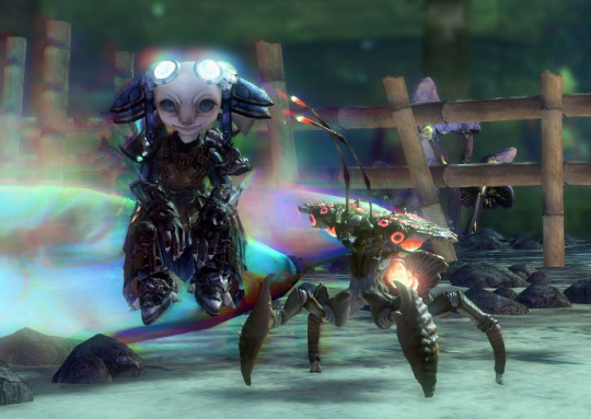
Aah, a horrifying amount of those in this single scene. Perfect!
Let's start with a little timelapse video, and I'll get into the details with screenshots below then.
So this actually went smoother than expected? Not super much fiddling needed in the end, but here's how it went in detail:
Load the raw footage into photoshop.
You can do this in two different ways: What I do is simply drag & drop the video file into the program and it'll open with a video timeline and some rudimentary video editing options.
What you can also do is File -> Import -> Videoframes to Layers and select your source video, which will give you a timeline of separate still image frames instead.
It comes down to preference, I used both methods in the past but nowadays I find the video timeline more intuitive.
Cut the footage to roughly the right length.

From experience I know that most of my gifs are around 3-4 seconds long. This can of course vary depending on different factors. Don't get too attached to the exact seconds you selected, you might have to shave off a bit depending on how evil the file size decides to act.
Optional: Change footage speed

Depending on the gif and its purpose, I slow the footage down. I usually do this for the visual effect (especially nice for showing off animation details) but it also has the practical side effect that it can help with file size. Say you want a gif that loops after 4 seconds. At 100% speed your gif will move at your original framerate (in my case 60 fps); if you slow it down but keep the same length in seconds it'll logically use less frames. That's less data to blow up the size! Yey.
Crop the image.
Now this is probably one of the most crucial parts when it comes to your final file size, and your gif looking nice on tumblr. Since the tumblr dashboard displays images at a width of 540px, you want this to be your absolute minimum image width to ensure a crisp image. If I can, I'll make the gifs larger (I like starting at a minimum of 600px and then reduce the image dimensions if needed).
With that in mind.... choose your image crop wisely.
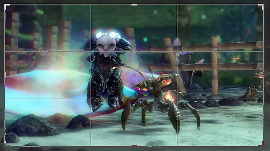
A "widescreen" image like this will be the most merciful in terms of file size, but might not always be what you want in terms of composition.

Given tumblr's very vertical nature, this kind of approach will look great in posts (if it fits your image composition of course), but at 540px minimum width tends to be a file size monster.
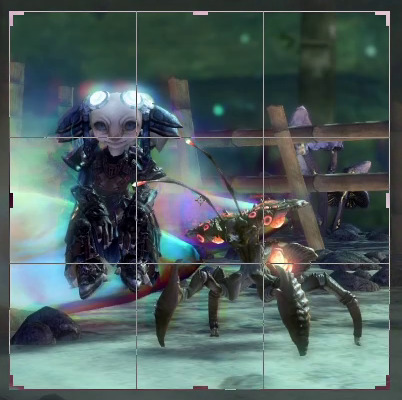
For the gif I'm attempting to make here I opted for a more square approach. The subjects of the scene fill out the image's space nicely, and it's still a nice size for tumblr posts overall. Let's see what the file size will say about this.
Replay your footage after cropping to make sure you didn't accidentally cut off any motion you didn't mean to cut.
Next up: optional colour corrections
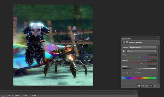
I tend to crank up the saturation for gifs way, way more than I ever would for regular screenshots since I find that often the limited web palette can make them look fairly dull. But like everything else so far, this greatly varies depending on the scene you're showing.
Note that colour correction can increase or decrease file size depending on what exactly you're doing. The more different colours you have, the larger your file size will be.
Reduce image dimensions
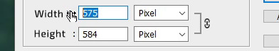
Since my original video footage was fairly zoomed out, the cropped area only left me 575px of width to begin with. In an earlier attempt (that I absolutely did not fail to capture and therefore had to record the whole thing a second time) I tried to leave it at these dimensions, but the 10MB size limit did not like that so now I knew better and immediately reduced the width to 560px.
Note: After you've changed the video's dimensions it won't let you edit the speed anymore (for some reason), so make sure you've got that settled.
After all the adjustments are done it's time for the moment of truth...
File > Save for Web...
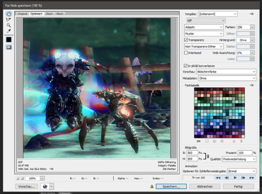
This beautiful window will open and...

Aww almost.
But honestly? That's not bad at all. I've had completely different disasters to deal with in the past (starting somewhere in the mid 20MB, good luck trying to make use of every size-reducing trick you've got up your sleeve).
Before I do any adjustments to shave off the last few KB though, I preview the gif to make sure it loops correctly. I want the Chak to sway seemlessly. Turns out it didn't, so I back out of the window to remove a few frames from the footage. And when I open the "Save for Web" window again....

Well that's anticlimatic. Apparently those few frames were enough to get the file size where I need it. (Note: Sometimes Tumblr likes to be a little b* and pretends your file is too big when you're this close to the 10MB limit. It be like that.)
While my gif journey theoretically ends here, I want to at least show you a few more things that could have helped if I had needed to get the file even smaller.
So this dithering thing I keep making a big deal of...
It can make or break a gif. In my experience this is so, so crucial to the final file size and quality of the gif.
In my own very amateurish words, dithering is a way to emulate colours that aren't actually part of the images colour palette. This is especially needed for in-game transparency effects like fog, glowy stuff, or smooth gradients. And that is part of why I chose this hell scene of all the ley line glow and the typical gw2 bloom that's particularly bad in this area.
PS CS6 offers you three different kinds of dithering techniques: Diffusion, pattern and noise.
My go-to is diffusion dithering, which has adjustable quality levels.


In my opinion it's generally the type of dithering that's often the least noticeable and creates the smoothest looking images. Unfortunately, it's also the one that creates by far the largest file sizes. Another downside is that it doesn't work super well with heavy DoF/fog etc. effects and is prone to really ugly banding, especially visible the more you decrease the quality. It looks awful for this particular scene. (Look at the glow around my asura's headpiece if you don't know what I'm talking about. Or... just the entire background.)
Both noise and pattern dithering will get you smaller file sizes, luckily.
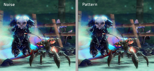
I've never used noise so far (it tends to look messy in my opinion), but pattern gets the job done! Especially for gradient heavy gifs it's a lifesaver. It's definitely more noticeable than the diffusion dithering on static parts of the gif, but it absolutely makes up for it by not having any ugly banding effects. This is also what gave me the neat little 9.99MB file size in comparison to the diffusion dithering's 15.31MB.
Last but not least, if fiddling with the dithering or image dimensions doesn't help you get below that magic 10MB mark...
Limit the colour palette
You can either manually colour edit your image to use less colours for a more artistic approach, or you can let Photoshop limit the palette to its best abilities.
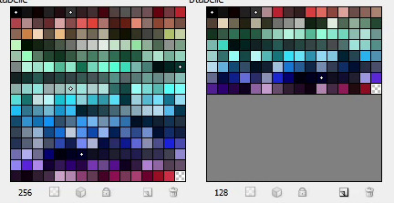
Additionally you can double click each individual colour to replace it how you see fit. (I've done that in the past when Petthri's yellow eye colour got erased and I had to bring it back manually.)
In this gif's example, reducing the palette from 256 to 128 colours has brought the file size down from 9.9 MB to about 8 MB. It can have a big effect, but doesn't always in my experience.
SHOW US THE GODDAMN GIF ALREADY!!!
Not the best quality gif we've ever seen on tumblr, but given the extremely unfavourable source material I think it turned out alright. I have to admit I'm actually surprised it worked at all.
Oh well! This got long (once again). I hope this was at least a little bit helpful to someone out there. Happy gif making!
72 notes
·
View notes
Text
(It is, in fact, a perfume)
Juliette Has A Gun: Not A Perfume (2010)
(newly-arrived “discovery set” sample)
I’ve wanted to try Not A Perfume for years; it’s supposedly one single base note that smells different on everyone. Thus, the real allure is, omg what does it smell like on me?
I will preface the rest of this by saying that perfume is a special interest for me, particularly reading about it. As such, I have read a lot about components, and I even have a wishlist of aromachemicals I’d like to huff for myself. And in theory, Not A Perfume would be a chance for me to smell Cetalox.
Allegedly, that’s all this is: “A fragrance made out of a single element called Cetalox. Usually used in perfumery as a base note, it plays here the lead role... Another advantage of this particular composition, is that it is entirely allergen free. The result is minimalist, elegant, pure,” says Juliette Has A Gun’s website.
“An extremely powerful and elegant amber note. Usage: Cetalox® gives rich, elegant effects to all areas of perfumery from sheer florals to modern ambers,” says The Perfumer’s Apprentice, a component supplier I stare at for hours like it’s the Sears Wish Book.
But a Fragrantica article claims,
In addition to cetalox, Not A Perfume obviously contains musks (galaxolide and helvetolide), iso e super and hedione. Together they create a slight floral effect, as if you washed the bed linens with an expensive conditioner with a white flower composition and hung it up to dry on a sunny summer morning.
(For what it’s worth, a commenter on that article says, “According to Dr. Philip Kraft (Scent&Chemistry) of Givaudan - Not a Perfume consists - 7.5% Cetalox along with Hedione, Iso E Super, Ambrettolide, Habanolide, Musk Ketone, Ethylene Brassylate & Boisamberene Forte.” Subsequent googling indicates that this seems to be widely known.)
Like, I don’t plan to do an aromachemical deep dive on every fragrance I talk about, but it seems kind of conceptually relevant here, you know? And I’m willing to believe Not A Perfume is something more floral, musky, and fruity than one (1) synthetic amber, because that Fragrantica description is very much what it smells like on me: dryer sheets. A strong but nondescript white laundry floral. Well-behaved yet loud as hell, like a six-year-old in a Sunday dress with the best of intentions. I sprayed this business into a tissue and barely touched it to my wrist; it gave me a headache within 15 minutes. It did not wash off after four hours. (Modern white musks—like, say, all those (-)olides—are used in dryer sheets and laundry detergent. They repel water; that’s why everything but the detergent scent washes out of your laundry, so I already knew I was probably fucked.) On me, it isn’t terrible, but it sure ain’t “an elegant amber.” My guess is that one note yelling at me in particular is the hedione: “An elegant, transparent floral, jasmine note with a citrus freshness,” known for its “radiance.” It’s been widely used in fragrance since the 1960s, and I’m wondering if it’s why “perfume” in general—in the ’80s for sure—gives me headaches. Goddammit, hedione.
So, dryer sheets. That’s my quiz result. What’s everyone else’s? In Fragrantica user reviews, there is a dizzying range: sour, green, “a fairy sweating,” gasoline, antibacterial hospital soap, “crystalline funk,” animal musk, rubbing alcohol, plain water, nothing, rotting garbage, wet cigarettes, wet burnt cigarettes, dried blood, Dolce & Gabbana’s Light Blue, ghosts, sandalwood, wet cardboard, metal, salt, and pears. Among many other things.
It smells like dryer sheets, and I do not want to wear it again.
I mean, I might. Actually, it smells kind of nice now that I’ve washed it off—oh, hey, I’m getting the pears now. Maybe Not A Perfume would play different in hot weather. I’ll pick some day to schedule a headache and see.
#perfume#juliette has a gun#text post#long post#welcome to hell it’s my blog#controversy!#perfume discussion#sparkling headache#note: musk
118 notes
·
View notes
Note
sorry to bother but i have a few questions! curious if you ever used other art programs besides sai and more about art things
- have you ever used sai 2? i think its still being refined
- whats your art program “progression” if you ever used a program before sai exactly, like ex: ibispaint -> fire alpaca -> sai
- are you a many layers artist with a seperate lineart layer and color each individual spots like skin, hair, eyes and etc in different layers? or do you combine the lineart and colors and just paint over it? or maybe you have multiple ways?
- do you use references a lot? or do you “wing” how stuff looks like? (which could honestly show te growth when it looks so right which you do always! your art is amazing?)
i still have so many questions but i dont want to bother by making this ask too long, sorry about that!
ooh this is interesting
i have sai2 downloaded, but i think i got the wrong version (the one that has a time trial thing and stops you from saving the files after a certain period of time). and i kinda just never bothered switching to it amd looking for a normal version? i know sai2 has a lot more options and textures and what not, but i like my old sai1 more for some reason.
for the art program progression, hmmmm. it's pretty much all sai1 i think! i have fire alpaca installed and still use it to make gifs and animations or to import text to sai / manage files / edit minecraft textures / etc, but it was never my main program. i drew some stuff in ibispaint as a kid before i had my computer, but i think back then i also mainly drew on paper, ibis wasn't my "main". never got into photoshop, never used any other programs.
for the layers. i do use them a lot, but like, for testing mostly? for example, when i want to change something in the sketch, i copy the layer and then compare the old and the new versions, deleting the one i don't like. i color and shade on one layer, but when i want to check how it'll look with different colors, i make a new layer and then compare them. when i want to fix something, like redraw the eye or clean up the sketch a bit or see how the character will look in a coat intstead of a vest, i make the new layer on top and just paint over everything. and eventually merge all the layers together and keep adding on top. so, i make a lot of layers, but then i also delete/merge a lot of them.
i used to use a lot of references and put all of them in the backgrounds of my drawings with low opacity to create this effect of busyness but also so i didn't haveto switch tabs constantly. but i stopped doing it for some reason. i do still use references, mostly for things that i don't have much experience drawing or want to be accurate. like armor, muscle structures, certain clothing elements, instruments, background elements, etc. and i wing things like poses, anatomy, expressions, clothing, lighting, composition, whatever else. i also recently find myself looking at a lot of art of other artists for inspiration, but not necessarily as references? like, the specific way that one artist drew hair poking out of the bandana, or the specific way that other artist drew a shadow on the glasses, or the specific way that other other artist drew a tail, its inspiring and i go "huh, i never thought of that" and i try to implement it in my art. well, i guess kind of like references.
i feel like you've answered all your questions in your ask, so this wasn't very helpful, but uhhhh...... yeah! thank you for this ask and thank you for the kind words, it was a lot of fun! and feel free to ask anything else
28 notes
·
View notes
Note
I just gotta say that I LOVEEEEE how you draw Mario and Luigi!!!! And how you characterize them!!! like omg imma have to study your art for when I try to figure out how I want to draw the bros (not to replicate it just to be clear!!! just take inspiration bc it’s so good!) did drawing them come easy to you or was there a learning curve?
AHHHH thank you so much, that's so sweet of you!! I've never had someone want to study my art before, so this is very exciting for me :D
To answer your question, when I first started drawing the bros, the movie hadn't come out yet. So I could only rely on the trailers for references. After the movie was released, the bros became much easier to draw. But that was after much trial and error.
Iluumination Mario and Luigi are different from their game counterparts. The game versions are much more bouncy and cartoony, like they were in the Super Mario Bros Super Show. Movie Bros designs are smoothed down and realistic-ish. Their faces aren't as cartoony and are more akin to the Illumination human style, with lots of little details and textures.
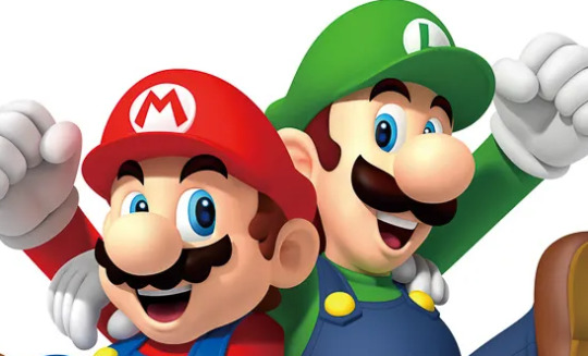

So keeping to the Movie style and my own personal art style ( which is a mix of Genndy Tartakovsky, Cartoon Saloon, and too many others to list haha) was a bit of a challenge. But I had a few tools to help me.
The first was Animation Screencaps , a website that takes high quality screenshots of almost every single animated and stop motion movie you can think of. I highly recommend you check them out if you want to study a movie's style, composition, color theory, or everything else that goes into making art.
The second tool that helped me was tracing. and before you attack me with a "tracing is cheating" speech that I've heard way too many times, let me explain. If I was trying to draw Mario from a certain angle, I would having trouble keeping the head shape consistent. I'd make it too long or not long enough. I would create a new canvas, get the screen shot I was referencing, and would trace over the head multiple times. This would help my brain to remember how the shape of the head is supposed to be. Then I would go back to my original canvas and draw the head again, and it would look how I wanted it to.
Tracing isn't bad. It's an effective tool for artists to use to learn. It's only bad when you trace an image and post it, claiming that it's yours.
So yeah, I hope that this helps and I with you the best in your Mario drawing adventure :)
#katlyn talks#the super mario bros movie#mario movie#also illumation if you could post the bros renders or model sheets that would be great thx
18 notes
·
View notes
Text
S1E3-"And the Bag's in the River"
The last 12 hours have been a fever dream so I feel I really understand what its like to be Domingo
TW: Racism, description of gore, Nazi mention, discussion of strangulation.

Credit to their props team or whoever that wet meat is the wettest and the meatiest.
The first time through this episode I assumed the Gretchen flashback was Walt attempting to disassociate from his actions via chemistry (in parallel to Jesse's "its just a bunch of meat!" last episode). With the context of the closing flashback though I think this entire episode is about Walt really confronting the spectre of his own mortality. This is something that influences his conversation with Krazy-8 and his confession to Skyler at the end of this episode
Notably this is probably the only time Walt thinks of Emilio as "human" even if by proxy. I find it interesting that the visual language is suggesting the gun as functionally a part of Emilio's body. When Walt thinks about calcium, he picks up a fragment of his jawbone. When he thinks about iron, he picks up the remains of the gun. Whether its the worldview of Walt or the show, the violence is so much a part of Emilio that it may as well be a part of his chemical composition
"Please don't say yo. You can't know how much I hate that." That theme of language policing is back. Sure, Skyler on a literal level is associating it with a specific bad interpersonal interaction she had. But its also a mom clamping down on how her son talks because she doesn't want him to sound like a criminal. Gonna be a bit of a theme with Junior in this episode.
This episode simultaneously establishes that everyone in the Schrader-White cluster has both used pot and is also a massive freak about it. To be clear, there might be a lens through which SOME of Marie's concern is merited. As I understand it pot is probably not good for a 17 year old. But there's a certain ritualization to the denial of using pot. Skyler used it, and yet asks Marie about it like she was the known pothead in the family. Marie sputters about MAYBE having sampled it, reflects almost nostalgically on its effects, and then immediately freaks out about Junior's proximity to it. Hank admits to indulging to deal with some unspecified childhood baggage, but still considers taking his nephew out to ogle addicts in order to scare him straight a justified tactic. Its perhaps best summed up in Marie and Hank's phonecall. "Autopsy of a pot overdose? C'mon." Deep down all of them know it doesn't have to be a big deal. But we return to that inherent suspicion and distrust. Everyone's a junkie except for me. I'm a sensible, reasonable adult who can be trusted with what substances I indulge in. After all, "I'm extremely clean". Everyone else though, might be subject to an unbecoming dependence.
We have two cases of "everyone else" humanizing themselves. The first is Domingo, who startles Walt with both his ability to reason and to connect. Krazy-8 shatters his image as benevolent by pointing out that keeping him chained up in a basement while they debate was to do with him is frankly a lot more cruel and unusual. He's also able to read Walt extremely easily, picking up his discomfort, teasing out his motivations, and even connecting with him on an interpersonal level.
The other example of this is poor Wendy. Everything about that scene is skin-crawling. Hank dehumanizes her in every way a person can be dehumanized, sexualizing her in a way that doesn't read even slightly as a joke and functionally treating her like an animal. He barks at her to come, to stay, to speak, and then has Junior ogle her teeth before battering her with questions. She's not a passive recipient of his abuse (though who could blame her if she was). While she's clearly used to a fair amount of rough treatment, she still reacts when something crosses a line ("hey I'm not doing him, he's a kid!") and even gets a little of her own back ("why, you got some?"). Wendy isn't doing anything remotely criminal that Hank can see. She's not soliciting, not holding drugs on her, not anything. She's just going about her day. However, for people in her class crime is no longer something you do, its what you are. Hank clearly feels entitled to harass her and threaten her even off the clock. But Wendy lets them know she can see them as much as they can see her, calling out both the inappropriateness of Junior's presence and Hank's fishing. Hank doesn't get the neat horror story about a fall from grace that he wants ("Tell my friend here how you got started. Probably used to be, what? Like a Girl Scout, or sang in the church choir?"). Instead he gets an interaction that not only exposes what a dickbag he is, but that will come back to bite him later.
After a looney tunes ass chase through the house we get the first connection of Walt with Nazis with Jesse's heil Hitler bitch. Primarily I bring it up only because its going to get freakishly poignant in a few seasons but I do think it's worth noting: Jesse's not a good arguer even when he's in the right. He's too inexperienced to understand what's actually wrong with Walt and it enables Walt to perpetually paint him as just an immature child throwing tantrums.
One last note about the Wendy scene before I dive into Domingo's last moments. Hank jumps in to "defend" Junior from the accusation of being disabled. The smile he gives him feels like its meant to be inclusive. Don't worry buddy I won't let this lesser than try to pull you out of the in-group. Have to wonder how much of Junior's childhood he spent with polite euphemisms about his condition.
The pro/con list functionally is its own analysis. The con side is all phrased in absolutes. "Murder is wrong", and more specifically, "YOU are not a murderer". This is factually inaccurate (by this point Walt has killed Emilio and attempted to kill Domingo), but it returns to that idea of criminal as a class rather than an action that I talked about. The Schrader-Whites aren't junkies, they're nice normal people who have once or twice indulged. Walt isn't a murderer, he's a man who's only ever done what he has to for his family! There's a resistance to seeing actions as a reflection of identity, because to do so is to admit the separation between Walt, Jesse, and Domingo is a matter of degrees, not some fundamental aspect of their character.
Domingo plays into this as well, reassuring Walt that he's not cut out for this. HE'S not a cold blooded murderer...he's just a good man, a family man caught way over his head. Its fitting his name means Sunday, because in essence he offers as Walt's confessional priest. He hears his sins, his fears, his secrets, and then offers him the path to redemption.
Walt's mistake here is underestimating how little reason Krazy-8 has to sincerely believe this of him. The plate that give Domingo his weapon is broken over Emilio's bloodstain. He's been held hostage, sick and in pain from the toxic gasses, stuck shitting in a bucket for days on end while Walt quibbles about his mortal soul. I don't want to posture Krazy-8 as some innocent. But the lie works because it feeds Walt's self-perception as the good normal man caught up in all this, and because Walt is very bad at imagining the inner worlds of the people he works with. Whether as a cashier at his father's furniture store or as the gunwielding drug lord or the captive in the basement, to Walt Domingo is a background element to be ignored and puzzled over, not a thinking person with intentions.
He majored in Business Administration at UNM. This surprises Walt, another challenge to his equivocating between education and moral character.
I like that its left a little ambiguous as to whether Domingo was still planning to stab Walter when he came down, or if he reached for it after noticing Walt's strange behavior. The man with lung cancer chokes his first hands on victim.
Final somewhat anti-climactic note: "Its a culture in decline...you people used to be conquistadores" NO HANK THEY DIDN'T.
Fascinating that I can do all this analysis and then it just spells itself out with "It looks like meth but its too damn white."
#breaking bad#brba#walter white#walter white jr#emilio koyama#domingo molina#jesse pinkman#marie schrader#hank schrader#analysis tag#long post#brba s1 e3
48 notes
·
View notes
Text
Not really a full review but just the thoughts at the forefront of my mind
If they'd of just cut some horror references (Shining elevator especially) down into shorter scenes (it'd also work as an unobtrusive background element) AND made it easier to tell apart future and past characters that happen to be in the same scene together, this film would honestly be damn near perfect.
It was still an enjoyable experience, though. Alot of scenes genuinely come close to freaking me out, like the respawn terminal failure. Having a fully voice acted cast and some custom models was a treat, i just don't see why some were custom and some were just Scout with a mustache slapped on. Plus, in the funeral scene, it's too noticeable how detailed Redmond and Blutarch are compared to everyone else in the room. I joked at one point that they blew the character budget on those two and couldn't afford to detail everyone else.
The voice direction also felt lacking, with certain actors (excluding Scout's and Soldier's bc DAMN i actually asked a couple times if they got Rick, posthumously, and Nathan to do the voice work) focusing more on sounding as much as they could like the original mercs than the actual performance. Mind you i'm not saying they did a BAD job, they did after all do a fantastic job with the emotional line deliveries.
Usually, you would complain about the cartoony art style of TF2 clashing with someone's high-end attempt to make the shots photorealistic or so, but since Fortress Films went to all the trouble of touching up everything with grit and keeping it consistent throughout scenes, it honestly works well even if non-TF2 models end up being used. The contrast actually fits.
The plot...honestly, again, this is where i wish certain horror tropes got cut way down. Did we really need a whole scene of zombie mercs doing stereotypical zombie things? I don't even think it added anything to the plot, it just happened and was pretty easy to forget right after they're all killed. It's just how it never gets referenced again once it's over.
I'm...also not really a fan of the shoehorned Christian imagery around the end. It's basically another trope and again it added pretty much nothing.
It's also fun trying to figure out who can and can't actually die. This, ironically, might be the only thing from the zombie scene worth any salt, if the implication is RED mercs zombify after some time while BLU just infinitely respawns (Jules wouldn't be dead and therefore would not need saving if this were the case, which is inch resting)
The attention to detail otherwise is fantastic. I keep finding parallels i didn't catch the first time.
Along with shots that are legit drop-dead GORGEOUS, or even cutting-edge as far as cinematography goes and are incredibly rare to see in other SFM animations, the mo-cap is some of the best i've seen. It's rough sometimes and makes for some funny facial expressions, but when it works it WORKS. The theatrical feel is just...unmatched. You almost wonder if Valve themselves produced this because of how good the scenes look. I was also really impressed with the sound design, and also the fire and water effects, prominent throughout the film.
Obviously, i think the film was really, really good, it's just that some parts feel like this project started as a shitpost animation, before getting stitched together with the parts where the team decided "no, we need to put actual effort into this". I also don't understand why, if the soundtrack is an original composition, the artist couldn't be credited anywhere.
Anyway, go see Emesis Blue and come back with your own thoughts.
12 notes
·
View notes
Text
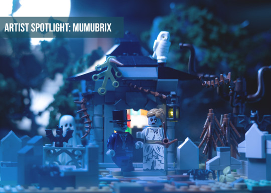
🤩 ARTIST SPOTLIGHT: @mumubrix
Hello everyone!
It's time to direct the spotlight toward our community members, and today we will get to know better @mumubrix!
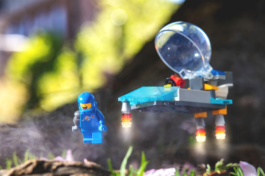
"Hi my name is Angel and I’ve been learning photography since January of 2021. Mumubrix is my social media name. Mumu is a Filipino (Tagalog) word for GHOST which is one of my favorite subjects.
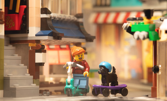
I would say that my style is leaning more towards incorporating emotions to my photos. Different kinds of emotions. I also like to add mist, rain, water as much as I can. My favorite subject are animals and spooky minifigs though I am confident to say that I am versatile with my photography. It all depends on my mood.I have a journal where I write my ideas, because I can't draw, and have been building more recently. Building bricks have been such a stress reliever and is a great mental challenge for me. It is great to just build, break it apart and rebuild something else. I get a lot of new ideas from daily experiences, interesting conversations with strangers and just sheer imagination.I also enjoy harsh lights and shadows. I love the shadows, it's art in itself. Being able to learn photography and manipulating light is magic!
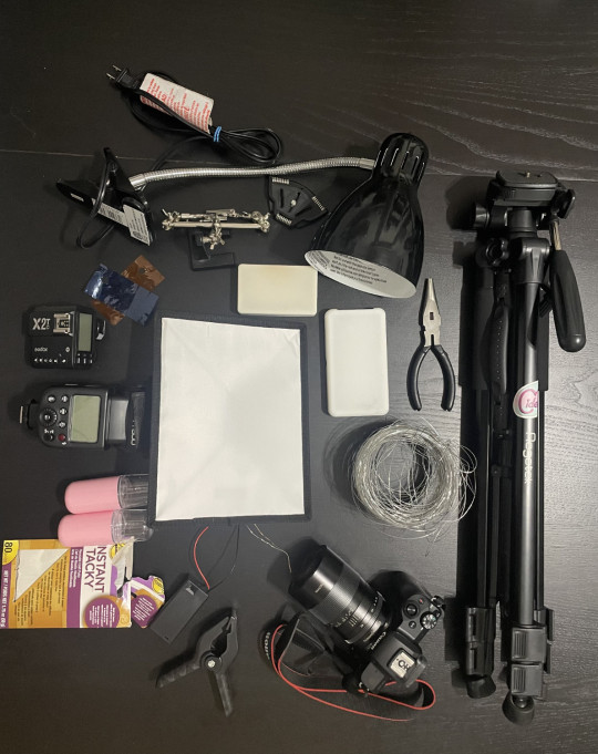
This is my basic gear. I cannot live without a tripod, I have the very basic tripod you can find from Amazon and the pocket size for low angle photos. I mainly use this lamp for main light and use a flash and a pocket mist for added "effects". I use a Canon EOS M50 mirrorless camera with a TT artisan macro lens. Everything here stays in my backpack except the tripod and the table lamp. If I want to make something float, I use the instant, the wire and the clamp to hold it, I also use the clamp to hold a piece of cardboard for bouncing the lights. I use the soldering hands if I need more floating pieces or if it’s a but windy outside. I have 2 more led lights that aren’t in this photo but I mainly use it if I take photos indoors.
My #1 challenge is my lack of knowledge about photography, light,compositions. All I have is my story and that's all I needed because I found this great community where people help and teach each other. I was using my phone to take photos before and I really thought they were great but thankfully, the constructive criticisms are there to steer me back to the correct path. Not knowing what looks good to begin with was the first challenge I had to break.
The #2 is my gear. I was learning through tips and tricks from Brickcentral and videos from Four Bricks Tall but there are just some things that a phone camera can't do like achieving that good Depth of field, catching those beautiful misty light and shadows without it looking flat. Or just being able to focus on one subject without having to blur everything in the background using an editing software. That's when I knew I had to upgrade and I'm so happy I did.
And #3 is my fear of getting ignored by the algorithm. I have always been someone to question rules and limitations and that makes me tend to experiment quite a lot. I enjoy creating photos that are not mainstream like Happy Happy photos or character photos. I enjoy creating mysterious ones or emotional ones where real people can relate. I enjoy self-expression. And yet social platforms made me wonder some time ago if I'm doing the right thing, or that maybe I should follow what everyone else is doing so people can like my photos more. In other words, I became a "photo people pleaser". I got burnt out after a month and stopped taking photos. Then I realized that my photography makes me happy, and it should make me happy. Not the other way around.
My goal is to help anyone who is wiling to learn about photography. I have been blessed to be taught so much by this community and would like to return it to the world. I believe that art is innate and it is in everything and that you just have to tap in the right kind of art, the right people to give you good direction and the patience to learn.
For the community: Many thanks for all the patience and the tips, tricks and advice that the mods and everyone else share. Remember that you don't need a lot of things to start, just the willingness to learn and the realization that you can do it too. You just have to keep on practicing, go out and take photos, just go and do it and ask for feedback. You need feedback."
Thank you for accepting our invitation and let the community knows you better!
If you want some insights on the exclusive picture and for a better view of the others, head to our blog at https://brickentral.net/.
- @theaphol, Community Outreach Manager
15 notes
·
View notes
Text
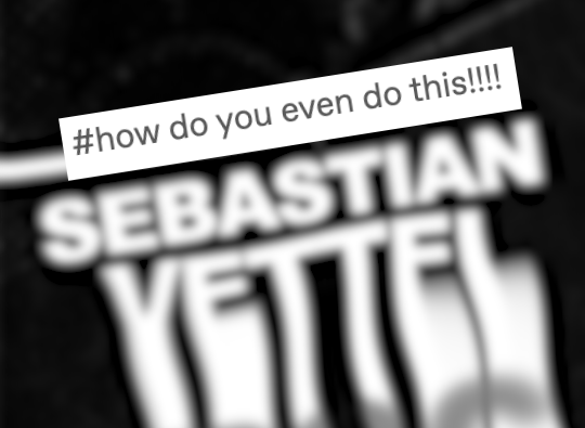
been a while since the last behind the curtain! also probably bc i haven't done anything too crazy edit-wise as of late. anyway this was a fun one! been wanting to edit the style ever since yrs dropped this mep, but i just never got around to it lol.
my ingredients:
- after effects cc 2022
- red giant universe
- sapphire distort
- video copilot twitch
so the first step was figure out how to do the melty text effect--i knew how to do it in photoshop, but it's a little different in motion! i figured there were a few ways to do it, so i narrowed the most likely down methods to:
scale wipe + wave warp effects
text to shapes + crazy keyframing action
shape layers + linear fades or something along those lines
photoshop + liquify
and i am so sick of animating shape layers i feel like it's all i do. it literally is like 70% of what we do in motion graphics. i'm sick. i went with the scale wipe + wave warp method because fuck this LMAO. the process was like type > precompose > slap effects on > keyframe. to an exaggerated extent, this is what you get:

you could probably achieve a similar wave warp effect with ae's plugin btw! but i liked that sapphire gave me a bit more customization. once i had the movement i liked, it was a simple keyframe job.
then because i am LAZY and cannot be arsed to deal with manually separating colour channels or triplicating multiple text layers just to get a chromatic aberration effect, i stuck uni.Chromatic Aberration and uni.RGB Separation onto the precomp and fiddled with those settings until i thought it was appropriately eyestrain-y.
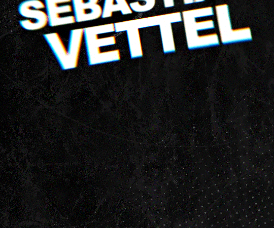
for the edit itself, i finally put my money where my mouth is and Thought About Form And Content. shoutout to my students for their relentless teasing. i set my comps at 12 fps to enhance the somewhat disjointed editing, and then i actually planned out the composition of my gifs instead of just throwing things at the wall and hoping something stuck. the background is black ice + a halftone overlay for the comic-y aesthetic. font is arial black (cheated with geller sans ultrabold for the "7" and "1") because #typography history and #cheeky references to the genre.
panels 2 + 3 basically employed the scale wipe + wave warp method in addition to my usual mograph bullshit (rotation, text animation, fake 3d using gaussian blur instead of adding a camera), but i changed minor things around. panel 3 especially, i gave the liquify tool a shot--and i don't like, hate it, but it was harder to map.
everything else seems pretty self-explanatory--stretch + center keyframes for the scale wipes in panel 1 (for the text effect), but aside from that, basic movement animations, basic glitches. i didn't reinvent the wheel! just added seb to it and spun.
8 notes
·
View notes
Text
Best New Anime of 2022
(reposted from cohost)
so i had cancer this year! which apparently means i actually watched enough new anime last year to do a top ten list? so i guess this is my first anime top ten! pretty neat! i’m only gonna cover shows that premiered this year because it would be hard not to put stuff like Mob Psycho and JoJo on here and there was so much great new stuff that i wanna focus on. here goes!
10: Love Flops: this show… this fuckin’ show y’all. the first few episodes are…. A Lot. some of the horniest anime bullshit i’ve seen. it takes over half the season to really show its hand. and look, i really don’t want to spoil anything, because it has some truly great reveals, but goddamn is it an incredible fucking hand. a show that is both absolutely demented and very touching
9: Aharen-san wa Hakarenai: translates to Aharen is Incomprehensible. just a really cute, chill little romcom about a couple of goofballs and their even goofier friends. was a very nice thing to look forward to during a pretty hard summer!
8: Urusei Yatsura: i originally had Spy x Family here, but y’know what? fuck that. Lum’s Back Bay Beeee and she looks better than ever. David Productions outdid themselves here
7: Bocchi the Rock: the most i've related to a character in ages. great music, great animation, great pals
6: Chainsaw Man: not typically my vibe, but it's so good i can't help but appreciate it anyway. i have trouble with “misery parade” stuff but Chainsaw Man takes it so far that it becomes hilarious. i really love its exploration of intimacy and control, very nuanced and looks at a lot of different aspects of it. Power and Denji’s friendship is super refreshing, Makima is scary as hell, and Himeno is… unfortunately very hot. don’t @ me
5: Ya Boi Kongming: time travel is always my jam, and this is one of the best. it subverts the whole "the character is dumb bc they're from the past" thing by making the MC a master strategist from the Three Kingdoms period. there's initial confusion, but he picks up quick, and it's more about him using his stratagems to help a girl become a famous singer. it also has one of the best OPs of the year too
4: Birdie Wing: it's the Lesbian Mafia Golf anime, what do you want from me
3: Akiba Maid War: legit one of the most buckwild first episodes ever put to film. absolutely has to be seen to be believed. all i'll say is that the title is literal, and it’s majestic. #1 fuckup gang of 2022
2: My Dress-Up Darling: immaculately crafted romcom, incredible characters. more or less a perfect show, would have been my top spot if the next one hadn't come to eat its lunch a few months later. the scene on the train after the con is one of my favorite scenes in anime period
1: Call of the Night: feels like a show made specifically for me. it's a romcom, but it's moody and there's philosophical shit and vampire fights? sign me the fuck up. then there’s Anko Uguisu, who is a fucking Problem 🥵 and to top it all off, it's the most gorgeous show i’ve seen in a long time. something like Demon Slayer has really fluid action sequences with amazing effects, but it looks pretty standard otherwise. but the composition and color and detail of every shot is so carefully considered in Call of the Night, it’s really something special. truly, absolutely cannot wait for season 2. i picked up the manga and am around chapter 100 now, it’s going in some really fascinating directions
and that’s my list! i was going to make this an honorable mentions section but ended up just mentioning basically everything else new i watched lol. so here’s that:
Ranking of Kings is a show i really loved but it just didn’t quite make the cut. the ending felt a little rushed and it started getting a bit predictable, but still great if you need a good cry
Shikimori Isn’t Just a Cutie was sweet and fun but felt a little thin
Spy x Family is really well-made and totally adorable but i have to take it in small doses for some reason
Reincarnated as a Sword i had no real issues with and i’m looking forward to season 2, but it just wasn’t a top 10
Eminence in Shadow: love the farce, fuckin’ hate the MC. still not sure where i come down on it tbh
Yakuza’s Guide to Babysitting: liked it, didn’t watch enough of it
Do It Yourself! is really cute but it never quite hits the highs of something like Laid Back Camp. still worthwhile if you like that kind of thing tho
Lycoris Recoil: i really enjoyed it while i was watching it, but i keep forgetting it exists tbh
and as far as returning stuff goes Mob had such a great ending, i’ve really enjoyed the Stone Ocean adaptation, i just got into Welcome to Demon School Iruma-kun this year and i’m having a great time with it, reminds me so much of that 00’s Soul Eater/HxH/toonami-type shonen but much less fight focused. and of course, Uzaki-chan was fucking incredible, as expected
it’s kind of crazy how much good anime there was this year and how many i haven’t even gotten around to yet! this winter 2023 season is seeming… a bit dry so far but at least Queen Nagatoro has returned to grace us with her presence. gonna wrap it up, but if someone found this and read all the way to the end… hey, thanks! you’re great!
2 notes
·
View notes
Note
B15 - fav year?
B15 Favourite Year: This is a tough question, because my answer changes depending on the context in which it's asked.
My favourite year in terms of aesthetics is almost certainly 2001. Its story is simplistic, and the sets themselves are outclassed almost immediately the following year. But there's something about the look of 01 that I simply adore. It goes hand-in-hand with Bionicle's initial concept: a semi-post-apocalyptic society of biomechanical beings on a tropical island, unaware that the gigantic, robotic body of their Great Spirit slumbers beneath. It's simple and effective, and you can see that concept reflected in the sets. They're both simplistic and complex, lacking the refinements of later years, but making up for it with wild designs united under a banner of strange. They're all just so odd-looking. Bizarre proportions, animals with treads for legs, asymmetrical limbs, exposed gears and hinges. It gives me the vibe of machinery adapting to a natural landscape, trying very hard to mimic real living creatures, but not quite there yet. It's delicious and it's a vibe that's so good I might just commandeer it for my own work. Lego seems to be done with it, after all. For now, anyway.
But when it comes to the sets themselves? Well, like I said, 2001 got outclassed very quickly. The sets got better and better with every year. Even into G2, which if you ask me gave us some of the best sets we ever got for Bionicle. Not necessarily my favourites, but among the best. My actual favourites, though? I think I have to go with 2009, which is...surprising. I really thought I was going to say 06, 07, or 08 here, but no, it's 2009. I like the characters from the previous years more, but in terms of raw set design, 2009 was the peak. Yeah, 04 is great for hitting that sweet spot between form and function that 2015 and 2016 then went on to perfect, but there's something about 09 that's just so lively and vibrant. 04 was plagued by clone sets, and the reboot years have their own issues, but 09 is where you can tell the designers really hit their stride with the Inika build. They knew how to use it to its fullest potential by that point. Every set told a story, conveying its character strongly while also tying back into Bionicle's elemental roots for the first time in a while. I will take some points off for some pieces being a little too hyper-specialized, i.e. Vastus' armour, Strakk's axe, etc, but damn, man, it all looks so good.
And then finally for story...this one's the hardest. Like everything else about Bionicle, I love it all, and I find it really difficult to break down the story into its composite years, because I see it as more than the sum of its parts. But if I have to pick one...I think 2006. 2007 and 2006 are a close race, mostly because 07 is effectively 06 But Underwater This Time. And I want to put 07 on top, I really do, because even though it is 2006 2: Scuba Boogaloo, it has a more unique setting, it has more impressive villains, it's the emotional climax of the entire Bionicle story, it lacks all the stupid things in 06 like the Nuva getting their asses kicked inexplicably. It has everything it should need to be the better year, and yet something about 2006 is more charming. Maybe it's nostalgia talking, but I can't help but feel like 07 is missing some special something that would secure it the number 1 spot. So the win goes to 2006: Island of Doom.
I hope those three distinct, equally long-winded answers are satisfactory. If not, and I still have to pick one winner...I'm going to surprise myself again and pick 2006, again. At least that's how I feel right now. It's got the perfect blend of personal nostalgia, fun sets, an aesthetic that is 01-but-slightly-to-the-left that is just perfect for me, multiple really dumb and really awesome marketing campaigns, and the online games, I didn't even mention those, but 06 killed it with the games, more than any other year. In my opinion, 2006 is pretty much about as BIONICLE as it gets. It's everything great about the series condensed and injected into a single year. It has its fair share of flaws, but I don't think those flaws outweigh the legion of things 2006 did right. My opinion may change in the future, but at least for now, my vote goes to 2006 for the best Bionicle year.
Unless we're talking about which year has the best licensed music, in which case it's 2007 by a mile. Crashed rules, I will not accept criticism over this.
#bionicle#bionicle ask game#07 also had creeping in my soul#and was when cryoshell was formed in general i think#so it gets more music points#but i'll leave 06 on top#original music would be a whole different category though#then i'd have to take into account...#so much#everything nathan furst wrote#the music for BIONICLE: The Game#the MNOG soundtracks#the music in the Power Pack#i don't know why the tags have turned into a bionicle music discussion#but damn#bionicle's music slapped hard
4 notes
·
View notes
Note
30,16, and 1 for the artist asks
30. What piece of yours do you think is underrated
I have a pretty good intuition of what metrics to expect from my work, so the fact that my Forgotten Turnabout piece doesn't have as many notes was never a surprise. Because a lot of people may have surface level fandom knowledge about AAI2 like say, of Seb the most popular new addition, but not a lot of people have actually played it, much less will appreciate a piece focused largely on minor/supporting characters.
But the thing is It Fucks. Look at it.
I think ppl should also look at my OCs and this Rampart piece :}
16. Something you are good at but don’t really have fun doing
Rendering and very detailed/realistic art. I take comfort knowing I have this latent power, and I Do love how they look when they Really work out, but I just no longer have the patience for it in general. Diminishing returns.
I often find I return to work that has simpler rendering but stronger composition/colors over these, and I find it very frustrating to render a piece to my desired level/balance, whether it's hyper detailed like these samples (too much work) or carefully rendered to a point of balance between detail and looseness/roughness (too easy to take it too far and lose charm in the process)
1. Art programs you have but don’t use
SAI........... I still have it in case I need to open older files since it's the program I used to main before CSP, but I think I've genuinely used it maybe Once in the past 3 years for the novelty.
Also Blender. I will get epic at lowpoly 3d someday <-dreaming
I use everything else I have LOL i hate downloading extraneous software. Photoshop I use mostly for edits or getting files print-ready. Paint is fine if I just need to crop something or small doodles.
Flash has been laying dormant because I don't have relevant projects for it (that might change if I ever get around to my indulgent AAI2 animatics) but I for real prefer doing simple animation compositioning in that over Premiere/After Effects.
Sculptris comes in useful in a pinch when I need to whip up a quick 3d reference and I used it in a recent zine piece. I've used Rebelle recently a lot.
Aaaand I've mentioned every art program I own in this post.
4 notes
·
View notes
Text
DAY 02 : Introduction to the 12 principles of animation.
THE 12 PRINCIPLES OF ANIMATIIN
1. Squash and stretch
•The most important and common principle.
2. Anticipation
•Helps the viewer to prepare for what's about to happen.
3. Staging
•Staging in animation is the same as composition.
•Keep the focus on what's important within the scene.
•Keep the motion of everything else of non important to a minimum.
4. Straight ahead action and pose to pose
•Each has its own benifits and the two approaches are often combined.
5. Follow through and overlapping action
•When objects come to a standstill after being in motion different parts of the object will stop to the different rates.
6. Slow it and slow out
•Understanding slow in and slow out is to think about how a car starts out and stops.
7. Arc
•Most objects follow an arc or a path when they're moving.
•When you toss a ball into the air, it follows a natural path as the effects of the earth's gravity act upon it.
8. Secondary animation
•Secondary animations are used to support or emphasise the main animation within.
9. Timing
•If you move an object more quickly or slowly then it would naturally move in the real world.
•Look at the laws of physics for help.
10. Exaggeration
•Too much realism can ruin an animation, making it appear static and boring.
•You are allowed to push the limits.
11. Solid drawing
•You need to understand the basics of drawing.
•While you push the limits here, too, it's important to remain consistent.
•Otherwise, it will fall apart.
12. Appeal
•Characters, objects and the world in which they live need to be appealing to the audience.
0 notes
Last Seen Blogs


weywyrdsis
Your 20s Are Just Your Second Set of Terrible Twos
inthebackground-poet
💜mia💜

mintory-jar
jar that screams