#i wanted to be fun and tried fonts and stuff
Explore tagged Tumblr posts
Text

behold, CLOTHES DON'T MAKE THE TURTLE ! . . . PT. 2 WHERE DONNIE ACTUALLY GETS HIS OWN SEGMENT !
#rottmnt#rise of the tmnt#rottmnt fanart#rise of the teenage mutant ninja turtles#tmnt#save rise of the tmnt#save rise of the teenage mutant ninja turtles#save rottmnt#rottmnt donnie#rottmnt donatello#rise donnie#rise donatello#rottmnt leo#rottmnt leonardo#rise leonardo#rise leo#rottmnt mikey#rottmnt michelangelo#rise mikey#rise michelangelo#rottmnt raph#rottmnt raphael#rise raphael#rise raph#THAT'S ALOT OF TAGS !!!#i wanted to be fun and tried fonts and stuff
1K notes
·
View notes
Text

a couple of terrible men for your tuesday
#em draws stuff#the flight of the heron#my reread got interrupted (they changed the font on my ebook) right around the fort augustus section so I had greening on the mind#and I thought it might be fun to actually draw him - it's interesting that he's described in very similar terms to francis throughout#and so it was an interesting challenge to make sure that their vibes were Strongly Conflicting!#so for greening I wanted to focus on a more slick and smooth and administratorial look#if he wasn't in the eighteenth century he'd have a clipboard and one of those very heavy engraved ballpoint pens in his pocket#and then with guthrie I tried to convey that This Is Not A Guy Who Is Pleasant To Spend Time Around#a little trickier because I have a strong mental image of his mouth and his hair and nothing else - but I think I got there in the end!#I actually tried doing an underpainting for this drawing and it turned out fairly okay so I might do it again sometime
19 notes
·
View notes
Text


hi simblr, it's my birthday today! virgo supremacy! I decided to share one of my favorite recolors i've ever made (finally!!!). I sticker-ed up the City Living keyboard and added some other fun swatches. There is a functional version for use with the City Living EP, and a non functional deco version for both the floor and the wall! More info + download below the cut!
DETAILS:
This is a recolor of the keyboard that came with City Living, and the deco mesh separated by @pixlmonster. Unfortunately this means CL is required, I'm sorry! I was hoping the deco versions would work without CL but they do not. Mesh by pixlmonster is included.
There are 19 swatches. The first 6 are the more unique sticker-ed swatches, and some of my personal favorites. Swatches 7-11 are more patterned recolors, and the last 8 swatches are from @pictureamoebae's fluoro-pop collection. Sometimes you just need a neon pink keyboard, y'know?
You can see an unedited in game photo of all swatches right here (part one, part two, part three)
Custom thumbnails for the first swatch.
You can download a merged .package with the functional + deco versions, and they also come separated if you'd prefer to pick and choose.
CREDIT:
Thank you to pixlmonster for the liberated keyboard mesh and pictureamoebae for the fluoro-pop collection palette!
I'll be super honest: It's been a year since I first initially started this project and I didn't do a great job recording where I got all of the stickers used. I apologize. Some of them were in game assets already, found via petaluhsims' sticker sheets. Some were found via google/freepik and some came from other places that I'm sure I'm forgetting. I made the parental advisory + seattle grunge stickers on the first swatch myself. Simlish fonts were found via franzillasims' font masterpost. Thanks so much to all of the original sticker/pattern creators, all credit goes to them. I just compiled a bunch of stuff together.
thanks to sam @m0ckest for testing <3
here's an ugly GIF of all the swatches! I tried so hard to make it look better but alas. I have completely forgotten the art of GIF making. I still wanted to include it so y'all could see all of the swatches somewhat easily!

DL:
MERGED: SFS / MF
INDIVIDUAL: SFS / MF
#ts4#the sims 4#ts4cc#s4cc#sims 4 custom content#maxis match#sims 4 cc#ts4 custom content#mycc#drops this and runs away jdrlfk#MY MAGNUM OPUS 2.0 HAS ARRIVED#pls reblog if u like it means a lot ❤️#i literally love this recolor so much im sooo happy to finally share it#pls tag me or show me if u use it in your builds/gp! 🥺
5K notes
·
View notes
Note
Also more ideas about that scenario. What if the Flower holding the door shut was 𝘍𝘶𝘬𝘢𝘴𝘦? Then the person inside would have to watch their friend kill them :) also unrelated but what do you think they'd sound like? I feel like the fusions would sound like normal but the way they speak would be odd? (Like exaggerating syllables if that makes sense) It would be more advantageous for the parasite to keep the original voice as a lure for people who knew them, so I think it could be neat. -🌟

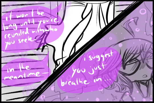
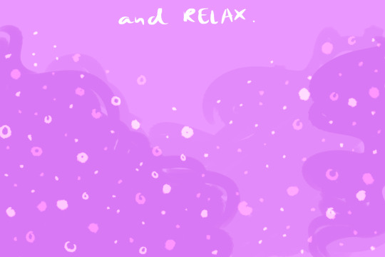

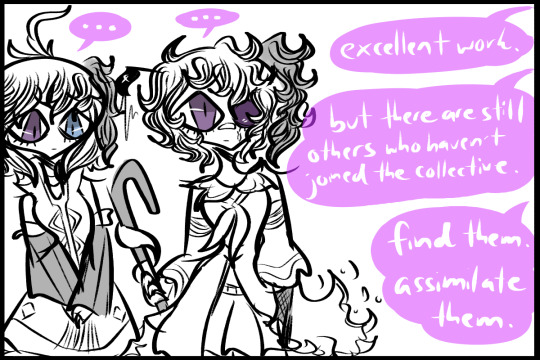
as for how they'd sound, i do think keeping part of the original voice is def a good strategy on the parasites' behalf, and a slightly different speaking pattern also sounds abt right 👀
i wish i could like... make an audio mockup version thing of it (but im not that skilled nor do i have all the things 😭), but personally the way i imagined a flowerized individual would talk is sounding kind of like a mix between the original person's voice + talk flower's voice... some sorta echoey overlay where the voices slightly overlap? you can mostly make out the original person's voice but something is... slightly off, slightly wrong :)
#ask#talk flower's voice for most of the flowers feels fitting just b/c... original v3/v4 ily but youre a lil incomprehensible sometimes#some of the flowers might have that original v3/v4 voice (and i have no idea what the cevio one actually sounds like rip) but only a few#cause as discussed a few asks back maybe some of the flowers came out a lil bit fucked up w/ mutations and such... plants b like that#SORRY THIS TOOK SO LONG TO ANSWER I REALLY WANTED TO DRAW SMTHN FOR IT#my hand is really sore from drawing arghhh but i still wanna draw stuff 😭😭😭#there's a lot of details/things wrong w/ the comic thingie but shhh im not good at making comics 😭 i tried#SORRY IF MY HANDWRITING'S ILLEGIBLE HDSKJGNK its shitty#i should make it into a creepy font i feel like it'd look cool#also last note: i figured for the most part the collective flower didnt actually talk much at all#maybe some sorta plant telepathy so its not necessary but in general saw them as rather quiet... its fun and creepy silence maybe lol?#flower hivemind au#ollie the star anon
1 note
·
View note
Text
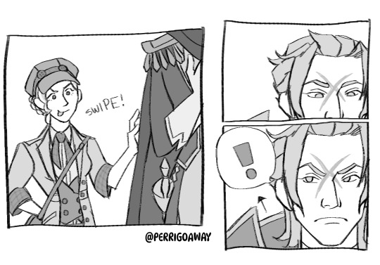

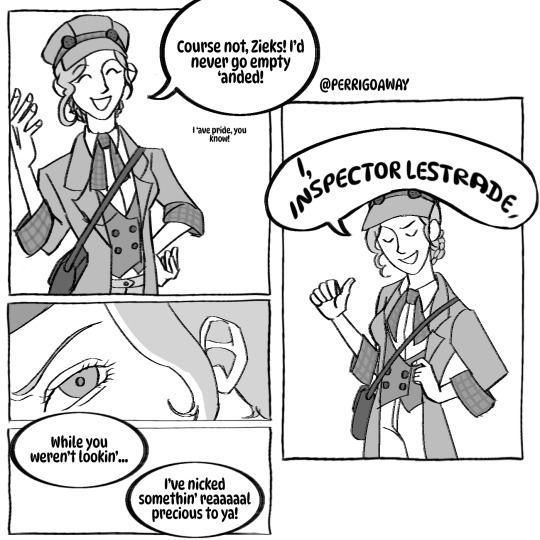
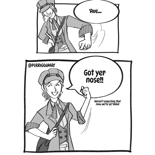


I like seeing them be silly
More thoughts and discussion beneath the cut!
Okay!! Another comic, guys! I tried to keep this one a little more simple visually! Of course, I always get carried away and end up putting in more effort into comics than I want to, so some parts are a bit more detailed than others, and some are a little more simple! Still, that's kinda just how comics are, so it's fine lol
Anyway, as for the comic itself, I think van Zieks would soften up a little over the years after everything is resolved, so maybe he'd be more willing to joke around a little. Still, Gina is a fun character, and also isn't really intimidated by him, so she'd think it was funny to try and mess with him. I tried to keep their dialog as in character as I could, also using the fonts to try and characterize them a bit! Hopefully it's legible!
My older sister gave me the idea for this comic, along with a couple others that I might do something with in the future :D my sisters pretty much ghost write most of my comics, as in planting an idea in my head and I draw it/make it in to comics! So thanks to them!
I think from now on, I'll put all my insane ramblings and yapping beneath the cut, so if you're reading this, thank you so much! I read and appreciate everyone's interactions with my stuff, and spend lots of my freetime reading through the reblogs HAHA they really do motivate me!
#the great ace attorney#dgs#dai gyakuten saiban#barok van zieks#gina lestrade#teagies art#my art#ace attorney#aa#ghhh is this considered spoilers?#maybe a little TT#dgs2 spoilers#art#fanart#with id#id in alt text
372 notes
·
View notes
Text
Tkachuky Derby & Hughesapalooza - 2024
*click for better detail- apologies for the lighting and general quality of the pics 😓!!*
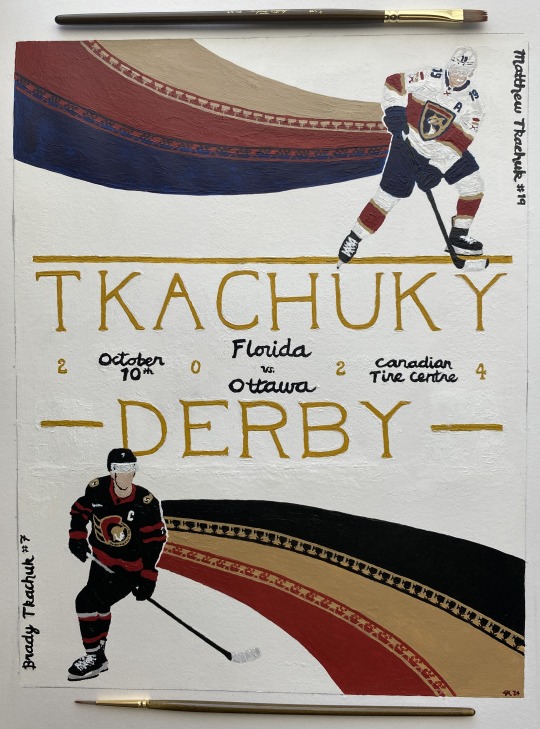
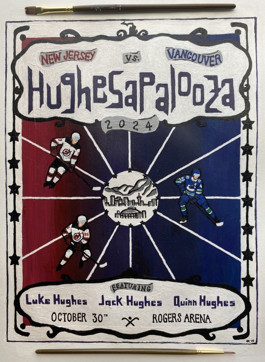
acrylic on paper
please don't steal or repost 💚
inspired by this tweet specifically (plus credit to the earliest twitter mentions i could find):

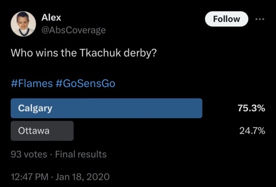
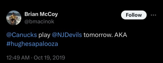
Made these for my fellow brothers bowls enthusiasts!! Especially those who know it’s all about the intricate webs of familial narratives in athletics. and the concepts of destiny and talent. and brothers as both allies and adversaries. and the bonds between siblings. and…
links to inspo, reference images, and other thoughts below the cut!
THEY'RE DONEEEEEE!! 😭🙌 i spent probably 2-3 full days' worth of time from concept sketches to final products. so much paint. so much frustration. they're still not perfect - there's little issues on both (if you notice something, i promise i'm aware of it!!) but 'fixing' stuff in acrylic often leads down a rabbit hole and i just had to call it and be done.
there's intentional little details on both - let me know what you catch! hopefully you can see them okay 😅
*i know they play each other more than once per season but i only wanted to make these for their first '24-'25 meetings)*
Let's get some whimsy up in here now, boys!
Derby:
team colors - Panthers Senators
matthew reference
brady reference
Kentucky Derby posters inspo
I wanted to keep the derby poster more 'clean' graphically. lots of derby posters have sharp lines of color and lots of movement, so i knew i wanted large swaths of the team colors somehow (thanks to the ppl that voted on my poll for what the team color shaping should be! i did follow the winning choice lol) chose poses where they look like they are moving in the direction of the 'flow.' generally wanted to keep focus on the idea of matthew vs brady, so i have them 'looking' across the way. was originally going to put in outlines of skylines for cities relevant to them, but that proved to be way too big of an undertaking so i scrapped that idea and came up with some different references. put some detailing for each of them that i'm reallyyyyy hoping you can see when you like zoom into it, but here’s some closer pics:
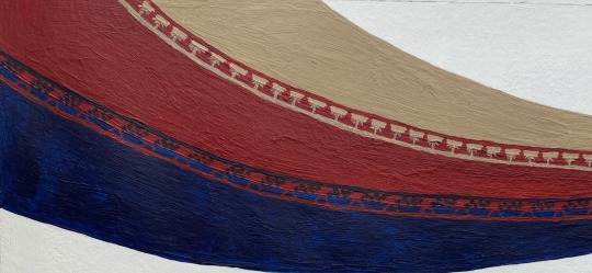
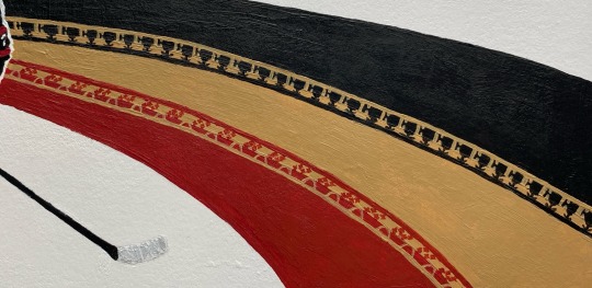
their last name is ukrainian for weaver, so i wanted to put a little nod to that somehow. not sure it will translate/be clear to viewers, but i limited myself by making the poster so damn small...*I* know they're there and can see them lol if it's not clear to ppl i will come back here and explicitly say what they are lol
Palooza:
team colors - Devils Canucks
luke reference
jack reference
quinn reference
Music posters inspo
inspired by lolla/music posters. wanted a more 'fun' vibe overall. while the derby poster would be more for say like, putting on a wall or hypothetically used for marketing purposes, palooza was more marketing poster and maybe on a t-shirt, too. definitely wanted a calligraphy type font for the name - just felt it out and came up with that shaping. tried to reference lolla a bit. used the devils and canucks coloring - and combo of those (did you notice?) - for the palette. wanted it to be a bit more pop graphic-ish (and hopefully not too cartoony). used some hockey/venue shapes and references, as well as some little hugheses-specific easter eggs...fun fact: the reference pic i used for jack is the EXACT SAME as his nhl25 cover. they just edited it to have the devils' home jersey colors. (i was like wait a second....i know that pose. bc i've been staring at it trying to paint it for hours!!!)
some pics of the palettes and initial sketches:
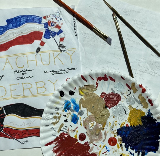
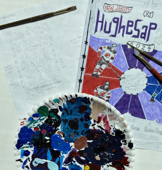
If anyone has fun nicknames for other nhl brothers bowls, i’d be open to making more posters! Lmk!
If u read all this just know i love u and hope you have a good day 🫶
#AHHHHH i'm scared but here they are#hope y’all like them 🫣#lmk what details you notice 👀 (me praying i painted them good enough and that they’re even visible/noticeable)#me#tkachuky derby#hughesapalooza#hockey art#tkachuk brothers#hughes brothers#matthew tkachuk#brady tkachuk#luke hughes#jack hughes#quinn hughes#panthers#senators#devils#canucks#nhl art#blue.art
123 notes
·
View notes
Text
As promised, I've got more books to share and they are all fic binds. Have a look at this new one:
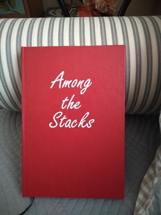
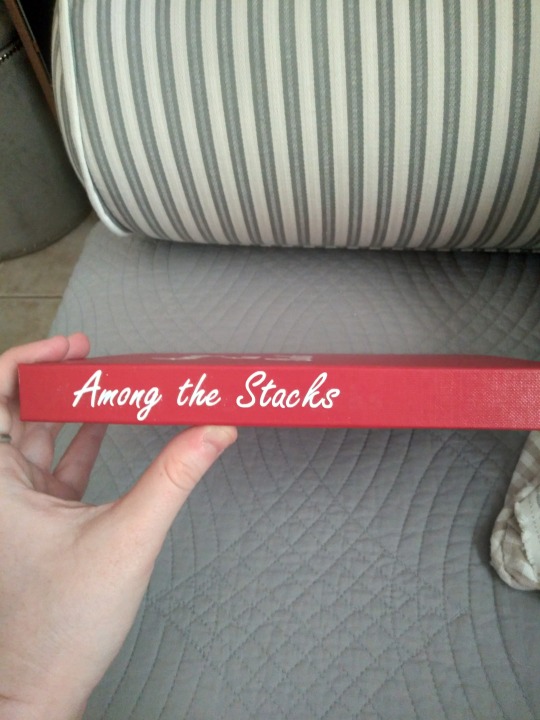
This is Among the Stacks by MeinirRhos, and it's one of the few post-s2 Good Omens fics that I've liked enough to bind. It's canon-compliant and full of pining, fluff, angst, and a memory loss plot and I knew before even finishing it that I wanted it on my physical shelves.
I kept it pretty simple on the outside, with Library Summit book cloth and white HTV for the title. Large parts of the fic have to do with libraries and library books, so I thought it would be fun to make it look like a library rebind, something that looks innocuous and blends in to the shelves but it's actually going to be your new fave once you open it up and start reading. I wanted very badly to have the titles hand-written in embossing inks but I couldn't get a clean enough line with the textured cloth, so this handwriting font saved the day.
More photos under the cut; I'm really proud of the typeset for this one!
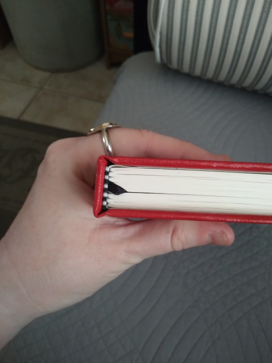
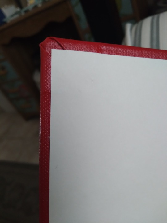
Top view, with pre-made end bands and a ribbon bookmark. Going with the library rebind aesthetic, I didn't think it ought to have handmade end bands, so these were perfect. Honestly I'm not sure the ribbon bookmark fits the theme, but you can pry that from my cold dead hands. All my books have them and I love them too much to leave it out. The endpapers are cream-colored cardstock, and while they look plain they feel nice. I tried out a new-to-me corner style, the library corner, where you don't trim off the excess material at the turn-in. It's supposed to be more durable than other styles and is common in rebinds. Library Summit is stiffer than most of the other book cloth I've worked with, so it was a little challenging to get it to lay flat while drying, and it's a bit bulkier than I'm used to, but it's perfect for the theming. Unrelatedly, it also holds a hinge crease really well.
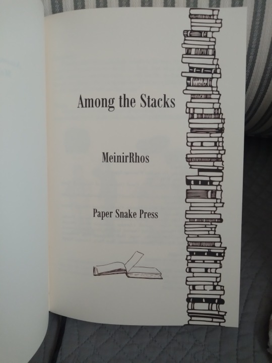
Title page. I could not be more pleased with this title page design. I showed it to my husband after I finished the text block but before I had the cover on it, and he didn't realize at first that it was one of mine. I have cracked the code of professional title pages. The graphics were, at the time I put this together, available for free on rawpixel. I'm in love with it. It is sexy as hell and it will never be equaled.
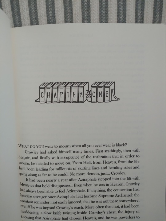
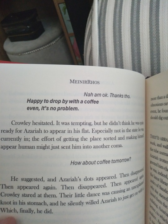
Couple more interiors. The chapter header font is called Book Ends and I found it on DaFont. You add in the little plants and stuff with symbols. I haven't done much with custom fonts until this batch of fics, and in some of the others I've got in the pipeline I went a little nuts with them, but I think this one's my favorite for how well it fits the story. I also started experimenting with formatting text messages in this fic, and I'm very pleased with how those came out as well. The Renegade Bindery discord has resources on this kind of formatting, so check them out if you haven't already. I'd never have gotten them so professional-looking otherwise.
And that's it for this bind! I started working on it back in April and I'm thrilled to finally be able to show off the finished product. Thanks @rhosmeinir (Hi! It's Amberfly from Ao3!) for giving me permission to bind it nearly six months ago.
70 notes
·
View notes
Text

Lucky Little Lunatics, R/L Monroe @petitemortality's latest erotica release, is out! Another one for the sapphics, particularly the monsterfucker sapphics. If you're into Chimera Falin, or any sort of TF, you'll be into this one! You can check out a three page sample and a full list of its contents over on the shop page.
but this is the post where i talk about the process of designing the cover. i had a lot of fun with this one (i mean, i ALWAYS do, but this one had the most ideas generated)
so let's talk about THUMBNAILS!

like i said: there were a lot! these were the notes i was given:
"moon imagery important
monster girl is a chimera incorporating wolf / stag / owl parts, big monster jaws and sharp teeth are important but otherwise the actual form she takes is open to exploration. she is Large, regardless
it's not an outright vore book but there's definitely a fairy tale style threat of gobble you up
I can give you direction on the three witches she's hunting if you want or need it, but as usual I'm not expecting anything super figurative so it's probably not That important"
so my big takeaways are: moon, obviously. A Monster, fairy tale vibe, and the three witches. already we're cooking with iconography, and the style so far with the covers has been largely silhouette. so obviously we have to do something with a big prominent moon, and obviously the title is going to go there. like that's a no brainer. if you need to have a big prominent circle, you put the title there.
i presented the first six to lee and he liked 2, 5, and 6 the most. we moved forward with 6 because the others were ultimately a little Too storybook, and it is after all a book about turning into a monster and chasing down some women you've been hanging out with, for the purpose of fucking them. taking his feedback about making the monster less specified and more oppressive, we ended up with the 8th thumbnail, which ended up being the final!

and then we went through some color variations. i work pretty much Exclusively with gradient maps these days, which make it really easy to iterate on a palette with very little additional work. lee chose the bottom left, so that's what i moved forward with!
FONTS

we tend to go through a lot when picking these. my first pass was based on the fantasy fairy tale vibe i was still operating under, which we ultimately dismissed. lee wanted something Like the first, simple, font, so i tried a bit more. the crit there was that they ended up looking too much like a bestseller, when what we wanted was something a little less top shelf and more pulpy. we ended up using the top right option, which coincidentally is the font i use for the cover of You're A Mage on Monsterfuck Mountain. apparently that font is just for monsterfuckers
and that's more or less it! there wasn't a whole lot of process between thumbnails and thumbs, just plan and execution. i think my favorite part of the cover is the little witches holding hands and running away. they charm me.
anyway you should go read the book! it's very good. it has big monster tongue stuff AND tail stuff. truly a monsterfucker's paradise
get a copy today!
58 notes
·
View notes
Text
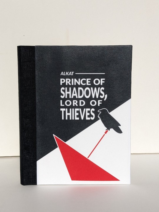
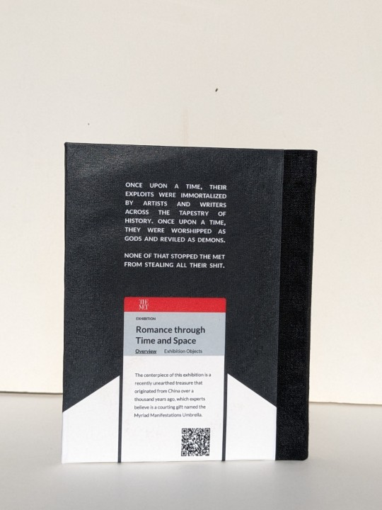
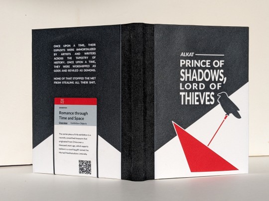
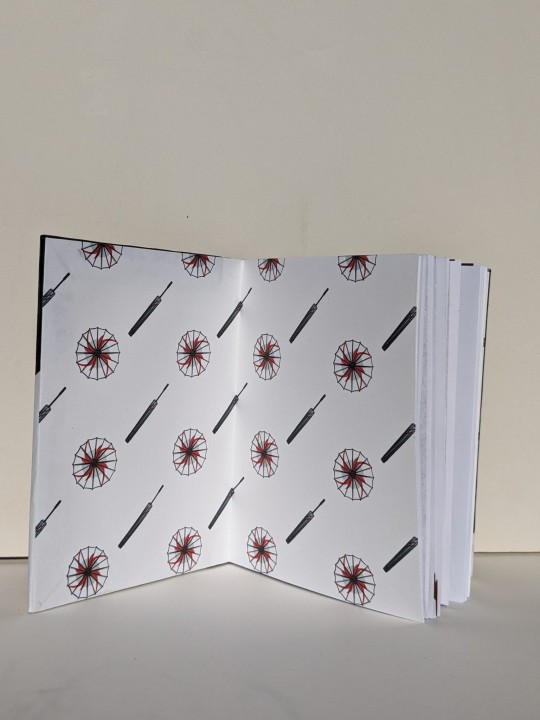
Prince of Shadows, Lord of Thieves by alkat
Fandom: The King's Avatar | 全职高手
Rating: Teen And Up Audiences
Category: Gen
Words: 1 929
Once upon a time, their exploits were immortalized by artists and writers across the tapestry of history. Once upon a time, they were worshipped as gods and reviled as demons. None of that stopped the Met from stealing all their shit.
About the Book
FONTS: Alegreya [Google Fonts], Lato [Google Fonts]
IMAGES: all art made by myself @greenhorn-art for this fic
MATERIALS: regular ol' printer paper (8.5"x11", 20lb, 96 bright); ~2-2.5mm binder's board; Neenah cardstock (8.5"x11", 65lb, bright white); Cialux bookcloth (black); waxed linen thread (30/3 size, white); wheat paste (1:4 flour:water); paste wax (from a friend, unknown ingredients&quantities, some kind of wax and turpentine/mineral spirits)
PROGRAMS USED: Affinity Publisher 2; Affinity Designer 2; Bookbinder JS | Renegade's Community Imposer (settings: Quarto, snug against binding edge, custom signatures of 2, 1, 2 sheets).
Text & QR codes printed with colour laser printer (duplex, flip long edge), images printed with inkjet printer. QR codes generated with LibreOffice Writer, snipped, saved, and inserted where needed.
BINDING: quarto (quarter-letter) size, sewn board binding with french link stitch and breakaway spine.
.
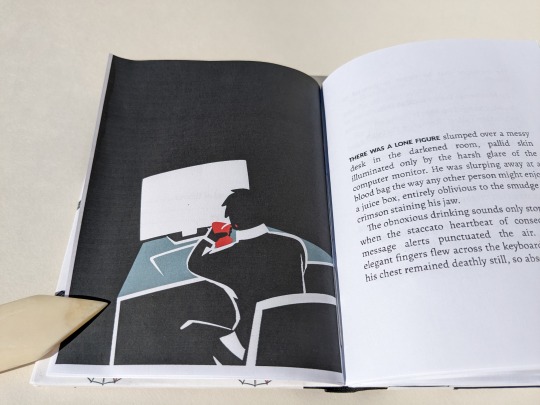
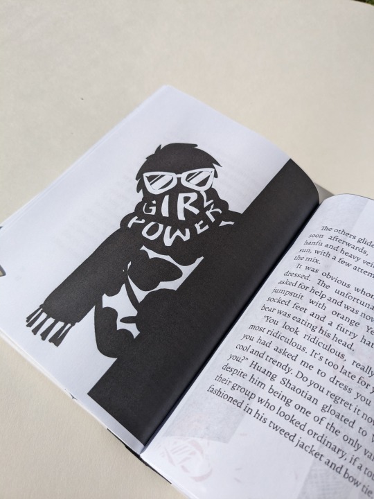
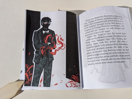
So this one all started because the visual of HST's outfit was so fun that I was possessed by a visceral need to draw it. Inspiration slapped me across my mind's eye, and much like a medieval knight being slapped in the face by a glove (which didn't actually happen, that's a myth that sprung from the throwing down of a gauntlet. but that's beside the point), I felt bound to take up the challenge. Which lead me to draw a few more, and then I ended up binding the whole thing.
(Also, I find it really amusing that the famous Terracotta Warriors were just storage for YXs stuff. And the gang going 'shopping' at various exhibits for gifts for friends/family,, like that sure is SOME window shopping! I can hear it now: 'Oooh I'll take one one those SMASH, and that SHATTER, and throw in some of those CRASH, they're going to love these! 😇'. All in all, it was a fun little read, and fun little project! :D)
About the Art
Because this was initially a one-off drawing I tried a new art style (and struggled to at least not stray too far for the rest). It was fun and helped me think more about shape and visual focus, instead of being caught up in the details.
The crow (based off of image ID: 4039963 from Rawpixel) and the red umbrella on the front cover were filled curves made with the pen tool. The illustrations' poses were based off of a combination of images found on Google and photos taken by myself.
Pinterest is awful for sources, but it would have been handy to pin the references I'd googled. Only remembered to save the one of a man sitting at a desk. (I deliberately searched for someone sitting with bad posture because YX is described as being "slumped" over the desk. I figure that since "the laws of physics held no meaning to ["cursed souls eschewed by the natural order"]", they'd also be immune to mundane things like discomfort from sitting hunched over for too long. Back pain images were a gold mine! All I had to do was choose one with lighting that would give me a silhouette.)
The Myriad Manifestations Umbrellas and illustrations were drawn in Procreate.
I opted for a more plain umbrella design because it's not (presumably) a fantastical weapon in this story. Though the initial version did have YX cradling the donghua!MMU.
For the scene breaks I inserted the images, pinned them inline as character, and adjusted height and baseline in the pinning menu to fit.
The author wrote one scene break differently than the others, using multiple empty paragraphs instead of just one. Following suit, I used a different image for that particular break. I wanted to reference vampires somewhere, so for that break I made two bloody spots resembling bite marks. The blood spots were made with a group of shapes in Designer.
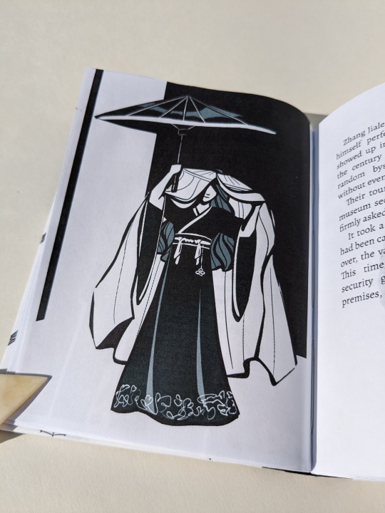
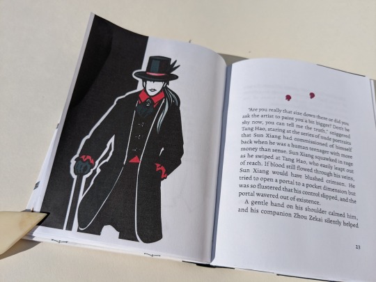
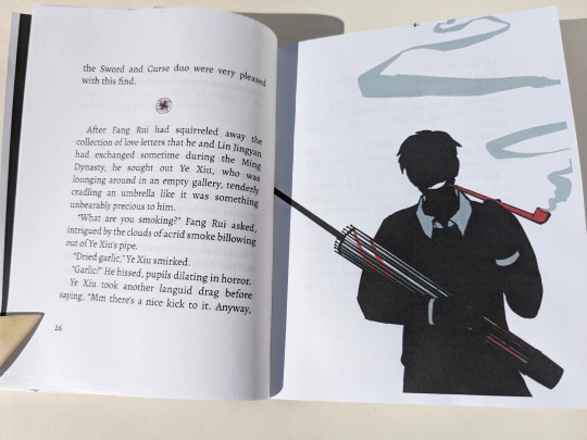
On cover design:
Because the MMU is what sparks the whole heist, I wanted it on the front cover.
Earlier iterations involved a full cover spread with a man's shadow standing before a shattered glass case, with a plaque mounted on the wall to the left providing information. The plaque was formatted like a museum label and had the author, date published, title, event collection, and story description. I'd also added a QR code to it. Ultimately, I abandoned the concept because it was difficult to decipher what is was when only looking a one cover at a time.
My second idea for the cover would have been a bookcloth-only cover with a cut-out of the MMU on the front, acting like a window showing off an image of the MMU on paper below it. (Inspired by the work of a number of folks over on Renegade's Discord. Here's a few examples gleaned from a quick search: szynkaaa's lung cutouts, some of EHyde's books, and the front cover of Spock's massive all-in-one TGCF). As fun as that would have been to try out, I felt it didn't quite suit the style of the art so I nixed that too.
Eventually I landed on the back cover design with the Met exhibition webpage. At last, I felt that the back & white and simple-shapes-background went with the artwork. The webpage viewed on the phone is based off of the Met's actual website. I took a snip/screenshot of the Met's logo from the banner at the top, then looked at their exhibitions' pages and eyeballed it to create my own. (Threw in the QR because I wanted the easy access to the fic online on the back cover). I chose to use a phone screen rather than I computer monitor because it worked better composition-wise. And besides, while YX may be allergic to owning a phone, SMC is not. I imagine that she saw the news while on her phone then messaged him.
The front cover came together after that. An umbrella for the MMU, and a pop of red. One of YX's messenger crows. A black shape in the background similar to the back cover's, sort of creating a spotlight over the umbrella and placing the rest of the cover in shadow.
Trying New Things: Applying a protective finish to printed covers
Over on the Renegade Bindery Discord, folks have spoken about using a beeswax & turpentine/mineral spirits 50-50 mix to seal printed covers (thank you Kate). According to my dad that's just a paste wax, so he threw 3 different ones at me and said 'have at it'.
I tested them out using the same paper and inkjet I'll use for the cover. I was looking at 1) whether the paste wax affected the paper colour or print quality, and 2) the finish. After applying one coat each and buffing them out I had my winner. Then I applied & buffed two more coats to it and tested 3) water resistance by dripping tea on it. The liquid beaded up and wiped away without staining -- good, three coats will work nicely.
(Test results: Mystery paste wax from a friend wins.
The commercial SC Johnson Paste Wax Original formula (intended for woodworking) has a nice dry shiny finish, but coloured the paper slightly brown -> disqualified
My dad's homemade stuff has a nice shiny/satin finish and didn't change paper's colour, but it felt slightly tacky even after buffing it -- maybe I didn't buff it enough?
The gifted paste wax has a matte finish, didn't change paper's colour (in the image below this one has 3 coats. The paper is now slightly off-white, but still acceptable), and while not as dry-to-touch as the Johnson it was not as tacky as the other homemade stuff.)
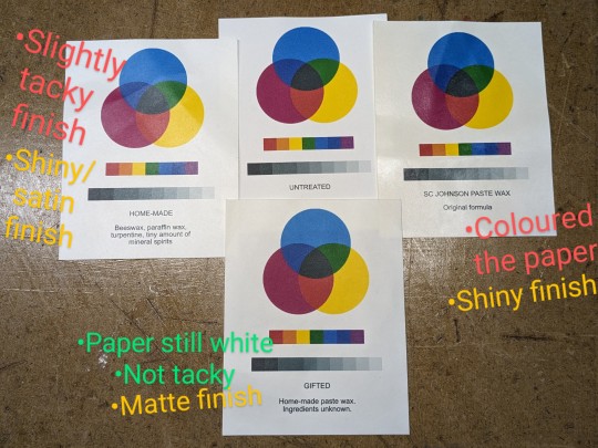
When I print out my quarto covers, I print front and back covers side-by-side on the same page*, with some guides to ensure I'm cutting and gluing in the correct place. (The guides mark the boundaries of the covers and start of the turn-ins, and stop at the edge of where I cut. Before cutting I flip it over to mark the guides [see marks indicated in image below] on the wrong side and connect them so I can see where to glue/place book. Then flip it back over to cut, right side up.)
*I'm being economical here at the cost of possible warping damage. This layout means that I'm only using one sheet of paper, but the grain is running in the wrong direction (across the book instead of preferred head-to-tail/top-bottom). This could cause warping issues, but I'm OK with that. I'm hoping that by just gluing at the edges, instead of pasting down the whole thing, warping will be minimized. (I use wrong-grain endpapers most of the time with larger books anyways).
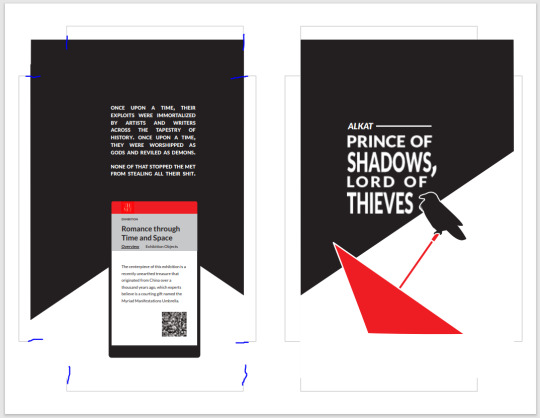
I applied the paste wax before cutting out the covers, working carefully to avoid accidentally creasing/bending the paper (which happened twice, but it was minimal and I hardly notice it). Doing so before cutting ensured that the cover material was completely covered. Even the turn-ins -- something I later came to regret. After all, wax is used specifically so that things don't stick to it. It made it rather difficult to drum on the endpapers because I was trying to glue something down onto a waxy surface. It all worked out in the end -- perhaps due to the fact that there were multiple layers of wheat paste which could adhere to each other, followed by being squashed in a press.
93 notes
·
View notes
Text


So! My third bind is now complete. (Well, 5th bind, but 3 and 4 are in transit to their owners at the moment.) This is my second bind of my own fanfic with the theory that if I'm gonna screw it up, at least I'm screwing up my own stuff. :) I'm really pleased with the formatting for the text - I had tons of fun playing around with it, and I love how it turned out. The cover, on the other hand, was a horrible experience and can die in a trash fire.
This bind is a compilation of various fics from Yuri on Ice and Check Please, so I tried to stick to the theme and use ice and ice skating motifs throughout. Hence the skater silhouettes on the cover and title page and the font for the main title has a sort of cracked-ice feel to it, with icy blue colors.
I had a lot of fun doing the typesetting. Since there’s several stories in the book, I used a title page for each, with a slightly transparent picture behind the title to give an idea of which ice skating world we’re in (hockey v. figure skating). And then for the one coffee shop AU, I used a coffee mug with the steam forming a heart. 😊
I also tried a couple different things with the formatting. One story relies on texts between characters, both via SMS and WhatsApp. So I creating text bubbles in the appropriate colors to emulate that. PAIN IN THE ASS, but it looks awesome.
Another story is told from two POVs. The 1st person POV character is really angry and defensive, and I decided that I’d play with his words a little to show emphasis in some places. So there’s places where I space words out, played with the sizing, the font, bold/italicized, where it sat on the page, all of that. I really liked how it turned out and stood out from the other POV.
And now, the casing. Once again, I made my casing too big for the caseblock (gah), and then when I tried to get the vinyl ironed onto the cover, I screwed up and wasn’t patient enough and ended up tearing it. I couldn’t get more (it was a scrap from the library, where I use their Cricut machine), but had some paint that matched. Mostly. I am probably the only one who can see it, and since this is just for me, I figured I just wanted to be done with it rather than create another cover. It opens flat, which I kinda like? But also the cover is kinda... bulgy in a way I don't like, and I don't know why. But… it’s done it’s done, and it’s fine.
I had at one point been thinking to try making a paper jacket cover for this bind; I still might, since the cover itself brings me no joy. But I needed it done and on my shelf and maybe I'll revisit after a few more binds.
14 notes
·
View notes
Text
sunday recap 🥓😽
so many things today but more importantly SO MANY CATS LET GET THIS THROUGH SO WE GET TO CATS
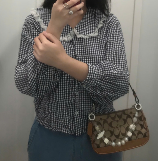
fit check, i changed like 5-6 times wanna lean into a coquette style but sadly this the shirt with the closest match I could find
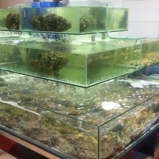
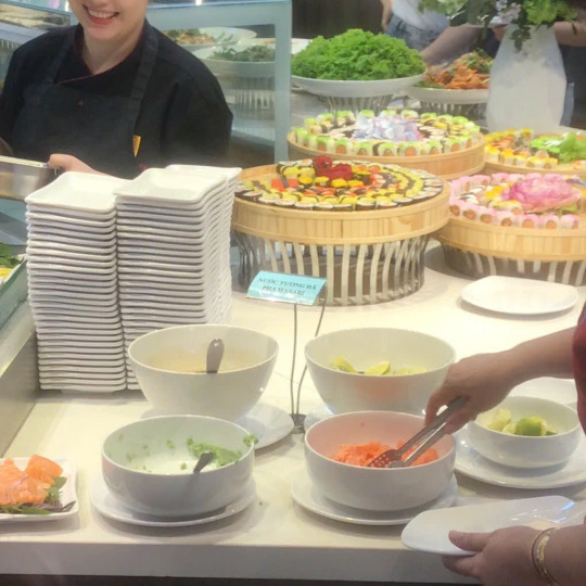
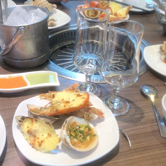
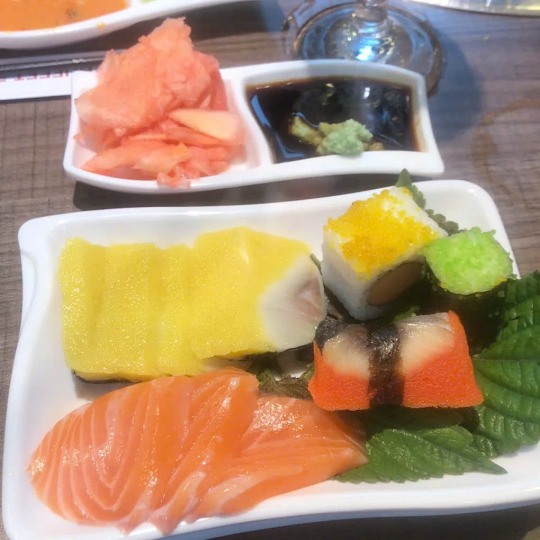
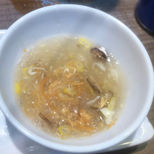
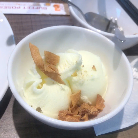
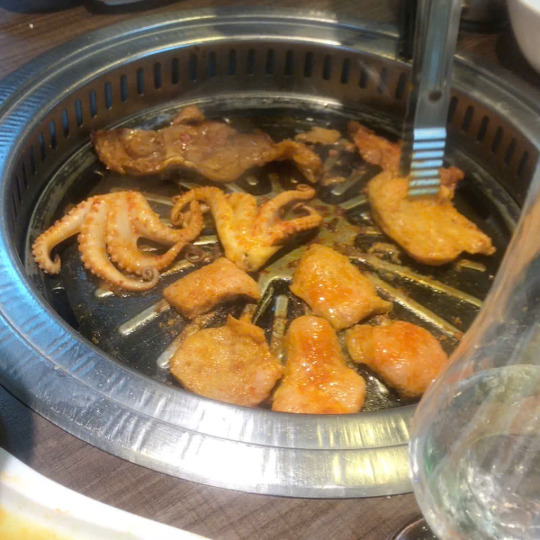
seafood buffet because we didnt have any breakfast so this kinda our brunch. this just opened in the mall near where I lived lmaoo, basically they served seafood in any kind, and also there bbq and hotpot too but we didn't take the hotpot. all seafoods are very fresh (look at that tank!!!) again ranking
grilled shrimp and oyster with cheese: 8/10, the cheese is like too sweet and fatty
grilled snail with scallion: 8/10, good but nothing special
sashimi: 9.2/10, very solid!!! and u can get as many as u want
sushi: 7.8/10, idk I dont grab those much there not much variation also it can make u full quick
grilled abalone (not pictured): 9/10, for the price we can get as much as we want and I think its neat! also it got run out so quick lmaoo
seafood soup: 9/10, phenomenal, like I had two bowl of these
grilled everything (had pork chest, pork, beef, octopus, grouper fish, okra, eggplant and cheese fish ball): 9.5/10, I love the way they marinated the meat!!
durian ice cream: 7.5/10, nothing special also it all durian which I dont like and they run out of chocolate ice cream :((
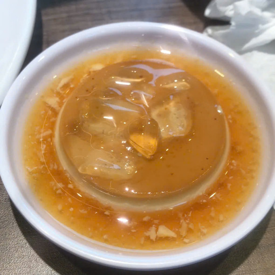
flan with coffee sauce: 9.2/10, smooth, creamy with that bitter sauce like it just top notch flan, literally one of the best I've ever eat
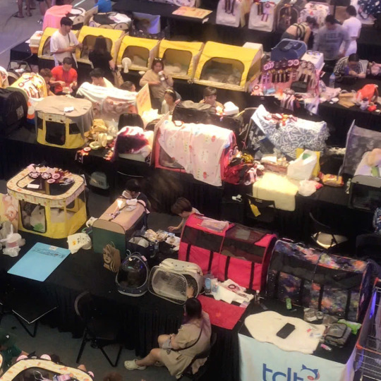
also on the way down i saw they're having this cat contest thing like there so many booths it looked so fun (pictures later cuz I took like A LOT)
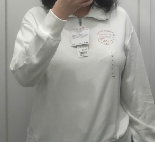
first tried a bunch of stuff at uniqlo, obsessed with these snoopy shirts and these cutest zip up, like the zip up are clothes for children but there big size and I can fit in there too
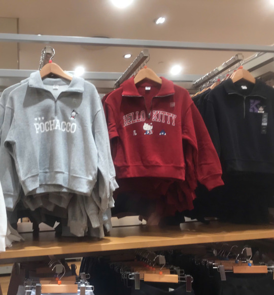
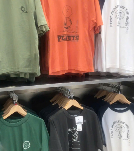
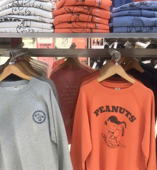
trying on, the shirts is from the male section and the zip up and hoddies are from children section biggest size they look so cute tho icant think of the way I would wear the white zip up a lot and the green shirt is xs so I def need a size bigger
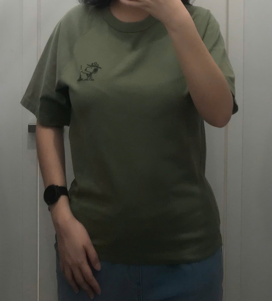
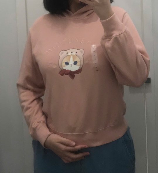
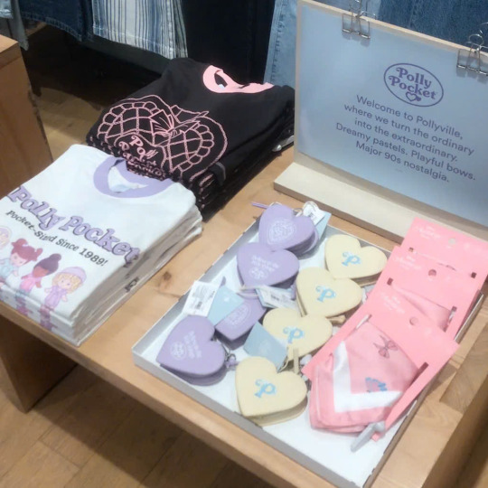
next is cotton-on, they're having this collab with polly pocket which is sawr cute if only they're not like fucking expensive, like why is that shirt 30$ and that tiny MICRO purse 28$ like I dont get it, it not even real leather! also oversea website having XL size but vietnamese store doesn't is criminal
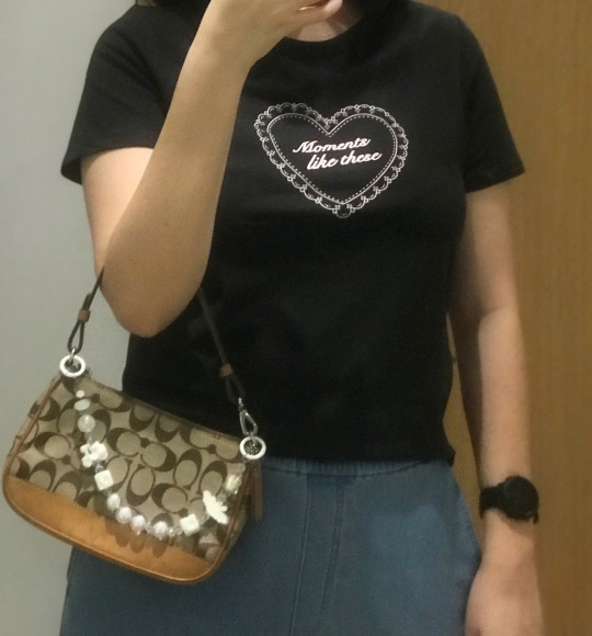
tried on a bunch of stuff the sale associate was looking at me like crazy also the price there has only gotten more ridiculous with time. the black shirt was giving sabrina carpenter and there another one with blue background and red font just like short n sweet aesthetic lmeow. the cardigan looked so close like that coloring the cutest but it looked wear on my body. the mentioned polly pocket shirt, I mean idk it fit but it expensive and also I dont like too much figure hugging in my clothes. same with the other shirt who I think the color pretty nice
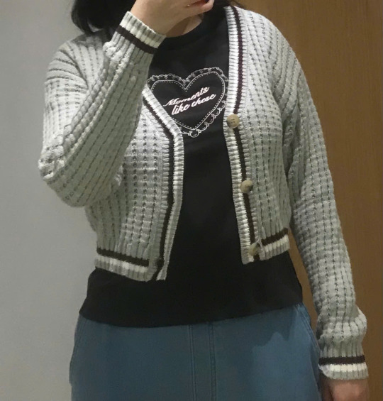
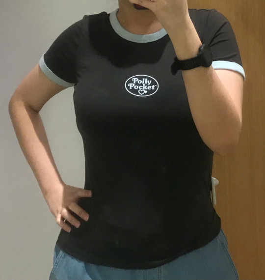
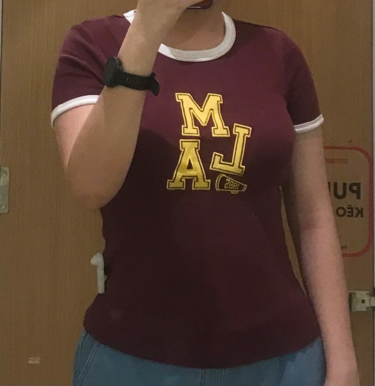
can you guess which one i got hehe
8 notes
·
View notes
Note
I have this strange confession to make and Im so sorry if it’s weird but I have autism so I have hard time putting together my words without them sounding weird.
I don’t follow your blog because I didn’t want to be drawn to you. The first time I found your blog, I had so much fun here and then I wanted to know more about you because the way you wrote was just right for me. And at first I saw your rules and I was like ‘Ew what the fuck’ even when I been paying attention to this kind of stuff for years. Even when I knew I was actually secretly craving that.
Because all of those things you wrote seems normal to me. Yes, let me know where you are just in case something happens, yes let’s share locations. And then I saw more and more and I liked it more and more even when I was saying ew out loud (it’s the ODD in autism) and I tried so hard to avoid this account because who am I, me, a Sagittarius, to even let those thoughts get so close to me? That’s unacceptable.
But it’s been months and I still didn’t stop thinking about those rules and how I always had those rules in my head. Not me giving them, but me receiving them because I always felt such a care in them. It’s been stuck in my mind and I keep being fidgety about it because I’m so restless and there’s no one to give me the strict gaze. I keep walking around everyone while others call me brat and “a number” (it’s a word in my language, meaning something like a jokester) with a laugh on their face but oh god I do crave to be told to stop swearing.
And you know what age regression is, what md/lg is and sub/dom and you know the difference between them and you care more about talking feelings out rather than sex and you listen to others which makes you really attractive. Which… I do have the same priorities in everything and I never saw someone being like that.
And I know you said you don’t want a relationship that would be long distance nor that you don’t want to purchase. But I’m from Bohemia and that’s close and I don’t know what I want from you, or what I want you to do with me. But once in a while I remember this and then it all sits in my mind and I’m not sure what to do with it.
And I just couldn’t help but to write it in the small font as I don’t want to draw attention to it, maybe I’m shy.
As I said, I apologize if this is weird. You don’t have to reply to this if you don’t want to. Have a nice and lovely day <3
Hello sweetheart! 𝒙𝒙
Thank you for sharing your thoughts and feelings with me. I appreciate your honesty and the courage it took to express something so personal. It’s clear that you’ve spent a lot of time reflecting on your feelings and experiences, and I want you to know that your words are valued and respected.
Your message conveys a lot of emotion and contemplation, and it’s okay to feel conflicted about your desires and boundaries. It’s perfectly normal to find certain dynamics or rules appealing even if they initially seem off-putting. Many people have complex feelings about relationships and the ways they connect with others, and it’s important to honor those feelings without judgment.
I understand that having autism can make it challenging to communicate your thoughts in a way that feels comfortable for you. I am diagnosted with autism too. Please know that your message came through clearly, and I appreciate the effort you put into expressing yourself. It's perfectly okay to have complex feelings and to be drawn to certain structures and dynamics in relationships, especially when they provide a sense of care and security.
Your interest in the way I communicate and prioritize emotional connection is very flattering. It’s always gratifying to know that my words and ideas resonate with someone. The fact that you’re from Bohemia and feel a closeness despite the distance speaks to the power of shared values and interests. It’s wonderful to know that the way I approach things has had such a positive impact on you.
It’s also important to acknowledge your self-awareness and understanding of your own needs and desires, whether they relate to age regression, sub/dom dynamics, or simply the way you interact with others. These insights are valuable as you navigate your personal journey. You mentioned feeling a sense of care in the rules and boundaries that others might find strict. This perspective is unique and valuable, highlighting how different people find comfort and safety in various ways.
The way you describe your experiences with others calling you a "brat" or a "number" in your language, along with your craving for structure and guidance, is deeply personal. It's clear that you have a strong sense of what you need to feel balanced and supported. Recognizing this is a significant step towards understanding yourself better and finding the right dynamics that suit you.
Your mention of being a Sagittarius is interesting, as many people find that their astrological sign can offer insights into their personality and preferences. Sagittarius individuals are often known for their adventurous spirit, honesty, and desire for freedom, which might seem at odds with the structure you're craving. However, this contrast can also highlight the complexity of human nature and how different aspects of our personality can coexist and influence our desires. [I‘m a pisces.]
If you’re comfortable, it might be helpful to explore these feelings further, either through writing, talking with me or someone you trust, or engaging in communities that understand and respect your experiences. Sometimes, just acknowledging and articulating our thoughts can bring clarity.
Please don’t feel pressured to define what you want from me or from these feelings right away. It’s okay to let things unfold naturally and see where your thoughts lead you. Relationships and connections can evolve in unexpected and fulfilling ways when given the space to grow organically. And remember, it’s perfectly alright to seek guidance and support when you need it.
If there are specific aspects of our interaction or my writing that you find particularly appealing, it could be beneficial to focus on those elements and explore why they resonate with you. This might provide further insight into your preferences and help you understand what you’re seeking in a connection or relationship.
Thank you again for your heartfelt message. Text me anytime if you want to. You don’t need to be shy. Wishing you a wonderful day as well <3

#bd/sm mommy#mommy#domme mommy#mommy k!nk#bd/sm blog#lesbian nsft#bd/sm community#bd/sm relationship#sapphic nsft#lesbian#mommyownsmeeasks#lesbian yearning#lesbian smut#wlw#wlw mommy#wlw yearning#wlw nsft#wlw smut#wlw community#wlw post#wlw blog#wlw love#wlw ns/fw#ns/fw community#ns/fw content#ns/fw blog#queer nsft#nsft ask#queer ns/fw#queer
17 notes
·
View notes
Note
Hey, tried to reach you on CuriousCat but didn't hear back. Saw your work on the wiki with regards to Splatoon alphabets - we're dealing with a very similar problem with the uppercase 'Galarian' alphabet in Pokemon Sword/Shield/Scarlet Violet. Lots of gibberish, no 'valid' translations that we can see, lots of letter inconsistency (the F of GAME FREAK is an R for GALAR, fun stuff like that). Any advice on getting the 'true' alphabet out of this mess? Tried a bunch of stuff, but it doesn't seem to be working. https://docs.google.com/document/d/1tz06e1q9dnXo29q9SpxELO_eDGEd6S08iA3NbkNHb8g/edit?usp=sharing https://www.pokemonaaah.net/research/galarian/galarwords/ ^our work so far, plus a decent chunk of the in-game body of text
Yeah my curiouscat is just about abandoned, this is a better place to contact me. Funny thing, I am aware with your guy's deciphering work of the Galarian (on the second website linked)! I remember it coming up in conversation some time ago while working on the deciphering of Splatoon's scripts. But the doc is new for me, and looking through that...i mean this with as much praise and respect as possible, you guys are insane. in the trenches over here. my god. I see some the progress on the lowercase, we used similar methods in solving some parts of the inkling languages too. for the uppercase...Going through and seeing real world decoding techniques applied... for a fictional script that likely was implemented for the sake of design rather than as a thing with secret meaning/consistency, you guys already figured it out, but it doesn't work. My two cents is that Galarian could be something like Splatoon's "Bold Script". this script has many letters that kind of look like latin script, and is often used to write things in game that look like real english words. when trying to decipher it however, there was a similar problem to Galarian: same symbols would be used to mimic different letters, just too much inconsistency. For years, it and the Inkling language as a whole was assumed to be totally indecipherable.
(TOWER RECORDS HICOLOR) But then the "true" alphabet that the splatoon team was using internally was solved for, and...
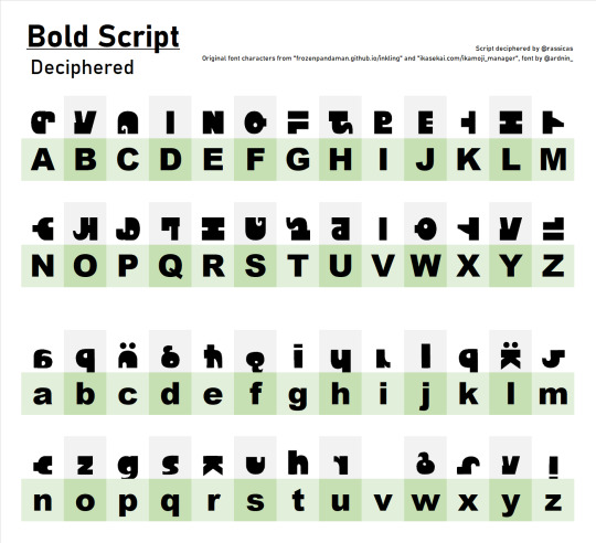
most of these don't resemble their latin letter counterparts at all, and then a few seemingly random repeats. There's also some glyphs we've found that looked like they'd be part of the deciphered form of the script, but only appeared in limited contexts and ended up not being a part of the alphabet. I think those extra letters were arbitrarily assigned to symbol keys, but its kind of impossible to know which. (those rare letters, like the G in game freak/galar could fall under that category of being an "extra" letter in the font and not part of the main alphabet?)
The "true" alphabet of Galarian may be something like this: comprised of many letters that resemble the latin alphabet that in font form, are assigned seemingly arbitrarily across the alphabet. And then to make something readable to the viewers, those letters are hand picked or modified to mimic words. Why go through all the effort to do that instead of doing a simpler decode-able thing? no idea other than "looks cool" "don't want people to solve it too easily" or "conveys information to the player". The splatoon team does both in the same games in the same writing systems. One key difference between Galarian and Splatoon's scripts is that splatoon has multiple scripts used within the same game, vs SWSH sticking with the one script. a lot of the deciphering work for Splatoon has involved comparing matching lines of text between a solved and unsolved script. If you're interested in the history of the deciphering of the Inkling language... there's a video for that ;) Without such points of comparison, and if the only way the script is used is to mimic words and doesn't exist in large bodies of text, the "true" alphabet of uppercase Galarian may be just about impossible to solve. (this is the case for a couple Splatoon scripts, like the Deepsea scripts)
ofc i'm not the one that's combed through Galarian so i'm not gonna claim to be an expert on it, but that's my two cents as someone who has extensively rotted their brain deciphering fake video game writing.
#asks#inkling language#pokemon#i probably have a few more things to say but this is getting long enough
108 notes
·
View notes
Text
I also had lots of dumb fun changing the evil clown into some stupid png. Tumblr tries to turn into twitter or tiktok, An App, essentially, but I think instead it should embrace its blogging roots and the whole kind of geocities vibe. I come here to shitpost, sure, but I also like to write and read long posts, like a blog, this is why I came here for and this is I don't leave: I hate the whole 10 second videos or 140 character post thing the rest of the internet is going for. You know what that means? I spend more time here, because THERE'S STUFF TO READ instead of watching five seconds of bullshit.
What I mean here is, remember custom blogs and themes, like mini-websites? (I still have that) Well, keep that AND allow us to customize the dashboard. Let me change the background to Messi lifting the world cup, let me put a gif of that girl from Dragon Half dancing somewhere instead of that clown, let me play music, let me change the font or the cursor and what my dashboard shows, give me all the stupid options, DON'T FORCE THE STUPID OPTIONS ON ME, but give them to me, that sort of stuff. Instead of removing the icons, make them bigger. Hell, even allow forum signatures (can be hidden if they get too obnoxious)
If I wanted twitter, I would go to twitter, or I would go elsewhere, every website is the same nowdays. Let me have my "blorbos" on "my dash", if you understand what I mean.
hey @staff you listening? I'm giving you ideas.
#cosas mias#most of this is potentially terrible web design you guys have people to figure out which is and which is not#all I want is for you to stop copying twitter or tiktok and keep this a blogging/personal interests website
24 notes
·
View notes
Text
nobody is going to read this, so I am just gonna put it out there warning: rambling from some fucking guy ever. you have been warned.
life sucks, blah blah blah, but instead of just complaning about that, how about I give you bit explenation as to why. so sit down there one of my 121 followers. If anyone of you read that is and not just clicked follow on one art I made and buzzed off (no offense there, just saying.) Okay so you might ask, why now out of sudden i blow like up that. Here is the answer: See, I have been doing creative stuff like, be it art, writing, music or whatever for past..... lets say 4-5 years. As you might guess, some of these ventures didnt pan out in the end. i mean, its given. It happens. Let me mention some of the things I tried over the years. I tried making a homestuck comic on mspa when I first started doing creative stuff. I managed to get pretty far compared to most projects I will mention, but I didnt finish in the end. Why? I got burned out, because I worked on it full non stop. Then I tried having a cool rp campagin session with pals from discord server I known. That ended in tragedy, especially after one of them out of fucking blue, send a fucking gore of dead person. None of us expected this to happen. Earlier I tried music, couldnt do that thing earlier unless you call "music" by swapping midis with shitty piano font. Well, atleast it didnt end up with a gore.
Then I tried working on some ut aus. Did it even work? HAHAHAHAHAHA, what do you think? Ofcourse, not. Didnt peak interest, because I didnt capture interest basically. Anyways this goes on and on. Deltarune au there, some another rp server there and there (one turned into glorified horny rp out of college setting that I tried initially, pal if you are reading this, sorry but this server just sucked ass) I think you might start seeing a pattern here. You would think eventually. That being "Gee meta, thats sure lot of failures, you must have atleast succed one time BIG right?" Haha, no. Okay I did manage to finish some of my stuff but like. really really low bar stuff. so essentially in the eyes for everyone, nothing. See, most of the failures from these projects came from me doing solo. You would think me teaming up with someone would help? Not really, unless I literally pay them money for it, tough fucking luck. Out of 5 years of me doing creative shit, only 4 people helped me out that I recall. they couldnt helped me out for long in the end, but i appreciated for them when they could. all rest of people? Fucking went ghost and then I was left alone, figuring this shit out myself. It isnt fun knowing that you put trust in someone, only in the end to be alone in this in the end. I wish I was so fucking talented, creative, witty or self efficent as the people i asspire to, the artists i admire who make works of artm writers who can write witty, fun but touching stories. I wish I could be at thier level, so I could make great works of art. But atlas, I am not. I dont seek glory or fame, even if it would be nice. No, I just want people to enjoy creating what I make, to feel like I have impact on the world, that people can share with. to make connections with. Look in the end I am just 20 year old guy from europe, that isnt much good at anything, including social life, apperantly. Only thing I am good at is pixel art, but just barely. I am very much uncreative person. and unconfident and rather hopeless one these days, despite how much I try to hide in fake smiles.
I dont have much better way to end this sort of ramble, besides mentioning tobys recent post from spring newslettter and my view on it. "There's times where it feels like your hopes and dreams are simply slipping away from you. That the things you wanted to achieve are floating away from you in the sky while you lie there, fallen in a crater, your wing torn off, never to grow back. Bitterness grows, and you feel like you may never leave the ground again.
But
That's not true.
You can still fly.
Even if you lose a piece of yourself, even if it feels like you can't get up anymore, you can. You can fly with one wing. You can fly without any wings."
Can you really even fly, even if you feel like a part of yourself was torn off? That it happened right before you could even took off. No matter how much you struggle, scream and rage. You can still never to be able to fly like others, much even take off from ground. No matter how much you try. You feel shackled to ground, to the bones of earth. While you look towards as sky, as other people dance in the air beyond your wildest imagination. Its so beautiful, yet so out of your reach. Cries of helps can be heared coming from you from miles in the air. But they all fall on the deaf ears. Or maybe its just out of bliss ignorance? You cant say. You want to join them, join them so badly. To feel like you could finally be a part of something greater. To feel like you could belong somewhere. To be cared. But you just cant. It wasnt meant to be made. Resentment grows inside your soul. As that feeling rots inside you more and more. Part of you wishes this feeling to be gone, to never be felt. But the other part, says otherwise. It wants that liberty desperately, looking with its green eyes at them. Why they? Why not me. Why not me at all!?. You just want what they have yourself. It grows inside you more and more as you allow it to. You eventually consdering tearning off other people wings. Even if you cant ever fly agian, doesnt mean you should be the only who suffer like this right? And why do they deserve to fly, anyway. They would be better off without that, you think. Plus, even in this state. You know you can do this option. To cripple someone, just to make yourself feel better even if its only for a moment. But then you realise. If you ever would reach to that point. Whatever drive you initally, would be just gone. In fear of your insecurities and weakness. You decide to lie up, instead. Rendering your shackled and vulerable. Locked inside, with no way or out. Perhpas in the end.... Its better if you dont fly at all...
6 notes
·
View notes
Text
Platonic madwheeler headcanons<3


Same people different fonts
They have lots of sleepovers at Mike's, for obvious reasons, but Max packs a whole suitcase full of stuff to do
Max paints Mike's nails after she noticed he wanted her to, but he'd never admit it. It grew his confidence tho, and she gave him a couple of her bottles
Holly once walked in on them painting their nails, and Max painted hers too. Now she asks Max to paint her nails every time she comes over. Mike tries to get her to go away, but Max doesn't mind and paints her nails with pleasure
Karen always makes them popcorn
Max learns Mike how to skate and he's not that bad (at skating, he falls every time he tries a trick (Max laughs at him every single time))
Mike shares his stories with Max (not voluntary, she basically forced him to), and she loves them
He tries to learn her the rules of poetry but she just writes whatever words come out and somehow it works
She makes fun of his stupid fantasy game
He makes fun of her whenever he gets the chance, which isn't often
They switch who gets to choose the movie they watch every time, since their taste are pretty different and they can never decide
They end up both loving the other's movies but won't admit it
They talk about Will and Lucas and the little cute stuff they do that makes their hearts flutter
They always hold hand whenever their boyfriends aren't there to hold hands with
Max wakes Mike up (with violence)
They tried to bake cupcakes once and aren't allowed in the kitchen together anymore
They style eachothers outfits
They have really deep late night talks
They have cried together
Mike helps her with picking out presents for Lucas
Mike's room is messy most of the time, and Max helps him clean it
They check in on eachother frequently
They know things of eachother that nobody else does
Sometimes when Mike is writing, Max just watches him. The sounds of pen on paper relax her
Max is really good at faking signatures and teaches Mike how to. Max now knows both his parents signatures
Nancy walked in on them trying on some of her old clothes, and told Max she should keep it of she wants to
They talk about their problems to eachother and end up yelling. Not to the other, to the world
They find their lack of physical affection they got in eachother
They love eachother. A lot.
That was it for now!! I loved making this so much, I might make a part two:)
#i care about these idiots a lot#they mean the world to me#mike wheeler#stranger things#max mayfield#madwheeler#platonic madwheeler#madwheeler headcanons#platonic madwheeler headcanons
85 notes
·
View notes