#holt renfrew
Explore tagged Tumblr posts
Photo


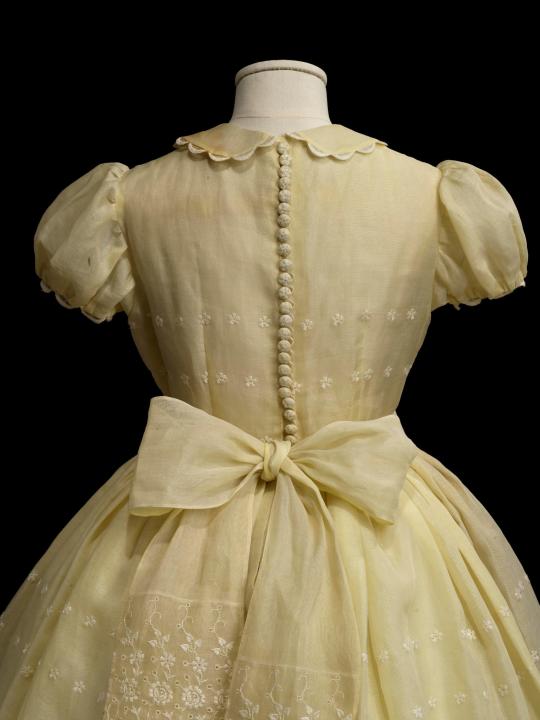
Formal Dress worn by Gayle Roebuck to her sister Elaine’s Bat Mitzvah
Holt Renfrew
Spring 1957
Royal Ontario Museum (Object number: 2013.68.15)
#formal dress#dress#fashion history#vintage fashion#1950s#holt renfrew#vintage photography#photography#20th century#1957#canada#off white#floral#embroidery#cotton#organdy#childrensfashion#royal ontario museum
279 notes
·
View notes
Text

Holt Renfrew Pre-Fall 2011 - Ben Hill
25 notes
·
View notes
Text

2 notes
·
View notes
Text

Isabeli Fontana for Holt Renfrew FW18
15 notes
·
View notes
Text

US Vogue November 15, 1956 ❤️❤️❤️❤️❤️
Holt Renfrew Photo Virginia Thoren Model/Modèle Barbara Mullen vogue archive
#us vogue#november 1956#fashion 50s#emba mink#vison emba#holt renfrew#virginia thoren#barbara mullen#christian dior#desert gold#stole mink#étole de vison
8 notes
·
View notes
Text
smth smth low income single mother family etc etc we couldnt rly afford to go to the mall when i was little and all of the clothes in the different boutiques seemed so extravagant when we passed by them. right now budget is still a bit tight but we’re fortunate enough to be able to buy some pretty things once in a while now.
but the difference is, all mall/big brand clothes nowadays seem to be the same rehashed cheap beige/black/white tshirts and crop tops and pants with inconsistent sizing and shitty material for triple the price of what they used to be, and im wondering was that how it always used to be and i jus didnt know or are we actually doomed in this minimalist future
#accidentally went into holt renfrew yesterday <- canadian luxury department store#for 1k each u can get 😄 muddy gray pants that look and feel exactly like the ones i saw hanging in h&m shelves😄#that essentials fear of god hoodie makes me want to maim and murder whenever i see it its so fucking BORING#el.doc
8 notes
·
View notes
Text
my brain went 'but what if writing jonelias porn did fix you? here, i'm narrating it in your mind.' and now i have a 3000+ word text file and the looming question of 'what does elias bouchard smell like?' and having flashbacks to that one tweet that asked kacey rohl what mads mikkelsen smelled like immediately post-trou normand airing with that kitchen cleaning-confession scene.
#jonelias#also a murder tie scene!#it's a good thing there's no holt renfrew here or else i would end up there giving myself a migraine from olfactory overexposure#it started NARRATING ITSELF WHAT SORCERY IS THIS
6 notes
·
View notes
Text


AUTUMN 2024 IN MONTREAL -
I used to love shopping at Holt Renfrew Ogilvy, on the corner of La Montagne and Sainte-Catherine in Montreal every fall.
Unfortunately, the Montreal of 2024 is no longer the Montreal of my heyday...
To make matters worse, luxury retailers have gathered around a new shopping mall north of Montreal: ROYALMOUNT.
ROYALMOUNT's promoters claim that their center is easily accessible by metro, bus, or bicycle...
Have we ever seen rich people shopping by bus...
Happy Fall 2024!
www.lestudio1.com
L’AUTOMNE 2024 À MONTRÉAL -
Chaque automne j’aimais aller magasiner chez Holt Renfrew Ogilvy, coin de La Montagne et Sainte-Catherine à Montréal.
Malheureusement, le Montréal de 2024 n’est plus celui de la belle époque…
Pour empirer la situation, voilà que les marchands de luxe se sont regroupés autour d’un nouveau centre d’achat au nord de Montréal: le ROYALMOUNT
Les promoteurs de ROYALMOUNT annoncent que leur centre est facilement accessible en métro, en autobus, à bicyclette...
A-t-on déjà vu des gens riches aller magasiner en autobus…
Bon automne 2024!
www.lestudio1.com
1 note
·
View note
Text
AI art has no anti-cooption immune system
TONIGHT (July 20), I'm appearing in CHICAGO at Exile in Bookville.

One thing Myspace had going for it: it was exuberantly ugly. The decision to let users with no design training loose on a highly customizable user-interface led to a proliferation of Myspace pages that vibrated with personality.
The ugliness of Myspace wasn't just exciting in a kind of outsider/folk-art way (though it was that). Myspace's ugliness was an anti-cooption force-field, because corporate designers and art-directors would, by and large, rather break their fingers and gouge out their eyes than produce pages that looked like that.
In this regard, Myspace was the heir to successive generations of "design democratization" that gave amateur communities, especially countercultural ones, a space to operate in where authentic community members could be easily distinguished between parasitic commercializers.
The immediate predecessors to Myspace's ugliness-as-a-feature were the web, and desktop publishing. Between the img tag, imagemaps, the blink tag, animated GIFs, and the million ways that you could weird a page with tables and padding, the early web was positively bursting with individual personality. The early web balanced in an equilibrium between the plunder-friendliness of "view source" and the topsy-turvy design imperatives of web-based layout, which confounded both print designers (no fixed fonts! RGB colorspaces! dithering!) and even multimedia designers who'd cut their teeth on Hypercard and CD ROMs (no fixed layout!).
Before the web came desktop publishing, the million tractor-feed ransom notes combining Broderbund Print Shop fonts, joystick-edited pixel-art, and a cohort of enthusiasts ranging from punk zinesters to community newsletter publishers. As this work proliferated on coffee-shop counters and telephone poles, it was visibly, obviously distinct from the work produced by "real" designers – that is, designers who'd been a) trained and b) paid by a corporation to employ that training.
All of this matters, and not just for aesthetic reasons. Communities – especially countercultural ones – are where our society's creative ferment starts. Getting your start in the trenches of the counterculture wars is no proof against being co-opted later (indeed, many of the designers who cut their teeth desktop publishing weird zines went on to pull their hair and roll their eyes at the incredible fuggliness of the web). But without that zone of noncommercial, antiestablishment, communitarian low weirdness, design and culture would stagnate.
I started thinking about this 25 years ago, the first time I met William Gibson. I'd been assigned by the Globe and Mail to interview him for the launch of All Tomorrow's Parties:
https://craphound.com/nonfic/transcript.html
One of the questions I asked was about his famous aphorism, "The street finds its own use for things." Given how quickly each post-punk tendency had been absorbed by commercial culture, couldn't we say that "Madison Avenue finds its own use for the street"? His answer started me down a quarter-century of thinking and writing about this subject:
I worry about what we'll do in the future, [about the instantaneous co-opting of pop culture]. Where is our new stuff going to come from? What we're doing pop culturally is like burning the rain forest. The biodiversity of pop culture is really, really in danger. I didn't see it coming until a few years ago, but looking back it's very apparent.
I watch a sort of primitive form of the recommodification machine around my friends and myself in sixties, and it took about two years for this clumsy mechanism to get and try to sell us The Monkees.
In 1977, it took about eight months for a slightly faster more refined mechanism to put punk in the window of Holt Renfrew. It's gotten faster ever since. The scene in Seattle that Nirvana came from: as soon as it had a label, it was on the runways of Paris.
Ugliness, transgressiveness and shock all represent an incoherent, grasping attempt to keep the world out of your demimonde – not just normies and squares, but also and especially enthusiastic marketers who want to figure out how to sell stuff to you, and use you to sell stuff to normies and squares.
I think this is what drove a lot of people to 4chan (remember, before 4chan was famous for incubating neofascism, it was the birthplace of Anonymous): its shock culture, combined with a strong cultural norm of anonymity, made for a difficult-to-digest, thoroughly spiky morsel that resisted recommodification (for a while).
All of this brings me to AI art (or AI "art"). In his essay on the "eerieness" of AI art, Henry Farrell quotes Mark Fisher's "The Weird and the Eerie":
https://www.programmablemutter.com/p/large-language-models-are-uncanny
"Eeriness" here is defined as "when there is something present where there should be nothing, or is there is nothing present when there should be something." AI is eerie because it produces the seeming of intent, without any intender:
https://pluralistic.net/2024/05/13/spooky-action-at-a-close-up/#invisible-hand
When we contemplate "authentic" countercultural work – ransom-note DTP, the weird old web, seizure-inducing Myspace GIFs – it is arresting because the personality of the human entity responsible for it shines through. We might be able to recognize where that person ganked their source-viewed HTML or pixel-optimized GIF, but we can also make inferences about the emotional meaning of those choices. To see that work is to connect to a mind. That mind might not necessarily belong to someone you want to be friends with or ever meet in person, but it is unmistakably another person, and you can't help but learn something about yourself from the way that their work makes you feel.
This is why corporate work is so often called "soulless." The point of corporate art is to dress the artificial person of the corporation in the stolen skins of the humans it uses as its substrate. Corporations are potentially immortal, artificial colony organisms. They maintain the pretense of personality, but they have no mind, only action that is the crescendo of an orchestra of improvised instruments played by hundreds or thousands of employees and a handful of executives who are often working directly against one another:
https://locusmag.com/2022/03/cory-doctorow-vertically-challenged/
The corporation is – as Charlie Stross has it – the "slow AI" that is slowly converting our planet to the long-prophesied grey goo (or, more prosaically, wildfire ashes and boiled oceans). The real thing that is signified by CEOs' professed fears of runaway AI is runaway corporations. As Ted Chiang says, the experience of being nominally in charge of a corporation that refuses to do what you tell it to is the kind of thing that will give you nightmares about autonomous AI turning on its masters:
https://pluralistic.net/2023/03/09/autocomplete-worshippers/#the-real-ai-was-the-corporations-that-we-fought-along-the-way
The job of corporate designers is to find the signifiers of authenticity and dress up the corporate entity's robotic imperatives in this stolen flesh. Everything about AI is done in service to this goal: the chatbots that replace customer service reps are meant to both perfectly mimic a real, competent corporate representative while also hewing perfectly to corporate policy, without ever betraying the real human frailties that none of us can escape.
In the same way, the shillbots that pretend to be corporate superfans online are supposed to perfectly amplify the corporate message, the slow AI's conception of its own virtues, without injecting their own off-script, potentially cringey enthusiasms.
The Hollywood writers' strike was, at root, about the studio execs' dream that they could convert the "insights" of focus groups and audience research into a perfect script, without having to go through a phalanx of lippy screenwriters who insisted on explaining why they think your idea is stupid. "Hey, nerd, make me another ET, except make the hero a dog, and set it on Mars" is exactly how you prompt an AI:
https://pluralistic.net/2023/08/20/everything-made-by-an-ai-is-in-the-public-domain/
Corporate design's job is to produce the seeming of intention without any intender. The "personality" we're meant to sense when we encounter corporate design isn't the designer's, nor the art director's, nor even the CEO's. The "personality" is meant to be the slow AI's, but a corporation doesn't have a personality.
In his 2018 short story "Noon in the antilibrary," Karl Schroeder describes an "antilibrary" as an endlessly deep anaerobic lagoon of generative botshit:
https://www.technologyreview.com/2018/08/18/104097/noon-in-the-antilibrary/
The antilibrary is a generative AI system that can produce entire librarys’-worth of fake books with fake authors, fake citations by other fake experts with their own fake books and biographies and fake social media accounts, on-demand and instantly. It was speculation in 2018; it’s possible now. Creating an antilibrary is just a matter of investing in a sufficient number of graphics cards and electricity.
https://kschroeder.substack.com/p/after-the-internet
Reading Karl's reflections on the antilibrary crystallized something for me that I've been thinking about for a quarter-century, since I interviewed Gibson at the Penguin offices in north Toronto. It snapped something into place that I've trying to fit since encountering Henry's thoughts on the "eeriness" of AI work and the intent without an intender.
It made me realize why I dislike AI art so much, on a deep, aesthetic level. The point of an image generator is to buffer the intention of the prompter (which might be genuinely creative and bursting with personality) in layers of automated decision-making that flense the final product of any hint of the mind that caused its creation.
The most febrile, deeply weird and authentic prompts of the most excluded outsiders produce images that feel the same as the corporate AI illustrations that project the illusion of personality from the immortal, transhuman colony organism that is the limited liability corporation.
AI art is born coopted. Even the 4chan equivalent of AI – the deeply transgressive and immoral nonconsensual pornography – feels no different from the "official" AI porn churned out by "real" pornographers. "Shrimp Jesus" and other SEO-optimized Facebook slop is so uncanny because it is simultaneously "weird" ("that which does not belong") and yet it belongs in the same aesthetic bucket of the most anodyne Corporate Memphis ephemera:
https://en.wikipedia.org/wiki/Corporate_Memphis
We call it "generative" but AI art can't generate the kind of turnover that aerates the aesthetic soil. An artform that can't be transgressive is sterile, stillborn, a dead end.

Support me this summer on the Clarion Write-A-Thon and help raise money for the Clarion Science Fiction and Fantasy Writers' Workshop!

If you'd like an essay-formatted version of this post to read or share, here's a link to it on pluralistic.net, my surveillance-free, ad-free, tracker-free blog:
https://pluralistic.net/2024/07/20/ransom-note-force-field/#antilibraries

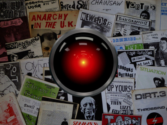
Image: Cryteria (modified) https://commons.wikimedia.org/wiki/File:HAL9000.svg
CC BY 3.0 https://creativecommons.org/licenses/by/3.0/deed.en
--
Jake (modified) https://commons.wikimedia.org/wiki/File:1970s_fanzines_(21224199545).jpg
CC BY 2.0 https://creativecommons.org/licenses/by/2.0/deed.en
673 notes
·
View notes
Text
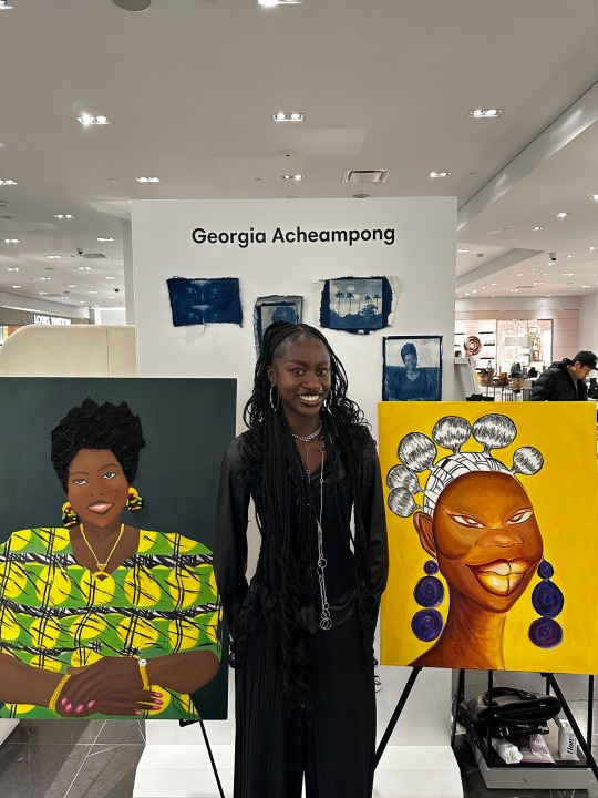
Yesterday I had the honour of doing my second live painting at Holt Renfrew for Black History month and the whole experience was truly so special to me that I’ll forever cherish this moment 🫶🏾

516 notes
·
View notes
Text

0 notes
Photo

Isabeli Fontana for Holt Renfrew FW18
8 notes
·
View notes
Photo


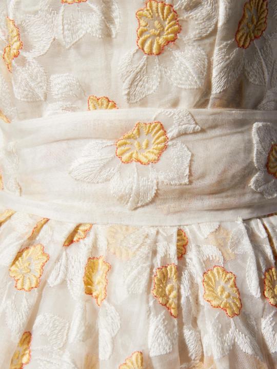

Custom Dress worn by Elaine Roebuck to her Bat Mitzvah
Christian Dior
Spring 1957
“It all started when I was twelve years old and I wanted a bat mitzvah. My father said absolutely not — girls didn’t have bat mitzvahs in those days,” Roebuck tells me. “My mother rallied for me and finally my father said OK. The next thing I knew, we were on the train to Montreal to look at my dress.”
The dress in question is a silk organdy masterpiece custom designed by Monsieur Christian Dior himself. Dior did not design for children back in ‘57, but he made an exception. “Not just anyone could go in and say ‘whip me up a dress for my daughter’s Bat Mitzvah’ – that wasn’t their business,” says Dr. Alexandra Palmer, the museum’s senior fashion curator. But that’s just what Elaine’s mother, the late Molly Roebuck, did. “She had a motto: If you’re going to do something, you better do it right,” says her daughter. “And in her mind, Dior was just right.” Likely, the exception was made on account of Dior’s relationship with Holt Renfrew, the prestigious high-end retailer with exclusive rights to his collection in Canada back when it launched.
So, with the help of her friend, buyer Betty Macpherson, Roebuck commissioned the dress in Paris. It was to be modest, but fantastical enough for such a special night. After a few months of trading sketches with Dior himself, the muslin models arrived in Montreal, where Dior’s pieces were made-to-measure for the Canadian market. “The dress was dreamlike and it made me think, or maybe even feel, like a princess,” says Roebuck. The end result was a full-skirted silk organdy cocktail dress with daffodil embroidery. As it was a one off, the fabric never appeared in Dior’s collections. “I knew the dress was special, but at the same time, I didn’t think I was different from any of my friends,” she says. (Teen Vogue)
Royal Ontario Museum (Object number: 2013.68.14.1-2)
#evening dress#fashion history#vintage fashion#christian dior#1950s#20th century#1957#france#canada#floral#flower print#cotton#organdy#embroidery#white#yellow#up close#vintage photography#photography#childrensfashion#royal ontario museum#crying because this is such a sweet story
347 notes
·
View notes
Text

US Vogue November 15, 1959 ❤️❤️❤️❤️❤️
Ritter. Original The silky magnificence of natural Labrador mink with the softness and lightness of chiffon. Ritter Brothers, 224 West 30th Street, New York In Canada, exclusive with Holt Renfrew
Ritter. Original La magnificence soyeuse du vison naturel du Labrador avec la douceur et la légèreté d'une mousseline. Ritter Brothers, 224 West 30th Street, New York Au Canada, exclusif avec Holt Renfrew
colorized with/colorisé avec palette.fm
Photo Unknown/Inconnu Modèle Unknown/Inconnu vogue archive
#us vogue#november 1959#fashion 50s#fashion 60s#fall/winter#automne/hiver#ritter original#holt renfrew#palette.fm#labrador#robe de mousseline#chic gown#manteau de vison#mink coat
6 notes
·
View notes
Text


I was planning on wearing jeans and a western(ish) shirt to Juno's world premiere. I thought it was a cool look, and it had a collar. That's fancy, right? I thought. When the Fox Searchlight publicity team learned about my outfit, they urgently took me to Holt Renfrew on Bloor Street, with a dramatic rushing that is characteristic of the Hollywood circulatory system. I suggested a suit. They said I should wear a dress and heels. After they discussed this with the director, he called me. He said he agreed with them, insisting that I play the part. Michael Cera rocked sneakers, slacks, and a collared shirt. He looked fancy to me. I wonder why they didn't take him to Holt Renfrew. I guess he had nothing to hide, he was approved. He fit the part.
Elliot Page, Pageboy, 2023
#i was gifted this book and don't know much about Elliot Page's films#I read this bit and looked up what they made him wear and just thought#jesus dude#pageboy#elliot page#they did him dirty#strapless??? i would rather fucking die#at that age?? fuck dude#it's interesting reading about his rural upbringing bc I also had that#and in a similar part of the world#but he is white and i am not#which makes a difference#it's just interesting#anyway that's enough tags#the fucking double standard just pisses me off so much ok ok that's enough
74 notes
·
View notes
