#decorative font composition
Text
Decorative font composition
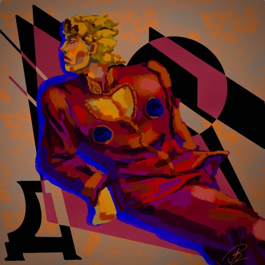
Я не знаю, как буду сдавать это в университете в следующем году… но пока пытаюсь совмещать приятное с полезным
I don't know how I'm going to pass this at university next year... but for now I'm trying to combine business with pleasure
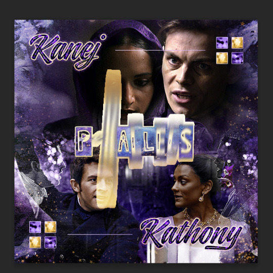
#jojo#jojo fanart#jojo no kimyou na bouken#jojo's bizarre adventure#jjba#jjba fanart#golden wind#jjba part 5#giorno giovanna#jjba vento auero#vento aureo#decorative font composition#dijital art#Spotify
34 notes
·
View notes
Text
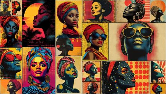
Vintage Halftone Posters: Classic Retro Designs
Step back in time with our exclusive collection of Vintage Halftone Posters, where nostalgia meets artistry. This series of posters is meticulously crafted to capture the essence of bygone eras, featuring bold typography and retro designs that transport you to a classic age of visual art.
Each poster is a tribute to the iconic styles of vintage advertisements, celebrating the timeless charm of old-school print techniques. The use of halftone elements creates a distinct visual texture, adding depth and character to the bold and classic compositions. From the vibrant colors that evoke memories of yesteryears to the unique paper texture that enhances the historical feel, these posters are a feast for the eyes and a nod to the graphic art of the past.
Features:
Vintage Charm: Immerse yourself in designs that echo the style and elegance of a bygone era.
Halftone Elements: Enjoy the classic print technique that adds a unique texture and depth to each piece.
Bold Typography: Appreciate the standout fonts that capture the essence of retro advertisement design.
Retro Designs: Revel in compositions that blend classic patterns and nostalgic colors for a truly historic feel.
Premium Quality: Printed on high-quality paper to reflect the authentic look and feel of vintage posters.
Versatile Art: Perfect for adding a touch of old-school flair to your home, office, or any creative space.
Why You'll Love It:
Our Vintage Halftone Posters are more than just decoration—they are a journey into the past. Each piece tells a story through its iconic design and historic charm, making it a perfect addition to any collection or as a statement piece in your space. Whether you’re a fan of classic graphic art or simply looking to infuse your environment with a touch of nostalgia, these posters offer both aesthetic appeal and a connection to a cherished era.
Get Yours Today:
Elevate your space with the elegance and nostalgia of vintage poster art. Order now and bring home a piece of history that celebrates the artistry and design of a classic age.
#Vintage Halftone Posters#nostalgia#artistry#classic age#visual art#iconic styles#vintage advertisements#old-school print techniques#halftone elements#visual texture#bold compositions#vibrant colors#historical feel#unique paper texture#vintage charm#retro designs#standout fonts#nostalgic colors#premium quality#high-quality paper#versatile art#old-school flair#home decor#office decor#creative space#findyourthing
0 notes
Note
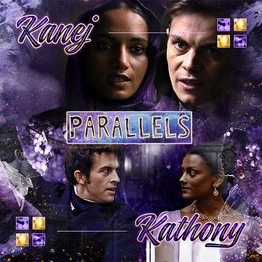
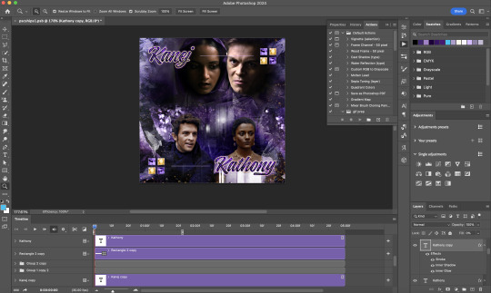
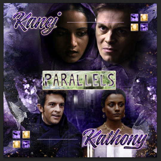
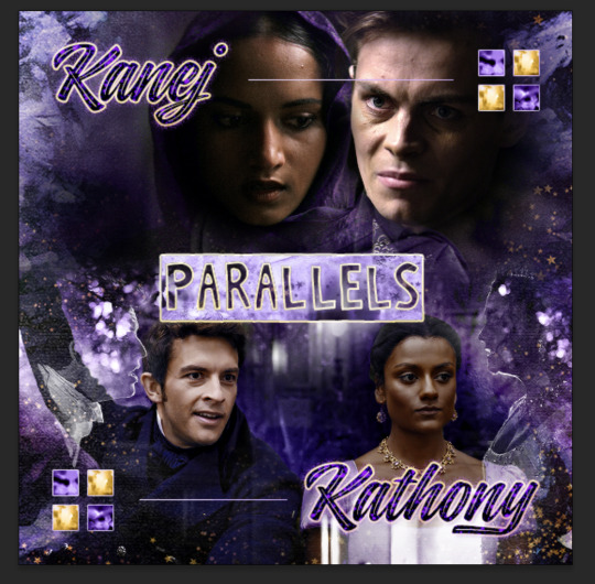
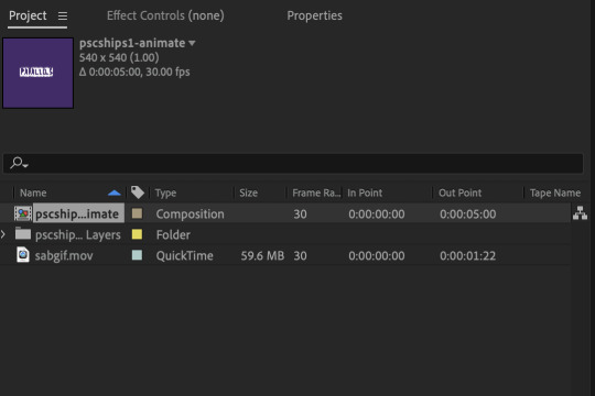
Oh I’m sorry I have GOT to ask! How did you do the text animation in the first gif of 718688291365502976/pscentral-event-15-favourite-ships-kanej?? It’s just. It’s so beautiful
Hi anon! I've used After Effects to create the text animation in the first panel of this post. I'll show you the basic idea of how I've created the animated text effect here :D
What you need:
A cutout font (the font that I've used is Trouble Child Outblack by @justlikethistrain)
Adobe Photoshop with Video Timeline feature
Adobe After Effects
Supplementary files: gif prep action pack / golden outline layer style / assorted textures
Difficulty: advanced; knowledge in gifmaking with the video timeline interface assumed
Note: This tutorial assumes that you're working with all of the composite gifs in a Photoshop composition file and using the video timeline interface
Other useful tutorials to refer to: Text overlay effect / After Effects text animation / clipping mask vs layer mask
Tutorial under the cut. Like / reblog if you find this useful!
1) Photoshop: Preparing your gif panel
Setting up your PSD composition panel: Create a blank PSD file and set it to Tumblr dimensions (540px x 540px in this particular gifset)
Enable Video Timeline and drag all of the component gifs from your folder to the PSD composition file. Resize / move these gifs around until you're happy with the placements.
Trim the timeline work area so it's the same length as the shortest component gif you've added to the PSD composition file. You can also add some textures & additional adjustment onto this panel.
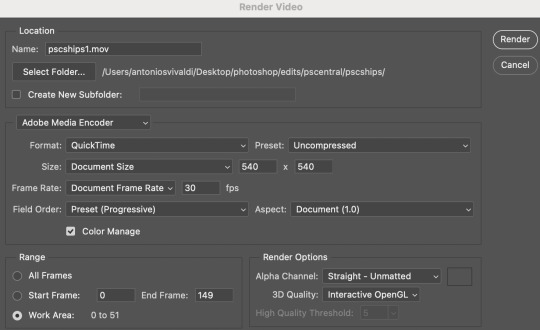
2) Photoshop: Exporting your base gif
I highly recommend exporting the base gif right now, to ensure a smoother experience scrubbing through the video timeline when adding finishing touches later on in the workflow.
My preferred method is to render the composition as a video clip from File > Export > Render video.
To get the optimal export quality, I use the following settings:
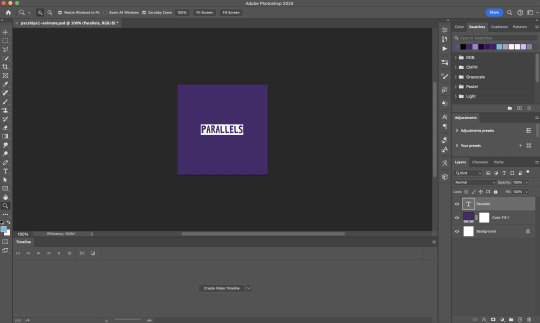
3) Photoshop: Preparing your text layer
Make a new Photoshop composition file of Tumblr dimensions

Drag in the video clip that you've just rendered (the base gif) to this composition file
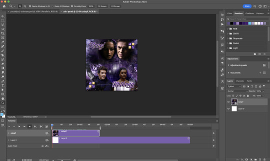
Add a new text layer in your PSD composition file and set the colour to white then tweak this layer until you're happy with the text placement.
For performance optimisations on After Effects, I duplicate the PSD composition file and delete all other layers. This PSD file contains only the text layer that will be animated.
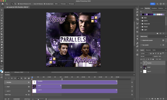
4) Photoshop: Adding overlays & decorations on the text layer
This step allows you to preview the text effect without the animations (i.e. allows you to tweak the texturings & colourings)
Duplicate the text layer. Set the bottom layer's (highlighted in red) blend mode to Exclusion and apply the gold outline layer style to the top layer (highlighted in green). Make sure the Inner Shadow is disabled!
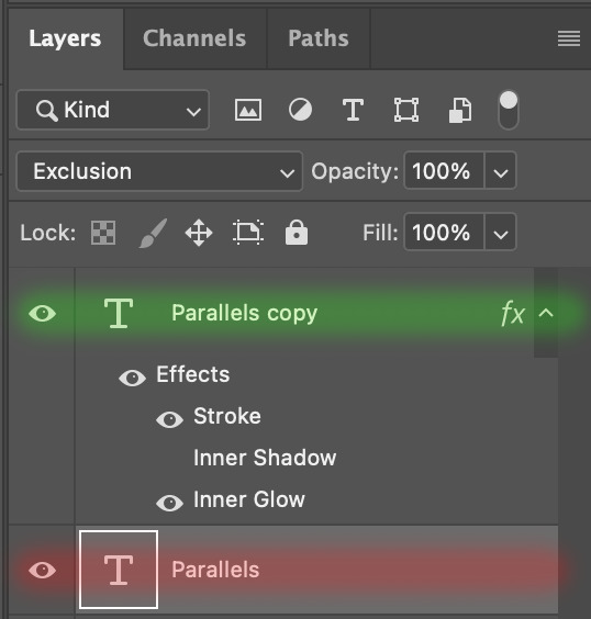
The panel now looks like this
I want to have the liberty to use different colours & textures on the bottom text layer with animation, so the next thing I do is to right click on the bottom text layer and select "Group from Layers"
To change the colour of the filled text layer to purple:
Collapse the Group that you've just created
On top of the collapsed Group a purple Colour Fill layer,
Set the Fill layer's blend mode to "Colour"
Right click on the Fill layer and select "Create Clipping Mask"
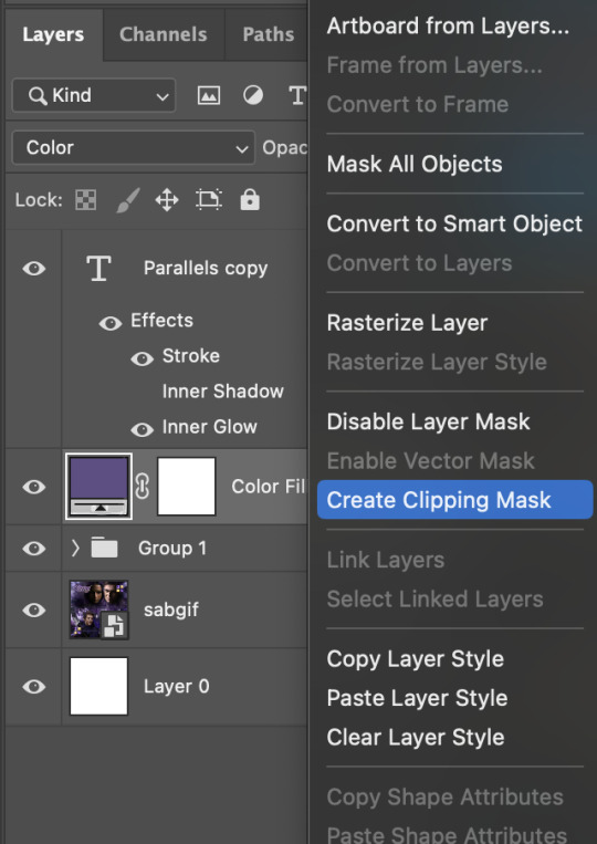
Now the colour of the filled text layer is purple
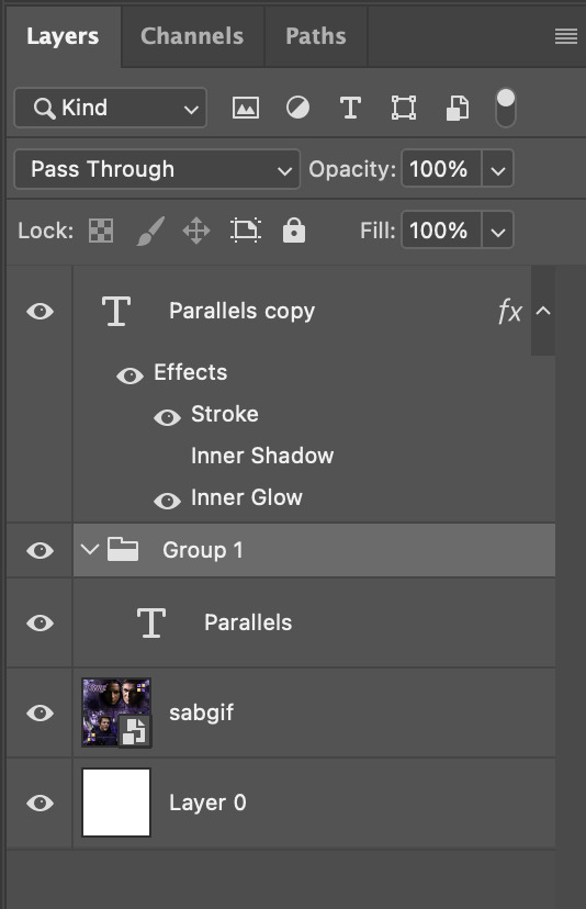
After adding more textures & decorations on the text layer (with photo negative effects) I get the following:
5) Photoshop: Adding overlays & decorations on the text layer
To avoid performance issues on After Effects, I make a new PSD file of the same dimension. With both the PSD files open, I select the text layer (highlighted in red) while holding Shift, I drag this to the blank PSD file (see the green arrow)
Holding Shift ensures that the layer's placement is preserved when it's copied to a separate PSD file.

In the new PSD file, I set the text layer's blend mode to "Normal"
6) After Effects: Animating your text layer
Make a new project on After Effects and drag in the text layer PSD file. Import this file as a Composition

Also drag in the base gif video clip to the AE project.
While we won't be exporting anything with the base gif visible, having this file in the project file is useful if you want to have a better picture of how the animation will look in tandem with the gif.
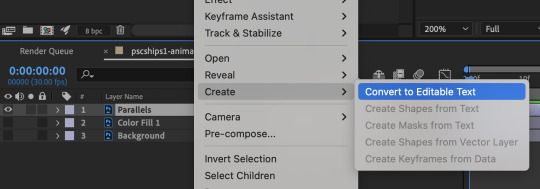
Double click on the composition. Hide the colour fill and background layers. Then right click on the text layer, go to Create > Convert to Editable Text
To be able to preview the animation with the base gif, drag the video clip to the composition file and below the text layer. The visibility of the layer can be toggled on / off anytime in the After Effects workflow
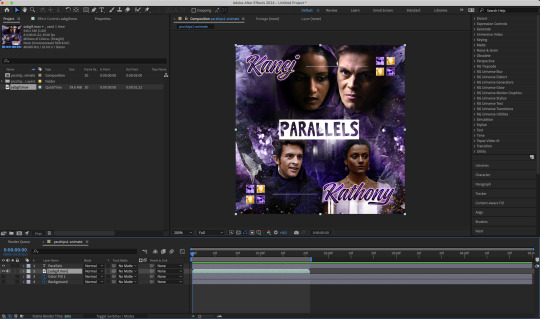
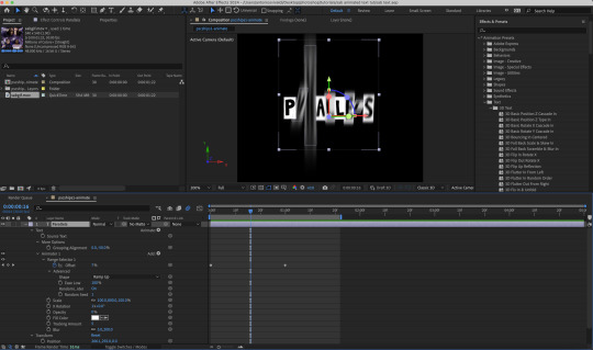
Now we prepare the text layer to be animated. Because the final animated effects is 3D & has motion blur, right click on the text layer and select "3D layer" (highlighted in green) and Switches > Motion Blur (highlighted in red)

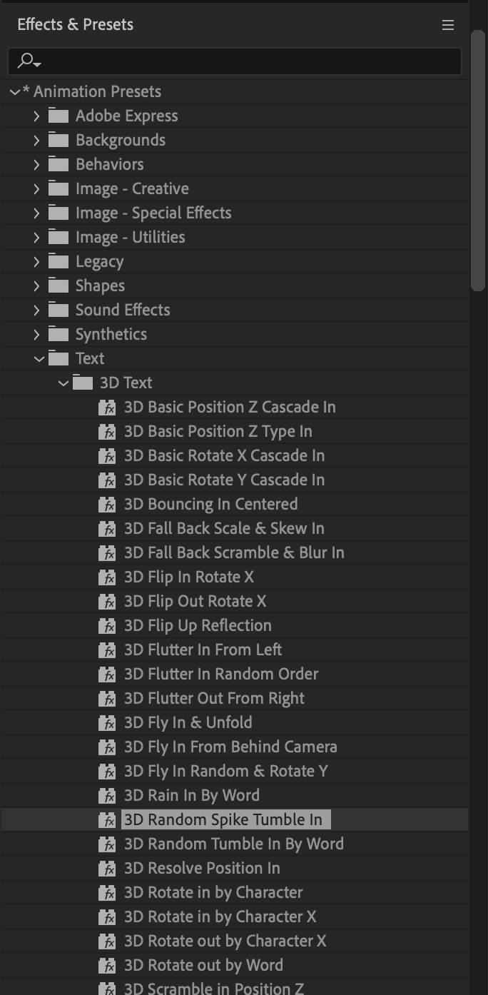
Go to Animation Presets > Text to browse through some presets that you could use to animate the text layer. For this gifset, I've used a preset within the 3D Text folder called "3D Random Spike Tumble in".
While selecting your text layer, press U to view the keyframes and you can adjust the position of these keyframes until you're happy.
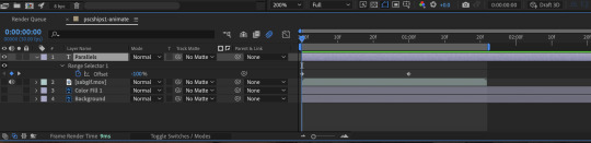
For more finishing touches, press U again to tweak more options in this preset. In this case, I do to Animato 1 > Range Selector and changed the Colour Fill to #fff (the default colour is light yellow)
Then do you File > Export > Add to Render Queue
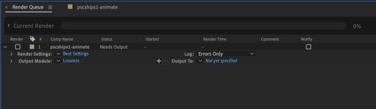
Click on the Output Module and use the following settings to render the text layer as a video file with transparency
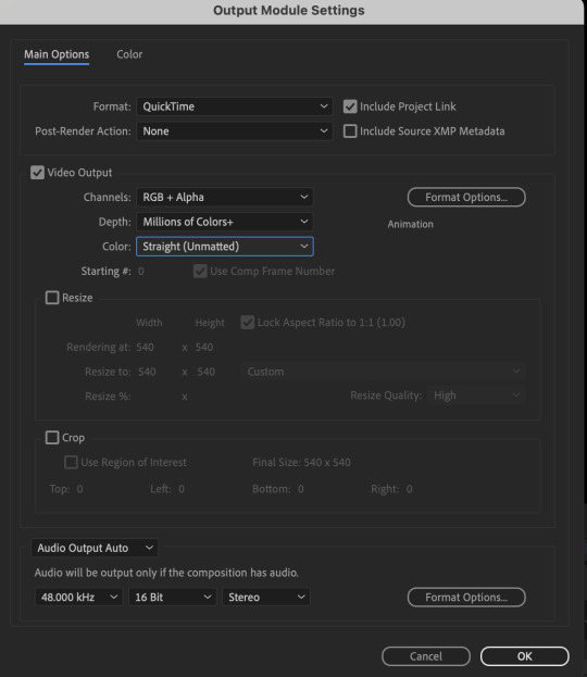
Then after specifying the folder in which you'll export the video to, click "Render" to render the video file containing your animated text layer.

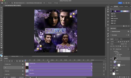
7) Photoshop: Adding the animated text & finishing touches
On Photoshop, drag the rendered clip containing animated text, to the PSD composition file with the static text layers.
Duplicate the animated text video layer
Drag one of the layers inside Group 1 and set the blend mode to "Exclusion" (Highlighted in green)
Move the other layer to the top and apply the gold outline layer style with Inner Shadow disabled (highlighted in red)
Hide both text layers (highlighted in yellow)

By scrubbing through the timeline, I've noticed that the animation didn't look clean enough, so I'll add some finishing touches
By selecting the upper text layer containing layer styles, go to the timeline and add opacity keyframes going from opacity 0% to 100% a few frames apart
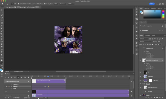
Once you're happy with the finishing touches, flatten / render your PSD composition file, change the frame delay to 0.05s and export your gif and voila!

I hope this helps 💖
#tutorial#gif tutorial#photoshop tutorial#after effects#chaoticresources#dearindies#userriel#useralien#userraffa#usershreyu#user.tee#useryoshi#usernik#userjoeys#usersole#arthurpendragonns#userhallie#*#my tutorials#my resources
125 notes
·
View notes
Text

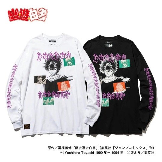
Yu Yu Hakusho x Glamb Collaboration Collection
The japanese fashion brand "Glamb" (operated by Laugh Valley Co., Ltd.) is releasing with Bandai a Yu Yu Hakusho collab. The brand proposes elegant rock fashion under the brand concept of "Grunge for Luxury".
I think glamb clothes are a little expensive, but they sure look amazing, specially Youko Kurama's shirt.
Reservations: from December 27, 2022 to January 11, 2023, on Premium Bandai (available for international shipping)
Official Site: Glamb
Ship: around early March 2023
Line Up: 9 items that express the charm of Yu Yu Hakusho, which has not faded away in the 30 years since it was first broadcast, are available in four sizes (S, M, L, XL)
Yusuke & Raizen T
Price: ¥8,470
Material: 100% cotton
Available in 2 colors and 4 unisex sizes, Yusuke & Raizen T-shirt captures the bloodline of Yusuke Urameshi in a dramatic composition. The three image cuts, arranged like a storyboard, from the top to bottom are: Yusuke, Yusuke awakened as a mazoku, and Yusuke's father, Raizen. There's also the english text of Raizen's alias, "God of Fighting" (Toshin) printed on it.
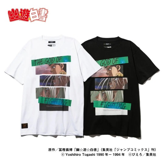
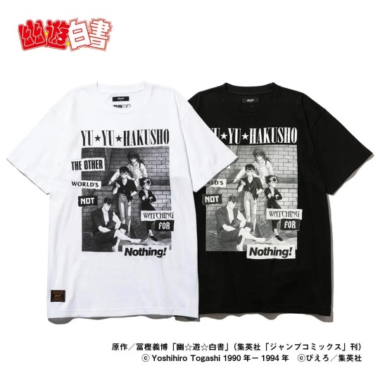
YU☆YU☆HAKUSHO T
Price: ¥8,470
Material: 100% cotton
Available in 2 colors and 4 unisex sizes, the YU☆YU☆HAKUSHO T-shirt features the four main characters, and the American catchphrase "The Other World's Not Watching For Nothing!".
Kuwabara Long Sleeves T
Price: ¥13,200
Material: 100% cotton
Available in 2 colors and 4 unisex sizes, the Kuwabara T-shirt captures Kazuma Kuwabara's heroic appearance in a long sleeve tee. On the back, there's Kuwabara in the combat uniform he wore in the finals of the Dark Tournament. The Chinese characters "Health First" (健康第一) from his uniform are printed on the chest and arms of the T-shirt in an original font that resembles his spirit sword.

Toguro Otouto Long Sleeves T
Price: ¥13,200
Material: 100% cotton
Available in 2 colors and 4 unisex sizes, the Younger Toguro T-shirt expresses the powerful enemy Toguro in a rock culture style. The front of the tee features Younger Toguro at his 100% of 100%, a figure that has had a tremendous impact on everyone who has seen it. To further emphasize the power of this design, a composition reminiscent of a metal T and grotesque lettering give it a hard-core appearance.

Hiei Long Sleeves T
Price: ¥16,500
Material: 100% cotton
Available in two colors and four unisex sizes, the Hiei T-shirt depicts Hiei's motifs in a contemporary interpretation. On the front, Hiei is overlaid with a patchwork of characters related to him, such as Yukina, Mukuro, Shigure, and Rui. The logo of the work in an original typeface combines a gothic font and a flame design.
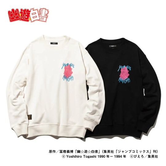
Botan Sweat
Price: ¥19,250
Material: 100% cotton
Available in 2 colors and 4 unisex sizes, Botan Sweat is an on-trend sweatshirt featuring Botan, the Spirit World guide. The use of retro-pop colors evokes emotions from the era when the work was created. The back is decorated with the red and white confetti that appears in the opening of the anime, a finish that revives the charm of Yu Yu Hakusho.

Kokuryuha JKT
Price: ¥38,500
Material: 100% polyester (lining: 100% cotton)
Available in 2 colors and 4 unisex sizes, the Kokuryuha JKT is a short blouson based on Hiei's special technique, the "Jaou Ensatsu Kokuryuuha". The distinctive lettering and composition are inspired by vintage Vietnamese war jackets, giving it a tough appearance. On the back, along with the English sentence "There's no turning back now, I have forgotten how to wrap it up again", a famous Hiei's quote, there's the seal method (ijutaihou) seen on Hiei's right arm into its design. The impressive scene from the original story, in which the bandages are untied to release the black dragon, has been sublimated into street fashion.

Kurama Hoodie
Price: ¥23,650 yen
Material: 100% cotton
Available in two colors and four unisex sizes, the Kurama hoodie incorporates a battle scene of Kurama into a hoodie, with the image of Kurama unleashing the "Rose Whip" on the back. The roses and whips are arranged in a laurel-like pattern to create a heroic mood.

Youko Kurama SH
Price: ¥24,200
Material: 100% polyester
Available in two colors and four unisex sizes, the Youko Kurama shirt features motifs of Youko scattered on an open-collared shirt. The two lines on either side of the front, reminiscent of a Cuban shirt, are represented by Kurama's "Rose Whip". The horizontal lines crossing at the bottom of the shirt are inspired by the "Fuka Enbujin". In addition, the mysterious plants of the Demon World and the figure of Youko on the chest adds a street-like tone.

84 notes
·
View notes
Text
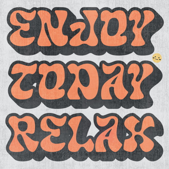
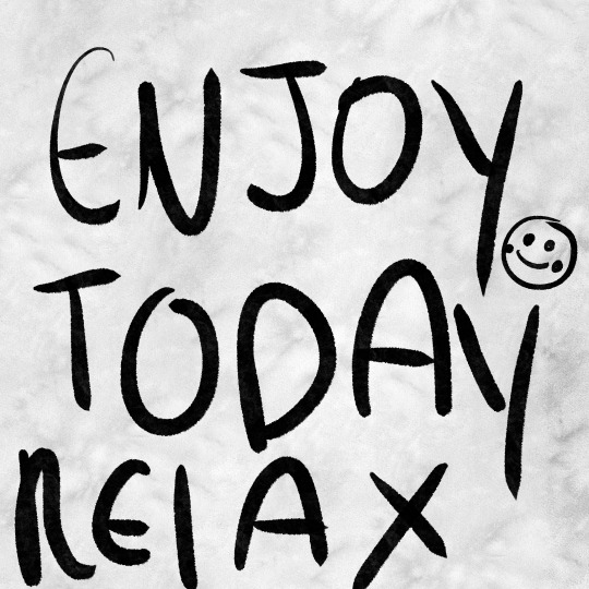
TERM PROJECT NO.6 | ENJOY TODAY RELAX
Topics of interest
Body Type | Personal, close-up, realistic
Tags | Youthful, informal, grunge
Loud Typography | Type, hierarchy, striking
CHOSEN TOPIC -> LOUD TYPOGRAPHY
I decided to work with loud typography this week and although I typically get really excited to work with type, I have to admit that out of all the 6 illos I've created so far, this is the most uninspired entry in my catalogue. After working with type (looking at you type specimen poster...) for so long, I just wasn't able to figure this one out unfortunately. Despite this I still wanted to at least put in SOME effort and make it a lot more cheerful and positive since I believe that was the best option for this week's illo, which is a theme I want to push even further with the next 4 illos.
Creative Concept
One aspect that I liked about loud typography is how much space it takes up the composition, usually it pushes up against its margins or even borders. Another aspect that I liked about loud typography is the use of shodows or more specifically using offset path strokes to create that drop shadow-like shape. Using those qualities in mind with a display typeface that helps creates a unique shape around the type, I went to work and creates a message using type that takes up most of the art board the ensure that the "loud" in typography is most certainly loud.
Description
After the previous two illos, I wanted to bring in some positive vibes and include some positive messages after reading break. I decided on the passage "ENJOY TODAY RELAX" to reflect that notion. However, like I said in the creative concept I wasn't as inspired for this illo unlike how I usually am for others. Finding a typeface that would suit the aesthetic was difficult, it took a solid hour just to find the typeface that I eventually ended on which is called "GLASS WATER." A beautiful decorative font that really has a lot of charm and personality with the amount of curves it contains.
Overall, I'm quite neutral with how this week's illo turned out, despite feeling quite uninspired throughout the process I managed to at least create a composition with type that gets its message across somewhat easily and looks visually distinct.
KEYWORDS
Joyful
Relaxation
Warmth
ROUGH -> PROCREATE
FINAL -> ADOBE ILLUSTRATOR
3 notes
·
View notes
Text
(4 photos image description coming up)
My Chaotic planner, I started using it yesterday, but I've been decorating it all last month. Got some planner pages on Etsy (ObsidianSirenShop) and printed them on my own designed background, don't know if I can share pics of those so I'm not gonna, but the shop is credited above. The inner back of the binder has my birth chart hidden in it (censored with giant vaporwave dolphins so you can't see the whole design unfortunately).
If it isn't already obvious I LOVE cinnamoroll and I couldn't not put him on here, he's ma boy and I love him. 🩵🩵🩵
I had a lot of fun making this and have 2 more planners on their way so I can my my Grimoire bigger (I have too many pages lmao)
Oh and I guess the only thing you can read on my birth chart is that I'm not a Gemini (like at all) lmao
(I hope that doesn't come back to astronomically destroy me, like some how you can figure out my birth chart or something but I think I'm just paranoid lmao.)
☀️✨☀️🧡🩵🧡🩵☀️✨☀️
Image description: four pictures of an A4 binder, front, back, back inside, front inside. There are stickers all over it consisting of: photo realistic planets and stars, various cinnamorolls (plushies dvds 3d renders and digital drawings), Stargender flag, windows old screensaver flowers, pixel sun, my pets, "my planer" in 2 different word art fonts, my music handle (day one) in word art font, golden wings, astrological star signs (they are censored on the back inside, it is laid out like my entire birth chart, so my signs are all censored by a vaporwave dolphin head. They are also censored on the front and back) album covers some of which are my own, 1 is ride on time by tatsuo Yamashita and 1 is Geno by Dexy's
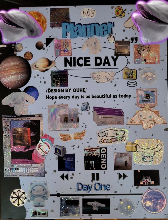
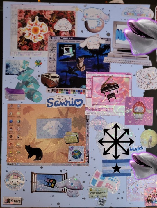
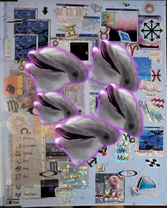
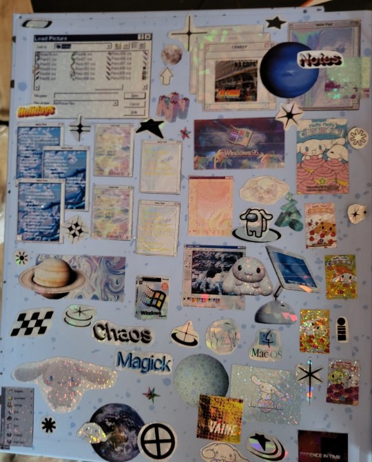
Midnight Runners, Macintosh computers from before 2005 but after 1990, Macintosh logos from 2000s, windows 95-98 themed logos and interface elements (application windows for "Paint", "Photoshop", "Notes" and clippy asking if you need help. Various random vaporwave and y2k aesthetic shapes, Memphis cup pattern, a piano, a volts wagon bus, chaos magick symbols and a bunch of random shapes.
The binder itself: a light blue A4 binder made to look like a composition book, it's speckled with grey dots on the blue background, it's spine is black, it says nice day in an oval near the top and underneath it says "/DESIGN BY QUHE" and underneath that it says "Hope every day is as beautiful as today".
Near the bottom it has a drawing of a music player, backwards button, pause button, fast-forward button and underneath it it has the music progress bar 1/8 across front he left (like the song only just started)
And one amogus cinnamoroll
Edit: I'm an idiot, I didn't need to sensor my fucking sun sign cause that bitch is on my bio lmao ♌🤷🏾☀️ but it's on the front next to the sun in the top left corner :p
#chaos magick#magick#stargender#sun#witchcraft#xenogender#blkmogai#cinnamoroll#planets#astro placements#planner#stickers#vaporwave#y2k aesthetic
4 notes
·
View notes
Text
From Thank You to Congratulations: Designs for Every Occasion
1.How to make a card in PowerPoint?
Creating a card in PowerPoint is a straightforward process that not only enhances your design skills but also provides an opportunity to express creativity in a digital format. To begin, open a new slide and select a blank layout, which offers a clean canvas free of distractions. This simplicity allows you to focus on your design without being hindered by pre-existing elements. Navigate to the "Insert" tab, where you can add various shapes, such as rectangles and circles, to form the foundational structure of your card. These shapes can serve as both the base and decorative elements, allowing for a layered and visually appealing design. As you progress, customize the shapes with a range of colors, gradients, and borders to achieve the aesthetic you desire, ensuring that the final product aligns with your vision.
Once the structural components of your card are in place, the next step involves integrating text to convey your message effectively. Utilize text boxes to add greetings or personalized messages, taking care to adjust the font style and size for clarity and visual impact. Consider the overall composition of the card the balance between text and design elements is crucial for a polished appearance. After finalizing your design, make use of the "Save As" feature to export your creation as a PDF or image file. This enables you to present your card in a professional manner, whether it’s for personal use or business purposes. By following these steps, you will not only enhance your proficiency in PowerPoint but also create a beautiful and meaningful card that can be shared with others.
2. How to make a office card?
Creating an effective office card is a crucial step in establishing a strong professional presence in today’s competitive business environment. The process begins with selecting a design that is not only visually appealing but also aligned with your brand identity. This includes thoughtfully incorporating your company logo and color scheme, which serve as visual representations of your organization’s values and mission. A well-designed card should feature essential information such as your full name, job title, phone number, email address, and company website. It is important to choose a legible font that enhances readability, while also ensuring that the layout remains clean and uncluttered. This simplicity will allow the recipient to quickly grasp the necessary details without feeling overwhelmed by excessive information.
In addition to the fundamental elements, the choice of materials for printing can significantly impact the durability and overall aesthetic appeal of your office card. Opting for high-quality cardstock or unique finishes, such as matte or glossy, can create a lasting impression and convey professionalism. Moreover, consider incorporating a unique element, such as a QR code, which can direct recipients to your online portfolio, LinkedIn profile, or relevant social media channels. This modern feature not only facilitates easy access to additional information about your professional offerings but also demonstrates your willingness to embrace technology and innovation in your field. By thoughtfully combining these elements, you can create an office card that effectively communicates your professional brand and leaves a memorable impression on potential clients and partners.
3. How to make a digital card?
Creating a digital card is a straightforward process that can be accomplished through several key steps, making it accessible for individuals and businesses alike. The first step involves selecting a design platform that offers a variety of user-friendly templates, with popular options including Canva and Adobe Spark. These platforms cater to a diverse range of needs and occasions, whether you are designing a birthday card, a holiday greeting, or a corporate invitation. It is essential to choose a theme that resonates with the specific event or sentiment you wish to convey. A well-selected theme not only sets the tone but also enhances the overall aesthetic of the card.
Once you have chosen a suitable template, the next phase is customization. This involves adding your own text, images, and color schemes to ensure that the card is a true reflection of your personal style or brand identity. To elevate the visual appeal, consider incorporating graphics, icons, or personal photos that complement the message you wish to communicate. After finalizing your design, it is crucial to save the card in an appropriate format, like JPEG or PDF, for optimal quality. Finally, share your creation effortlessly via email or social media platforms, ensuring that it reaches your intended recipient in a timely manner. This thoughtful approach to digital card creation not only demonstrates your creativity but also enhances your ability to connect with others, regardless of distance.
4. How to make a congratulations card?
Creating a congratulations card is an art that involves several thoughtful steps to ensure it conveys heartfelt sentiments effectively. The process begins with the selection of high-quality card stock, where the choice of color or design plays a crucial role in reflecting the significance of the occasion. For instance, a vibrant hue may be suitable for a joyful celebration, while a more subdued tone could be appropriate for a milestone that calls for reflection and gratitude. Once the cardstock is chosen, it should be carefully folded in half to form the card's structure. The front of the card offers an opportunity to incorporate a meaningful message or visual element that resonates with the achievement being celebrated. This could be achieved through the addition of a decorative border, an inspiring image, or even a simple yet impactful phrase that captures the essence of the occasion.
The interior of the card is where personal sentiments shine, allowing for the expression of genuine congratulations and best wishes for the recipient's future endeavors. A heartfelt note can be complemented by personal touches, such as a memorable quote that aligns with the theme of success, or a handwritten signature that adds a layer of intimacy to the message. Ensuring the card is appropriately addressed is vital, as it demonstrates thoughtfulness and consideration. To elevate the presentation, consider including a matching envelope that complements the card's design, providing a polished finish that enhances the overall experience. By taking these steps, the congratulations card becomes more than just a simple gesture; it transforms into a cherished keepsake that reflects the importance of the milestone being celebrated.
5. How to design a thank you card in Canvas?
Creating a thank you card in Canva is an efficient and enjoyable process that allows individuals and businesses to express gratitude in a visually appealing manner. To begin, simply navigate to the Canva platform and select the “Thank You Card” option from the extensive library of templates available. This feature provides a range of pre-designed layouts that cater to various styles and occasions. For those who prefer a more personalized approach, Canva also offers the flexibility to create a thank you card from scratch, allowing users to fully embody their brand's unique identity. By incorporating brand colors and specific fonts, one can ensure that the design remains consistent with overall branding efforts, reinforcing recognition and professionalism.
To enhance the emotional impact of the thank you card, it is essential to include a sincere message that resonates with the intended audience. Adding relevant images, graphics, or icons can further elevate the card's aesthetic appeal and make it more memorable. Canva’s intuitive drag-and-drop interface simplifies the process of arranging various elements, enabling users to achieve a polished look with minimal effort. Once the design meets your satisfaction, you can download the final product in your preferred format, whether it be PDF, JPG, or PNG. This ensures that you have a high-quality, professional thank you card ready for distribution, perfect for expressing appreciation to clients, customers, or collaborators.
0 notes
Text
Art Journal Pages
These are just some basic notes for creating art journal pages. You can do it however you want with whatever you want about whatever you want.
Background:
You could go with a solid colour, decorative paper, photographs, a map, magazine page, a combination, or nothing at all.
You could add texture with patterns/textures made with stencils, stamps, masking techniques, collaged elements.
Focus:
An image or other element, generally placed slightly off-centre for more dynamic composition.
Borders:
Washi tape, doodles, stamps, stickers, small drawings, solid coloured strips.
Consider contrasting colours, ribbon or lace, something that reflects an aspect of your focal point.
Text elements:
Notes and reflections on what you're making the page about, names, labelling, a title, a quotation or focal phrase, poetry.
You could glue in printed versions, hand-write the whole thing, use different types of lettering and fonts, different coloured pens or pencils, use letter stickers, or cut outs like a random note.
Embellish:
Smaller photographs or images to complement the focal point.
You could also use cutouts, stickers, small drawings, doodles, patterning, or line art.
You could add 3D elements as well, but make sure it's not going to be overly problematic for storage of the book, nor closure.
Include flip-outs, fold-outs, and pop-ups.
Final touch:
Use fineliners, gel pens, and other colouring tools to add shadows, lettering, mark-making, and other fine touches.
Consider sealing your page with a clear medium or clear gesso to protect the work.
Notes:
Don’t be afraid to experiment with different materials and techniques.
Embrace mistakes, accidents, and remember to go with the flow.
You can also do these projects on loose pages so you can frame and hang them.
0 notes
Text
Unlock Your Creativity with Free Embroidery Designs
Unlock Your Creativity with Free Embroidery Designs
Introduction:
Free embroidery designs are a treasure trove for crafters, offering endless possibilities to enhance projects without breaking the bank.
Whether you're a seasoned embroiderer or just starting, these complimentary patterns can inspire creativity, help you practice new techniques, and add a personal touch to your creations.
In this comprehensive guide, we'll explore where to find the best free embroidery designs, how to use them effectively, and tips for making the most of these valuable resources.
The Appeal of Free Embroidery Designs: Free embroidery designs offer numerous benefits:
- Cost-effective way to build a design library
- Opportunity to experiment with new styles and techniques
- Perfect for beginners to practice without financial commitment
- Instant gratification for last-minute projects
- Ability to test designs before investing in paid versions
Where to Find Free Embroidery Designs:
- Embroidery Machine Manufacturer Websites: Many brands offer free designs to owners of their machines. Examples: Brother, Janome, Bernina
- Embroidery Design Websites: Dedicated sites often have a free section or monthly free designs. Popular sites: Embroidery Online, Urban Threads, EmbroideryDesigns.com
- Craft Blogs and Websites: Individual designers and craft enthusiasts often share free designs. Look for blogs focused on machine embroidery or general crafting.
- Social Media Platforms: Follow embroidery-focused accounts on Pinterest, Instagram, and Facebook. Join embroidery groups where members share free designs.
- Embroidery Software Trials: Some software companies offer free designs with trial versions.
- Public Domain Resources: Vintage patterns and designs may be available in the public domain.
- Embroidery Design Forums: Online communities often have sections for sharing free designs.
- Discover our section Free Designs
Types of Free Embroidery Designs Available:
- Seasonal and Holiday Designs: Perfect for festive projects and seasonal decor.
- Floral and Nature Motifs: Versatile designs suitable for various projects.
- Monograms and Fonts: Great for personalizing items.
- Cartoon Characters and Cute Animals: Ideal for children's projects or whimsical adults' items.
- Geometric Patterns: Modern designs for contemporary projects.
- Redwork and Blackwork Designs: Simple, elegant patterns suitable for various skill levels.
- In-the-Hoop Projects: Designs for creating small items entirely in the embroidery hoop.
How to Download and Use Free Embroidery Designs:
- Check File Formats: Ensure the design is compatible with your embroidery machine. Common formats: .pes, .jef, .dst, .hus, .vip
- Read Usage Terms: Some free designs have restrictions on commercial use or sharing.
- Organize Your Downloads: Create a folder system to keep your free designs easily accessible.
- Verify Design Quality: Check stitch count and preview the design before stitching.
- Test Stitch: Always do a test stitch on scrap fabric before using on your final project.
Tips for Making the Most of Free Embroidery Designs:
- Combine Designs: Mix and match elements from different free designs to create unique compositions.
- Resize Carefully: If resizing, ensure your software recalculates stitch density appropriately.
- Customize Colors: Adapt the thread colors to match your project or personal style.
- Add Personal Touches: Enhance free designs with additional elements or your own embellishments.
- Practice New Techniques: Use free designs to experiment with different fabrics, stabilizers, or thread types.
- Create Collections: Group similar free designs to build themed collections for future projects.
- Share Your Results: Post your finished projects to inspire others and support the designers.
Quality Considerations for Free Embroidery Designs:
- Stitch Count: Higher stitch counts generally indicate more detailed designs.
- Jumps and Trims: Well-digitized designs minimize unnecessary jumps and trims.
- Underlay Stitches: Quality designs include appropriate underlay for stability.
- Color Changes: Efficient color changes make stitching smoother and faster.
- Designer Reputation: Look for free designs from reputable digitizers or well-known websites.
Challenges of Using Free Embroidery Designs:
- Limited Selection: Free options may not cover all themes or styles you need.
- Variable Quality: Some free designs may not be professionally digitized.
- File Format Restrictions: Free designs might not be available in all machine formats.
- Lack of Support: Unlike paid designs, free options may not come with customer support.
- Potential Copyright Issues: Be cautious of designs that may infringe on copyrighted characters or logos.
Enhancing Free Embroidery Designs:
- Color Blocking: Change colors to create a new look or match your project's palette.
- Adding Texture: Incorporate specialty threads or stitches to enhance the design.
- Appliqué Conversion: Transform simple designs into appliqué for added dimension.
- Background Addition: Create a complementary background to make the free design pop.
- Scale and Repeat: Use software to create larger designs by scaling and repeating elements.
Creating a Free Design Library:
- Categorize Designs: Sort designs by theme, season, or project type for easy access.
- Regular Updates: Set reminders to check favorite sites for new free designs.
- Backup System: Keep a cloud backup of your free design collection.
- Rating System: Develop a personal rating system to mark favorite or high-quality free designs.
- Notes on Usage: Keep a log of how and where you've used each design for future reference.
Ethical Considerations:
- Respect Usage Terms: Always adhere to the designer's stipulations for using free designs.
- Credit the Designer: When sharing projects, credit the source of free designs when possible.
- Support Designers: Consider purchasing designs or making donations to support your favorite free design sources.
- Avoid Reselling: Don't resell or distribute free designs unless explicitly permitted.
- Report Misuse: If you notice copyright infringement, report it to protect designers' work.
Advanced Tips for Free Embroidery Designs:
- Digitizing Practice: Use free designs as a basis to practice your own digitizing skills.
- Blending Techniques: Combine free machine embroidery designs with hand embroidery for unique effects.
- Software Exploration: Utilize free designs to explore advanced features of your embroidery software.
- Community Challenges: Participate in online challenges that use specific free designs to boost creativity.
- Educational Resources: Some free designs come with tutorials – use these to improve your skills.
Conclusion: Free embroidery designs are an invaluable resource for embroiderers of all levels.
They offer a way to expand your creative horizons, practice new techniques, and embellish projects without financial strain.
By knowing where to find quality free designs, understanding how to use them effectively, and respecting the designers' terms, you can build an impressive design library that will serve you well in countless projects.
Remember, while free designs are a fantastic resource, supporting designers by purchasing their work when possible helps ensure a continued supply of both free and paid designs in the future. Happy stitching, and may your free embroidery designs bring endless joy and creativity to your embroidery journey!
Discover our section Free Designs
Read the full article
1 note
·
View note
Text
Graphics Design: Essential Skills for Modern Creatives

Graphic design is vital to developing visual communication across various platforms. It combines creativity with technology to convey ideas and messages effectively, making it an essential skill in today's digital age. There is a growing need for visually compelling content from individuals and businesses to stand out in a crowded marketplace.
Understanding the fundamentals of graphic design can empower anyone to enhance their projects, whether in marketing, web design, or branding. Color, typography, and layout create engaging visuals that capture attention and drive engagement.
Exploring different design tools and techniques opens up opportunities for innovation and creativity. Whether a designer is a beginner or an experienced one, there are always new trends and methods to discover that can elevate one's work to the next level.
Foundations of Graphic Design
Graphic design is built upon essential concepts that shape visual communication. Key components include design principles and color theory, foundational in creating compelling graphics.
Design Principles
Design principles are the guidelines that govern visual composition. These include balance, contrast, emphasis, movement, pattern, rhythm, and unity.
Balance ensures visual stability through symmetry or asymmetry.
Contrast highlights differences in color or size to draw attention.
Emphasis directs focus to the most essential elements.
Neglecting these principles often results in common mistakes in graphic design. For instance, ignoring balance may result in a chaotic layout. Designers should regularly review their work against these principles to avoid common pitfalls.
Color Theory and Application
Color theory involves understanding the interactions and effects of color in design. Key concepts include the color wheel, color harmony, and the psychological impact of colors.
Color Wheel helps identify complementary and analogous colors.
Color Harmony focuses on pleasing combinations to evoke specific emotions.
Psychology of Color plays a role in brand perception and audience engagement.
Applying color theory effectively can transform a design. A frequent mistake is using too many clashing colors, which can detract from the message. Designers should select a limited color palette that aligns with the intended tone and audience.
Advanced Techniques and Best Practices
Mastery in typography, layout, and branding is essential for creating effective graphic designs. Each technique contributes significantly to the clarity and appeal of the design, enhancing the overall message conveyed to the audience.

Typography Mastery
In graphic design, typography is essential. It involves choosing suitable typefaces that align with the design's purpose and audience.
Font Selection: Select fonts that reflect the brand's voice. For example, a tech company might lean toward modern sans-serif fonts, while a fashion brand may prefer elegant serif fonts.
Hierarchy and Scale: Use size and weight to establish a visual hierarchy. Larger, bolder text draws attention, effectively guiding viewers through the content.
Common Mistakes: Using decorative fonts can lead to clarity. Limiting the number of fonts to maintain consistency and readability is essential.
Layout and Spatial Organization
A well-organized layout enhances navigation and comprehension. Designers benefit from applying grid systems to achieve balanced compositions.
Grids: Utilizing a grid provides a framework for placing elements systematically, ensuring alignment and consistency.
White Space: Effective use of white space (or negative space) around elements prevents clutter and allows for a more focused message.
Common Mistakes: A frequent error is overcrowding. Designers should prioritize essential information and eliminate unnecessary elements distracting from the core message.
Branding and Visual Identity
Establishing a solid brand identity is critical in graphic design. This includes creating recognizable elements that convey a brand's essence.
Color Palette: Select a scheme of colors that matches the company's image. Colors evoke emotions and should resonate with the target audience.
Logo Design: A memorable logo encapsulates the brand's values. It should be simple yet distinctive, facilitating instant recognition.
Common Mistakes: Inconsistency in branding elements can dilute brand identity. Designers must ensure that all visual materials align with brand standards to maintain coherence in messaging.
0 notes
Text
PixelLab: Empowering Creativity Through Text and Image Editing
In the realm of mobile creativity, PixelLab stands out as a versatile and powerful tool for users looking to enhance their images with text, graphics, and effects. Developed by App Holdings, PixelLab offers a comprehensive suite of features that cater to both amateur designers and professionals seeking to elevate their visual content.
Whether you're creating social media posts, designing digital artwork, or crafting personalized messages, PixelLab Apk provides intuitive tools and customization options to bring your creative visions to life.
The Essence of PixelLab: Text and Graphics Integration
PixelLab specializes in seamlessly integrating text and graphics into images, offering users a myriad of options to customize and stylize their creations:
Text Editing: PixelLab enables users to add and manipulate text layers with ease. Choose from a variety of fonts, adjust size, color, alignment, and spacing to create visually appealing text elements. Whether you're adding captions, quotes, or titles, PixelLab ensures that text is customizable to suit your design aesthetic.
Text Effects: Elevate your text with dynamic effects such as shadows, outlines, gradients, and textures. These effects enhance visibility and add depth to text layers, making them stand out against backgrounds and images.
Graphics and Stickers: PixelLab provides a library of stickers, icons, shapes, and decorative elements that can be easily added to your designs. From emojis to design elements like arrows and borders, these graphics enhance creativity and allow for personalized touches in your compositions.
Advanced Editing Tools
Beyond text and graphics, PixelLab offers advanced editing tools to refine and enhance your images:
Image Adjustments: Modify brightness, contrast, saturation, and hue to achieve the desired look for your photos or background images.
Layers and Blend Modes: Arrange elements in layers and utilize blend modes to control how different elements interact with each other. This feature enables complex compositions and creative effects.
Undo and Redo: PixelLab includes a robust undo/redo history, allowing users to experiment with edits and revert changes as needed without losing progress.
User-Friendly Interface and Accessibility
PixelLab prides itself on its user-friendly interface, designed to streamline the creative process:
Intuitive Controls: Navigation within PixelLab Apk is intuitive, with accessible menus and controls that make it easy to access features and apply edits efficiently.
Export Options: Save your creations in various formats, including PNG and JPG, and share directly to social media platforms or messaging apps from within the app.
Community and Inspiration
PixelLab boasts a vibrant community of users who share their creations, tips, and tutorials. Online forums and social media platforms serve as spaces for inspiration and collaboration, allowing users to learn from each other and showcase their creativity.

Future Innovations and Developments
As PixelLab continues to evolve, users can expect ongoing updates and enhancements. The development team is committed to improving functionality, expanding feature sets, and incorporating user feedback to meet the evolving needs of creators and designers.
Conclusion: Unleashing Creativity with PixelLab
PixelLab empowers users to transform ordinary images into compelling visual stories with its robust text and image editing capabilities. Whether you're a social media enthusiast, digital artist, or professional designer, PixelLab offers the tools and flexibility to unleash your creativity and produce visually stunning compositions. With its user-friendly interface, extensive customization options, and integration of text and graphics, PixelLab remains a go-to app for anyone looking to enhance their images and engage audiences with visually impactful content.
Embrace the power of mobile creativity with PixelLab and discover endless possibilities for expressing your ideas through text, graphics, and imagery. Join the community of creators who rely on PixelLab to bring their visions to life and make a lasting impression in the digital realm.
0 notes
Text
The Do’s and Don’ts of YouTube Thumbnail Design
Creating effective YouTube thumbnails involves knowing what works and what doesn’t. Thumbnails are the first thing viewers see when they come across your video, making them a critical factor in determining whether or not they’ll click. A well-designed thumbnail can significantly boost your video’s click-through rate (CTR) and overall performance, while a poorly designed one can deter potential viewers. This article outlines the do’s and don’ts of thumbnail design to help you avoid common mistakes and create compelling visuals that attract viewers.
Do: Use High-Quality Images
High-quality images are essential for professional-looking thumbnails:
Resolution: Always use high-resolution images to ensure clarity. Blurry or pixelated images can make your thumbnails look unprofessional and may deter viewers from clicking.
Lighting: Good lighting enhances the quality of your images. Ensure your images are well-lit to highlight important elements.
Focus: Use images that are in sharp focus. Blurry images can confuse viewers and reduce the effectiveness of your thumbnail.
Don’t: Overcrowd Your Thumbnail
A cluttered thumbnail can confuse viewers and make it difficult to discern the main message:
Keep it Simple: Focus on one or two main elements. Overcrowding your thumbnail with too many details can be overwhelming and off-putting.
Negative Space: Use negative space to create a balanced composition. This helps to highlight key elements and improves readability.
Clear Focal Point: Ensure there’s a clear focal point that draws the viewer’s eye. This could be an image, text, or a combination of both.
Do: Keep Text Readable
Text can add valuable context to your thumbnail, but it needs to be clear and readable:
Bold Fonts: Use bold, easy-to-read fonts. Avoid overly decorative fonts that can be difficult to decipher, especially on smaller screens.
Font Size: Make sure the text is large enough to be readable even on mobile devices. Small text can be easily overlooked.
Contrast: Ensure there’s a strong contrast between the text and background. This improves readability and helps the text stand out.
Don’t: Use Misleading Thumbnails
Misleading thumbnails can attract clicks, but they often result in high bounce rates and damage your channel’s reputation:
Accuracy: Ensure your thumbnail accurately represents your video content. Misleading thumbnails can lead to viewer disappointment and harm your credibility.
Relevance: Use images and text that are directly related to the video. Irrelevant thumbnails can confuse viewers and reduce engagement.
Authenticity: Maintain authenticity in your thumbnails. Trustworthiness is crucial for building a loyal audience.
Do: Test Different Designs
Experimenting with different thumbnail designs can help you understand what works best for your audience:
A/B Testing: Use A/B testing to compare different thumbnails for the same video. This can help you determine which design attracts more clicks.
YouTube Analytics: Analyze the performance of your thumbnails using YouTube Analytics. Pay attention to metrics like CTR and watch time to gauge effectiveness.
Feedback: Seek feedback from your audience. Understanding what they find appealing can guide your design decisions.
Don’t: Ignore Branding
Consistent branding can make your thumbnails easily recognizable and strengthen your channel identity:
Color Scheme: Use a consistent color scheme across your thumbnails. This helps in creating a cohesive look that viewers can associate with your brand.
Logo and Icons: Incorporate your logo or unique icons in your thumbnails. This reinforces your brand and makes your videos easily identifiable.
Style Consistency: Maintain a consistent style, including fonts, colors, and design elements. This helps build a strong visual identity.
Do: Highlight Key Elements
Effective thumbnails highlight key elements that draw viewers in:
Faces and Emotions: Thumbnails with human faces, especially those showing strong emotions, can attract more clicks. Emotions create a connection with viewers.
Text Highlights: Use highlights or outlines to make important text stand out. This can draw attention to key information.
Visual Cues: Use arrows, shapes, or other visual cues to direct attention to important elements. This can guide the viewer’s eye and emphasize critical aspects.
Don’t: Overuse Effects
While effects can enhance your thumbnails, overusing them can make your design look cluttered and unprofessional:
Subtle Enhancements: Use effects like shadows, glows, and gradients sparingly. They should enhance the design, not overwhelm it.
Avoid Gimmicks: Steer clear of gimmicky effects that can distract from the main message. Focus on clarity and simplicity.
Consistency: Maintain consistency in the use of effects. Randomly applied effects can create a chaotic look.
Case Studies
Analyzing successful thumbnails can provide valuable insights into effective design strategies:
MrBeast: Known for bright, colorful thumbnails with exaggerated expressions. His use of vibrant colors and clear, bold text makes his thumbnails instantly recognizable.
PewDiePie: Uses humor and exaggerated facial expressions to grab attention. His thumbnails often feature bold text and high contrast.
TED-Ed: Focuses on clean, simple designs with clear text and relevant images. Their thumbnails are professional and convey the educational nature of their content.
Practical Tips for Implementing Best Practices
Applying these best practices can elevate the effectiveness of your thumbnails:
High-Quality Images: Blurry or pixelated images can deter viewers. Always use high-resolution images for a professional look.
Keep it Simple: Avoid clutter and focus on a few key elements. Simplicity can make your thumbnail more appealing and easier to understand at a glance.
Test Different Designs: Experiment with different designs and track their performance using YouTube Analytics. A/B testing can help you determine which elements work best.
Stay Updated with Trends: Keep an eye on current trends in thumbnail design. Adapting to new styles and preferences can keep your content fresh and relevant.
Tools and Software
Several tools can help you create professional thumbnails:
Canva: Offers a wide range of templates and customization options, making it perfect for beginners and professionals alike.
Adobe Photoshop: Provides advanced editing features for those with more experience.
PicMonkey: User-friendly with robust editing capabilities.
Snappa: Offers templates and a simple interface for quick thumbnail creation.
Fotor: Provides easy-to-use tools and templates for creating thumbnails.
Conclusion:
By following these do’s and don’ts, you can create youtube thumbnails that attract viewers and enhance your channel’s reputation. Thumbnails are a critical part of your video’s success on YouTube, influencing not only the click-through rate but also the overall perception of your channel. Keep these guidelines in mind to optimize your thumbnail strategy. Focus on high-quality images, readability, authenticity, and consistency to make your thumbnails stand out. Regular testing and analysis will help you refine your approach and achieve better results over time.
0 notes
Text
Top Design Considerations for Custom Enamel Pins and Brass Plaques

Enamel lapel pins and brass signage are versatile and timeless forms of artistic expression, branding, and commemoration. Whether youre creating a custom pin for your organization or designing a brass plaque to mark a significant achievement, several key design considerations can elevate your project from ordinary to extraordinary. This blog post will explore the essential factors to remember when conceptualizing and executing these unique pieces, ensuring that your enamel pins and brass plaques capture attention and stand the test of time.
Design Elements for Enamel Lapel Pins
1. Size and Shape
The first step in creating a standout enamel pin is determining its size and shape. Consider the pin’s purpose and where it will be worn. A smaller, subtle design might be preferable for everyday wear, while a larger, more intricate pin could be ideal for special events or collector’s items.
2. Color Palette
Pick a color palette that compliments your brand or message. Enamel pins offer a range of color options, from bold and vibrant to subtle and sophisticated. Remember that contrasting colors can make certain elements pop, drawing the eye to crucial details.
3. Texture and Finish
Decide between hard and soft enamel for your pins. Hard enamel provides a smooth, polished surface, while soft enamel offers a textured feel with slight indentations. Each type has its unique appeal and can enhance different design aspects.
4. Metal Base and Plating
Select the appropriate metal base and plating for your pins. Options like gold, silver, or copper can dramatically alter the overall look and feel of the final product. Consider how the metal will complement your chosen enamel colors.
5. Typography and Iconography
If incorporating text or symbols, ensure they are legible and well-balanced within the design. Simple, clear fonts often work best for small pins, while more elaborate typefaces can be used for larger designs or as decorative elements.
Crafting Impactful Brass Signage
1. Material Selection
While brass is the primary material, consider the specific type and quality of brass for your plaque. Factors such as durability, weather resistance, and patina development over time should influence your choice.
2. Size and Proportions
Determine the appropriate size for your brass plaque based on its intended location and purpose. Consider the viewing distance and ensure that all elements are proportional and readable from the expected vantage point.
3. Text Layout and Font Choice
Carefully plan the layout of your text, considering hierarchy and readability. Choose fonts that complement the overall design and are easily legible. Sans-serif fonts often work well for modern designs, while serif fonts can lend a more traditional feel.
4. Engraving Depth and Technique
Decide on the engraving method and depth. Deep engravings can create dramatic shadows and are more durable, while shallower engravings offer a subtler look. Consider techniques like etching or relief for added dimensionality.
5. Finish and Patina
Select a finish that enhances your design and suits the plaque’s environment. Options range from high-polish to brushed or antique finishes. Consider how the brass will age and develop a natural patina over time.
In Conclusion
Designing custom enamel lapel pins and brass signage requires a thoughtful approach that balances aesthetics, functionality, and durability. By carefully considering elements such as size, material, color, and composition, you can create pieces that serve their intended purpose and become cherished keepsakes or enduring markers of significance.
0 notes
Text
Entry 5
Window Commission
I was prompted to find a quote regarding windows and doors, my first thought being 'Turn the key, Open the door' this didn't feel right and often in the making stage I'm always asking myself if it feels right. Does this go with the art? Is this what I'm trying to convey?
I preferred the phrase 'Through the looking glass' and I knew I'd heard that somewhere, of course ... Alice in Wonderland!
Looking glass is an older word for mirror and this seems to fit the description of the task quite well as we're decorating windows.
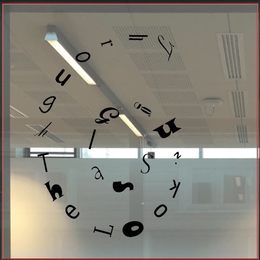
Originally I wanted to show all the craziness that is seen in the films and book so I was going to use different fonts for every letter.
This wasn't going to work because a few of the fonts I worried parts would be too thin for the cutting process. So I choose a nice running writing to work with.
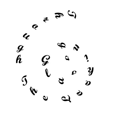
This font worked well with the composition.
In creating the design I inserted a spiral using the 'spiral tool' then used the 'vertical type on a path tool' and played around with the exact placement I liked.
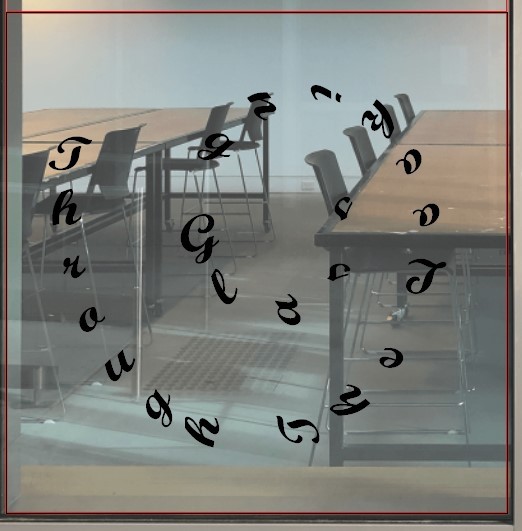
It will look something like this when installed but in white colouring, as the cutting machine prints all window commissions.
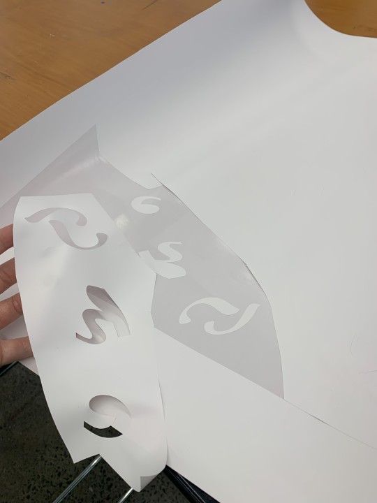
next was to peal off all parts of the print that weren't going to be part of the window piece.
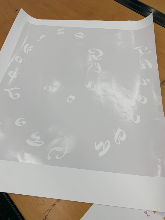
I'm glad I went with this font it looked very aesthetic and suited the quote very well while also taking away from the 'Alice in Wonderland' feel of it.
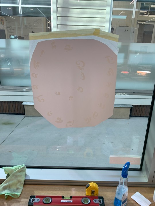
I really liked how the design looked on the window, as it was a circular spiral I didn't need it to measure the exact spot for it making application easier.
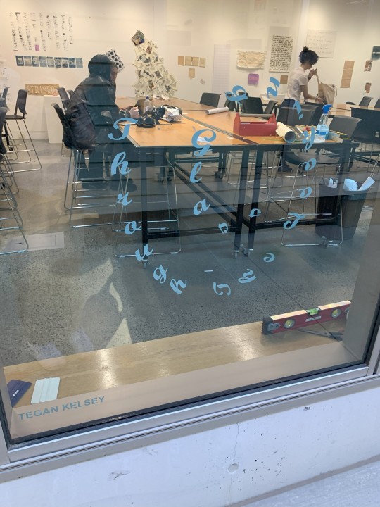
Finally the design looked just as I had hoped and I'm really happy with the outcome. Also it was a relief to see that everyone's artworks for this task looked all very different and unique.
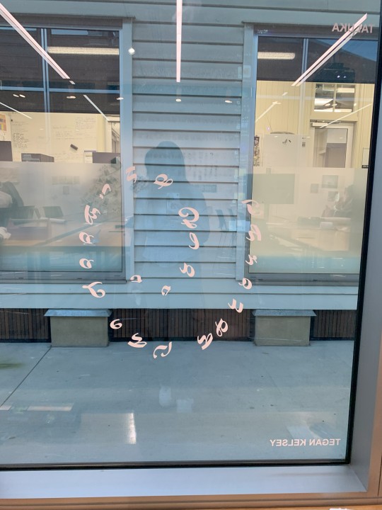
Vinyl Adhesive, 52x49cm
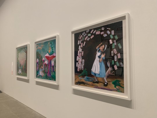
Inspiration;
I was lucky enough to finally visit the fairy tales exhibition at GOMA before it ended and there was a large section on Alice in Wonderland! Including paintings, an interactive spinning artwork and costumes from the live action movie.
These paintings are by artist, Polixeni Papapetrou in her 2024 Wonderland collection. This is only 3 of the collection there are 16 paintings in total. She photographs her daughter in wonderland through the series and paints around her to add to the photos.
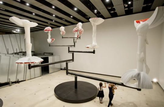
Carsten Holler, German artist was included in this part of the fairy tales exhibit with his 2015 artwork 'Flying Mushrooms'. Audiences are invited to hold the handles and slowly walk and the many parts of the artwork spin in circles.
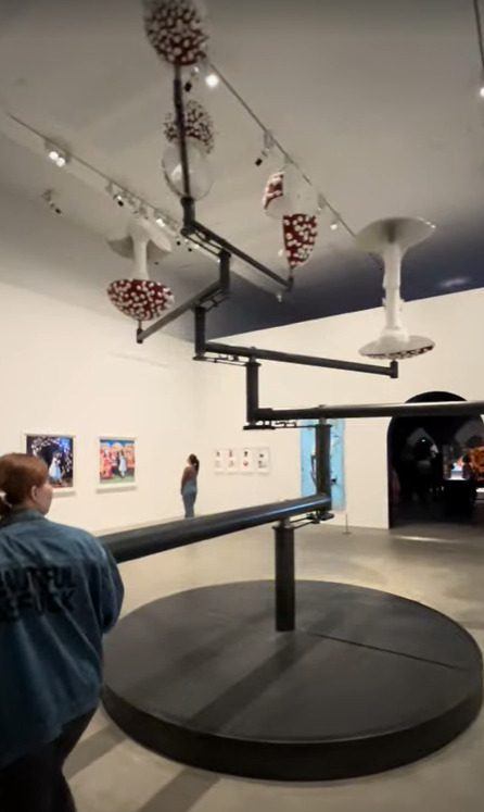
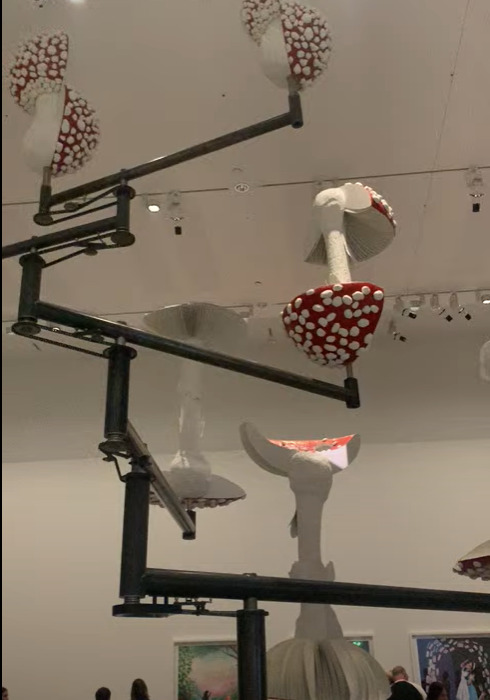
My own photos of the artwork aren't of very good quality so here is a better one from a gallery photo. Just the size of this work alone is incredible and the creation of it is beyond my mind.
0 notes
Note
hello emma! i hope you're doing well ❤️ i'm your usergif style swap partner!! i've been going through your creations and they're all so stunning, i love your eye for color and composition.
what's your go to color for gifsets (i.e the one you lean towards using most)? do you have any favorite fonts that you use often in your sets?
i love your work and i'm excited to try and replicate your syle!! i hope i can do it justice ❤️
hiiii!!! so sorry i haven’t replied to this yet, life has been so busy recently 😭
i don’t know if i have a go to color? i love anything purple or pink when i’m making something fun. and i like to base the color on the character or mood of the gifset, like how most of my anakin sets are red loll
for fonts it kind of depends!! i love pairing small a san serif font with a fancier script font or a decorative serif font. i’m always looking for new ones i can choose from. right now i love the fonts sunroll, breathing, kiona and reikna.
thank you so much i’m so excited to see what you come up with i’m sure it’ll be amazing!!!
1 note
·
View note
Text
drawing embroidery design

From Sketch to Stitch: A Comprehensive Guide to Drawing Embroidery Designs
Embroidery transforms simple fabric into stunning works of art. But before you thread your needle, it all starts with a design. This comprehensive guide delves into the world of drawing embroidery designs, equipping you to translate your vision onto fabric.
Finding Inspiration: Spark Your Creativity
The possibilities in embroidery design are endless! To get started, ignite your creativity with these inspiring sources:
Nature: Flowers, leaves, insects, and animals are popular embroidery motifs. Explore botanical illustrations or nature photographs for inspiration.
Art & Culture: Folk art, traditional embroidery patterns, and historical textiles offer a wealth of design inspiration.
Geometric Patterns: Simple shapes and lines can be combined to create striking geometric embroidery designs.
Typography & Lettering: Elevate your project with embroidered lettering, initials, or quotes. Explore calligraphy styles and fonts for unique designs.
Personalize: Incorporate meaningful symbols, dates, or names to make your embroidery truly special.
Embrace the Web: Websites like Pinterest and Instagram are treasure troves of embroidery design inspiration. Search keywords related to your interests or browse popular embroidery hashtags.
Understanding Embroidery Stitches: The Building Blocks of Design
Before sketching, familiarize yourself with basic embroidery stitches. These stitches are the building blocks that bring your design to life. Here are some fundamental stitches to consider:
Backstitch: A secure stitch for outlines and lettering.
Satin Stitch: Creates a smooth, solid-filled appearance.
Stem Stitch: Ideal for creating lines and stems.
French Knot: Adds a dimensional element to your design.
Lazy Daisy Stitch: Creates a delicate floral motif.
Chain Stitch: Creates a decorative looping effect.
Many additional stitches exist, each with its own unique application. Explore embroidery stitch tutorials online or consult a beginner's embroidery book for further guidance.
Developing Your Design: From Sketchbook to Fabric
Now that you're brimming with inspiration and equipped with basic stitch knowledge, it's time to translate your vision into a drawing:
1. Start with Rough Sketches:
Use a pencil and paper to explore different design compositions.
Don't worry about perfection at this stage; focus on capturing your ideas freely.
Consider the size and shape of the item you'll embroider on.
2. Refine Your Design:
Choose your final design from your rough sketches.
Trace it onto tracing paper or redraw it on a fresh sheet of paper.
Refine details and ensure lines are clean and crisp.
3. Transferring Your Design:
There are several ways to transfer your embroidery design onto fabric:
Tracing: Tape your design over your chosen fabric and trace the lines with a fabric pen that disappears with heat.
Iron-on Transfer Paper: Purchase special transfer paper, print your design onto it, and iron it onto your fabric following the manufacturer's instructions.
Lightbox Method: Place your design on a lightbox (or a window with light shining through) and trace the design onto your fabric with a fabric marker.
4. Simplifying for Embroidery:
Solid Fill Areas: Break down large areas of solid color into smaller sections filled with different stitches. This adds texture and visual interest.
Simplifying Lines: Curved lines can be broken down into smaller straight lines using satin stitch or back stitch.
Minimal Detail: Highly detailed elements may not translate well to embroidery. Opt for simpler representations or focus on key details.
Essential Tools:
Here are some key tools for drawing and transferring your embroidery design:
Pencil and Eraser: For initial sketches and refining details.
Tracing Paper: Allows for multiple design iterations.
Fabric Pen: Choose a pen that disappears with heat or washes out easily.
Lightbox (optional): Aids in transferring designs through light.
Iron (optional): For using iron-on transfer paper.
Software Solutions: Embracing Technology
For a more tech-savvy approach, consider using design software:
Vector Drawing Programs: Software like Adobe Illustrator allows you to create and edit embroidery designs with precise control.
Digitizing Software: This specialized software converts images or drawings into embroidery stitch files that your embroidery machine can read.
While software offers greater precision and flexibility, it requires a learning curve and may not be accessible to all budget levels.
Practice Makes Perfect: Honing Your Embroidery Design Skills
The best way to refine your embroidery design skills is through practice:
Start with Simple Designs: Begin with small, uncomplicated designs to hone your technique.
Experiment with Stitches: Practice different stitches on scrap fabric to get a feel for how they work and their visual effects.
Sample Different Fabrics: Different fabrics impact the look and feel of your embroidery. Experiment with cotton, linen, denim, or other materials to discover their unique possibilities.
Embrace Mistakes: Embroidery is a journey, not a destination. Mistakes are inevitable and learning opportunities. Learn from them and keep exploring.
Beyond the Basics: Advanced Design Techniques
Once you've mastered the fundamentals, explore these advanced design techniques to elevate your embroidery:
Shading & Color Blending: Combine stitches of varying densities or colors to create shading and depth.
Appliqué: Incorporate fabric cutouts to your design for a dimensional effect.
Metallics & Beads: Add a touch of glamour with metallic threads or decorative beads.
Watercolor Embroidery: Use a variety of colored threads and loose, blended stitches to create a painterly effect.
Free Motion Embroidery: Embroider freehand without following a pre-drawn design, allowing for greater creative expression.
Resources for Exploration:
Embroidery Books & Magazines: Offer in-depth tutorials, design inspiration, and advanced techniques.
Online Embroidery Courses: Find a plethora of online courses catering to all levels, providing guided instruction and expert tips.
Embroidery Communities: Join online forums or groups to connect with other embroidery enthusiasts, share your work, and learn from others.
Conclusion: Embark on Your Embroidery Design Journey
Embroidery design is a rewarding skill that allows you to personalize garments, create home décor, or express your artistic vision. Whether you're a beginner or an experienced embroiderer, there's always something new to learn and explore. So grab your pencil, pick up some fabric, and embark on your embroidery design adventure!
Bonus Tip: Consider creating a dedicated embroidery portfolio to document your design journey. This allows you to track your progress, showcase your skills, and inspire yourself and others with your creativity.
With dedication and practice, you'll be stitching stunning embroidery designs in no time!
Read the full article
0 notes
Last Seen Blogs