
Design is more interesting than you think!AIT student of Digital Design 🎨💻
Don't wanna be here? Send us removal request.
Statistics
We looked inside some of the posts by marianamantovait-blog and here's what we found interesting.
Average Info
Notes Per Post
0
Likes Per Post
0
Reblog Per Post
0
Reply Per Post
0
Time Between Posts
25 days
Number of Posts By Type
Photo
12
Text
5
Last Seen Tumblr Blogs


Fun Fact
The average Tumblr user visits about 67 pages every month.
Photo
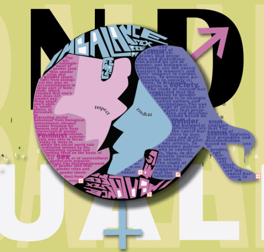
A little bit of my IMBALANCE poster. I chose the theme Equality of gender...
0 notes
Photo
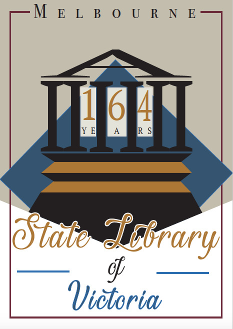
Final Typographic Poster
“The Melbourne Public Library of was published in 1853. Trustees were appointed and they immediately announced a competition to design the building. The first library building opened in February 1856 durian the Victorian Golden Rush.”
In this poster, the Library of Victoria is represented for its 164 years of history. but also as an important symbol of how typography designs have improved through the last centuries. I wanted to represent some of the typing designs that expires many of the actual ones that we have today. To start, the library’s illustration is built with letters that have a similar structure to the actual format of the library building. I used letters “I” for the columns and “A” for the ceiling. Both letters have the renaissance style with serifs and low contrast between thick and thin strokes. The renaissance letter appeared during the years of the 1460s and 1470s, modelled on lighter and open forms of the Italian humanistic writers.
The same font style was chosen to illustrate the banners and the “Melbourne” on the top of the poster, which gives consistency to it. The “State Library of Victoria” is written with a font that has the hand lettering shape that brings delicacy and identity to the poster, representing typography from ts originality which is the handwriting itself. I used a mix of pale colours that have a similar hue to the papers and ink used on the very first books made centuries ago. Also included the warm orange and cold blue that are opposite colours that gives contrast to the poster.
0 notes
Photo

Week 3 - Typographic composition in 2 directions.
I choose the lyrics from the song 21 guns from Green Days to illustrate this typographic poster.
Chorus
“One, twenty one guns Lay down your arms Give up the fight One, twenty one guns Throw up your arms into the sky, You and I”
“1″ “T” “went” “twentyoneguns” “one “guns are positioned in asymmetrical composition.
"Lay down your arms, give up the fight” and “Throw up your arms into the sky, you and I” are done in Symmetrical composition.
I chose opposite colours orange and blue to give contrast to the composition and also to emphasise the main chorus of the music. 21 guns is represented by extremely large type fonts with blue colour which is the first thing that pop up in the eyes when you see it. The rest of the chorus is written in white and in symmetrical composition.
0 notes
Photo

Week 2 - Printing based on movable types.
“Although the credit for inventing movable typing belongs to the Koreans, Johannes Gutenberg developed his own printing system based on the notion of movable type.”
- Venice was the location of the first fully humanistic letterform to be cast as a metal cast.
The type letters forms shown here are in the Baroque style. An art movement that started from the Renaissance era that reflects the spiritual and emotional aspects of the Catholic revival.
Characteristics of Baroque letter type: Vasp amount of detail, dramatic use of light and dark, vibrant colours and emotional drama.

Black letter font - Serifs, Thick strokes, dark colour, gothic style.
Humanist appeared during the 1460′s and 1470′s. Modelled not like the dark gothic scripts, but more like a lighter more open fonts. The humanistic types were at the same time the first roman types.
New Times Roman font - Sloping crossbar on the lower case “e”.
Low contrast between, thick and thin strokes.
0 notes
Photo

Typography Class - week 1- 2018
Here is a demonstration of Egyptian hieroglyphic writing according to each letter from our alphabet.
Vertical
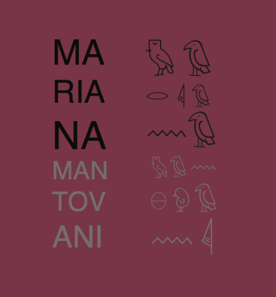
Radial
0 notes
Text
Final presentation -> Self expression poster construction ->


0 notes
Text
Self Expression Poster

Mood Map ->

Mind Map - >

Final work -> To produce my “MySelf Expression Poster” I chose the question: What is your dream job? My dream job, is when you work with what makes you satisfied, and most of it, happy! There is no better feeling than producing a piece of art, be happy with that, and also, be recognized for that. My poster represents myself inside and out.
0 notes
Text
Postcard - Week 7
This week we have worked on creating postcards based on 4 things that would be related to each other, as feelings, seasons etc.. I have chosen musics genrer.
Rock, POP, Jazz and Classical music. Here is my mood map that expired me on my work

After that, to start creating my design, I took some colour ideas from the pictures that I have choose, and put on my mind map how they would make me feel and which colour would came up in my mind from looking those pictures. By using colours concepts I decided how they would work with each music style in harmony.

Based on Gestalt’s theories of perception I’ve created 4 postcards based on music styles. First one is POP music, which I selected letters “P” and “O”. Pop music as the name says is popular music, and usually makes you feel enthusiastic about it, so then, I used a variety of warm complementary colors such as orange/blue and pink/green. Also, I’ve combined the “O” letters all together to arrange a big disco with multiple colors. Second one on the right, is about JAZZ music. Jazz was originated at first at North America on the beginning of 20th century, characterized particularly by using piano, brass and woodwind instruments. Jazz has a mix of sounds that requires cold and warm colors at the same time. Based on that I have chosen letters “J” and “Z” adding orange and blue which are opposite colors (complementary). Also, I made a sequence of letters that would shape as a jazz musician using neutral colors. On the third postcard I illustrated ROCK music. Usually rock, remind us of metal, heavy sound, guitar and drums. Based on that, I used warm (analogous of red) colors mixed with neutral ones. I chose letters “R” and “k”. Organizing the letters together, copying them on opposite sides beside each other, I could create a idea of a electric guitar shape, to illustrate the rock music and what it represents on this postcard. On the last one, the Classical music is represented. Classical music is not only about classic” music, but also, a mixed of feelings represented by music. There is so many diferent kinds of instruments that when played together could give us either anger or fear or happiness or sadness. From that, I decided that this postcard needed a contrast between colors. I chose letters “C” and “S” mixed all together in many di erent positions and sizes, to represents how various classical music could be. Also, I have used a analogous of red and the green color in the middle as a complementary. All the posters are not precise about what they mean, however, our self-perception gives us an idea of each illustration’s meaning based on what we have perceived before from seeing or even listening.

0 notes
Text
Gestalt Principals
Week of gestalt psychology!
“Gestalt psychology is an attempt to understand the laws behind the ability to acquire and maintain meaningful perceptions in an apparently chaotic world. The central principle of gestalt psychology is that the mind forms a global whole with self-organizing tendencies. The assumed physiological mechanisms on which Gestalt theory rests are poorly defined and support for their existence is lacking.”

Gestalt psychology on images is about SIMILARITY, when object look similar to one another, people often perceived them as a group or pattern. Also, CONTINUATION when de illustration keeps following a determined destination. CLOSURE, with objects close to each other giving a perceptions of them as group.
Gestalt principals are attempt to describe and verbalise how we naturally perceive things.

0 notes
Text
Colour theory
This week we got the chance to look further about colour theories and different techniques to represent them in illustration. Different colours can express different emotions is each person. There is also transitions between colours that when combined, they match perfectly together as we can see bellow:

>Primary colours: are supposed to be a set of colors that can be combined to create all, or a representative subset of all colors.
>Analogous colours: colours that are beside each other on the colour wheel.
Example: Gradients colours
>Triadic: 3 colours that are at even spacing on the wheel.
Example: Blue, red and green.
>Tetradic: 4 colours arranged in a rectangular configuration.
Example: yellow orange, yellow green, violet and blue.
>Complementary colours: colours that sit on the opposite side of a colour wheel.
example: Yellow and blue.
“Colour is a sensation we perceive thank to light.”
“When you think about colours, it probably can bring you back to primary school lessons when it’s learned that a primary colour is a colour that you cannot make by mixing. Example: Red, Yellow and Blue.”
CMYK colours/substractive colours - The primary colours for subtractive colours are MAGENTA, YELLOW AND CYAN(as illustrated on the first picture).
I’ve made an illustration using watercolour to create our own colour wheel to understand how colours had originated from their subtractive primaries colours: magenta, red, red orange, orange, yellow, yellow green, green, blue green, cyan, blue, blue violet and violet.

0 notes

Photo


Week 4 - Font template finished --> Here all the process of doing this font on illustrator.
0 notes
Photo


By creating the golden section rectangle, it's given the exact proportion for come up with many new and different ideas! For instance, different font styles 💡
0 notes
Photo

What is proportion? RELATIVE SIZE OF PARTS OF A WHOLE
A part, a share, or number considered in comparative in relation to a whole. Proportion reapers to the relevant size and scale of the various elements in design.
This picture illustrate a Golden Section Ratio figure. It is a serie of squares and rectangles presentation that explain visually the principals of geometry compositions. The Golden Section Ratio is based on Fibonacci Sequence = 0,1,1,2,3,5,8,13,21...
0+1 =1
1+1 =2
2+1 =3
3+2 =5
5+3 = 8...
It’s a scale proportion of 1:1
0 notes
Photo

“SANS SERIF” however is a typeface without serifs.
San from the French meaning “without”.
👌🏼👉🏻Awsome book by the way. MINDY KALING is amazing, very funny!
0 notes

Photo

"SERIF" is how it is called non structural details at the ends of each letter/number symbols.
0 notes