#you also see the general silhouette/shape of them when they're behind his back like that? say yes.
Explore tagged Tumblr posts
Visit Tumblr Blog
Explore Tumblr blogs with no restrictions, modern design and the best experience.
Last Seen Tumblr Blogs


Fun Fact
In 2020, 27% of US Tumblr users had an annual household income of over $100,000.
Text


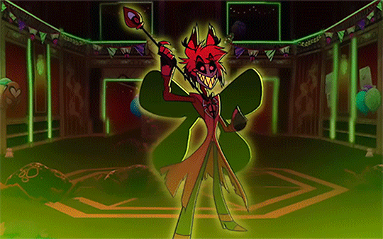

Alastor + "Wings"
#hazbin hotel#alastor#radio demon#hazbin hotel alastor#hazbin alastor#hmmm well that's INTERESTING#the idea of him creating his own ''wings'' w/ his demonic magic goes SO HARD. I love me some blasphemous symbolism#like you guys see the “wings” “flapping” in the last one too right? i'm not reaching here?#you also see the general silhouette/shape of them when they're behind his back like that? say yes.#i love the details in this show sm#dad beat dad#the show must go on#my gifs
85 notes
·
View notes
Note
💄 + Epel ?
send me 💄 + a character and i'll tell you how i would style them
in all honesty, epel feels like he barely has any concrete style compared to the rest of the cast. i understand that part of this is due to him being taken under vil's wing and agreeing to the plan we see in book 5, but i don't think that's a strong enough reason for what we actually have.
first and foremost, his uniform makes no sense to me. i assume the reason for his shirt is simply that vil provided it, but we do know from other characters that dorm uniforms are purchased at the cost of the student / the student's family. given that we also know his family is having finance trouble up until the events of book 5, i would hope that they were reimbursed in some way for that part of the uniform, or that epel was able to return it. there is so much behind the scenes that we will never see that has an incredible impact on how the characters are styled, and this is only one.
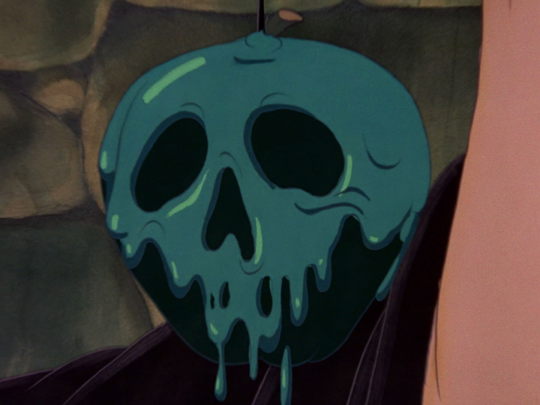
it isn't just the origin of his stylized school uniform that confuses me. epel has very little of the signature colors for the thing he is based on. the poison apple does have similar colors briefly, but it also doesn't have the bright green poison it is typically shown with in marketing and merchandise.
when initially poisoned, this is what the apple looks like:
and, as it's changing to appear as a normal apple, we see the closest to epel's natural colors that we can get:


all that being said, we really have so little to go off of, and that doesn't help me in this endeavor. i enjoy the challenge, at the very least.
i think it's safe to say that the above colors are entirely fair game, so i would stick to deeper shades of teal and turquoise, red, and some burgundy or maroon for a lot of his main colors. black would be a good accent, as well. in terms of hardware, i think i would give him silver or other cool-toned metals instead of golds, both to match closer to his hair and eyes but to set him apart from rook and vil. they're part of the same dorm, but he has an entirely different approach to self-expression. i'd prefer that be reflected in his outfits a little more than what we get.
now. onto the fun part.
he should have a big, structured jacket. at least one, to reference the silhouette of the dripping poison on the apple. having something bulkier on his shoulders could also widen his shape and make him appear larger, which is something he desperately wants. in conjunction with that, i think boots or (subtle) platform sneakers would suit him well. that would give him a little extra height while still being comfortable and casual.
in trey's birthday jacket vignette, epel gifts him a hat with patches and embroidery. epel picked something he thought looked cool, and he also mentions studs and embroidered flames on some he considered but did not buy.
in his PE vignette, he mentions embroidery again, so we know one thing for certain that epel would incorporate into his own style: embroidery.
that can easily be worked into a jacket, especially something intentionally oversized, and some little touches could be added to the shoes. he seems fond of bold, daring patterns and motifs in general, so i'm imagining something like a design that travels up the arms, perhaps something matching across the back.
another thing we know for certain is that epel is not fond of florals. this is mentioned in his PE vignette, when deuce suggests roses and epel turns the idea down. he's very upfront about this.
the two discuss, primarily, animal designs. while i do think rabbits make the most sense thematically, i don't think it's what he would choose for himself. the animals mentioned in this conversation are much larger—tigers and dragons. this is where i think i would stray a bit from epel's voiced preferences. twst relies heavily on theming and motifs, but epel is generally lacking in this category outside of the rabbits. we see an actual poison apple design in his dorm uniform vignette, and sometimes in jewelry or accessories, but it's largely downplayed despite being the source of his character.
so, to bring back a bit of the snow white theming, i propose birds as an alternative embroidery option. they could be flying the length of the arms, and we could add a poison apple on the back of the jacket. for thread colors, i would stay with the darker tones, perhaps using the colors from the first screencap—black for the birds and the apple, with a deeper turquoise or teal for the poison. this on a lighter colored fabric would be striking, and give epel some of that boldness he admires.
ravens are more in line with the evil queen, but vil is thoroughly set on peacocks, so i think giving them to epel as an extra motif is fine.
now, for the shoes, i think boots make more sense for his upbringing, but he's in a setting where he can branch out and try new things, so the sneakers might be a better match. preferably, they would be hightops, giving him more of that bulk but keeping it structured and spaced out. i think if the embroidery extended here, it should be very small and subtle, perhaps a bird on each or a tiny apple design. nothing extraordinary.
for pants, i think staying simple is better. jeans are an easy inclusion. a slimmer fit would do well to break up the wider silhouettes he already has, but i don't think he would jump straight to skinny jeans given that he does want to appear larger than he is. depending on the shoe, i could see him rolling the hems a bit, maybe showing an accent color with his socks? he has room to experiment. lightwash or a pale grey would work great here, i think.
for the shirt, i say we stay with the basics. a darker tshirt would be comfortable and still look good, especially if he tucks it in. if he goes that route, we could include a belt with a themed buckle for some extra motif inclusion.
i don't imagine he would go for jewelry on his own—maybe in the future, when he's more comfortable with his appearance—but not now. if we wanted the look to be slightly more dressed up, a watch or a simple necklace could easily do that. the watch makes more sense, but a necklace could be fun. either works for me.
that's really all i would give him for a main, non-event outfit. i do think he would enjoy a hat, but in trey's birthday jacket vignette, he doesn't seem confident in wearing them himself, so i would leave that out for the time being.
i'm fairly happy with this look. if drawing was something i partook in, i would include a sketch, but alas. i hope i've described it well enough at any rate.
all screencaps used are from here.
3 notes
·
View notes
Text
Here we go, my love letter to North Italy's and Germany's contrasting designs and how good they are!
Disclaimer: I only know the basics of character design. I am self taught and still learning so in no way is this a professional character designer review.
First of all, shape language
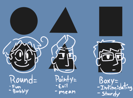
Circles, triangles, and rectangles/squares are fairly common shapes used in design. They are simple and appealing to not only children but everyone who loves consuming media! You can either have a main shape to your character or you can mix them all together and get a fun character soup!
A good example of a round character would be Vanellope von schweetz(Wreck It Ralph)—

She is a very energetic and happy character and this translates well into how her character was built. Without her fun clothes and color palette, you can easily tell Vanellope is an overall fun, childish character. 100% designed to be a marketable character might I add. Round shapes are also key to making cute characters btw!
A good pointy character would be Sideshow Bob(The Simpsons)—
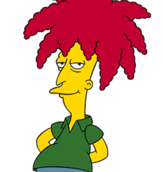
Without seeing the knife behind his back, you can clearly tell Sideshow Bob has malicious intent. The pointy nose. Erratically styled hair. He also has a very long body made up of mostly rectangular tubes, which translates well into his calculated and logical personality.
A good boxy character I say would be Mr. Gar(Ok Ko: Let's Be Heroes)—

His purpose in the show was to be the property manager of Lakewood Plaza Turbo, and that means he has to display some amount of authority. In order to do that, he was designed with mostly rectangles and squares in mind. He does have a very intimidating exterior but he's also a huge dork.
Lastly, a pretty decent design that mixes basic shapes together is Fear(Inside Out)—
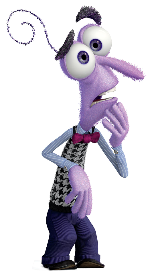
The emotion fear in general is a very mixed up thing to begin with. It's scary. Anxiety plays a messy part in it. Depression too. It makes sense for Fear to be all over the place visually. I suggest looking more into Inside Out's production process. They do a pretty good job with the final emotions' designs and their concept art is also very interesting to look at! I honestly kept it in mind while developing one of my own art styles and it helped me use shapes to my advantage.
As for silhouettes, give your character defining traits. North Italy's hair diddly-doo is good trait. Just something to make the character stick out when they are blocked out in black.
Color language.
Color is also a very important thing for design. However, as Hetalia is based purely on stereotypes, this really isn't applied here on a deep level as it is in normal character design. Let's compare two characters with a similar vibe, shall we?
In the past and in fandom, Russia is typically associated with malicious energy. However, he is most associated, in canon, with many neutral tones—
I see this as intentional on Himaruya's and the colorists/color stylists part. One, it fits his character very well. Two, it deviates away from Russia's disturbing attitude and intimidating appearance. It makes him look softer compared to the things he says. Makes him someone you would willingly want to hug on the streets of all places.
But Maleficent—

Was deliberately designed with purples, greens, reds, and blacks in order to sell that she was evil. If she were to dress any other way, say a hipster with mostly black or red, she would be more like Mother Gothel, basically a villain in plain sight much like how Russia is portrayed in at least the old fandom. Back to Maleficent, her pallet is all villain. She is the BEST example of what an obvious villain is and its thanks to Marc Davis(even if Sleeping Beauty (1959) was a flop). She's probably my favorite villain because her design works so well for her role.
Now onto the main event...

As you can see here, these are Germany and Italy's basic shapes. They translate very well into what their personalities are. I have to say, my favorite part of Germany would have to be his tightly slicked back hair. It really tells the viewer he's a serious guy. Whereas Italy's is loose and bouncy, which also translates pretty well into his character but not as obvious. Again, we can't say much about their color language as yellow means positivity and energy(think Spongebob Squarepants) and that isn't exactly Germany whatsoever.
Their contrasting designs work really well when both characters are put side by side—

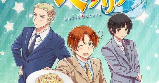
You can clearly tell their personalities apart just from one glance. Germany is very neat and straightforward. North Italy has this sort of spontaneous air to him. It also works pretty well with the mixed history real life Germany and Italy have— at least it does to me anyway.
I still don't hold North Italy's design to high praise, neither Germany's, but at least to this extent they're my favorite designs. They're pretty much the embodiment of unlikely friendship and opposites attract and I love it so much!
38 notes
·
View notes