#yeah i'm not tagging vice admiral rampart
Explore tagged Tumblr posts
Text
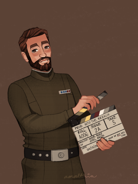
✨ EDMON RAMPART (Amalthia's Version) ✨ You know I once swore to never draw him, well that was of course before he got the James Norrington treatment so it's the Alexsandr Kallus Effect for me again. Talk about from fuck this man to I wanna fuck this man.

Teeny weeny fandom salt and salt in general coming up so if you don't like that, you can go scroll down. There used to be a cut here but I removed it. I will always be polite, but I know WHEN to talk.
From now on, I will be calling my fanart "Amalthia's version". I hope I don't come across as tone deaf or insensitive about this, but I wish I was good at art.
I've seen posts that say "I wish artists would stop drawing [character name] with [this] or [that]" or "stop drawing [character] with [this]". While it's great to hear about your preferences, please bear in mind that at the end of the day, fanart CAN BE an artist's take on a character. For me, THIS is how I draw Edmon Rampart. This is with regard to the art style I developed and the color palette that I constantly use to keep up with my blog's theme.
Another ick is an ongoing issue in the TBB fandom. In my Hunter and Omega art, I did something I don't usually do, which is add a secondary light source. A few minutes after posting, I got an anon telling me to unwhitewash the characters. I immediately messaged one of my friends for their honest opinion and they said I don't whitewash the characters. I went on to the drawing file and tried to study my own drawing and see if I really did whitewashed the characters. Edit: There really are some artists who whitewash the characters and I was trying to do a SELF-CHECK bec maybe I'm one of them.
I found out that the thing that made the difference is the secondary light source that I added. This secondary light source is lighter in color than their skin, and it created the Contrast Effect. Due to the nature of the human eye and visual processing by the brain, there's an optical illusion that the same color will look different depending on the color beside it and/or the background. It's in psychology class, paying attention would help.
In addition to the secondary light, it could also be the brown background color that caused this effect. And before anyone goes, "are you sure?" Yes, I am. I sat with a Psychology major to discuss about this whole Contract Effect thing.
This does not only apply in colors, it could also be to objects, that why they say all things are relative. One thing could appear bigger or smaller depending upon the object beside it. One of the things they 'check' to see if a certain artist whitewashed a character is the size of the nose. Once again, please do apply Contrast Effect. Some artist really draw their characters stick-like so try to compare all the noses they had drawn in their entire lifetimes and maybe, just maybe they did draw the noses wide in comparison to their other artworks, it just looks like that because it's part of their art style.
Edit: Please do try to analyze things first before casting down your judgement.
It's so difficult to be an artist AND IN THIS FANDOM. We never seem to be enough. If we do the character with artistic freedom, you'll say "stop drawing them like that bec they don't have that in the show" and when we try to draw them as close to the show, you'll say "unwhitewash the characters". We are never good enough for you.
So yeah, I wish I was good at this.
Link to the rest of this series:
1 || 2 || 3 || 4 || 5 || 6 || 7 || 8 || 9 || 10 || 11 || 12 || 13 || 14 || 15
#i'm gonna add this tag: AMALTHIA IS ANGRY#the bad batch#the bad batch season 3#the bad batch s3#tbb s3 spoilers#tbb rampart#edmon rampart#yeah i'm not tagging vice admiral rampart#HE'S BEEN DEMOTED#tbb#star wars#small artist#artists on tumblr#amalthiaph#the bad batch actors au
125 notes
·
View notes